What is Windows 95?
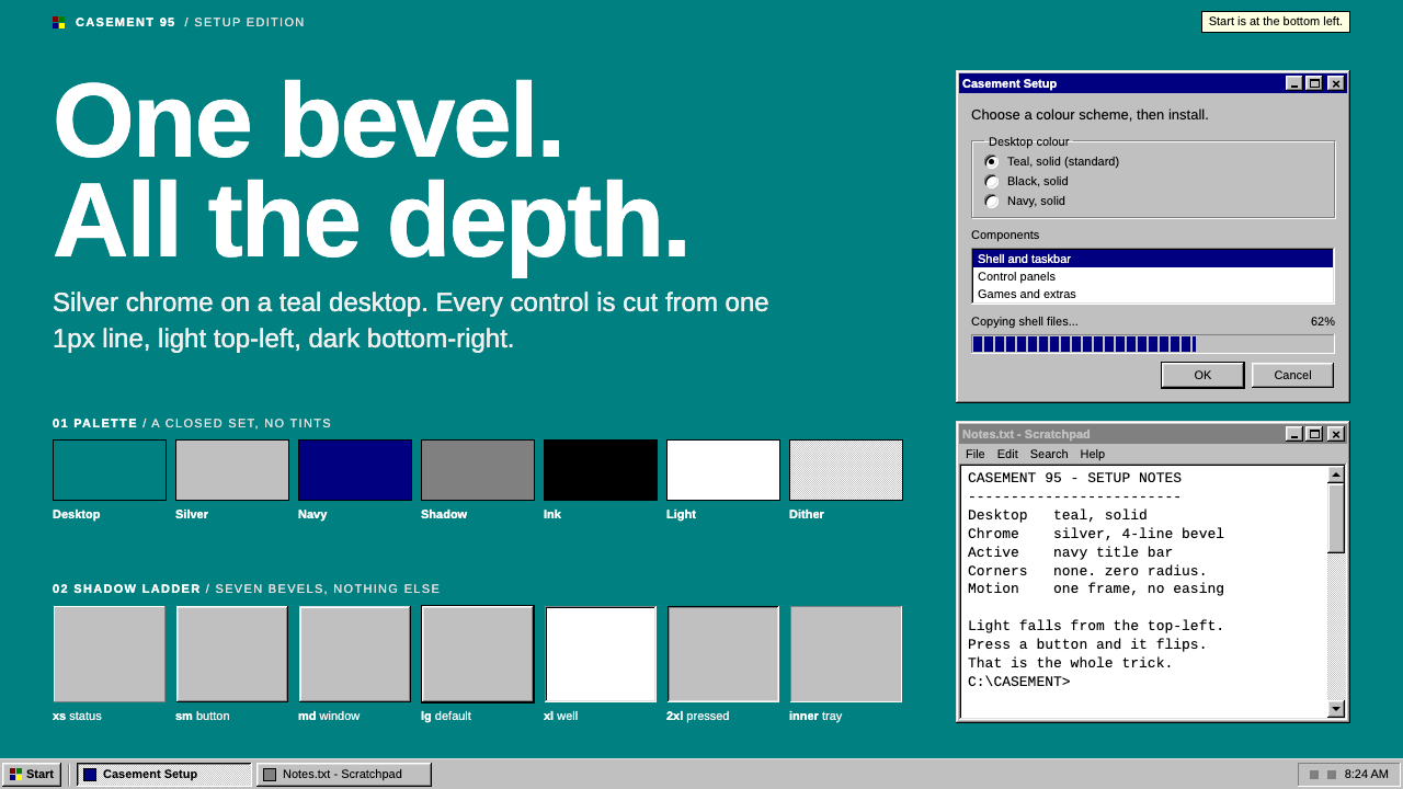
Windows 95 built a whole interface from one thin bevel: silver chrome, a navy title bar and a flat teal desktop, with no rounded corners, no shadows and no animation.
Windows 95 in brief
The Windows 95 style recreates the interface as it shipped in August 1995. A teal desktop fills the screen of a VGA monitor. Silver window chrome sits on top of it, each window topped by a solid navy title bar with white type. A taskbar runs along the bottom edge, with the Start button raised at its left end.
Every colour comes from the sixteen-colour system palette, and all sense of depth comes from a single thin bevel: light on the top and left edges, dark on the bottom and right. Buttons, input wells, group frames and scrollbars all use the same device. Nothing is blurred, rounded or animated, and pressing a control flips its bevel inward in a single frame.
The effect is blunt, orderly and instantly recognisable. It suits retro software, nostalgic web projects, playful tools, games and any product that wants the clarity of an early graphical desktop rather than the softness of modern interface design.

Where does Windows 95 come from?
Windows 95 was released in August 1995 by Microsoft in Redmond, Washington. It was a turning point for the personal computer, because it combined a new shell with a consistent visual language that ordinary people could learn quickly. For many users it was the image of what a computer looked like. The Start button and the taskbar were new to this release, and habits formed around them have lasted for decades.
The people credited with this shell include Brad Silverberg, who led the Windows 95 effort, and Kent Sullivan, who was part of the interface work, along with the wider Microsoft Windows 95 shell team. Their goal was practical: replace the earlier program-manager approach with a single place to launch programs, a visible list of open windows, and a stable set of controls that behaved in the same way everywhere.
The visual vocabulary came from the three-dimensional bevel GUI. Rather than drawing realistic shadows, which were expensive and inconsistent on the hardware of the time, the designers used a thin light edge and a thin dark edge to suggest that a control was raised or sunken. A button looked raised and could be pressed. A text field looked sunken, like a well. The same trick was applied to frames and bars, and it made the whole interface feel built from one material.
Colour was constrained by the sixteen-colour VGA system palette. The silver grey of the windows, the navy of the title bars and the teal of the default desktop were all drawn from that limited set, and the interface text used bitmap typography designed to be sharp on low-resolution displays. The shell was carried forward into Windows NT 4.0 in 1996 and into Windows 98, and it stayed in daily use through about 2001. The design system built from it keeps the discipline of that palette and that single bevel.
What defines the Windows 95 look?
One Bevel
The entire sense of depth comes from a single thin bevel with a light top-left edge and a dark bottom-right edge. Raised things, such as buttons and window frames, show it facing outward. Sunken things, such as text fields, show it reversed. No second depth system is permitted, so there are no drop shadows, glows or gradients to mix with it.
Silver Chrome
Windows, dialogs and controls are filled with a flat, medium-light silver grey. It is a neutral material that lets the bevel do the work. Large areas of this grey make the interface feel uniform and slightly industrial, like moulded plastic in a beige computer case.
Navy Title Bar
Each active window carries a solid navy bar across the top with white bold type for the program name and small control buttons at the right. Inactive windows switch to a grey bar. The bar is the one saturated colour in the window, and it tells you at a glance which window has focus.
Flat Teal Desktop
The background behind windows is a plain teal field with no wallpaper, texture or gradient. Icons sit on it with small labels, and selected items invert to the navy highlight. The flatness makes the silver windows read as solid objects resting on a surface.
Taskbar and Start
A grey bar spans the bottom edge, with a raised Start button on the left, buttons for open windows in the middle, and a sunken tray with the clock at the right. It is the spine of the layout. Menus unfold from it as plain bevelled lists with highlighted rows.
No Rounding, No Motion
Corners are square and edges are crisp. Transitions do not exist, so states change in a single frame: a button pressed flips its bevel, a menu item highlights, a window appears. This gives the interface a firm, mechanical response that feels immediate.
Bitmap Type
Interface text is set in small, sharp, bitmap-style sans serif designed for low-resolution screens, with labels often underlined on one letter to show a keyboard shortcut. Hierarchy comes from bold versus regular, not from size changes. Text is black on silver, or white on navy.

Who shaped Windows 95?
Silverberg is associated with leading the Windows 95 project at Microsoft. His role was to coordinate the engineering and product decisions that brought a new shell and a broad redesign of the interface to market in 1995.
Sullivan is credited with work on the Windows 95 user interface. His name is linked to the design thinking behind the shell’s consistent controls, the taskbar model and the way the system presented programs and windows to ordinary users.
The wider shell team built the Start menu, the taskbar and the family of bevelled controls that defined the release. Their shared work set conventions that influenced operating systems and applications for years afterward.
How do you use Windows 95 today?
Windows 95 is best when nostalgia, clarity or a deliberately old-computer personality is the point. It works for retro tools, creative projects, portfolios with a sense of humour, games, indie software and campaigns that play with early internet culture. It is less suitable for contexts that call for softness or luxury.
For presentation slides, a cover can show a teal field with a single silver window in the middle, a navy title bar carrying the talk title, and a small taskbar along the bottom. Content slides can be framed as windows, each with its own bar and a few controls, and a tidy list inside. Data slides work well as dialog boxes: flat bars in navy and teal, labels in the bitmap-style face, and sunken panels for key numbers.
For web interfaces, use real structure. Buttons are raised silver rectangles with the bevel, text inputs are sunken wells, and panels are bordered frames. Navigation can be a menu bar or a taskbar-like strip. Keep the whole screen flat, avoid shadows and rounding, and make state changes instant. The consistency of one bevel is the style, so do not mix in other depth effects.
For editorial and marketing work, present articles or product tours as stacked windows on a teal background. Use title bars as section headers, small icons as visual markers, and dialog-style callouts for key messages. A loading screen, an error dialog or a Start-style menu can become a witty recurring device if used sparingly.
A common mistake is to add soft shadows, rounded corners or smooth transitions in order to make it feel more modern, which breaks the one-bevel rule. Another is to use colours outside the limited palette, such as pastel gradients or bright accents, which dilutes the recognisable character. Keep the grey, navy and teal, keep corners square, and let the single bevel do all the depth.

Windows 95 — FAQ
What is the one-bevel rule?
It means that all depth in the interface is created by one thin bevel, light on the top and left and dark on the bottom and right. Raised controls show it outward, and sunken wells show it reversed. No shadows, glows or gradients are added on top.
Which colours does the style use?
It uses colours that come from the sixteen-colour system palette of the time: silver grey for window surfaces, navy for title bars and selection, teal for the desktop, plus black and white for text. Bright accents outside that set are avoided.
Why are there no animations?
The original interface changed state instantly. Pressing a control flipped its bevel inward in a single frame, with no easing. Keeping that behaviour is part of the identity, and it gives interactions a crisp, mechanical feel.
Is the style usable for serious software?
Yes, with care. Its controls are clear, consistent and easy to recognise, which is why the original was so widely learned. For a product with a retro or utilitarian identity it can work very well. For brands that want a contemporary, soft or premium look it will feel out of place.
Where did the Start button and taskbar come from?
They were introduced with Windows 95 in August 1995 and designed by the Microsoft shell team to give users a single place to launch programs and see their open windows. They were carried into later versions and shaped habits for many years.
Related design styles
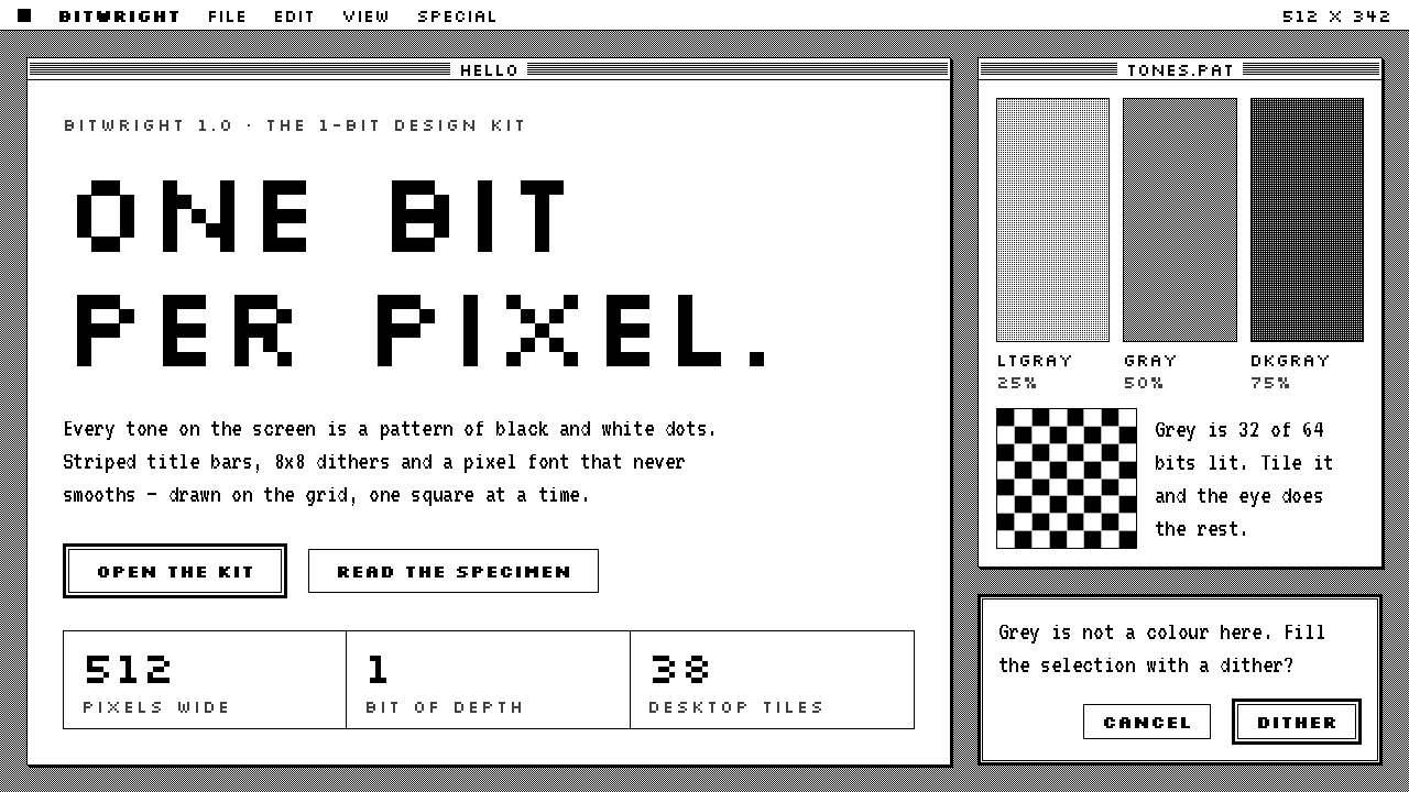 Macintosh 1984One bit per pixel, no grey. Black on white, striped title bars, dither fills…
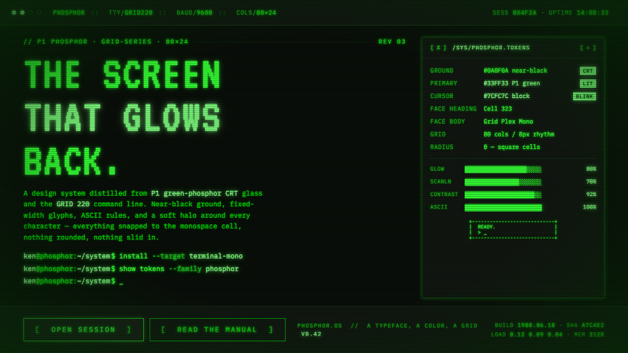 Unix Terminal MonoNear-black CRT glass that glows back. P1 phosphor green, VT323 mono, ASCII ru…
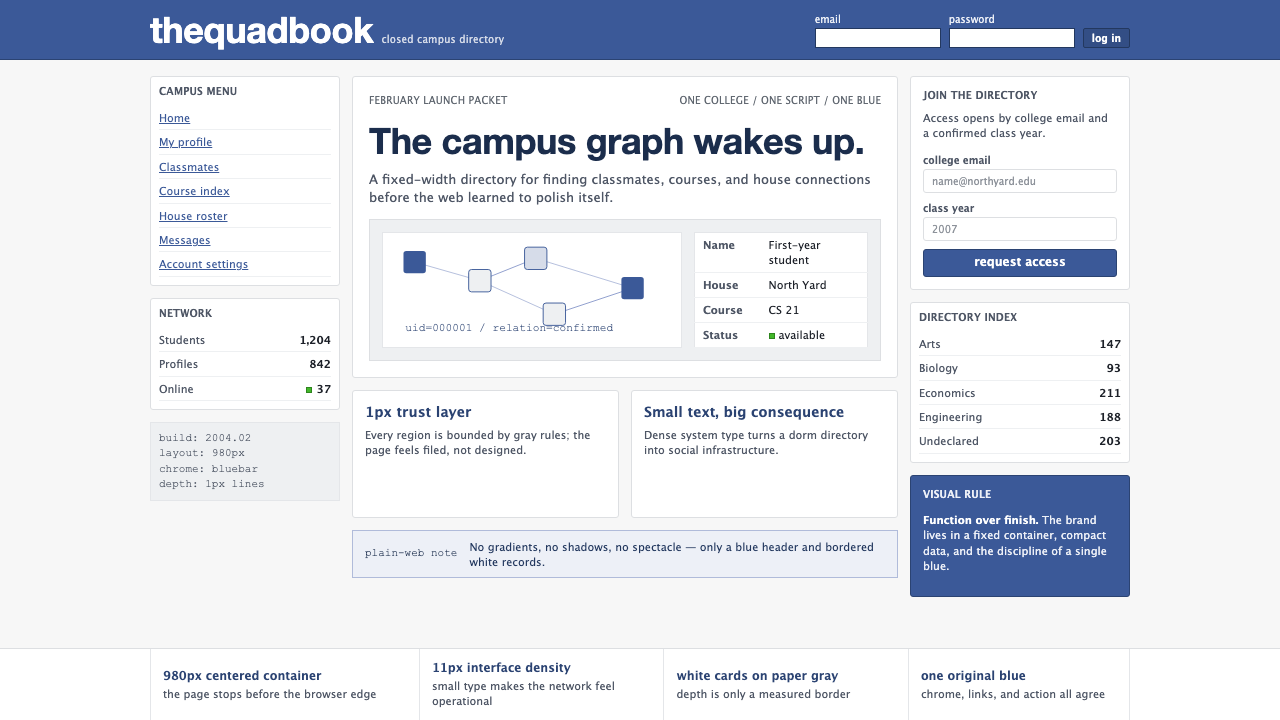 Facebook 2004Dorm-web austerity. Original blue, 980px grid, 1px borders, tiny Lucida Grand…
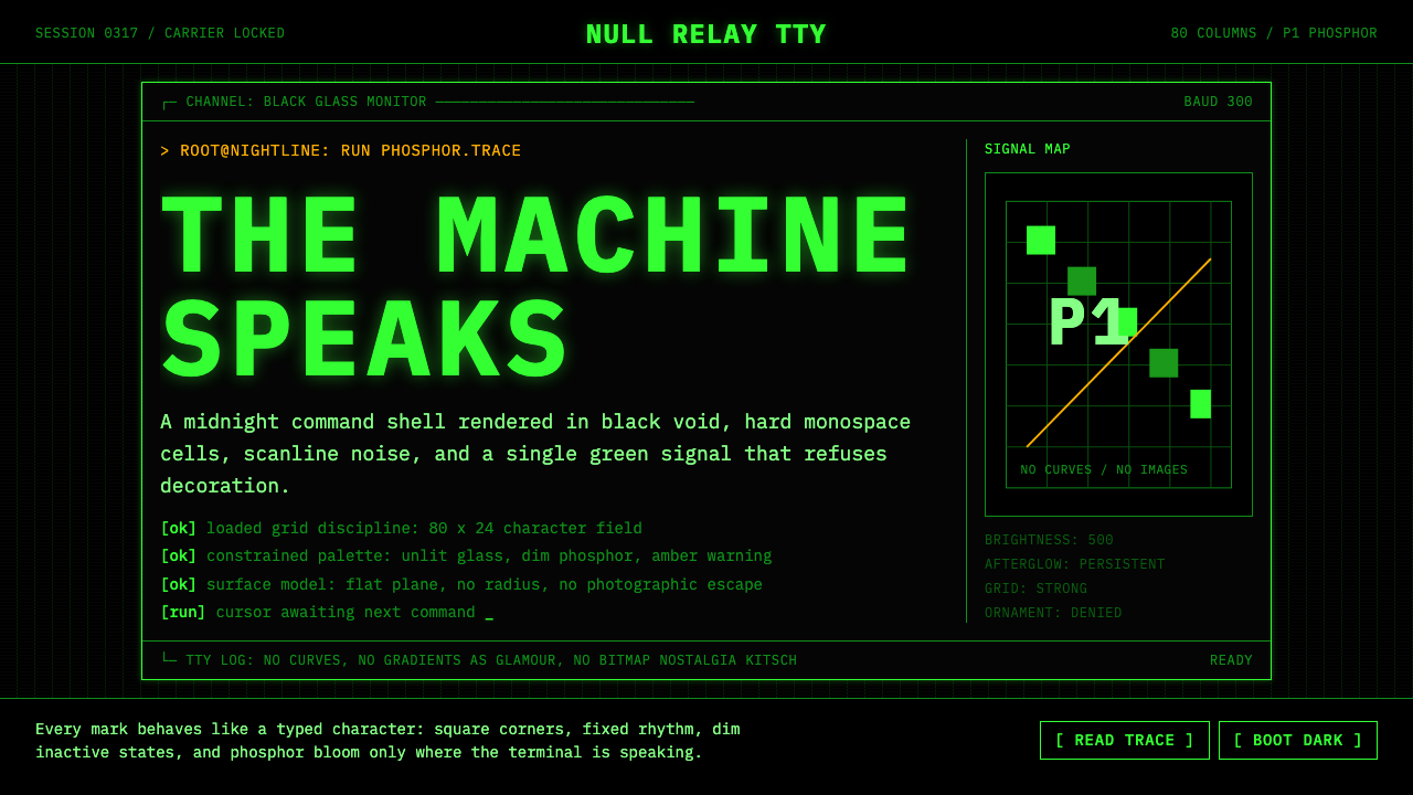 CLI Hacker Phosphor Green (1985)Pure terminal myth. Black glass, P1 green mono type, scanlines, and rigid 80-…
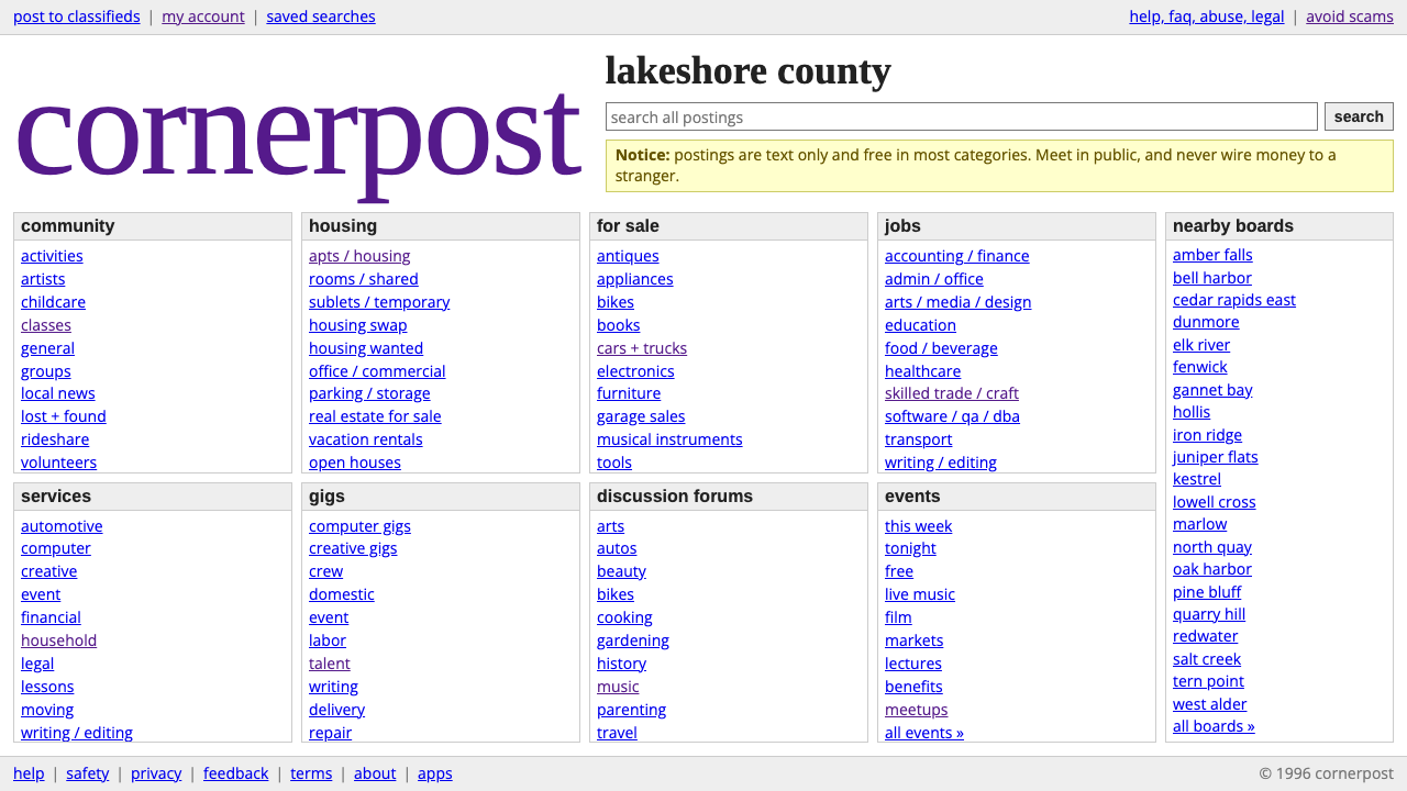 craigslistNothing designed, everything findable. Blue underlined links and a purple ser…
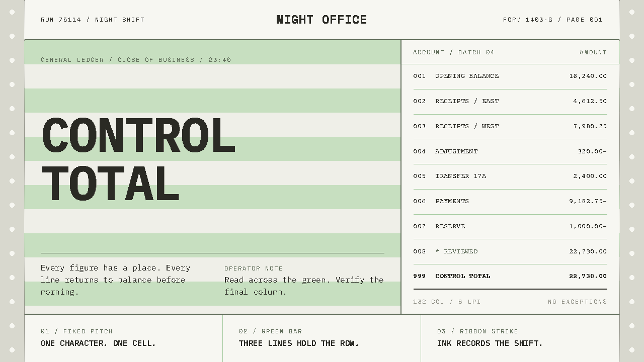 Green Bar PrintoutOrder, struck on paper. Worn mono type locks to fixed columns across pale gre…