What is Unix Terminal Mono?
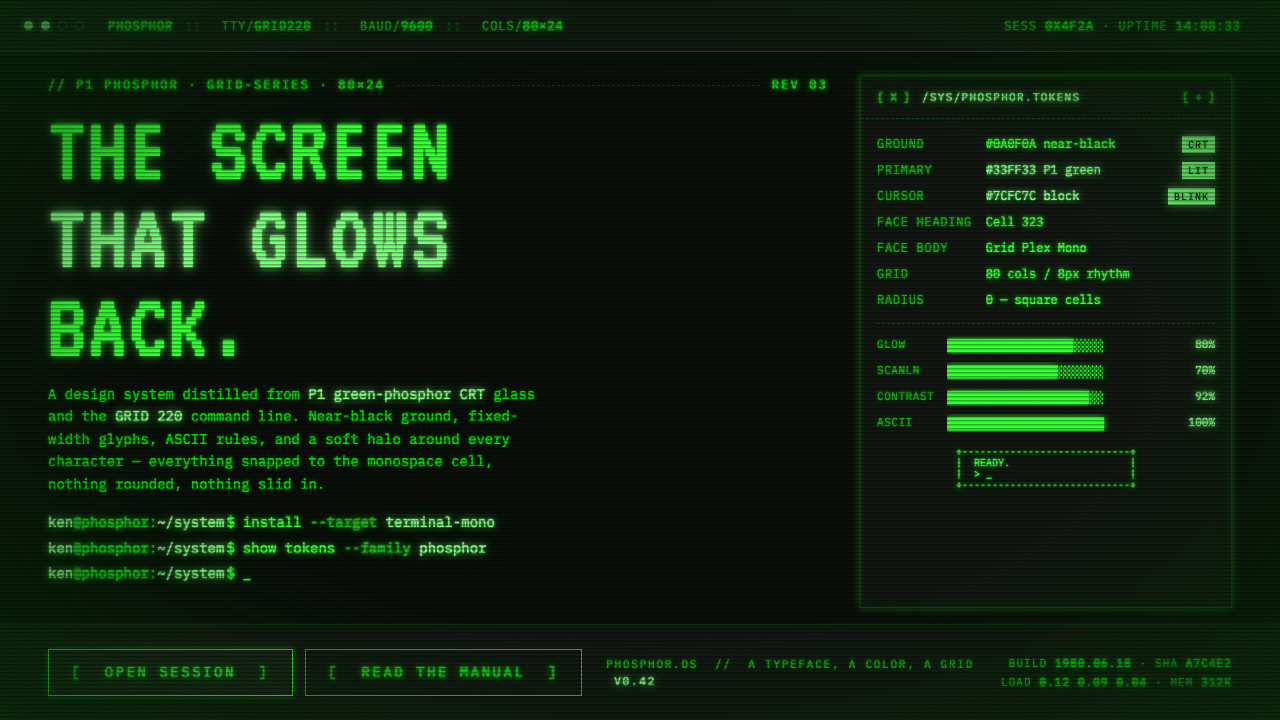
Unix Terminal Mono turns the command line into an atmosphere: near-black CRT glass, P1 phosphor green, fixed-width text, ASCII structure, and a cursor that seems to breathe.
Unix Terminal Mono in brief
Unix Terminal Mono is a digital design language drawn from the green-phosphor CRT terminals associated with DEC VT-series video terminals and Unix workstations from the 1960s through the 1980s. Its visual world is deliberately narrow: a genuinely near-black screen, bright terminal green with a slightly yellow cast, monospaced glyphs, and a command-line grid built from fixed-width characters.
The style is not simply green text placed on a dark background. Its identity comes from the relationship between elements. Text occupies a disciplined character field; prompts establish the beginning of an exchange; ASCII rules divide information without becoming decoration; and the cursor block gives the otherwise static screen a small sign of activity. Every visible mark feels emitted from the same glass surface.
In digital form, the system preserves the rawness of early computing while making it usable for contemporary interfaces. The background remains close to black, green is reserved for language and interaction, and typography stays strictly monospaced. A faint glow halo may surround characters, but it should reinforce the feeling of phosphor light rather than turn the interface into luminous ornament.
Where does Unix Terminal Mono come from?
The historical span of this language reaches from the 1950s through 1990, with P1 green-phosphor monitors becoming a standard presence in the 1960s and 1980s. Its geographic center was North America: Digital Equipment Corporation in Maynard, Massachusetts, and Bell Labs in Murray Hill, New Jersey. The aesthetic therefore belongs to a particular material and institutional world, where computing was encountered through a glowing monochrome screen rather than a richly illustrated desktop.
DEC VT-series terminals provide the clearest visual anchor for the style. The VT100, introduced in 1978, and the VT220, introduced in 1983, belong to the lineage named in the source material. Their importance here is not a catalog of technical features but the screen tradition they represent: dark glass, phosphor characters, fixed-width composition, and the visible grammar of a terminal session.
The other major source is Bell Labs and the Unix authors associated with it. Unix belongs to the command-line and teletype interface tradition, where language is the primary means of operating a computer. That history gives the style its textual seriousness. Information is not presented as a decorative card or pictorial scene; it arrives as a sequence of prompts, responses, rules, and aligned characters.
These origins converge in three movements identified by the source: early command-line computing, monochrome-CRT display technology, and the Unix or teletype interface tradition. Unix Terminal Mono does not recreate every historical artifact. It distills the common visual condition shared by them—the near-black field, the green emission, the rigid character grid, and the sense that the machine is speaking through a narrow luminous channel.
What defines the Unix Terminal Mono look?
Near-Black Glass
The background should feel like unlit CRT glass rather than ordinary dark paint. It is near-black, quiet, and spacious, allowing green characters to appear as emissions from within the surface. Large empty areas are not wasted space; they preserve the pressure and focus of the terminal field.
P1 Phosphor Green
Green is the system's defining and nearly exclusive chromatic voice. It should be bright enough to read as emitted light, with the slightly yellow character associated with terminal green. Its restraint matters: a single luminous family creates stronger historical coherence than a collection of competing accents.
Strict Monospace
VT323 mono is the named typographic reference, and fixed-width construction is non-negotiable. Characters should occupy dependable cells, producing the unmistakable rhythm of a command line. Variation comes through hierarchy, grouping, and repetition, not through switching among expressive type families.
ASCII Structure
Rules, separators, brackets, prompts, and other character-based marks should organize the interface visibly. They are structural signals made from the same vocabulary as the text. The result should feel assembled from a command-line grammar, with alignment carrying as much meaning as color or scale.
Prompt and Cursor
The prompt establishes a point of address: the machine is ready, waiting, or responding. The cursor block then gives the composition a living edge. Its blinking presence should remain simple and legible, acting as a state indicator rather than a decorative animation.
Controlled Glow
A faint green halo can soften the edges of characters and suggest phosphor emission. The halo must remain subordinate to the glyphs themselves. Excessive bloom turns the screen into neon signage and destroys the quiet density that makes the terminal feel authentic.
Who shaped Unix Terminal Mono?
The DEC VT-series engineers represent the terminal lineage most directly associated with this visual language. Their work stands for the dark CRT face, phosphor-green emission, fixed-width character field, prompt, and cursor that define the system's historical reference.
The Bell Labs Unix authors provide the cultural and operational context behind the style. They represent the command-line tradition in which text, prompts, and aligned characters form the primary interface between a person and a computer.
Ken Thompson is named among the key figures of the source material. In this design history, he stands for the Unix authorship associated with Bell Labs and for the command-line computing tradition that gives the style its textual, procedural character.
Dennis Ritchie is likewise identified as a key figure in the Unix lineage. His place in this article is less a portrait than a marker of the Bell Labs authorship and early computing culture from which the terminal language draws its authority.
How do you use Unix Terminal Mono today?
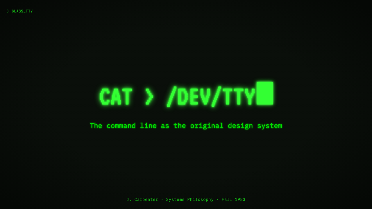
For presentation slides, use the style as a complete stage rather than a decorative cover treatment. A cover can place a short command-like title, a prompt, and a solitary cursor against the near-black field. Content slides should preserve the character grid through aligned text blocks and ASCII rules. Data slides work best when values read like terminal output: compact labels, clear columns, and green emphasis reserved for the active result or most important signal.
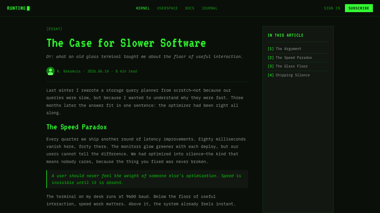
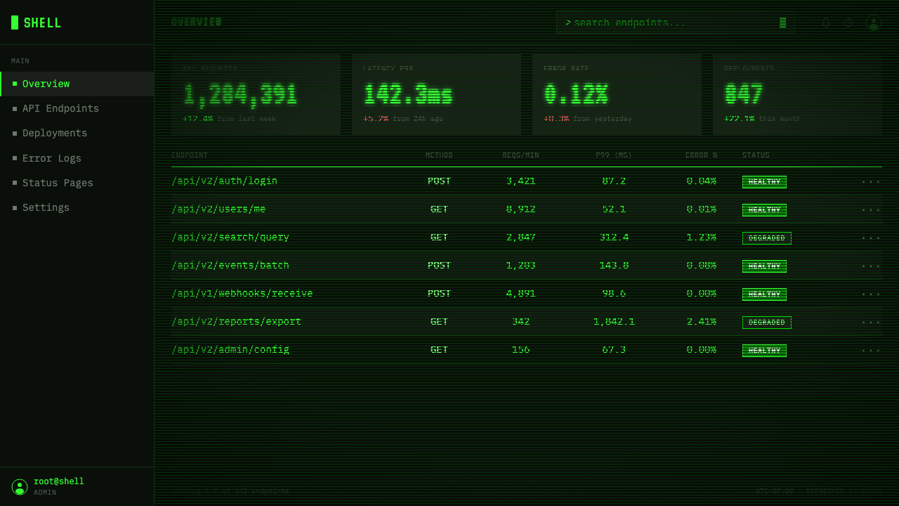
For web interfaces, Unix Terminal Mono suits dashboards, developer tools, monitoring views, system status pages, and pricing pages that want to communicate technical clarity. Keep the near-black surface continuous, use monospaced text throughout, and make hierarchy through alignment and grouping. In pricing layouts, plans can read as command-line sections separated by ASCII rules, while the primary action appears as a clear prompt or cursor-ready state rather than a glossy promotional button.
For editorial and marketing work, the style creates an immediate point of view. Articles can use terminal-like headings, short metadata lines, prompt-led section openings, and dense but carefully aligned information blocks. Marketing pages can frame a product as direct, technical, and self-possessed by treating the page like a readable session log. Imagery should remain subordinate; the strongest expression often comes from the dark field, green type, and disciplined text rhythm.
The common mistake is to confuse terminal atmosphere with cyberpunk excess. Adding many neon colors, decorative gradients, expressive display fonts, or elaborate motion breaks the system's strictness. Another failure is using a generic dark interface while allowing proportional text or loose alignment. The style works when every mark appears to belong to the same monochrome character grid, with glow and animation used only to support the feeling of phosphor, prompt, and cursor.
Unix Terminal Mono — FAQ
Is Unix Terminal Mono just green text on black?
No. The color pairing is necessary but not sufficient. The system also depends on strict monospace typography, fixed-width alignment, ASCII rules, command prompts, a cursor block, and a restrained phosphor glow. Remove those relationships and the result becomes a generic dark interface with green accents rather than a terminal language.
Can the style use colors besides green?
The source defines the language as strictly green against a near-black field, so additional colors should be treated as a departure rather than a normal extension. If distinction is needed, use hierarchy, spacing, rules, alignment, and cursor or prompt states before introducing another hue. The limitation is what preserves the phosphor-screen identity.
Does the design require literal CRT hardware?
No. Unix Terminal Mono is explicitly a digital distillation of the screen tradition. The essential qualities are the near-black glass-like field, P1 green, fixed-width text, cursor, prompt, ASCII structure, and faint character glow. Literal hardware may deepen the reference, but the system can remain convincing when those relationships are handled consistently in digital form.
Why is monospace typography so important?
Monospace typography makes the character grid visible. Every glyph occupies a dependable place, so columns, rules, prompts, and responses can align as parts of one operating surface. A proportional typeface introduces a different rhythm and weakens the connection to the command-line and teletype traditions that define the style.
What kinds of products suit this style best?
It is strongest where directness, technical identity, and readable system state matter: dashboards, developer tools, monitoring views, system pages, analytical products, and technically positioned pricing experiences. It is less suitable when the product depends on softness, sensory richness, or a broad expressive palette. The question is not whether the style can be applied, but whether the product benefits from its strictness.
Related design styles
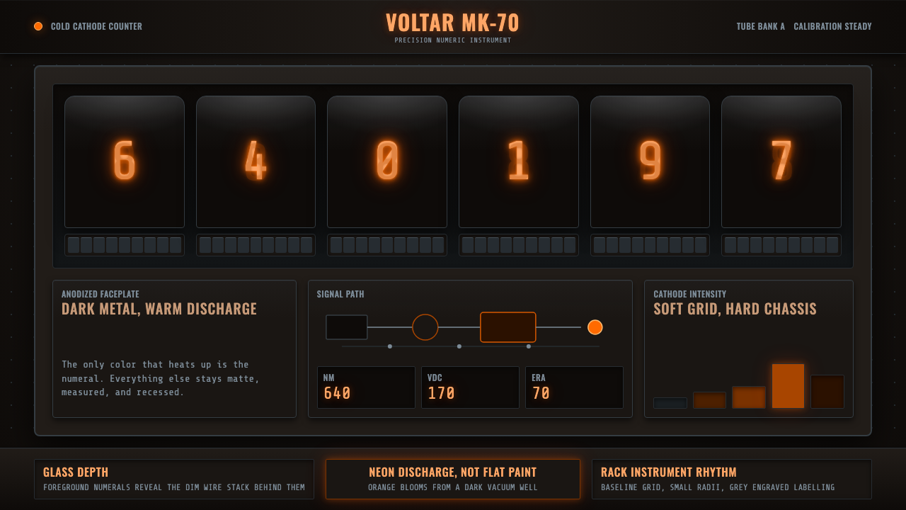 Nixie Tube DisplayHeat inside the machine. Neon-orange digits glow over black metal gridwork.
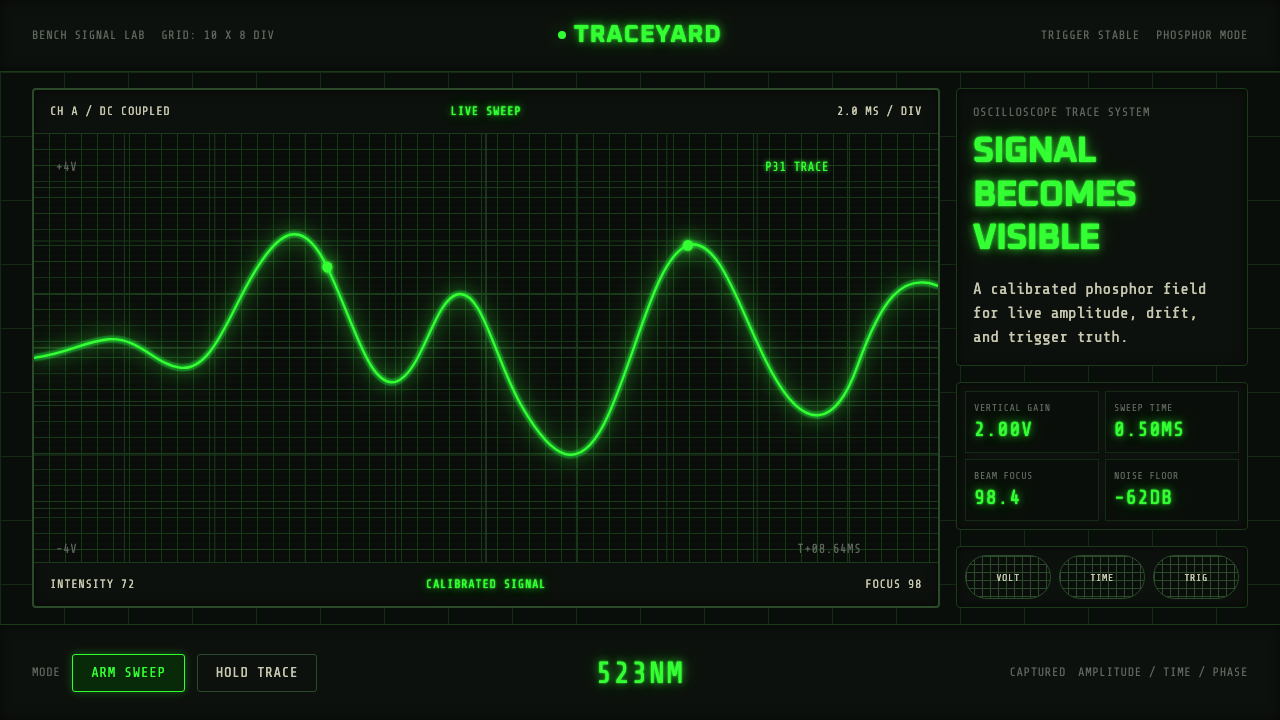 Oscilloscope TraceMeasurement glows. P31 green waveforms burn through a black graticule.
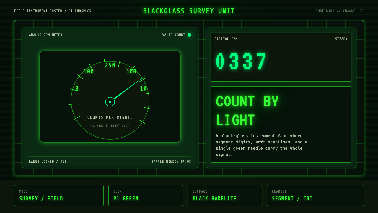 Geiger Counter Green ReadoutReads by glow. P1 green digits, scanlines, and a bordered black instrument gr…
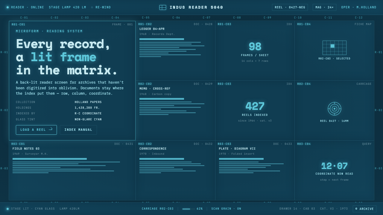 Microfiche ArchiveRecords as lit frames in a matrix. Cyan-blue back-lit panel, glowing mono typ…
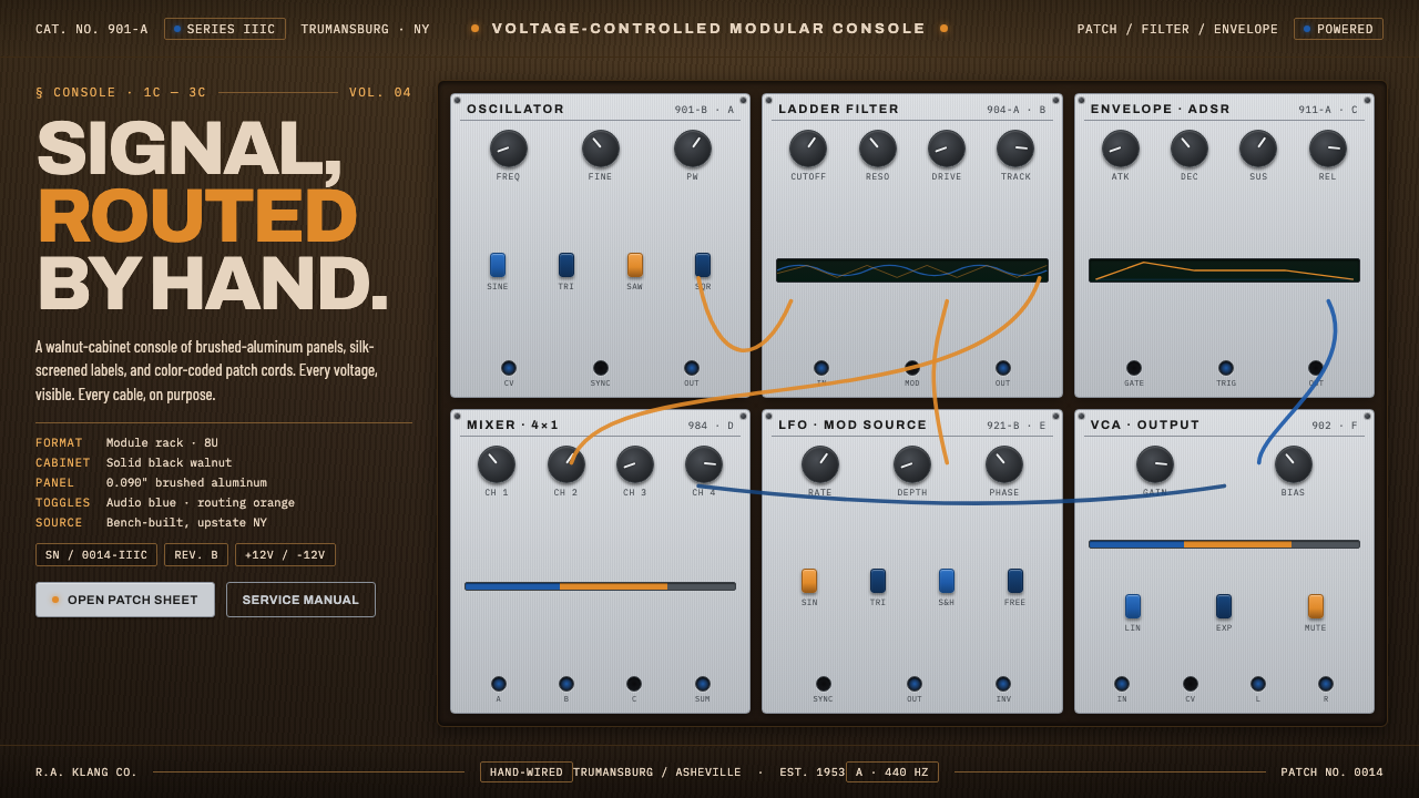 Moog Modular SynthWalnut cabinet, brushed-aluminum panels. Toggle-blue switches, orange patch c…
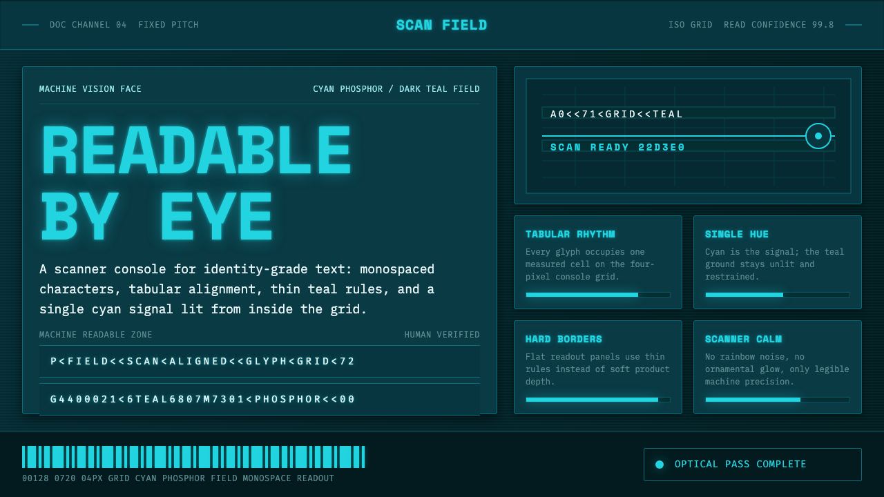 OCR-B Machine ReadableMachine vision, made calm. Cyan monospace glows on a dark teal scanner grid.