What is METAR Weather Code?
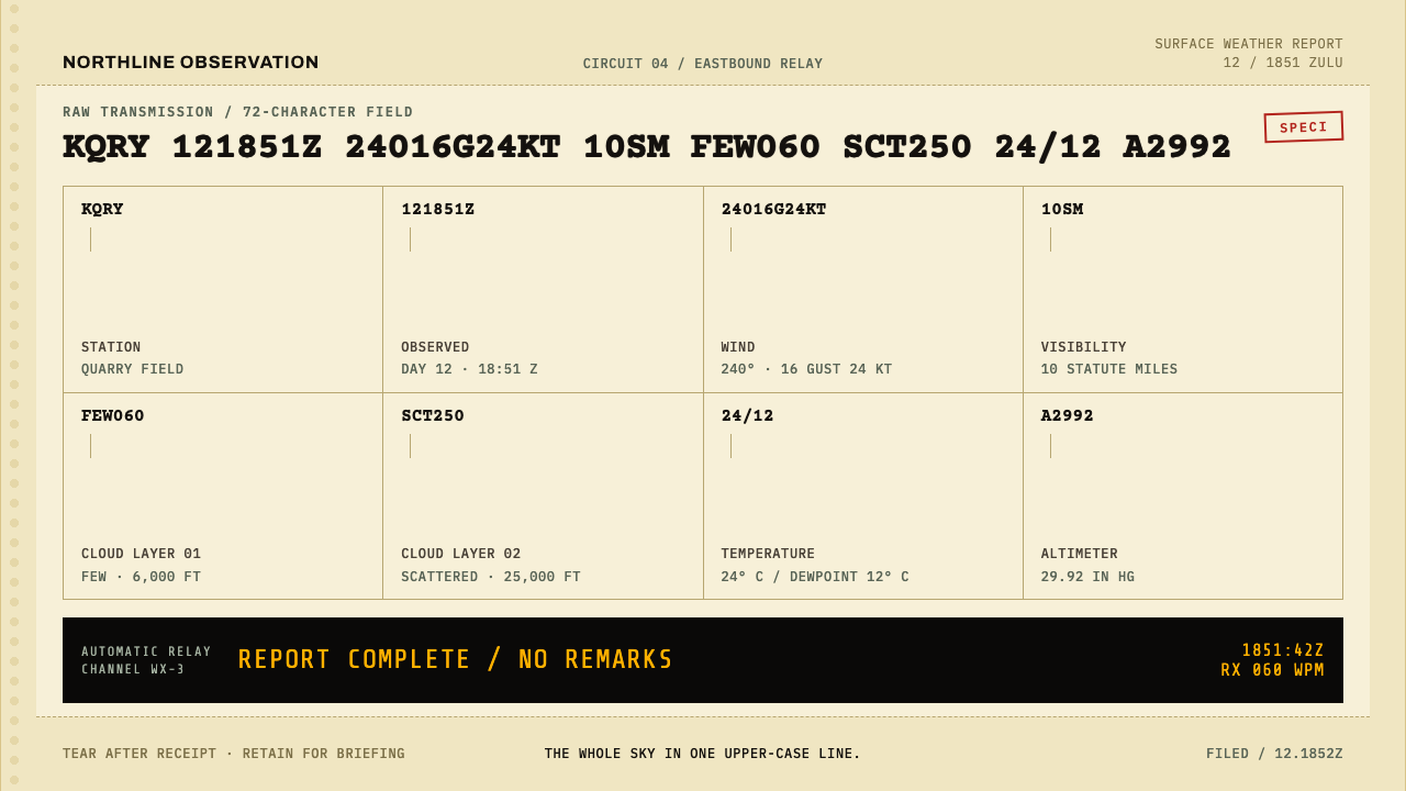
A METAR squeezes an entire sky into one line of capitals, and this system rebuilds the paper that carried it: ribbon-black code struck onto canary teleprinter stock.
METAR Weather Code in brief
METAR Weather Code is the visual language of aviation weather as it once arrived on paper. A METAR is one line of upper-case text that holds an entire sky: the airport, the Zulu hour, wind, visibility, cloud bases, temperature over dewpoint and the altimeter setting. Its forecast sibling, the TAF, is written in the same compressed idiom. Nothing in these strings is decorative. Every character is there because a pilot or a dispatcher needs it.
The capitals are not a design decision. The Teletype type box carried no lower case, so the machine could only speak in capitals. This style rebuilds the artefact rather than the idea of it: canary roll stock, a black Underwood ribbon, sprocket margins down both edges, and a fixed-width column that never centres itself. Decode annotations hang beneath the string on thin leader rules, and everything else gets out of the way of the code.
The surface carries the traces of a machine and a room. The paper curls at its edges. The ribbon strikes the paper unevenly, so some characters sit darker than others. A SPECI, a report issued outside the regular schedule, arrives as a crooked red rubber stamp. The tonal range is small and dry: yellowed paper, ribbon black, and one flash of red used as an exception. The mood is technical, accountable and quietly nostalgic, without ever becoming sentimental.

Where does METAR Weather Code come from?
The idiom grew from the need to send weather quickly over wires. Before screens, observations had to be compressed into short, strict strings that a telegraph or teleprinter could carry, so the style belongs to the family of telegraphic abbreviation codes. The first US weather teletype circuits date to 1928, and the offices of the US Weather Bureau anchor the history: observations were taken, encoded and sent out along circuits that spread across the country and linked to international networks. The record describes the geography as global, running along ICAO and WMO circuits.
The machine shaped the look as much as the code did. The Teletype Corporation built the equipment, and its type box offered capitals only, which is why every METAR and TAF is upper case to this day. The Model 28 entered service in 1953 and printed on continuous roll stock with sprocket holes along both edges, so the margins are part of the artefact and cannot be cropped away. This paper era ends around 1985, when screens replaced rolls, but the character of the idiom, its flat capitals and its steady column, has survived on every display that still shows a METAR.
People stand behind the strings too. Flight Service Station briefers read these lines for pilots and turned the compressed text back into plain speech, which is why decode annotations are such a natural part of the style: they are the written version of a briefer's work. Standing behind the code itself is the ICAO Aeronautical Meteorology code committee, the kind of body that makes a line written in one country readable in another. FAA aviation weather services connect the code to everyday flying practice.
The movements named in the record are telegraphic abbreviation codes, teleprinter typography and FAA aviation weather services. Together they describe a strangely pure form of design: a typography imposed entirely by mechanics, a content imposed entirely by use, and no one ever tried to make it beautiful. That is exactly why it is beautiful now. A style built from fixed capitals, a fixed column and honest paper can give a contemporary interface a sense of authority that no amount of polish can fake.
What defines the METAR Weather Code look?
Canary Roll Stock
The ground is pale canary yellow, a continuous roll rather than a sheet. It is matte, slightly aged and never pure white, and it carries a faint tooth that takes ribbon ink. The yellow is not a decorative tint; it is simply what this paper was. Because it is a roll, the layout has no real top or bottom, only a stream of lines that continues past the frame.
Ribbon-Black Strike
Characters are struck by a black ribbon, so every letter is a small impact rather than a drawn curve. The ink is slightly uneven: some characters sit darker, some are a little broken at the edge, and a few seem to lean. This variation is how the mechanism shows its work. A perfectly uniform, razor-clean black would look printed on a laser printer, and the point of the system is that it is struck.
Capitals Only
Everything is upper case because the type box carried no lower case. That constraint, not taste, gave the idiom its uniform, flat-topped skyline of letters. Within it, hierarchy cannot come from changing case, so it has to come from position, spacing and the use of the red stamp. The result is a strict and egalitarian texture in which every character weighs the same.
Fixed Column, Flush Left
Text sits in a fixed-width column of set character count, with every character occupying the same width. It is always aligned to the left and never centred, because a teleprinter has no way of centring anything. Lines break where the column ends, not where a sentence ends. This rigid measure gives the page a calm, tabulated rhythm in which columns of characters line up.
Sprocket Margins
Down both edges of the roll run the rows of small feed holes that pulled the paper through the machine. They form a margin that frames the text like a film strip, and they tell the viewer immediately what kind of object this is. The holes should be used once, as part of the page edge, and not repeated as decoration on every element.
Decode Leaders
Below the code string, annotations explain what each group means and connect to it by thin leader rules. This is the style's one concession to the human reader, and it is handled with the same economy as everything else: short labels, thin lines, no boxes. The annotation stays below the code, so the string always remains the main thing on the page.
The Crooked Red Stamp
Red appears in exactly one place: the rubber stamp that marks a SPECI, a report issued outside the regular schedule. It is slightly crooked, as if pressed by a hand in a hurry. Because the rest of the page is yellow paper and black ribbon, the red carries real urgency. It should be reserved for the exceptional event and never used as general decoration or branding.

Who shaped METAR Weather Code?
The maker of the machines whose limits defined the look. The Teletype type box carried no lower case, which fixed the capitals; the printing mechanism, with its ribbon and roll, fixed the strike and the paper. The Model 28, in service from 1953, is the machine most closely associated with the mature form of this style. Its constraints are the style's constraints.
The institutional anchor of the history. Its offices were where observations were taken, encoded and put onto the circuits, beginning with the first US weather teletype circuits in 1928. The Weather Bureau supplies the style's tone of public duty: dry, factual and meant to be relied upon. Anything borrowed from the style should keep that sense of accountability.
The people who turned the string back into speech. A briefer took a line of capitals and told a pilot what the sky was doing. They are the human interface of the code, and the decode annotations in this style are a written version of what they did. Thinking of the briefer helps a designer decide how much explanation a code needs and where to put it.
The standards body behind the code. Its work is what allows a line written in one country to be read in another, and it explains the style's global reach along ICAO and WMO circuits. A code committee has no interest in appearance, only in agreement, which is why the style feels so free of decoration. The lesson for design is that consistency is itself an aesthetic.
How do you use METAR Weather Code today?
METAR Weather Code suits work in which information density, authority and a sense of the real artefact are valuable. Its principles are structural: set text in a fixed column, left align everything, keep the palette to paper, ribbon and one stamp, and let the code dominate. Applying it well means designing like a teleprinter operator, not like a decorator.
For presentation slides, a cover can be a strip of canary paper with the title struck across as a single line of capitals, sprocket margins at each side, and the date or a short reference code beneath it. Content slides work as ruled printouts, with a monospaced column and short annotations connected by thin leader lines. Data slides are natural fits for the decode idea: label a chart or a table the way a briefer would decode a string, group by group, and mark exceptions with the red stamp.
For web interfaces, the style is an obvious match for status pages, log viewers, developer tools, terminals, monitoring dashboards, changelogs, and any product in aviation, weather, logistics or operations. Build pages as a single fixed-width column of capitals, flush left, with plain rules between sections. Tables can be set as lines of text. Buttons are best treated as plain bracketed labels, and states can be signalled by position or a small stamp, not by colour fills. A very small amount of ribbon unevenness in type or borders gives the page its human mechanical feel.
For editorial and marketing work, the style supports technical manuals, aviation history features, data journalism, reports on infrastructure, and any story about how information travels. A long read can be set as a printout with margins, and quotations can be struck as lines of capitals. For brands, the style gives an unusual and credible voice to anything that wants to sound precise, operational and unadorned, such as logistics services, weather products or engineering tools.
The most common mistake is making it too clean. A pure white page with a perfect monospaced font is a code editor, not a teleprinter printout. Another is centring text, which the machine could never do, or mixing in lower case for body copy, which breaks the central logic. A third is overusing the red stamp until it loses its meaning, or putting sprocket holes on every card and box as decoration. Keep the paper yellow, the strike uneven, and the red rare.

METAR Weather Code — FAQ
Why is everything in capital letters?
Because the Teletype type box carried no lower case. The machines could only print capitals, so aviation weather reports were written in capitals and still are. It was a mechanical limit that became a convention, and the style keeps it as a point of honesty. Hierarchy in this system therefore cannot come from changing case; it comes from position, spacing, thin rules and the rare use of the red stamp.
What do METAR and TAF mean in this style?
A METAR is a compressed line of observed weather at an airport, giving the station, the Zulu hour, wind, visibility, cloud bases, temperature over dewpoint and altimeter setting. The TAF is its forecast sibling, written in the same terse idiom. The design system borrows the form shared by both: one dense line of capitals, nothing decorative, with the meaning decoded in notes underneath. You do not need to know how to read a METAR to use the style, but it helps to remember that every character earns its place.
What is the red stamp for?
It marks a SPECI, a report issued outside the regular schedule when conditions change. In the style, it is the single appearance of red, slightly crooked as if stamped in a hurry. That rarity gives it meaning: a red mark on a yellow-and-black page says that something unscheduled has happened. If the red is used for buttons, headings or branding, the signal is lost.
Can the style be used on a dark background?
The artefact is a yellow paper roll struck with a black ribbon, so a light, warm ground is its home. A dark variation is possible as a terminal-like screen: pale characters on a dark ground, same fixed column, same flush left alignment, same absence of decoration. The risk is that a dark terminal quickly turns into a generic hacker look. Hold on to the paper-and-ribbon details, such as uneven strike and the stamp, to keep the identity.
Where does the style struggle?
It struggles where warmth, softness or persuasion are needed: consumer lifestyle brands, children's products, wellness and hospitality. Its rigid column and capital letters make long running prose tiring to read, so it is not suited to extended storytelling unless sections are kept short. It is strongest where precision, accountability and a feeling of real infrastructure are the values being communicated.
Related design styles
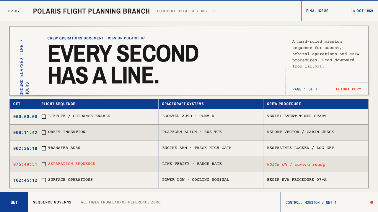 Apollo Flight PlanEvery second has a line. NASA blue rules and monospaced GET stamps discipline…
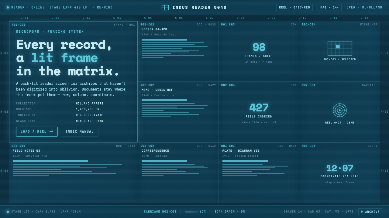 Microfiche ArchiveRecords as lit frames in a matrix. Cyan-blue back-lit panel, glowing mono typ…
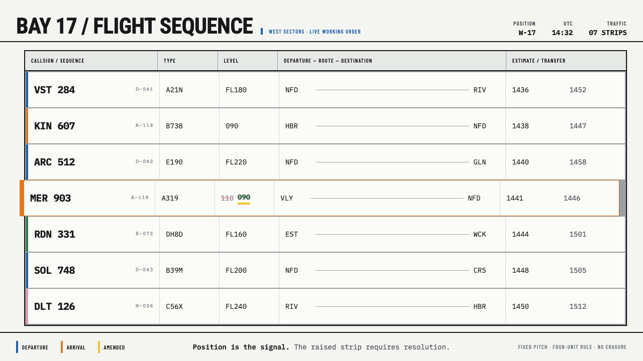 Flight Progress StripsPosition carries urgency. Pale ruled strips use blue and orange edges to sign…
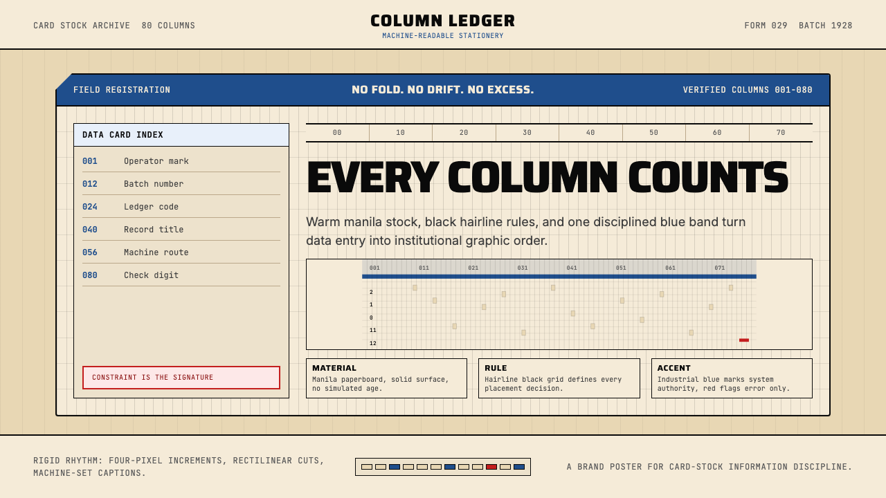 IBM Punchcard 029 (1928)Constraint becomes authority. Manila stock, hairline grid, industrial blue.
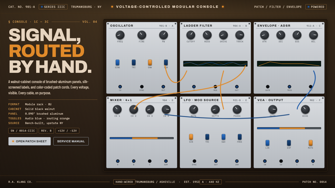 Moog Modular SynthWalnut cabinet, brushed-aluminum panels. Toggle-blue switches, orange patch c…
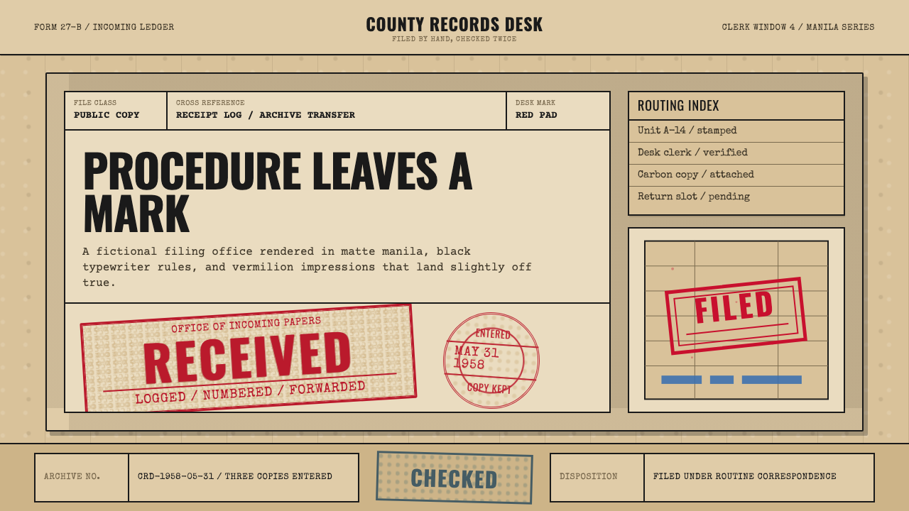 Office Rubber StampsProcedure made visible. Vermilion Oswald stamps strike a manila logbook grid.