What is IBM Punchcard 029 (1928)?什么是 IBM Punchcard 029 (1928)?
The IBM punchcard turned industrial constraint into a design language — warm cream stock, hairline grid, and the quiet authority of eighty columns that once held the world's data.IBM穿孔卡将工业约束转化为设计语言——温暖的米黄卡纸、发丝网格,以及曾经承载世界数据的八十列的静默权威。
IBM Punchcard 029 (1928) in briefIBM Punchcard 029 (1928) 速览
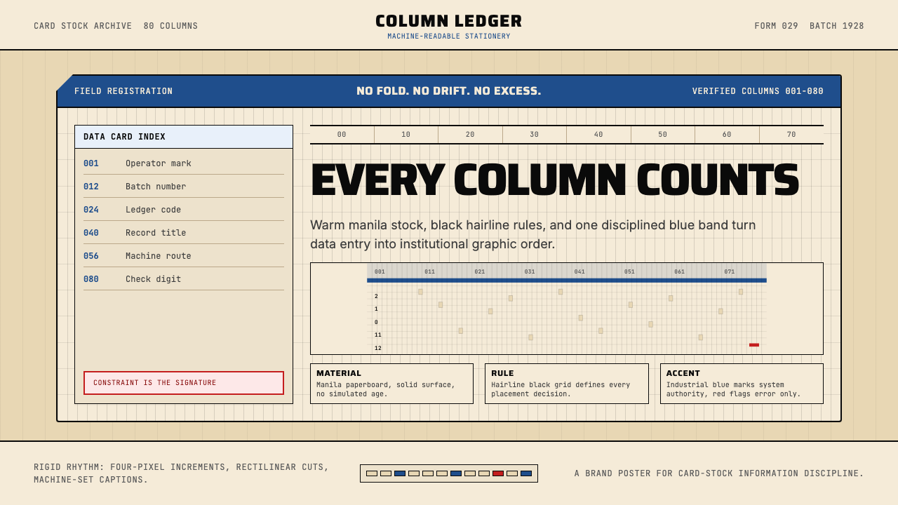
The IBM Punchcard 029 design language is rooted in the visual vocabulary of the 80-column tabulating card — a physical artifact that served as the universal data-entry medium for mid-twentieth-century business, government, and scientific computing. The aesthetic distills the card's physical properties into a design system: a warm cream or manila ground, hairline black grid lines arranged in strict vertical columns, and accents of IBM industrial blue that carry the weight of institutional authority.IBM穿孔卡029设计语言植根于80列制表卡的视觉词汇——这一实体物件曾是二十世纪中叶商业、政府与科学计算的通用数据载体。这套美学将穿孔卡的物理属性提炼为设计系统:温暖的米黄或马尼拉麻色底面、严格竖向排列的发丝黑色网格线,以及承载机构权威分量的IBM工业蓝点缀。
Where Bauhaus geometry is expressive and symbolic, punchcard aesthetics are instrumental and procedural. Every visual element exists because a physical process demanded it — column numbers aid keypunch operators, border cuts orient card readers, the grid maps directly to the data it encodes. Translated into contemporary design, this means surfaces that read as structured, purposeful, and engineered rather than decorated. The palette is deliberately narrow: cream grounds, black or very dark ink for type and grid, and a single restrained blue for hierarchy and emphasis.包豪斯几何具有表现性与象征性,而穿孔卡美学则是工具性与程序性的。每一个视觉元素的存在,都是因为某个物理过程的需要——列号帮助键穿操作员定位,边缘切角引导读卡机方向,网格直接映射它所编码的数据。转化为当代设计,这意味着界面呈现为结构化的、有目的性的、经过工程化处理的——而非被装饰过的。色板刻意收窄:米黄底面,黑色或极深的墨色用于文字与网格,单一的克制蓝色用于层级与强调。
The style carries the character of mid-century American institutional confidence — the same visual logic that appeared on government census forms, payroll ledgers, and university registration cards. It is neither warm nor cold in the emotional sense; it is precise, procedural, and authoritative. Applied thoughtfully, this language signals data integrity, systematic thinking, and a kind of honest industrial craft that contemporary audiences increasingly recognize as an alternative to over-polished digital aesthetics.这种风格承载着二十世纪中叶美国机构信心的气质——同样的视觉逻辑曾出现于政府人口普查表格、工资账簿与大学注册卡上。它在情感上既非温暖也非冰冷;它是精确的、程序化的、权威的。恰当运用,这套语言传递出数据诚信、系统性思维,以及一种当代受众日益视为过度抛光数字美学之替代方案的诚实工业工艺感。
See the IBM Punchcard 029 (1928) design system查看 IBM Punchcard 029 (1928) 完整设计系统
Where does IBM Punchcard 029 (1928) come from?IBM Punchcard 029 (1928) 从何而来?
The story begins with Herman Hollerith, a statistician who worked for the United States Census Bureau and faced a genuine computational crisis: the 1880 census had taken eight years to tabulate by hand, and the 1890 census — with a much larger population — threatened to exceed its own ten-year deadline before counting even began. Hollerith's solution was mechanical: a card punched with holes in specific positions, each position encoding a data value, read by electrical contacts that completed circuits when a metal pin passed through a hole. His Hollerith Electric Tabulating System processed the 1890 census in under three years. The basic card format — rectangular, stiff, with standardized column positions — was established in this period.故事始于赫尔曼·霍尔瑞斯——一位供职于美国人口普查局的统计学家,他面临着一场真实的计算危机:1880年的人口普查花了八年才完成手工制表,而人口规模更大的1890年普查,甚至在正式开始之前就已威胁到要超出十年期限。霍尔瑞斯的解决方案是机械性的:一张在特定位置打孔的卡片,每个孔位编码一个数据值,由电触点读取——当金属探针穿过小孔时,电路闭合。他的霍尔瑞斯电气制表系统在不到三年内完成了1890年的人口普查。矩形、硬质、具有标准化列位的基本卡片格式,正是在这一时期确立的。
Hollerith's Tabulating Machine Company was eventually consolidated, through a series of mergers, into the Computing-Tabulating-Recording Company in 1911 and renamed International Business Machines — IBM — in 1924 under the direction of Thomas J. Watson Sr. Watson transformed IBM from a tabulating-equipment vendor into the dominant force in American business automation. The 80-column card format was standardized in 1928, replacing earlier 45-column designs and establishing the physical parameters that would remain in use for more than five decades: the card's width, its row and column count, the precise spacing of positions, and the characteristic rectangular corner cut that prevented cards from being inserted upside down or reversed.霍尔瑞斯的制表机器公司经过一系列并购,于1911年整合进计算-制表-记录公司,并在小托马斯·沃森的主导下于1924年更名为国际商业机器公司——即IBM。沃森将IBM从一家制表设备供应商转变为美国商业自动化领域的主导力量。80列卡片格式于1928年完成标准化,取代了早期的45列设计,确立了此后沿用逾五十年的物理参数:卡片宽度、行列数量、孔位精确间距,以及防止卡片倒插或反插的特征性矩形角切。
The IBM 029 Keypunch machine, introduced in 1964, became the most widely used data-entry device of the mainframe era. Operators sat at keypunch consoles and typed data; the machine punched holes and printed the character above each column in a narrow strip at the top of the card, creating the distinctive visual signature of printed column characters running across the cream card face. The machine was designed for sustained, repetitive use — its keyboard had a deliberate tactile response, and its mechanical reliability was central to IBM's institutional reputation. In universities, corporations, and government agencies, learning to use the 029 keypunch was a standard professional skill from the mid-1960s through the late 1970s.1964年推出的IBM 029键穿机,成为大型机时代使用最广泛的数据录入设备。操作员坐在键穿控制台前敲入数据,机器打出小孔,并在卡片顶部的窄条区域将字符印在对应列上——由此产生了横贯米黄卡面的印刷列字符这一标志性视觉特征。这台机器为持续重复使用而设计——键盘具有刻意的触觉反馈,机械可靠性是IBM机构声誉的核心。从1960年代中期到1970年代末,在高校、企业和政府机构中,学会使用029键穿机是一项标准的职业技能。
The punchcard era formally ended as interactive terminals and disk storage displaced batch processing through the late 1970s and into the 1980s. IBM shipped its last cards in 1982. But the visual language of the punchcard — the cream ground, the column grid, the institutional blue, the sense of data as a physical and countable thing — survived as a cultural memory embedded in early computing aesthetics and has re-emerged repeatedly in design work that seeks to reference precision, data authority, or mid-century industrial craft.随着交互式终端和磁盘存储在1970年代末至1980年代逐步取代批处理,穿孔卡时代正式结束。IBM于1982年发出最后一批卡片。然而穿孔卡的视觉语言——米黄底面、列网格、机构蓝、将数据视为可触碰可计量之物的感知——作为文化记忆留存于早期计算美学之中,并在寻求参照精确性、数据权威或二十世纪中叶工业工艺的设计作品中反复浮现。
What defines the IBM Punchcard 029 (1928) look?IBM Punchcard 029 (1928) 的视觉特征是什么?
Ground Color底面色调
The foundation is a warm, slightly yellowed cream — the color of manila card stock aged just enough to read as archival rather than fresh. This is not a neutral off-white or a cold parchment; it carries warmth that distinguishes it from modern screen defaults. Against this ground, black ink reads with high contrast and a sense of physical registration, as if the characters were pressed into the surface rather than rendered on a screen.基础色是温暖、略带黄调的米黄色——马尼拉麻卡纸经轻微岁月浸染后的颜色,读来像档案存品而非崭新材料。这不是中性的米白或冷调的羊皮纸色;它承载着温度,区别于现代屏幕的默认底色。在这一底面上,黑色墨水以高对比度呈现,带有一种物理压印感——仿佛字符是被压入表面,而非在屏幕上渲染出来的。
Grid and Column Structure网格与列结构
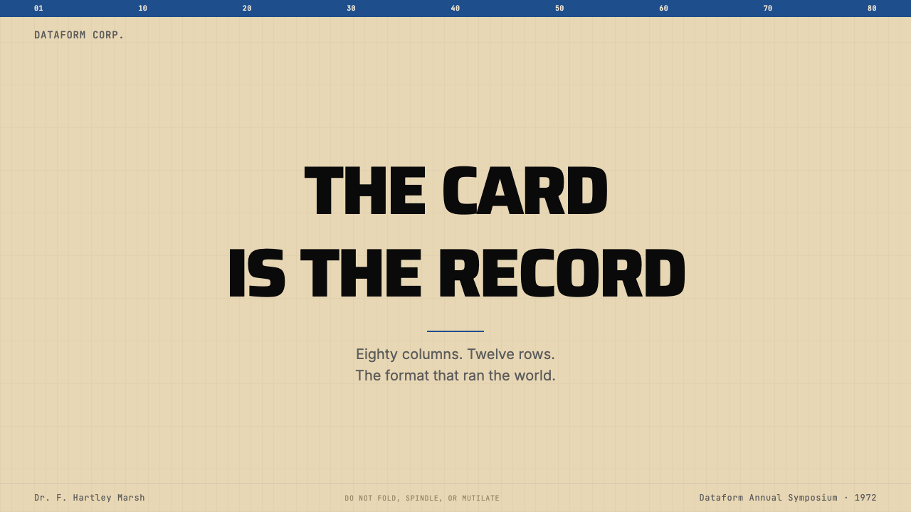
The defining structural element is the hairline vertical column grid — extremely fine ruled lines that divide the surface into equal, numbered units. These lines are not decorative; they map directly to the card's data capacity and reading mechanism. In design application, this grid provides an unusually strict and regular organizing system: all content aligns to column boundaries, spacing is rhythmic and machine-like, and the grid itself is visible rather than implied. The legibility of column numbers at the top of each column is a characteristic finishing detail.最具定义性的结构元素是发丝般的竖向列网格——极细的竖线将页面划分为等宽的编号单元。这些线条并非装饰性的;它们直接映射卡片的数据容量与读取机制。在设计应用中,这套网格提供了一种异乎寻常的严格规整的组织系统:所有内容对齐列边界,间距有节奏感、具机械感,网格本身可见而非隐含。每列顶部列号的清晰可读性,是一个标志性的收尾细节。
Industrial Blue Accent工业蓝点缀
A single, restrained blue — the institutional blue associated with IBM's mid-century corporate identity — serves as the only chromatic accent in the system. It is not a bright or saturated blue, nor a soft or muted one; it sits at the confident midpoint of institutional authority. This blue appears on column headers, border rules, or key informational elements — never as a background fill. Its sparing use gives it genuine weight: in a cream-and-black composition, every appearance of the blue registers as significant.单一、克制的蓝色——与IBM二十世纪中叶企业身份相关联的机构蓝——是这套系统中唯一的有彩点缀。它既非明亮饱和的蓝,也非柔和黯淡的蓝;它处于机构权威感的自信中间地带。这一蓝色出现于列标题、边框线或关键信息元素上——绝不作为背景填充色。克制的使用赋予它真实的分量:在米黄与黑色的构图中,蓝色的每一次出现都具有实质意义。
Monospaced Type Logic等宽字体逻辑
Type in the punchcard system is inherently monospaced — each character occupies exactly one column, regardless of its visual width. This mechanical equality produces a distinctive typographic texture: dense, evenly-spaced characters with no proportional variation. In design application, this translates to a preference for monospaced or mechanically-regular letterforms, where the rhythm of characters is uniform and the spacing carries the visual logic of a fixed-pitch typewriter rather than optical kerning. The effect reads as data rather than prose.穿孔卡系统中的字体本质上是等宽的——每个字符精确占据一列,不论其视觉宽度如何。这种机械上的等量性产生出独特的排印质感:密集、间距均匀的字符,无任何比例变化。在设计应用中,这转化为对等宽或机械规整字形的偏好——字符的节奏均一,间距承载着固定间距打字机而非光学字距调整的视觉逻辑。效果读来像数据,而非散文。
Border and Registration Marks边框与对位标记
The physical punchcard's border — a thin rectangular rule enclosing the entire card face, with characteristic corner cuts and edge markings — translates into a design preference for contained, bordered compositions. Layouts feel framed rather than open; content lives inside defined rectangles. Corner treatments echo the physical card's functional cuts. This sense of containment and registration gives compositions a quality of completeness: each layout is a discrete, self-contained data object rather than a fragment of a larger continuous surface.实体穿孔卡的边框——围合整个卡面的细矩形线框,带有特征性的角切和边缘标记——转化为对内聚、带框构图的设计偏好。版面感觉是被框定的而非开放的;内容存在于界定好的矩形之中。角部处理呼应实体卡片的功能性切角。这种内聚感与对位感赋予构图一种完整性品质:每个版面都是一个离散的、自足的数据对象,而非更大连续表面的片段。
Procedural Hierarchy程序性层级
Hierarchy in punchcard-derived design is established through structural position rather than decorative emphasis. Row numbers appear at a consistent position; column headers occupy a fixed zone; data content fills the body. This positional clarity means hierarchy is legible without color or scale variation — a characteristic that makes the system exceptionally robust across different reproduction contexts and screen sizes. When color or scale variation is used, it serves to reinforce a positional logic that already exists, not to create hierarchy from scratch.穿孔卡衍生设计中的层级,通过结构位置而非装饰强调来建立。行号出现在固定位置;列标题占据固定区域;数据内容填充主体。这种位置清晰性意味着层级无需颜色或尺寸变化即可辨读——这一特性使系统在不同复制场景和屏幕尺寸下都保持异常强健。当颜色或尺寸变化被使用时,它们是为了强化已经存在的位置逻辑,而非从零建构层级。
Absence of Ornament无装饰性
Like all genuine information-design systems, the punchcard aesthetic contains no decorative elements — nothing exists that is not required by the data or the reading mechanism. There are no flourishes, no gradient fills, no ambient shadows, no texture overlays, no illustrative elements. What reads as 'style' is in fact functional residue: the visible grid, the border, the column numbers, the institutional blue — all were there because a machine or an operator needed them. In contemporary application, honoring this constraint means resisting the impulse to add visual interest through decoration rather than through structural clarity.与所有真正的信息设计系统一样,穿孔卡美学不含任何装饰性元素——没有任何东西的存在不是由数据或读取机制所要求的。没有花饰,没有渐变填充,没有环境投影,没有纹理叠加,没有插图性元素。被读作「风格」的东西,实际上是功能性残留:可见的网格、边框、列号、机构蓝——这一切的存在,是因为机器或操作员需要它们。在当代应用中,尊重这一约束,意味着抵制通过装饰而非结构清晰度来增添视觉趣味的冲动。

See the IBM Punchcard 029 (1928) design system查看 IBM Punchcard 029 (1928) 完整设计系统
Who shaped IBM Punchcard 029 (1928)?谁塑造了 IBM Punchcard 029 (1928)?
Hollerith invented the electric tabulating system that established the punchcard as a data-storage medium. His solution to the 1890 census problem — encoding demographic data as hole positions on a standard card, then reading those positions electrically — set the physical and conceptual template for all subsequent punchcard systems. His company eventually became part of IBM, and his basic format decisions — card dimensions, column spacing, the electrical contact reading principle — persisted largely unchanged for sixty years.霍尔瑞斯发明了电气制表系统,确立了穿孔卡作为数据存储媒介的地位。他对1890年人口普查问题的解决方案——将人口统计数据编码为标准卡片上的孔位,再通过电气方式读取这些孔位——为此后所有穿孔卡系统奠定了物理与概念模板。他的公司最终并入IBM,而他在卡片尺寸、列间距、电触点读取原理等方面的基本格式决策,基本未经改变地延续了六十年。
Watson led IBM from 1914 to 1956 and built the institutional identity that gave the punchcard system its cultural authority. Under his direction, IBM developed not just the machines but a complete visual and corporate language — including the deep blue corporate color, the emphasis on precision and reliability, and the salesman-engineer culture — that made the IBM card synonymous with modern, trustworthy data processing. The card's visual restraint and institutional confidence reflects Watson's vision of IBM as a business civilization, not merely a technology company.沃森从1914年到1956年领导IBM,建立了赋予穿孔卡系统文化权威的机构身份。在他的主导下,IBM不仅研发了机器,还建立了完整的视觉与企业语言——包括深蓝色的企业色彩、对精确性与可靠性的强调,以及销售工程师文化——使IBM卡成为现代可信数据处理的同义词。这张卡片的视觉克制与机构自信,折射出沃森将IBM视为商业文明而非单纯技术公司的愿景。
The team responsible for the 1928 card standardization and the subsequent 029 Keypunch machine resolved a series of engineering constraints — card stiffness, punching tolerance, electrical contact reliability, operator ergonomics — into the finished artifact whose visual properties are still recognizable today. Their decisions about column spacing, border dimensions, character printing at the card top, and the physical corner cut were functional engineering choices that happened to produce a distinctive and durable aesthetic. The 029 machine's console design also influenced the broader visual language of mid-century computing hardware.负责1928年卡片标准化及后续029键穿机的工程设计团队,将一系列工程约束——卡片硬度、打孔公差、电触点可靠性、操作员人体工程学——解决为今天仍可辨认的成品视觉形态。他们在列间距、边框尺寸、卡片顶部字符印刷及实体角切方面的决策,是功能性工程选择,恰好产生了独特而持久的美学。029机器的控制台设计也影响了二十世纪中叶计算硬件更广泛的视觉语言。
Though not an IBM employee, Rear Admiral Grace Hopper was the most significant figure in establishing the operational culture of punchcard-era computing. Her work on early compilers and the COBOL programming language defined how data — much of it encoded on IBM cards — was structured, described, and processed in American business and government computing through the 1960s and 1970s. The formatting conventions she championed, including the idea that programs should be readable by non-specialists, reinforced the punchcard system's institutional legibility values and influenced how data-display aesthetics were understood across the era.虽然不是IBM员工,格蕾丝·霍珀准将是确立穿孔卡时代计算运营文化的最重要人物。她在早期编译器和COBOL编程语言方面的工作,定义了数据——其中大量编码于IBM卡片上——在1960至1970年代美国商业与政府计算中的结构化、描述与处理方式。她所倡导的格式化惯例,包括程序应当能被非专业人员读懂的理念,强化了穿孔卡系统的机构可读性价值观,并影响了整个时代数据显示美学的理解方式。
As a Columbia University computing historian, da Cruz produced the most thorough documentary record of punchcard systems — photographs, technical specifications, operational manuals — that preserved the visual and material culture of the IBM card era for subsequent researchers and designers. His archival work at the Columbia University Computing History project made high-quality reference material for the card's physical dimensions, printing styles, and operational contexts widely available, enabling designers decades later to work with authentic visual reference rather than reconstructed approximations.作为哥伦比亚大学计算历史学家,达克鲁兹建立了最完整的穿孔卡系统文献记录——照片、技术规格、操作手册——为后续研究者与设计师保存了IBM卡片时代的视觉与物质文化。他在哥伦比亚大学计算历史项目中的档案工作,使卡片物理尺寸、印刷风格与操作语境的高质量参考资料得以广泛获取,使数十年后的设计师能够依据真实的视觉参考工作,而非重建的近似物。
How do you use IBM Punchcard 029 (1928) today?今天怎么用 IBM Punchcard 029 (1928)?
The punchcard aesthetic is particularly well-suited to design work that needs to communicate data authority, systematic precision, or a knowing reference to computation's physical past. Its visual logic is structural rather than decorative, which means correct application requires understanding what the system is actually doing — using the grid to establish hierarchy, using the cream ground to signal warmth-within-precision, using the institutional blue to mark what matters — rather than simply applying a cream-and-monospace overlay to existing layouts.穿孔卡美学尤其适合需要传递数据权威、系统精确性,或对计算物理过去有所指涉的设计工作。其视觉逻辑是结构性的而非装饰性的,这意味着正确应用需要理解这套系统实际上在做什么——用网格建立层级,用米黄底面在精确中传递温度,用机构蓝标示重要内容——而非简单地将米黄色与等宽字体叠加到现有版面上。
For presentation slides, the style works powerfully on both cover and content pages. A cover benefits from the contained, bordered composition: the full card-edge border frames the slide, a column-grid structure organizes title and subtitle with strict alignment, and the IBM blue appears on a single headline element or a column-number detail. Content slides should treat the column grid as a genuine organizing principle — text, data, and labels all align to column positions, with the grid lines remaining faintly visible as structural guides. Data slides are where the style achieves its greatest specificity: tables and grids of numbers look native in this aesthetic, and charts designed with the grid's column logic read as if the data itself demanded this format.在演示文稿中,这种风格在封面页与内容页上都极具表现力。封面适合运用内聚的带框构图:完整的卡片边框围合整张幻灯片,列网格结构以严格对齐方式组织标题与副标题,IBM蓝出现在单一标题元素或列号细节上。内容页应将列网格作为真正的组织原则——文字、数据与标签全部对齐列位,网格线作为结构指引保持隐约可见。数据页是这种风格最能发挥特异性的地方:数字表格与网格在这套美学中显得浑然天成,依据网格列逻辑设计的图表,读来仿佛数据本身就要求这种格式。
For web interfaces — particularly dashboards, analytics platforms, and pricing pages — the punchcard language provides an unusually strong framework for information-dense layouts. The approach is to establish a visible or near-visible column grid as the actual layout grid, keep the background in the warm cream register, use monospaced or mechanically-regular type for all data values and labels, and reserve the institutional blue for primary interactive states or tier differentiation. Table components align naturally to the card metaphor: rows alternate subtly, column headers sit in a defined registration zone, and borders are visible hairlines rather than soft separators.对于网页界面——尤其是仪表板、分析平台和定价页面——穿孔卡语言为信息密集型版面提供了异常强健的框架。方法是将可见或近可见的列网格确立为实际布局网格,将背景保持在温暖的米黄色调中,对所有数据值和标签使用等宽或机械规整的字体,将机构蓝保留给主要交互状态或等级区分。表格组件与卡片比喻天然契合:行间有微妙交替,列标题位于固定的对位区域,边框是可见的发丝线而非柔和的分隔符。
For editorial and marketing applications, the style supports a distinct visual register that distinguishes data-forward content from purely narrative work. Feature comparisons, specification sheets, and technical documentation all benefit from the strict column alignment and monospaced type logic. Marketing pages can use the card border as a compositional device — full-bleed sections framed by visible rules, with the cream-and-blue palette providing enough warmth to prevent the layout from reading as purely utilitarian. The style's institutional character also makes it suitable for brands positioning themselves as trustworthy, established, or analytically rigorous rather than fashionable or trend-driven.对于编辑与营销应用,这种风格支持一种独特的视觉调性,将数据主导型内容与纯叙述性作品区分开来。功能对比、规格参数表和技术文档都能从严格的列对齐与等宽字体逻辑中获益。营销页面可以将卡片边框用作构图装置——可见线框围合的全出血区块,米黄与蓝色的色板提供足够的温度,防止版面读来过于功利。这种风格的机构气质,也使其适合将自身定位为值得信赖、成熟稳健或分析严谨而非时髦或追逐潮流的品牌。
A common mistake when applying punchcard aesthetics is treating the monospaced type and visible grid as texture rather than structure — using them as decorative overlays on layouts that otherwise follow standard proportional-type design logic. The system breaks down when the grid is visible but content does not actually align to it, or when monospaced type is used for headlines while proportional type handles data values. A second common error is over-saturating the institutional blue, which reads as corporate and contemporary rather than archival and authoritative. The blue should appear at a weight that feels restrained — present and purposeful, but never dominant.应用穿孔卡美学时最常见的错误,是将等宽字体和可见网格当作纹理而非结构来使用——将它们作为装饰性叠加层铺在其他方面仍遵循标准比例字体设计逻辑的版面上。当网格可见但内容实际上并不对齐时,或当等宽字体用于标题而比例字体处理数据值时,这套系统便会崩解。另一个常见错误是过度饱和机构蓝——这会让它读来像当代企业蓝而非档案权威蓝。这抹蓝色应当以克制的分量出现——存在感明确、有目的性,但绝不主导全局。
See the IBM Punchcard 029 (1928) design system查看 IBM Punchcard 029 (1928) 完整设计系统
IBM Punchcard 029 (1928) — FAQIBM Punchcard 029 (1928) · 常见问题
Is punchcard design the same as retro-computing or pixel aesthetics?穿孔卡设计与复古计算或像素美学是同一回事吗?
They are related references to computing history but operate through entirely different visual logics. Retro-computing aesthetics — pixel art, CRT scanlines, early video game palettes — are rooted in the screen-based era of the late 1970s and 1980s, and their visual character comes from the resolution limits and color constraints of early display hardware. Punchcard aesthetics are pre-screen and pre-digital: they derive from the physical properties of paper card, mechanical printing, and electrical reading mechanisms. The punchcard palette is warm and archival; retro-computing palettes tend toward phosphor green, amber, or constrained RGB. The punchcard grid is hairline-fine and column-regular; pixel grids are coarse and square. Mixing them produces visual incoherence.它们都是对计算历史的视觉引用,但通过完全不同的视觉逻辑运作。复古计算美学——像素艺术、CRT扫描线、早期电子游戏色板——植根于1970年代末至1980年代的屏幕时代,其视觉特征来自早期显示硬件的分辨率限制与色彩约束。穿孔卡美学则是前屏幕、前数字的:它源自纸质卡片的物理属性、机械印刷与电气读取机制。穿孔卡色板温暖而具档案气质;复古计算色板倾向于磷光绿、琥珀色或受限的RGB。穿孔卡网格细如发丝、列距均匀;像素网格粗糙而方整。将二者混用,会产生视觉上的不连贯。
Does the punchcard style work on dark backgrounds?穿孔卡风格能用在深色背景上吗?
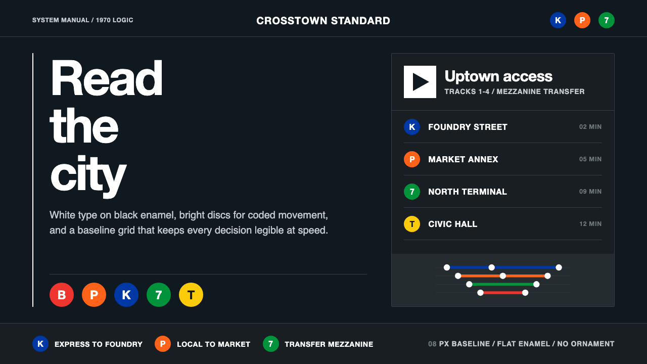
The authentic punchcard was always light-ground — cream on cream, black type on manila stock. A dark inversion is possible but requires careful judgment. The system's character depends significantly on the warmth of the cream ground; inverting to a dark background removes this foundational warmth and tends to push the aesthetic toward generic monospace-terminal associations rather than archival card associations. If a dark variant is needed, the most coherent approach is to treat the dark background as if it were the unexposed surface of photographic paper — pairing it with cream or warm-tinted type rather than pure white, and keeping the IBM blue as the sole chromatic accent at full restraint.真实的穿孔卡始终是浅色底面——米黄底面,黑色文字印于马尼拉麻卡纸上。深色反转是可能的,但需要谨慎判断。这套系统的气质在很大程度上依赖于米黄底面的温度;反转为深色背景会移除这一基础温度,往往将美学推向通用等宽终端联想而非档案卡片联想。如果确实需要深色变体,最连贯的做法是将深色背景视为摄影纸的未曝光表面——搭配米黄色或暖调文字而非纯白,并将IBM蓝作为充分克制的唯一有彩点缀保留。
How should photographs or illustrations be used within this aesthetic?在这套美学中,照片或插图应如何使用?
The punchcard system had no place for imagery — cards held alphanumeric data only. In contemporary design application, this means photography and illustration should be used sparingly and only when content genuinely requires it. When imagery does appear, it works best treated as a contained data element: cropped to a strict rectangular region that aligns to the column grid, reproduced in high-contrast duotone using the cream-and-blue or cream-and-black palette, or presented as a silhouetted figure against the card ground. Full-color naturalistic photography breaks the system's logic entirely; if a photograph must be full-color, it should be contained within a hard-bordered card frame that makes it read as an inserted document rather than an ambient background.穿孔卡系统没有图像的位置——卡片只承载字母数字数据。在当代设计应用中,这意味着摄影与插图应当克制使用,且仅在内容确实需要时使用。当图像出现时,最有效的处理是将其视为包含性数据元素:裁切为对齐列网格的严格矩形区域,以米黄与蓝色或米黄与黑色色板的高对比度双色调复制,或呈现为卡纸底面上的剪影图形。全彩自然主义摄影会彻底破坏系统逻辑;如果一张照片必须全彩,它应当被包含在硬边框的卡片框架内,使其读来像一份插入的文件,而非环境性背景。
What kind of brands or products are the best fit for this style?哪类品牌或产品最适合这种风格?
The punchcard style is best matched to products and brands where the association with data integrity, institutional authority, and systematic precision is a genuine asset rather than an ironic gesture. Financial data platforms, research and analytics tools, archival or records-management software, enterprise productivity tools, and educational materials in technical fields all benefit from the style's undecorated authority. It is also well-suited to brands seeking to differentiate from over-polished consumer tech aesthetics by signaling depth and seriousness. It struggles in consumer contexts that require warmth, playfulness, or sensory richness — food, wellness, children's products, entertainment — and should be avoided where the computing-era reference reads as cold or exclusionary rather than authoritative.穿孔卡风格最适合那些与数据诚信、机构权威和系统精确性的关联是真实资产而非反讽姿态的产品与品牌。金融数据平台、研究与分析工具、档案或记录管理软件、企业生产力工具,以及技术领域的教育材料,都能从这种风格的无装饰权威中获益。它也适合那些希望通过传递深度与严肃感,从过度抛光的消费科技美学中脱颖而出的品牌。在需要温暖感、趣味性或感官丰富性的消费者场景中——食品、健康、儿童产品、娱乐——它表现欠佳,在计算时代的指涉读来像冷漠或排他而非权威的语境中,也应避免使用。
How is the punchcard style different from Swiss International Style or Bauhaus?穿孔卡风格与瑞士国际主义风格或包豪斯有何不同?
All three are grid-based, restrained, and non-ornamental, but their origins and emotional registers are quite different. Bauhaus is ideological and expressive — its geometry and primary colors carry symbolic weight derived from theories of color psychology and political commitment. Swiss International Style is rationalist and universal — it aspires to a neutrality that transcends cultural context, and its mathematical grid and extensive use of photography make it the most cosmopolitan of the three. Punchcard design is instrumental and archival — it derives from a physical data artifact rather than a design philosophy, and its visual authority comes from institutional memory and functional necessity rather than ideological argument. Where Bauhaus and Swiss Style make visual arguments, punchcard design presents visual evidence. The sensibility is closer to a well-designed form or ledger than to a poster or a corporate identity.三者都是基于网格的、克制的、非装饰性的,但它们的起源与情感调性截然不同。包豪斯是意识形态性和表现性的——其几何形态与三原色承载着源自色彩心理学理论与政治承诺的象征重量。瑞士国际主义风格是理性主义和普世性的——它追求超越文化语境的中立性,其数学网格与大量摄影的使用使它成为三者中最具世界主义色彩的。穿孔卡设计是工具性和档案性的——它源自一种物理数据物件而非设计哲学,其视觉权威来自机构记忆与功能必要性,而非意识形态论证。包豪斯与瑞士风格提出视觉论点,穿孔卡设计呈现视觉证据。其感性更接近于一份设计精良的表格或账簿,而非一张海报或企业视觉识别。
Related design styles相关设计风格
 NYC Transit HelveticaOrder made visible. White type, black enamel, route discs, and a grid that ne…秩序一眼可见:黑底白字、线路圆盘与永不弯折的网格。
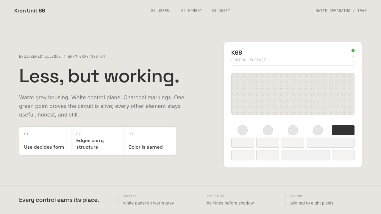 Dieter Rams / BraunQuiet by design. Warm gray, white panels, hairline grids, and one earned gree…安静即设计:暖灰、白面板、细网格,只留一枚绿色指示点。
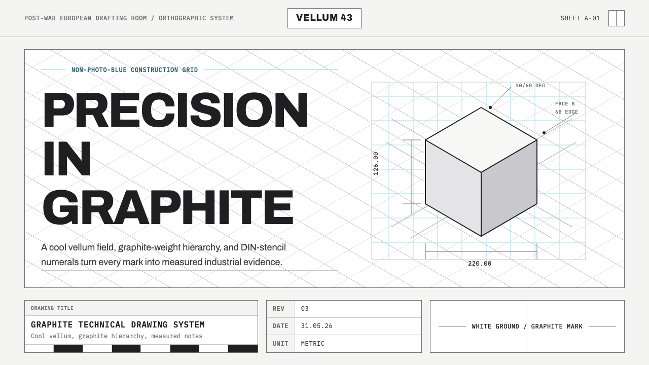 Graphite Technical DrawingDrafting-room precision. Non-photo-blue grid and graphite DIN lettering do th…制图室般精确:淡蓝网格与石墨DIN字母构成秩序。
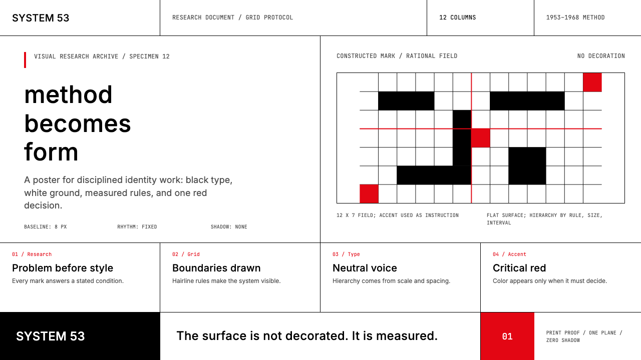 Ulm School (HfG Ulm)Clarity becomes discipline. Black-white grid, Inter grotesk, and one surgical…清晰即纪律:黑白网格、Inter 无衬线与一处手术般红标。
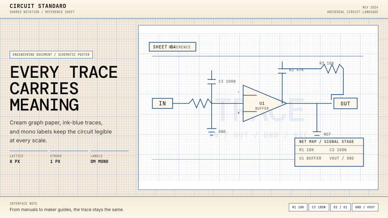 Electrical Schematic WiringAustere and exact. Cream graph paper, ink-blue traces, and mono labels make e…克制而精确。奶油方格纸与墨蓝细线,让每个标签都准确发声。
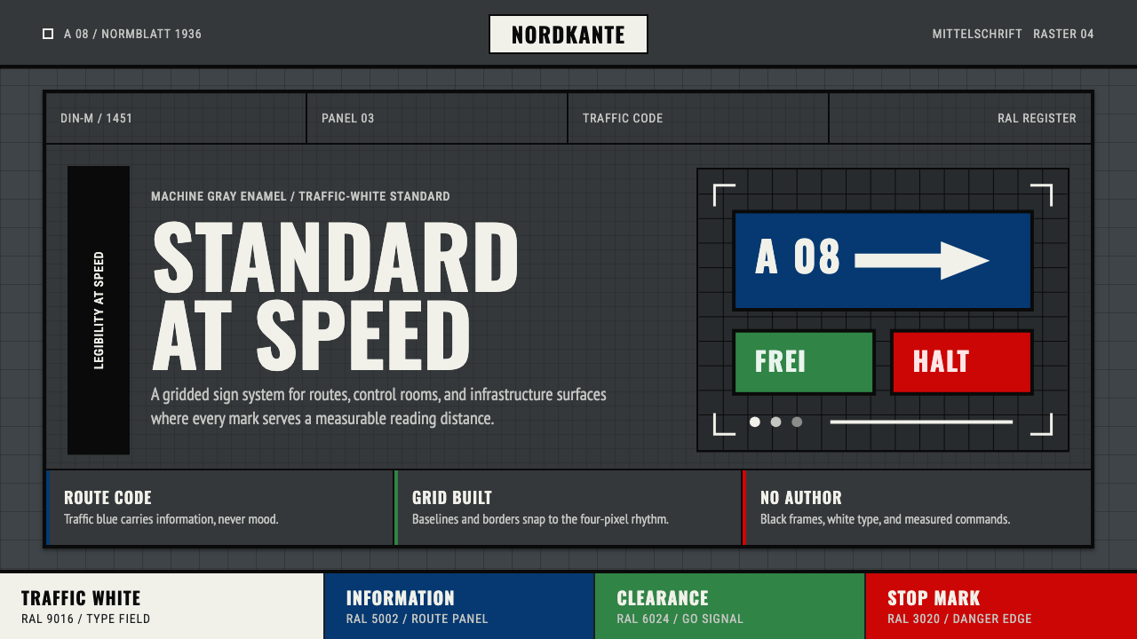 DIN 1451 SignageAuthorless and exact. Enamel gray grid, traffic-white DIN type, and RAL signa…无作者的精确感:珐琅灰网格、交通白字与RAL色条。