What is Dieter Rams / Braun?什么是 Dieter Rams / Braun?
Dieter Rams spent forty years at Braun proving that restraint, not decoration, is the highest form of design intelligence.迪特·拉姆斯在博朗工作了四十年,用每一件产品证明:克制,而非装饰,才是设计智识的最高形态。
Dieter Rams / Braun in briefDieter Rams / Braun 速览
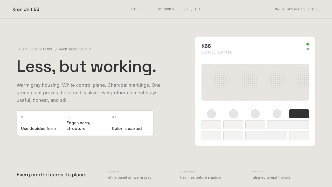
The Dieter Rams / Braun design language is a system of warm grays, pure white panels, charcoal text, and a single green indicator dot — the one moment color is permitted to speak. It emerged from the workshops of Braun GmbH in Kronberg im Taunus, West Germany, through a collaboration between Rams and a small team of designers who believed that a well-made object should communicate its function completely, modestly, and without performance. The visual vocabulary is rectangles and circles on a consistent grid, hairline borders doing the structural work that shadows would do elsewhere, and a matte surface quality that refuses to catch the light unnecessarily.迪特·拉姆斯/博朗设计语言是一套由暖灰色、纯白面板、炭灰文字与一枚绿色指示点构成的系统——那一点绿,是整个体系里色彩唯一被允许开口的瞬间。它诞生于西德克龙贝格博朗公司的工作室,由拉姆斯与一支小团队共同缔造;这支团队相信,一件做得好的产品应当完整、谦逊、不带表演性地传达它的功能。视觉词汇是矩形与圆形,依附于统一的网格基础节奏;细线边框做着其他体系交给阴影的结构工作;亚光表面拒绝任何不必要的光泽。
The aesthetic is inseparable from Rams's Ten Principles of Good Design, which he codified in the 1970s: good design is innovative, useful, aesthetic, understandable, unobtrusive, honest, long-lasting, thorough, environmentally friendly, and — the principle that underlies all the others — as little design as possible. Every Braun product, from the 1956 SK4 record player (nicknamed 'Snow White's Coffin' for its unprecedented clear acrylic lid) to the 1987 ET66 calculator, reads as a direct translation of these rules into physical form. Nothing is added that cannot justify its existence; nothing is removed that serves a purpose.这套美学与拉姆斯在1970年代归纳的《好设计十诫》不可分割:好设计是创新的、实用的、美的、易懂的、低调的、诚实的、经久耐用的、彻底的、环保的,以及——支撑所有其他原则的那一条——尽可能少设计。博朗的每一件产品,从1956年的SK4唱机(因其前所未有的透明亚克力盖板而得名「白雪公主的棺材」)到1987年的ET66计算器,都是这套规则向物质形态的直接翻译。凡是无法为自身存在提供正当理由的,一律不加;凡是服务于某种目的的,一律不减。
What distinguishes the Braun aesthetic from other modernist traditions is its specific warmth. The page ground is not cold clinical white but a warm functional gray — the color of matte plastic housing, of aluminum brushed in one direction, of the inside of a well-made appliance. White is reserved for panels and surfaces where content lives. This warm-gray / white / charcoal palette creates a system that is severe in principle but comfortable to inhabit over time, which is why its descendants — Apple's early hardware, MUJI's product line, countless SaaS dashboards — remain readable after decades.将博朗美学与其他现代主义传统区别开来的,是它特有的温度。页面底色不是冰冷的临床白,而是暖功能灰——哑光塑料外壳的颜色,单向拉丝铝的颜色,一台做工精良的家电内壁的颜色。白色留给内容栖居的面板与表面。这套暖灰/白/炭灰的色板构建出一套在原则上严苛、在居住中却令人舒适的系统——这也是它的后裔们——苹果早期硬件、无印良品产品线、无数SaaS仪表板——在数十年后依然可读的原因。
See the Dieter Rams / Braun design system查看 Dieter Rams / Braun 完整设计系统
Where does Dieter Rams / Braun come from?Dieter Rams / Braun 从何而来?
Dieter Rams joined Braun as an architect and interior designer in 1955, the year the company's founders died and their sons Erwin and Artur Braun took over and committed to a radical new design direction. The timing placed Rams inside a company that was simultaneously grieving its founders and betting its future on the conviction that functional honesty could be a competitive advantage. His first major project, the SK4 record player designed together with Hans Gugelot in 1956, announced the new program clearly: matte white enamel housing, exposed speaker grille, a clear acrylic lid that let you see the turntable mechanism. It looked like nothing in consumer electronics had looked before.迪特·拉姆斯于1955年以建筑师与室内设计师身份加入博朗,彼时公司创始人刚刚去世,其子厄文与阿尔图·博朗接管公司,并承诺走一条全新的激进设计路线。这一时机将拉姆斯置于一家同时在哀悼创始人、又以功能诚实作为竞争优势押注未来的公司内部。1956年,他与汉斯·古格洛特合作设计了首个重要作品——SK4唱机:亚光白色搪瓷外壳、裸露的扬声器格栅、可看见转盘机构的透明亚克力盖板。它的样子,是消费类电子产品前所未见的。
The intellectual foundation came partly from the Ulm School of Design (Hochschule für Gestaltung Ulm), where Hans Gugelot taught and where the legacy of the Bauhaus had been absorbed and systematized into a more rigorous, less ideologically charged functionalism. HfG Ulm emphasized the relationship between design and engineering, rejected historicism, and trained graduates to think of visual form as a problem of communication and structure rather than expression. Rams shared these convictions and deepened them over four decades into a body of work whose consistency is itself a kind of argument: if you hold to the principles long enough, the catalog becomes its own demonstration.其智识根基部分来自乌尔姆设计学院(HfG Ulm)——古格洛特在那里执教,包豪斯的遗产在那里被吸收并系统化为一种更严格、意识形态色彩更淡的功能主义。乌尔姆强调设计与工程的关系,拒绝历史主义,训练毕业生将视觉形态视为传达与结构问题,而非表达问题。拉姆斯与这些信念共鸣,并在四十年间将其深化为一批前后一致的作品——这种一致性本身就是一种论证:若你足够长久地坚守原则,这批目录就会成为自身的示范。
The Ten Principles of Good Design, which Rams began articulating in lectures during the 1970s, emerged not as an abstract manifesto but as a retrospective description of what the Braun team had already been practicing. The principle that attracted the most attention — 'good design is as little design as possible' — was easily misread as an instruction to remove things. Rams's own explanation was more precise: design should not add to itself for its own sake; every element should serve communication, function, or structure, and nothing else. The German phrase he used, 'weniger, aber besser' — less, but better — became the single most quoted sentence in twentieth-century industrial design.《好设计十诫》并非作为抽象宣言诞生,而是拉姆斯在1970年代的讲座中开始阐述——作为对博朗团队已然践行之物的回溯性描述。其中吸引最多关注的那条——「好设计是尽可能少的设计」——很容易被误读为一条删减指令。拉姆斯自己的解释更为精确:设计不应为了自身而添加;每个元素都应服务于传达、功能或结构,除此之外别无其他。他使用的德语短语「weniger, aber besser」——少,但更好——成为二十世纪工业设计中被引用最多的一句话。
Rams retired from Braun in 1995, by which time the company's ownership had changed and its design direction had drifted from his principles. The second peak of his influence came in the early 2000s, when Jony Ive at Apple acknowledged Rams as a primary influence on the iPod, iMac, and eventually iOS. The ET66 calculator's button grid became iOS's calculator app almost wholesale. The SK4's matte white panels became the iMac G4. The Braun T3 pocket radio's proportions and control language migrated into the first iPod. This lineage made the Braun aesthetic newly legible to a generation of designers who encountered it through Apple before encountering it through Braun.拉姆斯于1995年从博朗退休,彼时公司所有权已经易手,设计方向也已偏离他的原则。他影响力的第二次高峰出现在2000年代初,当乔纳森·伊夫在苹果公开承认拉姆斯是iPod、iMac乃至iOS的首要灵感来源。ET66计算器的按键网格几乎原封不动地变成了iOS的计算器应用;SK4的亚光白面板变成了iMac G4;博朗T3袖珍收音机的比例与控制语言迁移进了第一代iPod。这条传承链使博朗美学对一整代设计师重新变得可读——他们先通过苹果认识了它,才追溯到博朗本身。
What defines the Dieter Rams / Braun look?Dieter Rams / Braun 的视觉特征是什么?
Warm Functional Gray暖功能灰
The page ground is not white but a specific warm gray — the color of matte plastic housing, brushed aluminum, the inside of a well-made appliance. This ground color distinguishes the Braun aesthetic from colder Scandinavian minimalism or clinical Swiss functionalism. White is reserved for panels and surfaces where content lives, creating a visual hierarchy between ground and figure before a single word or control is placed. The warmth is subtle enough that most viewers do not consciously register it; it works below the threshold of explicit perception, making the interface feel comfortable rather than harsh.底色不是白色,而是一种特定的暖灰——哑光塑料外壳的颜色,单向拉丝铝的颜色,一台做工精良的家电内壁的颜色。这个底色将博朗美学与更冷的斯堪的纳维亚极简主义或临床式瑞士功能主义区别开来。白色留给内容栖居的面板与表面,在任何文字或控件被放置之前就建立起底与图之间的视觉层级。这份温度足够微妙,大多数观看者不会有意识地察觉;它在显性感知的阈值之下运作,让界面令人感到舒适而非严苛。
The Single Green Dot那一枚绿点
Across every Braun product, the only high-saturation color is a specific mid-range green used exclusively as the power-on indicator. One dot, small enough to be a whisper, placed beside an active control or state. This discipline treats color as a resource with a strict budget: saturation may be spent exactly once per visual group, on the single most important signal in the interface. The effect is that the green dot becomes genuinely informative — the eye learns to find it and trust it — rather than one color among many competing for attention.在博朗全系列产品中,唯一高饱和度的色彩是一种特定的中度绿,专门用作开机指示灯。一枚圆点,小到只是一声低语,置于激活的控件或状态旁边。这种纪律将色彩视为预算严格的资源:每个视觉组里,饱和度仅可在界面中最重要的那个信号上消费一次。其效果是:绿点变得真正具有信息量——眼睛学会寻找它、信任它——而不是众多争夺注意力的色彩之一。
Grid Discipline网格纪律
Every control, label, and panel in a Braun-derived layout aligns to a consistent base rhythm — a spacing unit small enough to be imperceptible but large enough to impose real discipline. The grid is felt rather than seen: no visible grid lines intrude, but the result of strict adherence is a composition where every element appears to belong exactly where it is. This is the visual equivalent of the ET66 calculator's button grid, where each key is the same size, occupies the same interval, and carries the same visual weight — the cumulative effect reads as engineered rather than arranged. Even a small departure from the grid registers as unease.博朗衍生版面中的每个控件、标签与面板都对齐于一个统一的基础节奏——一个细小到无法被察觉、但足以施加真实约束的间距单位。网格被感知而非被看见:没有可见的网格线介入,但严格遵守的结果是,构图中每个元素看起来恰好属于它所在的位置。这是ET66计算器按键网格的视觉等价物:每个按键尺寸相同、间隔相同、视觉重量相同,累积效果是一个被读解为被工程化的、而非被排列出来的表面。哪怕微小的网格偏离,也会被感知为不适。
Hairline Borders Over Shadows细线优先于阴影
Depth and separation in the Braun system are communicated almost entirely through hairline borders in a warm mid-gray — fine enough to read as a decision rather than a feature. Shadows exist — the system uses them — but they are so restrained as to be barely perceptible: a faint flat drop no deeper than the lightest whisper of black on a default card surface, nothing more. The principle is that a border is a decision — a drawn line stating that here and there are different — while a soft shadow is a simulation of natural lighting, importing the logic of the physical world into a designed artifact. The Braun system prefers decisions to simulations.博朗系统中的深度与分隔几乎完全通过暖中灰的细线边框来传达——纤细到被读解为一个决定,而非一种特性。阴影是存在的——系统使用它们——但克制到几乎无法察觉:默认卡片表面上最轻柔的一抹黑,仅此而已。这一选择背后的原则是:边框是一个决定——一条画出来的线,声明这里与那里是不同的——而柔和阴影是对自然光照的模拟,将物理世界的逻辑引入了设计物。博朗系统偏爱决定,而非模拟。
Invisible Typography隐形排版
Type in the Braun system is invisible by design. Braun products historically used neutral, industrial grotesques whose letterforms step back from what they carry and let content speak. In digital applications, the same principle applies: weight stays in the medium range, tracking is neutral or very slightly tight at display sizes, and there are no custom letterforms, no display personalities, no decorative choices in the typographic system. The measure and leading are generous — enough breathing room that the reader never notices the container, only the content.博朗系统中的字体是刻意隐形的。博朗产品历史上使用中性、工业感的无衬线体,其字形退后于所承载的内容,让内容自己说话。在数字应用中,同样的原则适用:字重保持在中等区间,字间距在正常至极轻微的紧密之间,没有定制字形,没有展示性格,排版系统中没有任何装饰性选择。行宽与行距是慷慨的——足够的呼吸空间,让读者永远注意不到容器,只看到内容。
Matte Materiality亚光物质感
No glassmorphism, no frosted blur, no gradient fills, no specular highlights. The Braun system is constitutively matte — surfaces absorb rather than reflect, which is both a formal commitment (the physical products were all matte plastic or brushed aluminum) and a philosophical one: a surface that reflects its environment calls attention to itself as a surface, which is precisely what the 'unobtrusive' principle forbids. In digital work, this means solid fills, no blur effects, and shadow values so low they read as structural information rather than lighting drama.没有玻璃拟态,没有磨砂模糊,没有渐变填充,没有镜面高光。博朗系统在本质上是亚光的——表面吸收而非反射,这既是形式上的承诺(实体产品全部是亚光塑料或拉丝铝),也是哲学上的:一个反射周围环境的表面正在将注意力引向自身作为表面的事实,而这恰恰是「低调」原则所禁止的。在数字作品中,这意味着纯色填充、无模糊效果、以及低到作为结构信息而非光照戏剧被读解的阴影值。
Earned Restraint克制是挣来的
The Braun aesthetic is sometimes confused with minimalism — a style that removes things for the sake of visual quietness. The distinction matters: Rams's restraint is earned by function. Every element that remains does so because it serves a specific communicative or structural purpose. The restraint is the result of a process of justification, not a starting aesthetic preference. This means that an interface that slavishly removes elements in pursuit of 'Braun-ness' will fail just as surely as one that adds decorative noise — the question is not how many elements are present, but whether each element earns its place.博朗美学有时被误认为极简主义——一种为了视觉宁静而删减事物的风格。这个区别至关重要:拉姆斯的克制是被功能挣来的。每个留下来的元素,都是因为服务于某个特定的传达或结构目的而留下来的。克制是论证过程的结果,而非出发时的美学偏好。这意味着,一个奴隶般追求「博朗感」而一味删减元素的界面,会和一个堆砌装饰噪声的界面一样失败——问题不在于有多少元素存在,而在于每个元素是否挣到了它的位置。

See the Dieter Rams / Braun design system查看 Dieter Rams / Braun 完整设计系统
Who shaped Dieter Rams / Braun?谁塑造了 Dieter Rams / Braun?
Rams joined Braun in 1955 and led its design department until 1995, producing a catalog of consumer electronics whose visual and functional consistency across four decades is unmatched in industrial design history. His Ten Principles of Good Design, codified in the 1970s, remain the most cited framework in product design education worldwide. Beyond Braun, he designed the Vitsoe 606 Universal Shelving System in 1960 — still in production, unchanged — which applies the same principles to furniture: modular, honest, made to outlast fashion.拉姆斯于1955年加入博朗,主持设计部门直至1995年,在四十年间产出了一批视觉与功能高度一致的消费类电子产品——这种一致性在工业设计史上无与伦比。他在1970年代归纳的《好设计十诫》至今仍是全球产品设计教育中被引用最多的框架。博朗之外,他于1960年设计了Vitsoe 606通用置物架系统——至今仍在生产,分毫未改——将同样的原则应用于家具:模块化、诚实、为超越时尚而生。
Gugelot was a Swiss-German designer and faculty member at HfG Ulm who collaborated with Rams on the landmark SK4 record player in 1956. His training at the Ulm School bridged the Bauhaus tradition and a more rigorous systems-thinking approach to product design. Gugelot introduced the logic of modular components and repeatable units — the idea that a product family should be a system, not a collection of individual objects — which became foundational to how Braun approached its entire catalog.古格洛特是瑞士裔德国设计师,乌尔姆设计学院教师,1956年与拉姆斯合作设计了里程碑式的SK4唱机。他在乌尔姆的训练将包豪斯传统与更严格的系统化产品设计方法连接在一起。古格洛特引入了模块化组件与可重复单元的逻辑——产品系列应当是一套系统,而非一批独立对象的集合——这成为博朗对待整个产品目录方式的基础。
Lubs joined Braun in 1962 and worked alongside Rams for decades, becoming his closest long-term collaborator. His most celebrated contribution is the ET66 calculator of 1987, whose grid of differentiated buttons — white for digits, gray for operations, a single orange equals key — is a masterclass in using color discipline and spatial rhythm to make a complex control surface self-explanatory. The ET66 is the product most directly absorbed by Apple's iOS Calculator, and Lubs's systematic approach to UI organization prefigures what digital product design would later call information architecture.卢布斯于1962年加入博朗,与拉姆斯并肩工作数十年,成为其最密切的长期合作者。他最著名的贡献是1987年的ET66计算器——那个由差异化按键组成的网格:数字键白色、运算键灰色、唯一一枚橙色等号键——是运用色彩纪律与空间节奏让复杂控制面板自我解释的大师课。ET66是被苹果iOS计算器最直接吸收的产品,而卢布斯对UI组织的系统化方法预示了数字产品设计后来所称的「信息架构」。
Eichler was Braun's head of product design and cultural programs from the mid-1950s and played a crucial but often overlooked institutional role: he was the person who created the conditions inside Braun that allowed Rams's design thinking to flourish. Where Erwin and Artur Braun provided ownership-level commitment to design, Eichler provided the organizational and cultural framework — hiring Rams, establishing the design department's authority relative to engineering and marketing, and articulating the company's design philosophy to the outside world.艾希勒从1950年代中期起担任博朗产品设计与文化项目主任,扮演了一个关键却常被忽视的制度性角色:他是在博朗内部创造了条件、让拉姆斯的设计思想得以生长的人。厄文与阿尔图·博朗在所有权层面承诺于设计,艾希勒则提供了组织与文化框架——聘用拉姆斯,确立设计部门相对于工程与市场部门的权威,并向外部世界阐述公司的设计哲学。
Ive is not a Braun designer, but his public acknowledgment of Rams as his primary design influence — and the documentary evidence visible in Apple's early 2000s product designs — makes him the pivotal figure in the Braun aesthetic's global transmission. The iPod, iMac G4, MacBook, and iOS interface each borrow specific visual decisions from specific Braun products. Through Apple's market reach, the Braun design language became the primary reference for an entire generation of digital product designers who encountered its logic before encountering its source.伊夫并非博朗设计师,但他公开承认拉姆斯是其首要设计灵感来源,加之苹果2000年代初产品设计中可见的文献性证据,使他成为博朗美学全球传播的关键节点。iPod、iMac G4、MacBook与iOS界面各自从特定博朗产品借用了具体的视觉决策。经由苹果的市场触达,博朗设计语言成为整整一代数字产品设计师的首要参照——他们在遇见其来源之前,就先遇见了它的逻辑。
How do you use Dieter Rams / Braun today?今天怎么用 Dieter Rams / Braun?
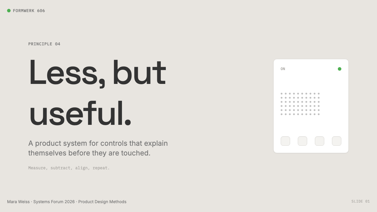
Applying the Braun aesthetic to presentation slides requires understanding the difference between emptiness and earned restraint. A cover slide in this system does not place a hero image or a gradient backdrop; it uses the warm gray ground, a white content panel, and the title in a medium-weight grotesque at generous scale, with nothing else competing for attention. Section divider slides work as pure typographic statements — a large section number in charcoal against warm gray, the section title in a smaller weight below. The goal on every slide is to make the content, not the design, the most memorable thing in the room.将博朗美学应用于演示文稿,需要理解空洞与挣来的克制之间的区别。在这套系统中,封面页不放英雄图片或渐变背景;它使用暖灰底色、一块白色内容面板,以及以慷慨尺寸呈现的中等字重标题,没有任何其他东西与之争夺注意力。章节过渡页作为纯排版陈述——一个大号炭灰色章节编号置于暖灰背景上,章节标题以更小的字重置于其下。每张幻灯片的目标是让内容,而非设计,成为观众离场后记住的东西。
For data slides, treat charts and tables as geometric objects subject to the same grid discipline as everything else. Bars in a bar chart align to the base rhythm; axis labels appear in the same neutral weight as body text; the single green accent highlights the most important data series — but only one series, never two. Pie charts become circle diagrams where segments are filled in the warm gray, white, and charcoal palette, with a single green segment for the value the presenter wants the audience to carry away. This discipline forces clarity about what the data is actually arguing.对于数据幻灯片,将图表与表格视为与所有其他元素服从同等网格纪律的几何对象。柱状图中的柱条对齐基础节奏;坐标轴标签使用与正文相同字重的中性字体;单枚绿色强调色可用于高亮最重要的数据系列——但只能是一个系列,绝不是两个。饼图变成圆形图,扇区用暖灰、白色与炭灰色板填充,以一个绿色扇区标示演讲者希望观众带走的那个数值。这种纪律迫使人对数据实际在论证什么保持清醒。
For web UI — dashboards, pricing pages, settings interfaces — the Braun approach requires defining a strict grid before touching visual design. A multi-column layout at a wide fixed container width, with generous gutters and components snapping to a consistent small-unit rhythm. The background is warm gray; all card and panel surfaces are white; borders are hairline at the warm neutral default; shadows are present but at the minimum value that communicates elevation. Navigation is typographic, not iconographic — labels and wordmarks rather than pictograms. The single green accent is reserved for active states, the currently selected item, and primary call-to-action buttons on critical conversion paths.对于网页UI——仪表板、定价页面、设置界面——博朗方法要求在触碰视觉设计之前先定义严格的网格:宽固定容器宽度的多列布局,慷慨的列间距,组件对齐至统一的细小增量单位。背景是暖灰色;所有卡片与面板表面为白色;边框为暖色调的细线边框;阴影存在,但保持在能传达层级的最小值。导航是文字性的,而非图标性的——标签与文字标识,而非象形图。单枚绿色强调色留给激活状态、当前选中项,以及关键转化路径上的主要行动按钮。
For editorial layouts and marketing pages, the style operates like a very good Swiss grid without the coldness. Long-form article pages use a narrow comfortable measure for body text with generous leading, a wide side margin for annotations or pull quotes in the muted secondary text color, and section breaks marked by a hairline rule rather than any decorative element. Marketing pages with multiple feature sections work well with alternating grounds — warm gray for context sections, white panels for feature content — using the consistent spacing rhythm to create visual breathing room between claims. The voice of the layout should feel like a well-made product, not a promotional poster.对于编辑排版与营销页面,这种风格运作起来像一套极好的瑞士网格,但没有那份冷漠。长文章页面使用舒适的窄行宽正文、慷慨的行距、宽阔的侧边距用于旁注或引用(以柔和的次要文字色呈现),章节分隔以细线而非任何装饰元素标记。包含多个特性区块的营销页面适合交替使用底色——暖灰用于背景区块,白色面板用于特性内容——用一致的间距节奏在各项主张之间创造视觉呼吸空间。版面的声音应当感觉像一件做工精良的产品,而非一张宣传海报。
The most common mistake when applying this style is confusing Braun restraint with visual emptiness and then compensating by adding trendy decorative elements to make it feel modern. Glassmorphism, gradient meshes, animated particle backgrounds, or oversized custom illustrative icons all violate the fundamental commitment to material honesty and unobtrusiveness. A second common error is using the warm gray palette as an excuse to de-emphasize all hierarchy — making everything the same quiet weight — so that the interface becomes hard to scan. The Braun system is restrained in decoration and decisive in hierarchy: headings are substantially larger than body text, primary actions substantially darker than secondary ones, and the single green accent reserved for the most important signal on screen.应用这种风格时最常见的错误,是将博朗的克制误认为视觉上的空洞,然后通过添加时髦装饰元素来让它感觉更现代而加以补偿。玻璃拟态、渐变网格、动态粒子背景或超大定制插画图标,都违背了对材料诚实与低调的根本承诺。第二个常见错误是把暖灰色板当作淡化所有层级的借口——让一切都同等安静——使界面变得难以扫读。博朗系统在装饰上克制,在层级上果断:标题比正文大得多,主要操作比次要操作深得多,那枚绿色强调色留给屏幕上最重要的那个信号。
See the Dieter Rams / Braun design system查看 Dieter Rams / Braun 完整设计系统
Dieter Rams / Braun — FAQDieter Rams / Braun · 常见问题
Is the Braun aesthetic the same as minimalism?博朗美学和极简主义是同一回事吗?
Not exactly. Contemporary minimalism is primarily a visual preference — a taste for emptiness, whitespace, and reduced visual stimulus. The Braun aesthetic is a functional doctrine: every element either earns its place by serving communication or structure, or it is removed. The distinction produces different results in practice. A minimalist designer might remove a label from a control to increase visual silence; a Braun-principled designer would keep the label because it serves function, and remove only the decorative border around the label. The results can look similar from a distance, but the reasoning — and therefore the behavior at the edges — is different.不完全是。当代极简主义首先是一种视觉偏好——对空洞、留白与减少视觉刺激的品味。博朗美学是一套功能性原则:每个元素要么通过服务传达或结构来挣到自己的位置,要么被去除。这个区别在实践中产生不同的结果。一位极简主义设计师可能会去掉控件上的标签以增加视觉宁静;一位遵循博朗原则的设计师会保留标签(因为它服务功能),只去掉标签周围的装饰性边框。结果从远处看可能相似,但推理方式——以及由此产生的边界行为——是不同的。
Can this style work for a consumer brand, or is it only suitable for B2B and tools?这种风格能用于消费者品牌吗,还是只适合B2B和工具类产品?
The Braun aesthetic works well in consumer contexts where trust, precision, and long-term quality are the primary brand values — premium audio hardware, precision instruments, professional-grade tools, design-forward direct-to-consumer products. It struggles in contexts requiring warmth, playfulness, or sensory richness: food, children's products, wellness brands, fashion. The useful test is to ask whether the product's core promise aligns with the values the aesthetic communicates: honesty, precision, quiet confidence, durability. If those are the values the brand wants to project, the style will carry them. If the brand promise is warmth, joy, or spontaneity, a different aesthetic vocabulary will serve better.博朗美学在信任、精准与长期品质是首要品牌价值的消费场景中表现出色——高端音频硬件、精密仪器、专业级工具、具有设计主张的直销消费品。它在需要温暖感、趣味性或感官丰富性的场景中则力不从心:食品、儿童产品、健康品牌、时尚。一个有用的测试是问:产品的核心承诺是否与这套美学所传达的价值观——诚实、精准、安静的自信、耐久性——对齐?如果这些是品牌希望传递的价值,这种风格会很好地承载它们。如果品牌承诺是温暖、喜悦或自发性,另一套美学词汇会更好地服务于它。
What is the correct way to use the green accent in digital interfaces?在数字界面中,绿色强调色的正确用法是什么?
The Braun green functions as an ON indicator — it signals active state, selection, or the single most important interactive signal on a given screen. The rule is one green element per visual group. In a navigation bar, the current page indicator gets the green dot; no other element in the nav does. In a form, the focused input border turns green; no other border does simultaneously. On a pricing page, the recommended tier card has a green accent; the others remain in the neutral palette. Using green for more than one state simultaneously — or as a general positive color for success messages, healthy statistics, and active toggles all at once — collapses the system's signal-to-noise ratio and makes the accent meaningless.博朗绿作为开机指示灯运作——它标示激活状态、选中状态,或给定屏幕上单个最重要的交互信号。规则是每个视觉组一个绿色元素。在导航栏中,当前页面指示灯获得绿点;导航中其他任何元素都不获得。在表单中,获得焦点的输入框边框变绿;其他边框不同时变绿。在定价页面上,推荐套餐卡片有绿色强调;其他卡片保持中性色板。将绿色同时用于多个状态——或将其作为通用的积极色彩,同时用于成功消息、健康数据和激活的开关——会破坏系统的信噪比,使这个强调色失去意义。
How does the Braun style relate to Apple's design language?博朗风格与苹果设计语言有何关联?
The relationship is well-documented and acknowledged by Apple's longtime design chief Jony Ive, who cited Rams as his primary influence. Specific Braun products map to specific Apple products: the ET66 calculator's button grid is the direct ancestor of iOS Calculator; the T3 pocket radio's proportions and material treatment prefigure the first iPod; the SK4 record player's white enamel and clear lid appear transformed in the iMac G4. Apple's departure from these origins became visible in the post-Ive era, with more gradient, more specular surface, and more expressive motion — choices that Rams himself has publicly criticized as departures from good design. The Braun aesthetic today occupies the position Apple's hardware once held: the clearest available reference for functional beauty in product design.这层关系有充分文献记录,并得到苹果长期设计总监乔纳森·伊夫的公开承认——他引用拉姆斯作为其首要灵感来源。具体的博朗产品与具体的苹果产品形成对应:ET66计算器的按键网格是iOS计算器的直接先祖;T3袖珍收音机的比例与材质处理预示了第一代iPod;SK4唱机的白色搪瓷与透明盖板以转化形式出现在iMac G4上。苹果对这些起源的背离在伊夫离开后的时代变得可见——更多渐变、更多镜面表面、更多表现性动效——这些选择遭到拉姆斯本人的公开批评,认为它们是对好设计的背离。今日的博朗美学占据了苹果硬件曾经占据的位置:产品设计中功能之美最清晰的现成参照。
Does this style work well in dark mode?这种风格适合深色模式吗?
A dark inversion of the Braun palette is possible but requires care. The canonical warm gray ground should invert to a warm dark — a very dark brown-gray rather than a neutral or blue-tinted black — to preserve the material warmth that distinguishes the system from colder dark-mode treatments. White surfaces become very dark charcoal panels; the hairline border color shifts to a lighter warm gray; body text becomes near-white but not pure white, to preserve the visual relationship between text and panel. The single green dot remains — it is perhaps even more powerful on a dark ground, where its scarcity is more visible. The trap to avoid is inverting the palette to something that looks like a standard dark-mode template: blue-black backgrounds, bright blue or purple accents, and white text with no warmth. That violates the foundational material identity of the system.博朗色板的深色反转版本是可能的,但需要谨慎。标准暖灰底色应当反转为暖暗色——一种极深的棕灰,而非中性或带蓝调的黑色——以保留将这套系统与更冷的深色模式处理区别开来的材质温度。白色表面变成极深的炭灰面板;细线边框颜色转为更浅的暖灰;正文变为接近白色但非纯白,以保留文字与面板之间的视觉关系。那枚绿点保留——在深色底面上它甚至可能更有力量,因为它的稀缺性更加可见。应当避免的陷阱是将色板反转成标准深色模式模板的样子:蓝黑背景、亮蓝或紫色强调色、没有温度的白色文字。那违背了这套系统最根本的材质特性。
Related design styles相关设计风格
 Graphite Technical DrawingDrafting-room precision. Non-photo-blue grid and graphite DIN lettering do th…制图室般精确:淡蓝网格与石墨DIN字母构成秩序。
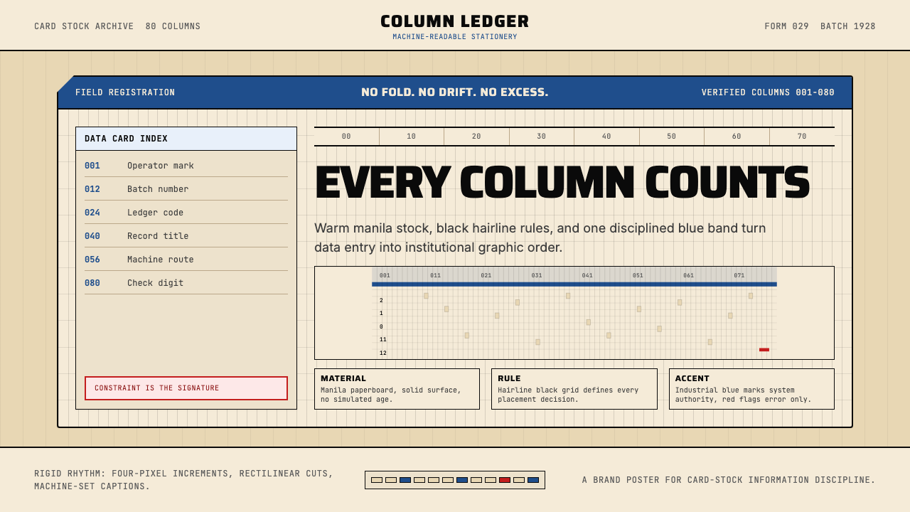 IBM Punchcard 029 (1928)Constraint becomes authority. Manila stock, hairline grid, industrial blue.约束即权威。米黄色卡纸、发丝网格与工业蓝。
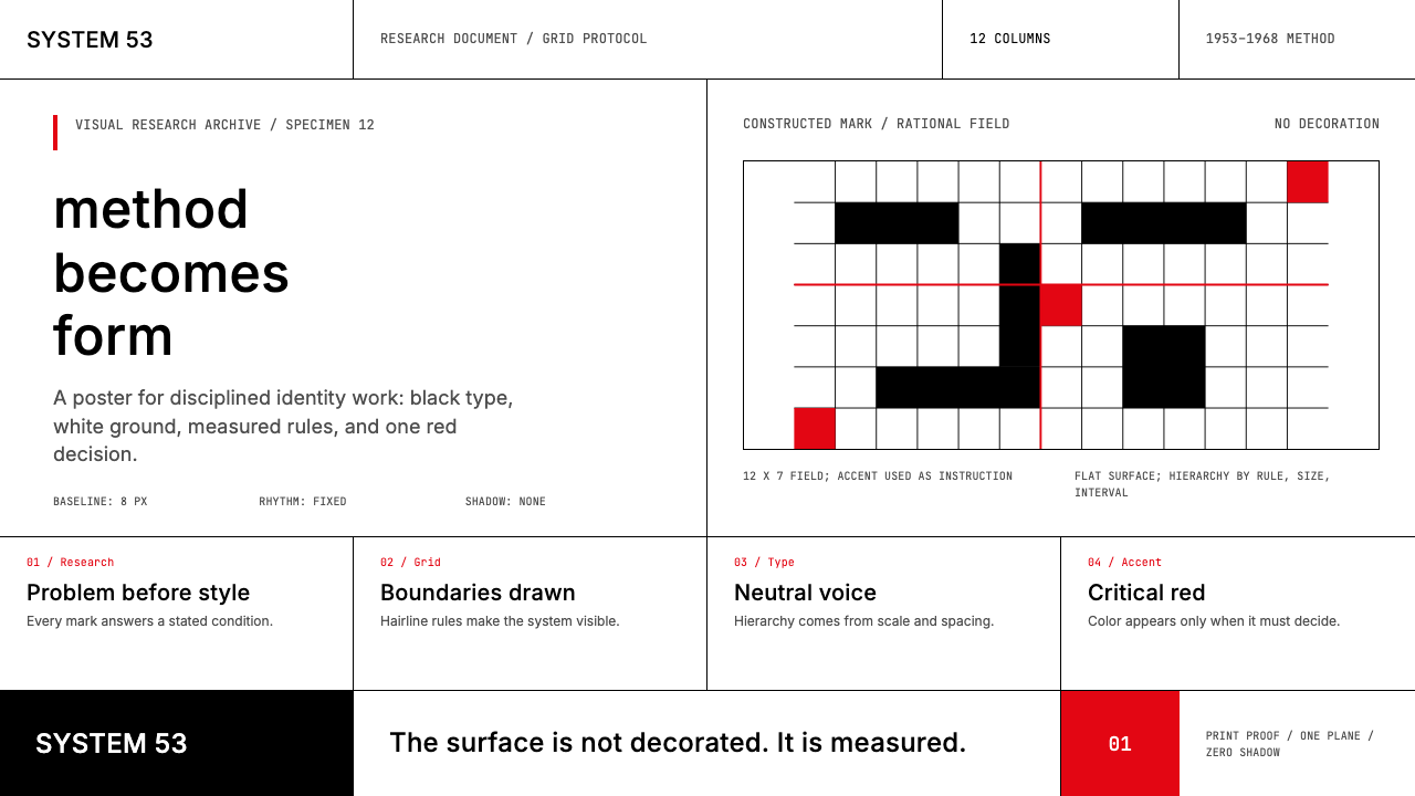 Ulm School (HfG Ulm)Clarity becomes discipline. Black-white grid, Inter grotesk, and one surgical…清晰即纪律:黑白网格、Inter 无衬线与一处手术般红标。
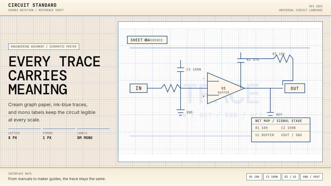 Electrical Schematic WiringAustere and exact. Cream graph paper, ink-blue traces, and mono labels make e…克制而精确。奶油方格纸与墨蓝细线,让每个标签都准确发声。
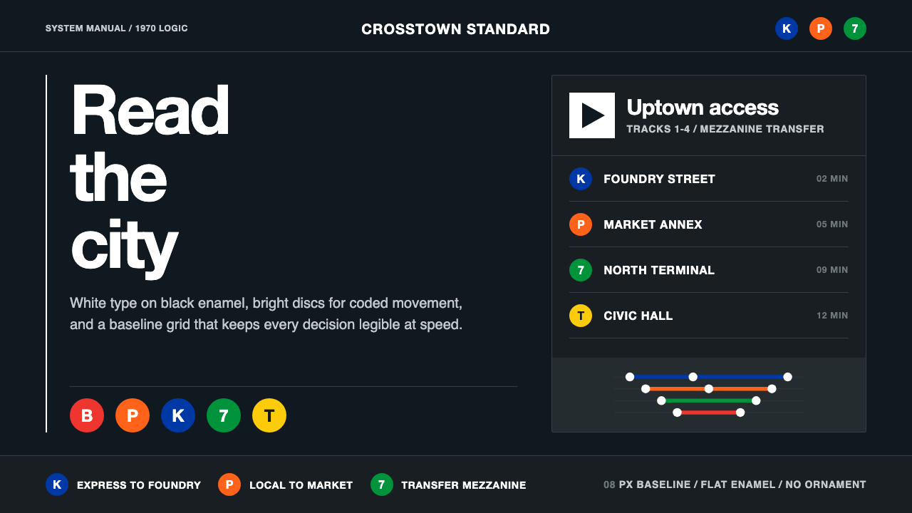 NYC Transit HelveticaOrder made visible. White type, black enamel, route discs, and a grid that ne…秩序一眼可见:黑底白字、线路圆盘与永不弯折的网格。
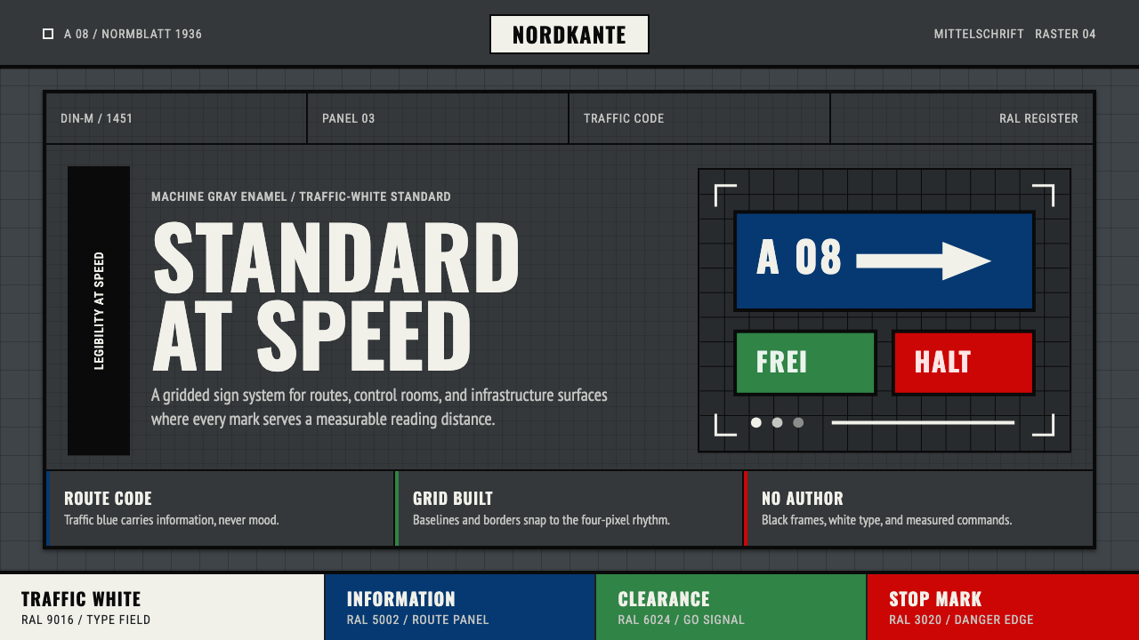 DIN 1451 SignageAuthorless and exact. Enamel gray grid, traffic-white DIN type, and RAL signa…无作者的精确感:珐琅灰网格、交通白字与RAL色条。