What is Electrical Schematic Wiring?什么是 Electrical Schematic Wiring?
The electrical schematic is engineering's oldest universal visual language — and its austere grammar of hairline traces, monospace labels, and graph-paper cream turns technical precision into a design system of unexpected elegance.电路原理图是工程界最古老的通用视觉语言——细线走线、等宽标注与方格纸奶油底的严谨语法,将技术精确转化为出乎意料的优雅设计体系。
Electrical Schematic Wiring in briefElectrical Schematic Wiring 速览
Electrical Schematic Wiring is a design language derived from the visual conventions of engineering circuit diagrams — the standardized graphic vocabulary that electrical engineers have used since the early twentieth century to communicate how circuits are connected and how components relate to one another. In its design application, the system translates that tradition into a complete aesthetic: graph-paper cream or off-white backgrounds, ink-blue hairline connections, monospace component labels, and the stripped-back clarity of an engineering document where every mark carries meaning.电路原理图风格是一套源自工程电路图视觉规范的设计语言——这套标准化图形词汇自二十世纪初起,便是电气工程师用以表达电路连接关系与元件逻辑的通用媒介。在设计应用层面,这一传统被转化为完整的美学体系:方格纸奶油色或米白色底面、墨蓝色细线连接、等宽字体元件标注,以及工程文档特有的极简清晰——每一个标记都承载意义。
Unlike decorative or expressionist styles, this language is rooted in function. Every symbol in a real schematic — the zigzag of a resistor, the parallel lines of a capacitor, the triangle of a diode — was standardized precisely because ambiguity is dangerous in a wiring diagram. That principle of zero ambiguity carries directly into the design system: nothing is included for visual richness alone. Backgrounds stay flat, connections are drawn at right angles, and labels are set in monospace type so that every character occupies the same width and nothing visually misleads.与装饰性或表现主义风格不同,这套语言根植于功能。真实原理图中的每个符号——锯齿形电阻、平行线电容、三角形二极管——之所以被标准化,正因为接线图中的歧义是危险的。零歧义原则直接延伸至这套设计体系:没有任何元素是为了视觉丰富性而存在的。背景保持平整,连线以直角绘制,标注使用等宽字体,使每个字符占据相同宽度,视觉上不产生任何误导。
The result is an aesthetic that reads as both rigorously technical and strangely warm. The grid-paper background, the pale ink-blue palette, and the precise labeling recall the hand-drawn circuit boards of mid-century electronics kits — a world of Heathkit manuals and laboratory bench diagrams that carries a nostalgic authority. Applied to contemporary digital work, this visual language signals precision, trustworthiness, and a maker-culture respect for how things actually work.由此形成的美学既严格技术性,又有一种奇特的温度感。方格纸背景、淡淡的墨蓝色调与精确的标注,唤起二十世纪中期电子套件时代那些手绘电路板的记忆——Heathkit套件手册与实验台接线图所承载的世界,带着一种怀旧的权威感。应用于当代数字作品时,这套视觉语言传递出精确、可信赖,以及创客文化对事物实际运作方式的尊重。
See the Electrical Schematic Wiring design system查看 Electrical Schematic Wiring 完整设计系统
Where does Electrical Schematic Wiring come from?Electrical Schematic Wiring 从何而来?
The standardized vocabulary of electrical schematics emerged alongside the electrical engineering profession itself. By the 1920s, as radio, telephony, and power distribution expanded rapidly across the industrialized world, engineers in different countries and companies found themselves unable to read each other's diagrams — a practical crisis that demanded a solution. Standards bodies in the United States, Britain, and Germany began producing formal symbol sets, and by the mid-twentieth century, the International Electrotechnical Commission (IEC) and the Institute of Electrical and Electronics Engineers (IEEE) had established the frameworks that persist to this day. IEEE-315, published in 1975, and IEC 60617, formalized in 1983 and revised through 2024, are the twin pillars of the modern schematic vocabulary.电气原理图的标准化词汇与电气工程专业本身同步成长。1920年代,随着无线电、电话与电力配送在工业化世界迅速扩展,不同国家和企业的工程师发现彼此的图纸无法互读——这一实际危机迫切需要解决方案。美国、英国和德国的标准机构开始制定正式符号集,至二十世纪中期,国际电工委员会(IEC)与电气电子工程师协会(IEEE)已确立沿用至今的框架。1975年发布的IEEE-315与1983年正式制定、经2024年修订的IEC 60617,是现代原理图词汇的两大支柱。
The visual character of the schematic diagram was shaped as much by its production medium as by its logical content. Before digital tools, schematics were drawn by hand on graph paper — the grid providing a registration system that kept connections orthogonal and spacing consistent. Ink was applied with ruling pens, and components were drawn with stencils or Letraset symbol sheets. The graph-paper grid, the hairline trace, the monospace lettering of hand-set labels — these were not aesthetic choices but practical consequences of the medium. When computer-aided design (CAD) tools replaced drafting tables beginning in the 1980s, they preserved these conventions because the engineers using them found them legible and trusted.原理图的视觉特征,与其说是由逻辑内容塑造的,不如说同样受到生产媒介的深刻影响。在数字工具出现之前,原理图由工程师在方格纸上手工绘制——网格提供了一套定位系统,使连线保持正交、间距保持一致。墨水以直线笔施加,元件符号借助模板或Letraset符号贴纸绘制。方格纸网格、细线走线、手工标注的等宽字体——这些并非美学选择,而是媒介的实际产物。从1980年代起,计算机辅助设计(CAD)工具取代了绘图桌,但这些惯例被完整保留下来,因为使用它们的工程师认为这套语言清晰可读、值得信赖。
The post-World War II consumer electronics kit culture gave schematic diagrams their widest popular reach. Companies like Heathkit in the United States and Maplin in the United Kingdom sold radio sets, oscilloscopes, and hi-fi amplifiers as kits of components, with detailed assembly manuals built around schematic diagrams. These manuals introduced the schematic's visual grammar to millions of hobbyists who were not professional engineers. The Heathkit aesthetic — cream paper, blue-black ink, clean component symbols, precise numerical labels — became a cultural touchstone for a generation of electronics enthusiasts. Paul Horowitz and Winfield Hill's textbook The Art of Electronics, first published in 1980, carried this tradition into the university curriculum and helped cement the schematic's look as the de facto visual language of electronics education.二战后的消费电子套件文化使原理图获得了最广泛的大众传播。美国的Heathkit和英国的Maplin等公司以元件套件形式销售收音机、示波器与高保真放大器,并配以以原理图为核心的详细装配手册。这些手册将原理图的视觉语法介绍给数以百万计的业余爱好者,而非仅限于职业工程师。Heathkit的美学——奶油色纸张、蓝黑色墨水、简洁的元件符号与精确的数字标注——成为一代电子爱好者的文化标志。保罗·霍罗威茨与温菲尔德·希尔于1980年初版的教科书《电子艺术》,将这一传统带入大学课程,并帮助将原理图的视觉风格巩固为电子学教育事实上的通用视觉语言。
The maker and Arduino movements of the 2000s and 2010s triggered a broad resurgence of schematic culture. Open-source hardware projects published their designs as public schematics, introducing the vocabulary to a new generation of designers, software engineers, and product builders who might never have encountered it in formal training. Design tools like Fritzing and KiCad made schematic authoring accessible to non-engineers. At the same time, a parallel nostalgia for mid-century technical aesthetics emerged in graphic design — the same period that revived letterpress printing, technical illustration, and blueprint-style graphics. Electrical Schematic Wiring as a design style sits at the intersection of these two currents: genuine technical heritage reinterpreted through a contemporary design lens.2000至2010年代的创客运动与Arduino社区触发了原理图文化的广泛复兴。开源硬件项目以公开原理图的形式发布设计,将这套词汇引介给新一代设计师、软件工程师和产品建构者——他们中许多人从未在正规培训中接触过这套语言。Fritzing和KiCad等设计工具使原理图创作对非工程师群体也变得触手可及。与此同时,平面设计领域也兴起了一股对二十世纪中期技术美学的怀旧浪潮——正是这一时期复兴了活版印刷、技术插图与蓝图风格图形。电路原理图风格作为一种设计语言,恰好处于这两股潮流的交汇点:真实的技术传承,经由当代设计视角重新诠释。
What defines the Electrical Schematic Wiring look?Electrical Schematic Wiring 的视觉特征是什么?
Ground Color底色
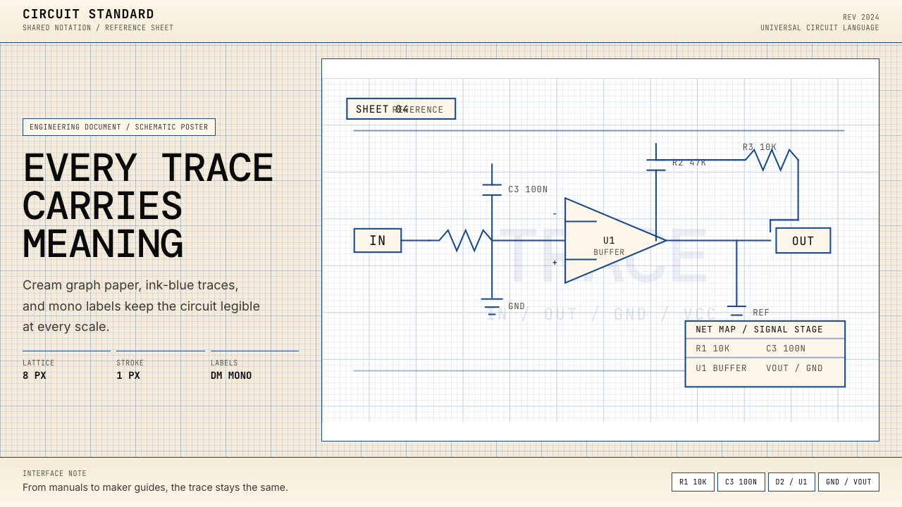
The background is always a warm off-white or graph-paper cream — never pure white and never a dark ground. This tone references the physical graph paper that engineers used for hand-drawn schematics, and it sets a low-contrast, easy-to-read field against which ink-blue and dark lines register cleanly. The slight warmth keeps the overall palette from feeling sterile or clinical.底色始终是温暖的米白色或方格纸奶油色——从不使用纯白,也从不使用深色底面。这种色调直接引用了工程师手绘原理图所用的物理方格纸,营造出低对比度、易于阅读的底场,使墨蓝色与深色线条能够清晰呈现。略带温度的暖调使整体色盘不至于显得无菌或冷峻。
Trace Color and Line Weight走线色彩与线重
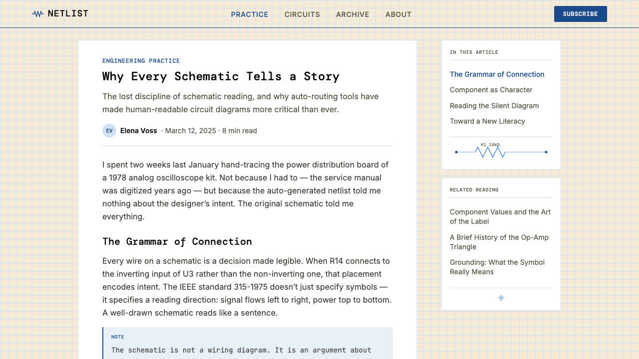
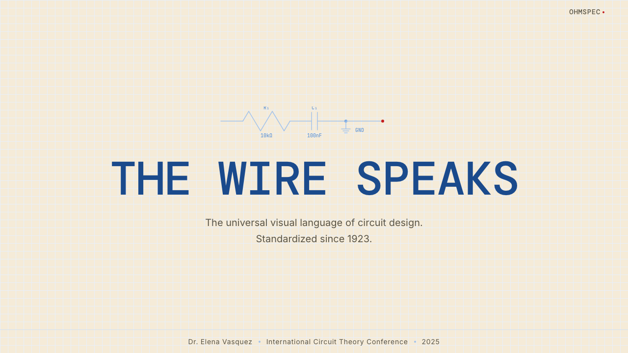
Connection lines — the traces — are drawn in a muted ink-blue, close in character to the color of technical drafting ink. This hue is neither the saturated primary blue of a UI accent nor a neutral gray; it sits at a precise tonal point that reads as deliberate and technical. Line weight is consistently thin, suggesting the hairlines of a ruling pen or a fine technical pen. All connections meet at right angles, reinforcing the orthogonal discipline of the grid.连接线——即走线——以柔和的墨蓝色绘制,其色调近似技术制图墨水的颜色。这种色相既非界面设计中的饱和主色蓝,也非中性灰;它处于一个精确的色调点,读来既刻意又技术性。线重始终细薄,令人联想到直线笔或精细技术笔的发丝线。所有连接线以直角相交,强化了网格的正交纪律。
Component Symbols元件符号
The vocabulary of standardized schematic symbols — resistor zigzags, capacitor parallel bars, inductor loops, diode triangles, ground rails — appears as decorative and structural elements simultaneously. Each symbol is drawn at the same stroke weight as the connecting traces, so the diagram reads as a single unified graphic system rather than a collection of icons placed on a line drawing. Used as ornament or texture in non-engineering contexts, these symbols carry strong associative weight: precision, technical authority, and maker culture.标准化原理图符号词汇——电阻锯齿、电容平行线、电感环路、二极管三角、接地轨——同时作为装饰性与结构性元素出现。每个符号与连接走线使用相同笔画粗细绘制,使整张图读来像一套统一的图形系统,而非叠加在线条图上的一组图标集合。在非工程语境中用作装饰或纹理时,这些符号承载着强烈的联想重量:精确性、技术权威,以及创客文化的气质。
Monospace Typography等宽字体排印
All text — component reference designators, values, node labels, title blocks — is set in monospace type. The choice is not arbitrary: in real schematics, monospace lettering ensures that labels align vertically and that no character is ambiguous in width. In the design system, monospace type carries the connotation of terminal output, embedded firmware, and engineering notation. It signals that the content is data, not prose, and that every character is meaningful.所有文字——元件参考标识符、数值、节点标签、标题栏——均以等宽字体排印。这一选择并非随意:在真实原理图中,等宽字母确保标注垂直对齐,且没有字符在宽度上产生歧义。在这套设计体系中,等宽字体承载着终端输出、嵌入式固件与工程标注的语义联想,传递出内容是数据而非散文的信号,且每一个字符都具有意义。
Grid Structure网格结构
The graph-paper grid is either subtly visible as a very light background ruling or implied by the strict orthogonal alignment of all elements. In either case, the grid is not decoration — it is the organizational skeleton of the entire composition. Elements snap to grid intersections; traces run along grid lines; spacing between components is a consistent multiple of the grid unit. This systematic regularity is what distinguishes the style from retro or novelty aesthetics: the grid is load-bearing.方格纸网格或以极浅的底纹线若隐若现,或通过所有元素严格的正交对齐关系隐性呈现。无论哪种形式,网格都不是装饰——它是整个构图的组织骨架。元素对齐至网格交叉点,走线沿网格线延伸,元件间距是网格单元的整数倍。这种系统性规律感正是将这种风格与复古或新奇美学区分开来的关键:网格是承重结构。
Sparse Notation and Annotation稀疏标注与注释
Real schematics use just enough labels to identify each component and its value — nothing more. Applied to design, this principle becomes a compositional rule: white space is generous, labels are minimal and precisely placed, and there is no explanatory text that could be removed without loss. The aesthetic effect is a kind of calm legibility — the diagram does not shout for attention but rewards careful reading.真实原理图只使用恰好足够识别每个元件及其数值的标注——仅此而已。应用于设计,这一原则成为构图规则:留白慷慨,标注精简且位置精确,没有任何可以删去而不造成信息损失的解释性文字。美学效果是一种平静的可读性——图表不高声争夺注意力,却回报仔细阅读。
Restrained Accent Color克制的强调色
Beyond the ink-blue traces and cream ground, color is used only as functional accent — to highlight a specific signal path, mark a component under test, or draw the eye to a critical node. When accent color appears, it is a single muted tone: a warm amber, a signal green, or a cautionary red, each used sparingly and with clear communicative purpose. No gradient, no glow, no decorative blending. If a second accent appears at all, it performs a distinct function from the first.除墨蓝色走线与奶油色底面之外,色彩仅作功能性强调使用——用于突出特定信号路径、标记被测元件,或将视线引导至关键节点。强调色出现时,是单一的柔和色调:暖琥珀色、信号绿,或警示红,每种色彩都稀疏使用,且具有明确的传达目的。无渐变,无发光效果,无装饰性混色。若出现第二种强调色,其功能必须与第一种截然不同。

See the Electrical Schematic Wiring design system查看 Electrical Schematic Wiring 完整设计系统
Who shaped Electrical Schematic Wiring?谁塑造了 Electrical Schematic Wiring?
The IEEE-315 standard, published in 1975, is the document that locked in the graphic symbols and drawing conventions used in North American electrical schematics. Its committee work represented decades of negotiation between manufacturers, universities, and government agencies — all of whom needed to read each other's diagrams without ambiguity. The standard is the invisible author of every American schematic's visual character: the way a resistor is drawn, how a ground symbol is oriented, what a node dot means. As a design system, Electrical Schematic Wiring inherits this committee's decisions as its foundational grammar.1975年发布的IEEE-315标准,确立了北美电气原理图所使用的图形符号与绘图规范。其委员会工作代表了制造商、大学与政府机构数十年的协商——所有参与方都需要无歧义地阅读彼此的图纸。这份标准是每一张美国原理图视觉特征的隐性作者:电阻的画法、接地符号的朝向、节点圆点的含义。作为设计体系,电路原理图风格将这一委员会的决定作为其基础语法加以继承。
Heathkit, founded in 1926 and at its peak through the 1950s and 1970s, sold electronic kits that introduced schematic reading to an entire generation of American hobbyists. The company's assembly manuals were models of technical communication: step-by-step instructions built around clear, consistently styled schematics. The visual character of Heathkit documentation — cream paper, precise ink-blue line work, legible monospace labels, generous whitespace — is the direct ancestor of the Electrical Schematic Wiring design aesthetic. The brand's cultural weight is significant: Heathkit represented a time when consumers were expected to understand their devices, not merely consume them.Heathkit创立于1926年,鼎盛于1950至70年代,以销售电子套件将整整一代美国业余爱好者引入原理图阅读的世界。该公司的装配手册是技术传播的典范:以清晰、风格一致的原理图为核心的逐步指引。Heathkit文档的视觉特征——奶油色纸张、精确的墨蓝色线条、清晰的等宽字体标注、慷慨的留白——正是电路原理图设计美学的直接源头。这个品牌的文化分量意义深远:Heathkit代表了那个消费者被期待理解而非仅仅使用其设备的时代。
Paul Horowitz, a physicist and electronics educator at Harvard, co-authored The Art of Electronics with Winfield Hill — first published in 1980 and revised in 2015. The book is arguably the most widely read electronics textbook ever written, and its schematic-heavy pedagogy shaped how two generations of engineers and hobbyists learned to visualize circuits. Horowitz's diagrams are notable for their clarity and their careful balance of information density: dense enough to be complete, spare enough to be readable. The book's schematic style — its use of consistent symbol sizing, orthogonal layout, and annotated node labels — is a direct influence on the design language this system codifies.哈佛大学物理学家与电子学教育者保罗·霍罗威茨与温菲尔德·希尔共同撰写了《电子艺术》——首版于1980年,2015年修订再版。这本书堪称有史以来阅读最广泛的电子学教科书,其以原理图为核心的教学方式塑造了两代工程师和业余爱好者的电路可视化思维。霍罗威茨的图表以清晰性和信息密度的精心平衡著称:足够密集以保证完整,足够简洁以保证可读。该书的原理图风格——一致的符号尺寸、正交布局与注释节点标签的运用——对本设计系统所编码的视觉语言有直接影响。
The Arduino project, launched in 2005 at the Interaction Design Institute Ivrea in Italy, democratized microcontroller programming and, with it, schematic literacy. Arduino's open-source hardware model meant that every board design was published as a public schematic, viewable and modifiable by anyone. This created an enormous new audience for schematic conventions — designers, artists, students, and software engineers who encountered circuit diagrams not through engineering school but through creative coding and physical computing communities. The aesthetic associations of schematics shifted: from exclusively technical documentation to a visual signifier of open, collaborative, maker culture.2005年在意大利伊夫雷亚交互设计学院启动的Arduino项目,将微控制器编程大众化,并随之普及了原理图读写能力。Arduino的开源硬件模式意味着每一块电路板的设计均以公开原理图形式发布,任何人均可查看与修改。这为原理图规范创造了大量新受众——设计师、艺术家、学生与软件工程师,他们接触电路图不是通过工程学院,而是通过创意编程与实体计算社区。原理图的美学联想随之转变:从纯粹的技术文档,演变为开放、协作、创客文化的视觉符号。
Where IEEE-315 governs North American practice, IEC 60617 — developed by the International Electrotechnical Commission and formalized in 1983, with continuous revision through 2024 — defines the schematic symbol vocabulary used across Europe, Asia, and international industrial contexts. The two standards differ in specific symbol forms: a European resistor is drawn as a rectangle, while an American resistor uses the familiar zigzag. These divergences have created two parallel schematic visual dialects, both of which are part of the Electrical Schematic Wiring design heritage. Awareness of the distinction matters when choosing which symbol vocabulary to deploy for a specific audience or cultural context.IEEE-315规范北美实践,而IEC 60617——由国际电工委员会制定、1983年正式颁布、经2024年持续修订——则定义了欧洲、亚洲及国际工业语境中使用的原理图符号词汇。两套标准在具体符号形式上存在差异:欧洲电阻以矩形绘制,而美国电阻使用人们熟悉的锯齿形。这些分歧形成了两套并行的原理图视觉方言,均属于电路原理图设计传承的组成部分。在为特定受众或文化语境选择部署哪套符号词汇时,了解这一区别具有实际意义。
How do you use Electrical Schematic Wiring today?今天怎么用 Electrical Schematic Wiring?
Electrical Schematic Wiring translates most directly into design contexts where technical credibility, precision, and a maker-culture sensibility are desired values. The key to applying it correctly is understanding that every visual decision in a real schematic diagram has a functional justification — and that the design system works by preserving that discipline even when the underlying content is not a circuit. Elements that would be decorative in other styles here serve as structural notation; whitespace is not emptiness but signal separation; monospace type is not a stylistic choice but a legibility requirement.电路原理图风格在技术可信度、精确性与创客文化感知是期望价值的设计语境中最为直接适用。正确应用它的关键,在于理解真实原理图中每一个视觉决定都有其功能依据——这套设计体系的运作方式,正是在底层内容并非电路的情况下,依然保持这种自律。在其他风格中属于装饰性的元素,在这里充当结构性标注;留白不是空洞,而是信号分隔;等宽字体不是风格选择,而是可读性要求。
For presentation slides, the style works exceptionally well for product demos, technical briefings, and data-heavy decks. A cover slide can be built around a simplified schematic fragment as background texture — traces and component symbols rendered faintly beneath the title, evoking a circuit board without obscuring the headline. Content slides should commit to the grid fully: one organizing line of ink-blue at the top, type set in a clean monospace or mono-adjacent face, and data visualized as diagrammatic objects rather than softly styled charts. Tables of specifications read naturally in this style. Avoid the temptation to add photography or gradient fills; the style's authority comes from its restraint.对于演示文稿,这种风格在产品演示、技术简报与数据密集型幻灯片组中表现出色。封面页可以围绕一个简化的原理图片段作为背景纹理构建——走线与元件符号以浅淡方式呈现于标题之下,唤起电路板的意象而不遮蔽标题文字。内容页应全面提交于网格:顶部一条组织性的墨蓝色线,标注使用干净的等宽或近等宽字体,数据以示意图式对象而非柔化风格图表可视化呈现。规格参数表格在这种风格下自然流畅。避免添加摄影图像或渐变填充;这种风格的权威性来自其克制。
For web interfaces and dashboards, the schematic aesthetic is well-suited to developer tools, infrastructure monitoring platforms, IoT dashboards, and any product that needs to communicate technical seriousness without sacrificing clarity. The approach: a cream or very light warm-gray background, ink-blue or dark charcoal for structural lines and borders, and monospace type for all data values and labels. Interactive states can use a single amber or green accent drawn from signal-indicator conventions. Card components should have visible borders rather than soft shadows; hover states should shift the border color rather than add glow. The grid should be explicit and regular, not fluid or responsive in ways that break orthogonal alignment.对于网页界面与仪表板,原理图美学非常适合开发者工具、基础设施监控平台、物联网仪表板,以及任何需要在不牺牲清晰度的前提下传达技术严谨性的产品。方法如下:奶油色或极浅的暖灰色背景,墨蓝或深炭色用于结构线条与边框,所有数据值和标注使用等宽字体。交互状态可使用源自信号指示灯规范的单一琥珀色或绿色强调。卡片组件应有可见边框而非柔和阴影;悬停状态应改变边框颜色而非添加发光效果。网格应当明确且规整,而非以破坏正交对齐的方式流动或响应变化。
For editorial and marketing applications, the style supports strong technical positioning. A landing page for a hardware product, developer API, or industrial software can use schematic fragments as section dividers or hero backgrounds — the component symbols functioning as a visual shorthand for how things work. Pricing pages benefit from the style's diagrammatic clarity: tiers differentiated by a single accent color, features listed in monospace type, borders rather than shading to define table regions. For printed materials, the style performs well at large format: posters and specification sheets where the graph-paper grid is allowed to show as a fine background ruling develop a distinctive and authoritative presence.对于编辑与营销应用,这种风格支持强劲的技术定位。硬件产品、开发者API或工业软件的落地页,可以使用原理图片段作为章节分割线或主视觉背景——元件符号作为事物运作方式的视觉简写。定价页面受益于这种风格的示意图式清晰度:等级以单一强调色区分,功能列表使用等宽字体,以边框而非底纹划定表格区域。对于印刷物料,这种风格在大幅面下表现出色:允许方格纸网格以细底纹线显现的海报和规格说明书,能够形成独特而权威的视觉存在。
A common mistake is treating the schematic style as simply a palette choice — applying the cream background and ink-blue color without committing to the underlying structural discipline. The style breaks down when it mixes soft shadows with hard-edged traces, when it uses proportionally-spaced type for labels that should be monospace, or when decorative elements are added that have no functional analog in a real schematic. The other frequent error is overloading the composition with symbol density — packing in component glyphs as texture until the result reads as busy rather than precise. Real schematics are generous with whitespace; the design system should be too.一个常见错误是将原理图风格仅仅视为色彩选择——应用奶油背景和墨蓝色调,却不承诺底层的结构自律。当风格将柔和阴影与硬边走线混用、当标注使用了本应是等宽的比例字体、或当加入了在真实原理图中没有功能对应物的装饰元素时,风格便崩解了。另一个常见错误是以过密的符号堆满构图——将元件字形作为纹理堆砌,直至结果读来繁乱而非精确。真实的原理图对留白慷慨大方;这套设计体系也应如此。
The style is less suited to contexts that require warmth, organic texture, or emotional softness — consumer lifestyle products, food and beverage brands, wellness applications, or any interface where the primary tone is inviting rather than authoritative. It is also a poor fit for purely decorative or fashion-adjacent design work where technical connotations would feel out of place. Within its natural domain, however, it offers something genuinely rare: an aesthetic with a verifiable historical and functional origin, where every convention can be explained and justified.
See the Electrical Schematic Wiring design system查看 Electrical Schematic Wiring 完整设计系统
Electrical Schematic Wiring — FAQElectrical Schematic Wiring · 常见问题
Do I need to use actual circuit symbols, or can I abstract the aesthetic?我需要使用真实的电路符号吗,还是可以抽象化这种美学?
Both approaches are valid, but they produce different results. Using recognizable schematic symbols — resistor zigzags, capacitor bars, ground rails — anchors the design in a specific technical tradition and reads immediately to anyone with electronics experience. Abstracting to just the grid, orthogonal lines, monospace type, and cream-plus-ink-blue palette is subtler and more broadly applicable, but loses some of the style's most distinctive associative power. The choice should follow the audience: if technical credibility is the goal and the audience is engineers or makers, use the real symbols. If the technical associations are a secondary tone in a more general design context, the abstracted version is less likely to feel niche.两种方式都有效,但产生不同的效果。使用可识别的原理图符号——电阻锯齿、电容线、接地轨——将设计锚定在特定的技术传统中,对任何有电子学经验的人都能即时解读。抽象化为仅保留网格、正交线条、等宽字体与奶油加墨蓝调色板,更为微妙且适用范围更广,但会失去这种风格最具辨识度的联想力量。选择应追随受众:若目标是技术可信度且受众是工程师或创客,使用真实符号;若技术联想只是更广泛设计语境中的次要基调,抽象版本不易让人感到小众。
Can this style work with color photography or rich imagery?这种风格能与彩色摄影或丰富图像搭配使用吗?
With care, yes — but it requires treating photography as a flat, diagrammatic element rather than a naturalistic window. The schematic style works well with high-contrast, desaturated, or duotone photography where the image feels like a technical artifact rather than an ambient scene. A product photograph shot cleanly against a white or cream ground, or an engineering photo converted to a cool-toned duotone in ink-blue and cream, can integrate without disrupting the system's logic. What breaks the style is soft, warm, ambient photography treated as a full-bleed background — that kind of imagery imports naturalistic depth that contradicts the flat, orthogonal discipline the rest of the composition depends on.谨慎处理下可以——但需要将摄影视为平面的、示意图式的元素,而非自然主义的窗口。原理图风格与高对比度、去饱和或双色调摄影配合良好,前提是图像感觉像一件技术产物而非环境场景。在白色或奶油色底面上干净拍摄的产品照片,或转换为墨蓝与奶油冷调双色调的工程摄影,可以在不破坏系统逻辑的情况下融入。破坏风格的是作为全幅背景使用的柔和、温暖、环境感强的摄影——这类图像引入了自然主义深度,与构图其余部分所依赖的平面、正交自律相矛盾。
How do I avoid the style reading as purely retro or nostalgic?如何避免这种风格被解读为纯粹的复古或怀旧?
The schematic style tips into nostalgia when its vintage signals — graph-paper texture, hand-drawn component symbols, aged paper tones — are emphasized over its structural logic. To keep it feeling current rather than retro, prioritize the functional principles: rigorous grid alignment, information-first composition, monospace type used for genuine data legibility rather than decoration, and minimal use of texture. Digital-native elements — clean vector component symbols at crisp resolution, precise hairline traces without ink bleed, consistent modular spacing — keep the style in the present. Reserve the warmest cream tones and any aged-paper effects for contexts where the nostalgic reading is intentional.当方格纸纹理、手绘元件符号、泛旧纸张色调等复古信号被过度强调,超越其结构逻辑时,原理图风格就会滑向怀旧。要使其感觉当代而非复古,应优先强调功能原则:严格的网格对齐、信息优先的构图、等宽字体用于真正的数据可读性而非装饰,以及最少量的纹理使用。数字原生元素——清晰分辨率下的干净矢量元件符号、无墨水渗出的精确细线走线、一致的模块化间距——使风格保持在当下。将最温暖的奶油色调与任何泛旧纸张效果,保留给刻意追求怀旧解读的语境。
Is there a difference between the American and European schematic symbol sets, and does it matter for design?美式与欧式原理图符号集有何区别,这对设计有影响吗?
Yes, there is a real and visible difference. The most recognizable divergence is the resistor: American schematics use a zigzag line (IEEE-315), while European and international schematics use a small rectangle (IEC 60617). Other symbols differ too — inductor coils, capacitor variants, and some logic gate shapes vary between the two systems. For design purposes, the choice of symbol vocabulary is partly an aesthetic decision and partly an audience signal. The zigzag resistor reads as distinctly American and carries associations with mid-century hobbyist culture; the rectangular resistor reads as more globally industrial. Neither is more correct for design use — the choice should reflect the cultural context the design is addressing.是的,存在真实且可见的差异。最具辨识度的分歧是电阻:美式原理图使用锯齿线(IEEE-315),而欧洲及国际通用原理图使用小矩形(IEC 60617)。其他符号也有差异——电感线圈、电容变体以及部分逻辑门形状在两套系统间各有不同。对于设计用途,符号词汇的选择既是美学决定,也是受众信号。锯齿形电阻带有明显的美国感,承载着二十世纪中期业余爱好者文化的联想;矩形电阻则显得更具全球工业感。对于设计用途,两者均无高下之分——选择应当反映设计所面向的文化语境。
Does the style suit dark mode, or is it inherently light-background only?这种风格适合深色模式吗,还是天然只适合浅色底面?
The historical schematic is unambiguously a light-background form — real schematics are drawn on white or cream paper, and the visual logic of ink-on-paper is foundational to the aesthetic. A dark inversion is possible but should be approached as a deliberate reinterpretation rather than a direct inversion. On a dark background, the cream ground becomes a very dark warm neutral, ink-blue traces become a lighter cool-blue or pale cyan, and monospace labels appear in light cream or off-white. The graph-paper grid, if shown, should be very subtle — barely distinguishable from the background. Component symbols work in this inverted palette, but the style loses some of its warmth and archival authority. Dark mode works best for interfaces where the technical and contemporary readings are more important than the historical and nostalgic ones.历史上的原理图毫无疑义是浅色底面的形式——真实原理图绘制于白色或奶油色纸张上,纸上墨水的视觉逻辑是这种美学的基础。深色反转是可行的,但应作为刻意的再诠释来处理,而非直接的色彩取反。在深色底面上,奶油底色变为极深的暖中性色,墨蓝走线变为较浅的冷蓝或淡青色,等宽字体标注以浅奶油或米白色呈现。方格纸网格若显示,应极为微妙——与背景几乎难以区分。元件符号在这套反转色盘下依然有效,但风格会失去部分温度感与档案权威感。深色模式最适合技术性与当代性解读比历史性与怀旧性解读更为重要的界面场景。
Related design styles相关设计风格
 Israeli Bauhaus Tel Aviv (White City)Austere urban modernism. Stucco-white grid, Jost type, hairline borders, and…克制都市现代主义。灰泥白网格、Jost 字体、细黑线与三原色点睛。
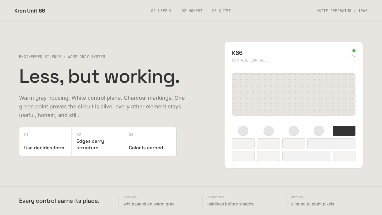 Dieter Rams / BraunQuiet by design. Warm gray, white panels, hairline grids, and one earned gree…安静即设计:暖灰、白面板、细网格,只留一枚绿色指示点。
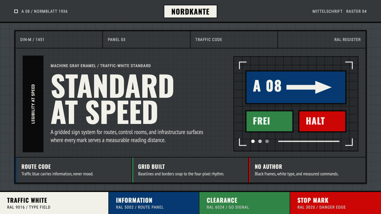 DIN 1451 SignageAuthorless and exact. Enamel gray grid, traffic-white DIN type, and RAL signa…无作者的精确感:珐琅灰网格、交通白字与RAL色条。
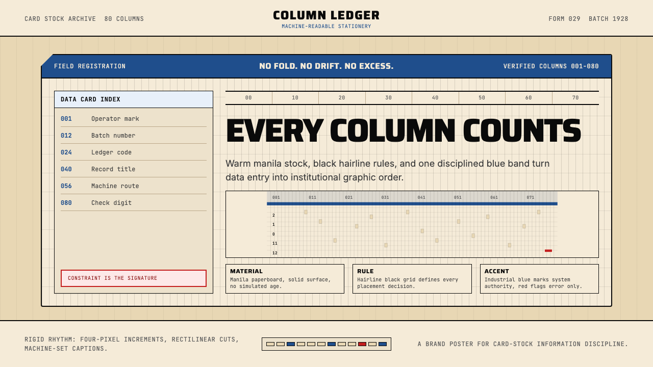 IBM Punchcard 029 (1928)Constraint becomes authority. Manila stock, hairline grid, industrial blue.约束即权威。米黄色卡纸、发丝网格与工业蓝。
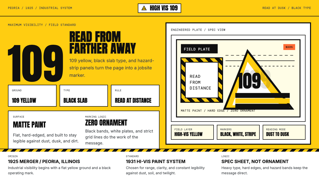 Caterpillar Construction Yellow (1925)Maximum visibility, zero softness. 109 yellow ground and black slab type.高可见度,零柔和。109 黄底配黑色粗体。
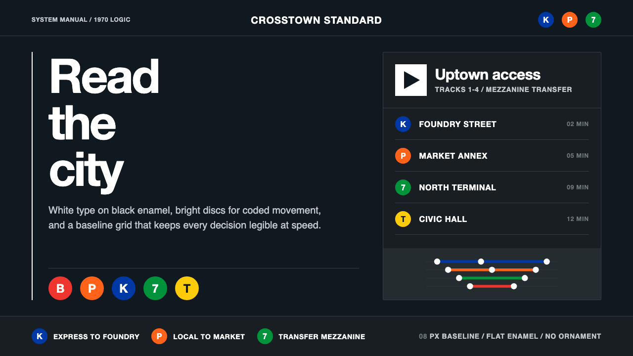 NYC Transit HelveticaOrder made visible. White type, black enamel, route discs, and a grid that ne…秩序一眼可见:黑底白字、线路圆盘与永不弯折的网格。