What is Memphis (Sottsass 1981)?什么是 Memphis (Sottsass 1981)?
The Memphis Group crashed the 1981 Milan furniture fair with clashing laminates, day-glo geometry, and a deliberate celebration of bad taste — and permanently rewired how designers think about joy.1981年,孟菲斯设计团体携撞色贴面与霓虹几何闯入米兰家具展,以一场对“坏品味”的蓄意礼赞,永久改写了设计师对“快乐”的认知。
Memphis (Sottsass 1981) in briefMemphis (Sottsass 1981) 速览
Memphis is a postmodern design movement founded in Milan in 1981 by Ettore Sottsass and a circle of younger collaborators. Its visual signature is instantly recognizable: hot pink alongside electric turquoise, terrazzo-speckle laminate surfaces, thick black outlines enclosing geometric shapes, zigzag lines that refuse to resolve into elegance, and a deliberate asymmetry that seems to tumble across the canvas rather than rest on it. Nothing harmonizes. Everything competes. That competition is the point.孟菲斯是1981年由埃托·索特萨斯与一批年轻合作者在米兰创立的后现代设计运动。其视觉特征一眼可辨:荧光粉撞上电光青,水磨石碎点贴面,粗黑轮廓包裹几何形,拒绝化解为优雅的锯齿线,以及一种仿佛在画布上滚落而非安坐其上的蓄意不对称感。没有什么是和谐的,一切都在竞争——而这种竞争本身就是目的所在。
Where modernism and its Italian cousin — the refined rationalism of mid-century Milan — demanded that form serve function and that decoration justify itself structurally, Memphis declared the opposite: decoration is the function. Surfaces printed with squiggle patterns and confetti dots exist to produce delight, provoke reaction, and assert that usefulness and seriousness are not the same thing. The style wore its influences openly — Pop Art's commercial exuberance, kitsch consumer culture, the color saturation of 1960s Italian graphic design — and mixed them without apology.现代主义及其意大利表亲——二十世纪中叶米兰的精炼理性主义——要求形式服务于功能,要求装饰以结构必要性自证。孟菲斯则宣告了相反的立场:装饰就是功能。印满曲线纹样与五彩碎点的表面存在的意义,是产生愉悦、激起反应,并申明“有用”与“严肃”并非同义词。这种风格毫不掩饰地展示其来源——波普艺术的商业饱满感、庸俗消费文化的廉价快乐、六十年代意大利平面设计的色彩张力——并将它们混合在一起,毫无歉意。
Visually, Memphis work is characterized by a specific tension between the flat and the tactile. Surfaces are pattern-heavy — geometric repeats, dot fields, diagonal stripes — but the overall composition is planar, without soft shadows or simulated depth. The hard-offset cartoon shadow (a solid block of near-black displaced to the lower right) creates a pop-up-book sense of depth without ever pretending to be real light. This flatness-with-attitude carries directly into the digital applications of the style today.在视觉上,孟菲斯作品的特征是一种特殊的平面与触感之间的张力:表面图案繁密——几何重复纹样、点阵、斜线条——但整体构图是平面性的,没有柔和阴影或模拟深度。那种硬边卡通投影(一块近黑色的实心色块向右下方偏移)制造出立体书式的深度感,却从不假装是真实光线。这种“带态度的平面性”直接延续到了今天对这种风格的数字化应用之中。
See the Memphis (Sottsass 1981) design system查看 Memphis (Sottsass 1981) 完整设计系统
Where does Memphis (Sottsass 1981) come from?Memphis (Sottsass 1981) 从何而来?
The Memphis Group's founding story has a mythic quality appropriate to its outsized influence. In December 1980, Ettore Sottsass — already a celebrated industrial designer known for his work at Olivetti — gathered a group of younger designers in his Milan apartment. According to the story, Bob Dylan's 'Stuck Inside of Mobile with the Memphis Blues Again' happened to be playing on repeat. The group named itself after the song, then spent the winter designing a furniture collection that would debut at the Salone del Mobile in September 1981. The reaction was immediate and polarized: critics called the pieces ugly; the public was electrified.孟菲斯设计团体的创立故事带有一种与其巨大影响力相称的神话色彩。1980年12月,埃托·索特萨斯——已是因奥利维蒂设计闻名的工业设计师——在米兰公寓里召集了一批年轻设计师。据说,鲍勃·迪伦那首《深陷莫比尔困境,心怀孟菲斯蓝调》恰好在反复播放。团体以这首歌命名,然后用整个冬天设计了一批将于1981年9月米兰国际家具展亮相的家具作品。反应是即时而两极化的:评论家称之为丑陋,公众则为之震动。
The context that produced Memphis was the exhaustion of Italian design rationalism in the late 1970s. Post-war Italian design — the celebrated 'bel design' of firms like Cassina and brands like Olivetti — had built its prestige on refinement, functional elegance, and a certain aristocratic restraint. By the late 1970s, a generation of younger designers found this vocabulary stifling. The radical design movements of the early 1970s — Studio Alchimia, Global Tools — had already begun pushing against the clean-line consensus, embracing kitsch, historicism, and provocation. Memphis crystallized this opposition into a coherent, commercially visible movement.催生孟菲斯的背景,是1970年代末意大利设计理性主义的精疲力竭。战后意大利设计——卡西纳等厂商、奥利维蒂等品牌所代表的那种“美丽设计”(bel design)——以精炼、功能性优雅和某种贵族式克制建立了自己的声誉。到了七十年代末,一代年轻设计师发现这套语汇令人窒息。七十年代初的激进设计运动——阿尔基米亚工作室、全球工具组织——已经开始推抵简洁线条的共识,拥抱庸俗、历史主义与挑衅。孟菲斯将这种对立结晶为一个连贯的、在商业上可见的运动。
Sottsass brought intellectual weight to what could have been mere provocation. He had spent years traveling in India and had been deeply influenced by the non-Western tradition of decoration as spiritual practice — the idea that surfaces could carry meaning through pattern and color rather than through structural logic alone. He was also responding to the emergence of postmodern theory in architecture: Robert Venturi's 'Learning from Las Vegas' (1972) had already argued that the decorated shed — populist, historical, ironic — was more honest than the heroic glass tower. Memphis was the furniture equivalent of that argument.索特萨斯为可能只是单纯挑衅的东西带来了思想重量。他曾长年旅居印度,深受非西方装饰传统的影响——那种图案与色彩可以承载意义、而非仅凭结构逻辑的观念。他同时也在回应建筑领域后现代理论的兴起:罗伯特·文丘里的《向拉斯维加斯学习》(1972年)已然论证,装饰性的棚屋——大众化的、历史性的、反讽式的——比英雄主义的玻璃塔楼更为诚实。孟菲斯就是这一论点的家具版本。
The group operated as a collective from 1981 to 1987, releasing annual collections at the Salone. By the mid-1980s, Memphis had become a genuine cultural phenomenon — its patterns appeared on album covers, in music videos, in fashion, and on the sets of television shows. When Sottsass dissolved the group in 1987, he said he felt the movement risked becoming a style rather than a provocation. The irony is that it became both: a fully realized aesthetic system that continues to be quoted, remixed, and applied wherever energy, playfulness, and anti-establishment attitude are called for.团体以集体方式运作,从1981年到1987年每年在家具展发布新系列。八十年代中期,孟菲斯已成为真正的文化现象——其纹样出现在唱片封套、音乐录影带、时装和电视节目的布景上。1987年索特萨斯解散团体时表示,他感到这场运动有变成一种风格而非一种挑衅的危险。讽刺在于,它两者都成了:一套完整实现的美学体系,在任何需要能量、趣味与反建制态度的地方持续被引用、混搭与应用。
What defines the Memphis (Sottsass 1981) look?Memphis (Sottsass 1981) 的视觉特征是什么?
Color Clash撞色
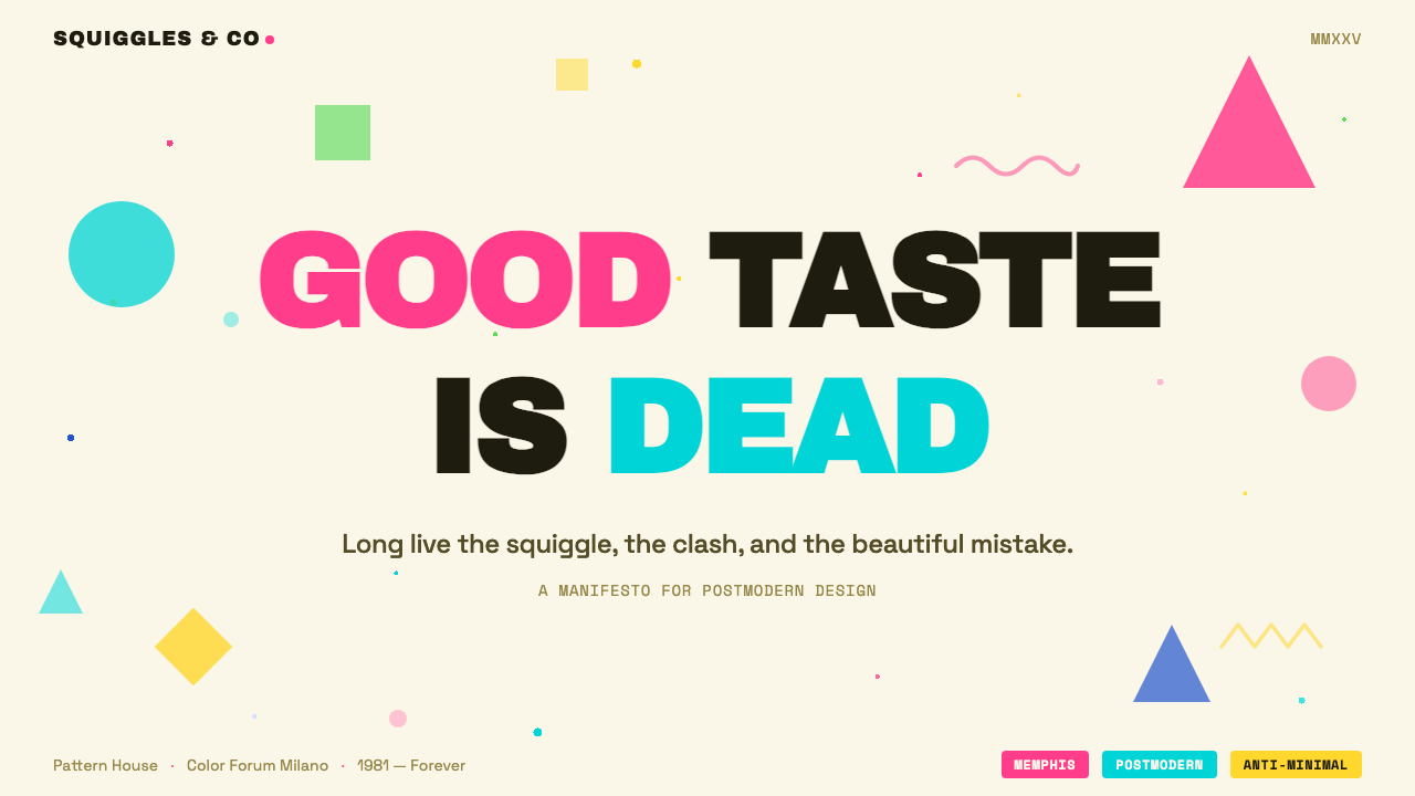
Memphis color is anti-harmony by principle. Hot pink, electric turquoise, sunshine yellow, cobalt blue, and lime green are not arranged to complement each other — they are placed side by side specifically because they clash. The palette descends from Pop Art's appropriation of commercial printing's most saturated inks and is filtered through 1980s Italian irreverence. The neutral base is a warm cream evoking terrazzo flooring, speckled rather than plain. No two adjacent colors should feel at ease with each other; visual tension is the goal, not visual balance.孟菲斯的色彩以反和谐为原则。荧光粉、电光青、明黄、钴蓝与草绿并置,不是为了互补,而是恰恰因为它们会撞色。这套色板源自波普艺术对商业印刷最饱和油墨的挪用,经由八十年代意大利的不羁气质过滤而来。中性底色是暖奶油色,令人联想到水磨石地板,有碎点而非素面。相邻的两种颜色不应让人感到舒适——视觉张力才是目标,而非视觉平衡。
Pattern Surfaces图案表面
One of Memphis's most distinctive contributions is its surface decoration: laminate sheets printed with patterns — terrazzo speckle, squiggly lines, diagonal stripes, polka dots, geometric mesh — applied to furniture, walls, and objects. These patterns do not communicate structural information; they exist purely as visual texture and noise. In two-dimensional applications, the same logic translates to decorated backgrounds, patterned fills, and ornamental dividers that would be strictly forbidden in modernist or Swiss-style work.孟菲斯最独特的贡献之一是其表面装饰:印有图案的贴面板——水磨石碎点、蜿蜒曲线、斜线条、波点、几何网格——被应用于家具、墙面与器物之上。这些图案不传递结构信息;它们的存在纯粹是作为视觉质感与噪声。在二维应用中,同样的逻辑转化为装饰性背景、图案填充和装饰性分割线——这些在现代主义或瑞士风格的作品中会被严格禁止的元素。
Geometry Without Resolution拒绝化解的几何
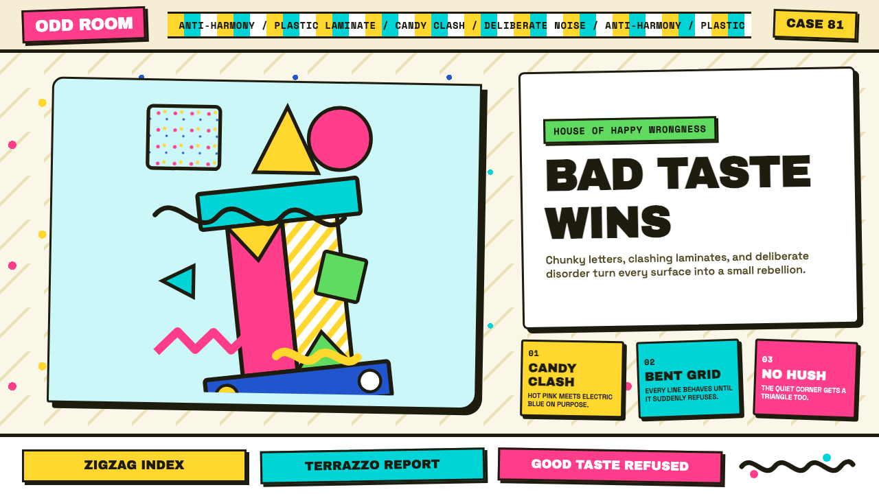
Memphis uses the same geometric vocabulary as the Bauhaus — circles, triangles, rectangles, zigzags — but deploys them in a fundamentally different spirit. Where Bauhaus geometry seeks order, resolution, and structural clarity, Memphis geometry is deliberately unresolved: shapes are juxtaposed at odd angles, overlapped without hierarchy, and scaled in ways that feel arbitrary rather than systematic. The Carlton bookcase — a totemic zigzag form in clashing laminate colors — became the movement's icon precisely because it looks like a geometry lesson interrupted by a practical joke.孟菲斯使用与包豪斯相同的几何词汇——圆形、三角形、矩形、锯齿形——但以根本不同的精神部署它们。包豪斯几何追求秩序、化解与结构清晰,而孟菲斯几何是刻意不化解的:形状以奇怪的角度并置,无层级地叠压,以感觉随意而非系统性的方式缩放。卡尔顿书架——一个用撞色贴面做成的图腾式锯齿形态——之所以成为这场运动的图标,恰恰是因为它看起来像一堂被恶作剧打断的几何课。
Hard-Offset Shadow硬边偏移投影
Memphis depth is cartoonish and literal. Shadows are hard-edged blocks of solid near-black, offset consistently to the lower right at a small but noticeable fixed distance. There is no blur, no gradient, no ambient occlusion. The effect reads like a popup book or a poorly registered screenprint: flat objects cast flat shadows, and the whole composition feels like it was assembled by cutting and placing shapes rather than by rendering a lit scene. This technique became one of the most widely borrowed elements of the Memphis visual vocabulary.孟菲斯的深度感是卡通式的、字面意义上的。投影是硬边实心的近黑色色块,以固定距离统一向右下方偏移——偏移距离小而明显。没有模糊,没有渐变,没有环境遮蔽。效果读起来像立体书或套印不准的丝网印刷:平面物体投出平面阴影,整个构图感觉像是通过剪切和摆放形状拼装而成,而非对一个被照亮场景的描绘。这种技法成了孟菲斯视觉词汇中被借用最广泛的元素之一。
Asymmetric Composition非对称构图
Memphis layouts are structured but refuse equilibrium. Elements are positioned off-axis, rotated, or placed at the edge of the canvas in ways that create energy rather than rest. The grid exists but is there to be broken: a circle might intrude from outside the frame, a text block might sit at an unexpected diagonal, a decorative shape might overlap two otherwise distinct content areas. This dynamic instability distinguishes Memphis from the principled asymmetry of Bauhaus — the Memphis version feels wilful and playful rather than rigorously calculated.孟菲斯的版面是有结构的,但拒绝平衡。元素被偏轴放置、旋转,或放置于画布边缘,制造能量而非安定感。网格存在,但就是为了被打破:一个圆形可能从画框外侵入,一块文字可能以意外的对角线方式安置,一个装饰形状可能叠压两个原本独立的内容区域。这种动态不稳定性将孟菲斯与包豪斯有原则的非对称区别开来——孟菲斯版本感觉是任性而好玩的,而非经过严格计算的。
Playful Typography趣味排印
Memphis typography favors chunky, assertive geometric sans-serif typefaces — letterforms with maximum visual weight, zero delicacy, and an almost silkscreen-poster quality. Headings are sized aggressively large, as if the text might burst through the frame. All-caps labeling is common. The type system does not aim for elegant hierarchy; it aims for presence and loudness. Unlike Bauhaus typography, where type serves the grid, Memphis type treats letterforms as decorative objects in their own right — to be scaled, colored, and positioned with the same recklessness as any other shape.孟菲斯的排印偏爱粗壮、强势的几何无衬线字体——视觉重量最大化、零纤细感、几乎具有丝网印刷海报质感的字形。标题被激进地放大,仿佛文字随时会冲破画框。全大写标注很常见。字体系统的目标不是优雅的层级,而是存在感与响亮感。与包豪斯排印——字体服务于网格——不同,孟菲斯把字形本身当作装饰对象,以对待任何其他形状同样鲁莽的方式对其进行缩放、着色和定位。
Material Abundance材料丰盛
The original Memphis furniture was built from cheap industrial materials — plastic laminates, glass, metal tubes — that were traditionally considered unsuitable for serious design. Sottsass's choice to use these materials was partly a political statement about access and taste, and partly a formal one: laminate could be printed with any pattern, which meant surface decoration was unlimited in a way that natural wood grain or marble could not be. In digital design, this principle translates to a willingness to use visual elements — gradients, patterns, fills — that would be considered excessive in more austere aesthetics.原版孟菲斯家具由廉价工业材料制成——塑料贴面、玻璃、金属管——这些材料传统上被认为不适合严肃设计。索特萨斯选择这些材料,部分是关于获取与品味的政治声明,部分是形式上的考量:贴面可以印上任何图案,这意味着表面装饰在自由度上远超天然木纹或大理石。在数字设计中,这一原则转化为一种意愿——使用在更朴素的美学中会被视为过度的视觉元素:渐变、图案、填充。

See the Memphis (Sottsass 1981) design system查看 Memphis (Sottsass 1981) 完整设计系统
Who shaped Memphis (Sottsass 1981)?谁塑造了 Memphis (Sottsass 1981)?
Sottsass was the intellectual and spiritual center of Memphis. His earlier career at Olivetti — designing typewriters and early personal computers with a sensibility that bridged industrial utility and sculptural form — gave him credibility in mainstream design circles that Memphis's younger members lacked. His founding role and his articulate defense of the movement's principles (he gave extensive interviews arguing that Memphis was about liberation from good taste as an oppressive norm) shaped how Memphis was received and discussed. After dissolving the group in 1987, he continued designing independently until his death in 2007.索特萨斯是孟菲斯的思想与精神核心。他早年在奥利维蒂的职业生涯——以融合工业实用性与雕塑形态感性的方式设计打字机和早期个人电脑——赋予了他在主流设计圈的信誉,这是孟菲斯年轻成员所不具备的。他的创始角色以及他对运动原则的雄辩捍卫(他接受了大量采访,论证孟菲斯是关于从作为压迫性规范的“好品味”中解放出来),塑造了孟菲斯被接受和讨论的方式。1987年解散团体后,他持续独立设计直至2007年辞世。
De Lucchi was among the founding members and one of Memphis's most prolific designers. His work epitomized the movement's visual energy: his First Chair (1983) — a steel sphere on a thin pole with a circular backrest — became one of the most recognizable objects of the decade. He had previously been involved with Studio Alchimia, the radical design laboratory that prefigured Memphis's anti-functionalist stance. After Memphis, de Lucchi went on to a distinguished career in corporate design, demonstrating that the movement's alumni were not limited to countercultural provocation.德卢基是创始成员之一,也是孟菲斯最多产的设计师之一。他的作品体现了这场运动的视觉能量:他的“第一把椅”(1983年)——一根细杆上的钢球配以圆形靠背——成为那个十年最具辨识度的物件之一。他此前曾参与阿尔基米亚工作室,那个预示了孟菲斯反功能主义立场的激进设计实验室。孟菲斯之后,德卢基开辟了杰出的企业设计职业生涯,证明了这场运动的校友并不局限于反文化挑衅。
Du Pasquier was the driving force behind Memphis's textile and surface pattern design. A self-taught designer who had traveled extensively through Africa and Asia before joining the group, she brought an anthropological sensitivity to decoration — treating pattern as a carrier of cultural meaning rather than mere visual noise. Her laminate patterns — geometric repeats, abstract organic forms, kaleidoscopic arrangements — defined the tactile identity of the Memphis aesthetic and remain its most widely reproduced visual element today.杜帕斯基耶是孟菲斯纺织品与表面图案设计的驱动力。这位自学成才的设计师在加入团体之前曾广泛游历非洲与亚洲,为装饰带来了人类学式的敏感——将图案视为文化意义的载体,而非单纯的视觉噪声。她的贴面图案——几何重复纹样、抽象有机形态、万花筒式排列——界定了孟菲斯美学的触觉身份,至今仍是其被复制最广泛的视觉元素。
Sowden, a British designer who had settled in Milan, contributed some of the movement's most distinctive product designs, including clocks, watches, and appliances where the functional object was simultaneously a visual provocation. His work demonstrated that Memphis principles could be applied to products requiring precise engineering, not just expressive furniture. He also developed significant work in textile and pattern design alongside du Pasquier, and continued designing and writing about the relationship between handcraft and industrial production after Memphis dissolved.索登是定居米兰的英国设计师,为这场运动贡献了一些最具辨识度的产品设计,包括时钟、手表和家电——功能性物件同时是视觉挑衅。他的工作证明了孟菲斯原则可以应用于需要精确工程的产品,而不仅仅是表现性家具。他还与杜帕斯基耶合作了大量纺织品与图案设计,并在孟菲斯解散后持续设计并撰文探讨手工艺与工业生产之间的关系。
Radice was not primarily a designer but the movement's theorist and chronicler. As Sottsass's partner and the author of the definitive 1984 book 'Memphis: Research, Experiences, Results, Failures and Successes of New Design', she gave the movement its most articulate intellectual framing. Her writing argued that Memphis was not decoration for decoration's sake but a critique of the cultural assumptions embedded in 'good taste' — the idea that restraint, neutrality, and refinement are values rather than the preferences of a particular class. Without Radice's theoretical work, Memphis might have remained a striking but poorly understood episode.拉迪斯主要不是设计师,而是这场运动的理论家与记录者。作为索特萨斯的伴侣和1984年权威著作《孟菲斯:新设计的研究、经验、成果、失败与成功》的作者,她为这场运动提供了最清晰的思想框架。她的写作论证,孟菲斯不是为装饰而装饰,而是对嵌入“好品味”中的文化假设的批判——那种认为克制、中性与精炼是价值观而非特定阶层偏好的观念。没有拉迪斯的理论工作,孟菲斯或许只会停留于一段引人注目但鲜为人理解的插曲。
How do you use Memphis (Sottsass 1981) today?今天怎么用 Memphis (Sottsass 1981)?
Memphis transfers into digital work with unusual directness, because its visual logic is already two-dimensional and pattern-based. The key insight for any application is that Memphis is not an accent — you cannot add a few squiggles to an otherwise conventional layout and call it Memphis. The style works when it governs the entire compositional system: the color palette, the shadow treatment, the surface patterns, the typographic scale, the willingness to let elements collide. Applying it at half-measures produces muddle, not energy.孟菲斯以不寻常的直接性迁移到数字作品中,因为其视觉逻辑本就是二维且基于图案的。任何应用的关键认识在于:孟菲斯不是一种点缀——你不能在一个原本普通的版面上加几条曲线,然后称之为孟菲斯。这种风格在统治整个构图系统时才有效:色板、投影处理、表面图案、排印尺度,以及让元素相互碰撞的意愿。半途而废的应用产生的是混乱,而非能量。
For presentation slides, Memphis is particularly effective for keynote-style covers and section dividers. A Memphis cover slide benefits from a strongly asymmetric layout: place the title in a bold uppercase geometric sans at scale large enough to feel oversized, anchor one corner with a geometric shape in a clashing color (a hot-pink circle against a turquoise background, for instance), and scatter a terrazzo dot pattern across the remaining surface. Section divider slides should use full-bleed color blocks — each section in a different saturated hue — with minimal text. Data slides require more restraint: use Memphis color to encode categories in charts (one hue per series, fully saturated, no desaturated neutrals) but keep the chart backgrounds plain cream to avoid competing with the data itself.在演示文稿中,孟菲斯对主题演讲式封面和章节分割页特别有效。一张孟菲斯封面页受益于强烈的非对称构图:将标题以粗重全大写几何无衬线字体排置,字号大到感觉有些过分;用一个撞色的几何形(比如青底上的荧光粉圆形)锚定某个角落;在剩余表面散布水磨石碎点图案。章节分割页应使用全出血的色块——每个章节一种不同的饱和色调——文字极简。数据页需要更多克制:用孟菲斯色彩在图表中编码类别(每个系列一种颜色,完全饱和,不用去饱和的中性色),但保持图表背景为素净的奶油色,避免与数据本身竞争。
For web UI — dashboards, pricing pages, and product landing pages — Memphis delivers energy that no other historical style matches. The dashboard application works best when the widget system is built around hard-offset shadow cards — a solid dark block offset to one corner, no blur, a bold black border — on a warm cream page background. Use saturated color to encode status and category, not just for decoration: metric cards can be hot pink for warnings, electric turquoise for active states, and yellow for neutral/informational. Pricing page tiers benefit from full-bleed colored sections — one tier per color block — with the recommended tier highlighted by a thicker black border and a contrasting shadow. Navigation should be typographic-only, with the wordmark in a heavy geometric sans.对于网页界面——仪表板、定价页面与产品登陆页——孟菲斯传递的能量是其他任何历史风格都无法匹敌的。仪表板应用在组件系统围绕硬边偏移阴影卡片构建时效果最佳——实心深色色块偏移至一角,无模糊,粗重黑色边框——置于暖奶油色页面背景上。用饱和色彩编码状态与类别,而非仅用于装饰:指标卡可以用荧光粉表示警告、电光青表示活跃状态、黄色表示中性/信息状态。定价页面的等级层次受益于全出血的彩色区块——每个层级一种色块——推荐层级以更粗的黑色边框和对比性投影突显。导航应仅为排印性,文字标识采用粗重几何无衬线字体。
For editorial and marketing work — posters, social media graphics, event branding, and packaging — Memphis is near-ideal. The style's poster heritage means it scales down to small formats (Instagram square, story card) without losing legibility, because the visual system is built on bold shapes rather than fine detail. A Memphis marketing graphic works with a maximum of three elements: a bold typographic statement, a geometric shape or pattern fill, and a hard border or offset shadow. Resist the urge to add photography — Memphis is a graphic system, not a photographic one, and mixing the two dilutes both.对于编辑与营销内容——海报、社交媒体图形、活动品牌与包装——孟菲斯几近理想。这种风格的海报传承意味着它缩小到小尺幅(Instagram方图、竖屏卡片)时不失易读性,因为视觉系统建立在粗壮形状而非精细细节上。一张孟菲斯营销图形只需三个元素:一句粗体排印声明、一个几何形或图案填充,以及一条硬边框或偏移阴影。抵制加入摄影的冲动——孟菲斯是图形体系,不是摄影体系,两者混合会稀释彼此。
The most common mistake when applying Memphis is confusing energy with chaos. Memphis is not random — its apparent disorder is carefully controlled. The underlying grid is always present, even when it is being broken. The color clashes are deliberate pairings, not arbitrary combinations. A design that simply throws saturated colors and irregular shapes at the screen without this underlying structure will look accidental rather than provoked. The discipline: always start with a clear grid, choose a specific color pairing rather than the full palette simultaneously, and let the asymmetry and clashes emerge from deliberate decisions rather than from the absence of decisions.应用孟菲斯时最常见的错误是混淆了能量与混乱。孟菲斯并非随机——它表面上的无序是经过精心控制的。底层网格始终存在,即便它正在被打破。色彩碰撞是刻意的配对,而非任意的组合。一个仅仅把饱和色彩和不规则形状扔向屏幕、缺乏这种底层结构的设计,看起来会像是意外,而非挑衅。自律的方法是:始终从清晰的网格出发,选择特定的色彩配对而非同时使用整个色板,让不对称与碰撞从刻意的决定中涌现,而非从决定的缺席中产生。
See the Memphis (Sottsass 1981) design system查看 Memphis (Sottsass 1981) 完整设计系统
Memphis (Sottsass 1981) — FAQMemphis (Sottsass 1981) · 常见问题
What is the Carlton bookcase and why does it matter?卡尔顿书架是什么?为什么它如此重要?
The Carlton bookcase, designed by Sottsass for the first Memphis collection in 1981, is a six-foot-tall asymmetric tower of shelves built from laminate-covered particleboard. Its profile is an irregular zigzag — no two horizontal planes at the same height, no vertical element quite plumb — and its surfaces are covered in the movement's signature clashing laminates: terrazzo speckle, solid hot colors, diagonal stripe. It became Memphis's most reproduced icon because it makes the movement's principles physical: it is usable as furniture (it holds books and objects) while being simultaneously a sculpture, a manifesto, and a deliberate visual assault. A rational bookcase has shelves that align; Carlton's refusal to align is the argument.卡尔顿书架由索特萨斯为1981年第一届孟菲斯系列设计,是一件约1.8米高的非对称书架塔,由贴面刨花板构成。其轮廓是不规则的锯齿形——没有两个水平层面在同一高度,没有垂直元素完全垂直——表面覆盖着这场运动标志性的撞色贴面:水磨石碎点、纯色高彩、斜线条纹。它成为孟菲斯被复制最多的图标,因为它将运动的原则变成了物质:它可以作为家具使用(能放书和物件),同时又是一件雕塑、一份宣言和一场蓄意的视觉冲击。一个理性的书架让搁板对齐;卡尔顿拒绝对齐,就是它的论点。
Is Memphis the same as 80s retro or vaporwave?孟菲斯和80年代复古风或蒸汽波是同一回事吗?
They overlap in cultural mood and period reference but are distinct visual systems. Memphis is a specific design movement with identifiable principles: hard-offset shadows, terrazzo patterns, thick black borders, geometric sans typography, and deliberate color clash. Vaporwave draws on 1980s and early 1990s digital aesthetics — glitch artifacts, early CGI textures, pastel gradients, and a sense of corporate optimism gone melancholy — and is primarily photographic and atmospheric. 80s retro is a broader, more diffuse category that borrows from multiple sources including Memphis but also from neon-on-dark aesthetics, sport typography, and early video game graphics. Memphis is the more intellectually grounded of the three and is the one most associated with designed objects and interiors rather than digital or screen culture.它们在文化情绪和时代参照上有重叠,但是截然不同的视觉体系。孟菲斯是有可辨识原则的特定设计运动:硬边偏移投影、水磨石图案、粗黑边框、几何无衬线排印,以及刻意的撞色。蒸汽波汲取的是1980至90年代初的数字美学——故障碎片、早期CGI质感、粉彩渐变,以及一种变为忧郁的企业乐观主义——主要是摄影性和氛围性的。80年代复古是更宽泛、更分散的类别,借鉴自多个来源,包括孟菲斯,但也包括黑底霓虹美学、运动排版与早期电子游戏图形。三者之中孟菲斯思想基础最为扎实,也最与设计物品和室内空间相关,而非数字或屏幕文化。
Why did Memphis only last six years as a movement?孟菲斯作为运动为何只持续了六年?
Sottsass dissolved the group in 1987, reportedly because he felt Memphis was becoming a style — a set of repeatable surfaces and moves — rather than a provocation. The movement had succeeded almost too well: its aesthetic had been absorbed into fashion, graphic design, television, and consumer products so quickly that the original critique of good taste had become, ironically, its own new form of good taste. The group was also practically a coalition of independent designers rather than a studio, and the commercial success of early Memphis pieces had drawn the members toward individual celebrity careers. Sottsass himself was characteristically honest about this: the dissolution was not a failure but a recognition that the argument had been made and it was time to stop repeating it.索特萨斯于1987年解散团体,据报道原因是他感到孟菲斯正在变成一种风格——一套可以重复的表面与手法——而非一种挑衅。这场运动成功得几乎太快:它的美学被时装、平面设计、电视与消费品如此迅速地吸收,以至于对“好品味”的原初批判,讽刺地成为了一种新的好品味。团体在实践上也是独立设计师的联盟而非工作室,早期孟菲斯作品的商业成功将成员拉向了各自的明星职业轨道。索特萨斯本人对此一如既往地坦诚:解散不是失败,而是一种认识——论点已经阐明,是时候停止重复了。
How does Memphis relate to Postmodernism in architecture?孟菲斯与建筑领域的后现代主义有何关联?
Memphis is the furniture-and-product equivalent of Postmodern architecture's challenge to Modernist orthodoxy. Both share the same intellectual moment — the late 1970s and early 1980s critique of Modernism's rationalist certainties — and many of the same conceptual moves: the embrace of historical reference, the legitimization of decoration, the ironic quotation of vernacular and commercial culture, and the rejection of the idea that there is one correct formal solution to any design problem. Sottsass was in dialogue with architects of the period, and Robert Venturi's arguments in 'Learning from Las Vegas' directly informed the Memphis position. The key difference is scale and duration: Postmodern architecture had a longer institutional life because buildings take longer to build and replace, while Memphis furniture could be purchased, absorbed, and discarded in a season.孟菲斯之于家具与产品设计,相当于后现代建筑之于现代主义正统的挑战。两者共享同一思想时刻——1970年代末至80年代初对现代主义理性主义确定性的批判——以及许多相同的概念动作:拥抱历史引用,使装饰合法化,反讽地引用民俗与商业文化,拒绝认为任何设计问题只有一个正确形式解答。索特萨斯与那个时代的建筑师保持对话,罗伯特·文丘里在《向拉斯维加斯学习》中的论点直接影响了孟菲斯的立场。关键区别在于规模与持续时间:后现代建筑有更长的机构生命,因为建筑物需要更长时间来建造和替换;而孟菲斯家具可以在一个季度内被购买、吸收和丢弃。
Is Memphis suitable for professional or corporate contexts, or only for playful brands?孟菲斯适合专业或企业场景吗,还是只适合趣味品牌?
Memphis sits at the energetic end of the design spectrum and is genuinely ill-suited to contexts that require authority, sobriety, or conservative trust-signaling — finance, healthcare, legal services, or government interfaces are unlikely candidates. However, within the technology and creative industries, Memphis has been adapted for professional use by leaning on its structural bones while restraining its most excessive surface moves. The approach: use the hard-offset shadow system and the thick-border card language (both of which read as bold rather than childish), commit to a two-color palette rather than the full five-color clash, and replace terrazzo pattern backgrounds with solid cream or white. This tightened version retains Memphis's energy and distinctiveness without the kitsch associations that come from full deployment. For any brand where differentiation and personality are competitive assets — SaaS tools, creative platforms, developer tooling — a controlled Memphis application can be more effective than generic minimalism.孟菲斯处于设计谱系中能量最高的一端,对于需要权威感、庄重感或保守信任信号的场景确实不适合——金融、医疗、法律服务或政府界面不太可能是候选。然而,在科技与创意行业内,通过依靠其结构骨架同时克制最过度的表面手法,孟菲斯已被调适用于专业场景。方法是:使用硬边偏移投影体系和粗边框卡片语言(两者读起来都是大胆而非孩子气的),采用双色板而非完整的五色撞色,以素净奶油或白色替代水磨石图案背景。这种收紧的版本保留了孟菲斯的能量与辨识度,却没有完整部署时带来的庸俗联想。对于任何以差异化和个性为竞争资产的品牌——SaaS工具、创意平台、开发者工具——受控的孟菲斯应用可以比泛化极简主义更为有效。
Related design styles相关设计风格
 80s Aerobics Fluoro SpandexNeon refuses restraint. Lime spandex, pink-cyan confetti, and black-stage typ…霓虹拒绝克制:荧光绿氨纶、粉蓝彩屑与黑场大字一起燃烧。
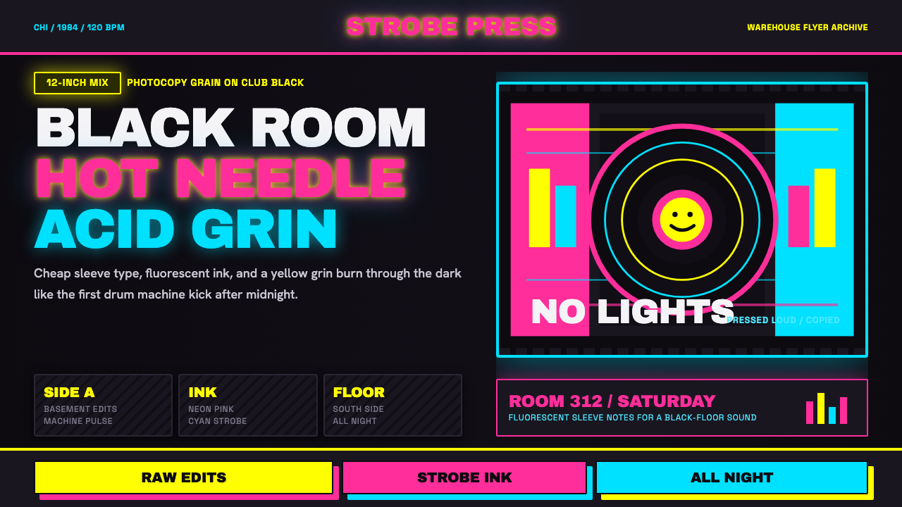 Chicago HouseDarkness starts the track. Neon pink, yellow and cyan hit black like Xerox st…黑暗先起拍。霓虹粉、黄与青打在黑底上,像复印频闪。
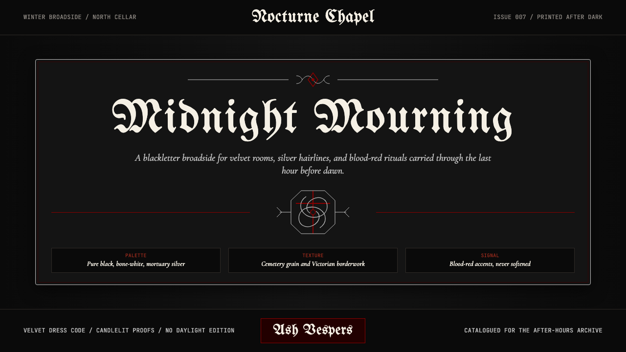 Traditional GothPost-punk in Victorian mourning. Black, blood red, bone white — Bauhaus album…1980 年代后朋克亚文化的视觉:纯黑、血红、骨白、太平间银——维多利亚丧葬美…
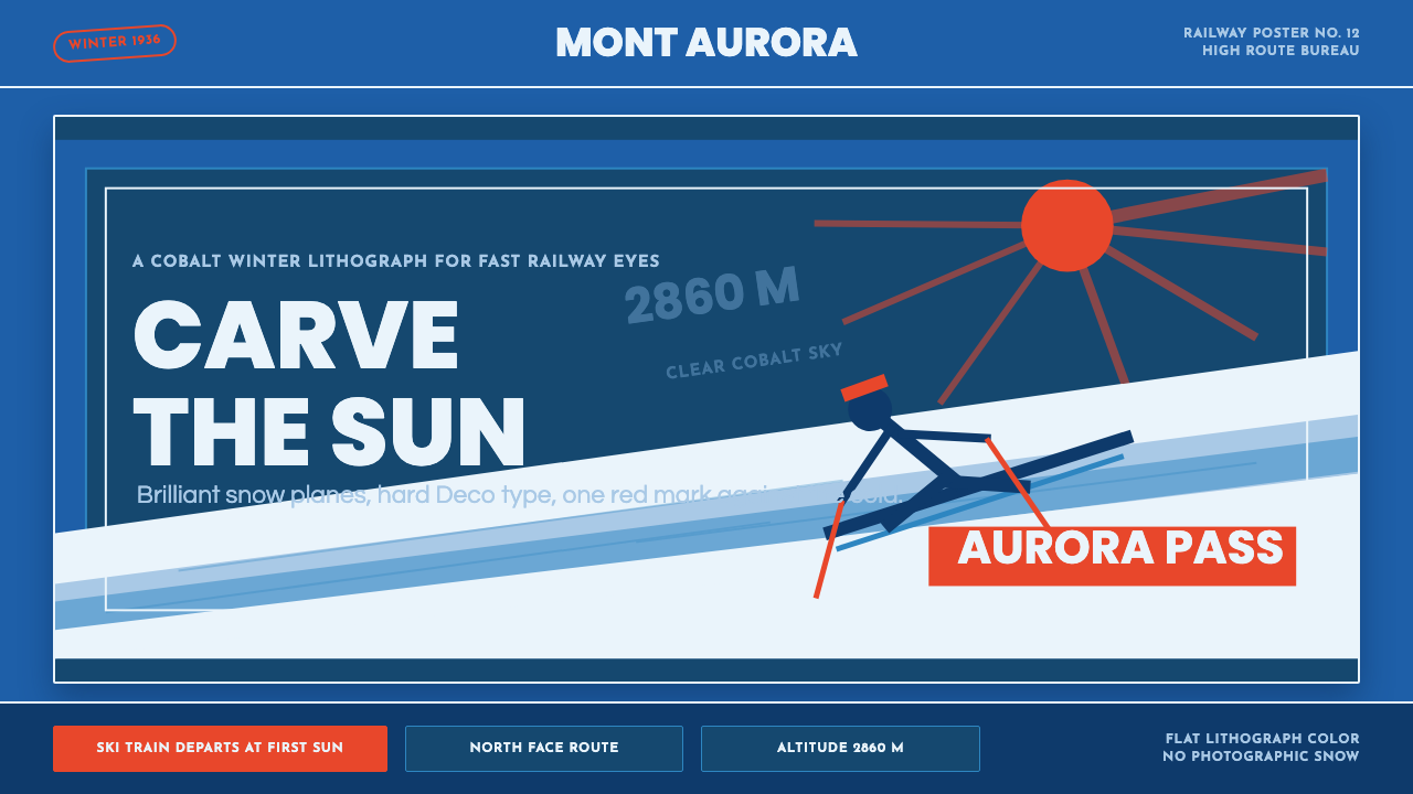 Alpine Ski PosterCold speed sells winter. Cobalt sky, snow planes, sun rays, and one resort-re…冷峻速度贩卖冬日:钴蓝天空、雪白斜坡与一抹度假红。
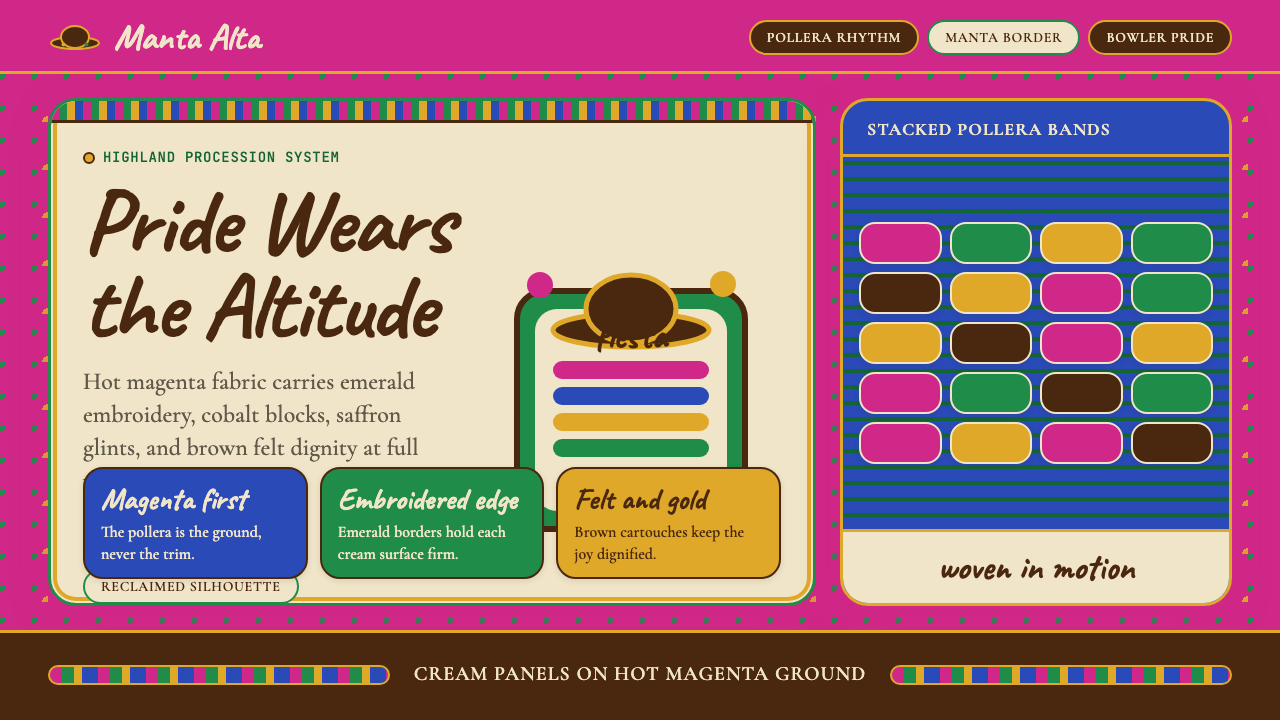 Bolivian Cholita (Bowler-Hat Fiesta)Loud pride, fully reclaimed. Magenta pollera bands, emerald borders, bowler c…骄傲高声回归:洋红波莱拉条带、翡翠边框与礼帽牌匾。
 Poster Stamp (Cinderella)Blazes in miniature. Vermilion stamps, chrome keylines, and toothed edges on…微缩海报在暗底燃烧:朱红邮票、铬黄描边和齿孔边。