What is Traditional Goth?什么是 Traditional Goth?
Post-punk's visual funeral — pure black, blood red, and bone white drawn from Victorian mourning rites and the stark album sleeves of the Batcave era.后朋克的视觉葬礼——纯黑、血红与骨白,源自维多利亚丧葬仪式与蝙蝠洞时代严峻的唱片封套。
Traditional Goth in briefTraditional Goth 速览
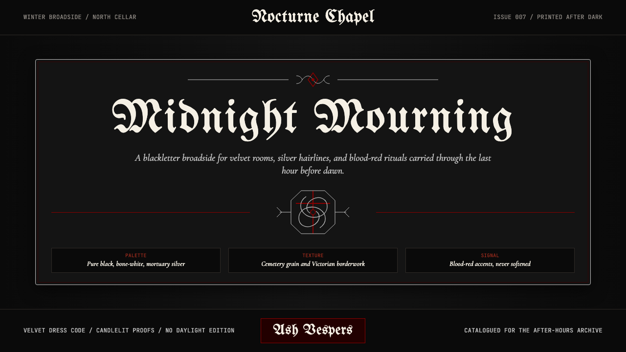
Traditional Goth is the original visual language of the post-punk subculture that crystallized in London and Leeds in the early 1980s. Its palette is a controlled extremity: pure black grounds, blood-red accents that carry the weight of ritual and danger, bone-white or mortuary-silver text that reads like an inscription on stone. Ornament is permitted — but only the right kind of ornament, drawn from Victorian mourning jewelry, blackletter calligraphy, wrought-iron cemetery gates, and the high-contrast photography of artists working within the goth-rock scene.传统哥特是后朋克亚文化的原始视觉语言,于1980年代初在伦敦与利兹凝结成形。它的色板是一种受控的极端:纯黑底色、承载仪式与危险分量的血红点缀,以及读来如同石刻铭文的骨白或太平间银色文字。装饰是被允许的——但只能是特定类型的装饰,源自维多利亚丧葬珠宝、哥特花体书法、铸铁墓地大门,以及哥特摇滚圈内艺术家的高反差摄影。
Unlike minimalism, which strips the canvas bare, Traditional Goth loads the canvas with meaning — but meaning of a specific register: death, beauty, transgression, and the uncanny. Every element is intentional and symbolic. A border is not decoration; it is a frame for something sacred or forbidden. Letterforms are chosen to evoke antiquity and weight rather than legibility or friendliness. Negative space functions as shadow rather than air — the black field is not emptiness but presence.与将画布剥至空白的极简主义不同,传统哥特将画布填满意义——但只属于特定音域的意义:死亡、美、越轨与诡异。每一个元素都是刻意的、象征性的。边框不是装饰,而是某种神圣或禁忌之物的框架。字形的选择是为了唤起古旧与分量,而非易读性或亲切感。负空间作为阴影而非空气运作——黑色底面不是空虚,而是存在本身。
The style's visual DNA is remarkably stable across four decades of revival cycles. Whether encountered on a 1983 cassette insert, a 1990s zine, or a contemporary web presence, Traditional Goth is immediately recognizable: its palette refuses warmth, its typography refuses playfulness, and its ornamental instinct refuses anything that could be mistaken for innocence. That consistency is not rigidity — it is the coherence of a visual system built around a clearly held worldview.这种风格的视觉基因在四十年的复兴循环中保持着惊人的稳定性。无论是在1983年的卡带内页、1990年代的独立志还是当代网站上,传统哥特都能被即刻辨认:它的色板拒绝温暖,它的字体排印拒绝嬉戏,它的装饰本能拒绝一切可能被误解为天真的东西。这种一致性不是僵化——而是一套建立在明确世界观之上的视觉系统所具有的连贯性。
See the Traditional Goth design system查看 Traditional Goth 完整设计系统
Where does Traditional Goth come from?Traditional Goth 从何而来?
The proximate origin of Traditional Goth as a visual style is the night of 6 August 1979, when Bauhaus — a four-piece from Northampton — released the single 'Bela Lugosi's Dead'. The nine-minute track, recorded in a single take, drew on dub reggae space, post-punk austerity, and explicit vampire-film imagery. Its cover art established a template: stark, high-contrast black-and-white photography, no color, a typeface that communicated weight and antiquity. The record did not invent the aesthetic wholesale, but it named and crystallized a set of visual instincts that had been forming around bands like Siouxsie and the Banshees since 1977.传统哥特作为视觉风格的直接起点,是1979年8月6日——来自北安普顿的四人乐队包豪斯发行单曲《贝拉·卢戈西已死》的那一夜。这首录制于单次演奏的九分钟曲目汲取了根特雷吉的空间感、后朋克的简朴与明确的吸血鬼电影意象。其封面图稿确立了一套模板:严峻的高反差黑白摄影,无色彩,字体传达着分量与古旧感。这张唱片并非凭空发明了这套美学,但它为一套自1977年前后在苏克西与女妖乐队等乐队周围逐渐形成的视觉本能命名并使之结晶。
The institutional center of early goth culture was the Batcave Club, which opened in Soho, London in July 1982. Hosted by Ollie Wisdom of the band Specimen, the Batcave became a weekly gathering for bands and fans who shared an aesthetic rooted in black clothing, theatrical makeup, androgynous styling, and a visual culture drawn from horror cinema, Victorian mourning practices, and occult symbolism. The Leeds scene, centered on acts like The Sisters of Mercy and The Mission, developed in parallel, with a slightly more austere and industrial visual register — less cabaret-gothic, more monastic darkness.早期哥特文化的制度性中心是蝙蝠洞俱乐部,于1982年7月在伦敦苏活区开幕。由乐队Specimen的奥利·威斯敦主持,蝙蝠洞成为每周聚集的场所,汇聚了在黑色服装、戏剧化妆容、雌雄同体造型以及源自恐怖电影、维多利亚丧葬习俗与神秘主义符号的视觉文化中共享美学的乐队与乐迷。以慈悲姐妹和传道会等乐队为核心的利兹场景则平行发展,呈现出稍微更朴素和工业化的视觉基调——更少歌舞杂耍式的哥特风,更多修道院式的黑暗。
The visual system that Traditional Goth draws from reaches back much further than the 1980s. Victorian mourning culture, which flourished especially in England after Prince Albert's death in 1861, produced an elaborate visual vocabulary: jet-black jewelry, mourning stationery printed with black borders, memorial portraiture, and elaborate funerary architecture. This culture treated death as an aesthetic occasion and developed highly specific conventions for its representation. Gothic literature and Gothic Revival architecture — the pointed arches, the gargoyles, the wrought-iron railings — provided the architectural and literary substrates that the subculture would later absorb and transform.传统哥特所汲取的视觉系统,其根源远比1980年代更为深远。维多利亚丧葬文化——尤其在阿尔伯特亲王1861年去世后在英格兰蓬勃发展——产生了一套精密的视觉词汇:煤玉黑色珠宝、印有黑色边框的丧葬文具、纪念肖像画,以及精心设计的葬礼建筑。这种文化将死亡视为美学场合,并为其呈现发展出高度特定的惯例。哥特文学与哥特复兴建筑——尖拱、石像鬼、铸铁栏杆——提供了亚文化日后将吸收并转化的建筑与文学基底。
Blackletter calligraphy, the script form associated with medieval manuscripts and Northern European printing traditions, became a typographic anchor for the style. Its dense, vertical strokes communicate authority, antiquity, and a certain illegibility that functions as gatekeeping — this is not a typeface chosen for welcome. Anton Corbijn's photography of bands like Depeche Mode, Joy Division, and The Sisters of Mercy — high-contrast, often desaturated, always striking in its use of shadow — helped establish the photographic grammar of the genre. By the mid-1980s, Traditional Goth had become a stable and self-consistent visual system, one capable of absorbing influences from death-rock in California and darkwave in Europe while retaining its core black-palette severity.与中世纪手抄本和北欧印刷传统相关的哥特花体书法,成为这种风格的字体锚点。其密集的垂直笔画传达着权威、古旧,以及一种作为门槛把守机制的刻意难辨——这不是为迎宾而选择的字体。安东·科尔宾为赶时髦乐团、欢乐分裂和慈悲姐妹等乐队拍摄的摄影作品——高反差、常去饱和、在阴影运用上总是引人注目——帮助确立了这一流派的摄影语法。到1980年代中期,传统哥特已经成为一套稳定且自洽的视觉系统,能够在保留其黑色调核心严峻性的同时,吸收来自加州死亡摇滚和欧洲暗浪的影响。
What defines the Traditional Goth look?Traditional Goth 的视觉特征是什么?
Color色彩
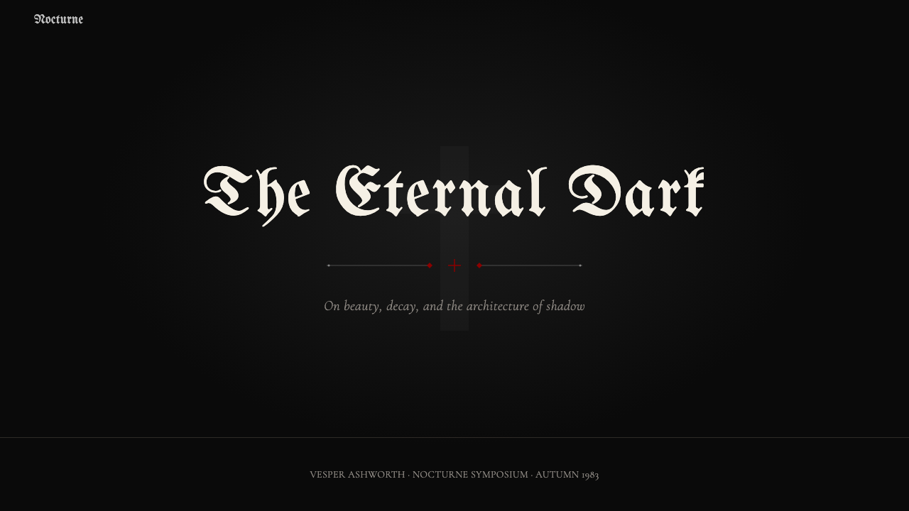
The palette is built around an absolute black ground — not dark grey, not near-black, but the deepest achievable darkness. Against this field, blood red functions as the primary accent: it carries connotations of violence, ritual, and vitality that are held in productive tension with the surrounding black. Bone white or cold grey-white provides the primary reading color for text and fine ornamental detail, evoking ivory, marble, and exposed bone. Mortuary silver — the cool metallic tone of aged metal and candlelight on stone — appears in ornamental elements. No warm tones, no yellows, no soft pinks enter the palette; warmth is categorically excluded as incompatible with the emotional register the style maintains.色板以绝对黑色底面为核心——不是深灰,不是接近黑色,而是可达到的最深暗色。在这一底面之上,血红作为主要点缀色:它承载着与周围黑色保持张力的暴力、仪式与生命力意涵。骨白或冷灰白为文字与精细装饰细节提供主要阅读色,唤起象牙、大理石与裸露骨骼的质感。太平间银——古旧金属与石面烛光的冷金属调——出现于装饰性元素中。没有暖色调,没有黄色,没有柔和的粉色进入色板;温暖感被彻底排除,因为它与这种风格维持的情感音域根本不相容。
Typography字体排印
Blackletter and blackletter-derived letterforms are the typographic signature of Traditional Goth — the dense, vertical strokes and angular terminals that read as both medieval and ceremonial. These are used for display and heading purposes, where legibility can be sacrificed to atmosphere. For body text, a high-contrast serif is common: the kind with pronounced thick-thin stroke variation that reads as both classical and slightly ominous. Condensed letterforms appear frequently, compressing text into vertical columns that reinforce the downward, gravity-pulled visual movement that defines the style. Generous leading and tight tracking at display sizes creates a sense of formal inscription rather than casual communication.哥特花体及其衍生字形是传统哥特的字体排印标志——密集的垂直笔画与棱角分明的终端,读来既属于中世纪又具有仪式感。它们用于展示性和标题性用途,在那里可读性可以为氛围让步。正文通常使用高对比度的衬线字体:那种笔画粗细变化明显、读来既古典又略带不祥感的字体。压缩字形频繁出现,将文字压入垂直列,强化了定义这种风格的向下、受重力牵引的视觉运动。展示尺寸下的宽行距与紧字距,营造出正式铭文而非随意交流的感觉。
Ornament装饰
Where Bauhaus forbids ornament entirely, Traditional Goth requires it — but demands that every ornamental element carry symbolic weight. The vocabulary is drawn from specific historical and subcultural sources: Gothic Revival architectural details (pointed arches, tracery, gargoyle silhouettes), Victorian mourning jewelry motifs (skulls, serpents, weeping willows, jet-black borders), occult and alchemical symbols, wrought-iron scrollwork, and candelabra and cross forms. These elements are never applied casually; they frame, divide, and accent the composition with the deliberateness of a funeral arrangement. Thin filigree borders replace simple ruled lines; ornamental dividers replace plain horizontal rules.包豪斯完全禁止装饰,传统哥特却要求它——但要求每个装饰性元素都承载象征分量。词汇从特定的历史与亚文化来源中汲取:哥特复兴建筑细节(尖拱、花格窗、石像鬼剪影),维多利亚丧葬珠宝母题(骷髅、盘蛇、垂柳、煤玉黑边框),神秘学与炼金术符号,铸铁涡卷纹,烛台与十字架形态。这些元素从不随意应用;它们以葬礼布置的刻意性来框定、划分和点缀构图。细丝花边框替代简单的直线;装饰性分隔符替代平实的水平线条。
Photography and Image摄影与图像
Imagery within Traditional Goth is almost always high-contrast and frequently desaturated to near-monochrome. The photographic grammar established by artists like Anton Corbijn favors dramatic shadow, strong rim lighting against dark backgrounds, and the elimination of mid-tones that might introduce ambiguity or comfort. Subjects are posed with theatrical deliberateness — faces partially obscured, figures in silhouette, environments that read as ruins, crypts, or empty industrial spaces. Representational illustration, when it appears, follows the same logic: cross-hatching and etching traditions produce the fine-line darkness of nineteenth-century engraving. There is no room for bright, documentary, or warmly naturalistic imagery.传统哥特中的图像几乎总是高反差的,并常被去饱和至接近单色。安东·科尔宾等艺术家确立的摄影语法偏爱戏剧性阴影、深色背景前的强轮廓光,以及对可能引入模糊感或舒适感的中间调的消除。主体以戏剧性的刻意摆pose——面孔部分遮蔽,人物成剪影,环境读来如废墟、地下墓穴或空旷工业空间。当具象插图出现时,遵循同样的逻辑:交叉线条与蚀刻传统产生了十九世纪版画的细线黑暗感。没有明亮的、纪录片式的或温暖自然主义的图像的位置。
Spatial Logic空间逻辑
Traditional Goth compositions do not use the clean mathematical grids of Swiss or Bauhaus design. Instead, they organize around a central vertical axis — suggesting processional, ceremonial, or altar-like arrangement — while allowing asymmetric weight at the margins. The black field absorbs negative space, so the operative tension is not between elements and emptiness but between elements and darkness. Dense ornamental frames define the boundary between content and void. Text and imagery tend toward the center or lower half of the composition, anchored as if by gravity or solemnity. There is a heaviness to the spatial distribution that is the opposite of the airy openness of modernist grid systems.传统哥特构图不使用瑞士或包豪斯设计那种整洁的数学网格。相反,它围绕中央垂直轴组织——暗示游行式的、仪式性的或祭坛式的排列——同时允许边缘处的非对称重量。黑色底面吸收负空间,因此有效的张力不是元素与空白之间的张力,而是元素与黑暗之间的张力。密集的装饰性框架定义了内容与虚空之间的边界。文字与图像倾向于构图的中央或下半部,仿佛被重力或庄严感所锚定。这种空间分布的沉重感与现代主义网格系统的通透开放感恰恰相反。
Texture and Surface质感与表面
Unlike the flat, material-honest surfaces of Bauhaus-derived work, Traditional Goth actively cultivates the illusion of physical texture — the grain of aged paper, the bite of letterpress printing into heavy stock, the pitting of corroded metal, the matte surface of stone. These textures are evoked rather than literally reproduced: overlaid noise, distressed type treatments, and uneven ink distribution suggest age and physical materiality. The goal is a surface that feels like it has existed for a long time, that carries the patina of history. Slick, frictionless digital surfaces work against the style; every composition should feel as though it could be held, folded, or worn.与包豪斯衍生作品平整、材料诚实的表面不同,传统哥特积极培育物理质感的幻觉——陈旧纸张的颗粒感、活字印刷在厚纸股上的咬合感、腐蚀金属的坑洼感、石材的哑光表面。这些质感是被唤起而非字面复制的:叠加的噪点、受损的字体处理,以及不均匀的墨水分布暗示着年代与物理材质感。目标是一个感觉已存在很久的表面,承载着历史的包浆。光滑、无摩擦的数字表面与这种风格相悖;每个构图都应感觉像是可以被拿在手里、折叠,或被穿戴的。
Hierarchy and Ceremony层级与仪式感
Information hierarchy in Traditional Goth is not established through the clean size-and-weight logic of modernist typography but through a ceremonial register — what feels most sacred or most forbidden is given the most prominent position and the most elaborate treatment. A band name in massive blackletter at the top of a composition reads as an altar inscription. Supporting text in a finer, lighter weight falls below as a kind of liturgical annotation. The hierarchy mimics the structure of ritual communication: proclamation, then detail, then the fine print that only the initiated will read closely. This ceremonial logic gives Traditional Goth compositions a gravity that purely functional hierarchies rarely achieve.传统哥特中的信息层级不是通过现代主义字体排印的整洁大小与字重逻辑建立的,而是通过仪式性音域——感觉最神圣或最禁忌的内容被给予最突出的位置和最精心的处理。构图顶部以巨幅哥特花体呈现的乐队名读来如同祭坛铭文。以更细、更轻字重排列的支撑文字落于其下,如同一种礼拜式注解。这种层级模仿仪式性传播的结构:宣告,然后是细节,然后是只有入门者才会仔细阅读的细则。这种仪式逻辑赋予传统哥特构图一种纯粹功能性层级很少能达到的庄重感。

See the Traditional Goth design system查看 Traditional Goth 完整设计系统
Who shaped Traditional Goth?谁塑造了 Traditional Goth?
As the vocalist and visual focal point of Bauhaus, Peter Murphy embodied the aesthetic before it had a name. His tall, gaunt frame, theatrical stage presence, and the cover photography for the band's early releases — high-contrast, deeply shadowed, shot to emphasize bone structure and intensity — established the visual template for the goth front-figure. After Bauhaus dissolved in 1983, Murphy's solo career continued to develop and disseminate the aesthetic into the later decades, making him one of the few figures who spanned the style's entire peak and revival arc.作为包豪斯乐队的主唱与视觉焦点,彼得·墨菲在这种美学尚未得名之前便已将其具身化。他高挑而清瘦的身形、戏剧性的舞台存在感,以及乐队早期发行物的封面摄影——高反差、深度阴影、以强调骨骼结构与强烈感为拍摄目的——确立了哥特主唱形象的视觉模板。1983年包豪斯解散后,墨菲的个人生涯持续发展并将这种美学传播至此后数十年,使他成为少数跨越这种风格整个鼎盛期与复兴弧线的人物之一。
Siouxsie Sioux and the Banshees arrived slightly before the term 'goth' was in common use, but their visual vocabulary — high-contrast eye makeup, dramatic hair, monochromatic clothing, and album art rooted in isolation and darkness — became foundational to the style. Siouxsie's visual persona demonstrated that goth aesthetics were not primarily masculine or macabre but could be wielded as a form of confrontational femininity. Her influence on the style's approach to the face as a painted, constructed surface — rather than a natural one to be flattered — remains evident across every revival.苏克西与女妖乐队出现时,「哥特」这个词尚未普及,但他们的视觉词汇——高反差眼妆、戏剧性发型、单色服装,以及扎根于孤立与黑暗的专辑艺术——成为这种风格的基础。苏克西的视觉人格表明,哥特美学并非主要是男性化的或骇人听闻的,而是可以作为对抗性女性气质的形式来运用。她对这种风格处理面孔的影响——将其视为一个被绘制、被建构的表面,而非一个需要被奉承的自然表面——在每一次复兴中都清晰可见。
As the architect of The Sisters of Mercy's visual identity from the band's formation in Leeds in 1980, Andrew Eldritch pushed the aesthetic toward a more austere, high-contrast, and deliberately unromantic register. The band's visual presentation — minimal color, heavy use of stark black-and-white photography, an avoidance of the more theatrical elements of southern English goth — influenced the darkwave and post-goth movements that followed and established a template for how the style could operate at maximum severity without sacrificing visual impact.作为慈悲姐妹乐队自1980年在利兹成立以来视觉身份的设计者,安德鲁·艾尔德里奇将这种美学推向了更朴素、高反差且刻意去浪漫化的音域。乐队的视觉呈现——极少色彩、大量使用严峻的黑白摄影、回避英格兰南部哥特中更多戏剧性元素——影响了随后的暗浪与后哥特运动,并确立了一套模板:这种风格如何在不牺牲视觉冲击力的前提下以最大严峻性运作。
Dutch photographer Anton Corbijn was not a musician but became one of the defining visual architects of the goth and post-punk aesthetic through his photographic work. His images for Joy Division, Depeche Mode, The Sisters of Mercy, and other bands established the photographic grammar of the scene: heavy shadow, desaturated tones, locations that read as post-industrial or ruined, subjects rendered in ways that emphasized isolation and weight rather than celebrity approachability. Corbijn's visual approach proved so influential that it became the default language for serious goth and darkwave promotional imagery well into the 1990s.荷兰摄影师安东·科尔宾并非音乐人,却通过其摄影作品成为哥特与后朋克美学最具定义性的视觉建筑师之一。他为欢乐分裂、赶时髦乐团、慈悲姐妹等乐队拍摄的图像确立了这一场景的摄影语法:浓重阴影、去饱和调子、读来如后工业或废墟的拍摄地点,以强调孤立感与沉重感而非明星亲切感的方式呈现主体。科尔宾的视觉手法影响力如此深远,以至于成为1990年代严肃哥特与暗浪宣传图像的默认语言。
As the front figure of The Cure from the late 1970s onward, Robert Smith bridged the divide between punk, post-punk, and what would become recognized as goth. His visual persona — smeared red lipstick, dark-circled eyes, wild back-combed hair, pallid skin — became one of the most globally recognized visual shorthand for the goth aesthetic. The Cure's album art, particularly across releases in the early to mid 1980s, demonstrated that the Traditional Goth visual system could operate at different temperatures: from the most austere and monochromatic to the more romantically saturated, while retaining the style's fundamental commitment to darkness and emotional extremity.作为1970年代末起治愈乐队的主角,罗伯特·史密斯弥合了朋克、后朋克与后来被认可为哥特的音乐之间的鸿沟。他的视觉人格——涂抹的红色口红、黑眼圈、蓬松反梳的头发、苍白肌肤——成为全球最具辨识度的哥特美学视觉速记之一。治愈乐队的专辑艺术,尤其是1980年代初至中期的发行物,证明了传统哥特视觉系统可以在不同温度下运作:从最朴素的单色到更为浪漫的饱和感,同时保持这种风格对黑暗与情感极端的根本承诺。
How do you use Traditional Goth today?今天怎么用 Traditional Goth?
Traditional Goth translates into contemporary design work most successfully when the application context shares the style's underlying values: seriousness, exclusivity, a certain disdain for mass-market legibility, and a willingness to let atmosphere take precedence over accessibility. The style works poorly for products that need to communicate openness, warmth, or democratic availability. It works exceptionally well for products that want to communicate edge, authenticity, and a specific kind of cultural seriousness — music, independent publishing, fashion at the darker end of the spectrum, immersive entertainment, and certain categories of luxury goods where heritage and darkness are brand values.传统哥特转化为当代设计作品最为成功的时候,是应用场景与这种风格的底层价值共享的时候:严肃、排他性、某种对大众市场易读性的鄙视,以及让氛围优先于可达性的意愿。这种风格对于需要传达开放性、温暖感或民主可及性的产品效果很差。对于想要传达个性、真实性与特定文化严肃感的产品则表现出色——音乐、独立出版、光谱较暗端的时尚、沉浸式娱乐,以及某些遗产感与黑暗感是品牌价值的奢侈品类别。
For presentation slides, Traditional Goth operates best as a full-commitment system rather than a light overlay. A cover slide benefits from the full palette treatment: pure black ground, a single display element in bone-white or blood red — perhaps an ornamental frame or a blackletter headline — and nothing else. Content slides work within a high-contrast framework: white or near-white text on black, with red used only for emphasis or critical data points. Data visualizations should be treated as monochromatic with a single red accent for the most important series or value. Avoid the temptation to introduce mid-tones or warm greys; they immediately dissolve the style's internal logic and read as compromise.在演示文稿中,传统哥特作为完全承诺的系统运作最佳,而非轻度叠加。封面页受益于完整的色板处理:纯黑底面,一个骨白或血红的单一展示性元素——或许是装饰性框架或哥特花体标题——别无其他。内容页在高对比度框架内运作:黑底白色或接近白色的文字,红色仅用于强调或关键数据点。数据可视化应当被处理为单色,以单一红色点缀最重要的数据系列或数值。避免引入中间调或暖灰色的诱惑;它们会立即瓦解这种风格的内在逻辑,读来如妥协。
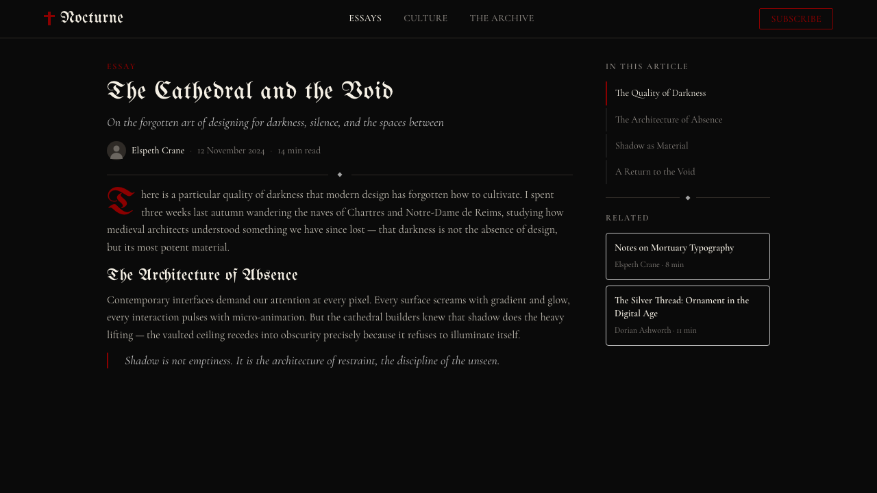
For web interfaces and digital dashboards, Traditional Goth requires careful attention to functional accessibility — the style's commitment to black grounds and fine white text can create contrast ratios that pass readability standards but feel fatiguing over extended sessions. The approach that works best is disciplined restraint in the ornamental layer: use the blackletter and filigree vocabulary for branding and display elements, but keep the interface's functional elements — navigation, data tables, form inputs — in a cleaner, higher-legibility register. Pricing pages and landing pages for goth-adjacent products, event platforms, and music services benefit from the style's poster-like boldness: alternating full-width sections of black and deep charcoal, with bone-white headlines and red calls to action.对于网页界面和数字仪表板,传统哥特需要仔细关注功能性可访问性——这种风格对黑色底面与细白文字的承诺可能创造出通过可读性标准但在长时间使用后让人感到疲劳的对比度。最有效的方法是在装饰层面保持有纪律的克制:将哥特花体与细丝花边词汇用于品牌和展示性元素,但将界面的功能性元素——导航、数据表、表单输入——保持在更整洁、更高易读性的音域。哥特相邻产品、活动平台与音乐服务的定价页面和落地页受益于这种风格的海报式大胆感:黑色与深炭灰的全宽区块交替,配以骨白标题和红色行动号召。
For editorial and marketing work, the style's historical connection to print culture — zines, cassette inserts, festival programs — gives it an authentic material quality that digital reproduction can approximate but never fully replicate. The most effective editorial applications lean into this: they use textured overlays to suggest aged paper, letterpress-weight type treatments for headlines, and the narrow-measure, heavily-leaded body text of zine production. Marketing work for music releases, independent films, or nightlife events can deploy the style's full vocabulary without irony — here it is not a reference or a pastiche but the native language of the audience.对于编辑与营销内容,这种风格与印刷文化的历史联系——独立志、卡带内页、演出节目册——赋予了它一种数字复制可以近似但永远无法完全复制的真实材质感。最有效的编辑应用倾向于此:使用质感叠加层来暗示陈旧纸张,使用活字印刷分量的字体处理来呈现标题,以及独立志生产的窄行宽、大行距正文。音乐发行、独立电影或夜生活活动的营销作品可以不加讽刺地部署这种风格的全套词汇——在这里,它不是引用或仿制,而是受众的母语。
The most common mistake when applying Traditional Goth is treating it as a simple palette swap — replacing white grounds with black and calling the result goth. Authentic application requires engaging with the ornamental vocabulary, the typographic conventions, and the spatial logic of the style. A second common error is mixing warmth into the palette — adding burnt orange, warm brown, or desaturated olive to 'balance' the severity — which immediately signals unfamiliarity with the visual system. A third mistake is lightening the black ground to improve legibility, which collapses the fundamental contrast that gives the style its visual authority. If the black ground must be compromised for accessibility reasons, it is better to acknowledge that this context requires a different style entirely than to apply a diluted version that satisfies neither function nor aesthetic intent.应用传统哥特时最常见的错误是将其视为简单的色板替换——将白色底面换成黑色,然后把结果称为哥特风。真正的应用需要参与这种风格的装饰词汇、字体排印惯例以及空间逻辑。第二个常见错误是将温暖感混入色板——添加焦橙色、暖棕色或去饱和的橄榄色来「平衡」严峻性——这立即表明对这套视觉系统的不熟悉。第三个错误是为提高可读性而将黑色底面调浅,这会瓦解赋予这种风格视觉权威性的根本对比。如果黑色底面必须因可访问性原因而妥协,不如承认这个场景完全需要一种不同的风格,也好过应用一个既不满足功能又不满足美学意图的稀释版本。
See the Traditional Goth design system查看 Traditional Goth 完整设计系统
Traditional Goth — FAQTraditional Goth · 常见问题
Is Traditional Goth the same as Dark Mode or dark UI design?传统哥特与深色模式或深色UI设计是一回事吗?
No — they share a dark ground but are fundamentally different systems. Dark Mode in contemporary interface design is an accessibility and preference feature: it takes a standard light-mode interface and inverts the value relationships, using dark greys rather than pure black, maintaining the same clean sans-serif typography and flat icon systems. Traditional Goth is not an inverted light mode — it is a design language built from the ground up around darkness, ornament, and a specific symbolic palette. Its black is absolute, its typography is chosen for atmosphere rather than legibility optimization, and its ornamental layer is essential rather than optional. Applying dark mode conventions to a goth project produces something that looks like neither.不——两者共享深色底面,但本质上是不同的系统。当代界面设计中的深色模式是一种可访问性与偏好功能:它获取标准的浅色模式界面并反转明度关系,使用深灰色而非纯黑,维持相同的整洁无衬线字体与平面图标系统。传统哥特不是反转的浅色模式——它是一套从零开始围绕黑暗、装饰与特定象征色板构建的设计语言。它的黑色是绝对的,它的字体排印是为氛围而非易读性优化而选择的,它的装饰层是必要的而非可选的。将深色模式惯例应用于哥特项目会产生两者都不像的东西。
Can Traditional Goth work for a brand that is not in the music or fashion space?传统哥特能为音乐或时尚领域之外的品牌服务吗?
Yes, but the application requires honestly assessing whether the brand's values and the style's values are genuinely compatible. The style works well for any product or service that benefits from associations of exclusivity, heritage, darkness-as-brand-value, and a deliberately non-mainstream positioning: certain independent book publishers, niche fragrance houses, occult and esoteric goods retailers, immersive theatre, specific categories of wellness or ritual-adjacent products where the ceremonial register is appropriate, and some categories of whisky or spirits where the darker end of the heritage spectrum is desirable. It works poorly for anything requiring approachability, optimism, or mass-market inclusivity. The test is not whether the brand is in the right industry but whether the emotional register the style produces matches what the brand genuinely wants to communicate.可以,但应用需要诚实评估品牌价值与这种风格价值是否真正兼容。这种风格对任何受益于排他性、遗产感、黑暗作为品牌价值以及刻意非主流定位的产品或服务都效果良好:某些独立图书出版商、小众香水品牌、神秘学与玄学商品零售商、沉浸式戏剧、特定类别的健康或仪式相邻产品(其中仪式性音域是合适的),以及某些遗产光谱较暗端是期望值的威士忌或烈酒类别。对于任何需要亲切感、乐观主义或大众市场包容性的产品,它的效果很差。检验标准不是品牌是否处于正确的行业,而是这种风格产生的情感音域是否与品牌真正想要传达的东西相匹配。
How does Traditional Goth differ from Victorian or Steampunk design styles?传统哥特与维多利亚风格或蒸汽朋克设计风格有何不同?
All three draw on nineteenth-century English visual culture, but they diverge significantly in what they select from it and why. Victorian design as a contemporary style tends toward warmth, richness, and abundance: it embraces jewel tones, gilding, pattern-on-pattern complexity, and a sense of material comfort and display. Steampunk layers Victorian aesthetics with retrofuturist industrial machinery imagery and tends toward warmer browns, coppers, and ambers. Traditional Goth selects specifically the mortuary and ecclesiastical end of Victorian visual culture — the mourning practices, the Gothic Revival architecture, the memorial photography — and strips away the warmth and comfort entirely. The palette is cold where Victorian is warm, the mood is ceremonial and severe where Steampunk is playful and adventurous.三者都汲取自十九世纪英国视觉文化,但在选择什么以及为何选择方面存在显著差异。维多利亚风格作为当代风格倾向于温暖、丰富与丰盛:它拥抱宝石色调、镀金、图案叠图案的复杂性,以及物质舒适与展示的感觉。蒸汽朋克将维多利亚美学与复古未来主义工业机械意象叠加,倾向于更温暖的棕色、铜色与琥珀色。传统哥特专门选取维多利亚视觉文化的丧葬与宗教端——丧葬习俗、哥特复兴建筑、纪念摄影——并彻底剥除温暖感与舒适感。维多利亚风格温暖的地方,哥特色板是冷的;蒸汽朋克嬉戏冒险的地方,哥特氛围是仪式性和严峻的。
Does Traditional Goth have to use blackletter type, or can it work with other typefaces?传统哥特必须使用哥特花体字吗?还是说它可以与其他字体配合使用?
Blackletter is the most historically grounded and immediately recognizable typographic choice, but it is not the only valid one. High-contrast serifs — the kind with pronounced thick-thin stroke variation and fine hairlines — carry significant goth-adjacent weight when deployed at the right scale and in the right palette. Condensed serifs with pointed apexes and terminals can read as goth without reaching for blackletter. What the style cannot accommodate is anything that communicates friendliness, roundness, or contemporary cleanliness: geometric sans-serifs, humanist sans-serifs, rounded terminals, and low-contrast letterforms all undermine the style's tonal register. The blackletter is not mandatory, but the typographic choice must communicate antiquity, weight, and ceremony by whatever means it uses.哥特花体是历史上最有根据、最能被即刻辨认的字体选择,但它不是唯一有效的选择。高对比度衬线字体——那种笔画粗细变化明显、具有精细发丝线的字体——在以正确的尺度和正确的色板部署时,承载着相当大的哥特相邻分量。具有尖锐顶点和终端的压缩衬线字体可以传达哥特感,而无需诉诸哥特花体。这种风格无法容纳的是任何传达亲切感、圆润感或当代清洁感的字体:几何无衬线、人文无衬线、圆角终端,以及低对比度字形都会破坏这种风格的音调基调。哥特花体不是强制性的,但字体选择必须以其使用的任何方式传达古旧感、分量与仪式感。
What is the difference between Traditional Goth and Nu-Goth or Pastel Goth aesthetics?传统哥特与新哥特或粉彩哥特美学有何区别?
Traditional Goth is the root style; Nu-Goth and Pastel Goth are later mutations that modify it by introducing elements the original categorically refused. Nu-Goth, which emerged primarily through Tumblr culture in the early 2010s, retained the black ground and some occult symbolism but introduced cleaner, more minimal typography, contemporary sans-serif fonts, and a generally more internet-native visual sensibility — removing the ornamental density and the historical typographic vocabulary. Pastel Goth goes further, introducing soft pinks, lilacs, and mint greens alongside the black, creating a deliberate aesthetic dissonance that functions as commentary on or subversion of the original. Traditional Goth practitioners typically regard both as dilutions that trade the original's coherent worldview for broader accessibility — which is, in fact, exactly what they do.传统哥特是根源风格;新哥特与粉彩哥特是后来的变体,通过引入原版彻底拒绝的元素来修改它。新哥特主要在2010年代初通过Tumblr文化兴起,保留了黑色底面和部分神秘学符号,但引入了更整洁、更极简的字体排印、当代无衬线字体,以及一种总体上更具互联网原生感的视觉感性——去除了装饰密度与历史字体词汇。粉彩哥特走得更远,在黑色旁边引入柔和的粉色、薰衣草色与薄荷绿,创造出一种刻意的美学失调,作为对原版的评论或颠覆。传统哥特的践行者通常认为两者都是以更广泛的可达性换取原版连贯世界观的稀释——事实上,这正是它们所做的。
Related design styles相关设计风格
 Jungle / Drum & BassRaw rave voltage. Neon green Anton, camo strips, and xerox grain hit black.粗粝锐舞电压。霓虹绿窄体字、迷彩警示条与复印颗粒压上黑底。
 Arcade Cabinet MarqueeToo loud to ignore. Black-indigo glass, violet glow, cyan grids, hot-pink arc…刺眼才对。黑靛玻璃、霓虹紫光、电青网格与品红像素字。
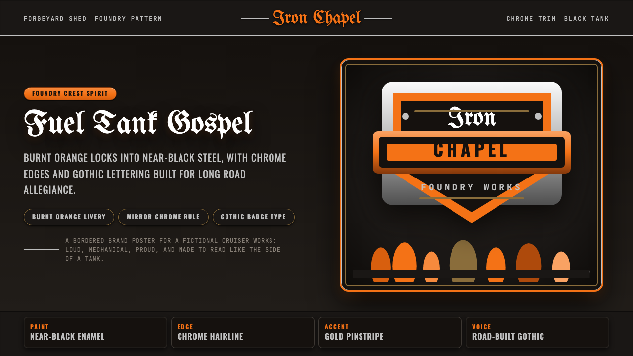 Harley Orange & BlackBuilt like a tank badge. Burnt orange, chrome hairlines, gothic type on near…像油箱徽章般强硬:燃橙、镀铬细线、哥特字压在近黑底上。
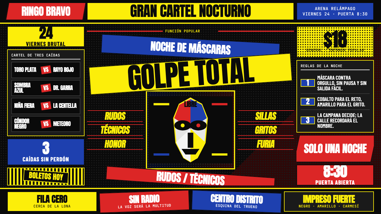 Lucha Libre PosterStreet-poster voltage. Yellow Anton banners, crimson diagonals, cobalt grids…街头高压海报:黑底上的荧光黄Anton、猩红斜线与钴蓝网格。
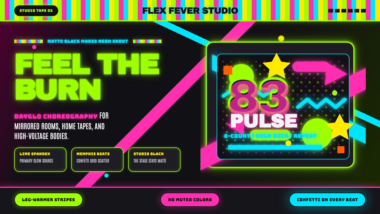 80s Aerobics Fluoro SpandexNeon refuses restraint. Lime spandex, pink-cyan confetti, and black-stage typ…霓虹拒绝克制:荧光绿氨纶、粉蓝彩屑与黑场大字一起燃烧。
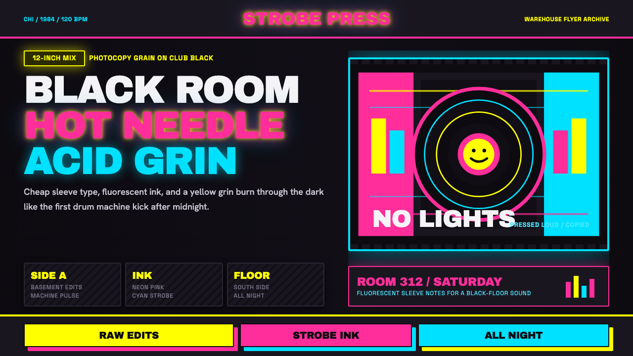 Chicago HouseDarkness starts the track. Neon pink, yellow and cyan hit black like Xerox st…黑暗先起拍。霓虹粉、黄与青打在黑底上,像复印频闪。