What is Harley Orange & Black?
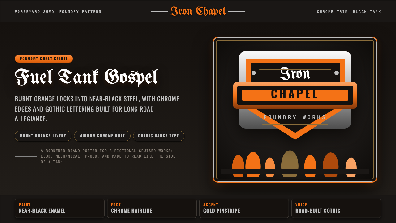
Harley-Davidson turned a Milwaukee backyard shed into a national visual identity — burnt orange and near-black, mirror chrome, and gothic lettering built to be read at highway speed.
Harley Orange & Black in brief
Harley-Davidson Orange & Black is the corporate livery of the oldest continuously operating American motorcycle manufacturer, and it is one of the few commercial color schemes that has escaped the showroom entirely to become a folk symbol in its own right. The system pairs a saturated burnt orange against a tank base of near-black, edges everything in mirror-polished chrome, and sets its wordmarks in a heavy blackletter-derived 'Old English' script bordered by a bar-and-shield badge shape. Nothing about it is subtle, and nothing about it is meant to be.
The visual logic comes from the object it originally decorated: a fuel tank. Every element reads as if it were airbrushed onto sheet metal and lacquered under a dozen coats of clear coat — flame licks radiating from a badge, a banner curling around a name, a chrome accent catching a highlight the way a polished tank catches the sun. Where a Bauhaus poster treats geometry as an argument about function, this style treats ornament as a badge of loyalty: the flame, the eagle, the ribbon are not decoration layered onto a neutral surface, they are the surface.
This makes it a style built for identity marking rather than information hierarchy. It communicates allegiance, permanence, and physical weight — the visual equivalent of a chrome nameplate riveted onto steel. Anywhere a designer needs a system to feel earned and durable rather than optimized and frictionless, this vocabulary is doing real communicative work, not merely borrowing a nostalgic palette.
Where does Harley Orange & Black come from?
Harley-Davidson was founded in 1903 in a wooden shed in the backyard of the Davidson family home in Milwaukee, Wisconsin. Twenty-one-year-old William S. Harley drew up plans for a small engine meant to be fitted to a bicycle frame; his childhood friend Arthur Davidson joined him, and Arthur's brother Walter Davidson soon came aboard as the company's first full-time employee and de facto production chief. A third Davidson brother, William A. Davidson, joined shortly after to run manufacturing. The four men built their first production motorcycle that same year, and by 1905 they had outgrown the shed and erected a proper factory on Chestnut Street, the same Milwaukee site the company still occupies as its historic home ground.
The identity that would define the brand for the next century did not arrive fully formed; the earliest logos were comparatively plain typographic marks. The bar-and-shield emblem — a shield shape banded by a horizontal bar carrying the company name — was adopted in 1910, and it is this badge geometry, not any single color choice, that gives Harley-Davidson graphics their armor-plated, riveted-on quality. The shield borrows the visual authority of a military or heraldic crest and applies it to a machine built in a backyard shed only seven years earlier.
The orange-and-black pairing entrenched itself gradually through the early and middle twentieth century as the dominant livery for tanks, fenders, and dealer signage. Alongside it grew a second, unofficial tradition from outside the factory altogether: the customization culture of postwar American bikers, who airbrushed flames, eagles, skulls, and pin-striping onto tanks in backyard garages rather than corporate design departments. The heavy gothic 'Old English' lettering associated with Harley culture belongs to this same vernacular lineage — borrowed from tattoo parlors, varsity jackets, and outlaw-club patches rather than any in-house type foundry.
By mid-century, the official bar-and-shield mark and the unofficial garage aesthetic of flames, chrome, and script had fused into one recognizable visual culture. Harley-Davidson's own marketing eventually absorbed the vernacular back into its official communications, so that today the brand's advertising and dealership signage draw as heavily on customization-shop iconography as on any centrally designed manual. Few American commercial identities have been so thoroughly co-authored by the customers who ride the product.
What defines the Harley Orange & Black look?
Color
The palette pivots on a single relationship: a hot, slightly burnt orange set directly against a base so dark it reads as near-black rather than true black. The orange is never a clean, primary orange — it leans warm and a touch smoky, closer to the color of a coal ember or an old fuel-tank paint job than to a traffic cone. The near-black ground is not neutral gray-black either; it carries a faint warmth of its own, so the whole pairing feels like metal and heat rather than ink and paper. White and chrome-suggesting light grays appear only as accents — a hairline, a highlight — never as a dominant field.
Typography
Lettering leans on heavy, ornamented blackletter-derived scripts — the 'Old English' family long associated with biker culture — for names, mottos, and badge text, contrasted against sturdy, condensed sans-serifs or slab forms for supporting information. The blackletter forms are dense and vertical, with thick strokes and sharp, almost weaponized serifs; they are meant to be read as an emblem more than as continuous prose, which is why they rarely appear in long passages of text. Supporting type, by contrast, is blunt, compressed, and utilitarian — built for stenciled labels and part numbers rather than elegant reading.
Chrome and Metallic Accents
Every badge, border, and letterform edge behaves as if it were physically plated: a bright, mirror-like highlight runs along one side while a darker reflection sits on the other, simulating the way polished metal catches ambient light unevenly rather than diffusing it. This is not a soft gloss or a uniform shine — it is a hard, directional glint, concentrated in narrow bands rather than spread across a whole surface. The effect gives flat graphic elements a sense of physical thickness and weight, as though the badge could be unbolted from the page.
Ornament and Motif
Flames, eagles, banners, skulls, and pin-striped scrollwork are not applied sparingly as accents — they are structural to the composition, often occupying as much visual weight as the type itself. Flames in particular radiate outward from a fixed point (a badge, a letterform, a tank shape) in tapering tongues that thin toward their tips, echoing the airbrush technique that originated them. Banners curl and fold in three dimensions rather than lying flat, wrapping around other elements the way a physical ribbon would drape over an object.
Badge Composition
The bar-and-shield format — a shield outline crossed by a horizontal band — establishes a compact, centered, symmetrical container that nearly all other Harley-derived graphics echo even when they are not literal badges. This creates a strong instinct toward circular or shield-shaped framing devices, with text curving to follow the container's edge rather than sitting on a straight horizontal baseline. The symmetry is heraldic rather than modernist: it signals authority and permanence through classical balance, the opposite of the asymmetric tension found in movements like Bauhaus or Constructivism.
Contrast and Boldness
Every relationship in the system is pushed toward maximum legibility at a distance and at speed: dark ground against bright accent, thick stroke against thin hairline, dense ornament against clear negative space around the badge itself. Nothing is pastel or muted for the sake of sophistication — the system assumes it will be seen from across a parking lot, not examined up close on a screen.

Who shaped Harley Orange & Black?
Harley drew the original engine design that became the company's founding product and remained its chief engineer for decades, shaping the mechanical identity — heavy, air-cooled, unapologetically loud — that the graphic identity would later represent. His engineering-first temperament set the tone for a company whose visual language, even a century later, still presents itself as hand-built rather than designed by committee.
Davidson co-founded the company alongside his childhood friend William Harley and led sales, marketing, and dealer relationships — the commercial engine that turned a backyard shed project into a national distribution network. His early emphasis on a loyal dealer and rider community laid the groundwork for the customer-driven visual culture that would eventually feed back into the brand's official identity.
Walter Davidson became the company's first full-time employee and its first president, overseeing production discipline as the operation scaled from hand-built machines to an industrial manufacturer. His steady leadership through the company's early decades helped establish the sense of endurance that the brand's badge-and-shield imagery still projects today.
The third Davidson brother joined shortly after the first motorcycles were built and took charge of manufacturing, helping the company move from shed-built prototypes to a repeatable factory process. The discipline he established is what allowed the badge and livery to be applied consistently across thousands of units rather than remaining a one-off hand-painted mark.
How do you use Harley Orange & Black today?
Applying this style well means treating it as an identity system built around a badge, not a generic color scheme laid over any layout. Getting the burnt-orange-on-near-black relationship right is necessary but not sufficient; the badge geometry, the chrome-edge treatment, and the willingness to let ornament carry real visual weight are what separate an authentic application from a shallow palette swap.
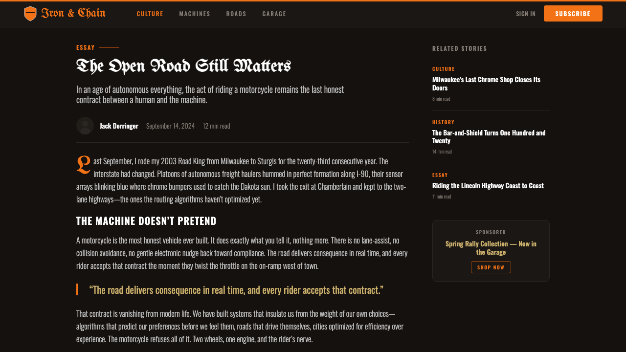
For presentation decks, this vocabulary is strongest on cover slides and section dividers rather than dense data slides. A cover benefits from a centered, symmetrical badge-like composition — title text curving inside a shield-adjacent shape, chrome-style hairline borders framing the card, near-black filling most of the frame with orange reserved for the emblem and headline. Content and data slides need a lighter hand: keep the palette for headers and key callouts, but let body content sit on a calmer, less ornamented surface so text and charts stay legible — a chart rendered entirely in flame-and-chrome ornament will fight the data it is supposed to display.
For web interfaces such as dashboards and pricing pages, the style works best as an accent layered onto a sturdy, high-contrast dark interface: near-black or charcoal surfaces, orange reserved for primary actions and tier badges, a thin bright hairline used sparingly to separate key modules. Pricing tiers suit the badge logic well — a shield-like container around the recommended plan reads as an endorsement mark rather than a generic 'popular' ribbon. Overusing ornament in UI chrome quickly becomes noise; save the flame and scrollwork motifs for marketing surfaces, not for every button and field.
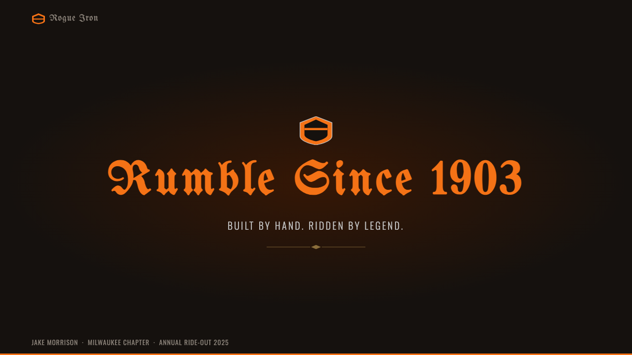
For editorial and marketing work, this is a poster-native style: full-bleed dark backgrounds, a single dominant orange headline or badge, and generous negative space around the emblem so it reads with authority rather than clutter. Feature articles about heritage or craftsmanship benefit from a pull-quote set in the heavy script treatment, used once per page for maximum impact — never for body copy. Marketing pages for automotive, apparel, or heritage brands can lean harder into full ornamental treatment than software interfaces ever should, since the audience expectation is closer to a poster than a productivity tool.
The most common mistake is applying the color pair without the badge geometry or ornamental confidence that make the style legible as Harley-derived rather than merely 'dark mode with an orange accent.' A second mistake is scattering ornament evenly across a layout instead of concentrating it at a few focal points; authentic badge design uses restraint everywhere except the emblem itself, where all the visual density belongs.
Harley Orange & Black — FAQ
Is this the same as generic 'biker' or 'garage' aesthetics?
They overlap but are not identical. Generic biker or garage aesthetics tend to be looser and more varied — grease-stained workbenches, mismatched tools, distressed signage in any color. The Harley-derived system is more disciplined: anchored to a particular orange-and-near-black relationship, a shield-and-bar badge geometry, and a consistent chrome-edge treatment. A garage aesthetic is a mood; this style is closer to a corporate identity that a mood grew up around.
Can this style work in a light or white-background layout?
It is possible but works against the style's core logic. The near-black ground simulates the dark tank paint the orange was originally set against, and it is what makes the chrome-highlight treatment legible — bright relative to a dark field, but with nothing to contrast against on white. A light-background adaptation should keep the badge geometry and ornamental confidence, but will likely need to darken key panels to near-black locally rather than attempting the full palette on a white field.
Why does the ornament (flames, banners, scrollwork) matter so much — isn't the color pairing enough?
The color pairing alone reads as a dark theme with an orange accent — it does not, by itself, signal Harley-Davidson or the biker-Americana tradition it comes from. The ornament carries the specific cultural reference: flames radiating from a badge, banners wrapping in three dimensions, and chrome-edge treatment are all borrowed from a distinct airbrush and pinstriping craft tradition. Without them the palette is generic; with them it reads as a specific, named visual culture with a hundred-plus-year history.
Does this style suit software products, or is it mainly for physical and heritage brands?
It works best where a product wants to signal ruggedness, permanence, or hard-earned authority — automotive and outdoor gear platforms, heritage and craft brands, loyalty programs, or any context where 'built to last' is a genuine value proposition. It is a poor fit for products that need to feel light, friendly, or effortless — the style's grammar argues for weight and permanence, which reads as heavy-handed around speed or approachability. The fit test is whether the brand's actual values align with ruggedness and tradition, not whether the palette merely looks striking.
How does the badge-and-shield symmetry differ from the asymmetric grids used in modernist styles?
Modernist grid systems, including Bauhaus and Swiss International Style, generally use asymmetric composition to create visual tension — a large element balanced against a small one, off-center weighting that guides the eye along a path. Badge-and-shield composition does the opposite: it centers content inside a symmetrical, often mirrored container, borrowing the authority of heraldry and military insignia. Asymmetry signals dynamism and rational structure; badge symmetry signals stability and institutional weight. Neither is more sophisticated — they answer different communicative questions.
Related design styles
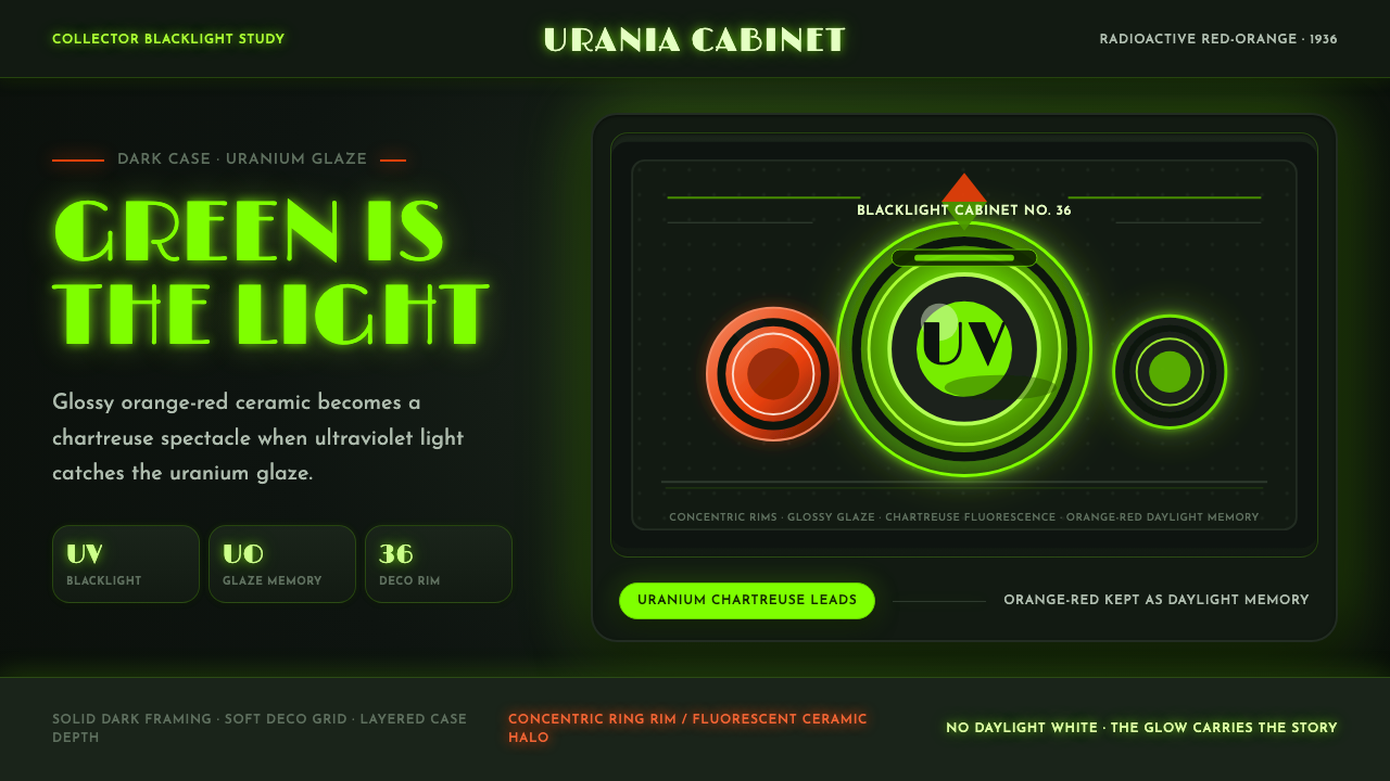 Fiestaware Radioactive Red-OrangeGlows like a collector's secret. Chartreuse rims cut through a dark deco case.
 Hollywood Golden Age (1930)Black-and-gold spectacle commands the night. Marquee bulbs frame monumental D…
 JPL Visions of the FutureSpace travel as print craft. Burnt orange silhouettes and Deco tan type on na…
 Lucha Libre PosterStreet-poster voltage. Yellow Anton banners, crimson diagonals, cobalt grids…
 Art Deco Teal BathroomColour was the modern bath. Water-duck teal glaze, snazzy black trim, Limelig…
 Dieselpunk RetrofutureMachine age, dark and bolted. Gunmetal grid, brass rivets, amber gauge geomet…