What is Streamline Moderne (1930s)?什么是 Streamline Moderne (1930s)?
Streamline Moderne bent speed itself into a design language — aerodynamic curves, chrome-trimmed panels, and racing stripes that taught Depression-era America to read the future as smooth, fast, and inevitable.流线型现代主义把速度本身弯折成设计语言——空气动力学曲线、镀铬边框与赛道条纹,让大萧条时代的美国人学会把未来读作流畅、快速而不可阻挡。
Streamline Moderne (1930s) in briefStreamline Moderne (1930s) 速览
Streamline Moderne is the American industrial design movement of the 1930s and 1940s that translated aerodynamic engineering into a popular visual language. Where Art Deco favored vertical thrust, angular ornament, and exotic materials, Streamline Moderne turned horizontal — speed stripes, teardrop silhouettes, and softly rounded edges wrapped everything from locomotives and ocean liners to kitchen appliances and pencil sharpeners in the promise of effortless forward motion.流线型现代主义是1930至1940年代兴起于美国的工业设计运动,它将空气动力学工程转化为一种大众视觉语言。装饰艺术偏好垂直张力、棱角装饰与异域材料,而流线型现代主义则转向水平——速度条纹、泪滴轮廓与柔和圆角,将从机车、远洋客轮到厨房电器、卷笔刀的一切物件,都包裹进毫不费力向前运动的承诺之中。
The palette is warm and optimistic: creamy off-white grounds offset against deep cherry or poppy red, accented by the cold gleam of chrome and the occasional cerulean or navy stripe. Color is not applied symbolically in the Bauhaus sense but emotionally — the cream-and-chrome combination reads as clean and prosperous, the red stripes as kinetic energy, the rounded corners as the absence of resistance. Nothing about the style is harsh or angular; even its type choices favor letterforms with softened geometry.这种风格的色板温暖而充满乐观:奶油色或米白底面与深樱桃红或罂粟红形成对比,以镀铬的冷光与偶尔出现的天青色或藏青色条纹点缀。色彩的使用不像包豪斯那样具有象征性,而是情感性的——奶油与铬的组合传递洁净与富足,红色条纹象征动能,圆角意味着阻力的消失。这种风格没有任何刺硬或棱角的东西;甚至在字体选择上,也偏好几何感经过柔化处理的字形。
Critically, Streamline Moderne is not about abstraction. It is about legibility and optimism in physical form. The movement believed that if an object looked fast and smooth, it communicated reliability and modernity to everyday people — not just to cultural elites. A toaster shaped like a silver bullet was a promise that domestic life could share in the same technological destiny as an ocean liner crossing the Atlantic.最关键的是,流线型现代主义不追求抽象。它追求的是以实体形态表达可读性与乐观精神。这一运动相信:如果一件物品看起来快速而流畅,它就能向普通人——而非仅仅是文化精英——传达可靠性与现代感。一只造型如银色子弹的烤面包机,是一个承诺:家居生活可以分享远洋客轮横渡大西洋时那同样的技术命运。
See the Streamline Moderne (1930s) design system查看 Streamline Moderne (1930s) 完整设计系统
Where does Streamline Moderne (1930s) come from?Streamline Moderne (1930s) 从何而来?
The movement emerged directly from the psychological wreckage of the Great Depression. After the 1929 stock market crash, American manufacturers faced collapsing consumer demand and needed a way to make people want to buy again. A generation of newly professionalized industrial designers — Raymond Loewy, Norman Bel Geddes, Walter Dorwin Teague, and Henry Dreyfuss among them — recognized that if you could not change the economic reality, you could change how objects felt. Applying the visual language of speed and progress to everyday goods transformed mundane purchases into acts of participation in a better future. The refrigerator was not just an appliance; it was a spacecraft for the kitchen.这一运动直接从大萧条的心理废墟中涌现。1929年股市崩盘后,美国制造商面临消费需求崩溃的困境,迫切需要找到一种让人们重新愿意购买的方式。一代新近职业化的工业设计师——雷蒙德·罗维、诺曼·贝尔·格迪斯、沃尔特·多尔温·蒂格与亨利·德雷夫斯等人——意识到:既然无法改变经济现实,就可以改变物品给人的感受。将速度与进步的视觉语言应用于日常商品,使平凡的购买行为转化为参与更美好未来的行动。冰箱不再只是一件电器,而是厨房里的一艘宇宙飞船。
Aerodynamics provided both the engineering rationale and the aesthetic vocabulary. Wind tunnel research, conducted publicly for automobiles, aircraft, and trains throughout the 1930s, demonstrated that teardrop shapes and smoothed surfaces reduced drag. Designers took this engineering logic and applied it far beyond contexts where aerodynamics actually mattered — a pencil sharpener bolted to a desk generates no drag, but a streamlined casing made it look as though progress were built into its very molecules. This transfer of engineering credibility into consumer objects was the movement's central rhetorical act.空气动力学同时提供了工程学依据与美学词汇。整个1930年代,针对汽车、飞机与火车所进行的风洞研究公开证明,泪滴形与光滑表面能够减少阻力。设计师将这种工程学逻辑运用到远超空气动力学真正适用的场景——一只固定在桌上的卷笔刀根本不产生任何阻力,但流线型外壳让它看起来仿佛进步被内嵌进了它的每一个分子之中。这种将工程可信度转移到消费品上的行为,是这一运动的核心修辞举措。
The style reached its cultural apex in the transportation icons of the mid-1930s. Loewy's redesign of the Pennsylvania Railroad's GG1 locomotive in 1934 demonstrated that industrial design could transform a functional machine into a national symbol. Dreyfuss's 20th Century Limited locomotive for the New York Central, introduced in 1938, became the image of American modernity itself — low, horizontal, clad in shrouding that turned the engine into a single flowing form. The Greyhound bus, the Douglas DC-3 aircraft, the Chrysler Airflow automobile: these were not just products but cultural artifacts that told Americans their civilization was still moving forward despite everything.这种风格在1930年代中期的交通运输标志性作品中达到文化顶峰。1934年罗维对宾夕法尼亚铁路GG1机车的重新设计证明,工业设计能够将一台功能性机器变为一个国家象征。德雷夫斯为纽约中央铁路设计、于1938年面世的「二十世纪特快」机车,成为美国现代性本身的图像——低矮、水平、以整体包覆让发动机成为一个流动的单一形体。灰狗巴士、道格拉斯DC-3飞机、克莱斯勒Airflow轿车:这些不仅仅是产品,而是文化器物,它们向美国人宣告:无论经历了什么,这个文明仍在向前运动。
The movement's influence extended far beyond transportation. Loewy redesigned the Lucky Strike cigarette pack, the Coca-Cola fountain dispenser, refrigerators for Frigidaire, and pencil sharpeners for Gestetner — applying the same aerodynamic logic across an enormous range of domestic and commercial objects. By the late 1930s, Streamline Moderne had become the dominant aesthetic of American consumer culture, appearing on everything from radio housings to gas station canopies to the architecture of World's Fair pavilions. The 1939 New York World's Fair, with its theme of the World of Tomorrow, was its apotheosis: Norman Bel Geddes's Futurama exhibit for General Motors showed a utopian highway system, and the entire fairground read as a built argument that the future had already been designed and was on its way.这一运动的影响远超交通领域。罗维重新设计了幸运牌香烟包装、可口可乐饮料机、Frigidaire冰箱以及Gestetner铅笔刀——将同样的空气动力学逻辑应用于极其广泛的家用与商业物品之上。到1930年代末,流线型现代主义已成为美国消费文化的主导美学,出现在从收音机外壳到加油站遮篷,再到世界博览会展馆建筑的各处。1939年纽约世博会以「明日世界」为主题,是这一运动的极致表达:诺曼·贝尔·格迪斯为通用汽车打造的「未来世界」展览展示了一套乌托邦公路系统,整个展览场地读起来就像一个已被建成的论点——未来已经被设计好,正在来临的路上。
What defines the Streamline Moderne (1930s) look?Streamline Moderne (1930s) 的视觉特征是什么?
Color色彩
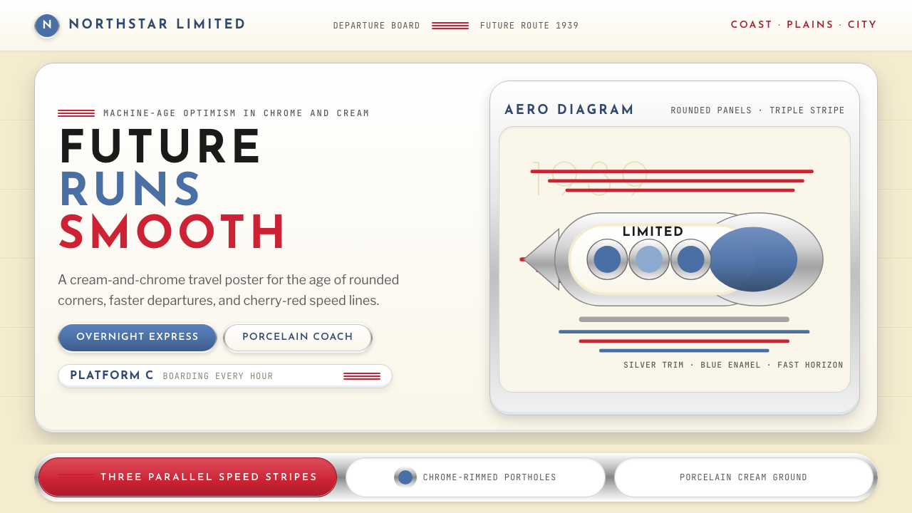
The signature palette is built on creamy off-white or warm ivory grounds — not the pure cold white of modernism, but a softer tone that suggests porcelain enamel and polished surfaces. Against this ground, deep cherry red and occasionally cerulean blue appear as accent stripes and trim, while chrome and silver provide a metallic coolness that prevents the warmth from becoming domestic. Color is applied in bold, confident bands rather than distributed across a surface; the horizontal stripe — two or three parallel lines of saturated color — is the movement's most recognizable motif.标志性色板建立在奶油色或暖象牙底面上——不是现代主义的纯冷白,而是一种更柔和的色调,令人联想到搪瓷与抛光表面。在这一底色之上,深樱桃红与偶尔出现的天青蓝以强调性条纹和饰边的形式出现,而铬色与银色则提供一种金属质感的冷意,防止暖调滑入过于居家的感受。色彩以大胆自信的色带形式运用,而非分散于整个表面;水平条纹——两到三条并行的饱和色线——是这一运动最具辨识度的视觉母题。
Form and Silhouette形态与轮廓
Every object in the Streamline vocabulary reaches toward the teardrop: rounded at the leading edge, tapering toward the rear, with no sharp corners to catch resistance. In two-dimensional work, this translates to softly rounded rectangles, oval frames, and compositions that flow left to right as if moving through air. The silhouette is always smooth and contained — no projecting ornament, no jagged edges, nothing that would interrupt the eye's travel across the surface.流线型词汇中的每一件物体都趋向泪滴形:前缘圆润,向后逐渐收窄,没有任何会产生阻力的尖锐角落。在二维设计中,这转化为柔和圆角矩形、椭圆形框架,以及从左向右流动、仿佛穿越空气的构图。轮廓始终光滑而自足——没有突出的装饰物,没有参差不齐的边缘,没有任何会打断视线在表面滑行的元素。
Speed Lines速度线
The horizontal speed stripe — two or three parallel lines running the full width of a surface — is Streamline Moderne's most direct borrowing from transportation design, where such lines were painted on locomotives and buses to suggest velocity even at rest. In graphic work, these stripes function as both decoration and direction: they establish a strong horizontal axis, guide the eye from left to right, and communicate momentum. Their width and spacing vary, but they are always parallel, always horizontal, and always suggest that the composition is moving.水平速度条纹——两到三条贯穿整个表面全宽的平行线——是流线型现代主义对交通运输设计最直接的借鉴。在机车与巴士上,这类线条被涂绘出来以暗示即便静止时也存在的速度感。在平面设计中,这些条纹同时具有装饰与方向功能:它们建立强烈的水平轴线,引导视线从左向右移动,并传达动量感。条纹的宽度与间距各有变化,但始终平行,始终水平,始终暗示着构图在运动之中。
Chrome and Metallic Accents铬饰与金属感
Chrome trim — the gleaming silver-white border applied to edges, dials, and panels — is structurally integral to the Streamline aesthetic in a way that gold ornament was to Art Deco. It signals technological currency: chrome was a new industrial material in the 1930s, associated with precision manufacturing and scientific progress. In two-dimensional design work, the metallic accent is approximated through light gradients along curved edges, or through the use of silver-toned color alongside warm grounds. The effect is one of controlled luxury — modern rather than antique, industrial rather than handcrafted.镀铬饰边——应用于边缘、表盘与面板的闪亮银白色边框——对流线型美学的结构性意义,正如镀金装饰之于装饰艺术。它传达技术时代感:铬在1930年代是一种新兴工业材料,与精密制造和科学进步相关联。在二维设计中,金属感通过沿弧形边缘的浅淡光晕,或通过银调色彩与暖底色的并置来近似呈现。整体效果是一种克制的奢华——现代而非古典,工业而非手工。
Typography字体排印
Type in the Streamline Moderne tradition favors letterforms whose round strokes have been softened and widened — not the geometric precision of Bauhaus sans-serifs, but something warmer and more rounded, evoking the smooth surfaces of the objects the style celebrated. Display type is often set in wide, expansive letterforms with generous spacing, creating a sense of breadth and confidence. Text blocks are secondary to image and form; the style is fundamentally object-centered rather than text-centered, and headlines function more like labels on a beautiful machine than like arguments.流线型现代主义传统中的字体排印偏好圆弧笔画经过柔化与加宽处理的字形——不是包豪斯无衬线字体的几何精确,而是更温暖、更圆润的感觉,令人联想到这种风格所赞颂的那些物体的光滑表面。展示性文字常以宽展、舒放的字形排设,字间距慷慨,营造出一种宏阔而自信的感受。文字块相对于图像和形态是次要的;这种风格从根本上以物体为中心而非以文字为中心,标题的功能更像是贴在一台美丽机器上的标签,而非某种论述。
Horizontal Composition水平构图
Where Art Deco reaches upward and Bauhaus balances through asymmetric tension, Streamline Moderne lies down and moves sideways. Compositions are strongly horizontal: elements stack in wide bands, images expand to fill the width before the height, and the overall visual weight is low and grounded. This horizontal emphasis was directly inspired by the low-slung profiles of the streamlined vehicles the style was born from — a locomotive hugging the rail, a sedan riding close to the road. On screen or on paper, this produces a sense of stability and forward momentum rather than the upward aspiration of earlier modernist styles.当装饰艺术向上伸展、包豪斯通过非对称张力寻求平衡时,流线型现代主义则横卧并向侧面运动。构图有着强烈的水平性:元素以宽阔的色带堆叠,图像在高度之前先填满宽度,整体视觉重心低沉而稳固。这种水平强调直接受到这种风格诞生自其中的流线型交通工具低矮轮廓的启发——贴地疾驰的机车,紧贴路面行驶的轿车。在屏幕或纸面上,这产生一种稳定与向前动势的感受,而非更早期现代主义风格向上攀升的志向。
Optimism as Aesthetic Principle乐观主义作为美学原则
More than any formal characteristic, Streamline Moderne is distinguished by its emotional register. Designed explicitly as a response to economic despair, every formal choice — the warm palette, the smooth curves, the forward-moving stripes — is in service of a single communicative goal: the future will be better than the present, and the evidence is already here in the shape of things. This is not naive cheerfulness but a deliberate rhetorical strategy, and it gives authentic Streamline work a particular quality of conviction that parodies of the style tend to miss.流线型现代主义最与众不同的,与其说是任何形式特征,不如说是它的情感基调。这种风格被明确设计为对经济绝望的回应,每一个形式选择——温暖的色板、流畅的曲线、向前运动的条纹——都服务于一个单一的传达目标:未来将比现在更好,而证据已经存在于事物的形态之中。这不是天真的乐观,而是一种有意为之的修辞策略;正是这一点,赋予真正的流线型作品一种独特的信念感,而对这种风格的模仿往往会错失这一点。
See the Streamline Moderne (1930s) design system查看 Streamline Moderne (1930s) 完整设计系统
Who shaped Streamline Moderne (1930s)?谁塑造了 Streamline Moderne (1930s)?
Loewy was the movement's most prolific and publicly visible practitioner, described by Time magazine in 1949 as the man who shaped America. Born in Paris and trained as an engineer, he emigrated to the United States in 1919 and built the most commercially successful industrial design practice of the century. His clients ranged from the Pennsylvania Railroad to Studebaker to Shell to NASA, and he applied the same streamlined logic to each: identify the object's forward face, smooth every surface that meets air or eye, and anchor the design with a strong horizontal band. The Pennsylvania Railroad's GG1 locomotive, the Studebaker Avanti, and the NASA Skylab interior demonstrate the breadth of his application of a single formal vocabulary.罗维是这一运动最多产、最广为人知的实践者,1949年被《时代》杂志称为塑造了美国的人。他生于巴黎,受过工程师训练,1919年移居美国,建立了二十世纪商业上最成功的工业设计事务所。他的客户从宾夕法尼亚铁路到斯图贝克汽车,从壳牌石油到美国航空航天局,他对每一个项目都应用同样的流线型逻辑:找到物体的正面,将与空气或视线相遇的每一个表面打磨光滑,并以一道强劲的水平色带锚定设计。宾夕法尼亚铁路GG1机车、斯图贝克Avanti轿车与美国航空航天局天空实验室内饰,展示了他将同一套形式词汇应用于何等广泛的场景之中。
Where Loewy was pragmatic and commercial, Bel Geddes was visionary and theatrical. A stage designer by training, he transferred his sense of spectacle to industrial design with a scale of imagination that outran any single client's budget. His 1932 book Horizons laid out a future of teardrop automobiles, vast ocean liners, and flying-wing aircraft that had not yet been built but looked utterly inevitable in his renderings. His Futurama exhibit for General Motors at the 1939 New York World's Fair — a diorama of a streamlined 1960s America seen from a moving ride — was experienced by over five million visitors and remains the canonical statement of Streamline Moderne as civic aspiration rather than product design.罗维务实而商业,贝尔·格迪斯则充满远见而富于戏剧性。他以舞台设计师身份接受训练,将其对壮观效果的感知移植到工业设计中,其想象力的规模远超任何单一客户的预算。他1932年出版的《地平线》勾勒了一个充满泪滴形汽车、巨型远洋客轮与飞翼飞机的未来——这些东西尚未被建造,却在他的效果图中显得无可置疑。他为通用汽车打造的1939年纽约世博会「未来世界」展览——一个可乘坐移动游览车俯瞰流线型1960年代美国的立体模型——被超过五百万名参观者体验,至今仍是流线型现代主义作为公民理想而非单纯产品设计的权威陈述。
Dreyfuss brought a discipline to Streamline Moderne that distinguished him from his more flamboyant contemporaries: he grounded every formal decision in human factors research. His books Designing for People (1955) and The Measure of Man (1960) codified ergonomic principles that are still referenced today. His most celebrated work — the 20th Century Limited locomotive for the New York Central Railroad, introduced in 1938 — was the result of meticulous attention to both the machine's aerodynamic performance and the passengers' experience of boarding and riding it. The telephone handset he designed for Bell in the late 1930s remained essentially unchanged for decades, demonstrating that good streamlined form, when it truly follows human use, has remarkable longevity.德雷夫斯为流线型现代主义带来了一种区别于其更张扬同侪的纪律:他将每一个形式决定都建立在人体工程学研究的基础上。他的著作《为人而设计》(1955年)与《人的尺度》(1960年)系统整理了至今仍被引用的人机工程学原则。他最著名的作品——1938年面世的纽约中央铁路「二十世纪特快」机车——是对机器空气动力学性能与乘客登乘体验双重细致关注的结果。他在1930年代末为贝尔设计的电话听筒基本保持不变长达数十年,证明了真正追随人类使用方式的优秀流线型形式具有非凡的持久生命力。
Teague was the most architecturally minded of the major Streamline designers, and his work demonstrated that the style could operate at every scale from a camera to a World's Fair pavilion. His long relationship with Kodak produced a series of camera designs — notably the Bantam Special of 1936 — that applied streamlined logic to precision instruments, wrapping complex mechanical interiors in smooth aluminum shells with chrome accents. His contribution to the 1939 World's Fair, where he designed pavilions for Ford, Du Pont, and the National Cash Register, showed that Streamline Moderne was as capable of working at architectural scale as at the scale of a product sitting in the hand.蒂格是主要流线型设计师中建筑思维最强的一位,他的作品证明这种风格可以在从相机到世博会展馆的每一个尺度上运作。他与柯达的长期合作产生了一系列相机设计——尤其是1936年的Bantam Special——将流线型逻辑应用于精密仪器,以带有铬色点缀的光滑铝壳包裹复杂的机械内部。他对1939年世博会的贡献——他为福特、杜邦与全国收银机设计展馆——表明流线型现代主义在建筑尺度上与在手持产品尺度上同样具有表现力。
While not an industrial designer, Brodovitch — art director of Harper's Bazaar from 1934 to 1958 — translated Streamline Moderne's formal principles into editorial design with a sophistication that elevated magazine layout to an art form. His genius was to apply the movement's horizontality, its sense of objects in motion, and its confidence with white space to fashion photography and typography in ways that felt simultaneously luxurious and aerodynamically inevitable. His layouts introduced a generation of American readers to the idea that a printed page could have the same quality of forward momentum as a locomotive.布罗多维奇虽非工业设计师,却以其独特方式将流线型现代主义的形式原则转化为编辑设计。1934至1958年担任《时尚芭莎》艺术总监期间,他以超凡的精致感将杂志版面提升为一种艺术形式。他的天才之处在于将这一运动的水平性、物体运动中的感觉以及对留白的自信,应用于时尚摄影与排版之中,使之感觉同时奢华而空气动力学上不可避免。他的版面设计让一代美国读者认识到,一张印刷页面可以拥有与机车相同的向前动势品质。
How do you use Streamline Moderne (1930s) today?今天怎么用 Streamline Moderne (1930s)?
Streamline Moderne translates into contemporary design work with surprising directness, because its formal vocabulary — horizontal bands, rounded edges, chrome-adjacent metallic accents, warm grounds — maps cleanly onto the components of modern interface and presentation design. The key to applying it authentically is to treat every horizontal element as a speed stripe waiting to happen, and every corner as a decision about how much momentum the design should communicate.流线型现代主义以出人意料的直接方式转化为当代设计实践,因为其形式词汇——水平色带、圆角边缘、近铬金属点缀与暖色底面——能够干净地映射到现代界面与演示设计的各组件之上。真实应用它的关键在于:将每一个水平元素都视为一条等待被激活的速度条纹,将每一个圆角都视为一次关于设计应传达多少动势的决定。
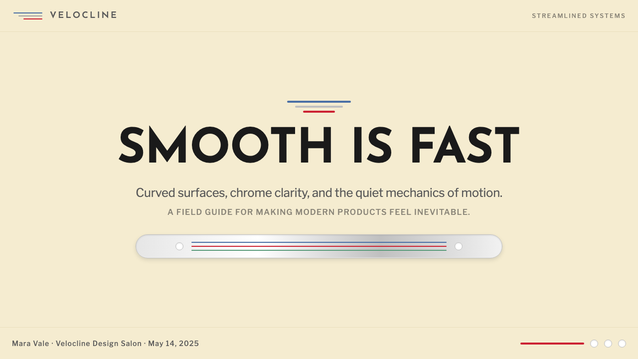
For presentation slides, Streamline Moderne is particularly effective on cover pages and section dividers. A cover built in this style places a wide, low composition against a warm ivory or cream ground: a large rounded-rectangle hero image or bold display headline anchors the upper two-thirds, and two or three horizontal accent stripes in deep red or chrome-adjacent silver run across the lower band. Content slides work best when they commit to the horizontal register — wide image panels above narrow text captions, data visualizations that expand left-to-right before they expand top-to-bottom, and section headers marked by a single bold rule rather than vertical dividers. The style rewards consistency: every slide should feel like it is moving in the same direction.在演示文稿中,流线型现代主义在封面页与章节分隔页上尤为出色。以这种风格构建的封面将宽阔、低重心的构图置于暖象牙或奶油底面上:一个大型圆角矩形主视觉或粗大展示型标题锚定上方三分之二区域,两到三道深红色或近铬银色水平强调条纹横贯底部色带。内容页面最适合彻底投入水平调性——宽图像面板置于窄文字说明上方,数据可视化在纵向扩展之前先横向扩展,章节标题以单道粗线而非竖向分割线标记。这种风格奖励一致性:每一张幻灯片都应感觉在同一方向上运动。
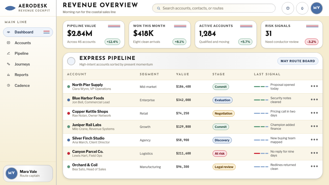
For web interfaces, dashboards and marketing landing pages are the native habitat of Streamline Moderne. A dashboard in this style uses a warm near-white background, card components with generously rounded corners and a subtle chrome-like border or shadow along their lower edge, and a top navigation bar with two or three thin accent stripes as a decorative footer element. Pricing pages benefit from the style's innate sense of progression — three tiers arranged horizontally, the recommended tier marked by a deeper red or metallic accent, each card with the same soft horizontal band at its base. The style does not suit dense information-heavy interfaces where the user needs to scan vertical lists; it is fundamentally about forward movement, not top-to-bottom hierarchy.在网页界面中,仪表板与营销落地页是流线型现代主义的原生栖息地。这种风格下的仪表板使用暖近白背景,卡片组件带有圆润的圆角与沿底边的微妙近铬边框或阴影,顶部导航栏带有两到三条细装饰条纹作为底部点缀元素。定价页面受益于这种风格天生的进程感——三个等级横向排列,推荐等级以更深的红色或金属感点缀标记,每张卡片底部都有同样柔和的水平色带。这种风格不适合用户需要纵向扫描列表的密集信息界面;它从根本上是关于向前运动,而非从上到下的层级关系。
For editorial and marketing work, the style excels at material that needs to feel simultaneously modern and warm — brand identity systems, print advertisements, packaging, and long-form articles where the reader should feel carried through the content rather than challenged by it. An editorial layout in this mode uses wide horizontal image bleeds with narrow body text below, section breaks marked by the signature double or triple stripe, and pull quotes framed in rounded rectangles with a warm ground. Marketing materials work particularly well when they lean into the style's optimism: full-width feature sections that alternate between warm ivory and deep red grounds, chrome-adjacent accents on calls to action, and headlines set in broad, confident letterforms with generous tracking.在编辑与营销设计中,这种风格擅长处理需要同时感觉现代而温暖的内容——品牌视觉识别系统、印刷广告、包装,以及读者应感觉被内容携带着前行而非被挑战的长篇文章。这种模式下的编辑版面使用宽幅横向出血图像配以其下的窄正文,章节分隔以标志性的双线或三线条纹标记,引用文字以圆角矩形加暖色底面框住。营销材料在充分发挥这种风格的乐观主义时表现尤为出色:全宽特性区块在暖象牙与深红底面之间交替,行动号召元素带有近铬感点缀,标题以宽展、自信的字形排设配以充裕的字间距。
The most common mistake when applying Streamline Moderne is confusing it with either Art Deco or 1950s retrofuturism. Art Deco is vertical, angular, and ornamental; Streamline Moderne is horizontal, curved, and restrained. 1950s retrofuturism adds rocket fins, starbursts, and a campy exuberance that Streamline Moderne never had — the 1930s style is fundamentally serious, even austere in its own way, born from economic hardship rather than postwar abundance. A second common error is over-applying the speed stripe — three stripes in the right place read as momentum; stripes scattered across every surface read as decoration, which is precisely what the style was trying to avoid. Use the stripe as a punctuation mark, not a pattern fill.应用流线型现代主义时最常见的错误,是将它与装饰艺术或1950年代复古未来主义混淆。装饰艺术是垂直的、棱角分明的、装饰性的;流线型现代主义是水平的、曲线化的、克制的。1950年代复古未来主义加入了火箭尾翼、星爆图案与一种夸张的活力,这些都是流线型现代主义从未有过的——1930年代的风格从根本上是严肃的,以其自身的方式甚至是朴素的,诞生于经济困苦而非战后丰裕之中。第二个常见错误是过度使用速度条纹——出现在正确位置的三道条纹传递动势感;散布在每个表面的条纹传递的是装饰感,而这恰恰是这种风格试图规避的。要把条纹当作标点符号而非图案填充来使用。
See the Streamline Moderne (1930s) design system查看 Streamline Moderne (1930s) 完整设计系统
Streamline Moderne (1930s) — FAQStreamline Moderne (1930s) · 常见问题
What is the difference between Art Deco and Streamline Moderne?装饰艺术与流线型现代主义有什么区别?
Art Deco (roughly 1920s–early 1930s) is vertical, angular, and ornamental — it reaches upward with chevrons, zigzags, sunburst patterns, and exotic materials like lacquered wood, ivory, and hammered metal. Streamline Moderne (mid-1930s through 1940s) is horizontal, curved, and restrained — it moves sideways with teardrop forms, smooth surfaces, and parallel speed stripes. Art Deco celebrates craftsmanship and cultural exoticism; Streamline Moderne celebrates engineering and the promise of mass-produced prosperity. They share a foundational confidence and a willingness to make objects beautiful rather than merely functional, but in almost every formal characteristic they pull in opposite directions.装饰艺术(大约1920至1930年代初)是垂直的、棱角分明的、装饰性的——它以箭形、锯齿形、旭日图案以及漆木、象牙、锻造金属等异域材料向上伸展。流线型现代主义(1930年代中期至1940年代)是水平的、曲线化的、克制的——它以泪滴形态、光滑表面与平行速度条纹向侧面运动。装饰艺术颂扬工艺与文化异域感;流线型现代主义颂扬工程学与大规模生产繁荣的承诺。两者共享一种根本性的自信,以及使物体美丽而非仅仅功能性的意愿,但在几乎每一个形式特征上,它们朝着相反的方向拉伸。
Can Streamline Moderne work in a dark color scheme?流线型现代主义能用于深色配色方案吗?
The canonical palette is warm and light-ground — the cream and chrome combination depends on the warm ground for its sense of cleanliness and optimism. A dark inversion is possible but requires careful handling. On a deep navy or charcoal ground, the cherry red and chrome accents can work well if the warm ivory is shifted to a light accent rather than a background fill. The risk is losing the forward-moving optimism that defines the style — dark versions tend to read as noir or retro-futurist rather than genuinely Streamline Moderne. If a dark background is required, commit to a single warm accent color and use the speed stripes sparingly as bright bands against the dark field rather than decorative elements.标准色板是暖色调、浅色底面——奶油与铬的组合依赖暖底来营造洁净与乐观的感受。深色反转版本是可能的,但需要谨慎处理。在深藏青或炭灰底面上,樱桃红与铬质点缀在暖象牙色被转换为浅色强调而非背景填充时可以很好地发挥作用。风险在于失去定义这种风格的向前运动乐观主义——深色版本往往读起来像黑色电影或复古未来主义,而非真正的流线型现代主义。如果必须使用深色背景,就专注于一种暖色强调色,并将速度条纹克制地用作深色底面上的明亮色带,而非装饰性元素。
How do I avoid Streamline Moderne looking like 1950s diner kitsch?如何避免流线型现代主义看起来像1950年代餐车俗气感?
The 1950s diner aesthetic — itself derived from Streamline Moderne — added elements that the original movement never had: checkerboard floors, neon pink and turquoise, chrome barstools with red vinyl cushions, and a general atmosphere of campy nostalgia. Authentic Streamline Moderne is more restrained and more serious: the palette is limited to cream, red, and chrome-adjacent silver; the forms are smooth and purposeful rather than exuberant; and the overall register is optimistic but not playful. Keeping the color count low, avoiding any checkerboard or diamond patterns, and ensuring that rounded forms feel aerodynamic rather than cartoonish will maintain the distinction. The historical reference point should be the 1934 locomotive, not the 1956 diner.1950年代餐车美学——本身衍生自流线型现代主义——加入了原始运动从未有过的元素:棋盘格地板、霓虹粉与青绿色、带红色乙烯软垫的镀铬吧椅,以及一种整体性的夸张怀旧气氛。真正的流线型现代主义更为克制也更为严肃:色板局限于奶油色、红色与近铬银色;形态是光滑而有目的性的,而非夸张热烈的;整体基调是乐观的,但不是嬉戏性的。保持低色彩数量,避免任何棋盘格或菱形图案,并确保圆角形态感觉像是空气动力学的而非卡通的,将有助于维持这种区别。历史参照点应当是1934年的机车,而非1956年的餐车。
Is Streamline Moderne appropriate for technology brands and SaaS products?流线型现代主义适合科技品牌和SaaS产品吗?
It can be highly effective, but with a specific positioning caveat. Streamline Moderne communicates optimism, forward momentum, and confidence in progress — values that align well with growth-stage technology companies that want to feel established and trustworthy without the coldness of pure minimalism. It works particularly well for infrastructure products, mobility technology, logistics platforms, and any context where the metaphor of things moving efficiently and reliably resonates with the product's function. It is less suited to products that need to communicate cutting-edge abstraction, deep technical complexity, or the austere precision of developer tools — contexts where Bauhaus or Swiss-derived minimalism will read more authentically. The warm palette also means it can feel slightly retro to audiences who associate the future with cool, dark, high-contrast interfaces.这种风格可以非常有效,但有一个特定的定位前提条件。流线型现代主义传达乐观主义、向前的动势以及对进步的信心——这些价值观与成长阶段的科技公司高度契合,这些公司希望感觉稳固而值得信赖,同时避免纯粹极简主义的冷漠感。它尤其适合基础设施产品、出行科技、物流平台,以及任何事物高效可靠运转的隐喻与产品功能产生共鸣的场景。它不太适合需要传达前沿抽象性、深层技术复杂性,或开发者工具那种严谨精确感的产品——这些场景中,包豪斯或瑞士风格衍生的极简主义读起来会更真实。暖色板也意味着,对于那些将未来与冷调、深色、高对比度界面相关联的受众来说,它可能感觉略带复古意味。
How many speed stripes is the right number, and where should they go?速度条纹用几道合适,应该放在哪里?
Two or three parallel horizontal stripes is the canonical number — enough to read as a deliberate motif rather than a single accident, but not so many that they become a pattern or texture. Historically, the stripes appeared at the threshold between two zones of a composition: the border between a vehicle's body and its lower panel, the line where a building's facade meets the street, the base of a poster where the headline gives way to the tagline. In contemporary work, they work best as a single compositional accent — at the bottom of a slide, across the foot of a hero section, or as a page divider — rather than repeated throughout. The stripes should feel like something painted on in one deliberate pass, not scattered. When in doubt, use two rather than three, and place them where the composition needs a strong horizontal anchor rather than where they seem decorative.两到三道平行水平条纹是标准数量——足以被读作一种有意为之的母题而非随机偶然,但又不至多到成为一种图案或纹理。历史上,条纹出现在构图中两个区域之间的分界处:交通工具车身与下方裙板之间的边界,建筑立面与街道相接的线条,海报底部标题让位于标语的位置。在当代设计中,它们最适合作为单一构图强调——在幻灯片底部、英雄区块的底脚、或作为页面分隔线——而非贯穿全篇重复出现。条纹应感觉像是一次有决心的笔触涂就,而非随意散布。如有疑问,用两道而非三道,并将它们放在构图需要强烈水平锚点的地方,而非感觉有装饰性的地方。
Related design styles相关设计风格
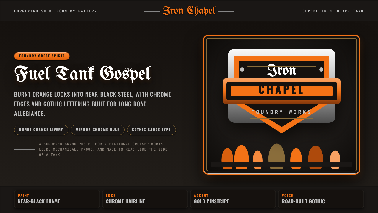 Harley Orange & BlackBuilt like a tank badge. Burnt orange, chrome hairlines, gothic type on near…像油箱徽章般强硬:燃橙、镀铬细线、哥特字压在近黑底上。
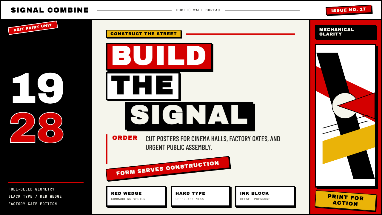
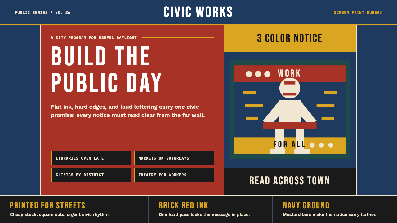 WPA Poster (Federal Art Project, 1936)Civic urgency in ink. Navy, brick red, mustard bands and Bebas Neue shout acr…公民急迫感成形:深海军蓝、砖红、芥末色块与窄体字像站台海报般呐喊。
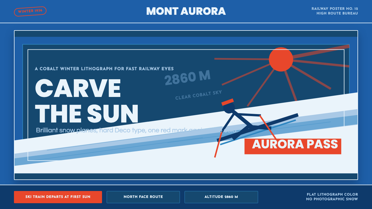 Alpine Ski PosterCold speed sells winter. Cobalt sky, snow planes, sun rays, and one resort-re…冷峻速度贩卖冬日:钴蓝天空、雪白斜坡与一抹度假红。
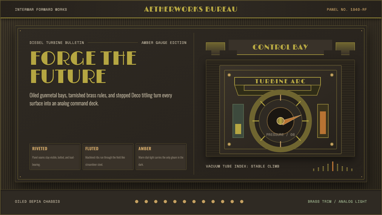 Dieselpunk RetrofutureMachine age, dark and bolted. Gunmetal grid, brass rivets, amber gauge geomet…黑暗铆接的机械时代:枪铁网格、黄铜铆钉与琥珀仪表几何。
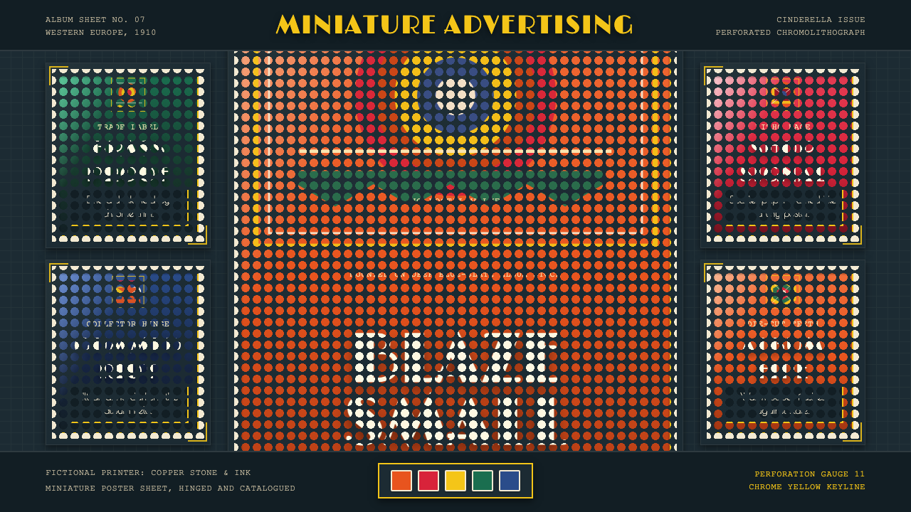 Poster Stamp (Cinderella)Blazes in miniature. Vermilion stamps, chrome keylines, and toothed edges on…微缩海报在暗底燃烧:朱红邮票、铬黄描边和齿孔边。
 Russian ConstructivismRevolution red, slashed across black and white. Diagonal sans-serif, photomon…1917 年革命视觉:红色斜劈黑白画面、几何无衬线倾斜排版、照片蒙太奇——形式…