What is Alpine Ski Poster?
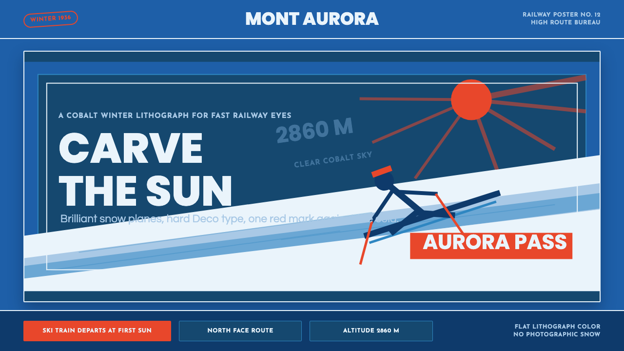
Before color photography, before digital retouching, before the ski resort became a mass-market destination, a small group of Swiss and French lithographers invented one of the twentieth century's most immediately recognizable visual vocabularies: cobalt sky, brilliant snow planes, radiating sunburst, one warm red accent, and lettering that commands rather than requests.
Alpine Ski Poster in brief
Alpine Ski Poster is a design system rooted in the golden age of Swiss and French Alpine travel lithography, roughly 1900 to 1950. The defining work of this tradition — Herbert Matter's photomontage posters for the Swiss National Tourist Office, Emil Cardinaux's jewel-like Matterhorn image for Zermatt, Roger Broders' sun-drenched Chamonix scenes — established a visual formula of exceptional power and durability: a dominant field of saturated cobalt or cerulean blue representing Alpine sky, brilliant white or near-white diagonal planes of snow, geometric sunburst or sun-flare motifs, and a single warm accent color (typically a vivid warm red) used for the resort name or a focal figure.
The style draws simultaneously on Art Deco's geometric discipline and the Swiss Plakat tradition's commitment to visual simplicity and immediate impact. Unlike ornamental Art Deco applied to interiors or jewelry, the Alpine poster tradition stripped decoration to the essential pictorial elements — sky, slope, figure, lettering — because the poster had to communicate at a distance, in a railway station or shop window, to a viewer moving at walking pace. Every element earned its place by being legible at speed.
What distinguishes this system from other vintage travel poster traditions is the precise interplay between flat chromatic fields and a sense of crisp, cold, high-altitude luminosity. There is no soft romanticism, no haze, no gentle atmospheric perspective. Alpine ski poster aesthetics are fundamentally about contrast: the sharpness of cold air, the blinding clarity of sunlight on snow, the hard edge where cobalt sky meets white slope. This is a visual system built around the sensation of altitude.
Where does Alpine Ski Poster come from?
The practical origin of the Alpine ski poster lies in the expansion of European railway networks in the late nineteenth century. As the Gotthard Railway (completed 1882) and the Jungfrau Railway (completed 1912) opened the high Alps to affluent travelers, Swiss and French resort operators needed advertising materials sophisticated enough to compete for the attention of wealthy tourists who received many such solicitations. The stone lithograph — the dominant large-format printing technology of the period — allowed artists to work directly on the printing stone, producing images of extraordinary chromatic richness and tonal control that could be printed in editions of hundreds or thousands.
Emil Cardinaux is generally credited with establishing the canonical visual formula with his 1908 Zermatt poster: a monumental Matterhorn rendered in simplified planes of ochre and grey, rising above a sunlit foreground of snow, beneath a sky of deep saturated blue. Cardinaux, trained as a painter, understood that the poster format rewarded simplification — the eye needed to resolve the image in an instant. His Matterhorn was not a naturalistic landscape painting but a set of flat chromatic decisions: this shape is sky, this shape is snow, this shape is rock. The formula was immediately influential.
Herbert Matter's contributions in the 1930s reoriented the tradition toward modernity without abandoning its chromatic logic. Working for the Swiss National Tourist Office from 1934, Matter combined photographic imagery with typographic and graphic elements through photomontage — placing a photographed skier against a flat graphic sky, scaling a giant face above a mountain range, tilting the entire composition to create dynamic diagonal energy. His work introduced the diagonal as an organizing compositional principle, replacing the symmetrical frontality of earlier posters with a sense of speed and movement consistent with skiing itself.
Roger Broders in France and Carl Moos in Switzerland extended the tradition toward the sunnier, more hedonistic register of French Alpine resorts like Chamonix and Megève. Broders's work has a particular warmth and palette clarity — his skies tend toward a brighter cerulean, his snow toward cream rather than pure white, and his resort scenes often include a pleasure-seeking figure whose vivid red costume provides the warm accent against the cool field. The red figure against blue sky became one of the tradition's most durable compositional motifs.
What defines the Alpine Ski Poster look?
Dominant Cobalt Field
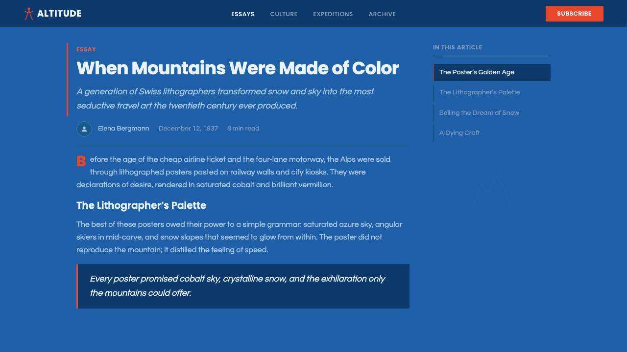
The large upper portion of any Alpine ski poster composition is typically reserved for sky, rendered in a deep, fully saturated blue — neither navy-dark nor grey-tinged, but the precise vivid cobalt that reads as clear, cold, Alpine air. This field functions as a chromatic ground against which all other elements operate. Its saturation is non-negotiable: desaturating the sky toward grey or blue-grey loses the sense of altitude and clarity that defines the style. The cobalt field should feel like atmosphere made into paint.
Snow Planes and Diagonal Geometry
The slope is represented not as a nuanced surface of shadow and highlight, but as one or more bold, flat geometric planes of brilliant white or near-white — angled diagonally to create movement and convey descent. The horizon line between sky and slope is typically clean and sharp, not soft or graduated. Secondary slope planes may be rendered in a cooler, slightly greyed white to suggest shadow without resorting to gradient, maintaining the flat chromatic discipline of the stone lithograph.
Sunburst and Radiant Light Motif
A recurring compositional element across the genre is the sunburst or sun-flare: geometric rays radiating outward from a point above the horizon, rendered in warm gold or brilliant white against the cobalt field. This motif communicates winter sun — specifically the intense, shadowless quality of high-altitude light that is the primary sensory luxury of skiing. The rays are stylized and geometric, not naturalistic: they read as pattern and symbol rather than as optical phenomenon. The sunburst is often placed at a corner or asymmetric position to create compositional tension.
The Warm Red Accent
Against the cool blues and whites of sky and snow, a single warm red functions as the primary chromatic accent. In the original posters, this red typically appeared in the resort name lettering, the costume of a skier figure, or both. In application to screen design, this accent should be used with similar restraint: one element at a time, never competing with the cobalt field, always providing warmth against the cold ground. The red should have warmth and life — a tomato or vermilion quality — rather than the cool precision of a pure primary red. It is the color of exhilaration against the cold.
Deco-Inflected Lettering
Typography in Alpine ski poster tradition draws on Art Deco letterforms: slightly condensed, geometric or semi-geometric sans-serifs (and occasionally slab serifs), with strong vertical emphasis and deliberate weight contrast between thick strokes and thin. The resort name is typically set in large, confidently spaced capitals — not crowded, not decorative, but monumental. Letters are treated as graphic elements with their own spatial presence, not as a caption to an image. In the original stone lithographs, lettering was often integrated directly into the pictorial space rather than placed above or below it.
Flat Color with Chromatic Clarity
The entire visual system is built on the chromatic logic of stone lithography: each color is a separate ink pass, requiring artists to think in terms of flat, bounded areas of color rather than blended, painterly transitions. This constraint produced a distinctive aesthetic of chromatic clarity — colors are pure, fully saturated within their bounds, and separated by clean edges. There are no muddy mid-tones, no soft gradients blending one hue into another. The discipline of the medium became the defining quality of the style. Applied digitally, this means embracing solid fills, hard edges, and the full saturation of each chosen color.
The Stylized Figure in Motion
Where a human figure appears, it is reduced to a geometric-silhouette form in dynamic diagonal posture — the bent knees and forward lean of a skier descending, rendered with the minimum number of shapes necessary for recognition. The figure is not realistic portraiture; it is a symbol of speed, mastery, and effortless descent. In red or warm-colored costume, set against the cold cobalt field, the figure provides the emotional center of the composition: this is what you could be, on this slope, in this light.

Who shaped Alpine Ski Poster?
The Swiss painter and graphic artist who created the first canonical Alpine ski poster in 1908 with his Zermatt / Matterhorn image, establishing the flat chromatic formula of saturated cobalt sky against simplified mountain and snow forms that would define the genre for the next four decades. Cardinaux studied painting in Munich and Paris before turning to commercial lithography, and his fine-art background gave his poster compositions an architectural solidity — the Matterhorn in his work is not a picturesque backdrop but a structural presence, as deliberate in its composition as a still life.
The Swiss graphic designer who transformed the Alpine poster tradition in the 1930s by introducing photomontage — layering photographed figures and mountain photography with flat graphic elements and bold typography. Working for the Swiss National Tourist Office from 1934, Matter brought a modernist sensibility to the genre, using dramatic scale contrasts, tilted compositions, and photographic realism alongside flat color fields in ways that felt urgently contemporary. He later emigrated to the United States, where his influence extended to corporate identity design and eventually to the early visual language of technology companies.
The French graphic artist who created a series of luminous ski and travel posters for the Paris-Lyon-Méditerranée railway from the 1920s, defining the sunnier and more hedonistic French variation of the Alpine tradition. Broders worked with a slightly lighter, warmer sky tone than his Swiss counterparts, and his scenes emphasize pleasure and sociability as much as athletic achievement. His posters for Chamonix, Val d'Isère, and Megève capture the interwar sense of Alpine skiing as the sport of a glamorous, internationally-minded elite.
A Swiss-German commercial artist whose ski and winter sports posters from the 1910s and 1920s helped establish the conventions of figural representation in the genre — particularly the dynamic diagonal figure of the skier in descent, silhouetted in a warm costume against cold sky. Moos's figures have a graphic economy and physical clarity that proved enormously influential: the skier-in-red-against-cobalt-sky compositional motif that became the genre's most durable shorthand can be traced in substantial part to his example.
The Swiss resort of St. Moritz occupied a unique position in the development of the Alpine ski poster tradition: as one of the earliest and most prestigious winter destinations, it attracted the finest poster artists and developed the most consistent and refined visual identity of any resort. The St. Moritz sun logo — a stylized sunburst that has barely changed since the 1930s — is among the most successful examples of resort branding in the world. Understanding the St. Moritz visual tradition is essential for understanding how the sunburst motif functions as a quality and prestige signal in the Alpine ski poster system, not merely a decorative element.
How do you use Alpine Ski Poster today?
The Alpine ski poster vocabulary translates to contemporary screen design more directly than many historical styles, because its original constraints — flat chromatic fields, clean edges, geometric simplification — map naturally onto digital rendering without the compromises required by styles that originated in texture, paint, or material richness. The system works best when the designer commits fully to its chromatic logic: dominant cobalt, brilliant white, one warm red accent, no color mixing, no soft gradients. Half-measures produce muddy results that feel like a failed vintage pastiche rather than a confident evocation.
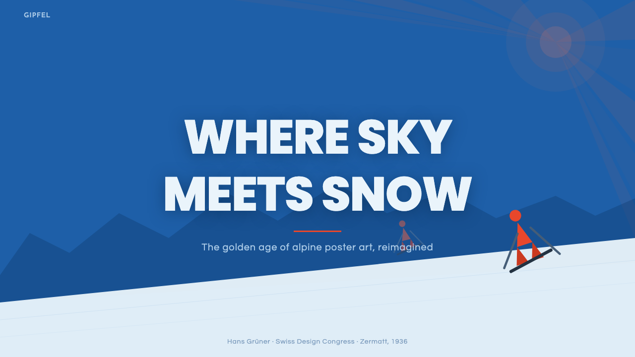
For presentation slides, the style delivers exceptional impact on cover pages. A full-bleed cobalt background with a geometric diagonal white plane in the lower third, a sunburst motif in one corner, the presentation title in bold condensed capitals, and the organization or project name in that single warm red: this is a cover that reads at the back of a large conference room and communicates authority, clarity, and aesthetic confidence. Content slides should maintain the cobalt-white-red palette but reduce its drama: a white ground with cobalt accents for section headers and red for a single key figure or call-to-action per slide. Data visualizations benefit from the flat color discipline — charts rendered in cobalt and red with white labels, no gradient fills, hard grid lines in a neutral grey.
For web interfaces and digital products, the Alpine ski poster aesthetic suits any context where the emotional register is premium, active, and outdoors-adjacent: adventure travel platforms, winter sports gear brands, high-end resort booking experiences, fitness or wellness applications positioned around physical performance. In these contexts, use cobalt as the primary hero background or accent, white space generously, red as the single interactive accent (primary buttons, active states, links), and avoid the temptation to introduce additional colors — the power of the system lies in its three-color clarity. The sunburst motif works well as a decorative element in hero sections or loading screens.
For editorial and marketing applications, the style supports high-impact single-page layouts and poster-format digital assets. A full-cobalt hero with white headline and red subhead, followed by a white-ground body section with cobalt pull quotes and red calls to action, establishes a rhythm that feels both historical and contemporary. Social media assets translate naturally: the geometric compositional logic works in square, portrait, and landscape formats without modification. The style's boldness makes it resistant to the visual noise of a social feed — a cobalt-dominated image stops the scroll.
The most common mistake when applying this style is treating it as a color overlay rather than a structural system. Designers often take a generic layout, apply a cobalt background, and wonder why the result looks like a blue PowerPoint rather than an Alpine poster. The style requires the geometric compositional logic — the diagonal slope plane, the asymmetric placement of the sunburst, the treatment of lettering as spatial object — not just the palette. The second common error is over-decoration: introducing additional motifs, patterns, or textures beyond the core vocabulary of sky field, snow plane, sunburst, and figure. The style's power comes from its commitment to very few elements used at very large scale.
Alpine Ski Poster — FAQ
How closely related is this style to Art Deco?
Alpine ski poster work from the golden period overlaps significantly with Art Deco, but the relationship is one of parallel development rather than derivation. Both traditions emerged in the same era (roughly 1910–1940), both valued geometric simplification and chromatic boldness, and both were shaped by advances in color printing technology. The key difference is context: Art Deco as typically understood covers interior decoration, jewelry, architecture, and fashion, where geometric ornament was applied to surfaces; Alpine ski poster tradition is a strictly graphic art form where geometry serves composition and communication rather than decoration. The Art Deco letterforms that appear in ski posters are a shared borrowing from the broader typographic culture of the era, not a sign of stylistic dependence.
Can the style work for non-winter or non-sports contexts?
Yes, but with deliberate abstraction. The core chromatic system — dominant cobalt, brilliant white, warm red accent — is not intrinsically about skiing; it is about altitude, clarity, and exhilaration. Any product or service that wants to communicate those values can draw on this vocabulary. The sunburst motif works well in summer contexts as a solar symbol. The diagonal compositional energy translates to any dynamic activity. What should not be imported uncritically are the figurative ski-specific elements: the slope geometry, the skier silhouette, the mountain forms. When these are removed, what remains is a bold, high-contrast, three-color graphic system with a strong sense of joyful energy — applicable much more broadly than its alpine origin suggests.
How does this style handle dark mode or dark backgrounds?
The style is inherently dark-sky-dominant, so a dark background is entirely native to it — but this refers to deep cobalt, not to black. Applying the system to a true black background tends to flatten the composition and strip the sense of atmosphere; the cobalt is doing emotional work that black cannot replicate. If a very dark variant is needed, a deep navy or near-black cobalt preserves the mood better than pure black. The warm red accent works well against dark grounds. The white snow planes become available as strong graphic elements. What changes is the luminosity: the light-on-dark variant feels more nocturnal and dramatic, less crisp and daylight-clear than the classic cobalt-sky version.
What makes Herbert Matter's photomontage posters different from the earlier painted tradition?
Matter's photomontage work introduced photography into a tradition that had been purely pictorial-graphic, but the photographic elements were not naturalistic windows — they were graphic materials to be cut, scaled, and composed according to the same flat-field logic as painted color areas. In a Matter poster, a photographed skier might be scaled to impossible size against a graphic mountain, or a sharp photographic portrait might float against a flat color field. The photographic texture introduces a quality of objective reality — this is a real person, a real mountain — that the earlier tradition, for all its power, could not deliver. Matter's achievement was integrating photographic realism with graphic abstraction without sacrificing the compositional boldness that defined the style.
Is this style appropriate for luxury or high-end brand positioning?
Yes — in fact, the original Alpine ski poster tradition was unambiguously luxury advertising. St. Moritz, Davos, Chamonix, and Zermatt were not affordable destinations; they were where European and American elites wintered. The visual language was designed to appeal to people accustomed to the finest things and unimpressed by ordinary ornament. The style communicates luxury through a particular form of restraint: three colors, not twenty; geometric clarity, not fussy detail; expansive space, not dense information. This is the luxury of confidence — of knowing that simplicity is more impressive than decoration. For contemporary luxury brands, the Alpine ski poster vocabulary offers a credible alternative to the overwrought baroque of much luxury visual language, with the added advantage of connoting active, experiential, and physically vigorous luxury rather than passive or material luxury.
Related design styles
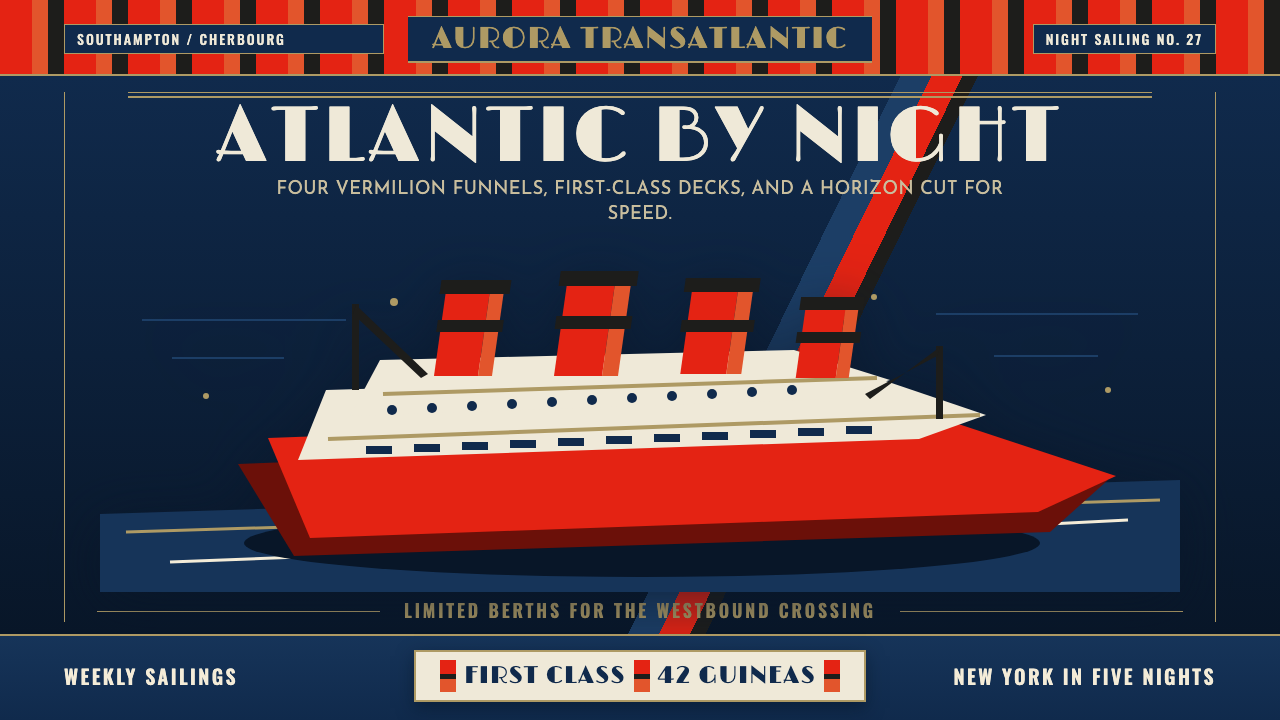 Cunard Liner PosterOceanic grandeur. Vermilion funnels, teak-gold caps, and a marine-blue poster…
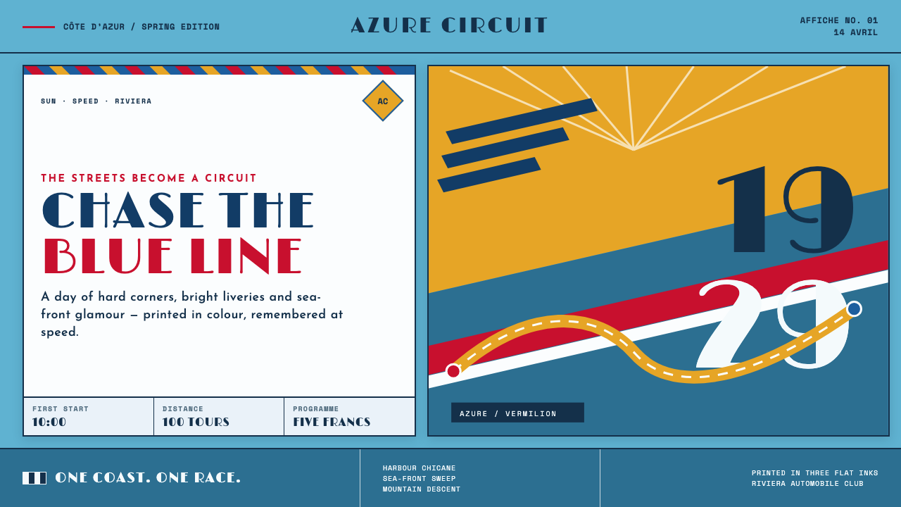 Monaco Grand Prix (1929)Speed becomes glamour. Riviera azure, racing red, and giant Deco numerals cut…
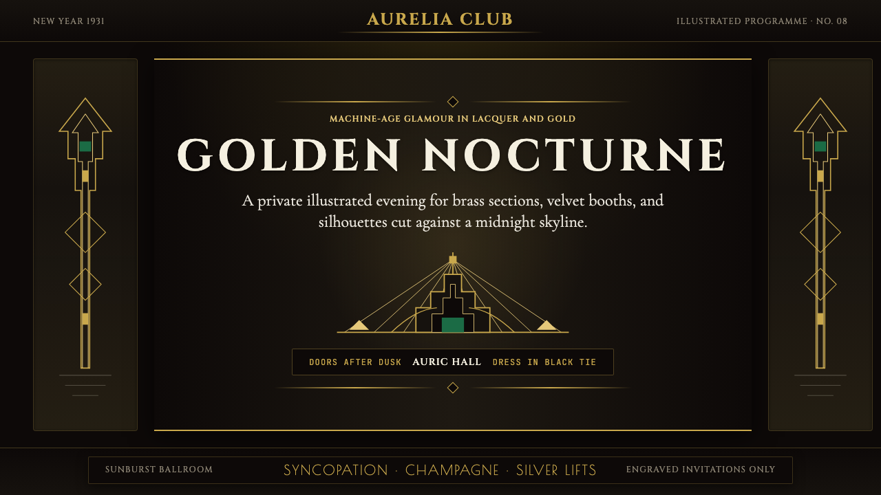 Art Deco Jazz AgeJazz Age glamour. Sunburst rays, stepped ziggurats, gold on black — Chrysler…
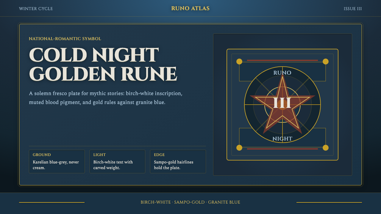 Finnish Kalevala EpicEpic weight in cold night. Birch-white Cinzel, Sampo-gold rules, blue-grey fr…
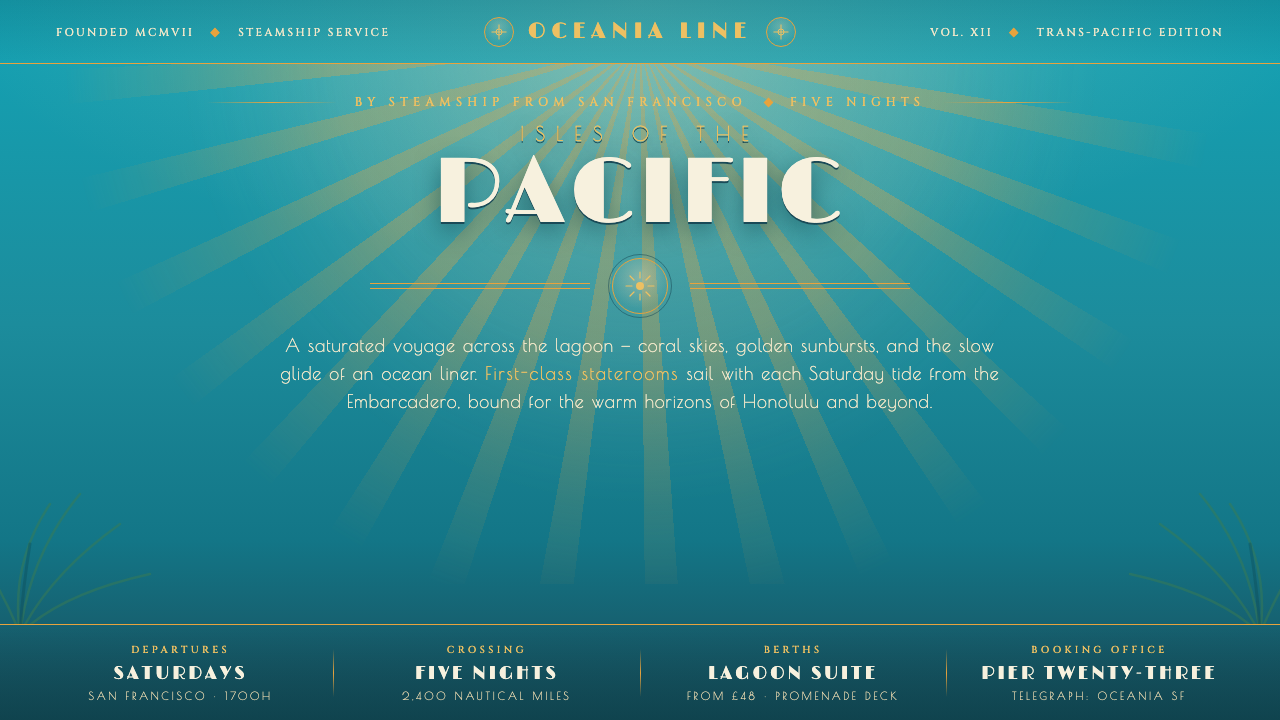 Matson Liner Travel PosterCruise-poster paradise. Lagoon-turquoise ground, coral-and-gold sunbursts, ai…
 Ocean Liner SeafoamLuxury in motion. Seafoam lacquer, gilt speed-lines, and Deco symmetry frame…