What is WPA Poster (Federal Art Project, 1936)?
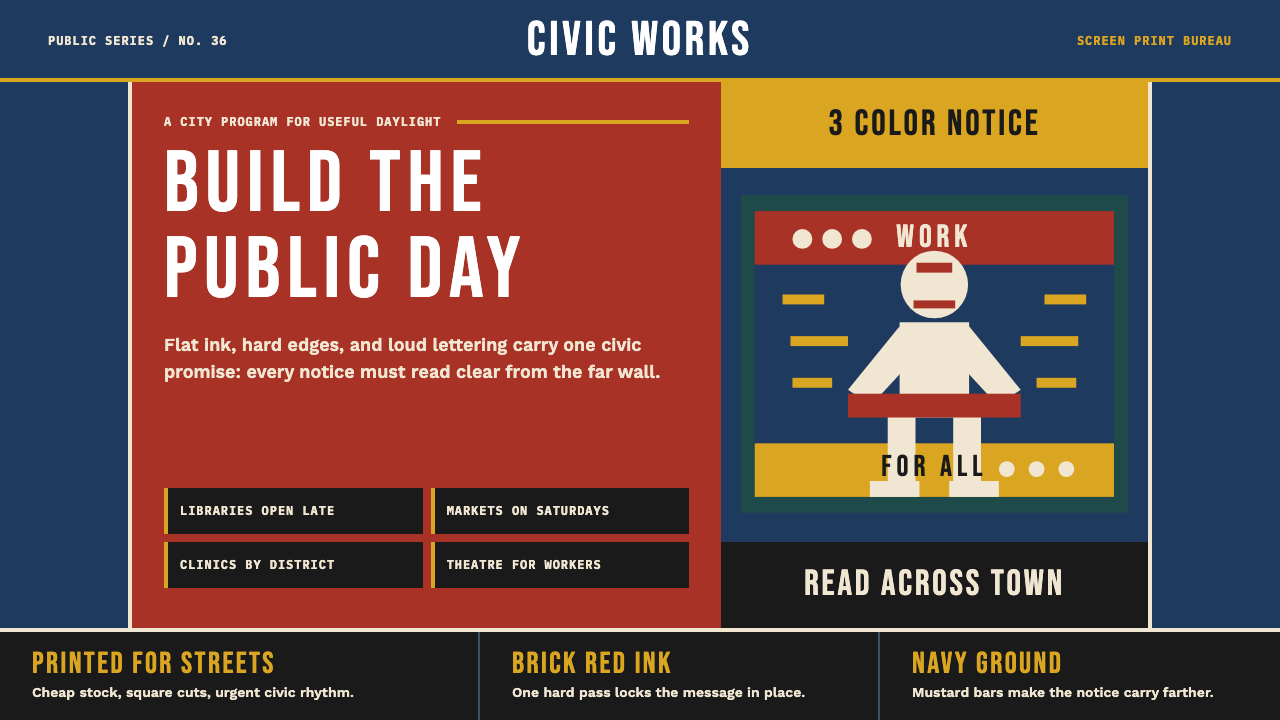
The WPA Federal Art Project didn't just make posters — it invented a civic visual language from scarcity: three ink colors, rough stock, and the conviction that a country in crisis could still make beautiful things for its people.
WPA Poster (Federal Art Project, 1936) in brief
WPA Poster style refers to the graphic language developed by the U.S. Works Progress Administration's Federal Art Project between 1935 and 1943. Employing artists who had been thrown out of work by the Great Depression, the project produced over two thousand screen-printed posters advertising national parks, public health campaigns, civic events, and cultural programs — at a time when the federal government had never before funded art on this scale.
The aesthetic is inseparable from its constraints. Screen printing on uncoated stock with three to five ink colors forces every designer into the same decisions: silhouette over detail, flat areas of color over blended tone, bold type over nuanced hierarchy. What emerged was not a compromise but a discipline — a distinctly American vernacular modernism that borrowed the geometric energy of European avant-garde movements while keeping the democratic directness of a government leaflet.
Visually, the style is defined by deep, saturated ink blocks in navy, brick red, and mustard; heavy condensed lettering that commands the eye from across a subway platform; and a figure/ground relationship so bold it borders on graphic abstraction. Slight misregistration between ink passes, barely-there paper texture, and the imprecision of hand-pulled prints give the style a handmade quality that modern reproductions often try too hard to simulate.
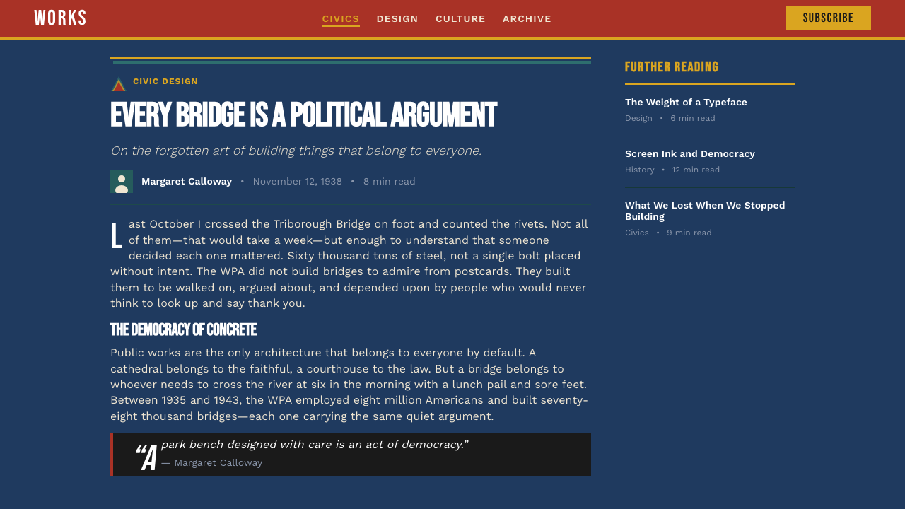
See the WPA Poster (Federal Art Project, 1936) design system
Where does WPA Poster (Federal Art Project, 1936) come from?
The Federal Art Project was one arm of the Works Progress Administration, itself the largest New Deal agency, established in 1935 under President Franklin D. Roosevelt. The immediate goal was employment: by 1936, the project was paying wages to over five thousand artists, writers, musicians, and theater workers nationwide. The poster division, headquartered in New York, Chicago, San Francisco, and a handful of other cities, ran its own silk-screen workshops where artists both designed and hand-printed the posters they created — an unusual integration of conception and production.
The visual language did not appear from nowhere. American commercial art in the 1930s was already absorbing lessons from European modernism — the compressed energy of Soviet Constructivist agitprop, the geometric clarity of the Bauhaus, the streamlined geometry of Art Deco. What the WPA workshops added was a material constraint that made these borrowed forms their own: hand-pulled silk screen on inexpensive stock couldn't support fine gradation or delicate detail, so the imported avant-garde vocabulary was compressed, coarsened, and brightened into something rawer and more immediate. The result reads less like European theory applied and more like American pragmatism solving a printing problem.
Anthony Velonis, a New York artist who became the project's leading technical expert on silk screening, was instrumental in developing the workshop's methods and training other artists. His 1938 pamphlet on silk-screen technique, produced by the project itself, served as the definitive how-to guide for the style's distinctive visual approach — including the registration tolerances that became, inadvertently, one of the style's most recognizable features.
The project was terminated in 1943, its funding cut as wartime employment made the relief rationale obsolete. Most of the posters were never formally archived; many were discarded, given away, or lost. The approximately two thousand surviving examples, now held primarily by the Library of Congress, were only broadly recognized as significant art objects in the 1980s and 1990s, when design historians began studying them as a coherent movement rather than as government ephemera.
What defines the WPA Poster (Federal Art Project, 1936) look?
Color
The WPA palette is built around a limited set of opaque, saturated ink colors applied in flat, unmodulated areas: a deep navy that reads almost like black from a distance, a warm brick red with the weight of dried clay, and a mustard or cadmium yellow that cuts through both. White is rarely a background — cream-tinted or uncoated natural stock does the job, giving the whole composition a warm, slightly worn ground. Because ink passes were limited and hand-registration was imperfect, color mixing is additive and accidental rather than designed: where two passes overlap, a third hue emerges that the artist may or may not have intended.
Typography
WPA posters are typographically assertive in a way that no other American style quite matches. Condensed sans-serif lettering — drawn or stenciled rather than set from a type tray — fills the upper third or half of many compositions, functioning less as text to be read at close range and more as a visual element to be recognized from a distance. Weight is extreme: stroke contrast is minimal, letterforms are nearly monolinear, and counters are open and generous so the type holds up when printed on rough paper with slight ink spread. Multiple sizes rarely appear in the same piece — the WPA poster is typically a shout, not a conversation.
Silhouette and Figure/Ground
With limited ink passes, internal modeling of forms is nearly impossible — what the poster maker has is the outer shape of a figure against a contrasting ground. WPA designers turned this into a compositional virtue: figures are reduced to their most legible silhouette, stripped of interior shadow and highlight. A national park poster might show a hiker as a solid dark form against a bright yellow sky; a public health poster reduces a nurse to a few flat ink shapes. The figure/ground relationship is so cleanly stated that the images read as well at thumbnail size as at wall scale.
Geometric Composition
WPA posters organize space through strong horizontal and vertical divisions — banded backgrounds of two or three colors, bold border rules, and architectural framing of figures. Diagonal movement appears primarily through figure posture or the angle of text blocks rather than through compositional lines. The effect is stately and forward-facing: the poster confronts the viewer rather than inviting them into a pictorial space. This frontality connects the style to both constructivist political graphics and traditional broadside printing.
Print Texture and Imperfection
The handmade quality of WPA posters is not incidental but structural. Slight misregistration between ink passes produces colored halos or unexpected overlaps at silhouette edges. Ink coverage varies across the pull — heavier at the squeegee's leading edge, lighter where the stroke finishes. Paper fibers occasionally ghost through areas of solid color. These imperfections are not noise to be designed out; they are the visual proof that a human hand made the object. In contemporary applications, this texture is often simulated through grain overlays and registration offsets — with variable results depending on how honestly the simulation is executed.
Civic Optimism in Subject and Tone
WPA posters are not merely decorative — they are argumentative. Every poster makes a case: visit this park, wash your hands, see this play, get vaccinated. The visual confidence mirrors the rhetorical confidence. Even in the depth of the Depression, the style conveys a belief that collective action is possible and that well-designed communication can motivate it. This civic earnestness distinguishes WPA work from commercial advertising of the same period, which used similar visual techniques for more cynical purposes. Applying the style today without understanding this dimension produces decoration; understanding it produces communication.
Restricted Palette as Compositional Logic
The forced economy of a three-ink print run trains the eye to use color relationally rather than expressively. Each color must do structural work: the darkest ink carries shadow and type, the mid-tone ink carries secondary figures and supporting bands, the lightest or most chromatic ink carries the focal point or the call to action. When a fourth or fifth color appears, it is typically a technical achievement that the designer uses to signal importance rather than decoration. Contemporary designers who apply the WPA palette freely — reaching for five or six colors — usually end up with something that looks related to the style but lacks its internal logic.

See the WPA Poster (Federal Art Project, 1936) design system
Who shaped WPA Poster (Federal Art Project, 1936)?
Velonis was the Federal Art Project's primary technical authority on silk-screen printing in New York, where the largest poster workshop operated. He trained hundreds of other artists in the medium, standardized production methods across the workshop, and wrote the project's definitive technical manual on screen-print technique in 1938. His practical systematization of what had been an inconsistent craft process is responsible for much of the visual consistency across WPA posters produced in different cities and by different hands.
One of the most technically accomplished artists in the Federal Art Project, Bock worked across both the poster and illustration divisions. Her work demonstrates the full range of the WPA graphic vocabulary — from austere geometric compositions to more figural designs where the silhouette technique is pushed toward something approaching portraiture. Her posters for cultural programs, particularly theater and music events, show how the style could be adapted for subject matter that didn't readily reduce to simple geometric abstraction.
Though not employed directly by the WPA, Beall's work for the Rural Electrification Administration in the late 1930s ran so close in spirit and technique to the Federal Art Project's poster output that it is regularly discussed in the same breath. His REA posters used the same flat color, condensed type, and silhouetted figure approach, but brought a more European-influenced compositional sophistication — particularly in his handling of diagonal tension and photographic montage elements. His career traced the absorption of WPA aesthetics into American corporate modernism.
Milhous worked in the Philadelphia workshop and brought a distinctive approach to the WPA vocabulary — her compositions incorporate more decorative folk-art inflections while maintaining the flat-color, silhouette-led construction that the technique demanded. Her travel and tourism posters show how regional artistic traditions could be filtered through the Federal Art Project's visual grammar without losing either their local character or their immediacy as public communication.
Unlike most design movements, the WPA poster style has no single dominant figure whose vision defined the whole. It was produced collectively, by thousands of artists working in dozens of workshops across the country, under similar material constraints and with shared institutional training. This collective authorship is itself a meaningful characteristic: the style's consistency comes not from the authority of a master designer but from the logic of a shared medium and a shared mission. It is, in the most literal sense, a people's art.
How do you use WPA Poster (Federal Art Project, 1936) today?
WPA Poster style is one of the most recognizable historical aesthetics in contemporary design, which creates both an opportunity and a risk. The opportunity is immediate legibility — audiences broadly associate the look with civic authenticity, New Deal seriousness, and handmade warmth. The risk is that surface-level application produces a costume rather than a system: adding grain textures and misregistration to an otherwise conventional layout borrows the style's nostalgia without inheriting its structural logic.
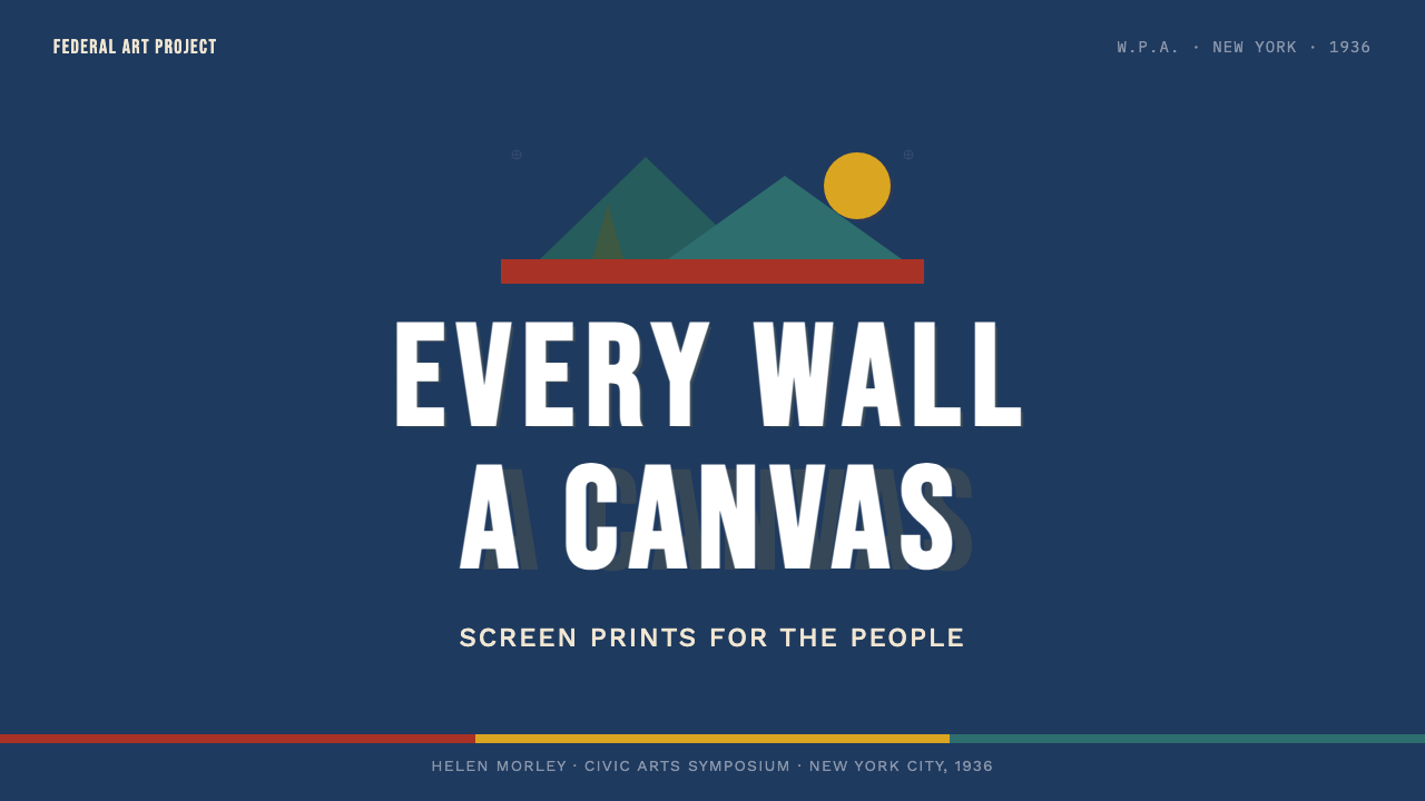
For presentation slides, WPA works best when the subject has civic or collective gravity — public health initiatives, environmental programs, community campaigns, nonprofit fundraising, or any context where the audience is being asked to participate in something larger than a commercial transaction. Cover slides benefit from the style's poster-bold composition: a single dominant silhouetted figure or geographic form against a two-color banded background, with the title set in a heavy condensed face. Content slides should resist the temptation to add more colors — the discipline of three-ink thinking (darkest for type and shadow, mid-tone for supporting elements, brightest for the focal point) produces more coherent slides than a freely expanded palette would.
For web interfaces and digital products, the WPA aesthetic is genuinely well-suited to mission-driven organizations, public institutions, editorial platforms, and brands positioning themselves as trustworthy rather than fashionable. Use banded horizontal color divisions to anchor page sections; keep body type in a heavy, condensed sans-serif; build card components and UI containers with visible borders rather than soft shadows; and treat images as silhouetted, high-contrast graphic elements rather than photographic windows. Dashboard and data visualization contexts benefit from the style's restriction: chart elements become ink-like flat bands, and the limited palette forces a cleaner mapping of data to color.
For editorial and marketing work, the style's poster logic translates directly to large-format headlines, campaign graphics, and social media assets. A WPA-influenced campaign image works best with a single dominant figure, two to three flat color areas, and lettering that feels drawn rather than typeset. Printed collateral benefits most from actual production choices that echo the original technique — letterpress or risograph printing, uncoated stock, and inks mixed to the characteristic navy-red-mustard triad rather than simulated digitally.
The most common mistake when applying WPA style is treating the print imperfections as the style itself. Grain overlays, misregistration simulation, and rough-edge brushwork are surface symptoms of a production process — applying them to an otherwise polished digital layout produces pastiche, not the style. The underlying logic is constraint-driven composition: flat color, maximum silhouette legibility, type as architecture, and a genuinely limited palette. Get those structural decisions right first, and the texture becomes optional enhancement rather than necessary camouflage.
See the WPA Poster (Federal Art Project, 1936) design system
WPA Poster (Federal Art Project, 1936) — FAQ
How is WPA Poster style different from Soviet Constructivism?
They share a family resemblance — flat color, bold geometry, assertive type, silhouetted figures — because WPA designers were consciously absorbing European avant-garde influences. But the differences are significant. Soviet Constructivism was ideologically explicit: its visual language was tied to specific political theory, and its diagonal compositions, overlapping circles, and dynamic figure arrangements were meant to convey revolution and collective energy. WPA work is more civic than revolutionary — it operates within democratic institutions rather than against them, and its compositions are more frontal and static, addressing the viewer as a citizen to be informed rather than a revolutionary to be mobilized. The color palettes also differ: Constructivism used a narrower range, typically red, black, and white, while WPA posters added warm yellows and earth tones that give the work a more approachable, less aggressive feeling.
Can the WPA style work for commercial or luxury brands?
With difficulty, and usually only in ironic or referential contexts. The style's civic earnestness is baked into its visual DNA — it was literally made with public funds to serve the public good, and it reads that way. Luxury brands depend on exclusivity, aspiration, and a certain detachment from collective utility; WPA work conveys the opposite: availability, shared purpose, and democratic participation. That said, the style has been successfully applied to food and beverage brands that want to position themselves as craft or heritage products with working-class roots, to campaigns that want to signal civic commitment rather than commercial ambition, and to cultural institutions where the association with public art and New Deal idealism is a positive asset.
Should the grain and misregistration effects be included in digital applications?
They can be, but they should be the last decision, not the first. The grain and misregistration effects in original WPA posters are byproducts of the production process — they were not designed, they happened. In a digital context, adding them is a simulation of a physical constraint you don't actually have. If the underlying composition is structurally WPA — flat color, silhouette-led, limited palette, condensed type — the grain is an optional layer of historical texture. If the underlying composition is not structurally WPA, the grain is a costume. A common mistake is applying heavy grain to a layout that still uses gradients, soft shadows, and multiple typefaces, and expecting that the texture alone will communicate the style. It won't. Fix the structure first.
How does WPA style relate to contemporary risograph printing?
The connection is real and not coincidental. Risograph printing — which uses soy-based ink drums, produces distinctive halftone dots, and allows only one color at a time with approximate registration — imposes almost exactly the same constraints that silk-screen hand-printing imposed on WPA poster makers. Both are processes that reward flat color, bold silhouette, and simple composition. This is why contemporary risograph work so frequently echoes WPA aesthetics even when the designers are not consciously referencing it: the medium reproduces the logic. The key difference is that risograph typically produces lighter, more translucent ink layers, giving it a softer, more pastel quality, while original WPA inks were opaque and saturated. Contemporary designers who print WPA-influenced work on risograph often choose to embrace the color shift as a deliberate variation rather than fighting it.
Is the WPA style specifically American, or can it be applied in non-American contexts?
The style is historically American but not exclusively so in application. What makes WPA posters distinctly American is not their visual grammar — which is borrowed from European avant-garde movements — but their civic optimism, their government patronage, and their specific subject matter: national parks, New Deal programs, American cities and industries. The visual grammar itself — flat color, condensed type, silhouette-led composition, limited palette — is formally portable. It has been successfully applied to civic communication campaigns in other countries, to international cultural institutions, and to any context where the values it connotes (public service, collective effort, democratic participation) are appropriate to the message. What travels less well is the specific cultural weight of the New Deal reference — audiences outside the United States may not have that association and will read the style primarily as graphic boldness rather than civic heritage.
Related design styles
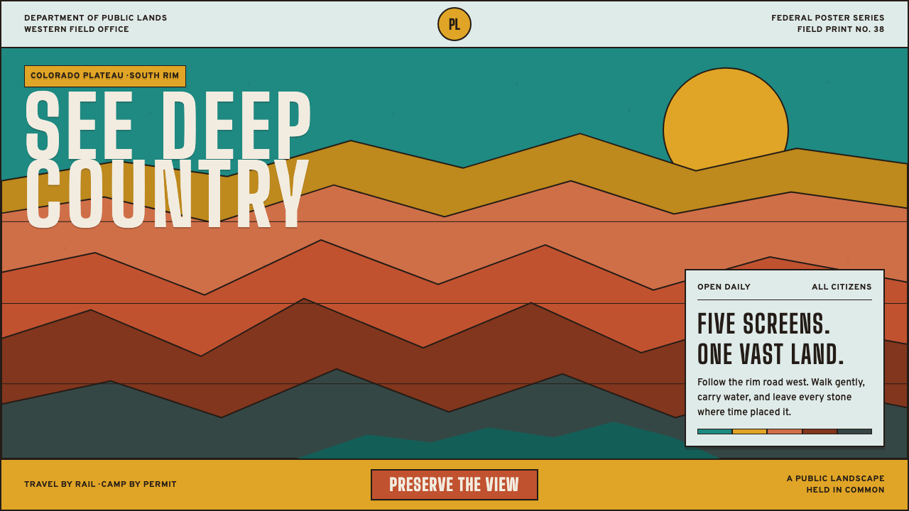 Grand Canyon WPA (1938)Public grandeur in five screens. Turquoise, ochre and terracotta stack in har…
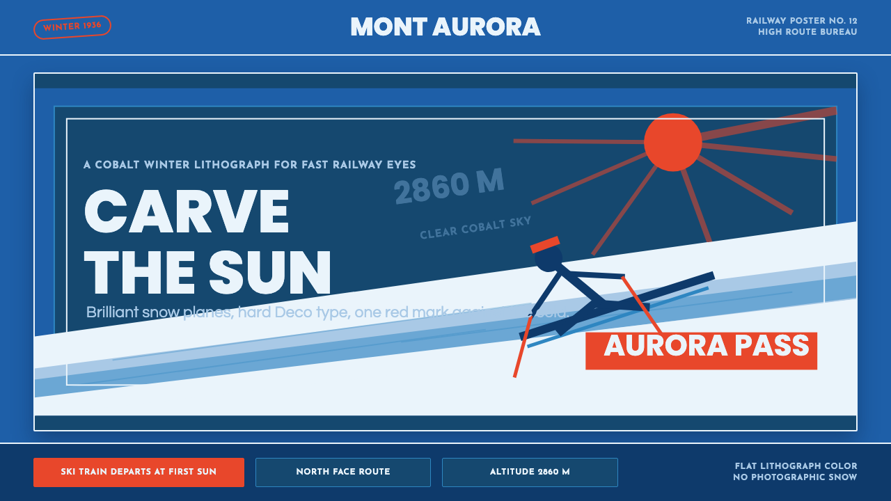 Alpine Ski PosterCold speed sells winter. Cobalt sky, snow planes, sun rays, and one resort-re…
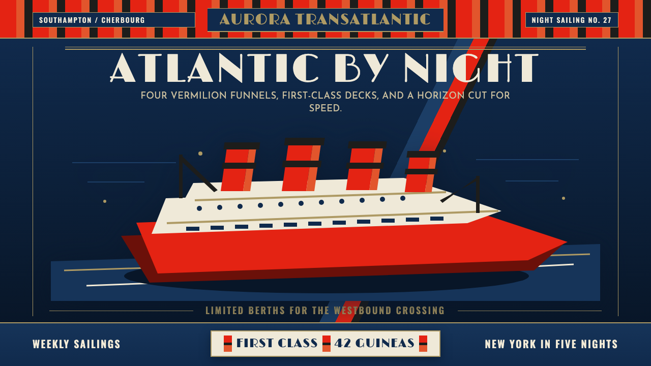 Cunard Liner PosterOceanic grandeur. Vermilion funnels, teak-gold caps, and a marine-blue poster…
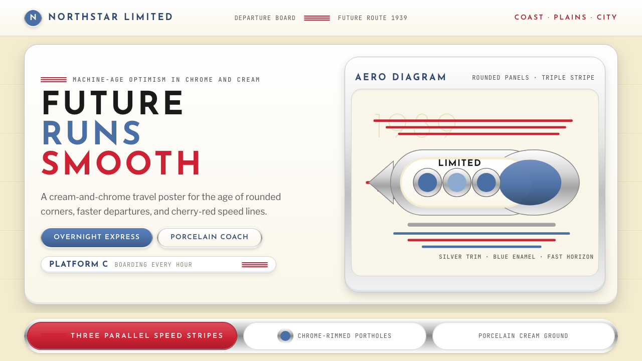 Streamline Moderne (1930s)Optimism made aerodynamic. Cream ground, chrome ovals, and cherry stripes dri…
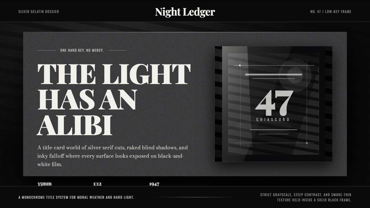 Film Noir ChiaroscuroLight is the crime. Silver serif cards, blind stripes, and grain carve drama…
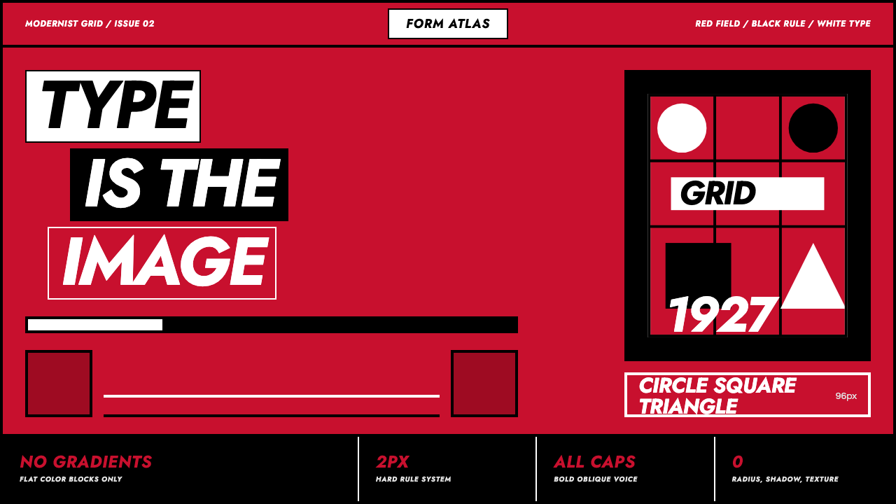 Futura Geometric PosterType becomes image. Red grid, white oblique Jost, black rules at poster scale.