What is Film Noir Chiaroscuro?
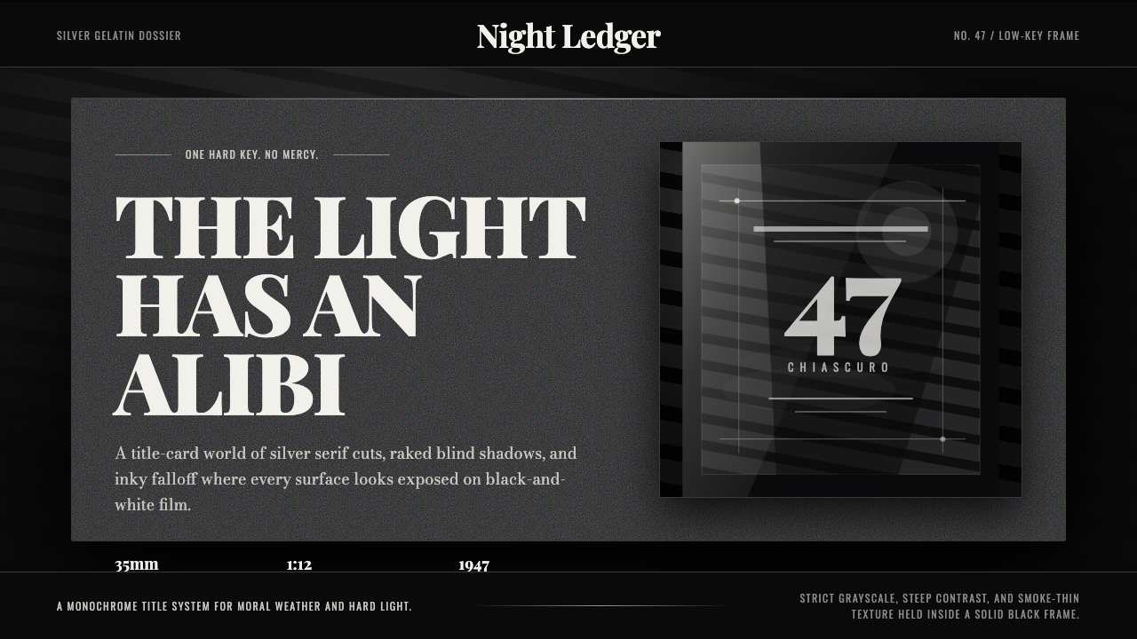
Film Noir Chiaroscuro turns the screen into a crime scene lit by a single hard light — where shadow is not the absence of design but its main event.
Film Noir Chiaroscuro in brief
Film Noir Chiaroscuro is a low-key, strictly grayscale visual language lifted from American crime pictures of the mid-to-late 1940s — the era of Out of the Past, The Lady from Shanghai, and Kiss of Death. Where most design styles start from a light or neutral ground and add marks to it, this one starts from black. The page, screen, or slide is treated as an already-dark field, and every visible element exists because a beam of light was aimed at it on purpose. Nothing is illuminated by accident.
The look is built entirely from contrast rather than color. There is no palette in the ordinary sense — no blue, no red, no warm accent — only the range between exposed silver-white and undeveloped black, with every gray in between doing structural work. A dramatic serif carries titling, standing in for the title cards that opened these films; striped shadow patterns recall light cut by venetian blinds; a fine grain sits over every surface, the residue of physical film stock. Falloff into black is steep and deliberate, so a figure or object seems cut out of darkness rather than resting on a background.
Because the style withholds so much — no color, no soft gradients, no even lighting — what it does show carries enormous weight. A single lit edge on a letterform, one bright diagonal slicing across a dark panel, a name picked out in silver against near-black: these read as high-stakes decisions precisely because everything around them has been suppressed. The style rewards restraint and punishes clutter; it is less a decoration than an interrogation.
Where does Film Noir Chiaroscuro come from?
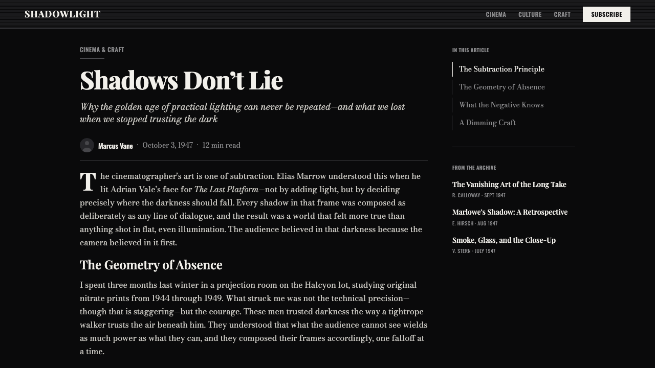
Film noir was never a movement its practitioners named themselves — it is a label French critics applied after the fact. In 1946, after wartime import restrictions had cut French audiences off from American cinema for years, critics Nino Frank and Jean-Pierre Chartier watched a backlog of Hollywood crime pictures arrive in Paris all at once and noticed something they had not seen from American studios before: a mood of fatalism and visual darkness closer to hard-boiled crime fiction than to Hollywood's usual polished optimism. Frank coined the phrase film noir — literally black film — borrowing from Gallimard's Série noire line of pulp crime novels. The directors and cinematographers making these pictures in the 1940s did not think of themselves as working in a school called noir; the label, and the retrospective sense that these films shared one visual system, came from critics looking back.
The technique underneath the label has an older, more traceable lineage: German Expressionist cinema of the 1910s and 1920s, and the theatrical use of light and shadow in films associated with directors and cinematographers who fled Germany and Central Europe as the Nazi regime rose to power. That generation of émigrés — trained where painted shadows, canted angles, and stark contrast were already standard vocabulary — arrived in Hollywood and found, in the low-budget B-picture crime genre, a place where those techniques were not just tolerated but useful. Low-key lighting hides cheap sets, and a single hard key light is faster and cheaper to rig than the soft, multi-source lighting of a glossy A-picture. What began as an aesthetic import became, in Hollywood's economics, also a practical solution.
Cinematographer Nicholas Musuraca, working at RKO through the 1940s, became one of the style's defining hands — his work on Jacques Tourneur's Out of the Past (1947) is now treated as close to a textbook demonstration of noir lighting, a world where a desk lamp or a passing car's headlights motivate the only light in a room and faces are frequently split by a hard line between lit and unlit. John Alton, a cinematographer working across several studios in the same period, pushed the technique further and later wrote about it explicitly, describing how one instrument and a carefully placed flag could carve a face or a rain-slicked street out of almost total blackness. Orson Welles brought a more theatrical, distorting version of the same instinct to The Lady from Shanghai (1947), using extreme angles and reflective surfaces — most famously a hall of mirrors — to turn noir lighting's disorientation into a statement about deception and self-image.
By the early 1950s, changing studio economics and shifting tastes had largely ended the classic cycle, but the visual language it left behind proved durable. It resurfaced deliberately in the 1970s and 1980s in films critics began calling neo-noir, and its core grammar — hard single-source light, deep black shadow, graphic contrast in place of color, a fatalistic mood conveyed through lighting rather than dialogue alone — has continued to be recognized and revived well outside cinema, in print design, photography, and now interface design, as shorthand for danger, secrecy, and moral ambiguity.
What defines the Film Noir Chiaroscuro look?
Low-Key Field
The default state of every surface is dark, not light. Instead of starting from white and adding black ink, this style starts from near-total blackness and earns every lit area back through deliberate exposure. Panels, cards, and backgrounds sit close to unlit black by default; brightness is treated as a scarce resource spent only where attention is meant to land.
Hard Key Light
Illumination comes from a single, identifiable source rather than an even ambient wash. The transition from lit to unlit is abrupt — a hard edge, not a soft gradient — so that a headline, an icon, or a card can appear to be caught in a beam rather than uniformly lit. This single-source logic is what gives the style its sense of a scene rather than a flat layout.
Strict Grayscale
Color, in the conventional sense, is absent. The entire visual range runs from silvery near-white through a full spectrum of grays down to ink black, with no hue temperature added — the style is deliberately cool and neutral rather than warm. Any accent color, if used at all, must be so restrained and so rare that it reads as an intrusion, the way a single splash of red would read in an otherwise black-and-white film.
Serif Title Cards
Headings and titling lean on a dramatic serif letterform, evoking the engraved title cards that opened these films. The serif carries formality and gravity that a plain sans-serif would not — it is meant to feel printed or engraved rather than typed, closer to a marquee or a credit sequence than to a modern interface label.
Venetian-Blind Shadow
Striped bands of shadow, echoing light cut by window blinds, are a recurring motif for dividing space or adding texture to an otherwise flat dark panel. Used sparingly, these stripes suggest an unseen window and an unseen street outside it, importing the sense of a specific physical location — an office, an interrogation room — without depicting one literally.
Film Grain
A fine, even grain texture sits across surfaces, the visual signature of physical silver-gelatin film stock rather than a clean digital render. This grain is subtle rather than heavy — it should read as period texture, a reminder that the image was once exposed onto physical film, not as visible noise or damage.
Cigarette Haze
A soft atmospheric haze, standing in for cigarette smoke drifting through a lit beam, can be used to soften an otherwise hard-edged composition and to make light itself visible as a physical, volumetric thing rather than an abstract brightening of a surface. It is an occasional, mood-setting device rather than a constant background condition.

Who shaped Film Noir Chiaroscuro?
A staff cinematographer at RKO through the 1930s and 1940s, Musuraca shot Jacques Tourneur's Out of the Past (1947), a film now treated as close to a defining demonstration of noir lighting technique. His interiors are frequently lit by a single motivated source — a desk lamp, a car's headlights sweeping past a window — leaving most of the frame in shadow and forcing faces to emerge from darkness rather than sit within an evenly lit room. His work at RKO's B-picture unit shows how a low budget and a low-key style reinforced each other: dark sets hide cheap construction, and a single key light is far faster to rig than soft multi-source lighting.
A cinematographer who worked across several studios during the same period, Alton became known for pushing low-key lighting to its most extreme and economical form, and later wrote about the technique explicitly in his own book on cinematography. He described how a single instrument, combined with a carefully placed flag to block light selectively, could carve a face or a rain-wet street out of almost total blackness. His writing helped turn what had been an intuitive studio craft into something closer to a documented, teachable method.
As both director and star of The Lady from Shanghai (1947), Welles brought a more theatrical and disorienting version of noir's visual instincts to the screen, favoring extreme camera angles and reflective surfaces — most famously the film's climactic hall-of-mirrors sequence — to turn the visual confusion of hard, fragmented light into a psychological statement about deception and unreliable appearances. His work shows the style's shadow-and-contrast vocabulary could be pushed toward the abstract, not only the moody and atmospheric.
Director of Out of the Past (1947), widely regarded as one of the defining films of the classic noir cycle, Tourneur worked closely with cinematographer Nicholas Musuraca to build entire scenes around a single controlled light source, letting mood and moral ambiguity emerge from staging and lighting rather than exposition. His restraint — trusting a dark frame and a well-placed shadow over overt explanation — became a model for how much a scene could withhold and still communicate clearly.
How do you use Film Noir Chiaroscuro today?
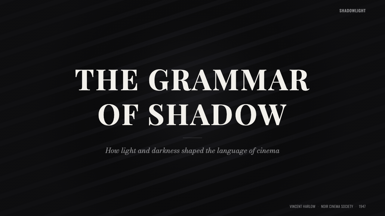
Film Noir Chiaroscuro is a high-drama style, and it rewards being applied where a project genuinely wants tension, mystery, or gravity rather than ordinary polish. On presentation cover slides, it is exceptionally effective: a single strong beam of light picking a title out of a near-black field creates immediate visual authority, and the dramatic serif reinforces a sense of consequence before a word of the pitch has been spoken. Content and data slides need more care — a chart rendered in strict low-key grayscale must still be readable, so keep the underlying grid and numerals in a clean, legible gray rather than pushing every element into deep shadow; let one element per slide catch the hard light as a focal point, and leave supporting data in calmer, evenly lit gray so it does not compete for attention.
For web interfaces, dashboards are a natural fit: a dark operating console with a single strong accent of brightness on the metric that matters most reads as confident and serious rather than merely dark-mode-for-its-own-sake. Pricing pages can use the style's selective illumination logic almost literally — the recommended plan is the one caught in the light, framed by a hard edge, while other tiers recede into the low-key field around it. In both cases the venetian-blind shadow motif works well as a section divider or background texture, but should stay in the background register; it must never compete with actual content for the eye's attention.
In editorial and marketing contexts, the style suits any narrative built around suspense, exposure, or revelation — investigative journalism, true-crime content, premium spirits and menswear branding, thriller and mystery publishing, security and privacy products positioning themselves against hidden threats. A magazine feature can open with a full-bleed dark image and a serif headline picked out by a single beam, then let body copy sit in calm, legible gray beneath it. Marketing pages benefit from restraint in how often the hard-light moment is used: one dramatic reveal per page reads as considered; three or four start to feel like a repeating gimmick.
The style also has a natural affinity for storytelling sequences — case studies, investigation timelines, before/after narratives — where each section can be staged as its own small scene, lit and revealed in turn rather than presented all at once. This sequential, one-beam-at-a-time quality is one of the style's more distinctive strengths relative to flatter, evenly lit design languages, and is worth leaning into rather than flattening out.
The most common mistake is treating the style as simply dark mode with a serif font. Genuine Film Noir Chiaroscuro depends on contrast doing structural work — a clear hierarchy of what is lit and what is left in shadow — not on uniformly dimming every surface to the same dark gray. A screen where everything is equally murky has abandoned the style's central logic; darkness only reads as dramatic if there is also, somewhere, a hard and deliberate beam of light for it to be dark against. A second frequent error is introducing warm color — amber highlights, sepia tones — which pulls the look toward vintage photography rather than the cool, neutral, strictly grayscale register the style depends on.
Film Noir Chiaroscuro — FAQ
Is Film Noir Chiaroscuro the same thing as dark mode?
No, though the two are often confused. Dark mode is simply a color-scheme inversion — light text on a dark background, applied fairly evenly across a whole interface. Film Noir Chiaroscuro is a lighting logic: illumination must come from a single, identifiable, hard-edged source, and most of the frame should remain genuinely unlit. A dashboard can be in dark mode and still be flat and evenly lit throughout; it only becomes noir when hierarchy is expressed through deliberate contrast between a lit focal point and deep surrounding shadow.
Can this style use any color at all, or must it stay strictly black and white?
The historical reference is strictly grayscale, and the style's discipline comes from that constraint. A contemporary application does not have to be literally colorless, but any accent color must be used so sparingly and deliberately that it reads as an intentional intrusion rather than a palette. That is the ceiling for how much color this style can absorb before it stops feeling like noir and starts feeling like a colorized photograph.
Why does the style rely so heavily on a single light source instead of even, ambient lighting?
Because the single hard source is what creates hierarchy without color. In a style that has given up hue as a tool, contrast between lit and unlit becomes the only way to tell the eye what matters. There is also a practical history: low-key, single-source lighting was cheaper and faster to rig in 1940s studios than soft, multi-instrument setups, and it conveniently hid inexpensive sets in shadow — expressive effect and production economy together are why the technique became so recognizable.
Does the venetian-blind shadow motif need a literal window to make sense?
No — its power comes precisely from being suggested rather than depicted. In the source films, stripes of shadow imply an unseen window and street beyond it without the camera ever showing either. Applied to a layout, the same striped shadow can fall across a panel with no window drawn anywhere in the composition; the eye supplies the implied location on its own. Rendering an actual window alongside the stripes tends to over-explain the effect and weakens it.
What kinds of products or brands should avoid this style?
Anything needing to communicate warmth, approachability, or everyday reassurance will fight against this style — children's products, healthcare apps, family-oriented consumer brands, and most everyday productivity tools generally need a friendlier register. The style is also a poor fit for content-dense reference material where every item needs equal visual weight, since its logic depends on treating most of the frame as intentionally unlit while a few chosen elements are picked out — a page that tries to spotlight everything ends up spotlighting nothing.
Related design styles
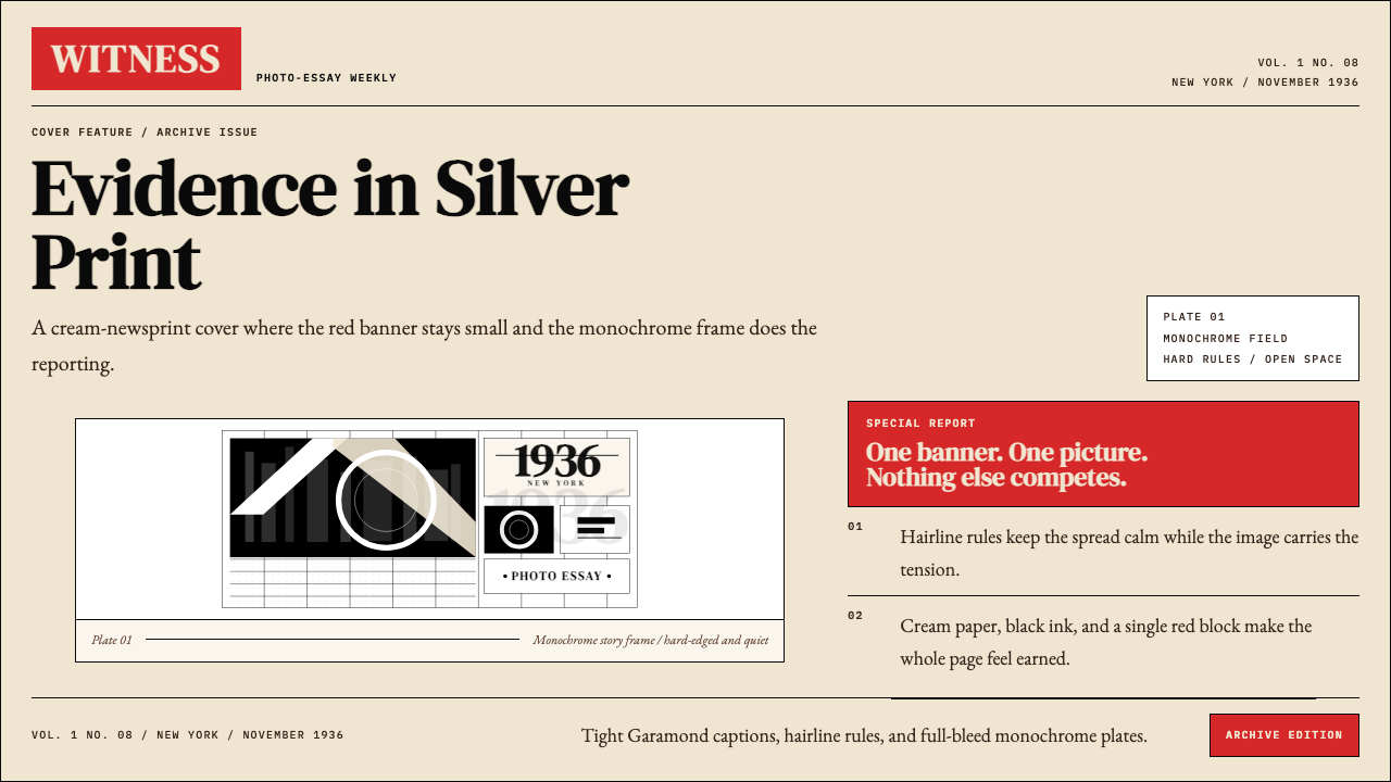 LIFE Magazine (Red-Banner)Photojournalism stripped bare. One red banner, cream newsprint, stark black p…
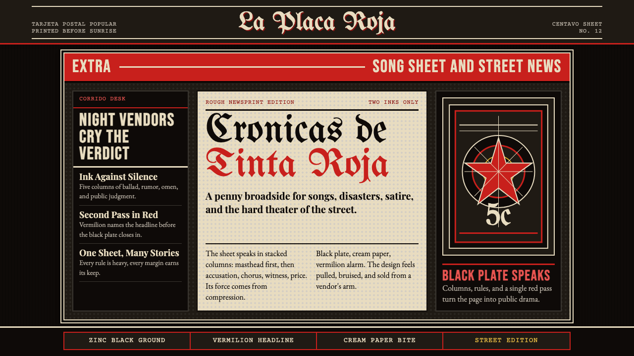 Mexican Tarjeta Postal (Posada Engraving 1900)Tabloid drama in two inks. Fraktur mastheads, vermilion rules, and cream news…
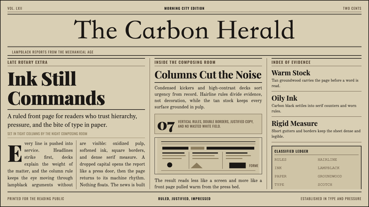 Broadsheet LetterpressAuthority in ink. Lampblack serif decks lock into tan paper with strict ruled…
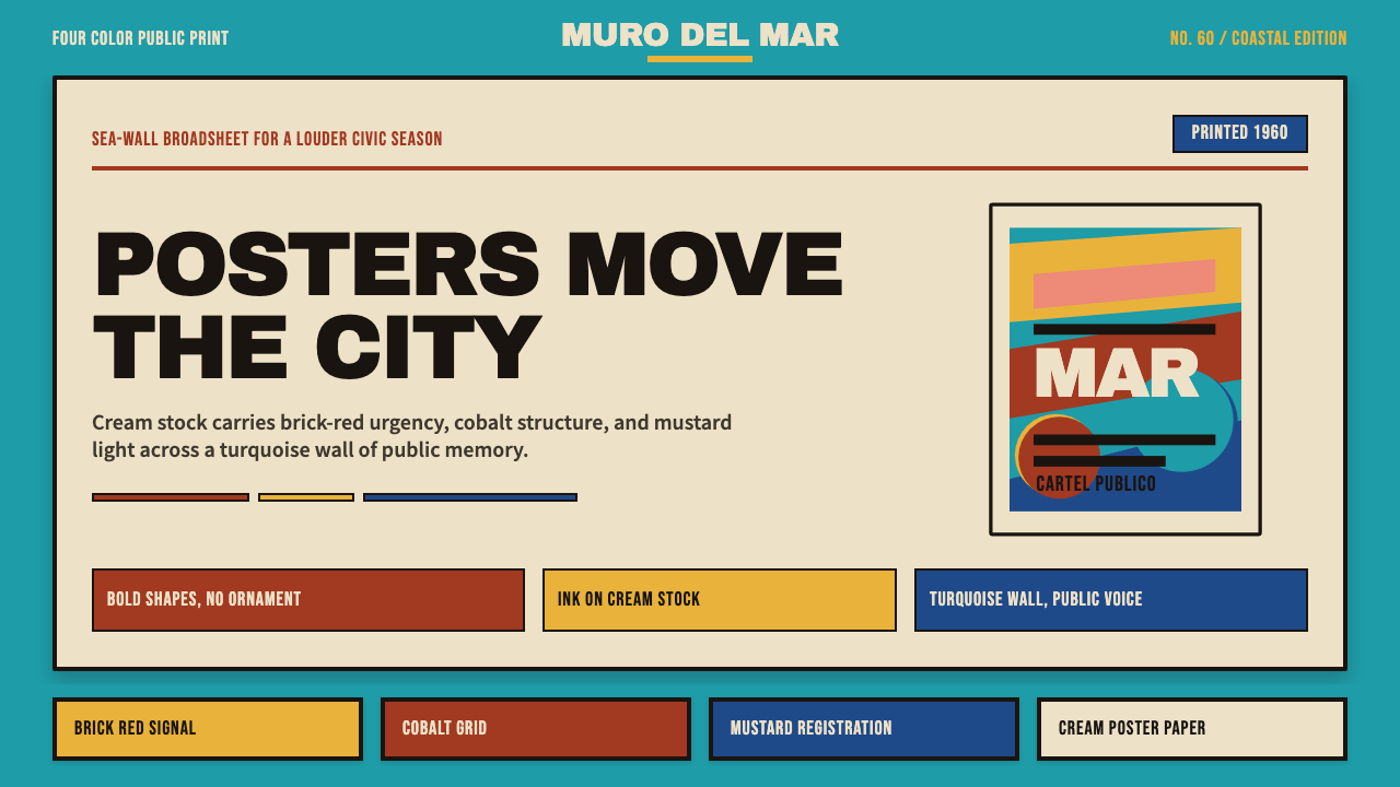 Cuban Malecón 1960 PosterPublic voice in flat ink. Turquoise wall, cream stock, brick red and cobalt b…
 JPL Visions of the FutureSpace travel as print craft. Burnt orange silhouettes and Deco tan type on na…
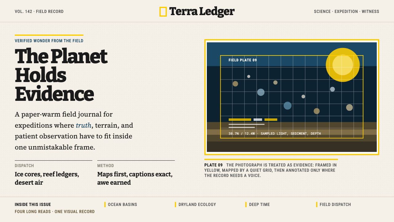 National GeographicAuthority frames wonder. Yellow border, Bitter slab type, and warm paper make…