What is LIFE Magazine (Red-Banner)?什么是 LIFE Magazine (Red-Banner)?
One saturated red wordmark on cream newsprint, one dramatic black-and-white photograph, and the twentieth century learned to read pictures as stories.一抹饱和的红色字标压在象牙色新闻纸上,一张震撼人心的黑白照片,二十世纪就此学会把图片当故事来读。
LIFE Magazine (Red-Banner) in briefLIFE Magazine (Red-Banner) 速览
LIFE Magazine (Red-Banner) is the visual system pioneered by Time Inc.'s LIFE from its founding in 1936 through its golden decades as America's dominant weekly. Its core logic is radical restraint in service of photographic impact: a single emergency-red masthead anchors the top of every cover and section head, while cream or off-white newsprint, hairline black rules, and tightly set caption text step back to let full-bleed black-and-white photography speak unimpeded. The palette is, by deliberate choice, almost binary — red for identity, black for image and type, off-white for ground.LIFE 杂志(红色横幅)风格是 Time Inc. 旗下《生活》杂志自 1936 年创刊、历经数十年黄金时代所建立的视觉系统。其核心逻辑是极度克制地服务于摄影冲击力:一条正红色大横幅锚定每期封面与版块标题,奶油色或米白色新闻纸、纤细的黑色细线、紧凑的图注文字全部退后,让全版铺满的黑白纪实摄影无阻碍地说话。调色板是刻意的近乎二元对立——红色用于品牌识别,黑色用于图像与文字,米白色用于底面。
Where most magazine design systems of the era competed for visual attention with illustrated borders, decorative headlines, and color fills, LIFE inverted the hierarchy. The photograph was the article. Headlines existed only to explain the image, not to attract the eye independently. Captions were set in a compact, slightly condensed serif, snug beneath or beside each frame. White space was not emptiness but breathing room — every margin was generous enough that the photographs seemed to float. The result was a page that felt simultaneously journalistic and monumental.同时代大多数杂志设计体系以插画边框、装饰标题和彩色填充争夺视觉注意,LIFE 则彻底颠覆这一层级:照片就是文章,标题只为解释图像而存在,无需独立吸引眼球。图注以一种紧凑、略带收缩的衬线字体排印,紧贴每幅图片上下或左右。留白不是空洞,而是呼吸空间——每一处页边都宽裕到照片仿佛漂浮于纸面之上。最终呈现的版面,既有新闻性又有纪念碑式的分量。
The style's authority comes from its refusal. By committing to a single accent color at maximum saturation, setting all titling in wide-spaced capital letters, and running photographs at sizes that would have seemed extravagant to a newspaper art director, LIFE created a visual language that said: this matters. That rhetoric of importance — red declares urgency, monochrome photographs claim documentary truth, generous white space signals that nothing here is filler — remains the style's core communicative argument.这种风格的权威感来自它的拒绝。通过将单一强调色置于最高饱和度、将所有标题排印为加大字距的全大写字母、将照片放到对报纸美编而言显得奢侈的尺寸,LIFE 创造了一种视觉语言,传递出「这件事很重要」的信号。这套重要性修辞——红色宣示紧迫感,黑白照片主张纪录真实,宽裕的留白表明此处没有废话——至今仍是这种风格最核心的传播主张。
See the LIFE Magazine (Red-Banner) design system查看 LIFE Magazine (Red-Banner) 完整设计系统
Where does LIFE Magazine (Red-Banner) come from?LIFE Magazine (Red-Banner) 从何而来?
The story of LIFE's visual identity begins not with a designer but with a publisher's ambition. Henry Luce, co-founder of Time Inc., acquired the rights to the LIFE name in 1936 from a defunct humor magazine. His vision was transformational: a weekly magazine that would make photojournalism the primary medium for understanding American and world events. When the first issue appeared on November 23, 1936, the cover photograph — Margaret Bourke-White's image of Fort Peck Dam in Montana — established immediately that this would be a different kind of publication. The photograph ran nearly full-bleed, framed only by the red masthead above it and a caption below.LIFE 视觉识别的故事,起点不是一位设计师,而是一位出版人的野心。Time Inc. 联合创始人亨利·卢斯于 1936 年从一本停刊的幽默杂志手中购得了「LIFE」这个名称的使用权。他的愿景是变革性的:创办一本以摄影报道为理解美国与世界事件的主要媒介的周刊杂志。1936 年 11 月 23 日,创刊号封面——玛格丽特·伯克-怀特拍摄的蒙大拿州堡派克大坝——立刻宣告了这是一种不同的出版物。照片几乎铺满整个版面,仅由上方红色横幅与下方图注所框定。
The typographic architecture that framed those photographs emerged from the editorial traditions of the era's most serious newspapers and news magazines. The masthead wordmark was drawn in a style descended from the heavy Bodoni-influenced display serifs that American newspapers used for front-page banners — thick verticals, razor-thin horizontals, high contrast between stroke weights, tight bracketing on the serifs. Its color, a saturated primary red, was chosen for maximum visibility on newsstand racks and maximum contrast against the cream stock. The decision to use red and only red as the accent — no secondary palette, no seasonal variations — was an unusual commitment to visual consistency for the 1930s.框架这些照片的排印架构,来自当时最严肃的报纸与新闻杂志的编辑传统。横幅字标的字形源于美国报纸用于头版横幅的 Bodoni 影响下的重磅展示衬线字体血脉——粗壮的竖笔画,剃刀般纤薄的横笔画,笔画粗细间的高对比,衬线处的紧密收束。它的颜色——饱和的正红色——是为了在报摊货架上获得最大辨识度,并与奶油纸面形成最大对比。决定使用红色且只用红色作强调色——没有辅助色板,没有季节性变体——对于 1930 年代而言,是对视觉一致性罕见的承诺。
From the start, LIFE's art direction operated on a principle that distinguished it from illustrated magazines: the photograph was not decoration for the text, but the text was annotation for the photograph. Art directors at LIFE — including the influential Howard Chapnick and later Bernard Quint — developed page layout conventions that treated the photographic spread as a cinematic sequence. Photographs were sequenced across pages to create narrative rhythm, with a large "lede" image establishing a scene, supporting photographs developing context, and a final image providing resolution or emotional closure. This sequencing logic, sometimes called the photo-essay grammar, became the template that countless editorial designers have borrowed since.从一开始,LIFE 的艺术总监工作就遵循一条将其与图文杂志区别开来的原则:照片不是文字的装饰,文字是照片的注解。LIFE 的艺术总监们——包括颇具影响力的霍华德·查普尼克,后来的伯纳德·昆特——将跨页摄影作为电影序列来处理,发展出一套版面惯例。照片按叙事节奏跨页编排:一张大幅「导引图」建立场景,辅助照片发展语境,最后一张图提供解决或情感收束。这种被称为「图片故事语法」的编排逻辑,成为此后无数编辑设计师借鉴的模板。
The magazine's visual authority was inseparable from its photographers. Margaret Bourke-White, Alfred Eisenstaedt, W. Eugene Smith, Gordon Parks, and Robert Capa — working through the 1940s, 1950s, and 1960s — produced images of a consistent tonal and compositional quality that the layout system was designed to honor rather than override. Eisenstaedt's images of ordinary American life, shot in available light with deep shadow and bright highlight, became the tonal model for what a LIFE photograph should look like. Smith's longer photo-essays — on a rural doctor, on Minamata — pushed the form toward something approaching visual literature. The design system's restraint was what gave these images room to be what they were.杂志的视觉权威感与它的摄影师密不可分。玛格丽特·伯克-怀特、阿尔弗雷德·艾森施塔特、W. 尤金·史密斯、戈登·帕克斯和罗伯特·卡帕——活跃于四五六十年代——创作出具有一致影调与构图品质的图像,而版面系统被设计为尊重这些图像,而非凌驾其上。艾森施塔特以现有光线拍摄、深暗影与明亮高光并存的美国日常生活图像,成为「LIFE 式照片」影调的范本。史密斯更长的图片故事——关于乡村医生、关于水俣病——将这种形式推向接近视觉文学的境界。设计系统的克制,正是给予这些图像成为其自身所需的空间。
What defines the LIFE Magazine (Red-Banner) look?LIFE Magazine (Red-Banner) 的视觉特征是什么?
The Red Masthead红色横幅
The defining element is a single saturated red band across the top of the page carrying the LIFE wordmark in heavy, high-contrast serif capitals. The red is unmodulated — no gradient, no shadow, no texture — and appears nowhere else in the layout. Its function is dual: brand identification at distance on the newsstand, and a chromatic anchor that makes the cream-and-black composition below feel complete. The masthead never competes with the photograph; it declares ownership of the page and then yields entirely to the image.最核心的元素是一条横跨页面顶端的饱和红色横幅,承载着由重磅高对比衬线大写字母组成的 LIFE 字标。这抹红色不调和——无渐变、无阴影、无纹理——且在版面其他任何地方都不再出现。它具有双重功能:在报摊上提供远距离的品牌识别,以及作为色彩锚点,使下方奶油色与黑色的构图得以完整。横幅从不与照片争夺注意力;它宣示对页面的所有权,然后完全让位于图像。
Full-Bleed Monochrome Photography全版黑白摄影
Photographs run edge-to-edge or close to it, with gutters kept minimal and frames eliminated entirely. Black-and-white reproduction was partly a production constraint of the era, but LIFE's editors and photographers embraced it as an expressive choice: the removal of color forces the eye toward form, light, shadow, and gesture. The tonal range of LIFE photographs tends toward deep shadow and brilliant highlight — a high-contrast print style that reproduced well on newsprint and gave images a dramatic, almost graphic quality.照片从边到边铺满或接近满版,间距保持最小,图框完全取消。黑白印刷一部分是当时的生产限制,但 LIFE 的编辑与摄影师将其视为一种表达选择来接受:去除色彩迫使眼睛转向形态、光线、阴影与姿态。LIFE 照片的影调倾向于深暗的暗部与明亮的高光——一种高对比的冲印风格,在新闻纸上能良好再现,同时赋予图像戏剧性的、近乎图形般的品质。
Wide-Spaced Capital Headlines宽字距大写标题
Headlines and section labels are set in capital letters with generous letter-spacing, typically in a weight heavier than the body text but considerably lighter than the masthead. The wide spacing slows the reading pace, giving each word weight and deliberateness. This is typographic restraint in service of gravitas — the headline does not shout, it pronounces. Subheadings, where used, are set smaller but follow the same capitalized, spaced convention, creating a clear and consistent hierarchy.标题与版块标签以大写字母排印,字距宽裕,字重通常重于正文,但比横幅字标明显更轻。宽字距放慢阅读速度,使每个词语都具有分量与庄重感。这是服务于厚重感的排印克制——标题不是呼喊,而是宣告。小标题若使用,字号更小,但延续同样的大写、加宽字距的惯例,形成清晰而一致的层级。
Hairline Rules and Structural Lines细线与结构分隔
Thin, single-weight horizontal rules — barely visible but structurally present — separate sections, frame captions, and articulate the grid. These hairlines are not decorative; they are organizational. Their fineness prevents them from competing with the photographs, but their presence keeps the layout from dissolving into undifferentiated white space. The rules reinforce the sense that every element on the page has been placed with intention, not dropped into position.纤细的、单一粗细的水平细线——几乎不可见,但在结构上存在——分隔版块、框定图注、清晰表达网格。这些细线不是装饰性的,而是组织性的。它们的纤细防止与照片竞争,但它们的存在使版面不至于消融为无差别的白色空间。细线强化了一种感受:页面上的每个元素都是有意放置的,而非随意落位。
Compact Caption Typography紧凑图注排印
Captions are the secondary reading layer in the LIFE system, and they are typeset to behave subordinately: a slightly condensed serif face, set at a smaller size than body text, with tight leading that keeps the caption block visually compact. The caption is anchored close to its photograph — never floating ambiguously between images. This proximity creates an unambiguous image-text pair. Captions were written with journalistic precision and often ran to several sentences, forming a secondary narrative beneath the visual one.图注是 LIFE 系统中的次要阅读层,排印方式使其处于从属地位:一种略带收缩感的衬线字体,字号小于正文,行距紧密使图注文字块在视觉上保持紧凑。图注锚定于对应照片近旁——绝不在图片之间模糊漂浮。这种紧密性构成清晰无歧义的图文配对。图注以新闻记者式的精确撰写,常延伸至数句,在视觉叙事之下形成一条次要叙事线。
Cream Ground and Generous Margins奶油底色与宽裕页边
The base is off-white newsprint — not pure white, but the warm, slightly yellowish cream of uncoated stock. This ground gives the photographs a slightly warmer tonal context than a bright white page would, and it makes the red masthead appear richer and more saturated by contrast. Margins are kept wide by the standards of print journalism, providing visual breathing room that signals editorial confidence: the editors did not fill every column inch because they did not need to.底色是米白色新闻纸——不是纯白,而是未涂布纸张温暖的、略带黄调的奶油色。这一底色为照片提供了比明亮白色页面更温暖的影调语境,并通过对比使红色横幅显得更饱满、更浓郁。页边距按平面新闻业的标准保持宽裕,提供视觉上的呼吸空间,传递出一种编辑自信:编辑们并未填满每一列英寸,因为他们不需要这样做。
Narrative Photo Sequencing叙事式照片编排
The photo-essay layout is not a collection of images but a scripted sequence. LIFE art directors typically opened with one large establishing photograph, followed by a series of supporting images at varied sizes and crops that developed the story, and closed with an image that provided resolution or emotional weight. Scale relationships between photographs on a spread signal importance: the largest image is the thesis, smaller ones are evidence. This cinematic grammar elevated magazine layout to a storytelling discipline.图片故事的版面不是图像的堆砌,而是有剧本的序列。LIFE 艺术总监通常以一张大幅的建场照片开篇,随后是一系列大小与裁切各异、推进故事的辅助图像,并以一张提供解决感或情感重量的图像收束。跨页照片之间的尺度关系传达重要性:最大的图像是论点,较小的是证据。这种电影式语法将杂志版面提升为一门叙事学科。
See the LIFE Magazine (Red-Banner) design system查看 LIFE Magazine (Red-Banner) 完整设计系统
Who shaped LIFE Magazine (Red-Banner)?谁塑造了 LIFE Magazine (Red-Banner)?
Luce co-founded Time magazine in 1923 and launched LIFE in November 1936, transforming photojournalism from a supplementary illustration practice into the primary vehicle for American news storytelling. His editorial conviction — that photographs could convey the complexity of world events with an immediacy that text alone could not match — shaped every aspect of LIFE's visual and editorial identity. Luce ran Time Inc. until 1964, presiding over LIFE's peak circulation years and its influence on how generations of Americans understood news through pictures.卢斯于 1923 年联合创办了《时代》杂志,并于 1936 年 11 月创刊《生活》,将摄影报道从辅助性插图实践转变为美国新闻叙事的主要载体。他的编辑信念——照片能以文字无法单独匹敌的即时性传达世界事件的复杂性——塑造了 LIFE 视觉与编辑认同的每个层面。卢斯主持 Time Inc. 直至 1964 年,见证了 LIFE 发行量的巅峰岁月,以及它对数代美国人通过图片理解新闻这一方式的深远影响。
Bourke-White shot the photograph that appeared on LIFE's first cover — the Fort Peck Dam construction site in Montana — and became one of the magazine's defining staff photographers. Her visual approach combined formal architectural composition with documentary social concern: industrial subjects rendered with the precision of a technical drawing, human subjects placed within those structures to convey scale and social meaning. Her photographs from the Dust Bowl, from World War II battlefields, from the partition of India, and from the aftermath of the Nazi concentration camps set a standard of moral seriousness that shaped what LIFE photography aspired to be.伯克-怀特拍摄了刊登于 LIFE 创刊号封面的照片——蒙大拿州堡派克大坝建设工地——并成为杂志最具代表性的签约摄影师之一。她的视觉方法将正式的建筑构图与纪录社会关怀相结合:以技术图纸的精确度呈现工业题材,在这些结构中安置人物以传达尺度感与社会意义。她拍摄的尘暴带、二战战场、印巴分治与纳粹集中营劫后的照片,树立了一种道义严肃性的标准,塑造了 LIFE 摄影所追求的目标。
Eisenstaedt was one of LIFE's earliest staff photographers and remained associated with the magazine for decades, contributing more than ninety cover photographs during his tenure. His approach to portraiture and candid photography — catching subjects in unposed moments with available light — established the visual baseline for what a LIFE image looked and felt like. His photograph of a sailor kissing a nurse in Times Square on V-J Day, 1945, became one of the most reproduced images of the twentieth century and crystallized the magazine's ability to capture a historical moment as a single, iconic frame.艾森施塔特是 LIFE 最早的签约摄影师之一,与杂志的渊源历经数十年,任职期间贡献了逾九十张封面照片。他的人像与抓拍方法——以现有光线捕捉主体的未摆拍瞬间——确立了 LIFE 图像视觉基调的基准。他于 1945 年二战日本投降日拍摄的水手在时代广场亲吻护士的照片,成为二十世纪传播最广的图像之一,结晶了这本杂志将历史时刻凝固为单一标志性画面的能力。
Smith worked for LIFE at intervals from the 1940s through the early 1970s and pushed the photo-essay form toward its most ambitious and contentious expressions. His extended essays — on a rural Spanish village, on a country doctor in Colorado, on jazz musician Albert Schweitzer, and most powerfully on the mercury poisoning tragedy in Minamata, Japan — ran to dozens of photographs and were designed to be read as complete visual arguments rather than illustrated articles. Smith's conflicts with LIFE editors over control of his photo-essays made the underlying question of who governs the layout of a photographic story a lasting professional and ethical debate.史密斯从 1940 年代到 70 年代初断续为 LIFE 工作,将图片故事形式推向最有雄心也最具争议性的表达。他的长篇图片故事——关于西班牙乡村、科罗拉多乡村医生、爵士音乐家阿尔伯特·史怀哲,以及最具震撼力的日本水俣汞中毒悲剧——常达数十张照片,被设计为完整的视觉论述而非配图文章来阅读。史密斯与 LIFE 编辑就图片故事版面控制权的持续冲突,使「谁来主导一部摄影叙事的版面」这一核心问题成为延续至今的职业与伦理争论。
Parks joined LIFE as a staff photographer in 1948, becoming the first African American staff photographer at any major American news magazine. His work for LIFE documented segregation, poverty, and the civil rights movement with a visual authority that forced these subjects into the mainstream of American editorial culture. Parks also brought a formal compositional sensibility rooted in his background as a self-taught photographer — his images frequently deploy symmetry, depth of field, and strong geometric framing in ways that gave his documentary subjects the visual weight of fine-art portraiture.帕克斯于 1948 年加入 LIFE 成为签约摄影师,成为美国主流新闻杂志中首位非裔美国签约摄影师。他为 LIFE 所做的报道以视觉权威感记录了种族隔离、贫困与民权运动,迫使这些议题进入美国编辑文化的主流。帕克斯还带来了根植于自学摄影背景的正式构图感受力——他的图像频繁运用对称、景深与强烈的几何取景,使他的纪录题材具有纯艺术人像摄影般的视觉分量。
How do you use LIFE Magazine (Red-Banner) today?今天怎么用 LIFE Magazine (Red-Banner)?
The LIFE Red-Banner style translates most naturally to contexts where a single dominant image needs to carry authority, and where the designer's job is to frame rather than to decorate. The core discipline is the same whether the medium is a slide deck, a web dashboard, or a printed editorial layout: choose the strongest visual, give it maximum real estate, and let the typographic system announce rather than compete.LIFE 红色横幅风格最自然地适用于需要单一主导图像传递权威感的场景,以及设计师的工作是框定而非装饰的场合。无论媒介是演示文稿、网页仪表板还是平面编辑版面,核心纪律都是一致的:选择最强的视觉主体,赋予它最大的空间,让排印系统去宣告而非竞争。
For presentation slides, the cover page is where this style pays its highest dividend. A full-bleed photograph or a high-contrast graphic occupies nearly the entire slide area; a red band at the very top carries the title or event name in wide-spaced capitals; a short subtitle or date runs below in a smaller, tracked serif. Content slides should resist the temptation to fill — a single strong graphic or photograph per slide, with a headline above and a caption-length annotation below, follows the photo-essay grammar and keeps each slide readable at a distance. Data slides can adopt the tonal language of LIFE's charts from its editorial spreads: black-and-white bar graphs with a single red bar used to highlight the most important value.对于演示文稿,封面页是这种风格获益最大的地方。全版照片或高对比图形占据几乎整张幻灯片;顶部一条红色横幅以宽字距大写字母承载标题或活动名称;下方以更小的、带字距的衬线字体排印副标题或日期。内容页应抵制填满的冲动——每张幻灯片一个强有力的图形或照片,上方标题、下方图注式注解,遵循图片故事语法,在远处仍保持可读。数据页可以采用 LIFE 编辑跨页图表的影调语言:黑白柱状图,以单一红色柱体高亮最重要的数值。
For web interfaces, the style suits editorial landing pages, long-form article templates, and publisher home pages rather than transactional or application interfaces. The approach: set the hero module as a full-width, high-contrast photograph with a red band above carrying the publication name or section identity. Body copy should be set in a traditional, slightly condensed serif at a moderate measure, with generous line spacing and wide left and right margins. Navigation is typographic — categories in tracked capitals — with no icon ornamentation. Red appears only in the masthead and in active or hover link states, never as a background fill.对于网页界面,这种风格适合编辑类落地页、长文章模板与出版商主页,而非交易性或应用型界面。方法如下:将主视觉模块设为全宽高对比照片,上方红色横幅承载刊名或版块识别;正文以传统的略带收缩感的衬线字体排印,行距宽裕,左右页边宽裕。导航是字体式的——以宽字距大写字母排印类别——无图标装饰。红色仅出现于横幅与活跃或悬停链接状态,绝不作为背景填充色。
For editorial and marketing work, the style has natural affinity with print-referencing contexts: book covers, magazine-style annual reports, brand journalism, and event programs. A well-executed LIFE-derived book cover uses a strong photograph or high-contrast illustration at full bleed, a red strip at top or bottom for the publisher or series identity, and titling in wide-spaced capitals against a light or dark ground. Marketing materials that need to convey authority — capability statements, prospectuses, institutional presentations — benefit from the style's association with editorial seriousness. The red accent, used only as a masthead or a single rule, communicates the visual rhetoric of a news organization: reliable, direct, significant.对于编辑与营销内容,这种风格与引用印刷语境的场合有天然亲和力:书籍封面、杂志式年报、品牌新闻与活动手册。一张执行良好的 LIFE 衍生书籍封面,使用强烈照片或高对比插图作全版底图,顶部或底部以红色窄条承载出版社或系列识别,标题以宽字距大写字母排印于浅色或深色底面上。需要传达权威感的营销材料——能力陈述、招股说明书、机构展示——受益于这种风格与编辑严肃性的关联。红色强调色仅用于横幅或单条细线,传递新闻机构的视觉修辞:可靠、直接、重要。
The most common mistake when applying this style is treating the red as a general accent color rather than as the sole identity element. In authentic LIFE-derived work, red appears in one place: the masthead. When designers use red for call-to-action buttons, pull quotes, section dividers, and data highlights simultaneously, the chromatic discipline collapses and the style loses its authority. A second frequent error is filling white space with content — adding additional photographs, sub-articles, or feature previews to layouts that the style demands be kept sparse. The LIFE aesthetic is not a dense information system; it is a stage for a single performance.应用这种风格时最常见的错误,是将红色视为通用强调色而非唯一识别元素。在真正源于 LIFE 的作品中,红色只出现在一个地方:横幅。当设计师同时将红色用于行动号召按钮、摘录引言、版块分隔线与数据高亮时,色彩纪律崩溃,风格失去权威感。第二个常见错误是用内容填充留白——在这种风格要求保持稀疏的版面中添加额外照片、子文章或专题预览。LIFE 美学不是一套密集的信息系统,而是一个为单一表演服务的舞台。
See the LIFE Magazine (Red-Banner) design system查看 LIFE Magazine (Red-Banner) 完整设计系统
LIFE Magazine (Red-Banner) — FAQLIFE Magazine (Red-Banner) · 常见问题
Can this style work without black-and-white photography?这种风格可以在没有黑白摄影的情况下使用吗?
Yes, but it requires care. The LIFE system was built around the tonal properties of monochrome photography — deep shadow, brilliant highlight, the absence of color distraction. Color photography can work within the system if it is treated with similar tonal discipline: high contrast, strong blacks, limited mid-range murkiness. Flat or low-contrast color photography will undermine the style's authority, because the layout architecture is designed to honor a bold image. Color illustration, if kept to high-contrast black line work or bold flat fills, can also function effectively. The red masthead and cream ground remain constant regardless of whether the primary visual is in color or monochrome.可以,但需要谨慎。LIFE 系统建立在黑白摄影的影调特性之上——深暗的暗部、明亮的高光、色彩干扰的缺席。彩色摄影若以类似的影调纪律处理,也能在系统内运作:高对比、深黑色、有限的中间调暗沉感。平淡或低对比的彩色摄影会削弱这种风格的权威感,因为版面架构是为承载有力图像而设计的。彩色插图若保持高对比黑线稿或大胆的平面填充,同样可以有效运作。无论主视觉是彩色还是黑白,红色横幅与奶油色底面始终保持不变。
How does this style differ from other editorial magazine aesthetics, like Esquire or Harper's Bazaar?这种风格与其他编辑类杂志美学(如《Esquire》或《Harper's Bazaar》)有何不同?
Esquire in its golden era under art director Henry Wolf deployed illustration, conceptual photography, and strong typographic wit — the cover was as much a designed object as a photograph. Harper's Bazaar under Alexey Brodovitch was typographically adventurous, using large type as a graphic element and treating the page as a canvas for visual tension between image and letter. LIFE's system is more austere than either: it subordinates typography entirely to photography, uses a single accent color rather than a developed typographic palette, and values documentary weight over formal elegance. Where Brodovitch's Bazaar was fashion and fine art, LIFE was journalism and history — and its visual language made that claim unmistakably.《Esquire》在艺术总监亨利·沃尔夫主持的黄金时代,大量运用插图、概念摄影与强烈的排印机智——封面本身既是设计作品也是照片。《Harper's Bazaar》在阿列克谢·布罗多维奇的主导下排印风格大胆冒险,将大字号排印作为图形元素,将页面当作图像与字母之间视觉张力的画布。LIFE 的系统比两者都更朴素:它将排印完全置于摄影之下,使用单一强调色而非发展完整的排印色板,重视纪录分量胜于形式优雅。布罗多维奇的《Bazaar》是时尚与纯艺术,LIFE 是新闻与历史——而它的视觉语言将这一主张表达得毫无歧义。
Is this style appropriate for digital-first contexts, or does it feel too print-native?这种风格适用于以数字为主的场景,还是感觉过于印刷原生?
The core elements — full-bleed imagery, strong typographic hierarchy, a single saturated accent color, generous white space — translate effectively to digital screens. What requires translation rather than direct transfer is the newsprint ground: on screen, a warm cream background reads differently than it does on uncoated paper, and the choice between a true cream, a warm off-white, or a pure white ground affects the mood significantly. The hairline rules that work beautifully in print can disappear or look anemic at screen resolution; they may need to be slightly heavier than their print equivalents. The style works best on screens in long-form reading contexts — article templates, editorial landing pages, institutional reports — where the slow, considered pacing of the photo-essay format is an asset rather than a friction.核心元素——全版图像、强烈的排印层级、单一饱和强调色、宽裕的留白——能有效转译到数字屏幕上。需要转译而非直接移植的是新闻纸底色:在屏幕上,温暖的奶油色背景与在未涂布纸张上的视觉效果不同,在真正的奶油色、暖白色或纯白底色之间的选择会显著影响情绪。在印刷中效果精美的细线在屏幕分辨率下可能消失或显得贫弱;它们可能需要比印刷版本略粗一些。这种风格在屏幕上最适合长文阅读场景——文章模板、编辑类落地页、机构报告——在这些场景中,图片故事形式缓慢而从容的节奏是资产而非阻力。
How much of the style depends on having access to strong photography?这种风格在多大程度上依赖于获得强有力的摄影作品?
Substantially. The LIFE layout system is designed to serve exceptional photography, and a weak or generic photograph will expose the system's limitations rather than its strengths. The architecture of the style — wide margins, minimal typography, the single red accent — exists to honor a dominant image; if the image does not command attention, the layout will simply feel empty. This is the style's most significant practical constraint. Designers working without access to strong photography can adapt by working with high-contrast graphic elements — bold illustration, typographic composition, strong geometric shapes rendered in the red-black-cream palette — but this shifts the style toward a graphic idiom that owes more to constructivism than to LIFE itself.相当程度上依赖。LIFE 的版面系统是为服务卓越摄影而设计的,一张薄弱或平庸的照片会暴露这套系统的局限而非优势。这种风格的架构——宽裕的页边、极简的排印、单一的红色强调——是为承载一张主导图像而存在的;若图像无法命令注意力,版面将只是显得空洞。这是这种风格最重要的实际约束。无法获得强有力摄影作品的设计师,可以通过使用高对比图形元素来调适——大胆插图、排印构图、在红-黑-奶油色板中呈现的强烈几何形——但这会将风格转向一种更接近构成主义而非 LIFE 本身的图形方言。
What is the single rule most worth remembering when using this style?使用这种风格时,最值得记住的单一原则是什么?
One image, one red element, nothing else competing. The entire authority of the LIFE visual system comes from its willingness to let a single photograph carry the page, with the red masthead as the only other element with any chromatic weight. Every design decision in the system — the cream ground, the hairline rules, the tracked capitals, the tight caption setting — is a form of subtraction: removing visual noise so that the photograph can do its work. If a layout built in this style is not working, the solution is almost never to add an element; it is to remove one, or to find a stronger photograph.一张图像,一处红色元素,无其他竞争。LIFE 视觉系统的全部权威感,来自它愿意让单张照片承载整个页面,红色横幅是唯一另一个具有色彩重量的元素。系统中的每一个设计决策——奶油色底面、细线、宽字距大写字母、紧凑图注——都是一种减法:移除视觉噪声,使照片能够完成它的工作。如果以这种风格构建的版面运行不佳,解决方案几乎从来不是添加一个元素,而是移除一个,或者找到一张更强有力的照片。
Related design styles相关设计风格
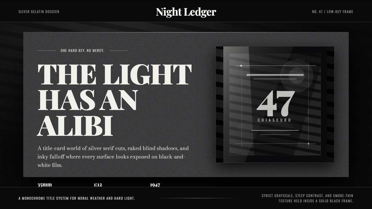 Film Noir ChiaroscuroLight is the crime. Silver serif cards, blind stripes, and grain carve drama…光就是罪证。银色衬线、百叶窗斜影与胶片颗粒从黑场刻出戏剧。
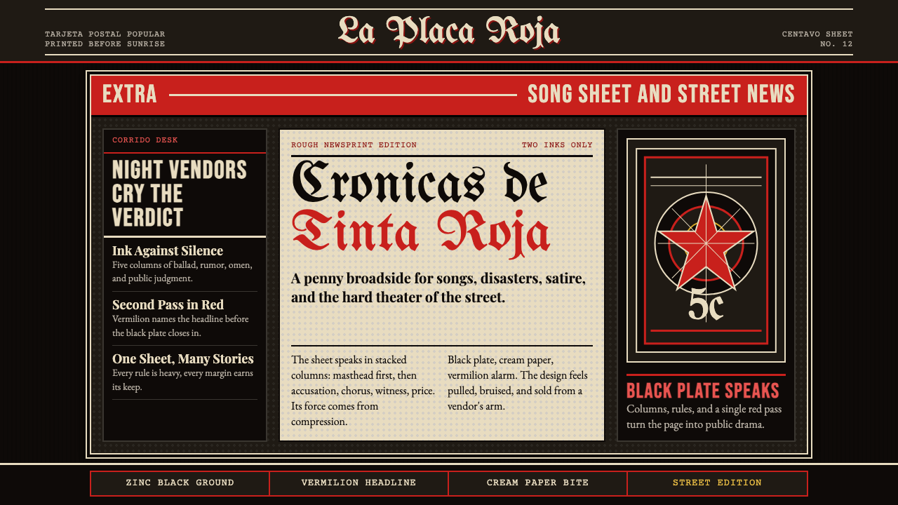 Mexican Tarjeta Postal (Posada Engraving 1900)Tabloid drama in two inks. Fraktur mastheads, vermilion rules, and cream news…双色小报式戏剧:哥特报头、朱红分隔线与粗粝新闻纸。
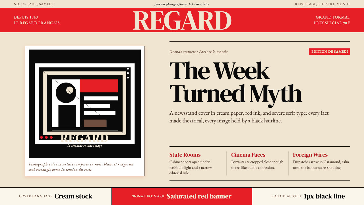 Paris MatchThe cover shouts in one red slab. Cream paper, serif headlines, and black rul…一块红色横幅在呐喊。奶油纸、衬线标题与黑色细线制造戏剧。
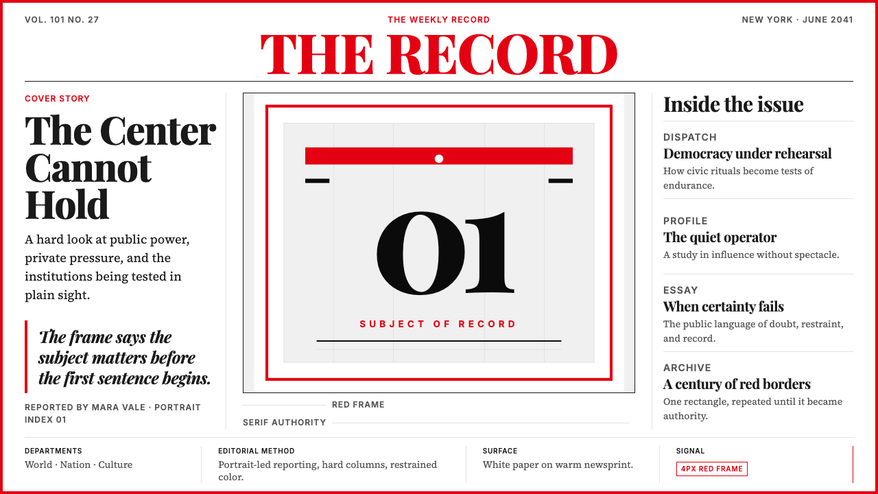 TIME MagazineAuthority in a red rectangle. Didone masthead, black-white columns, and a 4px…红框即权威。Didone刊头、黑白栏栅与4px边框定调。
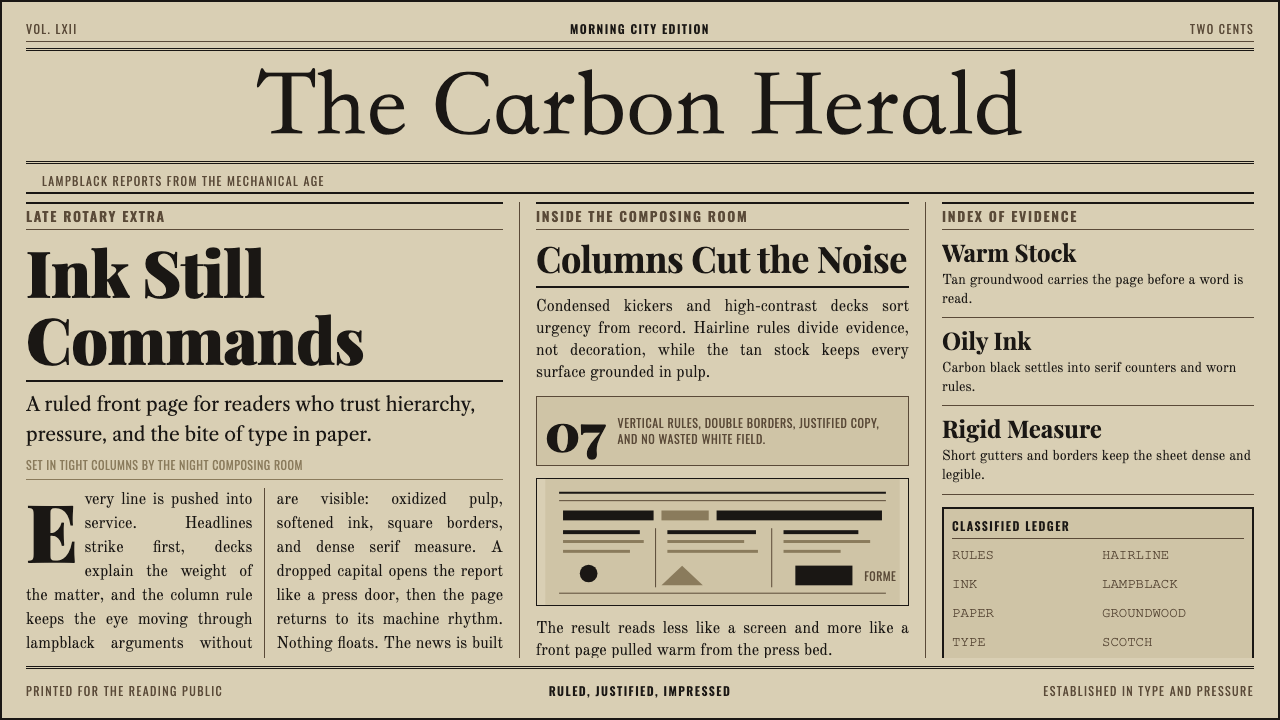 Broadsheet LetterpressAuthority in ink. Lampblack serif decks lock into tan paper with strict ruled…油墨里的权威:灯黑衬线与褐黄纸面,被严密栏线锁住。
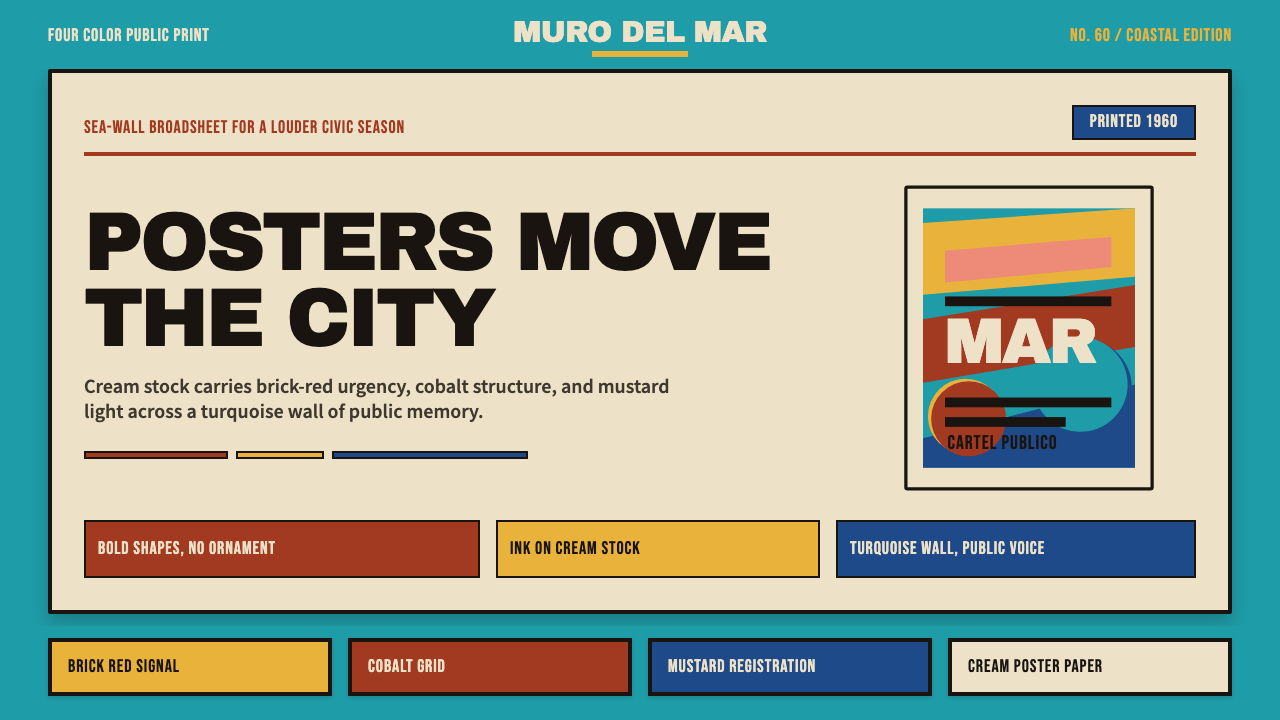 Cuban Malecón 1960 PosterPublic voice in flat ink. Turquoise wall, cream stock, brick red and cobalt b…平面油墨的公共之声:绿松石墙、奶油纸、砖红与钴蓝色条。