What is TIME Magazine?什么是 TIME Magazine?
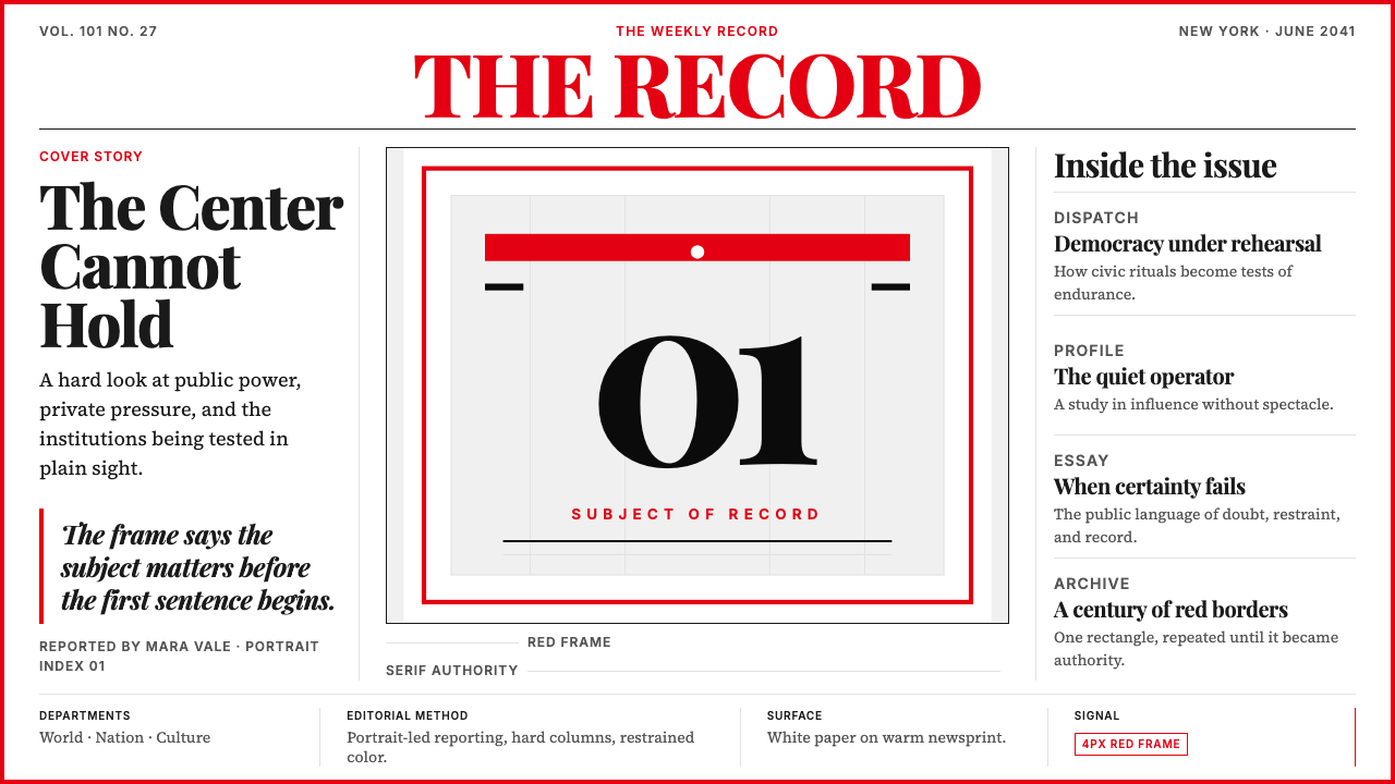
A red rectangle drawn around a single portrait told the world, for a century, that this person and this moment mattered.一道红色矩形框住一张肖像,向世界宣告了整整一个世纪:这个人,这一刻,值得被记住。
TIME Magazine in briefTIME Magazine 速览
TIME Magazine is an American weekly news publication whose visual identity — a scarlet border, a bold Didone masthead, a single portrait dominating the cover, and a strict red-black-white palette — has remained essentially unchanged since the late 1920s and has become one of the most recognized editorial design systems in the world.《时代》是美国一份历史悠久的新闻周刊,其视觉识别系统——鲜红色边框、粗重的 Didone 衬线刊头、主导封面的单人肖像,以及严格的红-黑-白三色调——自 1920 年代末以来几乎未变,已成为全球辨识度最高的编辑设计体系之一。
The design language is rooted in newspaper clarity and editorial authority. Serif headlines carry weight and permanence; column grids give the interior pages a disciplined, legible rhythm. Red is used sparingly and deliberately: the border frame, the masthead lettering, and selective accent treatments are its almost exclusive domain. Black carries body text and secondary hierarchy. White — or the clean ground of the page — provides the breathing room that keeps the system from feeling heavy despite its visual seriousness.这套设计语言根植于报纸的清晰感与编辑的权威感。衬线标题承载厚重与永久感;多栏网格为内页赋予严谨、易读的节奏。红色的使用极为克制而刻意:边框、刊头字母,以及极少数的强调处理,几乎是它仅有的领地。黑色承载正文与次级层级。白色——或者说页面的洁净底面——提供了必要的呼吸空间,让整套系统在视觉上严肃却不沉重。
What distinguishes the TIME aesthetic from other editorial systems is its economy. The cover composition almost never changes: one image, one name or subject line, one border. This restraint is a statement of confidence — the belief that the subject is enough, that the design's job is to frame rather than to decorate. The result is a visual vocabulary that reads instantly as authoritative, serious, and built for the long record.将《时代》美学与其他编辑系统区别开来的,是它的经济性。封面构图几乎从不改变:一张图像、一个姓名或主题行、一道边框。这种克制是一种自信的表态——相信主题本身已经足够,设计的职责是框定而非装饰。由此形成的视觉词汇,让人一眼便读出权威、严肃,以及为长久记录而生的气质。
Where does TIME Magazine come from?TIME Magazine 从何而来?
TIME was founded on March 3, 1923, by Henry Luce and Briton Hadden, two Yale graduates who had worked together on the Yale Daily News. Both were in their mid-twenties. Their founding concept was deliberately populist: not a newspaper, not an academic journal, but a weekly digest that would allow a busy reader to follow world affairs in one sitting. Hadden shaped the prose voice — brisk, opinionated, written with a compression that became known as 'Timestyle.' Luce shaped the business. When Hadden died unexpectedly in 1929, Luce took sole control and turned the single title into a publishing empire that would eventually include Fortune, Life, and Sports Illustrated.《时代》由亨利·卢斯与布里顿·哈登于 1923 年 3 月 3 日创刊,两人均为耶鲁大学毕业生,曾共事于《耶鲁每日新闻》,创刊时均二十五岁上下。他们的创刊理念刻意面向大众:不是报纸,不是学术期刊,而是一份每周文摘,让忙碌的读者一次阅读即可跟上世界大事。哈登塑造了文字风格——简练、有主见、以一种被称为「时代体」的压缩方式写就。卢斯掌管商务。哈登于 1929 年意外辞世后,卢斯独掌大权,将这一刊号发展为出版帝国,旗下最终包括《财富》《生活》与《体育画报》。
The cover format was established early and refined slowly. The first issue featured a portrait of Speaker of the House Joseph Cannon — a convention that would rarely be broken for decades. Initially the border was simple and dark; it became the now-famous red in 1927, a change whose precise origin is debated but which transformed the magazine's newsstand presence immediately. The Didone-style serif masthead — with its high contrast between thick strokes and hairline thins — projected the permanence and gravity of an institution, not the casualness of a consumer magazine.封面形式早期确立,缓慢精炼。创刊号刊登了众议院议长约瑟夫·坎农的肖像——这一惯例此后数十年几乎从未打破。最初边框样式简单而色深;1927 年变为如今广为人知的红色,这一改变的确切起源至今众说纷纭,但它立即改变了杂志在报刊亭的视觉存在感。Didone 风格的衬线刊头——粗笔画与发丝细线之间的高对比——投射出一个机构的永久性与庄重感,而非消费杂志的随意感。
The cover portrait tradition became a cultural institution in its own right. Being named TIME's 'Person of the Year' (originally 'Man of the Year,' introduced in 1927) became a global marker of significance. The selection process — covering statesmen, scientists, activists, and occasional abstract concepts such as 'The Computer' in 1982 or 'You' in 2006 — extended the magazine's editorial authority far beyond its pages. The red-bordered cover was reproduced on newsstands in every country, making the frame itself synonymous with the idea that a subject had achieved world-historical importance.封面肖像传统本身成为一项文化制度。被《时代》评为年度人物(最初称为「年度男性」,1927 年设立)成为全球层面的重要性标志。评选对象涵盖政治家、科学家、社会活动人士,乃至偶尔的抽象概念——如 1982 年的「计算机」或 2006 年的「你」——将杂志的编辑权威延伸至远超其版面的范围。那道红色边框封面在每个国家的报刊亭复制传播,使得这道边框本身成为一个符号:某个主题已获得世界历史意义。
Boris Artzybasheff, who worked as a cover illustrator for TIME for over three decades beginning in the 1940s, helped define the magazine's illustrative register: technically precise, slightly dramatic, always portrait-focused. His work, and that of subsequent illustrators, established that a painted or illustrated cover was a signal of particular weight — not a substitute for photography, but a deliberate elevation of the subject. D.W. Pine, who served as TIME's art director in the 2000s, led refinements that brought the masthead into the digital era while preserving its essential character, ensuring that the system read as legibly on a screen thumbnail as on a printed cover.鲍里斯·阿尔兹巴舍夫自 1940 年代起为《时代》担任封面插画师逾三十年,帮助界定了杂志的插画格调:技术精准、略带戏剧感、始终以肖像为中心。他及此后历任插画师的作品确立了这样一个信号:绘画或插图封面代表特别的分量——不是对摄影的替代,而是对主题的刻意拔高。曾于 2000 年代担任《时代》艺术总监的 D.W. 派恩主导了一系列精炼,将刊头带入数字时代的同时保留了其本质特征,确保这套系统无论在印刷封面还是屏幕缩略图上都同样清晰可辨。
What defines the TIME Magazine look?TIME Magazine 的视觉特征是什么?
The Red Border红色边框
The defining element of the TIME visual system is the narrow scarlet rectangle that surrounds every cover. It functions simultaneously as a brand mark, a compositional frame, and an editorial signal. The border is not decorative — it is declarative. It announces that whatever appears inside it has been judged, by the editorial process, to deserve that frame. Crucially, the border is sometimes partially obscured by the subject of the cover photograph, a deliberate convention that signals the subject is larger than the frame — an iconographic statement of magnitude.《时代》视觉系统的决定性元素,是围绕每期封面的那道窄幅红色矩形。它同时承担三重功能:品牌标志、构图框架与编辑信号。这道边框不是装饰性的——它是宣示性的。它告知读者:出现在框内的一切,已经过编辑程序的判断,值得被这道框框住。尤为值得注意的是,封面摄影主角有时会部分遮挡这道边框——这是一个刻意沿用的惯例,意在表明:主题比框架更大,是一种关于重要性的图像学陈述。
Didone MastheadDidone 衬线刊头
The TIME masthead is set in a Didone-category serif — a style characterized by extreme contrast between thick vertical strokes and almost invisible hairline horizontals. This contrast gives the letters a sharp, almost engraved quality that connotes precision, permanence, and institutional authority. The masthead sits at the top of the cover in large, confident lettering, often printed in red against white or white against red, reinforcing the brand's two-color signal. The letterforms have been refined over decades but never abandoned for a sans-serif or a softer serif, because the Didone contrast is fundamental to the magazine's tone.《时代》刊头采用 Didone 类衬线字体——这类字体的特征是粗重竖笔画与几乎不可见的细横线之间的极端对比。这种对比赋予字母一种锐利、近乎雕刻的质感,令人联想到精准、永久与机构权威。刊头以大而自信的字母置于封面顶部,通常以红底白字或白底红字印刷,强化了品牌的双色信号。字形在数十年间不断精炼,但从未放弃以无衬线或更柔和的衬线取代,因为 Didone 的对比感是杂志语调的基础。
Portrait-Dominant Cover Composition肖像主导的封面构图
The TIME cover format is almost invariably built around a single portrait — a face, usually front-facing or three-quarters, that fills or nearly fills the cover field. This compositional convention, established in the first issue and maintained for a century, communicates a specific editorial philosophy: history is made by individuals, and the face is the most immediate and emotionally legible subject available. Typography on the cover is reduced to its minimum: the masthead, a brief headline, and often a cover line. The image carries the argument.《时代》的封面构图几乎始终围绕一张肖像建立——一张脸,通常正面或四分之三侧面,充满或接近充满整个封面。这一构图惯例自创刊号确立并延续百年,传达着一种具体的编辑哲学:历史由个体书写,而面孔是最直接、最具情感可读性的视觉主题。封面上的文字被压缩至最低限度:刊头、简短标题、通常还有一行封面导语。图像承载论点。
Three-Color Palette三色调色板
The TIME palette is among the most austere in mainstream magazine publishing: red, black, and white, with no sanctioned departure. Red is reserved for structural and brand elements — the border, the masthead, and occasional typographic emphasis. Black handles editorial typography: headlines, standfirsts, body text, captions. White or the near-white of the page ground provides the field. The absence of additional colors is not a limitation but a discipline. Over a century, the palette has become self-reinforcing: the red-black-white combination, in the proportions TIME uses them, is instantly legible as TIME before the masthead is even read.《时代》的调色板是主流杂志出版中最节制的之一:红、黑、白,不设其他认可的偏离。红色保留给结构性与品牌性元素——边框、刊头,以及偶尔的排版强调。黑色负责编辑排版:标题、导言、正文、图说。白色或页面底面的近白色提供底场。缺少其他颜色不是局限,而是一种自律。百年之间,这套色板已形成自我强化:红-黑-白的组合,以《时代》使用它们的比例呈现,在刊头被读出之前便已立刻可辨。
Serif Typography with Strong Hierarchy具有强烈层级的衬线排版
Interior pages establish hierarchy through a disciplined typographic system in which a high-contrast Didone or transitional serif governs headlines, a more readable text-weight serif handles body copy, and scale and weight do the organizational work that other systems assign to color. Captions, pull-quotes, and section labels step down through clearly differentiated sizes. The reading experience is column-structured, with generous leading that makes sustained reading comfortable — a newspaper inheritance adapted for the longer-form narrative that TIME pioneered.内页通过严谨的排版系统建立层级:高对比度的 Didone 或过渡型衬线字体主导标题,可读性更强的文本字重衬线负责正文,而其他系统可能交给色彩的组织工作,这里由尺寸与字重完成。图注、摘引与栏目标签则以清晰分级的尺寸逐层收小。阅读体验呈多栏结构,宽裕的行距让持续阅读舒适——这是报纸遗产在《时代》所开创的长篇叙事格式中的一次适应性移植。
Photography as Primary Visual Language摄影作为核心视觉语言
From its earliest decades, TIME has treated photography — and painted portraiture in its place when a living photograph was unavailable — as the primary carrier of editorial meaning. The cover image is selected not for aesthetic novelty but for journalistic weight: it should make the argument visible. Interior photography follows editorial conventions of documentary and news photography: direct, factual, contextually grounded. When illustration is used, it maintains the portrait format and the gravity of the photographic tradition, rather than departing into decorative or abstract directions.从最早的数十年起,《时代》便将摄影——以及在无法获得当事人照片时以绘画肖像代替——视为编辑意义的首要载体。封面图像的选取不以美学新颖性为标准,而以新闻分量为准则:它应当让论点可见。内页摄影遵循纪录片与新闻摄影的编辑惯例:直接、客观、扎根于具体情境。即便使用插图,也维持肖像格式与摄影传统的庄重感,而非转向装饰性或抽象方向。
Institutional Restraint机构式克制
Perhaps the most distinctive quality of the TIME aesthetic is what it refuses to do. No decorative borders inside the magazine, no ornamental dividers between sections, no gradient backgrounds, no playful typographic experiments, no seasonal redesigns. The system is conservative in the precise sense: it conserves a visual identity that has accrued credibility over generations. Every design decision is subordinated to the editorial mission of record-keeping and authority. The restraint is itself the message — it says that the magazine does not need to court attention through visual novelty because its subject matter already demands it.《时代》美学最具特色的品质,也许在于它拒绝做什么。杂志内部没有装饰性边框,栏目之间没有花哨分隔线,没有渐变背景,没有俏皮的排版实验,没有季节性重新设计。这套系统在精确意义上是保守的:它保守着历经数代积累起可信度的视觉身份。每一个设计决定都从属于记录与权威的编辑使命。这份克制本身就是信息——它表明,这本杂志不需要靠视觉新奇来争夺注意力,因为其报道主题本身已足够有力。
Who shaped TIME Magazine?谁塑造了 TIME Magazine?
Luce co-founded TIME in 1923 and, after Briton Hadden's death in 1929, became the sole architect of the Time Inc. publishing empire. His conviction that photojournalism and editorial design were as important as prose — manifest most fully in the founding of Life magazine in 1936 — shaped the visual ambition of all Time Inc. publications. Luce believed that the designed page was an argument, not a container, and the TIME cover, with its deliberate portrait-plus-border formula, reflects that conviction directly.卢斯于 1923 年联合创办《时代》,并在布里顿·哈登 1929 年辞世后成为时代出版集团的唯一设计者。他对新闻摄影与编辑设计之重要性不亚于文字的坚信——在 1936 年创办《生活》杂志时体现得最为充分——塑造了时代旗下所有出版物的视觉抱负。卢斯相信,设计页面是一个论点,而非一个容器,而《时代》封面那套刻意为之的肖像加边框公式,正是这一信念的直接体现。
Hadden, Luce's co-founder and equal partner until his death at thirty-one, was responsible for TIME's distinctive prose voice — a compressed, active, often irreverent style that broke sharply from the formal conventions of newspaper journalism. Though his contributions were editorial rather than visual, Hadden's insistence on compression and directness established the editorial philosophy that the design system would need to serve: more impact per square inch, a layout that respected the reader's time. His influence on the magazine's tone persists in its design DNA.哈登是卢斯的联合创始人,以三十一岁之龄英年早逝前始终是平等合伙人,负责塑造《时代》独特的文字风格——简练、主动、常带一丝不敬,与报纸新闻正式惯例形成鲜明对比。尽管他的贡献属于编辑而非视觉层面,哈登对简洁与直接的坚持确立了设计系统所需服务的编辑哲学:每平方英寸更多冲击力,版面尊重读者的时间。他对杂志语调的影响延续在其设计基因之中。
Artzybasheff created more than two hundred TIME covers between 1941 and 1965, making him the magazine's most prolific cover artist and one of the defining visual voices of mid-century American editorial illustration. His portraits combined technical precision with psychological intensity — subjects were rendered with the detail of a scientific illustration and the drama of a theatrical close-up. His work demonstrated that the painted cover was not a compromise when photography was unavailable but a distinct editorial mode capable of conveying interiority and significance that photography could not.阿尔兹巴舍夫在 1941 至 1965 年间为《时代》创作了逾二百幅封面,是杂志史上最多产的封面艺术家,也是二十世纪中叶美国编辑插画最具代表性的视觉声音之一。他的肖像作品将技术精准与心理张力融为一体——主角以科学插图的细节与戏剧特写的张力被呈现出来。他的作品证明,绘画封面并非在摄影不可及时的妥协,而是一种独特的编辑模式,能够传达摄影所无法企及的内在性与重要感。
Pine served as TIME's art director through the 2000s, a period in which the magazine faced the foundational challenge of translating a print-born visual identity to digital screens, web thumbnails, and social media contexts. His stewardship of the masthead refinement — maintaining the Didone contrast and the red-black-white palette while ensuring legibility at reduced scale — is a case study in responsible heritage design. Under Pine, the system that Luce and Hadden's original vision had produced proved durable enough to survive the transition from newsstand dominance to digital competition without losing its essential character.派恩于 2000 年代担任《时代》艺术总监,期间杂志面临一项根本性挑战:将一套诞生于印刷的视觉身份迁移至数字屏幕、网页缩略图与社交媒体语境。他对刊头精炼的主导——在确保小尺寸可读性的同时保持 Didone 对比感与红-黑-白调色板——是负责任的遗产设计的典型案例。在派恩的守护下,卢斯与哈登最初愿景所产生的这套系统,证明了其足够持久,在从报刊亭主导到数字竞争的转型中完好保全了核心特征。
Though primarily associated with Life magazine, Bourke-White's influence on Time Inc.'s editorial photography standards shaped how TIME itself understood the relationship between photographic image and editorial argument. Her approach — treating the photograph as a document of moral as well as factual significance — matched the register that TIME's cover format demanded. Her career established the precedent that the journalists and photographers who fed the TIME cover were not image-makers in the commercial sense but witnesses whose work warranted the authority of the red border.尽管伯克-怀特主要与《生活》杂志相关联,她对时代出版集团编辑摄影标准的影响,塑造了《时代》理解摄影图像与编辑论点之间关系的方式。她的方式——将照片视为道德意义与事实意义并重的文件——与《时代》封面格式所要求的分量精准契合。她的职业生涯确立了这样一个先例:为《时代》封面供稿的记者与摄影师,不是商业意义上的图像制造者,而是见证者,其作品值得那道红色边框所赋予的权威。
How do you use TIME Magazine today?今天怎么用 TIME Magazine?
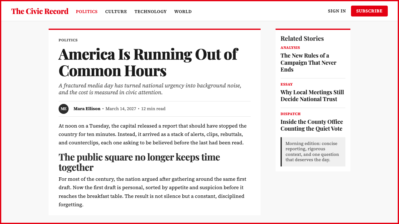
The TIME Magazine aesthetic is one of the most legible editorial design systems available to contemporary designers because its principles are structural and repeatable: a dominant image, a constrained palette, a strong typographic hierarchy, and a framing device that confers authority. Applying it well requires understanding that the system's power comes from restraint, not decoration — every element earns its place or is removed.《时代》杂志美学是当代设计师可用的最清晰可辨的编辑设计系统之一,因为它的原则是结构性且可重复的:一张主导性图像、一套受约束的色板、一套强劲的排版层级,以及一个赋予权威感的框架装置。正确应用它,需要理解这套系统的力量来自克制而非装饰——每个元素都赢得其位置,否则就被移除。
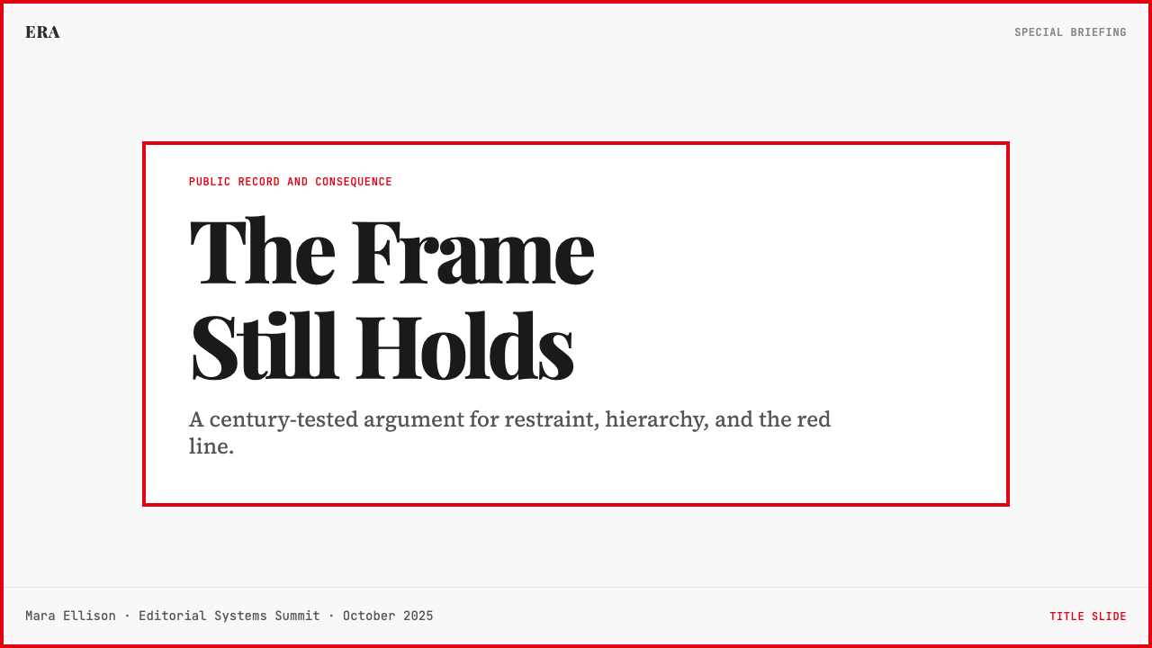
For presentation slides, the TIME approach works powerfully on cover and section-divider pages. A cover slide should foreground a single strong image — a portrait, a product photograph, or a documentary-style scene — cropped to fill the slide field, with the title overlaid in high-contrast serif type and a narrow red border applied to the slide edge as a frame. Section-divider slides benefit from the TIME convention of large, bold type against a clean white or near-black field, with red used only for a single accent element. Data and content slides should maintain the column-grid logic: two or three content zones separated by clear typographic hierarchy rather than decorative dividers. Charts and graphs take on an editorial quality when axis labels and annotations are set in a consistent serif, with red reserved for the single most important data series.在演示文稿中,《时代》风格在封面页与章节分隔页上效果强劲。封面幻灯片应以单张强力图像为主角——肖像、产品照片或纪录片风格场景——裁切至充满幻灯片画面,标题以高对比度衬线字体叠加,并在幻灯片边缘施加一道窄幅红色边框作为框架。章节分隔幻灯片适合借鉴《时代》大号粗重字体衬托洁净白色或近黑色底场的惯例,红色仅用于单一强调元素。数据与内容幻灯片应保持多栏网格逻辑:两到三个内容区由清晰的排版层级而非装饰性分隔线划分。图表与统计图在坐标轴标签和注释以统一衬线字设置、红色仅保留给最重要的单条数据系列时,便呈现出编辑质感。
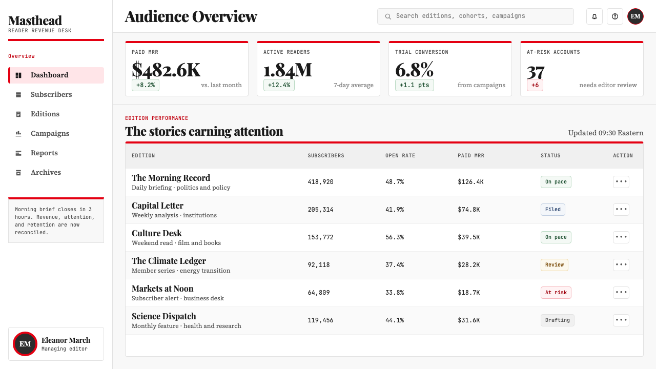
For web UI, dashboards, and pricing pages, the TIME visual system translates into a clean, authority-signaling interface language. Use a near-white background as the primary field; structure navigation and headers with a high-contrast serif typeface at meaningful scale; deploy red exclusively for primary calls to action, status alerts, or selected states. A thin red border or underline applied to active navigation items echoes the cover-frame convention and gives the interface a distinctive editorial identity. Avoid gradient backgrounds and soft drop shadows — the system reads best when surfaces are flat and edges are crisp.对于网页界面、仪表板与定价页面,《时代》视觉系统转化为一套简洁、传递权威感的界面语言。以近白色背景作为主底场;用高对比度衬线字体在有意义的尺寸上构建导航与标题;红色仅用于主要行动召唤、状态警示或选中状态。为当前激活的导航项施加细红色边框或下划线,呼应封面框架惯例,赋予界面独特的编辑身份。避免渐变背景与柔和投影——这套系统在表面平整、边缘清晰时读来最佳。
For editorial layouts, marketing materials, and branded reports, the TIME aesthetic supports strong information hierarchy with minimal visual noise. Long-form article layouts work well with a narrow central column for body text and a wide outer margin for pull-quotes or supporting data — a structure that echoes the magazine's own interior grid. Marketing pages can deploy the full-bleed image with typographic overlay convention from the cover: a strong photograph, a headline set in a bold serif, and a red border or accent that frames the key message. Branded reports gain credibility from the system's restraint — a consistent serif for all editorial text, black and red for hierarchy, and white space that gives data room to breathe.对于编辑版面、营销材料与品牌报告,《时代》美学以最低视觉噪音支持强劲的信息层级。长篇文章版面适合为正文设置窄幅中央栏,为摘引或辅助数据保留宽阔外页边——这种结构呼应杂志自身的内页网格。营销页面可借用封面的满幅图像加排版叠加惯例:一张强力照片,一行粗重衬线标题,以及框定核心信息的红色边框或强调元素。品牌报告通过这套系统的克制获得公信力——所有编辑文本使用统一衬线,层级依赖黑色与红色,留白给数据以呼吸空间。
A common mistake when applying the TIME aesthetic is treating the red as a general accent color to be used freely throughout a layout. In the original system, red is extremely scarce — it appears in the border, in the masthead, and almost nowhere else in any given spread. Overusing red dilutes the framing power that makes the system work. A second frequent error is selecting a decorative or display serif that suggests fashion or culture rather than permanence and authority. The Didone contrast is essential: a serif with low stroke contrast will look soft where the system demands gravity. Finally, resist the temptation to add secondary colors, gradients, or photographic treatments that soften the image — the three-color discipline is not a retro aesthetic choice but the load-bearing structure of the entire visual argument.应用《时代》美学时最常见的错误,是将红色视为可在版面中自由使用的通用强调色。在原始系统中,红色极为稀缺——它出现在边框、刊头,在任何给定跨页中几乎无处可见。过度使用红色会稀释使这套系统运转的框架效力。第二个常见错误是选择一种暗示时尚或文化气息而非永久性与权威感的装饰性或展示性衬线字体。Didone 的笔画对比至关重要:笔画对比度低的衬线字看来柔和,而这套系统要求的是庄重。最后,请抵制添加次要颜色、渐变或柔化图像的摄影处理的诱惑——三色律法不是一种复古美学选择,而是整个视觉论点的承重结构。
TIME Magazine — FAQTIME Magazine · 常见问题
Does the TIME aesthetic only work for news or journalism contexts?《时代》美学是否只适用于新闻或新闻报道语境?
No — the TIME system transfers well to any context where authority, credibility, and hierarchical clarity are desired values. Annual reports, institutional publications, policy documents, academic presentations, and technology platforms positioned as serious and trustworthy all benefit from the visual grammar. The association with journalism is an asset in those cases: it says the content is researched, factual, and intended to inform rather than persuade through emotion. The system struggles in contexts that call for warmth, playfulness, or cultural specificity — consumer brands, lifestyle products, and entertainment platforms will find the palette too austere and the typographic gravity too heavy.不——《时代》系统能良好迁移至任何以权威性、可信度与层级清晰度为期望价值的语境。年报、机构出版物、政策文件、学术演示,以及被定位为严肃可信的科技平台,都能从这套视觉语法中获益。与新闻业的关联在这些场合是一项资产:它传达内容经过研究、基于事实,旨在告知而非通过情感说服。这套系统在需要温暖感、趣味性或文化特殊性的语境中力不从心——消费品牌、生活方式产品与娱乐平台会发现这套色板过于简朴,排版庄重感过于沉重。
How should the red border be adapted for digital interfaces?红色边框应如何适应数字界面?
In print, the TIME border is a physical frame around the entire cover. In digital contexts, a literal full-screen red border is rarely appropriate and can feel gimmicky. The better approach is to use the border convention selectively: a thin red left-border on featured content cards, a red underline on active navigation, or a narrow red horizontal rule to separate major content sections. The key is to deploy it as a framing device rather than a decoration — it should mark what is most important, not appear uniformly throughout. Used this way, the border convention carries the editorial signal into digital space without overwhelming the interface.在印刷品中,《时代》的边框是围绕整个封面的物理框架。在数字语境中,字面意义上的全屏红色边框很少适用,且可能显得刻意。更好的做法是有选择性地使用边框惯例:为特色内容卡片施加细红色左边框,为激活导航添加红色下划线,或以窄幅红色水平线分隔主要内容段落。关键在于将其作为框架装置而非装饰来部署——它应标记最重要的内容,而非均匀出现在整个界面中。如此使用,边框惯例便将编辑信号带入数字空间,而不会淹没界面。
Can the TIME style work in dark mode or with an inverted palette?《时代》风格是否适用于深色模式或翻转色板?
A dark-mode inversion is possible but requires deliberate handling. The canonical TIME palette is light-ground: white or near-white serves as the field, with black for type and red for structure. On a dark ground, the relationships shift: red becomes more aggressive, and white type against a dark field can lose the gravitas that black type on white delivers. The most effective dark inversion keeps the red border but treats it as a light element against the dark field, uses a warm off-white for body text to avoid the harshness of pure white on pure black, and reduces red usage even further than in the light version. An inverted TIME design that feels authentic will look like the covers TIME has run for special editions — moody, deliberate, and reserved for specific occasions.深色模式翻转是可能的,但需要刻意处理。《时代》的标准色板以浅色底场为基础:白色或近白色作为底场,黑色用于文字,红色用于结构。在深色底场上,关系发生变化:红色变得更为强势,而深色底场上的白色文字可能丧失黑色文字在白色底面上所具有的庄重感。最有效的深色翻转方案是:保留红色边框但将其视为深色底场上的浅色元素,为正文使用温暖的米白色以避免纯黑底纯白字的生硬感,并比浅色版本进一步减少红色用量。一套感觉真实的翻转《时代》设计,应看起来像《时代》为特别专题出版的封面——富有情绪感、刻意为之、为特定场合保留。
What is the difference between the TIME style and other authoritative editorial systems like The Economist or The New Yorker?《时代》风格与《经济学人》或《纽约客》等其他权威编辑系统有何不同?
All three are editorial systems built on restraint and typographic authority, but they diverge significantly in tone and application. The Economist is more sparingly designed — its covers often feature a single bold illustration against a white or single-color ground with minimal typography, and its palette is even more constrained than TIME's. The New Yorker favors a warmer, more literary register: its cover art is painterly and playful, its interior typography is classical rather than high-contrast, and the overall tone is cultural rather than declarative. TIME is the most photo-centric and the most explicitly framing in its authority claim — the border convention is unique to it. Designers should choose based on the tonal register their content requires: TIME for institutional weight and journalistic authority, The Economist for analytical clarity and stripped-back seriousness, The New Yorker for cultural prestige and editorial wit.三者都是建立在克制与排版权威基础上的编辑系统,但在语调与应用上存在显著差异。《经济学人》的设计更为简省——封面通常以单幅大胆插图衬托白色或单色底场,排版极简,其色板甚至比《时代》更为受限。《纽约客》倾向更温暖、更具文学气息的风格:封面艺术绘画性强且富趣味,内页排版偏向古典而非高对比度,整体语调文化性多于宣示性。《时代》是三者中最以摄影为中心、权威主张最明确框定的——边框惯例是其独有的。设计师应依据内容所需的语调风格作出选择:需要机构分量与新闻权威时选《时代》,需要分析清晰度与精简严肃感时选《经济学人》,需要文化声望与编辑机智时选《纽约客》。
Is it appropriate to use the TIME aesthetic for a brand that is not in media or publishing?对于非媒体或出版领域的品牌,使用《时代》美学是否合适?
Yes, and it can be highly effective precisely because it borrows credibility from a context — news journalism — that the target audience already trusts. Financial services, legal technology, healthcare information platforms, and professional education providers have all successfully adopted the core conventions of the TIME visual system: authoritative serif typography, a constrained red-black-white palette, portrait-forward imagery, and a framing border device. The risk is mismatch: if the brand's actual content or product does not justify the seriousness the system claims, the aesthetic will read as overclaiming or parody. Used authentically, the TIME-derived system signals that the organization takes its subject matter seriously, respects the reader's intelligence, and has the institutional confidence to resist the pressure to seem approachable through visual casualness.可以,且往往极为有效,恰恰因为它从一个目标受众已然信任的语境——新闻新闻业——借用了公信力。金融服务、法律科技、医疗信息平台与专业教育机构,都曾成功采用《时代》视觉系统的核心惯例:权威性衬线排版、受约束的红-黑-白色板、以肖像为主导的图像,以及边框框架装置。风险在于错配:若品牌的实际内容或产品无法撑起这套系统所主张的严肃感,这种美学将被解读为过度宣称或戏仿。在真实匹配的情况下使用,《时代》衍生系统传递的信号是:这家机构认真对待其主题,尊重读者的智识,并有足够的机构自信抵制通过视觉随意性显得亲切的压力。
Related design styles相关设计风格
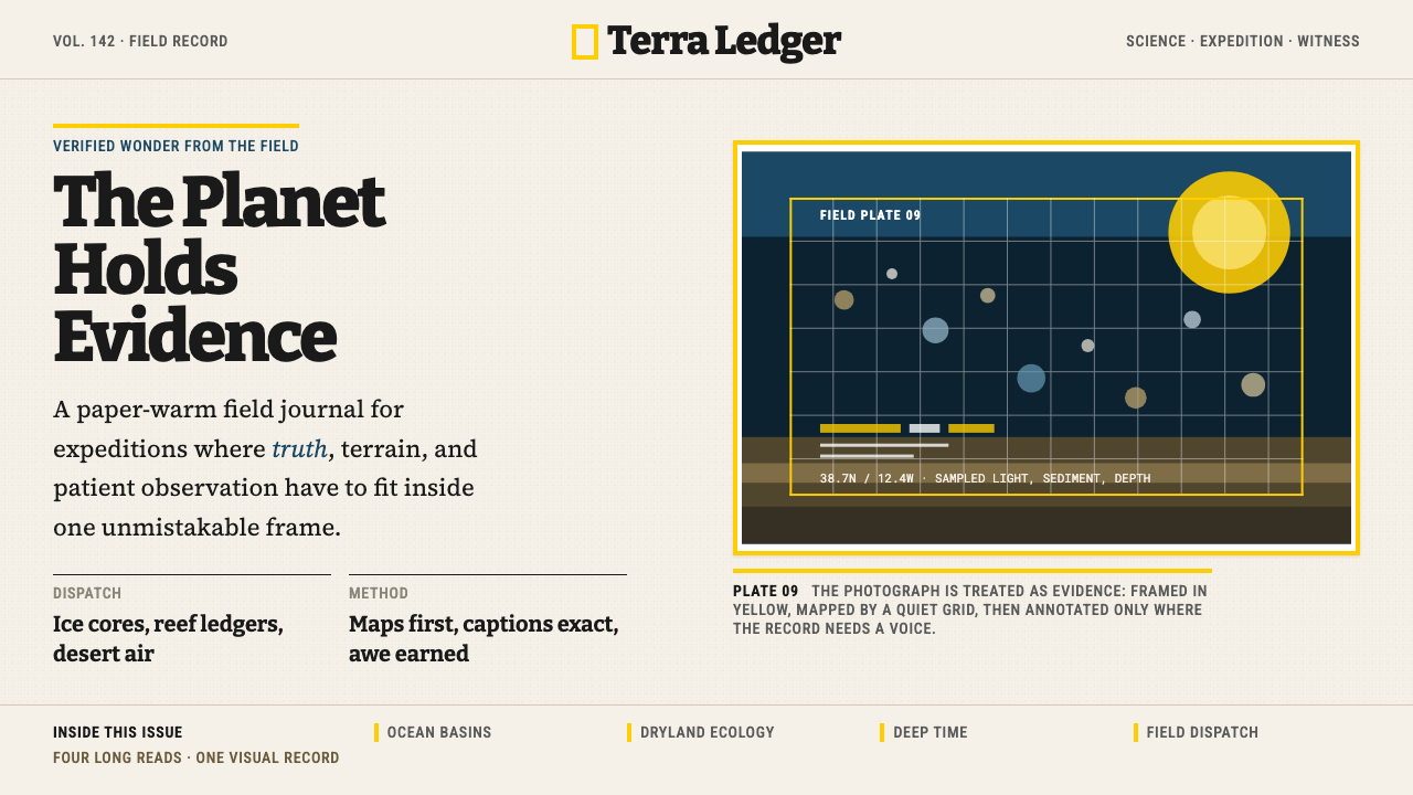 National GeographicAuthority frames wonder. Yellow border, Bitter slab type, and warm paper make…权威框住奇观:黄框、Bitter板衬线与暖纸底,让证据有史诗感。
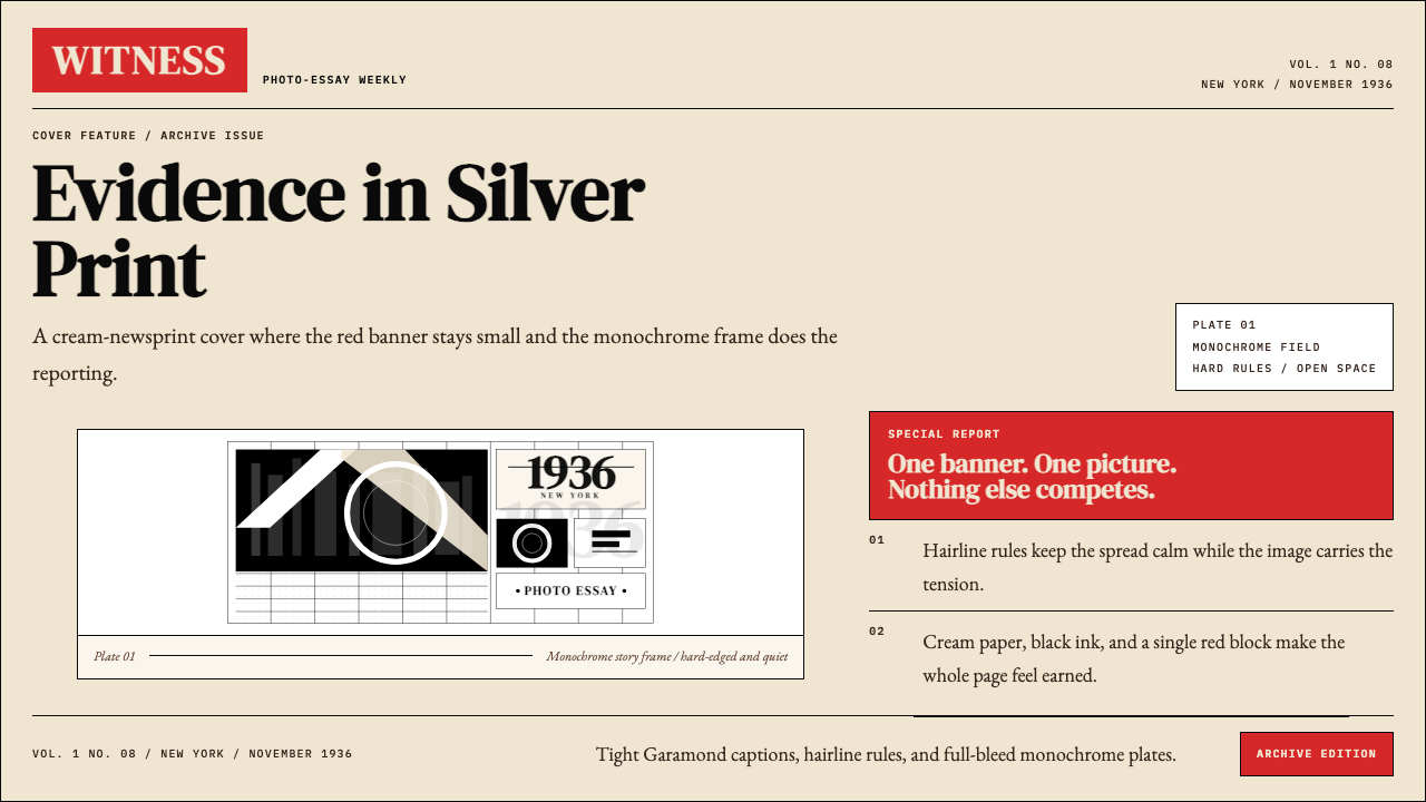 LIFE Magazine (Red-Banner)Photojournalism stripped bare. One red banner, cream newsprint, stark black p…摄影报道被剥到最简。红横幅、米色纸底与黑白版面。
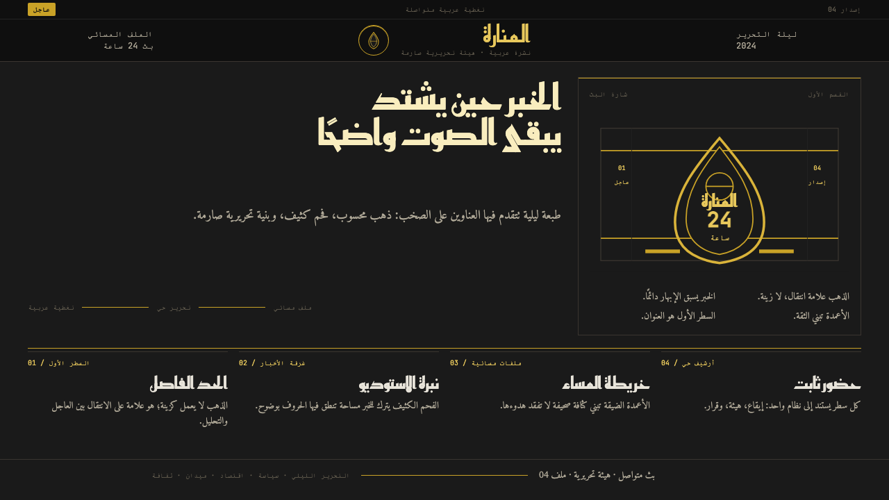 Al Jazeera Arabic NewsAuthority, stripped bare. Gold seal, dense Arabic type, matte charcoal.权威感被提纯。金色印章、密集阿文、炭黑底面构成画面。
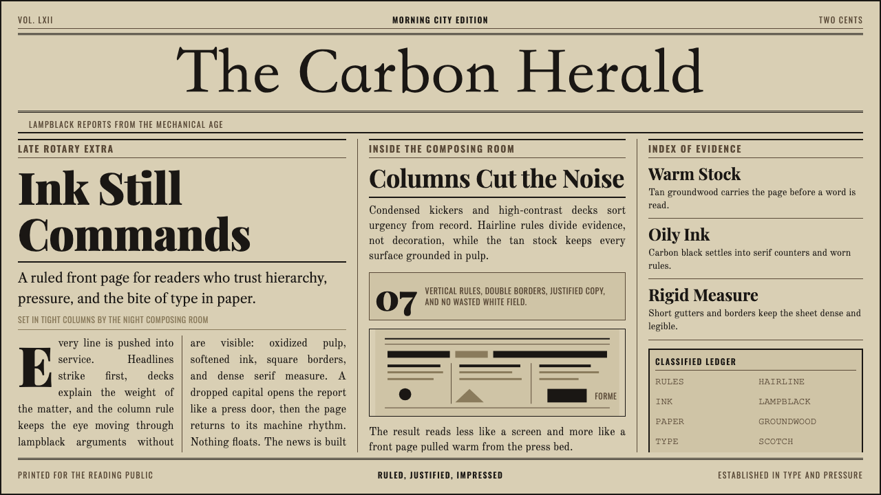 Broadsheet LetterpressAuthority in ink. Lampblack serif decks lock into tan paper with strict ruled…油墨里的权威:灯黑衬线与褐黄纸面,被严密栏线锁住。
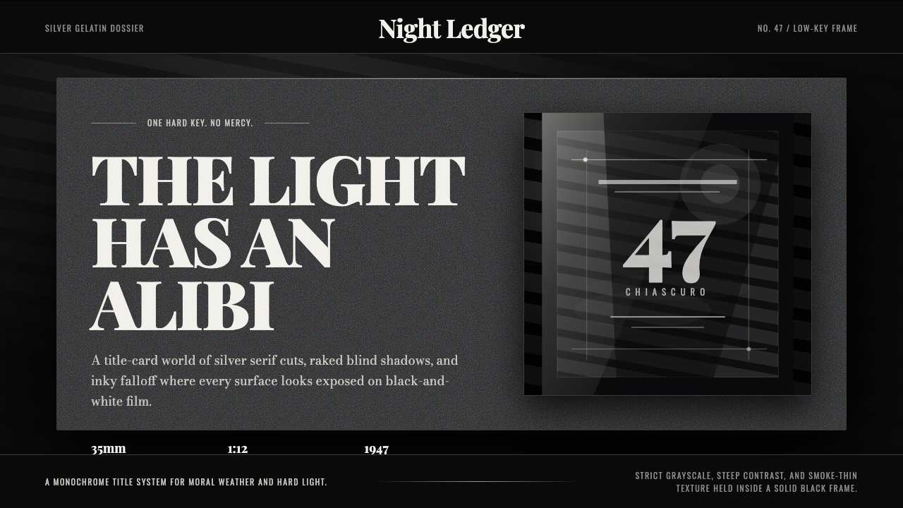 Film Noir ChiaroscuroLight is the crime. Silver serif cards, blind stripes, and grain carve drama…光就是罪证。银色衬线、百叶窗斜影与胶片颗粒从黑场刻出戏剧。
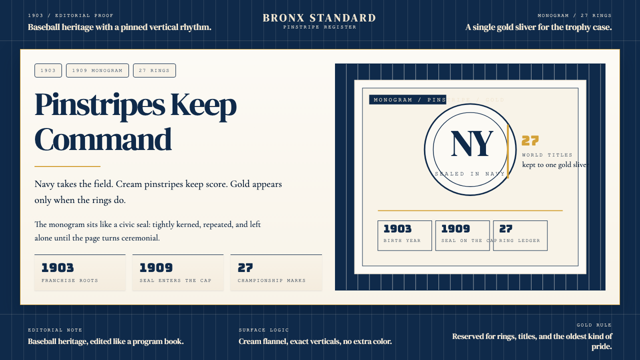 New York Yankees (Navy-Pinstripe)Navy restraint, not noise. Cream pinstripes and a gold monogram seal do the w…海军蓝克制到底。奶油细条纹与金色徽章撑起整页。