About TIME Magazine
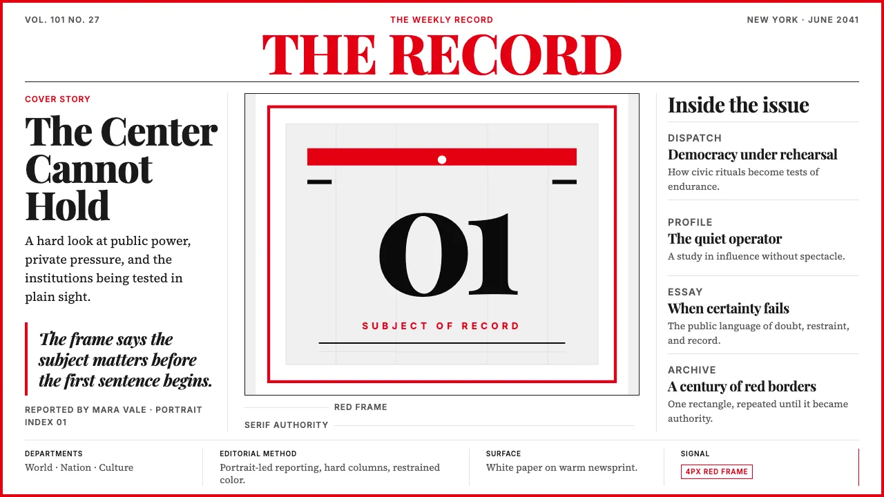
TIME Magazine has framed American journalism inside a red rectangle since 1927. A single portrait, a bold Didone masthead, and that unmistakable border announce that the subject matters — that a century of reporting stands behind the image.
The design vocabulary is newspaper-clean: red, black, white, nothing else. Serif headlines carry the authority; generous leading and column grids carry the reading. No ornament, no softness — only the weight of the record.
- Origin
- New York City, USA
- Era
- 1923 (first issue March 3, 1923); red border introduced 1927; current masthead refined 2000s
- Key figures
- Henry Luce · Briton Hadden · Boris Artzybasheff · D.W. Pine
- Movements
- American news magazine journalism · Portrait-cover editorial tradition · Long-form narrative journalism
TIME Magazine design spec
Colors
Background
Surface
Primary
Secondary
Accent
Text
Typography
Playfair DisplayHeadings
Source Serif 4Body
JetBrains MonoMono
Unlock for 1 credit
The other 11 sections — buttons, cards, spacing, motion, techniques and more — open once you unlock. Download the DESIGN.md or send it to your AI in one click. Unlock once, yours forever.
Sign up nowHave an account? Sign in
Styles similar to TIME Magazine
Also inspired by brands & products, with a close feel.
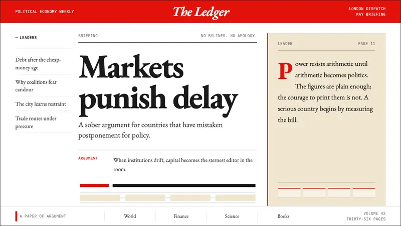 The Economist (Red-Banner)Argument made visible. Red banner, cream paper and Garamond columns enforce the grid.
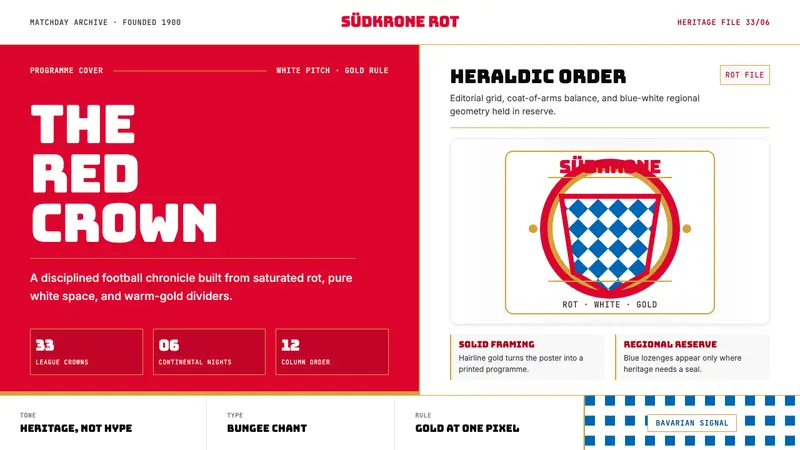 Bayern Munich (Rot)Heritage, not hype. Saturated rot fields, gold rules, and blue lozenges enforce order.
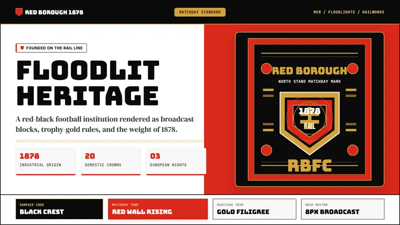 Manchester United (Red Devils)Heritage hits like a chant. Red-black blocks, Bungee type, and gold filigree hold the pitch.
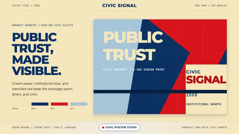 Gotham / Obama Hope Poster (2008)Public trust, made visible. Cream, navy, and red grid the poster.