About The Economist (Red-Banner)
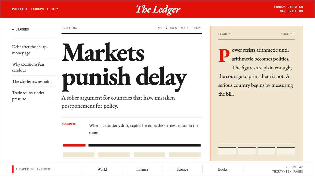
The Economist is the British political-economy weekly founded in 1843 to oppose the Corn Laws, and its visual identity is one of the most recognizable in global journalism. A saturated red banner crowns every cover; Milo serif body type, set on a generous baseline, carries the prose without ornament.
The system pairs Economist-red with warm cream and deep charcoal — a palette of editorial conviction. Composition is rigorously gridded, typographically British, and quietly opinionated. No bylines, no decoration, no apology: the page itself is the argument.
- Origin
- London, United Kingdom
- Era
- 1843 founded; current visual identity ~2001–2024 (Milo serif era)
- Key figures
- James Wilson · Walter Bagehot · Zanny Minton Beddoes · Mike Parker
- Movements
- British political-economy journalism · Editorial modernism · Contemporary global newsweekly
The Economist (Red-Banner) design spec
Colors
Typography
The other 11 sections — buttons, cards, spacing, motion, techniques and more — open once you unlock. Download the DESIGN.md or send it to your AI in one click. Unlock once, yours forever.
Sign up nowStyles similar to The Economist (Red-Banner)
Also inspired by brands & products, with a close feel.
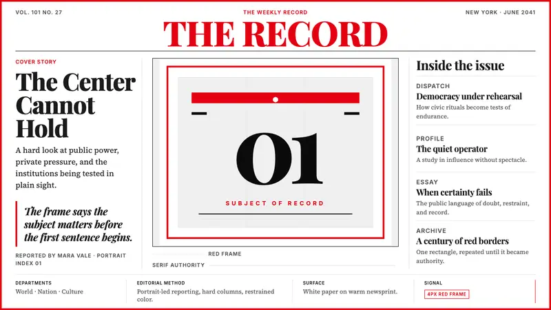 TIME MagazineAuthority in a red rectangle. Didone masthead, black-white columns, and a 4px frame.
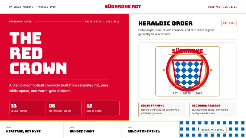 Bayern Munich (Rot)Heritage, not hype. Saturated rot fields, gold rules, and blue lozenges enforce order.
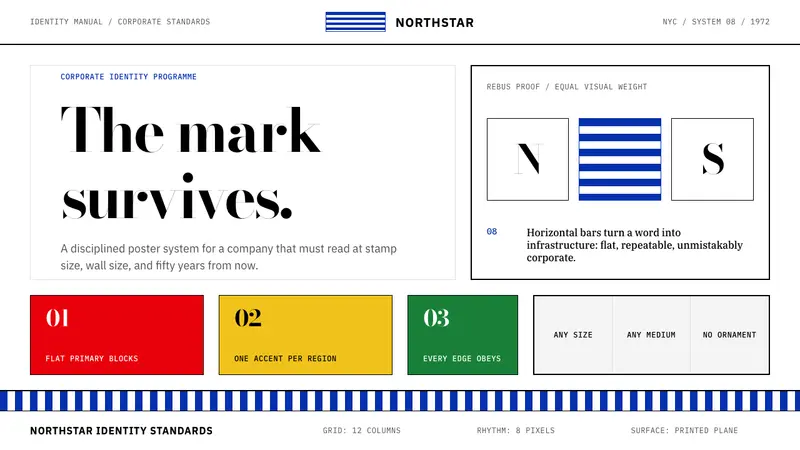 Paul Rand / IBM Corporate IdentityCorporate modernism stays exact. Blue 8-bar stripes, high-contrast serif, hard grid blocks.
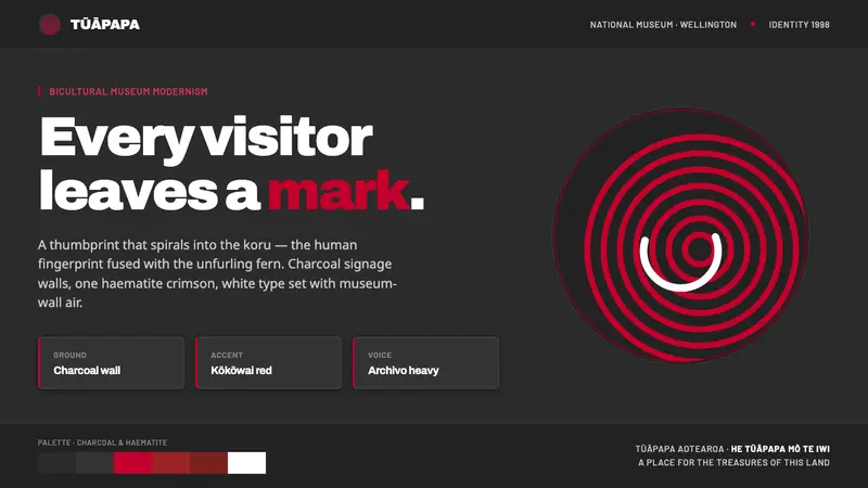 Te Papa Aotearoa ModernEvery visitor leaves a mark. Charcoal museum walls, one haematite crimson, a thumbprint-koru spiral.