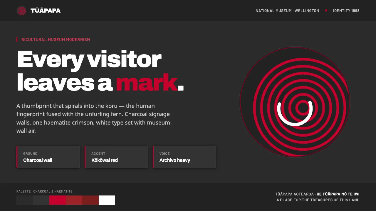
About Te Papa Aotearoa Modern
Te Papa Tongarewa, New Zealand's national museum, opened in 1998 with an identity by Cato Brand Partners built on a single device: a thumbprint that spirals into the kōuru koru, fusing the human fingerprint with the Māori unfurling-fern motif. It is applied across charcoal signage, packaging and interiors.
The bicultural palette pairs a charcoal grey-dark museum-wall ground with kōkōwai red — the Māori haematite ochre, a deep crimson — and white. The red honours the pigment, never a pillar-box primary. The result is clean, confident and modernist.
- Origin
- Wellington, Aotearoa New Zealand, Oceania
- Era
- 1998 brand identity (Te Papa Tongarewa opened February 1998); contemporary 1990–2010
- Key figures
- Cato Brand Partners · Te Papa Tongarewa
- Movements
- Bicultural New Zealand brand design · Koru-and-thumbprint contemporary identity
Te Papa Aotearoa Modern design spec
Colors
Typography
The other 11 sections — buttons, cards, spacing, motion, techniques and more — open once you unlock. Download the DESIGN.md or send it to your AI in one click. Unlock once, yours forever.
Sign up nowStyles similar to Te Papa Aotearoa Modern
Also inspired by brands & products, with a close feel.
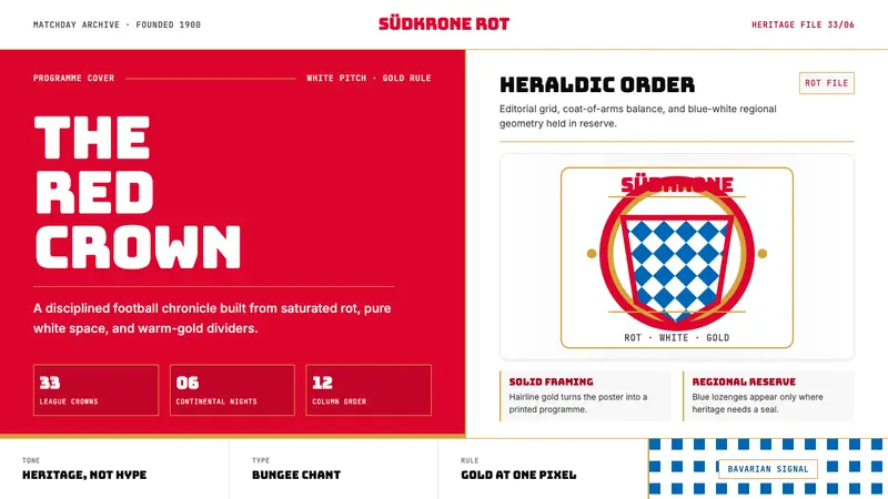 Bayern Munich (Rot)Heritage, not hype. Saturated rot fields, gold rules, and blue lozenges enforce order.
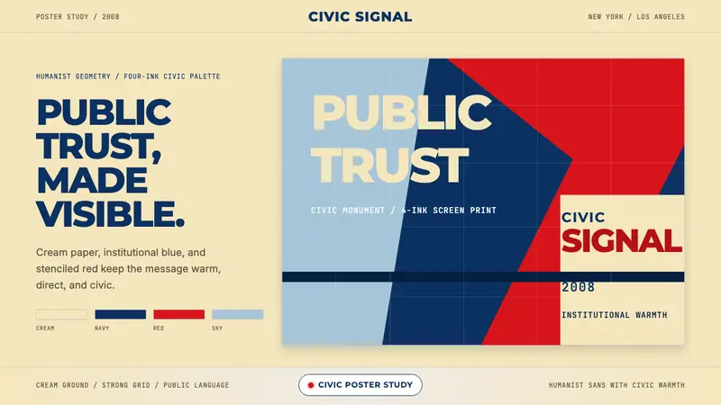 Gotham / Obama Hope Poster (2008)Public trust, made visible. Cream, navy, and red grid the poster.
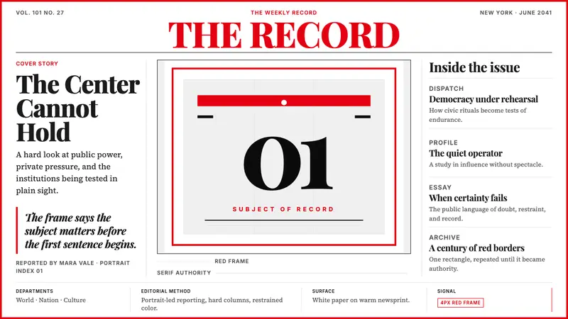 TIME MagazineAuthority in a red rectangle. Didone masthead, black-white columns, and a 4px frame.
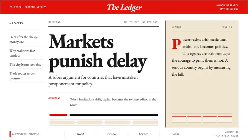 The Economist (Red-Banner)Argument made visible. Red banner, cream paper and Garamond columns enforce the grid.