What is Bauhaus Weimar?什么是 Bauhaus Weimar?
Bauhaus stripped design to its skeleton — primary colors, geometric form, and the conviction that beauty and usefulness were the same thing.包豪斯把设计剥到骨架——三原色、几何形态,以及美与实用本是一回事的坚定信念。
Bauhaus Weimar in briefBauhaus Weimar 速览
Bauhaus is a German design school and movement (1919–1933) whose visual language — primary red, blue, and yellow on cream or white grounds, hard geometric forms, asymmetric grid layouts, and a total rejection of surface ornament — became the most copied aesthetic of the twentieth century.包豪斯是1919至1933年间活跃于德国的设计学校与运动,其视觉语言——奶油或白色底面上的红、蓝、黄三原色,硬朗的几何形态,非对称网格布局,以及对一切表面装饰的彻底拒绝——成为二十世纪被模仿最多的美学体系。
The movement held that every designed object, from a teapot to a typeface to a building facade, should be governed by the same principle: form follows function. Decoration that serves no structural or communicative purpose is waste. What remains after all waste is removed is not austerity — it is clarity.该运动主张:从茶壶到字体,从建筑立面到海报,所有设计对象都应遵循同一原则——形式追随功能。不服务于结构或传达目的的装饰就是浪费。去除浪费之后剩下的,不是苦涩的简陋,而是明澈的清晰。
Visually, Bauhaus work is instantly recognizable. Heavy sans-serif type sits alongside ruled lines and flat geometric shapes. Color is used symbolically and sparingly: red anchors structure, blue implies space and movement, yellow signals energy or direction. Shadows, where they appear, are hard and offset rather than soft and diffuse. Nothing fades or gradients; edges are decisions.包豪斯作品在视觉上极易辨认:粗重无衬线字体与直线、平面几何形并置;色彩用法克制而具有象征意义——红色锚定结构,蓝色暗示空间与运动,黄色传递能量或方向。投影(若出现)是硬边偏移而非柔和漫射,没有渐变,没有模糊——每一条边都是一个决定。
See the Bauhaus Weimar design system查看 Bauhaus Weimar 完整设计系统
Where does Bauhaus Weimar come from?Bauhaus Weimar 从何而来?
The Bauhaus — the name fuses the German words for 'building' (Bau) and 'house' (Haus), deliberately evoking the medieval guild lodge — was founded in Weimar in April 1919 by architect Walter Gropius. The timing was not incidental. Germany had just lost the First World War. The Weimar Republic was days old. Gropius, who had served on the Western Front, returned convinced that art and craft had been severed from everyday life and that this rupture was itself a kind of cultural catastrophe. His founding manifesto declared that 'the ultimate aim of all creative activity is building' and called for the reunion of fine art and applied craft under a single roof.包豪斯——校名融合了德语“建造”(Bau)与“房屋”(Haus),有意唤起中世纪行会工坊的意象——由建筑师瓦尔特·格罗皮乌斯于1919年4月创立于魏玛。时机并非偶然。德国刚刚战败,魏玛共和国甫告成立。曾在西线服役的格罗皮乌斯归来后确信:艺术与手工艺已与日常生活割裂,而这一断裂本身就是一场文化灾难。他的创校宣言宣告“一切创造活动的终极目标是建筑”,并呼吁将纯艺术与应用工艺重新汇聚于同一屋檐下。
The school absorbed the remnants of two older Weimar institutions: the Grand Ducal Saxon School of Arts and Crafts and the Weimar Academy of Fine Arts. From the start, Gropius organized teaching around a 'double faculty' model: each workshop was led simultaneously by a master craftsman and a master of form (a practicing artist). Early masters of form included the painter Johannes Itten, the Swiss mystic who developed the foundational course (Vorkurs) in which students explored texture, contrast, and the expressive properties of basic materials before touching any specialized discipline. Itten's spiritual intensity eventually clashed with Gropius's more rational industrial ambitions, and in 1923 he was replaced by László Moholy-Nagy, whose mechanist, photographic sensibility pushed the school decisively toward industrial production and mass reproducibility.学校接纳了魏玛两所旧机构的遗产:大公国萨克森工艺美术学校与魏玛美术学院。从一开始,格罗皮乌斯就围绕“双师制”组织教学:每个工坊同时由一位手工艺大师与一位形式大师(执业艺术家)共同主持。早期形式大师中包括画家约翰内斯·伊滕——这位瑞士神秘主义者开发了基础课程(Vorkurs),让学生在涉足任何专业领域之前,先探索材料的质感、对比与表现力。伊滕的精神强度最终与格罗皮乌斯更偏理性的工业抱负产生冲突;1923年,他被拉兹洛·莫霍利-纳吉取代。莫霍利-纳吉的机械主义与摄影感性将学校坚决推向工业生产与大规模复制。
The political environment shaped the aesthetic. Weimar-era Germany was a crucible of competing ideologies, and the Bauhaus attracted both utopian socialists and pragmatic industrialists. Its teachers read Marx and corresponded with the Soviet Constructivists; they also negotiated contracts with German manufacturers. The tension between idealism and commerce never fully resolved, but it produced a design language that was simultaneously radical and functional — readable on a mass-produced lamp as clearly as on a political poster.政治环境塑造了美学。魏玛时代的德国是各种意识形态激烈角力的熔炉,包豪斯同时吸引了乌托邦社会主义者和务实的工业资本家。教师们研读马克思、与苏联构成主义者通信,同时也与德国制造商谈判合同。理想主义与商业利益之间的张力从未完全化解,但正是这种张力催生了一套既激进又实用的设计语言——印在量产台灯上与印在政治海报上同样清晰可读。
In 1925, rising hostility from the Thuringian state government — which found the school too politically left-leaning — forced a move to Dessau, an industrial city whose Social Democratic government was more sympathetic. The Dessau years (1925–1932) were the school's most productive. Gropius designed the famous Dessau campus, a building whose glass curtain walls, asymmetric massing, and flat roofs embodied everything the school preached. Moholy-Nagy, Herbert Bayer, Marcel Breuer, and Oskar Schlemmer produced canonical works here: Bayer's Universal typeface, Breuer's tubular steel furniture, Moholy-Nagy's light-space experiments. In 1928 Gropius resigned and was succeeded by the Swiss architect Hannes Meyer, who pushed the school further toward functionalist collectivism, then by Ludwig Mies van der Rohe in 1930. Mies relocated the school to Berlin in 1932, but Nazi political pressure finally closed it in July 1933. Many faculty emigrated — to Britain, the United States, Israel — and carried the Bauhaus vocabulary with them, seeding modernism worldwide.1925年,图林根州政府以学校政治立场过于左倾为由施压,迫使包豪斯迁往德绍——那座工业城市的社会民主党政府对学校更为友善。德绍时期(1925—1932年)是学校最富创造力的阶段。格罗皮乌斯设计了著名的德绍校园,其玻璃幕墙、非对称体量与平屋顶将学校的全部主张凝固成建筑。莫霍利-纳吉、赫伯特·拜耶、马塞尔·布劳耶与奥斯卡·施莱默在此创作了各自的代表作:拜耶的通用字体、布劳耶的钢管家具、莫霍利-纳吉的光-空间实验。1928年格罗皮乌斯辞职,继任者依次为瑞士建筑师汉内斯·迈耶(将学校进一步推向功能主义集体主义)和路德维希·密斯·凡德罗(1930年)。密斯于1932年将学校迁至柏林,但纳粹的政治压力最终于1933年7月强制关闭了包豪斯。大批教师流亡——前往英国、美国、以色列——将包豪斯语汇带往世界各地,播下现代主义的种子。
What defines the Bauhaus Weimar look?Bauhaus Weimar 的视觉特征是什么?
Color色彩
The palette is restricted to primary red, blue, and yellow, deployed against cream or pure white grounds, with black used for type and structural lines. Color carries symbolic weight derived from Kandinsky's theory: red is active and structural, blue is recessive and spatial, yellow is acute and energetic. Secondary and tertiary hues rarely appear; when they do, they are used to signal hierarchy rather than decoration.色板严格限于红、蓝、黄三原色,铺设于奶油或纯白底面,黑色用于文字与结构线条。色彩承载康定斯基理论赋予的象征重量:红色主动而具结构感,蓝色内敛而富空间感,黄色尖锐而充满能量。间色与复色极少出现;一旦出现,也是用于标示层级而非装饰。
Typography字体排印
Sans-serif letterforms dominate, reflecting the conviction that serifs are vestigial ornament with no functional justification. Herbert Bayer's Universal alphabet — designed at Dessau — reduced each character to its geometrically simplest readable form. Type is set with deliberate contrast in scale: a headline might be several times the weight and size of body text, using scale itself as the primary organizing device rather than color or decorative borders.无衬线字体占主导,这反映了一种信念:衬线是功能上毫无依据的遗留装饰。赫伯特·拜耶在德绍设计的“通用字母”将每个字符简化至几何上最简洁的可读形态。排版刻意在尺度上形成强烈对比:标题的字重与字号可能是正文的数倍,以尺度本身作为主要组织手段,而非依赖色彩或装饰边框。
Geometry几何形态
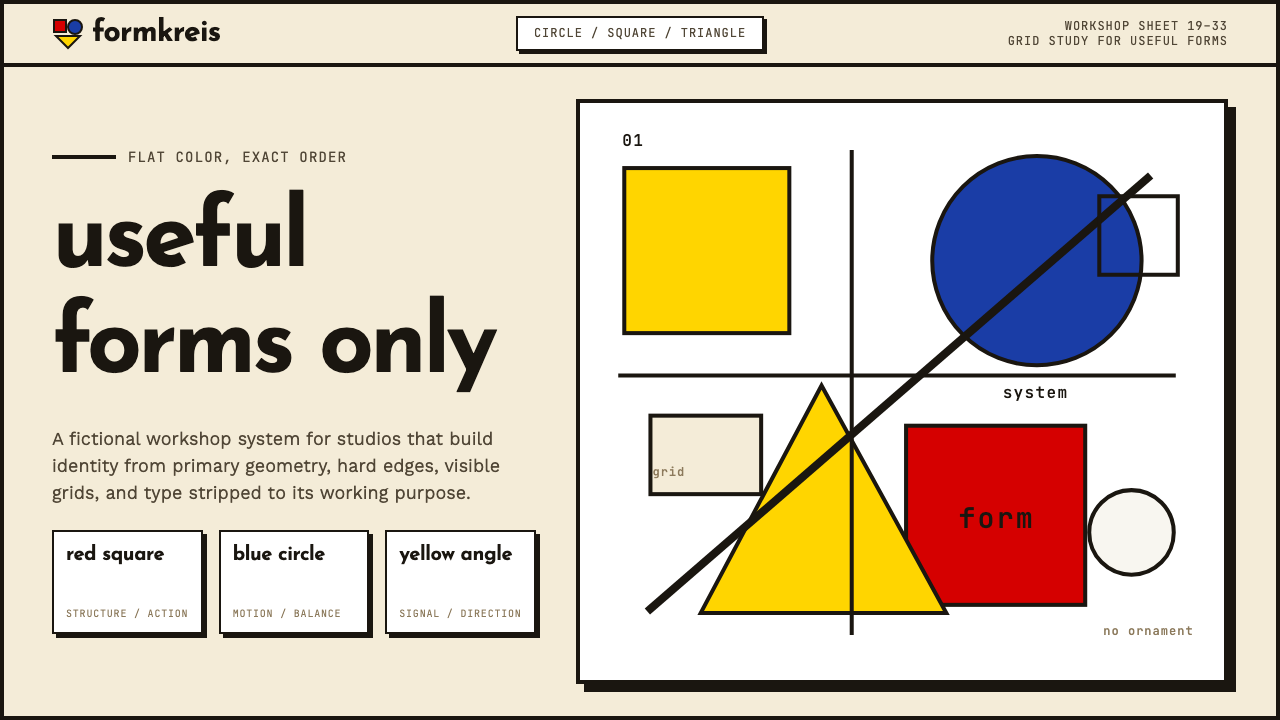
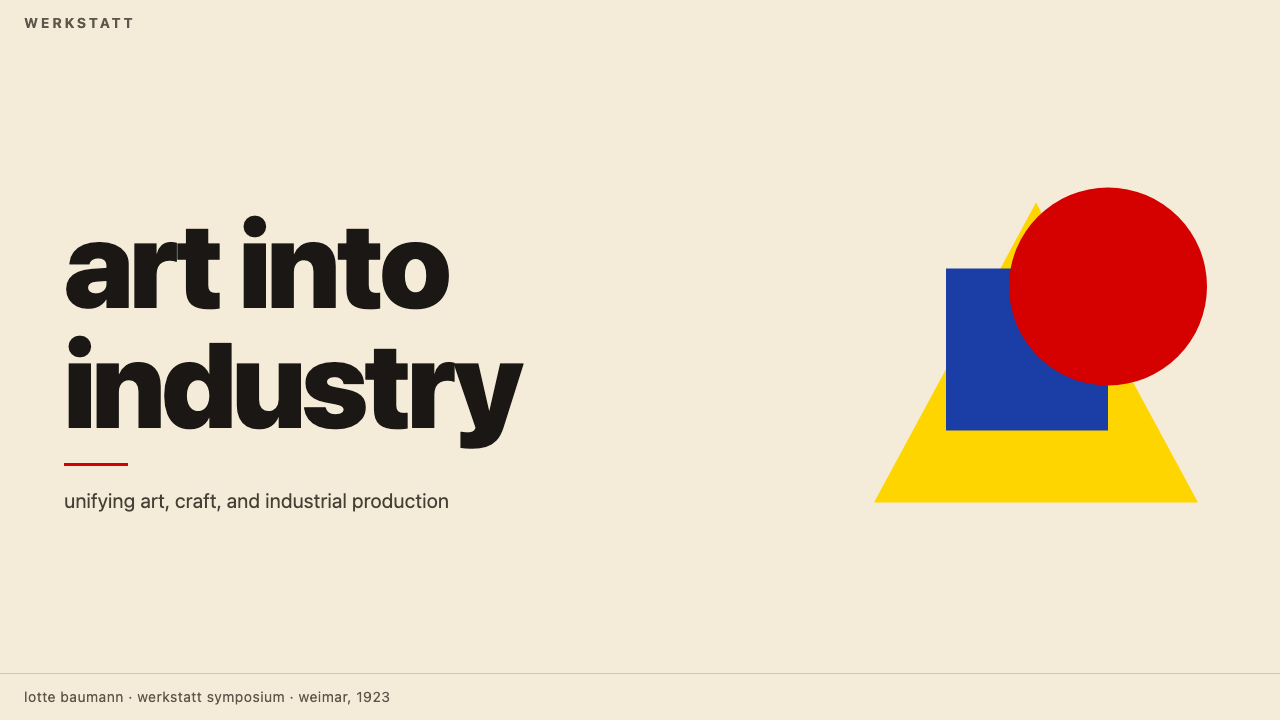
The circle, square, and triangle — the Bauhaus formkreis — are the fundamental vocabulary. Gropius's workshop assignments and Itten's preliminary course both required students to work through permutations of these three forms before tackling applied design. In finished work, circles appear as focal points or mechanical motifs, squares as grid anchors, and triangles as directional signals. Overlapping flat shapes replace representational illustration entirely.圆形、正方形与三角形——包豪斯的“形式圆”(formkreis)——是最基本的视觉词汇。格罗皮乌斯的工坊作业与伊滕的基础课程都要求学生在进入应用设计之前,彻底排演这三种形态的各种组合。在成品中,圆形充当焦点或机械母题,正方形锚定网格,三角形发出方向信号。相互叠压的平面形取代了一切具象插图。
Grid and Asymmetry网格与非对称
Bauhaus layouts are rigorously gridded but never symmetrical in the traditional sense. Composition is balanced through weight and tension rather than mirroring — a large black rectangle on the left offset by a small red circle on the right, a column of tight body text anchored against a single large numeral. This asymmetric balance was partly political (symmetry was associated with classical authority) and partly functional: it creates natural reading direction.包豪斯的版面严格依附网格,却绝不采用传统意义上的对称。构图通过重量与张力取得平衡,而非镜像——左侧一块大面积黑色矩形,被右侧一个小红圆所平衡;一列紧凑正文,被一个巨大单数字所锚定。这种非对称平衡一半出于政治立场(对称与古典权威相关联),一半出于功能考量:它制造自然的阅读方向。
Shadow and Depth投影与深度
Where shadow is used at all, it is hard-edged, offset at a consistent angle, and rendered as a solid flat shape rather than a gradient. This approach treats shadow as a structural element — another geometric form on the page — rather than a lighting simulation. The effect is bold and almost diagrammatic: objects look cut out and placed, not rendered and lit.若使用投影,则必是硬边、以固定角度偏移、以实心平面形而非渐变呈现。这种处理将投影视为结构性元素——页面上的又一个几何形——而非光照模拟。效果大胆而近乎示意图式:物体看起来像被剪切摆放,而非被描绘打光。
Material Honesty材料诚实
In physical products, the Bauhaus insisted that materials be used in ways consistent with their structural properties: steel should look like steel, wood like wood. In two-dimensional work, this principle translates to flatness — no simulated textures, no fake depth, no skeuomorphic surfaces. Every element is what it appears to be. This discipline distinguishes authentic Bauhaus-derived work from pastiches that borrow the color palette but retain decorative layering.在实体产品中,包豪斯坚持以符合材料结构特性的方式使用材料:钢铁应该看起来是钢铁,木材应该看起来是木材。在二维作品中,这一原则转化为平面性——无模拟纹理,无虚假深度,无拟物化表面。每个元素就是它看起来的那个样子。这种自律将真正源自包豪斯的作品与那些借用色板却保留装饰分层的仿制品区别开来。
Zero Ornament零装饰
The most absolute of Bauhaus principles: if a visual element cannot be justified by structure or communication, it should not exist. No flourishes on letterforms, no decorative borders, no gradient fills applied for visual richness, no ambient shadows softening edges. The restraint is not minimalism in the contemporary sense — it is principled refusal. Every absence is an argument.这是包豪斯最绝对的原则:若一个视觉元素无法以结构或传达目的为正当理由,它就不应存在。字形无花饰,无装饰边框,无用于丰富视觉的渐变填充,无柔化边缘的环境投影。这种克制并非当代意义上的极简主义——它是有原则的拒绝。每一处缺席,都是一个论点。
See the Bauhaus Weimar design system查看 Bauhaus Weimar 完整设计系统
Who shaped Bauhaus Weimar?谁塑造了 Bauhaus Weimar?
Gropius founded the Bauhaus and wrote its founding manifesto, which called for the reunion of fine art and craft. His administrative and diplomatic skills kept the school financially viable through multiple political crises. His Dessau campus building — with its glass curtain walls and flat roofs — remains a definitive statement of the movement's architectural ambitions, and his emigration to Harvard in 1937 helped transplant Bauhaus thinking directly into American design and architectural education.格罗皮乌斯创立了包豪斯并撰写创校宣言,呼吁纯艺术与手工艺的重新合流。他的行政与外交才能使学校在多次政治危机中维持财务运转。他设计的德绍校园建筑——玻璃幕墙与平屋顶——至今仍是该运动建筑抱负的权威陈述。1937年流亡哈佛后,他将包豪斯思想直接移植进美国设计与建筑教育。
Moholy-Nagy joined the Bauhaus in 1923 and redirected its preliminary course toward industrial materials and photography. His light-space experiments — constructions that cast moving shadows — explored the intersection of kinetics, light, and form. After the school closed, he founded the New Bauhaus in Chicago in 1937, ensuring that the pedagogical method survived in the United States and continued influencing graphic design, photography, and product design long after the original school's closure.莫霍利-纳吉于1923年加入包豪斯,将基础课程重新导向工业材料与摄影。他的光-空间装置——投射运动阴影的构造物——探索了动力学、光线与形态的交汇。学校关闭后,他于1937年在芝加哥创立了新包豪斯,确保这套教学法在美国延续,并在原始学校关闭后长期影响平面设计、摄影与产品设计。
Kandinsky joined the Bauhaus in 1922 after the closure of the avant-garde school Inkhuk in Moscow. At Bauhaus he taught the analytical drawing course and developed his systematic theory linking geometric forms to emotional and psychological states — circle to blue and repose, square to red and stability, triangle to yellow and action. This color-shape symbology became foundational to the Bauhaus visual system and continues to underpin much of what contemporary designers recognize as 'Bauhaus color logic'.康定斯基于1922年在莫斯科先锋学校Inkhuk关闭后加入包豪斯。在校期间,他讲授分析性绘画课程,并发展出将几何形态与情感、心理状态系统性联结的理论——圆形对应蓝色与静息,正方形对应红色与稳定,三角形对应黄色与行动。这套色-形象征体系成为包豪斯视觉系统的基础,也是当代设计师所认知的“包豪斯色彩逻辑”的持久根基。
Bayer studied and then taught at Bauhaus, serving as director of the printing and advertising workshop from 1925. His Universal typeface, designed in 1925, attempted to reduce the Latin alphabet to purely geometric, single-stroke letterforms — eliminating capital letters on the grounds that spoken language does not distinguish them. As a typographer and exhibition designer, Bayer developed spatial and typographic systems that influenced corporate identity design, museum exhibition practice, and international information graphics well into the second half of the twentieth century.拜耶先后在包豪斯求学与执教,1925年起担任印刷与广告工坊主任。他于1925年设计的“通用”字体试图将拉丁字母简化为纯几何、单笔画字形——并以口语不作大小写区分为由取消大写字母。作为字体设计师与展览设计师,拜耶建立的空间与排印体系在二十世纪下半叶持续影响企业视觉识别、博物馆展览实践与国际信息图形设计。
Schlemmer directed the Bauhaus theater workshop, where he developed the Triadic Ballet — a performance work in which dancers wore geometric costume-sculptures that reduced the human figure to spheres, cylinders, and cones. His work represents the movement's most direct engagement with the body as a designed form. The theater workshop's output demonstrates that Bauhaus principles were not limited to print or products but extended to performance, costume, and the staging of human presence itself.施莱默主持了包豪斯剧场工坊,在那里他发展出“三元芭蕾”——一部让舞者穿戴几何雕塑服装的表演作品,将人体简化为球体、圆柱与圆锥的组合。他的工作代表了该运动对身体作为被设计形态的最直接介入。剧场工坊的产出证明,包豪斯原则并不局限于印刷品或产品,而是延伸至表演、服装乃至人的存在本身的舞台化呈现。
How do you use Bauhaus Weimar today?今天怎么用 Bauhaus Weimar?
Bauhaus is among the most transferable historical styles in contemporary design work, because its principles are structural rather than ornamental. Applying it correctly requires understanding what the visual system is actually doing — using color to assign meaning, using geometry to create order, using negative space to give every element breathing room — rather than simply overlaying primary colors on a layout.包豪斯是当代设计实践中可移植性最强的历史风格之一,因为它的原则是结构性的,而非装饰性的。正确应用它,需要理解这套视觉系统实际上在做什么——用色彩指派意义,用几何创造秩序,用留白给每个元素以呼吸空间——而不仅仅是在版面上叠加三原色。
For presentation slides, Bauhaus works exceptionally well on both cover and content pages. A cover benefits from the bold asymmetric composition: a large geometric shape in one primary color anchors a corner while the title sits in high-contrast type against a cream or white field. Content slides should be treated as grids: one organizing line, two or three text hierarchies defined purely by size and weight, no decorative dividers. Data slides take on a diagrammatic quality — bar charts and pie charts become geometric objects in their own right, with bars and segments colored according to the primary palette.在演示文稿中,包豪斯在封面页与内容页上都表现出色。封面适合运用大胆的非对称构图:一个大几何形以某一主色锚定角落,标题以高对比度字体置于奶油或白色底面上。内容页应当被当作网格处理:一条组织性线条,仅以尺寸与字重定义两到三级文字层级,无装饰性分割线。数据页呈现出示意图式的品质——柱状图与饼图本身成为几何对象,柱条与扇区依照主色板着色。
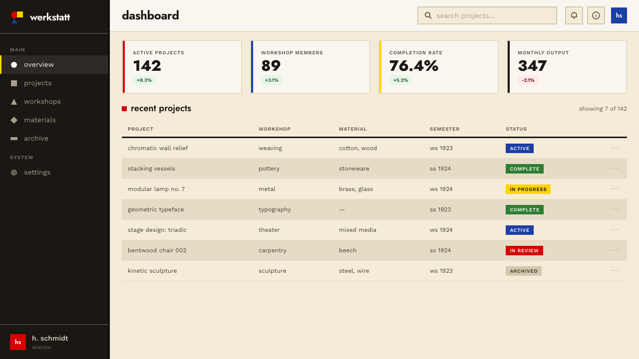
For web interfaces, Bauhaus is well-suited to dashboards and pricing pages where hierarchy and scannability are paramount. The approach: define a strict four-column or twelve-column grid, keep the background near-white or cream, use black for all body text, and reserve the primary colors for interactive states, alerts, or tier differentiation. Hard-shadow card components replace soft-shadow equivalents; bordered inputs replace ghost inputs. Navigation should be typographic — wordmarks and labels — with no icon decoration beyond geometric indicators.对于网页界面,包豪斯尤其适合层级与可扫描性至关重要的仪表板与定价页面。方法如下:定义严格的四列或十二列网格,保持背景接近白色或奶油色,所有正文用黑色,将三原色保留给交互状态、警示或等级区分。硬边投影卡片组件替代软阴影版本;有边框输入框替代幽灵输入框。导航应当是字体性的——文字标识与标签——除几何指示符外无图标装饰。
For editorial and marketing work, the style supports strong information hierarchy. A Bauhaus-derived article layout uses a narrow measure for body text, a wide left or right margin for call-outs or metadata, and section breaks marked by a bold horizontal rule rather than decorative ornaments. Marketing pages work well with the style's poster-like boldness: full-width feature blocks alternate between cream-on-black and black-on-cream, with a single primary-color accent used consistently for calls to action.对于编辑与营销内容,这种风格支持强劲的信息层级。包豪斯衍生的文章版面为正文使用窄行宽,为引用语或元数据保留宽阔的左侧或右侧留白,以粗水平线而非装饰元素标记段落分隔。营销页面适合这种风格的海报式大胆感:全宽特性区块在奶油底黑字与黑底奶油字之间交替,以一种主色作为行动号召的一致强调色。
A common mistake when applying Bauhaus is treating the primary color palette as license to use all three colors simultaneously at high saturation. Authentic Bauhaus work typically leads with one primary and uses a second as accent; the third appears rarely, if at all. Similarly, mixing multiple sans-serif typefaces undermines the system's logic — one typeface at multiple weights and sizes will produce more coherent results than several families in competition.应用包豪斯时最常见的错误,是将三原色色板理解为同时大面积使用三种高饱和色的许可。真实的包豪斯作品通常以一种主色为主导,以第二种作强调;第三种极少出现,甚至不出现。同样,混用多种无衬线字体会破坏系统的逻辑——一种字体以多个字重和尺寸使用,比多个字体家族相互竞争产生更为连贯的结果。
See the Bauhaus Weimar design system查看 Bauhaus Weimar 完整设计系统
Bauhaus Weimar — FAQBauhaus Weimar · 常见问题
Is Bauhaus the same as Swiss International Style?包豪斯和瑞士国际主义风格是同一回事吗?
They are related but distinct. The Bauhaus (1919–1933) established the foundational principles — geometric forms, primary colors, rejection of ornament, grid-based composition — that Swiss International Style (emerging in the 1950s and 1960s) then systematized into a global corporate standard. Swiss Style is more rigorous typographically, more committed to the mathematical grid, and uses a much broader color range including photography. Bauhaus work is bolder, more symbolic in its color use, and more visually confrontational. Think of Swiss Style as Bauhaus with the political urgency removed and the precision dialed up.两者相关但截然不同。包豪斯(1919—1933年)确立了基础原则——几何形态、三原色、拒绝装饰、网格化构图——而瑞士国际主义风格(兴起于1950至60年代)则将这些原则系统化为全球企业标准。瑞士风格在排版上更为严格,对数学网格更为恪守,使用的色彩范围也远更宽广,包括摄影图像。包豪斯作品更大胆,色彩运用更具象征性,视觉上更具对抗性。可以这样理解:瑞士风格是去除了政治紧迫感、精确度拨至最高的包豪斯。
Can Bauhaus work in a dark-background layout?包豪斯风格能用在深色背景版面上吗?
The historic Bauhaus palette was light-ground — cream or white backgrounds were canonical. A dark inversion is possible and not uncommon in contemporary applications, but it requires care. On a black ground, primary yellow tends to dominate aggressively, and the structural clarity that the style depends on can break down if all three primaries are present simultaneously at high contrast. A dark Bauhaus variant works best when it commits to one primary color as foreground accent — typically yellow or red — and treats the other two as structural or typographic elements only.历史上的包豪斯色板以浅色底面为标准——奶油或白色背景是经典形态。深色反转版本是可能的,在当代应用中也并不罕见,但需要谨慎处理。在黑色底面上,原色黄往往会攻击性地主导整体,如果三种主色同时以高对比度出现,这种风格所依赖的结构清晰度可能随之崩溃。深色包豪斯变体最有效的做法是:以一种主色(通常是黄色或红色)作为前景强调,其余两种仅用作结构性或字体性元素。
Why does Bauhaus avoid gradients and soft shadows so strictly?包豪斯为何如此严格地回避渐变和柔和阴影?
Because gradients and soft shadows simulate natural lighting — they import the logic of the physical world into a designed artifact. Bauhaus believed the designed artifact should be governed by its own structural logic, not by naturalistic illusion. A soft shadow suggests a light source; a hard shadow is a geometric decision. This matters practically too: flat elements and hard shadows reproduce cleanly across different media, at different scales, in single-color printing, and on early digital screens. The anti-gradient principle was partly a formal commitment and partly a production reality of the 1920s that happened to age well.因为渐变和柔和阴影模拟的是自然光照——它们将物理世界的逻辑引入了设计物。包豪斯相信,设计物应受其自身结构逻辑支配,而非受自然主义幻觉驱动。柔和阴影暗示一个光源;硬边阴影是一个几何决定。这在实践中同样重要:平面元素与硬边阴影能在不同媒介、不同尺寸、单色印刷和早期数字屏幕上清晰再现。反渐变原则一半是形式上的承诺,一半是1920年代的生产现实——而这一现实碰巧经受了时间的检验。
How does Bauhaus handle imagery and photography?包豪斯如何处理图像与摄影?
Photography entered Bauhaus practice primarily through Moholy-Nagy, who saw the camera as a form-finding tool rather than a documentation device. Bauhaus photography is typically high-contrast, shot from unusual angles, and used to isolate geometric qualities in everyday objects. In layouts, photography is treated as a flat element — cropped aggressively, silhouetted against white, or reproduced in high-contrast duotone — never as a naturalistic window into a scene. Representational illustration is almost entirely absent; when figurative imagery appears, it is reduced to geometric silhouette.摄影主要经由莫霍利-纳吉进入包豪斯实践——他将相机视为发现形态的工具,而非记录设备。包豪斯摄影通常是高对比度的,从非常规角度拍摄,用于隔离日常物体的几何品质。在版面中,摄影被当作平面元素处理——激进裁切、在白底上做轮廓剪影,或以高对比度双色调复制——绝不作为对某一场景的自然主义窗口。具象插图几乎完全缺席;当具象图像出现时,它被简化为几何剪影。
Does Bauhaus suit every kind of product, or are there contexts where it struggles?包豪斯适合所有类型的产品吗?有没有它表现欠佳的场景?
Bauhaus is not universally suited. It works well for products where authority, clarity, and rational structure are desired values: dashboards, pricing pages, analytical tools, educational materials, and platforms positioning themselves as modern and principled. It struggles in contexts that call for warmth, sensory richness, or cultural specificity — food brands, children's products, wellness applications, or any context where the user experience depends on organic texture and human warmth. The style's severity can also read as cold or even aggressive in consumer-facing emotional contexts. Knowing where the style's values align with the product's values is more important than technical execution.包豪斯并非普遍适用。它在权威性、清晰度与理性结构是期望价值的产品中表现出色:仪表板、定价页面、分析工具、教育材料,以及将自身定位为现代且有原则的平台。它在需要温暖感、感官丰富性或文化特殊性的场景中则力不从心——食品品牌、儿童产品、健康应用,以及任何用户体验依赖有机质感与人文温度的场景。这种风格的严肃性在面向消费者的情感语境中也可能被解读为冷漠甚至攻击性。理解这种风格的价值观在哪里与产品价值观对齐,比技术执行更为重要。
Related design styles相关设计风格
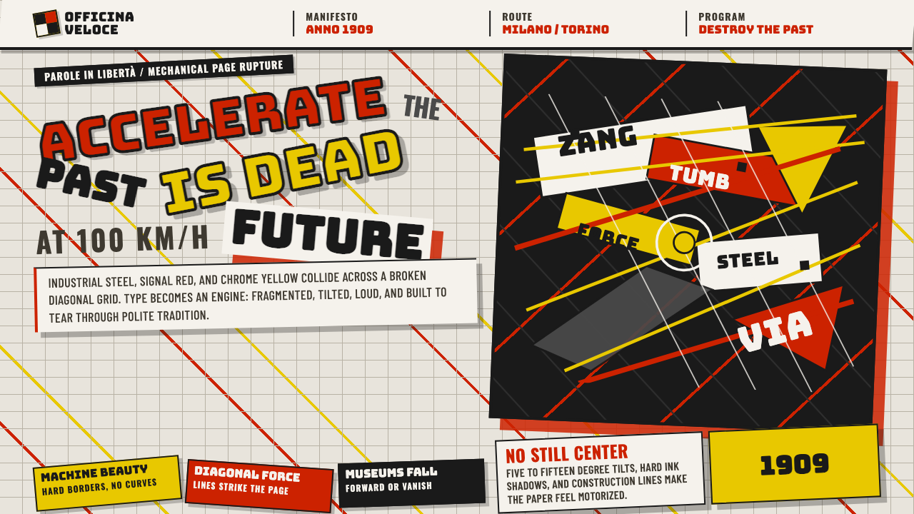 Italian Futurism (Marinetti 1909)Speed murders tradition. Signal red and chrome yellow slash a broken diagonal…速度杀死传统:信号红与铬黄斩开破碎斜向网格。
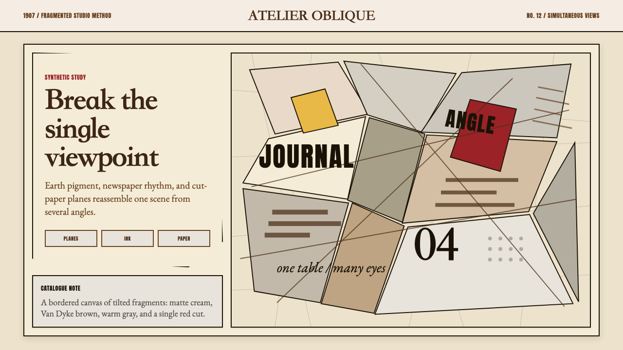 Picasso CubismSingle sight is shattered. Cream collage paper fractures brown-gray planes wi…单一视角被击碎:奶油拼贴纸上,褐灰棱面被一刀红色刺穿。
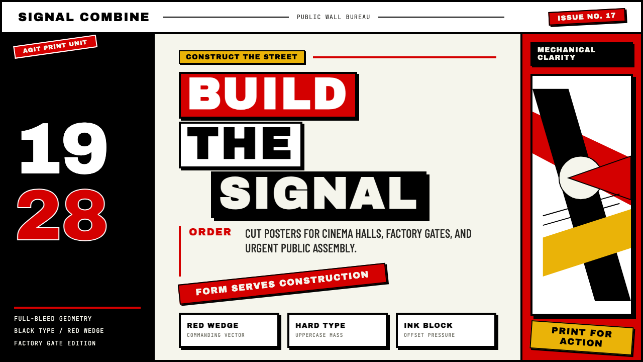 Russian ConstructivismRevolution red, slashed across black and white. Diagonal sans-serif, photomon…1917 年革命视觉:红色斜劈黑白画面、几何无衬线倾斜排版、照片蒙太奇——形式…
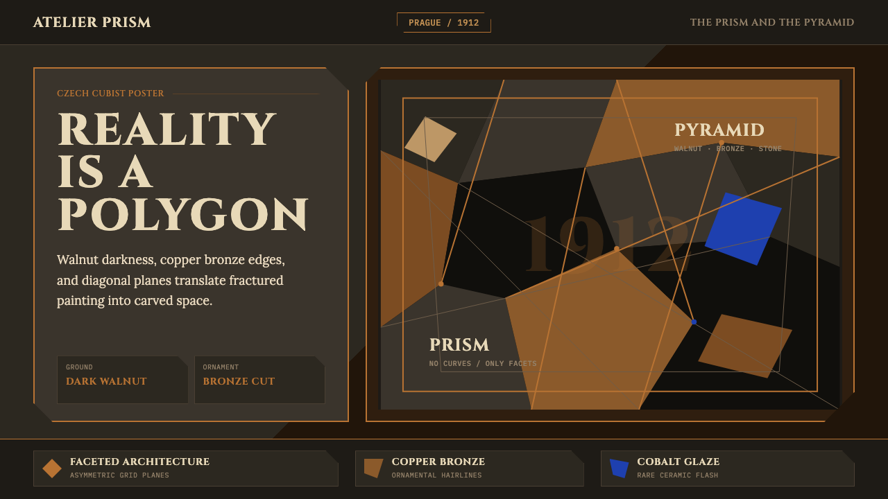 Czech Cubism (Prague 1912)Reality is faceted. Walnut ground, Cinzel capitals, and bronze diagonals cut…现实是多面体。胡桃木底、Cinzel 大写与青铜斜线切开平面。
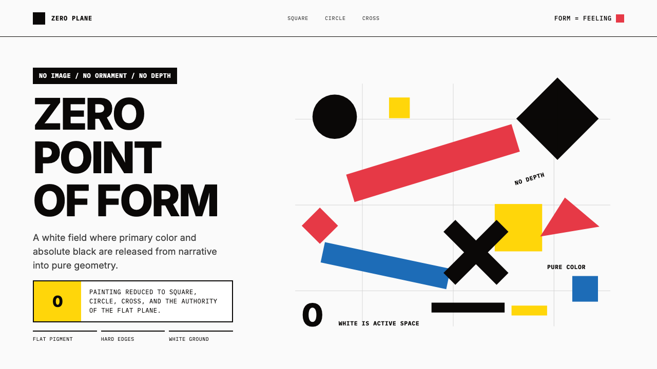 Malevich SuprematismGeometry declares zero. Red, yellow, blue and black blocks float on active wh…几何宣告零点:红黄蓝黑色块漂浮于主动白场。
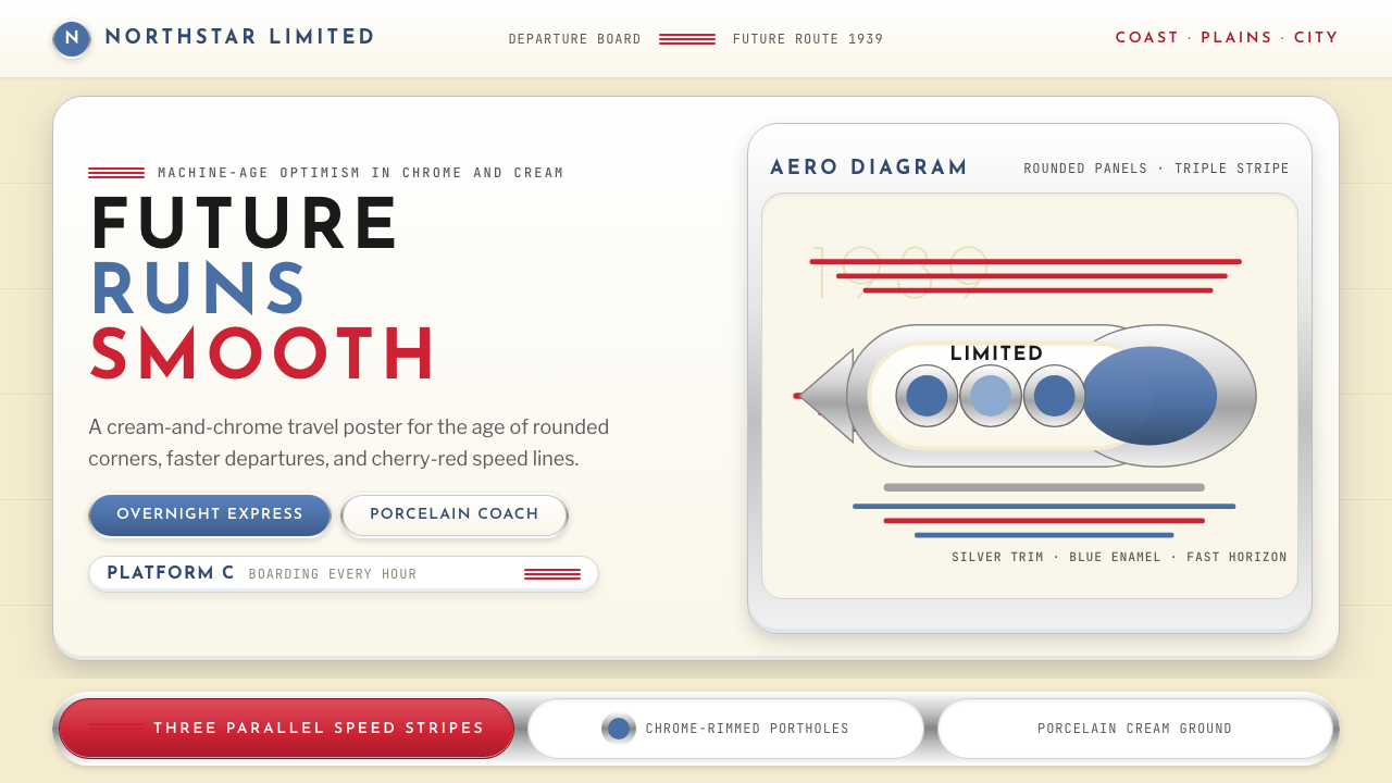 Streamline Moderne (1930s)Optimism made aerodynamic. Cream ground, chrome ovals, and cherry stripes dri…乐观被做成流线:奶油底、铬圆框与樱桃红速度线向右疾行。