What is Russian Constructivism?什么是 Russian Constructivism?
Revolution red slashed across black and white — Russian Constructivism made militant clarity the only acceptable aesthetic.革命红色斜劈黑白画面——俄国构成主义将战斗般的清晰度确立为唯一可接受的美学准则。
Russian Constructivism in briefRussian Constructivism 速览
Russian Constructivism is a design and art movement that emerged from the 1917 October Revolution as a radical demand that visual form serve social purpose. It rejected 'art for art's sake' entirely, insisting that the poster, the book cover, the film title, and the exhibition display were all instruments of socialist construction — as purposeful and engineered as a bridge or a factory. The name itself is deliberate: to construct, not to decorate.俄国构成主义是一场设计与艺术运动,它在1917年十月革命的烈火中诞生,以一种激进的主张为核心:视觉形式必须服务于社会目的。它彻底否定了「为艺术而艺术」的旧观念,坚持认为海报、书籍封面、电影字幕和展览陈列,与桥梁或工厂同样具有工具性——同样是有目的地建造出来的。「构成主义」这个名字本身就是宣言:是建造,不是装饰。
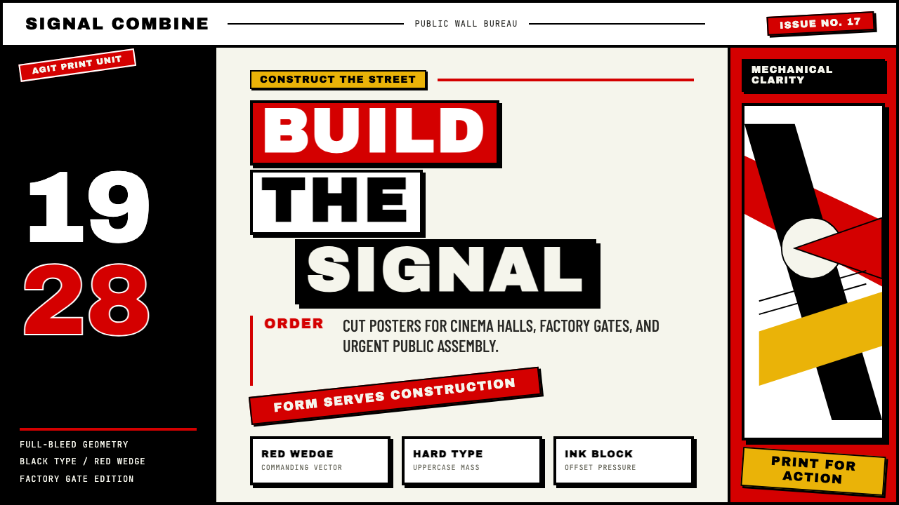
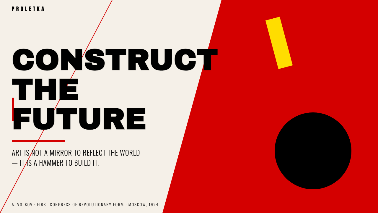
The movement's visual language is immediately recognizable. Revolutionary red — saturated, flat, unmodulated — is cut and slashed against black and white fields. Heavy geometric sans-serif type is set at aggressive diagonals, often thirty or forty-five degrees off horizontal. Photographs are torn apart and recombined in photomontage collisions that feel urgent and destabilizing. Compositions are asymmetric by principle, with elements arranged along strong diagonal axes that seem to refuse stillness. Nothing is centered, nothing is at rest.这一运动的视觉语言令人一望即知。革命红色——饱和、平涂、无渐变——在黑白色域上被切割、斜劈。厚重的几何无衬线字体以强烈的斜角排列,往往偏离水平线三十度或四十五度。照片被撕裂后重新拼合为蒙太奇画面,给人一种紧迫而动荡的感受。构图在原则上是非对称的,各元素沿强劲的对角轴线排布,仿佛在拒绝任何静止状态。没有居中,没有安息。
Suppressed by Stalin's doctrine of Socialist Realism around 1934, which demanded legible figurative imagery over abstract formal experiment, Constructivism was effectively erased from Soviet cultural life. But the movement's afterlife has been extraordinary: its diagonal grids echo through Swiss punk typography of the 1970s, its photomontage technique recurs in radical editorial design, and its stripped geometry anticipates contemporary brutalist web aesthetics. Nearly every designed artifact that uses aggressive diagonal composition and stark color contrast owes something to Constructivism.大约在1934年前后,斯大林的社会主义现实主义教条——要求可辨识的具象图像而非抽象形式实验——有效地将构成主义从苏联文化生活中抹去。但这一运动的来世之旅却格外漫长:它的斜角网格回响在1970年代的瑞士朋克字体排印中,它的蒙太奇技术在激进的编辑设计中一再复现,它被剥至骨骼的几何语汇预示了当代粗野主义网页美学。几乎所有使用强烈对角构图与鲜明色彩对比的设计物,都欠构成主义一份债。
See the Russian Constructivism design system查看 Russian Constructivism 完整设计系统
Where does Russian Constructivism come from?Russian Constructivism 从何而来?
The intellectual ground for Constructivism was prepared before the Revolution. Suprematism — the radical abstraction developed by Kazimir Malevich beginning around 1915 — had already dissolved the Russian avant-garde's attachment to representational form, reducing the painted canvas to pure geometric relationships: black squares, red circles, cross-forms floating in white space. Malevich insisted these were not decorations but the essential structure of visual experience stripped of social convention. His students and peers absorbed this lesson thoroughly, even as they would later turn against his apolitical spiritualism.构成主义的思想土壤早在革命之前就已备好。卡济米尔·马列维奇自1915年前后发展起来的激进抽象——至上主义——已经溶解了俄国先锋派对具象形式的执念,将绘画画布简化为纯粹的几何关系:黑色方块、红色圆形、十字形漂浮于白色空间中。马列维奇坚持认为,这些不是装饰,而是视觉经验被剥去社会惯例之后的本质结构。他的学生和同伴彻底消化了这一课,尽管他们后来会转而反对他的非政治性精神主义。
The October Revolution of 1917 gave the avant-garde both a mission and an institutional foothold. Designers and artists were recruited by the new Soviet state to produce propaganda for a largely illiterate population — posters that could be read across a city square, banners that communicated allegiance at a glance. Aleksandr Rodchenko, who had trained as a painter under Malevich's influence, brought his abstract compositional instincts into direct contact with this mass communication demand. He and his collaborator Varvara Stepanova developed what they called Productivism: the argument that the artist's proper role was not studio production of unique objects but the design of functional things for industrial reproduction. A poster that could be printed ten thousand times was worth more than a canvas painting that lived in one room.1917年的十月革命赋予先锋派既有使命又有制度立足点。设计师和艺术家被新苏维埃政权征召,为一个大量文盲的人口生产宣传品——能够在城市广场对面被阅读的海报,能够一望即知其效忠立场的横幅。曾在马列维奇影响下接受绘画训练的亚历山大·罗德琴科,将他的抽象构图直觉与这一大众传播需求直接对接。他与合作者瓦尔瓦拉·斯捷潘诺娃发展出他们所称的「生产主义」:艺术家的恰当角色不是在画室生产唯一性的物件,而是为工业复制设计功能性的东西。一张能印刷一万份的海报,比一幅只能挂在一个房间里的布面油画价值更高。
El Lissitzky, working initially in the Jewish cultural milieu of Vitebsk under Marc Chagall before the two fell out over Malevich's arrival, became the movement's most internationally connected figure. His series of abstract compositions called Proun — 'Project for the Affirmation of the New' — explored the representation of architectural space through geometric forms floating on the page, combining Suprematist flatness with a sense of three-dimensional construction. More critically, Lissitzky traveled extensively to Germany and the Netherlands, where he met and influenced the De Stijl group and the nascent Bauhaus, creating one of the most fertile cross-pollinations in modern design history. His typographic experiments, particularly the layout work for the journal Veshch and for various Soviet and German publications, introduced diagonal composition and photomontage to Western graphic practice.埃尔·利西茨基最初在维捷布斯克的犹太文化圈子里、在马克·夏加尔麾下工作,后来因马列维奇的到来二人产生嫌隙。利西茨基成为这一运动与国际联系最广泛的人物。他那组被称为「普鲁恩」(Proun,「肯定新事物之项目」)的抽象构图系列,通过漂浮在页面上的几何形式探索建筑空间的再现,将至上主义的平面性与三维建造感相结合。更为关键的是,利西茨基频繁前往德国和荷兰,在那里与风格派(De Stijl)群体和初生的包豪斯相遇并相互影响,造就了现代设计史上最富成果的交叉授粉之一。他的排版实验——尤其是为杂志《物品》(Veshch)及苏联和德国各类出版物所做的版面设计——将对角线构图和照片蒙太奇引入了西方平面实践。
Vladimir Tatlin, though primarily a sculptor and architect, contributed the movement's most iconic emblem: the proposed Monument to the Third International (1919–1920), a rotating tower of steel and glass intended to surpass the Eiffel Tower in height and symbolize the dynamism of the Revolution. It was never built, but the image of Tatlin's Tower — a double helix of steel climbing through the air — became the visual shorthand for Constructivist ambition: engineering as ideology, structure as politics. By the early 1920s, the movement had expanded into textile design, film titles, exhibition architecture, and book design, with figures like Stepanova designing factory uniforms and Lissitzky designing landmark exhibitions. The suppression came gradually: by the late 1920s, Socialist Realism was consolidating its hold, and by 1934, the abstract formal experiment that defined Constructivism was officially condemned.弗拉基米尔·塔特林虽主要是一位雕塑家和建筑师,却为这一运动贡献了最具标志性的意象:计划中的「第三国际纪念碑」(1919—1920年),一座打算超越埃菲尔铁塔高度的旋转钢铁与玻璃塔,意在象征革命的动态性。它从未建成,但塔特林之塔的形象——一道钢铁双螺旋直插天际——成为构成主义雄心的视觉简称:工程即意识形态,结构即政治。到1920年代初,这一运动已扩展至纺织品设计、电影字幕、展览建筑与书籍设计——斯捷潘诺娃为工厂设计制服,利西茨基设计里程碑式的展览。压制是逐渐到来的:1920年代末,社会主义现实主义正在巩固其主导地位;至1934年,定义构成主义的抽象形式实验已被正式谴责。
What defines the Russian Constructivism look?Russian Constructivism 的视觉特征是什么?
Revolutionary Red on Black and White革命红色与黑白对位
The Constructivist palette is built on a near-total restriction: revolutionary red deployed against black and white. Red is not simply one color among many — it is the ideological primary, carrying the weight of political urgency and mass mobilization. Black and white establish the structural field, creating maximum contrast. The palette functions less like an aesthetic choice and more like a signaling system. Secondary colors rarely appear, and when they do, they serve to distinguish information layers rather than to create visual variety for its own sake.构成主义的色板建立在一种近乎全面的限制之上:革命红色在黑白之间展开。红色不仅仅是众多颜色中的一种——它是意识形态的首色,承载着政治紧迫感与大众动员的重量。黑色与白色确立结构性底场,制造最大程度的对比。这套色板的运作方式不像审美选择,更像是信号系统。间色极少出现,一旦出现,也是用于区分信息层级,而非单纯创造视觉变化。
Diagonal Composition and Kinetic Energy对角线构图与动势能量
Perhaps the most distinctive feature of Constructivist design is its commitment to the diagonal as the primary compositional axis. Unlike the horizontal and vertical grids that organize most Western page design, Constructivist layouts rotate type, rules, and geometric shapes to angles that feel unstable and urgent — a visual equivalent of the revolutionary momentum the work was meant to communicate. These diagonals are not decorative; they are structural. They create reading paths and establish hierarchies, but they refuse the settled authority of the orthogonal.构成主义设计最显著的特征,或许就是对对角线作为主要构图轴线的执守。与组织大多数西方页面设计的水平与垂直网格不同,构成主义版面将文字、直线和几何形旋转至令人感到不稳定、充满紧迫感的角度——是对这些作品所要传达的革命动势的视觉等价物。这些对角线不是装饰性的,而是结构性的。它们创造阅读路径,建立层级,但它们拒绝正交的那种安定权威。
Photomontage and Collision照片蒙太奇与硬切拼贴
Constructivist designers were among the first to make photomontage a primary expressive and communicative method. Photographs were not used naturalistically — they were cut, cropped at severe angles, scaled to disproportionate sizes, and collided with type and geometric forms on the same surface. The photomontage technique, developed in parallel by Berlin Dadaists and Soviet Constructivists, implies that reality can be reordered and that the viewer's habitual perception can be disrupted. Images of workers, machines, and crowds are made to feel simultaneous and overwhelming rather than sequential and calm.构成主义设计师是最早将照片蒙太奇作为主要表现与传达方法的人之一。照片并非以自然主义方式使用——它们被裁切、以强烈角度切割、缩放至不成比例的尺寸,并在同一画面上与文字和几何形碰撞。蒙太奇技术——由柏林达达主义者和苏联构成主义者平行发展——意味着现实可以被重新排序,观者习惯性的感知可以被打断。工人、机器和人群的图像被处理得像是同时涌来、势不可挡,而非有序、平静地呈现。
Heavy Geometric Sans-Serif Type粗重几何无衬线字体
Constructivist typography favors letterforms that are blocky, geometric, and heavy — forms whose thick strokes and even weight distribution read as engineered objects rather than calligraphic traces. Type is used at extreme contrasts of scale: a single enormous word or letter may occupy a quarter of the composition, serving as both text and visual mass. Type and image are treated as compositional equals, not as figure and ground. Rules, bars, and geometric shapes are used to anchor type, extend it, or interrupt it — the typographic arrangement is itself a constructed object.构成主义字体排印偏爱方正、几何、粗重的字形——那些笔画粗厚、字重均匀的形态,读来像是工程化的物件,而非书写的痕迹。文字以极端的尺度对比使用:单个巨大的词语或字母可能占据构图的四分之一,同时充当文本和视觉块面。文字与图像被视为构图上的平等元素,而非图形与底场的关系。直线、色条和几何形被用来锚定文字、延伸文字或打断文字——排版编排本身就是一个被建造的对象。
Asymmetric Tension, Not Decorative Balance非对称张力,而非装饰性平衡
Constructivist compositions achieve balance through tension rather than symmetry. A heavy mass of text in one corner is countered by a bold geometric shape in the opposite zone; a diagonal rule pulls against a vertical column of type. This is balance understood as a dynamic system of forces, not as a stable resting point. Traditional symmetric compositions — the centered title, the mirrored page — were associated with classical authority and bourgeois convention. Asymmetry was a formal rejection of that authority, carried through the design itself.构成主义构图通过张力而非对称来实现平衡。一角的大量文字块面与对角区域的粗重几何形相互抗衡;一条斜线与一列竖排文字形成对拉。这是将平衡理解为一个力的动态系统,而非一个稳定的静止点。传统的对称构图——居中的标题、镜像的页面——被视为与古典权威和资产阶级惯例相关联。非对称是对那种权威的形式性拒绝,贯穿于设计本身之中。
Machine Aesthetic and Productivist Ethics机器美学与生产主义伦理
Underlying Constructivist form is a philosophical commitment to the machine as model. Where earlier decorative traditions looked to nature or classical antiquity for their formal vocabulary, Constructivism looked to engineering. Straight lines, precise angles, flat planes, and systematic repetition are all marks of industrial production — and they were embraced not merely as aesthetic choices but as ethical statements about what culture should value. The hand-rendered flourish was a mark of aristocratic leisure; the geometric rule was a mark of productive labor. This is why authentic Constructivist work feels deliberately hard and unaccommodating.构成主义形式的深层,是一种以机器为范本的哲学承诺。早期装饰传统从自然或古典古代汲取形式词汇,而构成主义则转向工程学。直线、精确角度、平面和系统性重复,都是工业生产的标记——它们被接纳不仅仅是作为审美选择,更是关于文化应当珍视何物的伦理声明。手工渲染的花饰是贵族闲暇的标记;几何直线是生产性劳动的标记。这就是为什么真实的构成主义作品感觉上是刻意地硬朗、毫不妥协。
Flatness and Zero Illusionism平面性与零幻觉主义
Constructivist work is resolutely flat. There are no simulated depths, no soft gradients suggesting volume, no naturalistic shading. When a circle appears on the page, it is a flat disk — a shape, not a sphere. When type casts a shadow, the shadow is a hard geometric offset, not a diffuse atmospheric halo. This flatness is both an aesthetic and an ideological position: illusionism was associated with the deceptive conventions of bourgeois representational culture. The constructed image should be legible as a constructed image — it should not pretend to be a window onto the world.构成主义作品是坚决平面的。没有模拟的纵深,没有暗示体积的柔和渐变,没有自然主义的明暗处理。当一个圆形出现在页面上,它是一个平面圆盘——一个形状,不是一个球体。当文字投下阴影,那阴影是一个硬边几何偏移,而非一个漫射的大气光晕。这种平面性既是审美立场,也是意识形态立场:幻觉主义被视为与资产阶级具象文化的欺骗性惯例相关联。被建造出来的图像应当作为被建造的图像被阅读——它不应假装成通往世界的一扇窗。
See the Russian Constructivism design system查看 Russian Constructivism 完整设计系统
Who shaped Russian Constructivism?谁塑造了 Russian Constructivism?
Rodchenko is the figure most central to Constructivism's visual identity. Beginning as a painter experimenting with pure black compositions, he moved into graphic design, photography, and textile design, always under the conviction that art must serve social function. His poster work — particularly the 1924 advertisement for Lengiz books featuring Lilya Brik photographed from below, mouth open, calling out a slogan — defines the movement's photomontage and diagonal typographic synthesis. He also designed book covers, magazine spreads, and film advertisement boards that remain canonical reference points. His later photography, characteristically shot from extreme high or low angles, pioneered the use of the camera as a formal instrument rather than a documentary one.罗德琴科是构成主义视觉身份最核心的人物。他从绘画实验(探索纯黑色构图)出发,转入平面设计、摄影和纺织品设计,始终坚信艺术必须服务于社会功能。他的海报作品——尤其是1924年为连吉兹出版社制作的广告,以低角度拍摄莉莉娅·布里克张口高呼口号的面孔——定义了这一运动的照片蒙太奇与对角排版的综合体。他还设计了书籍封面、杂志版面和电影广告牌,至今仍是标准参照点。他后期以极端俯角或仰角拍摄的摄影作品,开创了将相机作为形式工具而非记录工具使用的先例。
Lissitzky was the movement's great connector — the figure who built the bridges between Soviet Constructivism and the Western European avant-garde. His Proun series of abstract compositions explored the intersection of flat Suprematist geometry and implied architectural space, creating forms that appear to float, rotate, and intersect in ambiguous virtual depth. His typographic work — particularly his design of the 1923 publication 'Of Two Squares,' a children's story told entirely through abstract shapes, and his layouts for the journal Veshch — introduced Constructivist formal vocabulary to European designers and influenced a generation of Bauhaus typographers. He also designed landmark Soviet exhibition pavilions in Germany and the Netherlands, staging Soviet modernity for international audiences.利西茨基是这一运动的伟大连接者——在苏联构成主义与西欧先锋派之间架设桥梁的人物。他的「普鲁恩」系列抽象构图探索了至上主义平面几何与暗示性建筑空间的交汇,创造出在模糊虚拟纵深中漂浮、旋转、交叉的形态。他的排版作品——尤其是1923年出版物《两个方块的故事》(一个完全以抽象形状讲述的儿童故事)的设计,以及为杂志《物品》所做的版面——将构成主义的形式词汇引介给欧洲设计师,影响了一整代包豪斯排版师。他还在德国和荷兰设计了里程碑式的苏联展览馆,向国际观众呈现苏联的现代性。
Stepanova is one of the most complete embodiments of the Productivist ethic. Her work spans poetry, painting, graphic design, and textile design, and she was among the most committed advocates for the idea that the artist should abandon studio production for the design of functional, reproducible objects. Her textile designs for the First State Textile Print Factory — geometric patterns built on repeated angular forms — attempted to bring Constructivist form into everyday life through mass-produced fabric. Her magazine and book design, produced in close collaboration with Rodchenko, matches his formal rigor while often incorporating a more systematic, modular approach to grid organization.斯捷潘诺娃是生产主义伦理最完整的体现者之一。她的工作横跨诗歌、绘画、平面设计和纺织品设计,她是坚持艺术家应当放弃画室生产、转而设计功能性可复制对象这一理念最积极的倡导者之一。她为第一国家纺织印花工厂设计的纺织品图案——建立在重复角形之上的几何图案——试图通过量产布料将构成主义形式带入日常生活。她与罗德琴科密切合作完成的杂志与书籍设计,在匹配他的形式严谨性的同时,往往呈现出对网格组织更为系统化、模块化的处理方式。
Tatlin's contribution to Constructivism is more architectural and sculptural than graphic, but his influence on the movement's ideology was foundational. His counter-reliefs — three-dimensional constructions of industrial materials assembled without traditional craft methods — established the principle that artistic construction should use the materials and methods of industry. His Monument to the Third International, the great unbuilt tower, proposed a building that was also a machine and also a symbol: a steel double-helix rotating on different schedules at different levels, housing the organs of the Third Communist International. It summarized the movement's belief that structure, function, and political meaning could be unified in a single designed object.塔特林对构成主义的贡献更多属于建筑与雕塑领域,而非平面,但他对这一运动意识形态的影响是奠基性的。他的「反浮雕」——用工业材料以非传统工艺方法组装而成的三维构造物——确立了艺术建造应当使用工业材料与方法的原则。他的「第三国际纪念碑」,那座伟大的未建成之塔,设想了一座同时是机器、同时是象征的建筑:一道钢铁双螺旋在不同高度以不同节律旋转,容纳第三共产国际的各个机关。它浓缩了这一运动的信念:结构、功能与政治意义可以在一个被设计的对象中统一。
As life and professional partners, Rodchenko and Stepanova represent the movement's most sustained and productive artistic relationship. Their joint work — on the journal LEF, on textile and clothing design, on exhibition installations — demonstrates how Constructivist principles operated as a shared working method rather than merely an individual style. Stepanova's rigorously modular approach often provided structural architecture for compositions that Rodchenko then charged with photographic and diagonal energy. Together they show that Constructivism was above all a social practice: design as collective labor in service of collective transformation.罗德琴科与斯捷潘诺娃作为生活与职业伴侣,代表了这一运动最为持续而富有成果的艺术合作关系。他们共同在杂志《列夫》(LEF)、纺织品与服装设计以及展览装置上完成的作品,展示了构成主义原则如何作为一种共享的工作方法而非单纯的个人风格运作。斯捷潘诺娃严格模块化的方式常常为构图提供结构性骨架,罗德琴科再以摄影和对角线的能量为其充电。两人合在一起表明,构成主义首先是一种社会实践:设计作为集体劳动,服务于集体变革。
How do you use Russian Constructivism today?今天怎么用 Russian Constructivism?
Russian Constructivism is one of the most transferable historical styles in contemporary visual communication — not because it is easy to apply, but because its logic is structural and therefore scalable. The style does not ask you to copy a historical artifact; it asks you to understand why red is slashed diagonally and not placed centrally, why the type is rotated and not set horizontal, why the photograph is collided with geometry and not given clean white space. Applying Constructivism correctly means internalizing the movement's formal argument: urgency through diagonal, hierarchy through scale, meaning through color, structure through flatness.俄国构成主义是当代视觉传达中可移植性最强的历史风格之一——不是因为它易于应用,而是因为它的逻辑是结构性的,因而是可扩展的。这种风格不要求你复制一件历史文物,而是要求你理解:为什么红色是斜劈的而非居中摆放的,为什么文字是旋转的而非水平排列的,为什么照片与几何形碰撞而非得到干净的留白。正确地应用构成主义意味着内化这一运动的形式论证:对角线带来紧迫感,尺度创建层级,色彩承载意义,平面性构建结构。
For presentation slides, Constructivism offers a distinct and memorable alternative to conventional template layouts. A cover slide benefits from the movement's core compositional logic: a dominant diagonal element — a colored bar, a heavy typographic block, or a cropped photographic form — cuts across the field at an aggressive angle while the title sits in oversized, heavy type. The result should feel like a poster, not a slide. Content slides should similarly embrace extreme scale contrast: section headers several times the visual weight of body text, a bold horizontal or diagonal rule separating content zones, and color used only to signal the most critical element on the page. Data visualizations take on a geometric authority in this style — bar charts become architectural forms, and selective use of revolutionary red draws the eye to the single most important data point.对于演示文稿幻灯片,构成主义提供了一种有别于常规模板版面的鲜明而令人难忘的选择。封面幻灯片得益于这一运动的核心构图逻辑:一个主导性的对角线元素——一条色彩横条、一块粗重的排版块面,或一个被裁切的摄影形态——以强烈角度切割画面,同时标题以超大号、粗重字体排列。结果应该感觉像一张海报,而非一张幻灯片。内容幻灯片同样应当拥抱极端的尺度对比:章节标题的视觉重量是正文的数倍,一条粗重的水平或对角直线分隔内容区域,色彩仅用于标示页面上最关键的元素。在这种风格中,数据可视化呈现出一种几何权威——柱状图成为建筑形态,对革命红色的选择性使用将视线导向单个最重要的数据点。
For web interfaces, the style translates most naturally to dashboards, analytics platforms, and pages designed for experienced users who need to scan and act quickly rather than be welcomed or soothed. The structural approach is to establish a rigorous grid, set type in a heavy weight with strong scale contrast between headers and body, and use the restricted palette — red for interactive or alert states, black for primary content, white or near-white for backgrounds — with disciplined restraint. Navigation can be purely typographic: large, bold labels without icons, positioned asymmetrically. Avoid soft card shadows and gradient backgrounds, which undercut the aesthetic's flatness; instead, use hard borders, bold rules, and flat color fills. On pricing pages, Constructivist treatment can make a featured tier feel genuinely dominant rather than merely highlighted.对于网页界面,这种风格最自然地转化于仪表板、分析平台,以及为需要快速扫描和行动而非被欢迎或安抚的有经验用户设计的页面。结构性方法是:建立严格的网格,以粗重字重排版并在标题与正文之间保持强烈的尺度对比,以克制的自律使用限制性色板——红色用于交互或警示状态,黑色用于主要内容,白色或接近白色的色调用于背景。导航可以是纯文字的:大号、粗重的标签,不带图标,非对称地定位。避免柔和卡片阴影和渐变背景——它们会削弱这种美学的平面性;代之以硬边边框、粗重直线和平面色块填充。在定价页面上,构成主义的处理方式能让推荐档位感觉真正地主导全局,而非仅仅被高亮突出。
For editorial and marketing work, the style is best suited to contexts where authority and confrontation are desirable qualities — cultural institutions, political commentary, technology brands positioning themselves as challengers rather than incumbents, or print work that needs to stand apart from polished commercial aesthetics. A Constructivist editorial layout places the headline at maximum scale and maximum weight, rotates it or sets it against a bold color field, and treats the body text as a dense column that contrasts with generous negative space elsewhere on the spread. Marketing campaigns benefit from the poster-like singularity of the style: each piece should communicate one dominant idea, supported by one dominant visual, in a palette of no more than two or three colors at maximum.对于编辑与营销内容,这种风格最适合权威性与对抗性是可取品质的语境——文化机构、政治评论、将自身定位为挑战者而非既有势力的科技品牌,或需要从精致商业美学中脱颖而出的印刷品。构成主义的编辑版面将标题置于最大尺度和最大字重,或将其旋转,或将其置于粗重色场之上,并将正文处理为一列与版面其他地方宽裕留白形成对比的紧密文字柱。营销活动得益于这种风格的海报式单一性:每件作品应当传达一个主导性想法,由一个主导性视觉图像支撑,色板不超过两到三种颜色并保持最大强度。
A common and revealing mistake when applying Constructivism is to treat the diagonal as decoration. The diagonal in authentic Constructivist work is always load-bearing — it is the direction of the composition's primary thrust, the axis along which the main visual and typographic elements are organized. Placing a single rotated text element against an otherwise conventional layout is not Constructivism; it is a quotation mark around an empty reference. Similarly, using the red-black-white palette without committing to the compositional logic — without the aggressive scale, the asymmetric tension, the photomontage collision — produces work that looks historical but feels inert. The style's power is systemic, not cosmetic.应用构成主义时一个常见且具有揭示意义的错误,是将对角线当作装饰来处理。在真实的构成主义作品中,对角线始终是承重的——它是构图主要推力的方向,是主要视觉和排版元素沿其组织的轴线。在一个整体上仍属常规的版面中放置一个旋转的文本元素,不是构成主义,而是对一个空洞引用的引号标记。同样,在没有承诺构图逻辑的情况下使用红-黑-白色板——没有强烈的尺度对比,没有非对称的张力,没有蒙太奇的碰撞——产出的作品看起来历史感十足,感觉却毫无生气。这种风格的力量是系统性的,而非表面性的。
See the Russian Constructivism design system查看 Russian Constructivism 完整设计系统
Russian Constructivism — FAQRussian Constructivism · 常见问题
How is Russian Constructivism different from Bauhaus?俄国构成主义与包豪斯有何区别?
The two movements were roughly contemporary — Constructivism from 1917, Bauhaus from 1919 — and cross-pollinated heavily through El Lissitzky's travels and correspondence. But their core logic differs. Bauhaus sought the union of art and industry to produce well-designed objects for everyday life; its ideological commitment was to functional clarity and reproducibility. Constructivism was more explicitly political and more formally radical: it emerged from revolutionary upheaval and used visual aggression as a communicative strategy. Bauhaus work tends toward organized calm within its geometric vocabulary; Constructivist work is deliberately destabilizing. A Bauhaus poster explains; a Constructivist poster mobilizes.两个运动大致同期——构成主义自1917年,包豪斯自1919年——并通过利西茨基的旅行与通信深度交叉授粉。但它们的核心逻辑不同。包豪斯追求艺术与工业的结合,以为日常生活生产设计良好的物件;它的意识形态承诺是功能性清晰度与可复制性。构成主义在政治上更为明显,在形式上更为激进:它从革命动荡中诞生,以视觉攻击性作为传达策略。包豪斯作品在其几何词汇中倾向于有组织的平静;构成主义作品是刻意让人不安的。一张包豪斯海报在解释,一张构成主义海报在动员。
Can Constructivism work for brands that are not overtly political?构成主义能用于非明显政治性品牌吗?
Yes, with an important qualification. The style's formal vocabulary — diagonal composition, flat geometric shapes, heavy type, restricted palette — is separable from its original ideological content, and contemporary designers regularly deploy it for technology products, cultural institutions, and challenger brands without any socialist intent. What it retains is a disposition: anti-decorative, confrontational, flat, and structurally aggressive. This disposition aligns well with brands that want to signal that they are serious, unconventional, or fundamentally different from incumbent competitors. It aligns poorly with brands whose value proposition depends on warmth, organic naturalness, luxury softness, or emotional approachability.可以,但有一个重要的限定条件。这种风格的形式词汇——对角线构图、平面几何形、粗重字体、限制性色板——是可以与其原始意识形态内容分离的,当代设计师经常在毫无社会主义意图的情况下,将其用于科技产品、文化机构和挑战者品牌。它保留的是一种气质:反装饰、对抗性、平面性、结构上的攻击性。这种气质与希望传达自身严肃、非常规、或与现有竞争者根本不同的品牌高度吻合。它与那些价值主张依赖温暖感、有机自然感、奢华柔软性或情感可亲近性的品牌不匹配。
Is photomontage necessary for an authentic Constructivist look?照片蒙太奇是实现真实构成主义外观的必要条件吗?
Not strictly necessary, but it is deeply characteristic. Many of the most iconic Constructivist works are purely typographic and geometric, without any photography — particularly the more abstract compositions by Lissitzky and the early works of Rodchenko. Photomontage became central to the movement's poster and mass-communication work because it combined the urgency of documentary photography with the compositional freedom of abstract design. In contemporary application, the equivalent of photomontage might be high-contrast photography treated as a flat shape — cropped hard, silhouetted, or printed in a single-color duotone — rather than naturalistic imagery given clean separation.严格来说并非必要,但它是极具特征性的。许多最具标志性的构成主义作品是纯排版和纯几何的,没有任何摄影成分——尤其是利西茨基更为抽象的构图和罗德琴科的早期作品。蒙太奇之所以成为这一运动海报和大众传播作品的核心,是因为它将纪录摄影的紧迫性与抽象设计的构图自由结合在一起。在当代应用中,蒙太奇的等价物可能是被作为平面形状处理的高对比度摄影——硬切裁剪、做成轮廓剪影、或以单色双色调复制——而非被赋予干净分隔的自然主义图像。
What are the most common mistakes when applying this style today?今天应用这种风格时最常见的错误是什么?
Three mistakes recur most often. First: treating the diagonal as a single decorative accent rather than the organizing principle of the entire composition. One tilted word does not make a Constructivist layout. Second: using the red-black-white palette as visual shorthand without committing to the formal logic — flat geometry, heavy type, aggressive scale contrast — that makes the palette meaningful rather than merely historical. Third: softening the edges. Constructivism is hard: hard shadows, hard crops, hard type, hard geometry. The instinct to add rounded corners, soft gradients, or ambient shadows to make the style feel 'contemporary' produces work that is neither Constructivist nor contemporary but stranded between two aesthetics.最常见的错误有三类。第一:将对角线视为单一的装饰性点缀,而非整个构图的组织原则。一个倾斜的词语并不能构成一个构成主义版面。第二:将红-黑-白色板用作视觉简写,却不承诺使这套色板有意义而非仅仅历史感的形式逻辑——平面几何、粗重字体、强烈的尺度对比。第三:柔化边缘。构成主义是硬的:硬阴影、硬裁切、硬字体、硬几何。以添加圆角、柔和渐变或环境投影来让这种风格感觉「现代」的直觉,产出的作品既非构成主义也非当代风格,而是搁浅在两种美学之间。
Why does Constructivism feel so contemporary even though it is over a century old?为什么构成主义尽管已有逾百年历史,感觉上依然如此当代?
Several reasons converge. Constructivism was itself a reaction against ornament and tradition, so it shares a formal vocabulary with any subsequent movement that makes the same rejection — including contemporary digital brutalism, flat design, and much of the current graphic design renaissance. Its flatness was a constraint of printing technology in the 1920s that has become a design preference in the age of screen display. Its diagonal dynamism translates naturally to scroll-based web interaction and video motion graphics. And its color restriction — essentially a two-or-three-color system — maps directly onto modern design tokens and brand palette architecture. What felt radical and industrial in 1923 feels principled and systematic in the present.几个原因汇聚在一起。构成主义本身就是对装饰与传统的反动,因此它与任何后来做出同样拒绝的运动共享一套形式词汇——包括当代数字粗野主义、扁平设计和当前大量平面设计复兴。它的平面性在1920年代是印刷技术的约束,在屏幕显示时代则成为一种设计偏好。它的对角线动势自然地转化为基于滚动的网页交互和视频动态图形。它的色彩限制——本质上是一个两或三色系统——直接对应当代设计令牌和品牌色板架构。1923年感觉激进而工业性的东西,在当下感觉是有原则而系统性的。
Related design styles相关设计风格
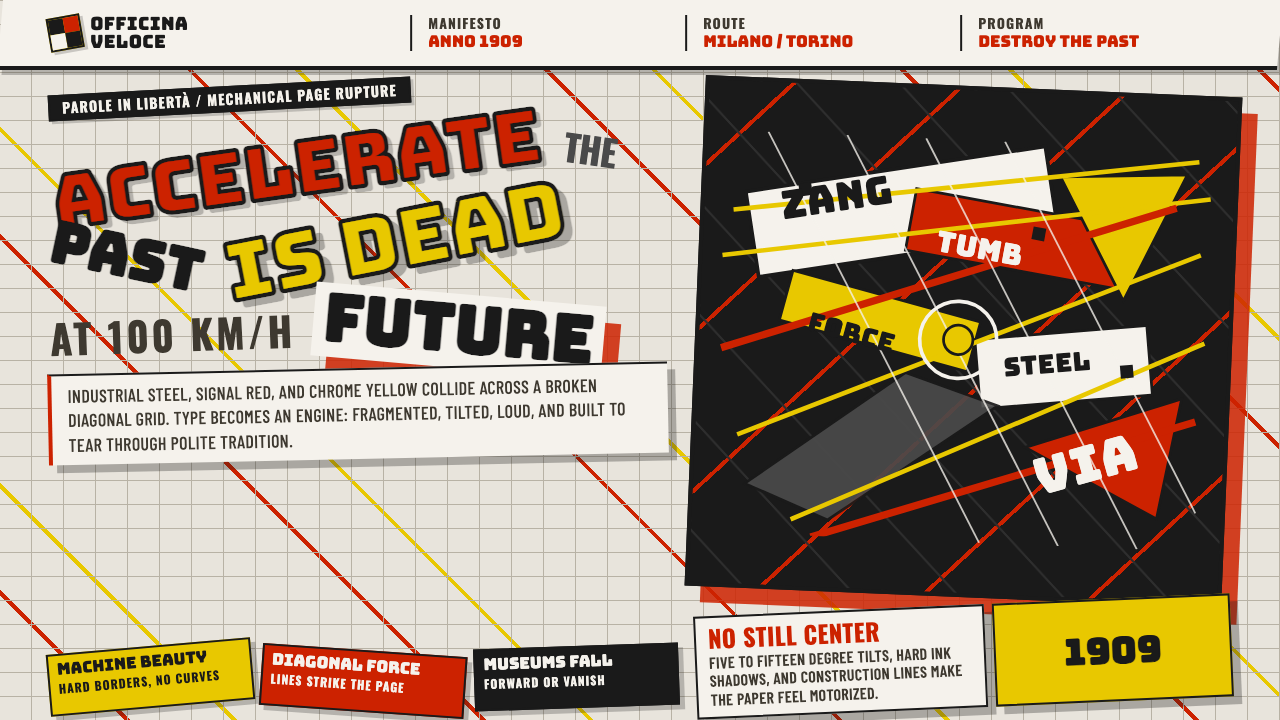 Italian Futurism (Marinetti 1909)Speed murders tradition. Signal red and chrome yellow slash a broken diagonal…速度杀死传统:信号红与铬黄斩开破碎斜向网格。
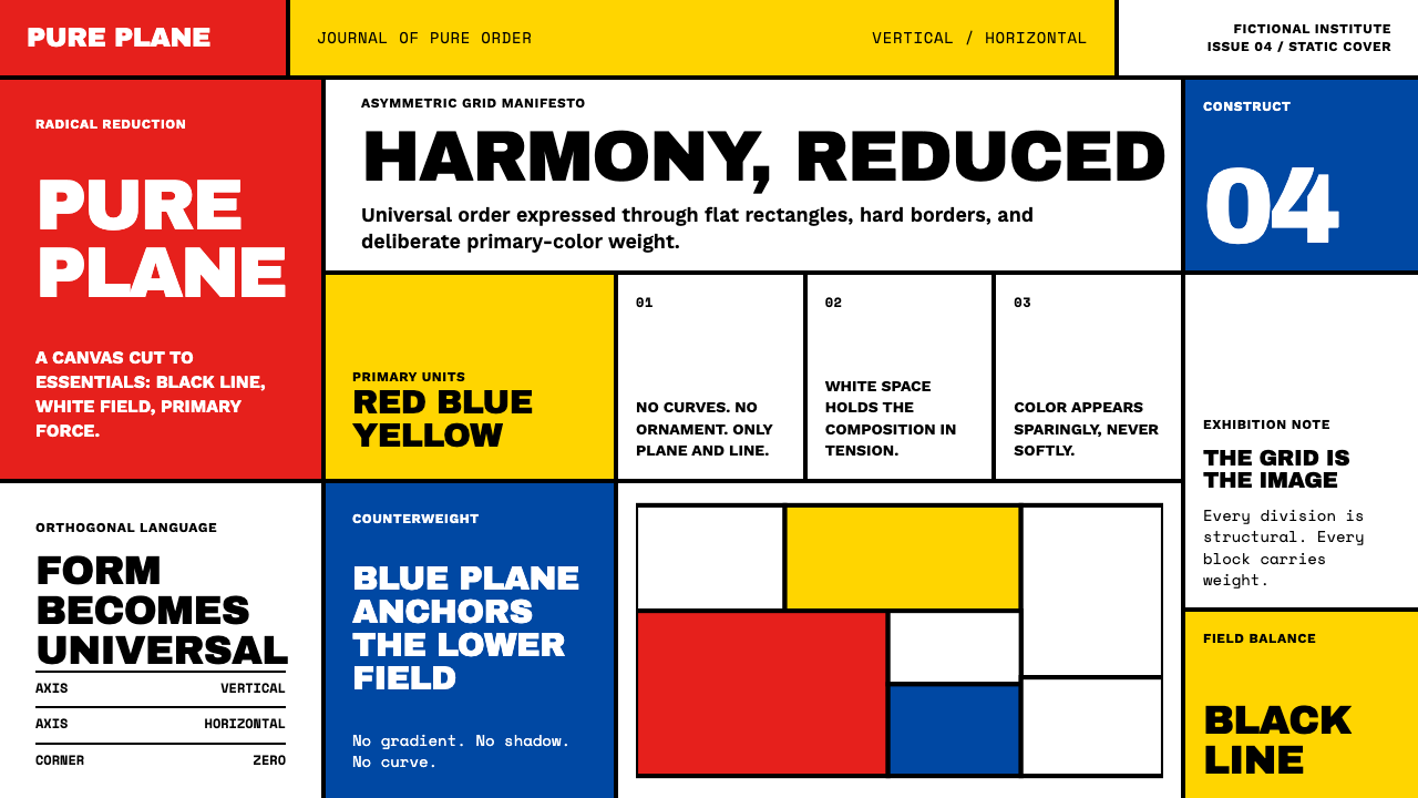
 Bauhaus WeimarForm follows revolution. Primary red-blue-yellow on cream, hard shadows, no o…形式追随革命:奶油纸底上的红蓝黄三原色、硬偏移投影、零装饰——纯粹功能即美。
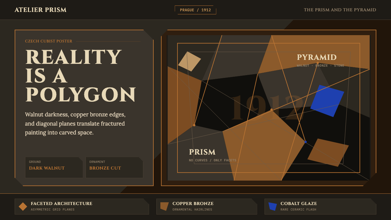 Czech Cubism (Prague 1912)Reality is faceted. Walnut ground, Cinzel capitals, and bronze diagonals cut…现实是多面体。胡桃木底、Cinzel 大写与青铜斜线切开平面。
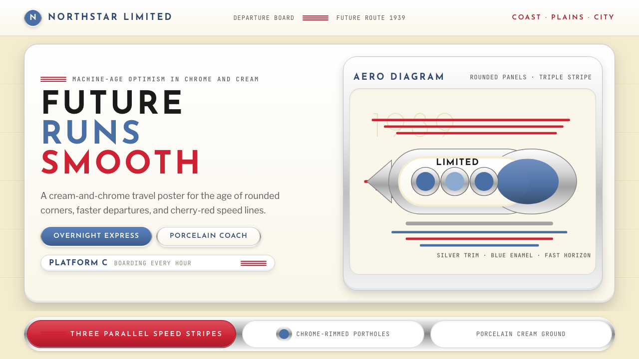 Streamline Moderne (1930s)Optimism made aerodynamic. Cream ground, chrome ovals, and cherry stripes dri…乐观被做成流线:奶油底、铬圆框与樱桃红速度线向右疾行。
 De StijlPrimary colors, locked in a black grid. Mondrian's compositions, in thick bor…蒙德里安的构成系列译为界面:黑色粗线划分白底、纯红蓝黄填充、零圆角——新造型主…
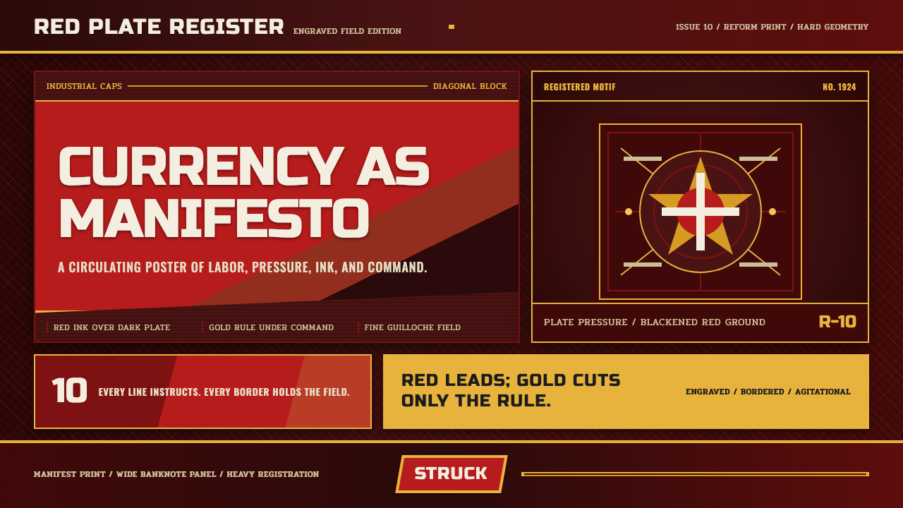 Soviet RubleAgitation in print. Red-black plates, gold rules, and industrial caps strike…印刷即鼓动:红黑版块、金色细线与工业大写字,如钞票油墨般压下。