What is Italian Futurism (Marinetti 1909)?什么是 Italian Futurism (Marinetti 1909)?
Marinetti's 1909 manifesto detonated a century of still composition — Futurism made speed, noise, and the machine the only worthy subjects of art.马里内蒂的1909年宣言引爆了数百年静态构图——未来主义宣告速度、噪声与机器是唯一值得艺术追求的主题。
Italian Futurism (Marinetti 1909) in briefItalian Futurism (Marinetti 1909) 速览
Italian Futurism was the twentieth century's first self-declared avant-garde movement — a violent rejection of museums, libraries, and all inherited tradition, launched by poet Filippo Tommaso Marinetti with his Manifesto of Futurism, published on the front page of the Paris newspaper Le Figaro on 20 February 1909. Where earlier modernisms sought to reform visual culture gradually, Futurism demanded its immediate destruction and replacement with the aesthetics of the machine age: speed, simultaneity, force, and industrial noise.意大利未来主义是二十世纪第一个公开自我宣告为前卫运动的艺术流派——由诗人菲利波·托马索·马里内蒂以激进的姿态发起,通过1909年2月20日刊登在巴黎《费加罗报》头版的《未来主义宣言》,向博物馆、图书馆和一切传承传统宣战。与此前渐进式变革视觉文化的现代主义不同,未来主义要求立即摧毁旧秩序,以机器时代的美学取而代之:速度、同时性、力量与工业噪声。
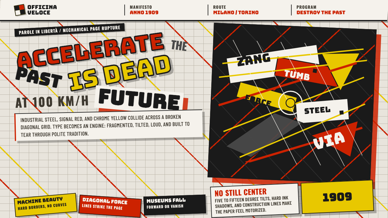
The Futurist visual language translates these values into a distinctive graphic grammar. Compositions shatter into overlapping diagonal planes, suggesting objects caught mid-motion. Typography breaks free of the horizontal baseline — letters grow and shrink, rotate, and collide on the page in what Marinetti called parole in libertà (words in freedom). Color is industrial and declarative: signal red, chrome yellow, steel grey, and the white of unprinted paper serve as the primary palette. Nothing in a Futurist composition is meant to rest the eye; every element charges forward.未来主义的视觉语言将这些价值观转译为一套独特的图形文法。构图破碎成相互叠压的对角线平面,暗示被捕捉于运动瞬间的物体。字体排印彻底挣脱水平基线的束缚——字母在页面上放大、缩小、旋转、碰撞,形成马里内蒂所称的「自由的词语」(parole in libertà)。色彩是工业性的、宣示性的:信号红、铬黄、钢灰与白纸底色构成主色板。未来主义构图中没有任何元素是为了让眼睛休息而设计的;每个元素都在向前冲锋。
Though the movement was short-lived as a coherent political and artistic program — absorbed by Italian Fascism in the 1920s and exhausted by the Second World War — its visual vocabulary proved extraordinarily durable. The diagonal grid, the force line, the fragmented letterform, and the collision composition became foundational tools of twentieth-century graphic design, influencing Constructivism, De Stijl, punk typography, and contemporary motion graphics alike.尽管这场运动作为一个连贯政治与艺术纲领的存在时间短暂——1920年代被意大利法西斯主义吸收,随后在第二次世界大战中消耗殆尽——但它的视觉词汇表现出非凡的持久生命力。对角网格、力线、碎裂字形与碰撞式构图成为二十世纪平面设计的基础工具,对构成主义、风格派、朋克排版与当代动态图形均产生了深远影响。
See the Italian Futurism (Marinetti 1909) design system查看 Italian Futurism (Marinetti 1909) 完整设计系统
Where does Italian Futurism (Marinetti 1909) come from?Italian Futurism (Marinetti 1909) 从何而来?
The Manifesto of Futurism arrived at a moment of acute cultural frustration. Northern Italian industrial cities — Milan, Turin — were undergoing rapid transformation, their factories and trams and automobiles reshaping daily life at a pace that painting, poetry, and architecture had entirely failed to register. Marinetti, a wealthy Milanese writer who had absorbed Symbolism and the provocations of Alfred Jarry's Ubu Roi, concluded that the problem was not merely stylistic but ontological: European culture was a corpse being venerated in museums. His manifesto called for burning the museums and flooding the libraries, and for replacing beauty with the roaring automobile, which he declared more beautiful than the Winged Victory of Samothrace.《未来主义宣言》诞生于一个文化挫败感极为尖锐的时刻。意大利北部工业城市——米兰、都灵——正经历快速变革,工厂、有轨电车与汽车以绘画、诗歌和建筑完全未能记录的速度重塑着日常生活。马里内蒂是一位吸收了象征主义与阿尔弗雷德·雅里《乌布王》挑衅精神的富裕米兰作家,他断定这个问题不仅是风格层面的,而是存在论层面的:欧洲文化是一具正在博物馆中被供奉的尸体。他的宣言呼吁烧掉博物馆、淹没图书馆,并以轰鸣的汽车取代旧有的美感——他宣称一辆赛车比萨莫色雷斯的胜利女神更为美丽。
The visual arts response to Marinetti's provocation came from a group of painters — Umberto Boccioni, Carlo Carrà, Luigi Russolo, Giacomo Balla, and Gino Severini — who signed the Manifesto of Futurist Painters in February 1910 and a companion Technical Manifesto of Futurist Painting in April of the same year. Their central problem was representing motion and simultaneity in static media. Drawing on Divisionism (the Italian variant of Pointillism) and on the sequential photography of Étienne-Jules Marey and Eadweard Muybridge, they developed a technique of overlapping translucent planes and radiating force lines — lines of force — to suggest a figure or machine at multiple positions within a single frame.对马里内蒂挑衅的视觉艺术回应来自一批画家——翁贝托·波丘尼、卡洛·卡拉、路易吉·鲁索洛、贾科莫·巴拉与吉诺·塞韦里尼——他们于1910年2月签署了《未来主义画家宣言》,同年4月又签署了《未来主义绘画技术宣言》。他们面临的核心问题是如何在静态媒介中呈现运动与同时性。借助分割主义(法国点彩派的意大利变体)以及艾蒂安-儒勒·马雷和埃德沃德·迈布里奇的连续摄影,他们发展出一种叠压透明平面与向外辐射「力线」的技法,在单一画面内暗示一个人物或机器在多个位置同时存在。
Boccioni pushed the program furthest into three dimensions. His sculpture series States of Mind (1911) and the bronze Unique Forms of Continuity in Space (1913) dissolved the traditional sculptural boundary between figure and environment, allowing the figure's motion to ripple outward into the surrounding atmosphere as interlocking planes of streaked form. Meanwhile Balla, whose Dynamism of a Dog on a Leash (1912) had fragmented a dachshund's legs into a blur of overlapping silhouettes, moved by 1914 toward pure abstraction: his abstract speed paintings reduced the automobile and its velocity to interpenetrating wedges and arcs of color, entirely shedding representation.波丘尼将这一纲领推进到三维领域。他的雕塑系列《心境》(1911年)和青铜作品《空间中连续性的独特形式》(1913年)消解了人物与环境之间的传统雕塑边界,让人物的运动以相互咬合的条纹形平面向周围大气层涟漪扩散。与此同时,巴拉——其《皮带上的狗的动感》(1912年)将一只腊肠犬的腿肢分解为相互叠压轮廓的模糊运动——到1914年已迈向纯粹抽象:他的抽象速度画作将汽车及其速度简化为相互穿透的色彩楔形与弧形,彻底舍弃了具象表达。
Marinetti's own contribution to visual culture was typographic. His 1914 book Zang Tumb Tumb, describing the 1912 siege of Adrianople through sound poetry, deployed multiple typefaces, multiple sizes, rotated text blocks, and onomatopoeic word clusters across the page in total defiance of conventional book layout. This practice of parole in libertà — words in freedom — became Futurism's most direct and lasting contribution to graphic design. The fragmented, multi-directional page, in which the act of reading becomes physically active rather than passively linear, anticipates twentieth-century experimental typography from Dada through punk zines to contemporary digital motion design.马里内蒂本人对视觉文化的贡献是字体排印层面的。他描述1912年阿德里亚诺堡战役的1914年声音诗歌书籍《砰砰砰》,在页面上部署了多种字体、多种字号、旋转的文字块与象声词词组,完全无视传统书籍版面规范。这种「自由的词语」(parole in libertà)的实践,成为未来主义对平面设计最直接、最持久的贡献。碎裂的、多方向的页面——在其中阅读行为从被动线性变为主动身体性参与——预示了二十世纪从达达主义到朋克手册直至当代数字动态设计的实验性排版传统。
What defines the Italian Futurism (Marinetti 1909) look?Italian Futurism (Marinetti 1909) 的视觉特征是什么?
Diagonal Dynamism对角线动感
The diagonal is Futurism's defining compositional axis. Where academic composition balanced elements along stable horizontals and verticals, Futurist layouts tilt every element — planes, text blocks, figure contours — to suggest arrested motion. The diagonal reads as a vector: something is moving from one corner toward another, and the viewer's eye is pulled along with it. In typographic work, diagonal text blocks collide with horizontal ones, generating visual friction that mimics the sensation of mechanical speed.对角线是未来主义构图的决定性轴线。学院派构图将元素沿稳定的水平与垂直方向平衡分布,而未来主义版面则将每个元素——平面、文字块、人物轮廓——倾斜排布,以暗示被捕捉的运动瞬间。对角线被读作一个向量:某物正从一个角落向另一个角落运动,观者的视线被随之牵引。在字体排印作品中,倾斜的文字块与水平文字块相互碰撞,产生模拟机械速度感的视觉摩擦力。
Force Lines力线
Futurist painters borrowed the concept of force lines — radiating strokes that extend outward from a moving object — from the study of electricity and from sequential photography. In painting, these lines do not represent visible streaks but the kinetic energy that a body in motion generates in its surrounding environment. In graphic design, force lines translate into radiating rules, speed stripes, or burst patterns that emanate from a central focal point, pushing the composition outward and amplifying the sense that the image is on the verge of exploding off the page.未来主义画家从电学研究与连续摄影中借用了力线概念——从运动物体向外辐射的笔触。在绘画中,这些线条并非代表可见的运动轨迹,而是运动中的物体在周围环境中所产生的动能。在平面设计中,力线转译为从中心焦点向外辐射的直线、速度条纹或爆发式图案,将构图向外推压,放大图像即将从页面炸裂而出的感觉。
Fragmented Typography碎裂字体排印
Marinetti's parole in libertà practice shattered the conventions of the printed page. A single composition might combine hand-lettering, bold display type, condensed sans-serif, and italic roman in radically different sizes, each rotated or stacked according to sonic and emotional logic rather than reading order. Large words suggest shouts; tiny clusters suggest whispers or machinery noise. This approach treats the page as a scored musical manuscript — a performance instruction as much as a text — and it remains one of the most radical typographic ideas in the history of print.马里内蒂「自由的词语」的实践将印刷页面的一切规范粉碎。单一构图可能同时融合手写字、粗重展示字体、压缩无衬线字体与斜体罗马字,尺寸之间存在根本性差异,每种字体都按照声音与情感逻辑而非阅读顺序旋转或堆叠。大字代表呐喊;微型词组代表低语或机械噪声。这种方式将页面视为记谱的乐谱——既是演奏指令也是文本——它至今仍是印刷史上最激进的字体排印理念之一。
Simultaneous Planes同时性平面
Futurist painting developed a technique of overlapping semi-transparent planes to compress multiple moments of a motion sequence into a single image. A running figure appears in several positions at once; a speeding tram fractures into interlocking wedges of color and form. In graphic design, this principle produces layered compositions where shapes stack at varying degrees of opacity, creating depth through transparency rather than through perspective or shadow. The effect suggests cinematic superimposition — multiple frames collapsed onto one.未来主义绘画发展出一种叠压半透明平面的技法,将运动序列的多个时刻压缩进单一图像。奔跑中的人物同时呈现于多个位置;疾驰的有轨电车碎裂成相互咬合的色彩与形态楔形。在平面设计中,这一原则产生了分层构图,形态以不同透明度叠放,通过透明性而非透视或阴影制造深度。效果令人联想到电影叠印——多帧画面折叠为一。
Industrial Color Palette工业色板
Futurism's palette is drawn from the factory floor and the racing circuit rather than from nature or classical tradition. Signal red — the red of danger warnings and racing livery — anchors energy and urgency. Chrome yellow, the color of industrial chrome and early automobile bodywork, signals speed and modernity. Steel grey and iron black provide structural weight. Unprinted white or the warm off-white of newsprint serves as the ground. The palette reads as deliberately harsh and modern: it has no softness, no atmospheric haze, no pastoral reference.未来主义的色板取材于工厂车间与赛道,而非自然或古典传统。信号红——危险警告与赛车涂装之红——锚定能量与紧迫感。铬黄,工业镀铬与早期汽车车身之色,传递速度与现代性。钢灰与铁黑提供结构重量。未印刷的白色或新闻用纸的暖米白作为底色。这套色板读起来刻意刺眼而现代:没有柔和,没有大气雾霾,没有田园气息。
Noise and Simultaneity噪声与同时性
Futurism was one of the first visual movements to try to represent sound as image. Luigi Russolo's Art of Noises manifesto (1913) called for new instruments built from industrial sound sources; Balla's paintings attempted to render the visual equivalent of a chord. In graphic work, this principle translates into visual density — the deliberate accumulation of competing text sizes, overlapping shapes, and clashing diagonals that forces the eye to process multiple signals simultaneously, as if reading a score rather than a sentence. Silence and empty space are not valued; they register as absence of energy.未来主义是最早尝试将声音以图像形式呈现的视觉运动之一。路易吉·鲁索洛的《噪声艺术》宣言(1913年)呼吁以工业声源建造新乐器;巴拉的绘画试图再现一个和弦的视觉等价物。在图形作品中,这一原则转译为视觉密度——刻意积累相互竞争的文字尺寸、叠压的形态与碰撞的对角线,迫使眼睛同时处理多个信号,犹如读乐谱而非句子。寂静与空白没有价值;它们被解读为能量的缺席。
Manifesto as Medium宣言即媒介
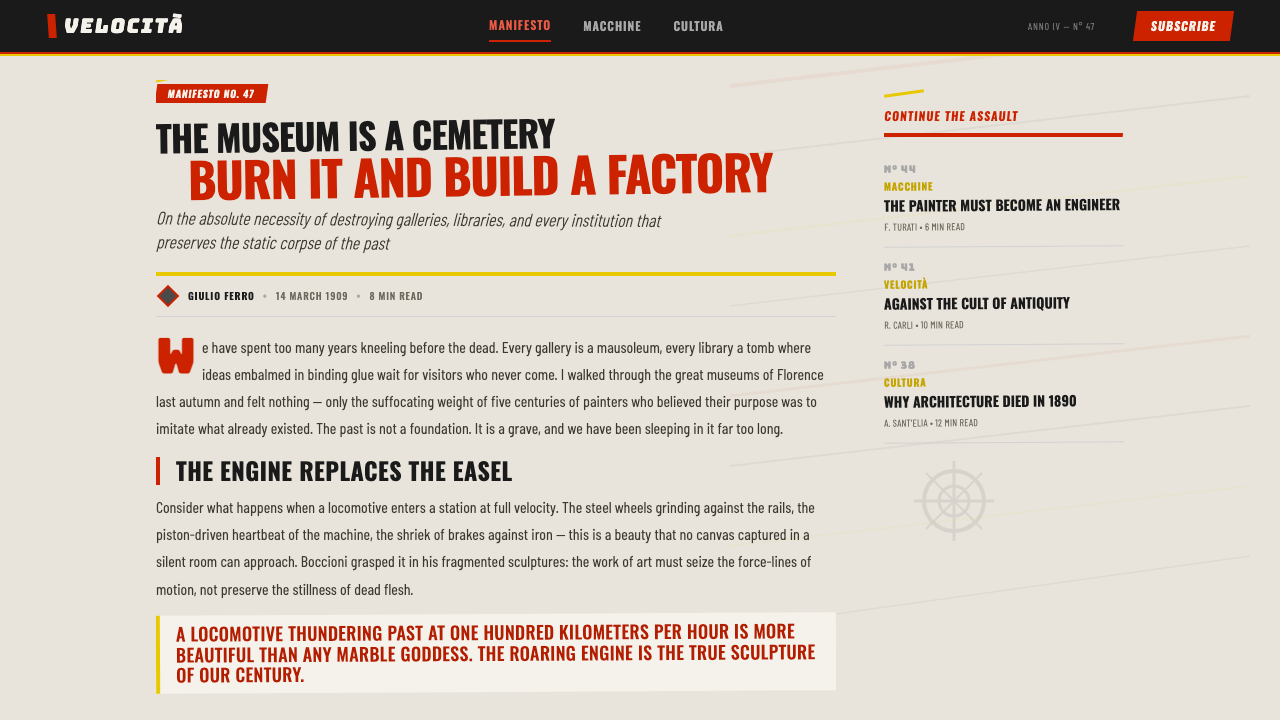
Uniquely among art movements, Futurism used the published manifesto as both a political and a designed artifact. Marinetti produced over fifty manifestos between 1909 and 1944, each printed with aggressive typographic choices — heavy display rules, dramatic size contrast, bold declarative sentences set flush left against dense body copy. The manifesto format — short, numbered, aggressive, addressed directly to the reader — influenced not only political propaganda but the format of advertising copy, product launch communications, and digital announcement posts that are now ubiquitous.在所有艺术运动中,未来主义独特地将出版宣言既作为政治行动也作为设计物来使用。马里内蒂在1909年至1944年间发布了逾五十份宣言,每份都以激进的排印选择印制——粗重的展示线条、戏剧性的尺寸对比、粗体宣示性句子与密集正文形成齐左对照。这种宣言格式——简短、编号、咄咄逼人、直接向读者发声——不仅影响了政治宣传,也影响了广告文案、产品发布传播与如今无处不在的数字公告帖格式。
See the Italian Futurism (Marinetti 1909) design system查看 Italian Futurism (Marinetti 1909) 完整设计系统
Who shaped Italian Futurism (Marinetti 1909)?谁塑造了 Italian Futurism (Marinetti 1909)?
Marinetti was the movement's founder, impresario, and primary theorist. Born in Alexandria, Egypt, to wealthy Italian parents, he was educated in French-language schools and came to Paris as a poet before returning to Milan. His 1909 manifesto made him internationally famous overnight. Over the following three decades he organized Futurist exhibitions, wrote performance texts, designed books, and relentlessly promoted the movement across Europe and beyond. His typographic innovations in Zang Tumb Tumb (1914) and Les Mots en liberté futuristes (1919) remain foundational texts in the history of experimental printing.马里内蒂是这场运动的创始人、主持人与首席理论家。他出生于埃及亚历山大港,家境富裕的意大利父母将他送往法语学校接受教育;他以诗人身份旅居巴黎后返回米兰。1909年的宣言令他一夜之间享誉国际。此后三十年间,他组织未来主义展览、撰写表演文本、设计书籍,并不懈地在欧洲及更远地区推广这场运动。他在《砰砰砰》(1914年)与《未来主义自由词语》(1919年)中的排印创新至今仍是实验印刷史上的奠基文本。
Boccioni was the movement's most gifted visual artist, working across painting and sculpture to produce its most ambitious formal achievements. His triptych States of Mind (1911) tried to give painted form to the emotions of departure and arrival at a railway station — melancholy of those who go, farewells of those who stay — through overlapping planes of distorted color and form. His bronze Unique Forms of Continuity in Space (1913) solved, in three dimensions, the problem the painters had been wrestling with in two: how to render the interpenetration of figure and environment during motion. Boccioni died in 1916 after falling from a horse during military exercises, cutting short one of the most original artistic trajectories of his generation.波丘尼是这场运动最具天赋的视觉艺术家,在绘画与雕塑两个领域都取得了最雄心勃勃的形式成就。他的三联作《心境》(1911年)试图通过相互叠压的扭曲色彩与形态平面,为火车站出发与抵达时的情绪赋予绘画形式——离去者的忧郁,送别者的挥手。他的青铜作品《空间中连续性的独特形式》(1913年)在三维空间中解决了画家们在二维领域反复角力的问题:如何呈现运动中人物与环境的相互穿透。波丘尼于1916年在军事演习中从马上跌落后不治身亡,一个最具原创性的艺术轨迹就此中断。
Balla was the oldest of the Futurist painters and the one who pushed furthest into pure abstraction. His Dynamism of a Dog on a Leash (1912) — depicting the blurred multiple-position legs of a dachshund and its owner — became one of the movement's most recognized images precisely because its subject is so domestic while its method is so radical. By the mid-1910s Balla had abandoned representation entirely, producing paintings of pure color wedges and velocity arcs that anticipate later hard-edge abstraction. He also applied Futurist principles to interior design and furniture, and his collaborations with Fortunato Depero on the Futurist Reconstruction of the Universe (1915) extended the movement's reach into total environmental design.巴拉是未来主义画家中年龄最长的一位,也是走得最远进入纯粹抽象领域的一位。他的《皮带上的狗的动感》(1912年)——描绘一只腊肠犬与主人模糊的多位置腿部轮廓——成为这场运动最广为人知的图像之一,恰恰因为其主题如此家常,其手法却如此激进。至1910年代中期,巴拉已完全放弃具象,创作出纯色楔形与速度弧线的画作,预示了后来的硬边抽象。他还将未来主义原则应用于室内设计与家具,与福尔图纳托·德佩罗合作的《未来主义宇宙重建》(1915年)将这场运动的触角延伸至整体环境设计。
Depero was the Futurist figure most directly engaged with commercial and applied design. His Futurist House in Rovereto functioned as a workshop producing tapestries, toys, and theatrical sets. His advertising work for Campari — including the famous Campari Soda bottle design and a series of graphic advertisements that deployed Futurist diagonal energy directly in commercial contexts — demonstrated that the movement's visual language could survive translation into mass market communications without losing its charge. Depero's work in New York from 1928 to 1930, where he produced covers for Vogue, Vanity Fair, and The New Yorker, showed how the Futurist vocabulary could infiltrate mainstream American publishing.德佩罗是未来主义人物中最直接参与商业与应用设计的一位。他在罗韦雷托的「未来主义之家」作为工坊运营,生产挂毯、玩具与舞台布景。他为金巴利所做的广告工作——包括著名的金巴利苏打瓶身设计以及一系列将未来主义对角线能量直接运用于商业语境的平面广告——证明了这场运动的视觉语言在转译为大众市场传播时仍能保持其张力。德佩罗1928年至1930年在纽约期间,为《时尚》、《名利场》与《纽约客》创作封面,展示了未来主义词汇如何渗透进美国主流出版业。
Russolo is the Futurist least remembered as a painter and most remembered as a sound theorist. His manifesto The Art of Noises (1913) argued that the sonic environment of industrial civilization — factory machinery, trains, street crowds, electrical hum — had permanently altered what music could mean, and that composers had an obligation to incorporate this expanded sonic palette. He built a series of acoustic instruments he called intonarumori (noise intoners) and performed with them across Europe before they were destroyed in the First World War. In graphic design terms, Russolo's theoretical framework — that industrial noise is itself an expressive medium — legitimized the idea that visual cacophony and compositional overload could be deliberate aesthetic choices rather than failures of discipline.鲁索洛作为画家的记忆最为模糊,作为声音理论家的影响却最为深远。他的宣言《噪声艺术》(1913年)主张,工业文明的声音环境——工厂机器、火车、街头人群、电流嗡鸣——已经永久改变了音乐的可能意涵,作曲家有义务将这一扩展的声音色板纳入创作。他建造了一系列称为「噪声调音器」(intonarumori)的声学装置,并在欧洲各地演出,直至它们在第一次世界大战中被毁。从平面设计角度看,鲁索洛的理论框架——工业噪声本身是一种表达媒介——为这样一种观念提供了合法性:视觉喧嚣与构图过载可以是刻意的美学选择,而非纪律失范的结果。
How do you use Italian Futurism (Marinetti 1909) today?今天怎么用 Italian Futurism (Marinetti 1909)?
Italian Futurism is one of the more demanding historical styles to apply in contemporary design, because its power comes from controlled aggression rather than from elegance or restraint. Getting it right requires internalizing what the style is actually doing — using diagonal force to generate forward momentum, using typographic fragmentation to create reading experiences that feel active rather than passive, using industrial color to signal urgency and modernity — and then making those choices serve a specific communication goal rather than simply decorating a layout.意大利未来主义是当代设计中较难驾驭的历史风格之一,因为它的力量来自受控的攻击性,而非优雅或克制。正确应用它,需要内化这套风格实际上在做什么——用对角线力量产生向前的动量,用字体碎裂制造主动而非被动的阅读体验,用工业色彩传递紧迫感与现代性——然后让这些选择服务于具体的传达目标,而非仅仅装饰版面。
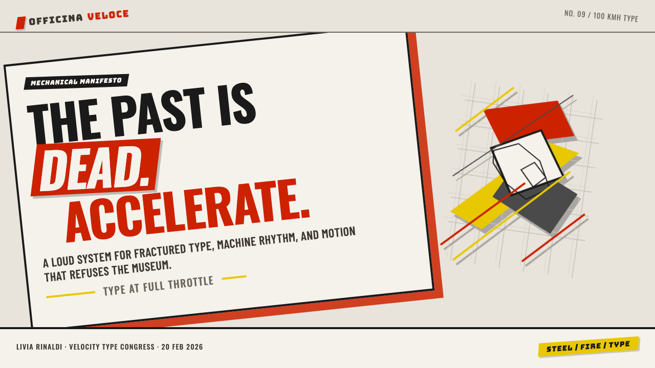
For presentation slides, Futurism excels on kinetic cover slides and section dividers. A cover built on this style uses a strong diagonal composition: the title set in multiple weight and size variations — some words large and dominant, others small and recessive — on an off-white or stark white ground with a single signal-red or chrome-yellow accent shape cutting across the corner. Content slides should be more restrained than the cover: one clear typographic hierarchy, one diagonal rule or shape to establish movement, and generous negative space to let the energy breathe. Data slides work especially well when charts are treated as geometric objects — bar charts rendered with thick strokes and hard-edged fills, labeled with bold condensed type that matches the compositional energy.在演示文稿中,未来主义在动感封面页与章节分隔页上表现突出。以这种风格构建的封面使用强烈的对角线构图:标题以多种字重和尺寸变体排布——有些词大而主导,有些词小而退缩——置于米白或纯白底面上,一个信号红或铬黄的强调形态斜切角落。内容页应比封面更为克制:一条清晰的字体层级、一条建立运动感的对角线规则或形态,以及充裕的负空间让能量得以呼吸。当图表被作为几何对象处理时,数据页效果尤为突出——柱状图以粗笔触与硬边填色呈现,以匹配构图能量的粗重压缩字体标注。
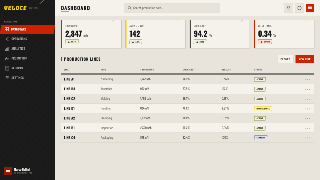
For web interfaces, Futurism's visual language is best suited to dashboards, launch pages, and high-impact marketing surfaces where urgency and forward motion are genuine values. A Futurist-inflected dashboard uses a near-white or very light background, employs diagonal accent elements sparingly as directional cues, and reserves signal red or chrome yellow exclusively for critical alerts, primary calls to action, or key metrics. Typography hierarchies should be pronounced — a large, heavy weight for primary numbers and headlines, a compact weight for supporting labels — creating the size contrast that reads as Futurist even without explicit diagonal placement. Navigation and card components can incorporate subtle diagonal rules or angled borders rather than purely rectangular framing.对于网页界面,未来主义视觉语言最适合仪表板、发布页与高冲击力营销界面——在这些场景中,紧迫感与向前的动势是真实的价值诉求。带有未来主义气息的仪表板使用接近白色或极浅的背景,将对角线强调元素节制地用作方向性暗示,并将信号红或铬黄专门保留给关键警报、主要行动号召或核心数据指标。字体层级应当鲜明——主要数字与标题使用大号粗重字体,辅助标签使用紧凑字体——制造出即便没有明显对角线排布也能被识别为未来主义的尺寸对比。导航与卡片组件可以融入细微的对角线规则或斜切边框,而非纯粹的矩形框架。
For editorial and marketing work, Futurism's poster heritage makes it particularly strong for announcement contexts: product launches, event promotions, limited-edition campaign materials. The approach here is deliberately bold: full-bleed backgrounds in industrial white or light grey, oversized typography that runs off the edge or collides with a geometric shape, and a single chromatic accent — never two competing accent colors — that carries the eye through the composition. For article layouts, the diagonal energy can be introduced more quietly through pull quotes set at a slight tilt, through section headers that use dramatic size contrast, or through image cropping that emphasizes vectors rather than centering subjects.对于编辑与营销工作,未来主义的海报传统使其在公告类场景中尤为有力:产品发布、活动推广、限量版活动物料。这里的手法是刻意大胆的:工业白或浅灰的满版背景,超大号字体延伸至边缘或与几何形态碰撞,以及一种单一的色彩强调——绝不使用两种相互竞争的强调色——引导视线穿越构图。对于文章版面,对角线能量可以更安静地引入:略微倾斜的引用文字、使用戏剧性尺寸对比的章节标题,或强调方向性向量而非居中主体的图像裁切。
A common mistake when applying Futurism is confusing visual loudness with visual energy. Stacking multiple competing accent colors, filling every zone of the composition, and using diagonal elements in every component simultaneously produces chaos rather than dynamism. Authentic Futurist energy comes from contrast — between a large empty field and a dense typographic collision, between a single bold diagonal and a quiet background, between one blazing accent color and a restrained neutral field. The movement was aggressive, not cluttered; every collision in the original works was purposeful. When in doubt, reduce the number of competing elements and increase the intensity of the ones that remain.应用未来主义时最常见的错误,是将视觉喧闹与视觉能量混为一谈。叠加多种相互竞争的强调色、填满构图的每个区域、在每个组件上同时使用对角线元素,产生的是混乱而非动感。真实的未来主义能量来自对比——大片空旷区域与密集排印碰撞之间的对比,单一粗重对角线与安静背景之间的对比,一种燃烧强调色与克制中性底色之间的对比。这场运动是咄咄逼人的,但不是杂乱的;原作中每一处碰撞都是有意为之的。一旦拿不准,减少相互竞争的元素数量,增强保留元素的强度。
See the Italian Futurism (Marinetti 1909) design system查看 Italian Futurism (Marinetti 1909) 完整设计系统
Italian Futurism (Marinetti 1909) — FAQItalian Futurism (Marinetti 1909) · 常见问题
How is Italian Futurism different from Russian Constructivism, which also uses bold diagonals and industrial color?意大利未来主义与同样使用粗重对角线和工业色彩的俄国构成主义有何区别?
The two movements share visual DNA — diagonal composition, primary-adjacent palette, typographic aggression — because Constructivism directly absorbed Futurist influence after the 1909 manifesto circulated in Russia. But their underlying logic diverges sharply. Futurism was individualist and sensation-driven: the goal was to communicate the raw feeling of speed and mechanical power, with the artist as the source of expressive force. Constructivism was collectivist and functionalist: the goal was to serve the social revolution through efficient visual communication, with the designer as an engineer of information. In practice, Constructivist layouts tend to be more structurally ordered and grid-aligned; Futurist layouts tend to be more explosive and less resolved. Constructivism uses the diagonal as a structural device; Futurism uses it as an emotional one.两场运动共享视觉基因——对角线构图、接近三原色的色板、咄咄逼人的排版——因为1909年宣言在俄国传播后,构成主义直接吸收了未来主义的影响。但它们的底层逻辑截然分歧。未来主义是个人主义的、感官驱动的:目标是传达速度与机械力量的原始感受,艺术家是表现力量的源泉。构成主义是集体主义的、功能主义的:目标是通过高效的视觉传达服务于社会革命,设计师是信息的工程师。在实践中,构成主义版面往往更具结构秩序感和网格对齐性;未来主义版面往往更具爆炸性,不追求解决状态。构成主义将对角线作为结构性装置使用;未来主义将它作为情感性装置使用。
Can Futurism work in a digital product context, or is it too aggressive for everyday UI?未来主义能应用于数字产品语境吗,还是对日常界面而言过于激进?
Futurism can work in digital products, but it requires selective application rather than wholesale adoption. Applied at full intensity across an entire interface, it will exhaust and disorient users. The productive approach is to use Futurist principles at the compositional and typographic level — strong diagonal visual hierarchy, pronounced size contrast, industrial color accents reserved for action states — while keeping individual component design relatively neutral. Think of it as a system where the overall grid and typographic rhythm carries the style's energy, while buttons, inputs, and data tables remain clean and readable. Futurism is most at home in product contexts where speed and urgency are core values: trading platforms, logistics dashboards, performance analytics tools.未来主义可以在数字产品中发挥作用,但需要选择性应用,而非全盘采用。若以全强度铺满整个界面,它将使用户精疲力竭并感到迷失。有效的做法是在构图与排版层面运用未来主义原则——强烈的对角线视觉层级、鲜明的尺寸对比、保留给操作状态的工业色彩强调——同时保持单个组件设计相对中立。可以将它理解为一套系统:整体网格与排版节奏承载风格的能量,而按钮、输入框与数据表格保持简洁可读。未来主义在速度与紧迫感是核心价值的产品语境中最为自然:交易平台、物流仪表板、性能分析工具。
Is there an ethical problem with using a style associated with Fascism?使用一种与法西斯主义有关联的风格,是否存在伦理问题?
The relationship between Italian Futurism and Fascism is real and should not be minimized. Marinetti was an early supporter of Mussolini, and the movement's cult of violence, its contempt for democratic deliberation, and its glorification of war fed directly into Fascist ideology. Using the style without acknowledging this history is a form of aesthetic laundering. That said, the visual language developed by Futurism — the diagonal composition, the typographic fragmentation, the industrial palette — was adopted by movements across the political spectrum, including anarchist and left-wing publications, and the formal vocabulary has been detached from its original ideological context through a century of use. The ethical approach is contextual awareness: using the style to signal urgency or modernity in commercial or creative contexts is defensible; deploying its aggressive compositional energy in contexts that echo the original movement's glorification of force or exclusion requires more careful consideration.意大利未来主义与法西斯主义之间的关联是真实存在的,不应被淡化。马里内蒂是墨索里尼的早期支持者,这场运动对暴力的崇拜、对民主审议的蔑视以及对战争的颂扬,直接滋养了法西斯主义意识形态。在不承认这段历史的情况下使用这种风格,是一种美学洗白。话虽如此,未来主义发展出的视觉语言——对角线构图、字体碎裂、工业色板——被跨政治谱系的运动所采纳,包括无政府主义与左翼出版物;经过一个世纪的使用,这套形式词汇已与其原初意识形态语境相分离。符合伦理的做法是具有语境意识:在商业或创意语境中使用这种风格来传递紧迫感或现代性是可以辩护的;将其咄咄逼人的构图能量部署于呼应该运动原初对力量或排斥的颂扬的场景,则需要更为审慎的考量。
How do I avoid the most common failure mode — compositions that look chaotic rather than dynamic?如何避免最常见的失败——构图看起来混乱而非充满活力?
The single most reliable principle: establish one dominant compositional direction before adding anything else. In every strong Futurist work, there is a primary diagonal or a primary force vector that the eye follows first. Everything else — secondary type, color accents, overlapping planes — is subordinate to that primary direction. When chaos occurs in contemporary applications, it is almost always because multiple equal-weight competing vectors are present simultaneously, none of which dominates. Start with the primary force line, commit to it, then add elements that reinforce or slightly deviate from it rather than contradict it. Reduce your color count to one accent and one neutral. Let empty space carry as much compositional weight as the filled zones — in the original works, the tension between density and openness was as important as the diagonal itself.最可靠的单一原则:在添加任何其他内容之前,先确立一个主导性的构图方向。在每一件强有力的未来主义作品中,都存在一条视线首先跟随的主对角线或主力向量。其他一切——次级文字、色彩强调、叠压平面——都从属于这个主方向。当代应用中出现混乱,几乎总是因为同时存在多个权重相当、相互竞争的向量,没有任何一个居于主导地位。从主力线开始,对它做出承诺,然后添加强化或略微偏离它的元素,而非与之矛盾的元素。将色彩数量减少到一种强调色加一种中性色。让空白区域承载与填充区域同等的构图重量——在原作中,密度与开放之间的张力与对角线本身同等重要。
Are there contexts where Futurism is completely wrong for the job?有没有未来主义完全不适合的应用场景?
Yes, and the list is longer than it might seem. Futurism struggles badly in any context where the primary emotional register is calm, trust, or warmth: healthcare interfaces, financial planning tools, children's products, wellness and meditation applications, luxury goods positioned around heritage and craftsmanship, and any brand whose core value is approachability. The style's aggression and its association with mechanical force are also unsuitable for contexts that require cultural sensitivity or community belonging — it is not a style that invites; it challenges. Additionally, Futurism's emphasis on motion and diagonal tension translates poorly to dense information environments like long-form reading, complex data tables, or reference documentation, where the user needs to rest the eye and process information sequentially rather than simultaneously.是的,而且名单比想象中更长。未来主义在任何主要情感基调是平静、信任或温暖的场景中都表现极差:医疗保健界面、财务规划工具、儿童产品、健康与冥想应用、以传承和工艺为定位的奢侈品,以及任何核心价值是亲和力的品牌。这种风格的攻击性及其与机械力量的关联,同样不适合需要文化敏感性或社群归属感的场景——它不是一种邀请的风格,而是挑战的风格。此外,未来主义对运动与对角线张力的强调,在密集信息环境中——如长篇阅读、复杂数据表格或参考文档——转译效果极差;在这些场景中,用户需要让眼睛休息,并顺序而非同时地处理信息。
Related design styles相关设计风格
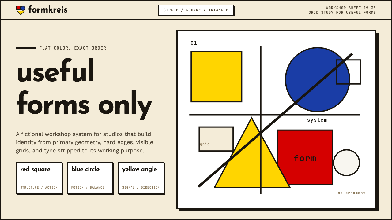 Bauhaus WeimarForm follows revolution. Primary red-blue-yellow on cream, hard shadows, no o…形式追随革命:奶油纸底上的红蓝黄三原色、硬偏移投影、零装饰——纯粹功能即美。
 Russian ConstructivismRevolution red, slashed across black and white. Diagonal sans-serif, photomon…1917 年革命视觉:红色斜劈黑白画面、几何无衬线倾斜排版、照片蒙太奇——形式…
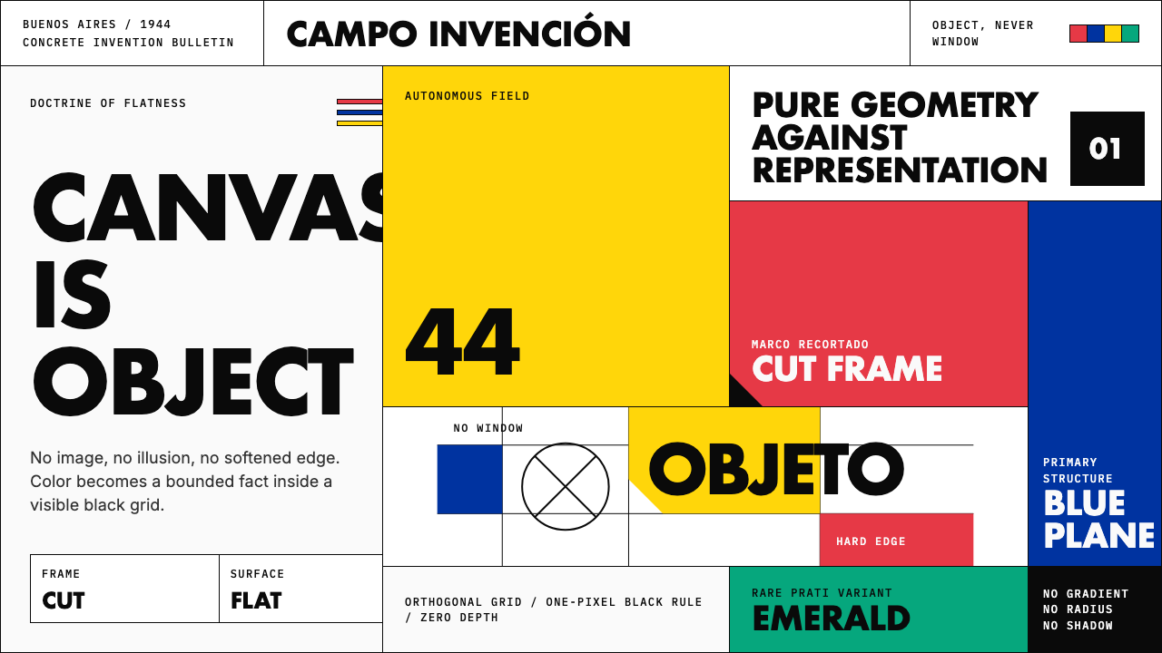 Argentine Arte ConcretoCanvas becomes object. Primary blocks, black hairlines, and a cut-frame grid…画布成为物:原色块、黑色细线与剪裁框网格强制平面性。
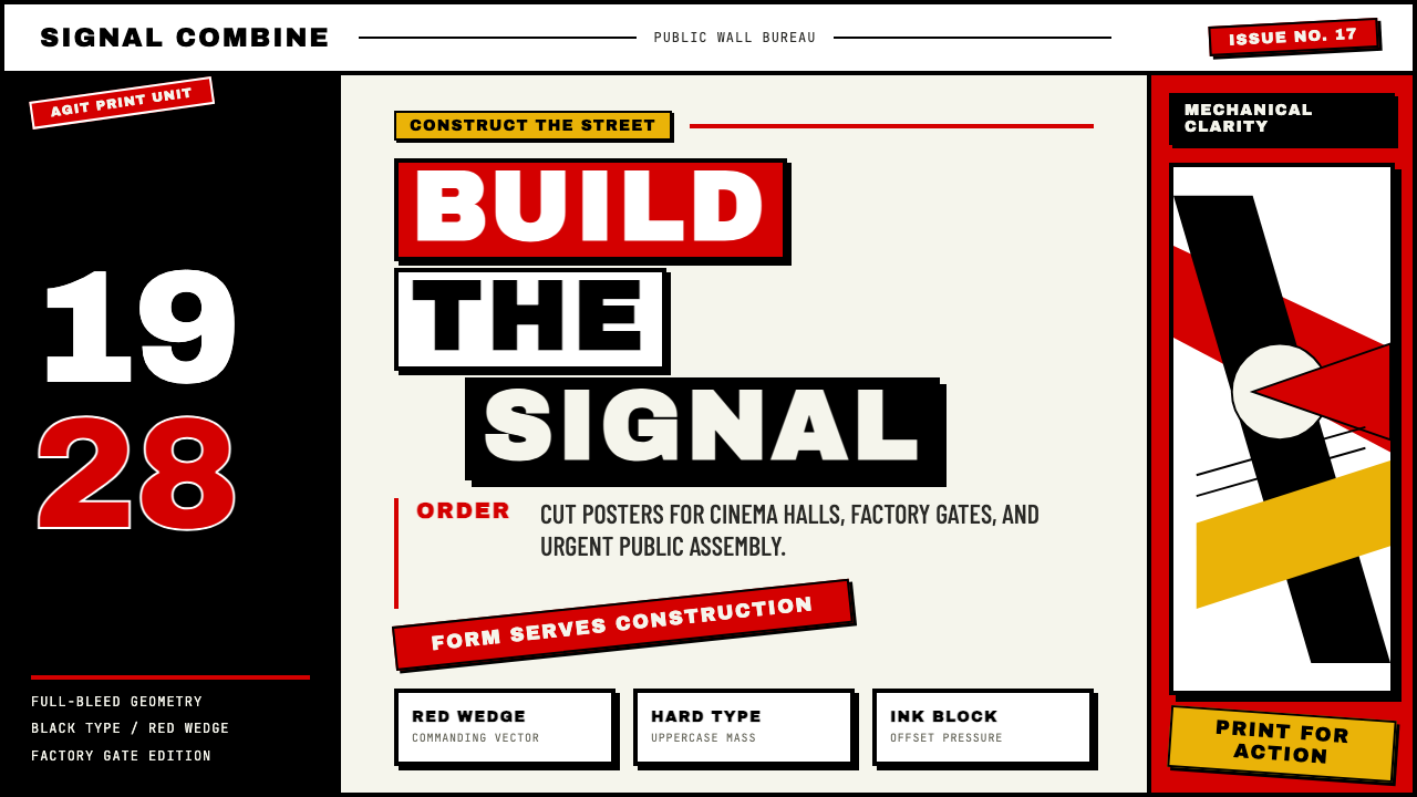
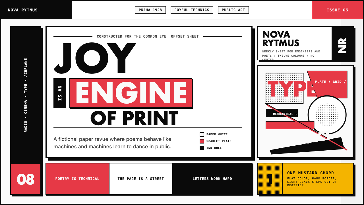 Czech Devětsil Avant-GardeJoy is engineered. Scarlet ink blocks and rotated sans type collide on an asy…欢愉被工程化:猩红墨块与旋转无衬线字撞上非对称网格。
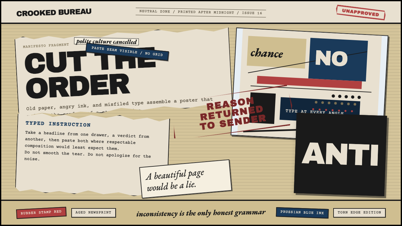 Dadaism (Zürich 1916)Chaos is the grammar. Aged newsprint, stamp red, Prussian blue, and tilted ty…混乱即语法:旧报纸底、印章红、普鲁士蓝与倾斜字体相撞。
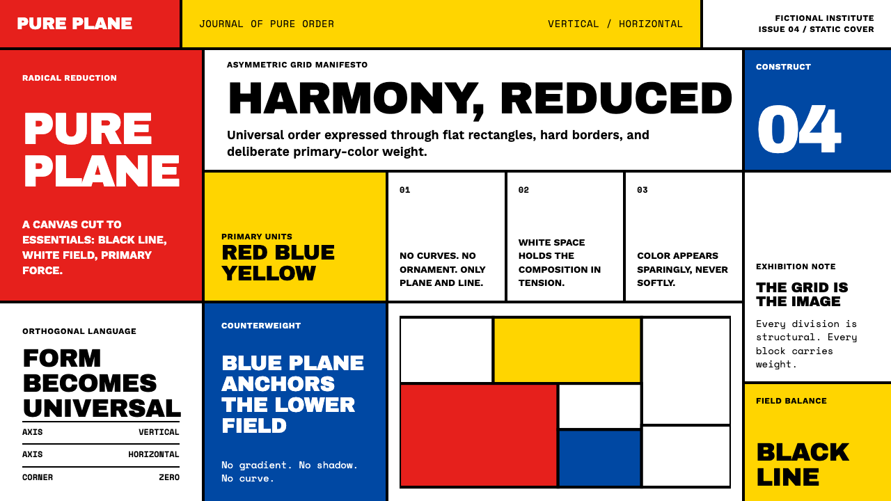 De StijlPrimary colors, locked in a black grid. Mondrian's compositions, in thick bor…蒙德里安的构成系列译为界面:黑色粗线划分白底、纯红蓝黄填充、零圆角——新造型主…