What is Argentine Arte Concreto?什么是 Argentine Arte Concreto?
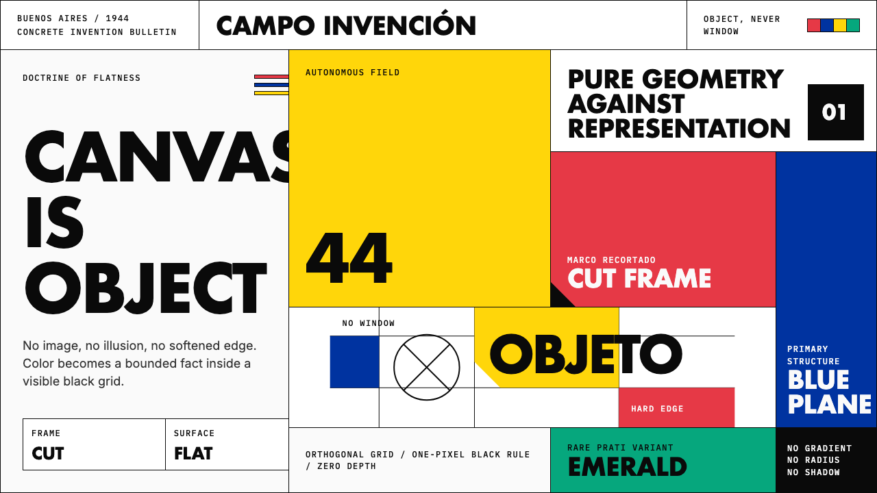
In 1944, Buenos Aires intellectuals cut the canvas into polygons and declared flatness a doctrine — primary color, hard edge, and zero representation.1944年,布宜诺斯艾利斯的知识分子将画布剪成多边形,宣告平面性本身就是一种主张——原色、硬边、零再现。
Argentine Arte Concreto in briefArgentine Arte Concreto 速览
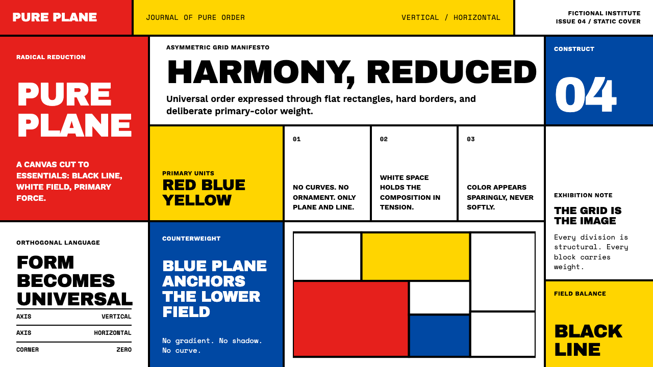
Argentine Arte Concreto-Invención is a mid-twentieth-century movement born in Buenos Aires that pushed geometric abstraction to its logical extreme: the picture plane is not a window into any imagined space but an autonomous physical object governed solely by its own internal logic. Color is confined to pure black, white, and the saturated primaries — red, yellow, blue — deployed as hard-edged flat zones with no gradation, no shadow, and no illusionistic depth. Composition is built from geometric forms — rectangles, triangles, diagonals — arranged with the rigorous economy of a proof.阿根廷具体艺术-发明运动是二十世纪中叶诞生于布宜诺斯艾利斯的艺术运动,将几何抽象推向了逻辑的极端:画平面不是通往任何想象空间的窗口,而是一个自主的物质对象,仅受其自身内在逻辑支配。色彩被限定为纯粹的黑、白与饱和原色——红、黄、蓝——以硬边平面色块的形式铺陈,没有渐变、没有阴影、没有任何幻觉深度。构图由几何形态构建——矩形、三角形、对角线——以近乎数学证明的严格经济性加以排布。
The movement's most radical invention was the marco recortado, the cut frame: rather than accepting the rectangle as a neutral container, artists physically cropped the canvas into irregular polygons so that the support itself became part of the composition. This collapsed the distinction between the art object and its boundary. Every edge was a decision; the canvas was not a stage but the work itself.这一运动最激进的发明是「剪裁框」(marco recortado):艺术家拒绝将矩形画框作为中性容器,而是将画布本身物理地裁切成不规则多边形,使支撑物成为构图的组成部分。这消解了艺术对象与其边界之间的区别——每一条边都是一个决定,画布不是舞台,而就是作品本身。
Emerging from the same theoretical soil as De Stijl, Russian Suprematism, and Swiss Concrete Art, Arte Concreto-Invención added a distinctly Argentine urgency — the conviction that pure invention, liberated from both academic figuration and European Surrealism, was the only honest pictorial act. Its visual discipline later fed directly into postwar information design and design education through Tomás Maldonado's work at the Ulm Hochschule für Gestaltung.这一运动与风格派、俄国至上主义和瑞士具体艺术生长于同一理论土壤,却带有鲜明的阿根廷紧迫感:纯粹的发明——从学院具象与欧洲超现实主义双重束缚中解放出来——是唯一诚实的绘画行为。其视觉纪律后来通过托马斯·马尔多纳多在乌尔姆造型学院的工作,直接滋养了战后信息设计与设计教育。
See the Argentine Arte Concreto design system查看 Argentine Arte Concreto 完整设计系统
Where does Argentine Arte Concreto come from?Argentine Arte Concreto 从何而来?
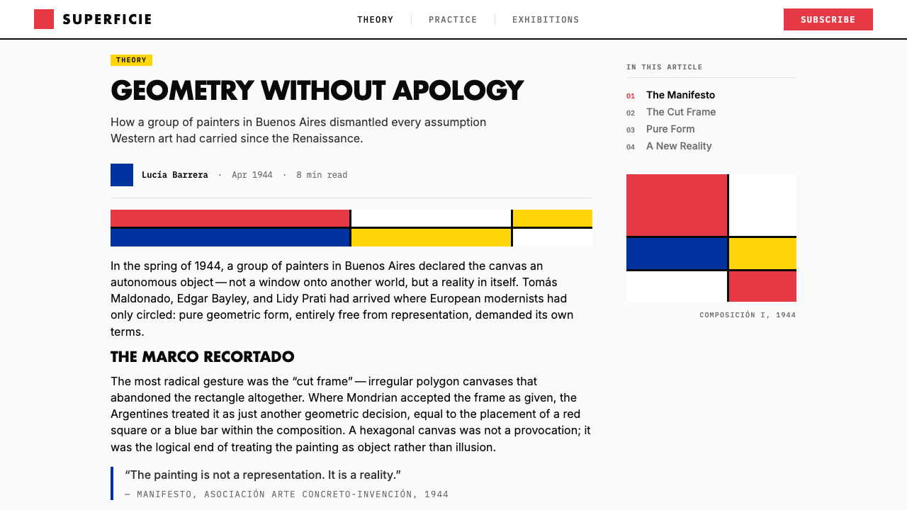
The story begins in 1944 with a single magazine issue. *Arturo: Revista de Artes Abstractas* was conceived by a circle of Buenos Aires intellectuals — among them the poet Edgar Bayley and the painter Tomás Maldonado — as a manifesto-in-print for pure abstraction. Only one issue was ever published, but its theoretical ambition detonated a movement. The magazine declared outright war on figurative art and on the psychic symbolism of Surrealism, arguing that the painted surface must be entirely invented, not derived from observed nature or unconscious imagery.故事始于1944年的一本杂志。《Arturo:抽象艺术评论》由布宜诺斯艾利斯知识分子圈子构想——其中包括诗人埃德加·贝利和画家托马斯·马尔多纳多——作为纯粹抽象主义的印刷宣言。这本杂志只出版了一期,但其理论雄心引爆了一场运动。杂志对具象艺术和超现实主义的精神象征主义宣战,主张绘画表面必须完全出于发明,不得源自观察自然或无意识图像。
The following year, 1945, saw the formal founding of the Asociación Arte Concreto-Invención, with Maldonado, Bayley, Lidy Prati, Alfredo Hlito, Manuel Espinosa, and others as core members. They staged group exhibitions, published theoretical texts, and developed their distinctive doctrine of pictorial invention: a painting's elements — its forms, its colors, its edges — must be conceived entirely from within the work's own logic, imported from nowhere outside it. The *marco recortado* became the movement's signature device because it made the argument physical: cut the frame, and the canvas can no longer pretend to be a neutral window.次年,即1945年,具体艺术-发明协会(Asociación Arte Concreto-Invención)正式成立,以马尔多纳多、贝利、莉迪·普拉蒂、阿尔弗雷多·伊利托、曼努埃尔·埃斯皮诺萨等人为核心成员。他们举办群展、发表理论文章,并发展出其独特的绘画发明学说:一幅画的元素——形态、色彩、边缘——必须完全从作品自身逻辑内部生成,不得从外部引入任何东西。「剪裁框」成为这一运动的标志性手法,因为它使论点变得触手可及:剪掉边框,画布便不再能伪装成中性的窗口。
Buenos Aires in the mid-1940s was an unusually receptive environment for this kind of radical European-inflected modernism. Argentina had remained neutral during the Second World War, and the capital was home to a substantial community of European émigré intellectuals. The group was in close correspondence with Concrete Art circles in Switzerland, particularly around Max Bill, and was conversant with the Dutch De Stijl legacy and Soviet Constructivism. But Arte Concreto-Invención was not derivative: it synthesized these sources into an original program that insisted on geometric invention as a moral and political position, not merely a formal one.1940年代中期的布宜诺斯艾利斯是接纳这类带有欧洲色彩的激进现代主义的异常肥沃土壤。阿根廷在二战期间保持中立,首都聚集着大量欧洲流亡知识分子。该群体与瑞士具体艺术圈——尤其是马克斯·比尔周围的圈子——保持密切书信往来,熟悉荷兰风格派遗产和苏联构成主义。但具体艺术-发明运动并非衍生物:它将这些来源综合为一套原创纲领,坚持将几何发明视为道德和政治立场,而不仅仅是形式选择。
Internal tensions soon split the movement. By 1946 a splinter group led by Gyula Kosice and Rhod Rothfuss broke away to form Grupo Madí, which pushed the cut-frame and the kinetic object further into three-dimensional and participatory territory. Perceptismo, associated with Raúl Lozza, explored how color relationships and spatial illusion could be generated through pure chromatic placement. Maldonado himself gradually shifted toward design theory: in 1954 he joined the newly founded Hochschule für Gestaltung in Ulm, West Germany, eventually becoming its rector, and his influence carried the movement's geometric rigor into the global postwar design mainstream. By the late 1950s the founding moment had dispersed, but its visual logic had entered the DNA of modern information design.内部张力很快分裂了这一运动。1946年,以古拉·科西切和罗德·罗斯弗斯为首的分支群体独立出来,成立了Grupo Madí,将剪裁框和动力对象进一步推向三维与参与性领域。与劳尔·洛萨相关的「感知主义」(Perceptismo)探索如何通过纯粹的色彩置放来生成色彩关系和空间错觉。马尔多纳多本人逐渐转向设计理论:1954年,他加入刚成立的西德乌尔姆造型学院,最终出任校长,他的影响力将这一运动的几何严谨性带入全球战后设计主流。至1950年代末,创立时期的那股气势已然消散,但其视觉逻辑已融入现代信息设计的基因之中。
What defines the Argentine Arte Concreto look?Argentine Arte Concreto 的视觉特征是什么?
Primary Color Doctrine原色主义
The palette is compressed to pure black, pure white, and the saturated primaries — red, yellow, and blue — with virtually no mixing, no tinting, and no tonal gradation between them. Each color arrives at full intensity and is held there: a red zone is red throughout, a white zone is unmodulated white. Lidy Prati occasionally introduced a saturated emerald green as a secondary accent, but the foundational logic remains binary — each zone is either occupied by a primary or it is neutral. Color is never used to describe light falling on a surface; it is a categorical decision, as absolute as a boolean.色板被压缩至纯黑、纯白与饱和原色——红、黄、蓝——几乎没有混色、没有调淡,各色之间也没有色调渐变。每种颜色以完全的强度到达并保持于此:红色区域始终是红色,白色区域是未经调制的白色。莉迪·普拉蒂偶尔引入饱和翡翠绿作为辅助强调,但基础逻辑依然是二元的——每个区域要么被一种原色占据,要么是中性的。色彩从不用于描述光线照射在表面上的效果;它是一种绝对的范畴性决定,如同布尔值一般确定。
Hard Edge, Zero Gradation硬边,零渐变
Every boundary between color zones is a razor-sharp edge with no blending, no antialiasing, and no softening of any kind. Where red meets white, the transition is instantaneous and total. This hardness is not merely a technical preference — it is a theoretical position. Gradation implies transition, which implies the simulation of three-dimensional space or natural light. The hard edge refuses that implication. It insists that the picture plane is a flat surface where events occur at coordinates, not in depth.色彩区域之间的每一条边界都是剃刀般锐利的边缘,没有混融、没有羽化、没有任何形式的柔化。红色与白色相遇之处,过渡是瞬间而彻底的。这种硬度不仅仅是技术偏好——它是一种理论立场。渐变意味着过渡,而过渡意味着对三维空间或自然光线的模拟。硬边拒绝了这种暗示,坚持认为画平面是一个平坦的表面,事件发生在坐标上,而非深度中。
The Cut Frame (Marco Recortado)剪裁框(Marco Recortado)
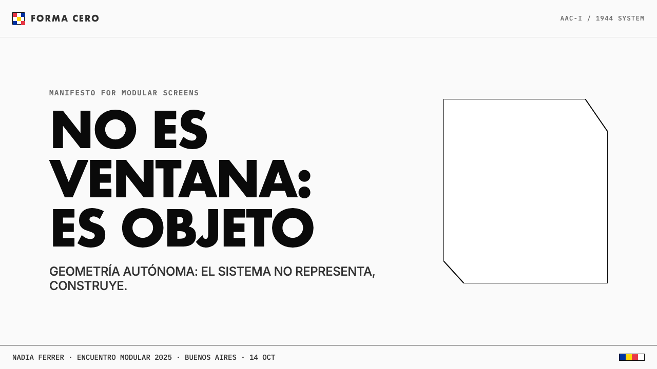
The movement's most distinctive formal invention: the physical support — canvas or board — is cut into irregular polygons rather than kept as a rectangle. The frame is no longer a neutral container surrounding the composition; it is itself a shape, a compositional edge that participates in the geometry of the whole. In contemporary digital application, this principle translates to compositions where the bounding box of a design element is irregular, where a card or layout block terminates at a diagonal rather than a right angle, and where the crop itself carries compositional intent.这一运动最具标志性的形式发明:物质支撑——画布或板——被裁切成不规则多边形,而非保留为矩形。框架不再是围绕构图的中性容器;它本身是一个形状,是参与整体几何的构图边缘。在当代数字应用中,这一原则转化为:设计元素的边界框是不规则的,卡片或布局块以对角线而非直角终止,裁切本身具有构图意图。
Pure Geometry, No Representation纯几何,零再现
No figurative imagery of any kind appears in canonical Arte Concreto work — no silhouettes, no abstracted natural forms, no human figures reduced to geometric approximation. The geometric elements are entirely invented: they refer to nothing outside themselves. A black diagonal is not a shadow or a horizon; a red rectangle is not a wall or a flag. This total rejection of reference distinguishes the movement from more expressive geometric abstraction and aligns it with the mathematical purity of Concrete Art as defined by Theo van Doesburg in 1930.在典范的具体艺术作品中,没有任何形式的具象图像——没有剪影,没有抽象的自然形态,没有被简化为几何近似的人物形象。几何元素完全出于发明:它们不指涉自身以外的任何事物。一条黑色对角线不是阴影或地平线;一个红色矩形不是墙壁或旗帜。这种对参照物的彻底拒绝将这一运动与更具表现性的几何抽象区分开来,使其与泰奥·凡·杜斯伯格1930年定义的具体艺术的数学纯粹性相吻合。
Modular Grid Logic模块网格逻辑
Compositions are organized around an underlying modular structure — a grid of equal units that governs the placement and proportioning of every element. Alfredo Hlito's paintings make this logic most transparent: bands of color step across the surface in measured intervals that feel arithmetically derived. The grid is not shown but its presence is legible. In design application, this translates to strict column-and-row systems where every element snaps to a common unit, and the intervals between elements are as precisely considered as the elements themselves.构图围绕一种潜在的模块结构组织——一个由等单元构成的网格,支配着每个元素的位置和比例。阿尔弗雷多·伊利托的画作使这种逻辑最为透明:色彩条带以仿佛经过算术推导的精确间隔横跨画面。网格未被显示,但其存在清晰可读。在设计应用中,这转化为严格的列-行系统,每个元素均对齐于公共单元,元素之间的间距与元素本身同样经过精密考量。
Object, Not Window物,而非窗
The foundational philosophical distinction of the movement: the designed surface is a physical object that exists in the viewer's space, not a transparent plane opening onto an imagined scene. This changes everything about how depth cues are treated. There is no pictorial recession, no overlapping that implies one form is behind another in a simulated space. When shapes overlap in Arte Concreto work, they do so as flat zones occupying a common plane — one color atop another — not as objects occluding each other in depth.这一运动的根本哲学区分:被设计的表面是存在于观者空间中的物质对象,而非打开通向想象场景的透明平面。这改变了深度线索的一切处理方式。没有画面后退感,没有暗示一个形态位于另一个形态之后的重叠关系。当形态在具体艺术作品中重叠时,它们作为占据同一平面的平面区域相互叠压——一种颜色置于另一种之上——而非作为在深度中相互遮挡的对象。
Invention Over Expression发明优于表现
The Arte Concreto-Invención name encodes its method: the work is invented, not expressed. Unlike Abstract Expressionism or even some strands of European geometric abstraction, the movement explicitly rejected the artist's psychological state as a legitimate source of visual form. Composition is arrived at through reasoned construction — the application of rules, proportional relationships, and formal logic — not through gesture, intuition, or emotional impulse. This disciplined constructivism is what gives the style its cool, architectural authority even at small scales.「具体艺术-发明」的名称本身编码了其方法:作品是被发明的,而非被表现的。与抽象表现主义乃至欧洲几何抽象的某些流派不同,这一运动明确拒绝将艺术家的心理状态作为视觉形态的合法来源。构图通过理性建构抵达——规则、比例关系与形式逻辑的运用——而非通过姿态、直觉或情感冲动。正是这种纪律性的建构主义,使这种风格即使在小尺度上也具有冷静的建筑权威感。
See the Argentine Arte Concreto design system查看 Argentine Arte Concreto 完整设计系统
Who shaped Argentine Arte Concreto?谁塑造了 Argentine Arte Concreto?
Maldonado was the intellectual engine of Arte Concreto-Invención and arguably its most consequential figure in terms of global influence. A co-editor of the *Arturo* magazine and a founding member of the Asociación, he developed the movement's theoretical framework, arguing that pure geometric invention was the only pictorial practice consistent with a rational, materialist worldview. In 1954 he joined the Hochschule für Gestaltung at Ulm in West Germany, eventually becoming its rector, where he translated the movement's geometric rigor into a systematic theory of design and visual communication that shaped postwar design education worldwide. His departure for Ulm marks the point at which Argentine Arte Concreto's influence became truly international.马尔多纳多是具体艺术-发明运动的智识引擎,就全球影响力而言堪称最重要的人物。作为《Arturo》杂志的联合编辑和协会创始成员,他发展了这一运动的理论框架,主张纯几何发明是唯一与理性、唯物主义世界观相符的绘画实践。1954年,他加入西德乌尔姆造型学院,最终出任校长,在那里他将这一运动的几何严谨性转化为系统性的设计与视觉传达理论,深刻塑造了战后全球设计教育。他前往乌尔姆的那一刻,标志着阿根廷具体艺术的影响力真正走向国际。
Prati was one of the movement's most rigorous formal practitioners and, as Maldonado's partner, a central presence in its social and intellectual life. Her paintings are among the most resolved in the canon: composed of interlocking geometric zones in the primary palette with occasional saturated green, they demonstrate extraordinary control of chromatic tension and compositional balance. Where many of her contemporaries treated the cut frame as a radical gesture, Prati used it with architectural precision, ensuring that the irregular support and the internal geometry were logically continuous. Her work was long underrecognized relative to its quality and influence.普拉蒂是这一运动最严谨的形式实践者之一,作为马尔多纳多的伴侣,她也是运动社交与智识生活的核心存在。她的画作是这一正典中最为完整的:由原色系列中相互咬合的几何色区构成,偶有饱和翡翠绿点缀,展现出对色彩张力与构图平衡的超凡掌控。在许多同时代人将剪裁框视为激进姿态时,普拉蒂以建筑般的精确运用它,确保不规则的支撑物与内部几何在逻辑上保持连续。她的作品长期未能获得与其质量和影响相称的认可。
Hlito's contribution was a particular refinement of the movement's modular grid logic. His canvases — typically rectangular, without the cut frame — organize color bands in precisely measured horizontal and vertical sequences that recall musical notation or typographic leading. His work demonstrates that Arte Concreto's principles could generate visual richness through interval and proportion alone, without relying on the dramatic gesture of the shaped support. Later in his career, Hlito moved toward a slightly more lyrical use of color while retaining the movement's structural discipline, producing a body of work that bridges the founding moment and the broader Latin American geometric tradition.伊利托的贡献在于对这一运动模块网格逻辑的特殊精炼。他的画作——通常为矩形,不使用剪裁框——以精确测量的水平和垂直色彩条带序列进行组织,令人联想到乐谱记谱法或字体行距。他的作品证明,具体艺术的原则能够仅凭间距与比例就产生视觉丰富性,无需依赖异形支撑物的戏剧性姿态。职业生涯后期,伊利托在保持运动结构纪律的同时,向略为抒情的色彩运用方向发展,创作出一批架接创立时刻与更广泛的拉丁美洲几何传统的作品。
Bayley was the poet of the founding circle — a writer and theorist whose essays gave the movement much of its philosophical scaffolding. He co-edited *Arturo* and contributed theoretical texts that articulated why the rejection of representation was not a retreat into formalism but an affirmative ethical position: to invent form rather than copy appearances was to affirm human creative autonomy. His influence was more textual than visual, but the movement's theoretical sophistication — which distinguished it from being merely a style — owes much to his contribution. His ideas about invention as a fundamental human act prefigure later debates in design theory about authorship and construction.贝利是创立圈子中的诗人——一位作家和理论家,他的文章为这一运动提供了大部分哲学脚手架。他联合编辑了《Arturo》,并发表理论文章,阐明为何拒绝再现不是退守形式主义,而是一种肯定性的伦理立场:发明形态而非复制外观,是对人类创造自主性的肯定。他的影响更多是文本性的而非视觉性的,但这一运动的理论成熟度——正是这种成熟度使它不仅仅是一种风格——有赖于他的贡献。他关于发明作为基本人类行为的思想预示了后来设计理论中关于作者身份与建构的争论。
Espinosa was among the most technically adventurous of the founding group, exploring how geometric forms could be made to activate the entire picture surface rather than sitting within it as figure against ground. His paintings often work through diagonal and rhomboid geometries that create the sensation of a field in motion without any element actually moving — the flatness is kinetic rather than static. He remained active in Argentine geometric abstraction for decades after the movement's initial period, becoming a bridge figure between the founding generation and younger artists working in the geometric tradition through the 1970s and beyond.埃斯皮诺萨是创始群体中技术上最具冒险精神的成员之一,探索如何使几何形态激活整个画面,而不仅仅是作为图形-背景关系中的图形停留其中。他的画作常以对角线和菱形几何进行运作,营造出一种场域运动的感觉,而实际上没有任何元素在移动——平面性是动态的,而非静态的。在运动的初始时期之后,他在阿根廷几何抽象领域活跃了数十年,成为创立一代与延续至1970年代及以后的几何传统年轻艺术家之间的桥接人物。
How do you use Argentine Arte Concreto today?今天怎么用 Argentine Arte Concreto?
Argentine Arte Concreto-Invención is a highly transferable design system precisely because its principles are structural rather than decorative. Applying it correctly means understanding what the visual grammar is actually doing: primary color zones assign categorical meaning, hard edges create unambiguous boundaries, modular grid logic ensures that proportions feel reasoned rather than arbitrary, and the absence of gradation or shadow insists on the flatness of the designed surface. Borrowing only the color palette without understanding these structural commitments produces work that looks derivative rather than principled.阿根廷具体艺术-发明运动是一套可移植性极高的设计系统,恰恰因为其原则是结构性的而非装饰性的。正确应用它,意味着理解这套视觉语法实际上在做什么:原色区域指派范畴性意义,硬边创造明确无误的边界,模块网格逻辑确保比例感觉经过推理而非随意为之,渐变或阴影的缺席坚持于被设计表面的平面性。只借用色板而不理解这些结构性承诺,会产生看起来像衍生品而非有原则的作品。
For presentation slides, the style functions with particular force on both cover and content layouts. A cover page benefits from the bold asymmetric composition: one primary-color geometric zone occupying a significant portion of the frame, a black or white ground, and a title in a clean geometric sans-serif at high contrast. The cut-frame principle translates digitally as diagonal crops or angled layout blocks that give the composition an edge that participates in the design rather than containing it. Content slides should be built on a strict grid: one organizing axis, two or three text hierarchies defined purely by scale, no decorative dividers or rules beyond what the grid itself requires. Data visualizations — bar charts, area charts, pie charts — become geometric objects in their own right when colored with the primary palette and rendered without gradients or drop shadows.对于演示文稿,这种风格在封面和内容版面上都极具力量。封面页适合运用大胆的非对称构图:一个原色几何区域占据画框的重要部分,以黑色或白色为底,标题以干净的几何无衬线字体高对比度呈现。剪裁框原则在数字语境中转化为对角裁切或斜向布局块,使构图的边缘本身参与到设计中,而非仅仅容纳它。内容幻灯片应建立在严格的网格上:一条组织轴线,仅凭尺度定义两到三级文字层级,除网格本身所需之外无任何装饰性分隔线或规则。当数据可视化——柱状图、面积图、饼图——以原色系着色并不使用渐变或投影阴影时,它们本身成为几何对象。
For web interfaces, the style is well suited to dashboards, pricing pages, and analytical tools where categorical clarity and information hierarchy are the dominant requirements. The approach: establish a strict multi-column grid, use a near-white or pure white ground, deploy black for all body text and structural elements, and reserve the primaries for interactive states, tier differentiation, or status indicators. Card components work well with flat color fills and sharp borders rather than soft shadows; the hard edge of a card becomes a compositional element rather than a container. Navigation should be typographic — wordmarks and labels in a single geometric sans-serif — with the primary palette used only for active or highlighted states.对于网页界面,这种风格特别适合以范畴清晰度和信息层级为主要需求的仪表板、定价页面和分析工具。方法如下:建立严格的多列网格,使用接近白色或纯白的底面,将黑色用于所有正文和结构性元素,将原色保留给交互状态、等级区分或状态指示符。卡片组件以平面色块填充和锐利边框效果最佳,而非柔和阴影;卡片的硬边成为构图元素而非容器。导航应为字体性的——以单一几何无衬线字体呈现的文字标识和标签——原色只用于活跃或高亮状态。
For editorial and marketing applications, the style supports bold information hierarchy with the poster-like conviction of its origins. An editorial layout in this system uses a narrow text measure with a wide margin reserved for call-outs or metadata, section breaks marked by a bold geometric rule rather than decorative ornament, and image handling that privileges hard crops and flat silhouettes over naturalistic full-bleed photography. Marketing pages work well with full-width feature blocks alternating between contrasting grounds — white zone then primary-color zone — with calls to action rendered in the opposing primary. The rule of the single accent primary should govern the entire page: choose one primary as the active color and treat the others as structural or neutral.对于编辑和营销应用,这种风格以其起源处的海报式确信感支持大胆的信息层级。采用这一系统的编辑版面使用窄行宽正文,宽边距保留给引用语或元数据,段落分隔以粗几何线而非装饰性装饰物标记,图像处理优先考虑硬裁切和平面剪影而非自然主义的出血摄影。营销页面适合以全宽特色区块在对比底面之间交替——白色区域接着原色区域——行动号召以对立原色呈现。单一强调原色的规则应统摄整个页面:选定一种原色作为活跃色,将其他两种视为结构性或中性元素。
A common mistake when working in this style is treating the three-primary palette as permission to use all three simultaneously at full saturation across a composition. Authentic Arte Concreto work almost never does this: typically one primary dominates, a second appears as a subordinate accent, and the third is either absent or used only as a structural note. Similarly, adding gradient fills, soft drop shadows, or rounded corners to elements that should be geometrically absolute destroys the style's defining tension between flatness and color intensity. The discipline of the style is in the refusals — no gradation, no softening, no representation — and half-measures undermine the whole system.使用这种风格时最常见的错误是将三原色调板理解为在整个构图中同时以完全饱和度使用三种颜色的许可。真实的具体艺术作品几乎从不这样做:通常一种原色占主导,第二种作为从属强调出现,第三种要么缺席,要么只作为结构性注脚。同样,向本应几何绝对的元素添加渐变填充、柔和投影阴影或圆角,会摧毁这种风格平面性与色彩强度之间的决定性张力。这种风格的纪律在于那些拒绝——没有渐变、没有柔化、没有再现——而半途而废的妥协会破坏整个系统。
See the Argentine Arte Concreto design system查看 Argentine Arte Concreto 完整设计系统
Argentine Arte Concreto — FAQArgentine Arte Concreto · 常见问题
How does Arte Concreto-Invención differ from Mondrian and De Stijl?具体艺术-发明运动与蒙德里安及风格派有何不同?
The family resemblance is real — both share primary colors, hard edges, and the rejection of representation — but the Argentine movement departs from De Stijl in two important ways. First, De Stijl retained the rectangular canvas as an absolute constraint and treated the orthogonal grid as a near-universal structural principle; Arte Concreto-Invención literally cut the frame, making the support itself an irregular geometric object and extending the composition's logic to its own boundary. Second, where Mondrian's grid carries a quasi-mystical or utopian charge — he believed geometric harmony could embody universal spiritual truths — the Argentine artists were explicitly anti-metaphysical, grounding their practice in materialist rationalism and the politics of pure invention. The Argentine work is cooler, more argumentative, less transcendent.两者的家族相似性是真实的——都共享原色、硬边和拒绝再现——但阿根廷运动在两个重要方面偏离了风格派。首先,风格派将矩形画布保留为绝对约束,将正交网格视为近乎普遍的结构原则;具体艺术-发明运动则从字面上剪切了框架,使支撑物本身成为不规则的几何对象,并将构图的逻辑延伸至其自身边界。其次,蒙德里安的网格承载着准神秘主义或乌托邦色彩——他相信几何和谐能够体现普遍的精神真理——而阿根廷艺术家明确反形而上学,将其实践植根于唯物主义理性主义和纯粹发明的政治性。阿根廷的作品更冷静、更具论辩性、较少超验色彩。
Can the cut-frame principle be applied in digital design?剪裁框原则可以应用于数字设计吗?
Yes, and with considerable expressive power. In digital contexts, the cut-frame principle manifests as compositions where layout elements — cards, image containers, section dividers — have irregular or diagonal boundaries rather than universal right angles. A hero section that terminates at a diagonal instead of a horizontal line, a pricing card whose top edge is angled, or a data panel clipped to a parallelogram all invoke the logic of the marco recortado. The key is that the irregular edge must feel logically continuous with the internal composition, not arbitrary: the angle of the cut should relate to angles within the content, so that the boundary participates in the geometry rather than interrupting it.可以,而且具有相当大的表现力。在数字语境中,剪裁框原则体现为布局元素——卡片、图像容器、段落分隔——具有不规则或对角线边界,而非统一的直角。以对角线而非水平线终止的英雄区域,顶边呈斜角的定价卡片,或被裁切为平行四边形的数据面板,都援引了marco recortado的逻辑。关键在于不规则边缘必须感觉与内部构图逻辑连续,而非随意为之:裁切角度应与内容中的角度相关联,使边界参与几何关系,而非打断它。
Is this style appropriate for color-meaning-sensitive contexts like healthcare or finance?这种风格适合颜色含义敏感的场景,比如医疗或金融吗?
With care, yes. The primary palette of Arte Concreto — especially the combination of red and blue — does overlap with culturally loaded color meanings in finance (red for loss, blue for institutional trust) and healthcare (red for emergency, blue for clinical calm). When applying the style in these contexts, the safest approach is to designate one primary as structurally neutral — using it for decorative or compositional zones that carry no data meaning — and reserve the others for categorical functions that align with their cultural associations. Yellow, which carries fewer loaded meanings in finance and healthcare than red or blue, often works well as the dominant compositional primary, with red and blue reserved for specific states or categories. The style's hard-edge clarity is actually an asset in both domains — the lack of ambiguity in color zone boundaries maps well onto the categorical precision these fields require.谨慎使用的话,可以。具体艺术的原色调板——尤其是红色和蓝色的组合——确实与金融(红色表示亏损,蓝色表示机构信任)和医疗(红色表示紧急,蓝色表示临床平静)中文化赋予的颜色含义有所重叠。在这些场景中应用这种风格,最安全的做法是将一种原色指定为结构性中性——用于不承载数据含义的装饰性或构图性区域——将另两种保留给与其文化关联相符的范畴功能。黄色在金融和医疗领域承载的负担性含义少于红色或蓝色,通常作为主导构图原色效果最好,将红色和蓝色保留给特定状态或类别。这种风格的硬边清晰度在这两个领域实际上是一种优势——色彩区域边界的明确无误,与这些领域所需的范畴精确性高度契合。
How strictly should the no-gradation rule be followed in modern digital products?在现代数字产品中,无渐变规则应该被多严格地遵守?
In its fullest expression, the no-gradation rule is absolute — flat zones of pure color, no transitions, no ambient light effects. In practice, some contemporary adaptations introduce very subtle tonal variation within color zones for accessibility reasons — ensuring sufficient contrast ratios for users with visual impairments — while preserving the hard-edge boundary logic everywhere. What should never be compromised is the boundary itself: a gradient that fades from a primary to neutral across a zone boundary dissolves the style's defining tension entirely. Similarly, background gradients used for visual richness — common in contemporary design — are incompatible with the system's logic. The rule to follow is: gradients that serve a structural or accessibility function can be evaluated case by case; gradients used purely for visual softening should be eliminated.在最完整的表达中,无渐变规则是绝对的——纯色的平面区域,没有过渡,没有环境光效果。实际上,一些当代适应版本出于无障碍原因在色彩区域内引入非常细微的色调变化——确保为视觉障碍用户提供足够的对比度——同时在各处保持硬边边界逻辑。绝不应妥协的是边界本身:在区域边界处从原色渐变为中性色的渐变会彻底消解这种风格的决定性张力。同样,用于视觉丰富性的背景渐变——在当代设计中很常见——与这个系统的逻辑不相容。应遵循的规则是:服务于结构或无障碍功能的渐变可以逐案评估;纯粹用于视觉柔化的渐变应予以消除。
Does the movement have a relationship to Constructivism and Suprematism, and does that matter for applying the style?这一运动与构成主义和至上主义有关系吗?这对应用这种风格有影响吗?
The relationship is direct and acknowledged. The Arte Concreto-Invención founders were deeply conversant with Malevich's Suprematism — particularly its insistence that pure geometric form was independent of any narrative or natural referent — and with El Lissitzky and Soviet Constructivism's fusion of geometric rigor with utilitarian purpose. Where Suprematism tended toward a kind of cosmic spiritualism and Constructivism toward political function, Arte Concreto-Invención stripped both of their non-pictorial allegiances and committed purely to the logic of the invented form. For practical application, this genealogy matters because it explains the style's unusually strong alignment with information design: the Constructivist idea that geometric form can carry semantic content without representation is precisely what makes the style well-suited to data visualization, taxonomic UI, and systems thinking more broadly. Understanding this context helps designers use the style as a logical system rather than a surface treatment.这种关系是直接且被承认的。具体艺术-发明运动的创始人对马列维奇的至上主义——尤其是其关于纯几何形态独立于任何叙事或自然参照物的坚持——以及利西茨基和苏联构成主义将几何严谨性与实用目的融合的方式,都有深入了解。至上主义倾向于一种宇宙精神主义,构成主义倾向于政治功能,而具体艺术-发明运动则剥离了两者的非绘画性关联,纯粹致力于被发明形态的逻辑。对于实际应用,这一谱系很重要,因为它解释了这种风格与信息设计异常强烈的契合:构成主义关于几何形态可以在没有再现的情况下承载语义内容的思想,恰恰使这种风格非常适合数据可视化、分类型用户界面和更广泛的系统思维。理解这一背景有助于设计师将这种风格作为逻辑系统而非表面处理来运用。
Related design styles相关设计风格
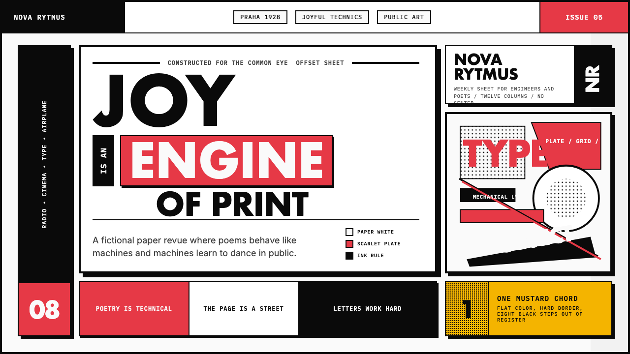 Czech Devětsil Avant-GardeJoy is engineered. Scarlet ink blocks and rotated sans type collide on an asy…欢愉被工程化:猩红墨块与旋转无衬线字撞上非对称网格。
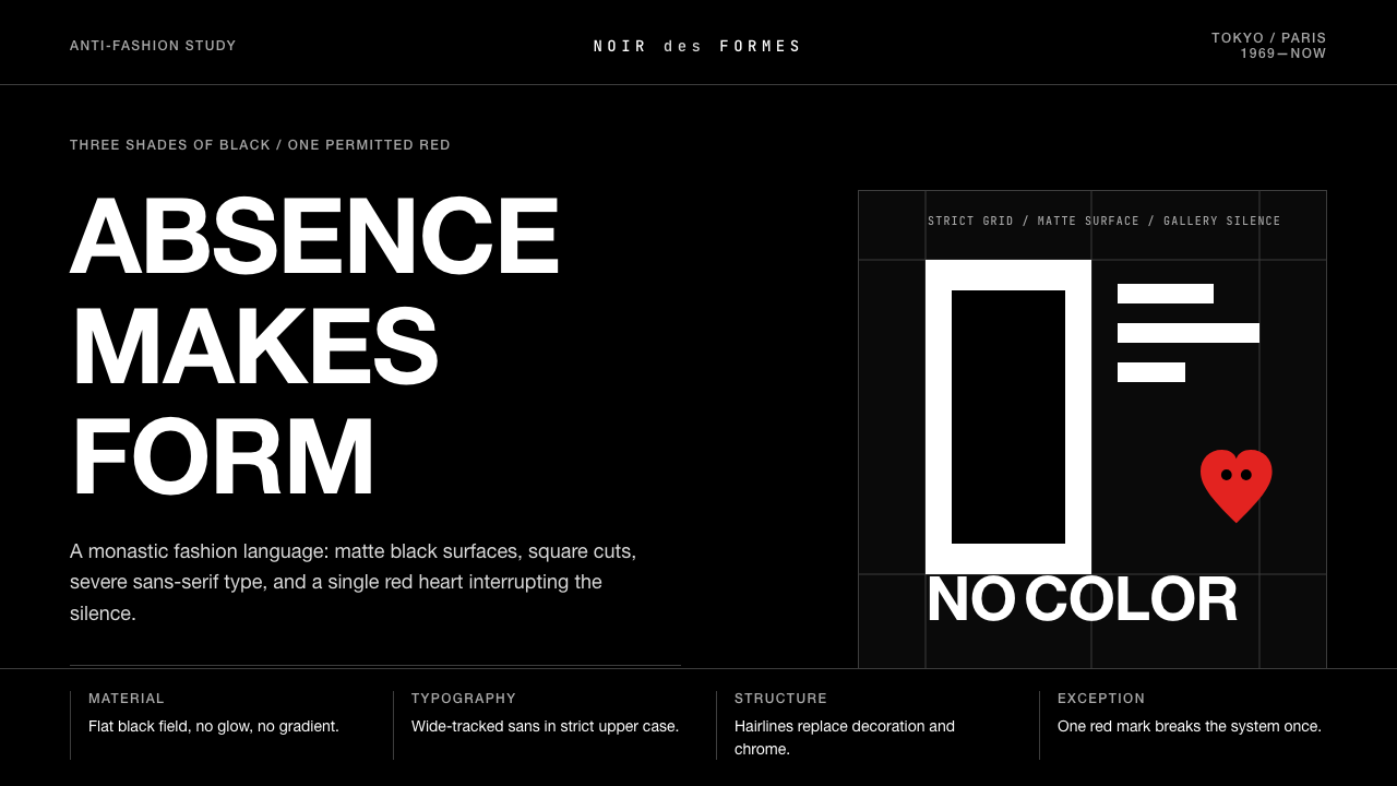 Comme des Garçons (Rei Kawakubo)Austerity becomes the event. Pure black, wide sans type, and one red heart br…克制即事件:纯黑、宽距无衬线与一枚红心打破沉默。
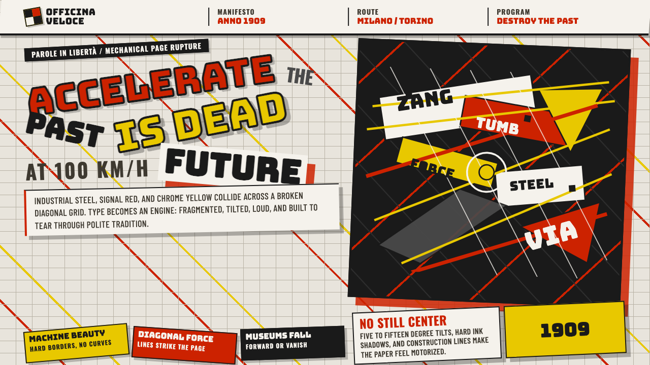 Italian Futurism (Marinetti 1909)Speed murders tradition. Signal red and chrome yellow slash a broken diagonal…速度杀死传统:信号红与铬黄斩开破碎斜向网格。
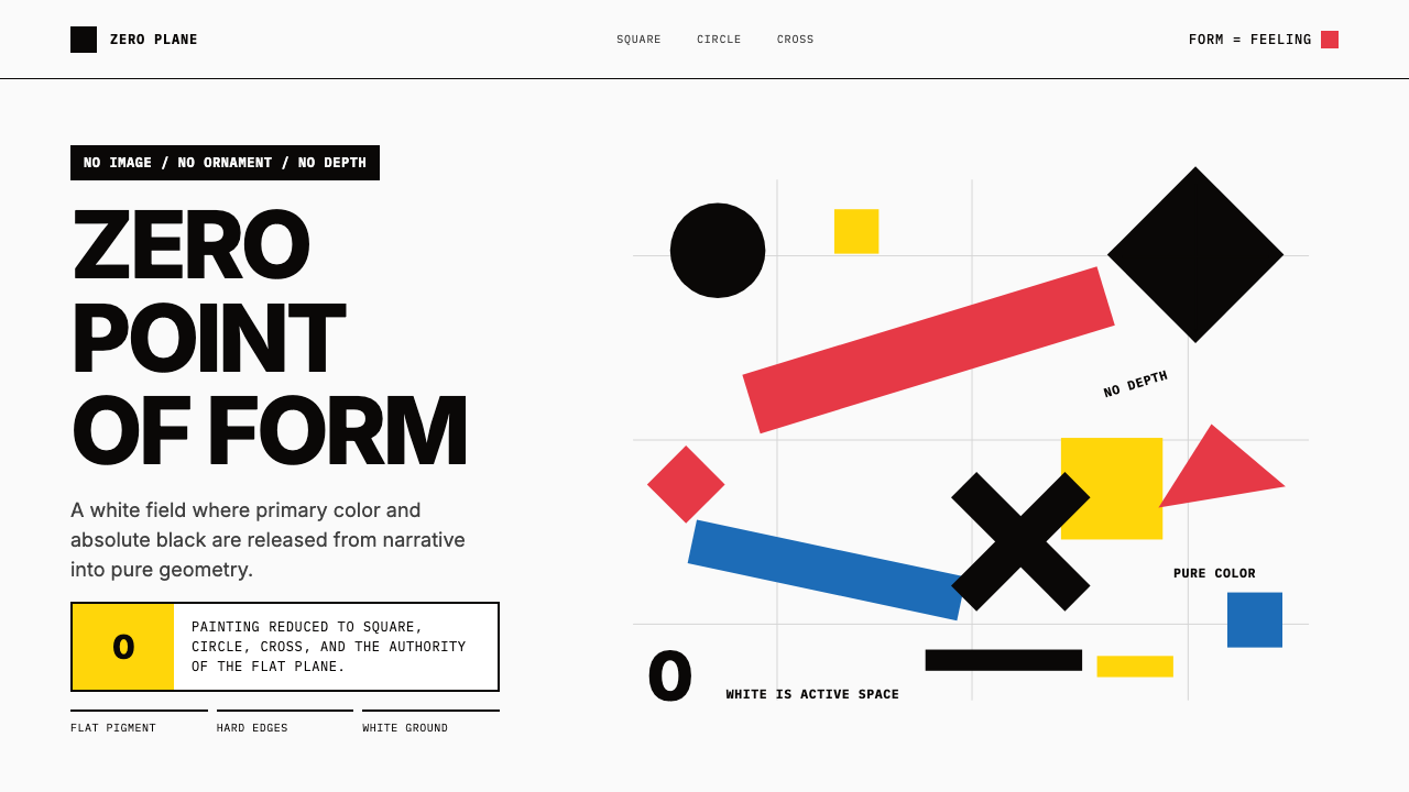 Malevich SuprematismGeometry declares zero. Red, yellow, blue and black blocks float on active wh…几何宣告零点:红黄蓝黑色块漂浮于主动白场。
 De StijlPrimary colors, locked in a black grid. Mondrian's compositions, in thick bor…蒙德里安的构成系列译为界面:黑色粗线划分白底、纯红蓝黄填充、零圆角——新造型主…
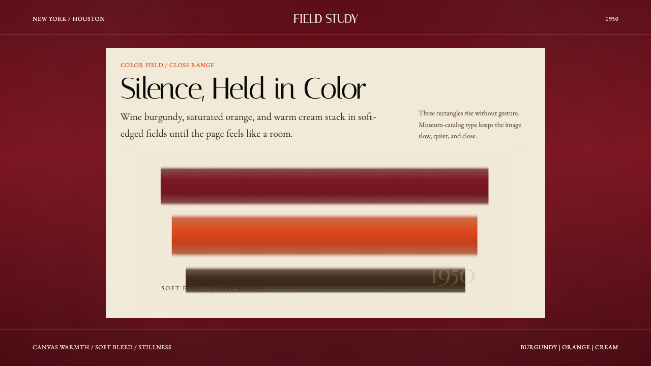 Mark Rothko Color Field (1950)Silence made visible. Burgundy, orange, and cream stack in soft-edged fields.把沉默变成可见。酒红、橙与奶油柔边堆叠成色域。