What is Mark Rothko Color Field (1950)?什么是 Mark Rothko Color Field (1950)?
Rothko stripped painting to pure feeling — two or three soft-edged rectangles of saturated pigment that swallow the viewer whole.罗斯科将绘画剥至纯粹的感受——两三块柔边饱和色矩形,将观者整个吞没。
Mark Rothko Color Field (1950) in briefMark Rothko Color Field (1950) 速览
Mark Rothko's color-field paintings, produced in their definitive form from the late 1940s onward, reduce the painted surface to its most elemental condition: two or three large rectangles of deep, saturated pigment stacked vertically, their edges blurred and breathing against one another rather than cleanly cut. From a distance, the compositions read as simple bands of color. Approached closely — as Rothko always insisted they should be — they become immersive environments, expanding beyond their physical boundaries to fill the entire visual field.罗斯科的色域绘画从1940年代末起形成其决定性的面貌,将画布简化为最纯粹的状态:两三块大面积深度饱和的矩形垂直堆叠,边缘模糊、相互呼吸,而非清晰切割。从远处看,画面呈现为简单的色带;近距离凝视时——正如罗斯科始终坚持的那样——它们变为沉浸式的环境,超越自身物理边界,充盈观者整个视野。
The design language derived from this tradition carries that same quality of environmental immersion. Wine burgundy, saturated orange, and warm cream are not used as accent colors or decorative highlights; they flood the page or screen as primary grounds. Classical serif typography, recalling the measured authority of museum catalogs, provides the only structural counterpoint to the expansive color fields. Nothing else competes. No ornamental detail, no illustrative element, no busy pattern asserts itself against the color's dominance.从这一传统中提炼出的设计语言同样承载着这种环境式沉浸感。酒红、饱和橙与暖奶油色并非用作点缀色或装饰高光,而是作为主色域漫溢页面与屏幕。古典衬线字体,带着美术馆图录那种从容的权威感,提供了唯一与宽广色域相抗衡的结构元素。没有任何其他元素与之竞争——无装饰细节,无插图,无繁复图案挑战色彩的统治。
What distinguishes this approach from surface minimalism is its emotional register. The palette is deliberately weighted toward the mineral and organic — pigments that carry a sense of physical depth and temperature rather than digital brightness. Every surface feels as though it has been painted rather than filled. Edges bleed into one another with soft gradation. The result is contemplative and unapologetically slow: a design vocabulary for communication that asks its audience to pause rather than scan.这种方式与表面意义上的极简主义的区别,在于其情感分量。调色板刻意偏向矿物性与有机性——带有物理深度感与温度感的颜料,而非数字荧光。每一个表面都像是被涂抹而非被填充。边缘以柔和的渐层相互渗透。最终呈现的是沉思的、毫不妥协的缓慢节奏:一套要求观众停顿而非扫视的视觉传达词汇。
See the Mark Rothko Color Field (1950) design system查看 Mark Rothko Color Field (1950) 完整设计系统
Where does Mark Rothko Color Field (1950) come from?Mark Rothko Color Field (1950) 从何而来?
Mark Rothko was born Marcus Rothkowitz in 1903 in Dvinsk, in the Russian Empire, and emigrated with his family to Portland, Oregon, in 1913. He studied briefly at Yale before leaving for New York, where he would spend most of his career. His early work drew on Surrealism and mythology — dense, biomorphic forms derived from Nietzsche, ancient ritual, and the unconscious — but by the mid-1940s he had grown dissatisfied with imagery that still carried representational residue. He wanted painting to speak directly to primal emotion without the mediation of recognizable form.马克·罗斯科原名马库斯·罗思科维茨,1903年生于俄罗斯帝国的德文斯克,1913年随家人移居俄勒冈州波特兰。他曾短暂就读于耶鲁大学,后辍学前往纽约,在那里度过了职业生涯的大部分时光。他早期的作品深受超现实主义与神话学影响——源自尼采、古代仪式与无意识的浓密生物形态——但到1940年代中期,他已对那些仍带有具象残留的图像感到不满。他想要绘画直接触达原始情感,而无需可辨认形态的中介。
The breakthrough came between 1947 and 1950, when Rothko moved through a transitional style he called 'multiforms' — loosely organized clouds of color without defined edges — toward the rectangular format that would define the rest of his career. These mature paintings dispensed entirely with figure and ground. Instead, two or three soft-edged rectangles of saturated color occupied the canvas in vertical sequence, each pigment layer built up through multiple thin washes that gave the surface a luminous, atmospheric depth. Critics at the time struggled to locate these works within existing categories; Rothko himself resisted labels, famously stating that he was interested in expressing basic human emotions — tragedy, ecstasy, doom — and that if viewers were moved to tears in front of his paintings, they were having the same religious experience he had while painting them.突破发生在1947至1950年间。罗斯科经历了他称之为「多形态」的过渡风格——松散组织的色彩云团,边缘未经界定——逐步走向将定义其余生的矩形形式。这些成熟的画作彻底放弃了图形与背景的区分。两三块柔边饱和色矩形按垂直顺序占据画布,每层颜料通过多道薄洗积累而成,赋予表面发光的、大气层般的深度。当时的批评家难以将这些作品归入现有类别;罗斯科本人抗拒标签,他有一句著名的话:他感兴趣的是表达人类的基本情感——悲剧、狂喜、末日——如果观者在他的画前落泪,他们正在经历他作画时经历的同一种宗教体验。
The critical and institutional framework around Rothko's mature work was shaped significantly by the critic Clement Greenberg, who championed Abstract Expressionism as the authentic successor to European modernism and positioned color-field painting — alongside the gestural work of Jackson Pollock — as the vanguard of postwar American art. Greenberg's formalist reading emphasized the paintings' literal flatness, their refusal of illusionistic depth, and their assertion of the canvas as a physical object rather than a representational window. This interpretation gave the work institutional legitimacy even as it arguably missed the psychological and spiritual dimensions Rothko cared about most.围绕罗斯科成熟作品的批评与机构框架,很大程度上由批评家克莱门特·格林伯格塑造。格林伯格将抽象表现主义推举为欧洲现代主义的真正继承者,并将色域绘画——与杰克逊·波洛克的姿势性作品并列——定位为战后美国艺术的先锋。他的形式主义解读强调这些画作字面意义上的平面性、对幻觉深度的拒绝,以及对画布作为物理对象而非再现窗口的坚持。这一诠释赋予了这些作品机构上的合法性,尽管它很可能错失了罗斯科最在意的心理与精神维度。
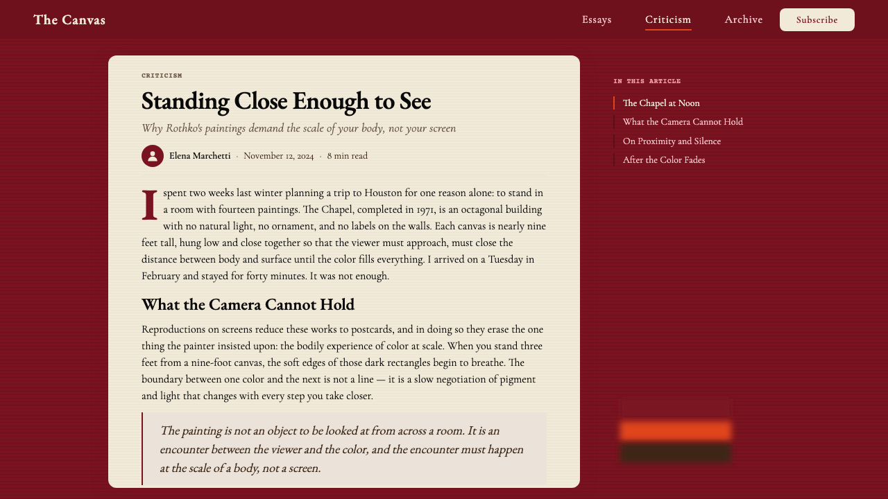
The most concentrated encounter with Rothko's vision is the Rothko Chapel in Houston, Texas — fourteen large-scale paintings installed in an octagonal, non-denominational meditation space commissioned by collectors John and Dominique de Menil and inaugurated in 1971, one year after Rothko's death. The chapel paintings are among Rothko's darkest: near-black burgundy and plum tones that seem to absorb rather than emit light, pushing the viewer toward an experience of pure sensation stripped of pleasure. The chapel became an influential model for contemplative public space and confirmed that Rothko's system — large color fields in enclosed environments — was capable of producing a sustained, near-architectural experience distinct from anything oil painting had previously achieved.与罗斯科视野最集中的相遇,是得克萨斯州休斯顿的罗斯科礼拜堂——十四幅大型绘画陈列于一座八角形的无教派冥想空间中,由收藏家约翰与多米尼克·德梅尼尔委托建造,于1971年——罗斯科辞世一年后——落成。礼拜堂的画作是罗斯科最暗沉的作品之列:接近黑色的酒红与梅紫色调,看似吸收光线而非释放光线,将观者推向一种剥去愉悦感的纯粹感官体验。礼拜堂成为沉思性公共空间的重要范本,证明了罗斯科的系统——封闭环境中的大型色域——能够产生一种接近建筑体验的持续效果,远超油画此前所能达到的任何成就。
What defines the Mark Rothko Color Field (1950) look?Mark Rothko Color Field (1950) 的视觉特征是什么?
Color as Ground色彩即底面
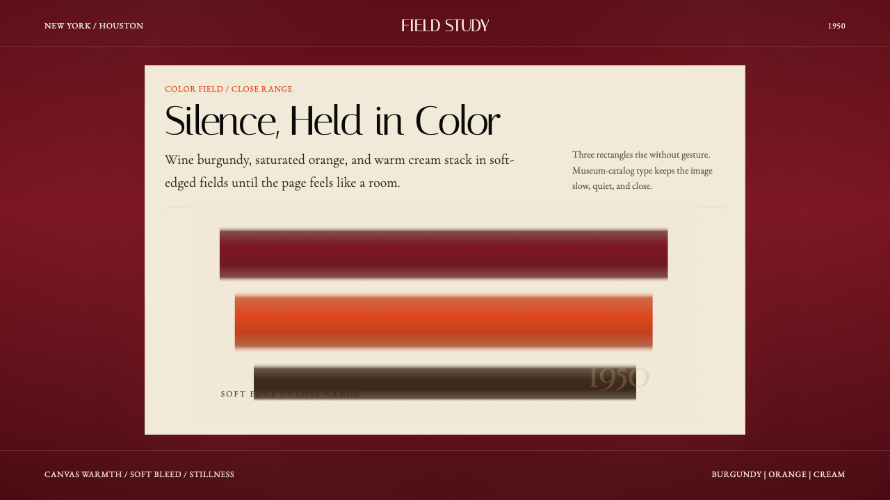
In Rothko-derived design, color does not accent or highlight — it constitutes the entire surface. Deep wine burgundy, a saturated warm orange, and a soft cream or off-white are used as full-field grounds that flood the page or screen from edge to edge. These are not neutral backgrounds waiting to support other elements; they are the primary visual fact, and everything else exists within them. The palette carries a mineral, pigment-like weight: these are colors with physical depth, not the electric brightness of screen primaries.在罗斯科衍生的设计中,色彩不是点缀或高光——它构成整个表面。深酒红、饱和暖橙与柔奶油色或米白色被用作全幅底面,从边缘到边缘漫溢页面或屏幕。这些不是等待承托其他元素的中性背景;它们是首要的视觉事实,其他一切都存在于其中。调色板带有矿物颜料般的质感:这些色彩具有物理深度,而非屏幕三原色的电子荧光感。
Soft Edges and Bleed柔边与渗透
The defining formal characteristic of Rothko's mature paintings — and of design that draws from them — is the deliberately softened boundary between adjacent color areas. Where most design systems use hard edges to separate zones, the Rothko approach allows adjacent fields to bleed into one another with a gradual softening. This is not imprecision; it is a considered decision that makes color areas feel atmospheric and breathing rather than cut out. The boundaries between zones become the most charged passages in the composition.罗斯科成熟画作——以及从中汲取灵感的设计——最具决定性的形式特征,是相邻色彩区域之间刻意柔化的边界。大多数设计系统使用硬边分隔区域,而罗斯科的方式允许相邻色域以渐进柔化相互渗透。这不是模糊,而是一种经过考量的决定,使色彩区域感觉像大气般呼吸,而非被剪裁出来。区域之间的边界,成为构图中张力最充盈的段落。
Saturated Depth饱和的深度
Rothko achieved his characteristic surface luminosity by building up color through many thin, semi-transparent washes of paint rather than applying a single opaque layer. The depth visible in his canvases is not an illusion of three-dimensional space — it is the literal depth of accumulated pigment layers. In digital or print contexts, this quality translates to a preference for colors of high saturation and warm undertone, used at scales large enough that the color can be fully perceived rather than merely registered.罗斯科通过多道薄透半透明颜料的积累而非单层不透明涂抹,获得其标志性的表面发光效果。他画布上可见的深度,并非三维空间的幻觉,而是积累颜料层的字面深度。在数字或印刷语境中,这种品质转化为对高饱和度、暖底色调颜色的偏好,且使用面积足够大,使色彩得以被充分感知而非仅仅被注册。
Classical Serif Typography古典衬线字体排印
Rothko's paintings were framed institutionally by museum catalogs, critical essays, and gallery wall text — almost invariably set in classical, high-contrast serif typefaces with generous leading and restrained letterspacing. Design that references this tradition adopts the same typographic register: serif letterforms with visible stroke contrast, set at a scale and weight that feels considered and unhurried. Type does not compete with the color fields; it occupies them with quiet authority.罗斯科的绘画在机构层面被美术馆图录、批评文章与展厅墙文所框定——这些几乎无一例外地采用古典、高对比度衬线字体,行距宽裕,字距克制。援引这一传统的设计采用同样的排印语调:具有可见笔画对比的衬线字形,以令人感到从容不迫的尺寸与字重排列。文字不与色域竞争;它以安静的权威栖居其中。
Monumental Scale纪念碑式的尺度
Rothko consistently worked at large scale because scale is inseparable from the experience he was after: the color must fill peripheral vision to produce the sense of being inside rather than looking at the painting. Design translations of this principle avoid the tendency to subdivide the surface into many small elements. Large, uninterrupted color areas dominate. When compositional zones are defined, they are defined at a scale that feels generous and expansive rather than segmented.罗斯科始终以大尺幅作画,因为尺度与他所追求的体验不可分割:色彩必须充满周边视野,才能产生身处其中而非观看画作的感觉。这一原则的设计转化是:避免将表面细分为许多小元素的倾向。大面积不间断的色彩区域占据主导地位。当构图区域被划定时,它们的尺度令人感到宽广而开放,而非零碎分割。
Contemplative Pacing沉思的节奏
The experience of standing before a Rothko painting is deliberately slow. There is nothing to decode, no narrative to follow, no detail to discover — only the sustained encounter with color. Design that draws from this quality structures its hierarchy to reward the viewer who lingers rather than the viewer who scans. Generous whitespace and deep color fields create pauses between information. The pace of reading slows because the visual field encourages looking before processing.驻足于一幅罗斯科画作前的体验是刻意缓慢的。没有什么需要解码,没有叙事可循,没有细节待发现——只有与色彩的持续相遇。从这种品质中汲取灵感的设计,以奖励驻留者而非扫视者的方式构建层级。宽裕的留白与深邃的色域在信息之间创造停顿。阅读的节奏放慢,因为视觉场域鼓励先看后处理。
Absence of Decoration装饰的缺席
Rothko removed from his paintings everything that was not color and edge: no line, no texture, no figure, no gesture visible as gesture. The design equivalent is a similar severity of reduction. No decorative borders, no illustrative elements, no gradient effects used for visual richness, no ambient shadows softening transitions. What is not directly functional or communicative is absent. This is not minimalism as trend — it is a principled commitment to letting color carry the full communicative weight without assistance.罗斯科从画作中移除了所有非色彩、非边缘的东西:无线条,无质感,无图形,无作为姿势可见的笔触。设计上的对等是类似程度的严格减法。无装饰边框,无插图元素,无用于视觉丰富性的渐变效果,无柔化过渡的环境阴影。凡不直接服务于功能或传达的,皆不存在。这不是作为潮流的极简主义——而是一种有原则的承诺:让色彩无需援助地承载全部传达重量。
See the Mark Rothko Color Field (1950) design system查看 Mark Rothko Color Field (1950) 完整设计系统
Who shaped Mark Rothko Color Field (1950)?谁塑造了 Mark Rothko Color Field (1950)?
Rothko (1903–1970) developed the rectangular color-field format that defines this aesthetic between 1947 and 1950, after passing through Surrealist and mythological phases that he ultimately found too mediated. His insistence that viewers stand close — he specified distances — and that his paintings be hung low enough to occupy the viewer's full visual field reveals a designer's attention to the conditions of reception. He refused to explain his paintings through iconography or allegory, maintaining that they addressed emotion directly. His late work for the Rothko Chapel in Houston, completed just before his death, pushed the color field toward its darkest and most absorbing extreme.罗斯科(1903—1970年)在1947至1950年间,经历了他最终认为过于间接的超现实主义与神话学阶段后,发展出定义这一美学的矩形色域形式。他坚持观者应近距离驻足——他具体规定了距离——画作应挂得足够低以占据观者全部视野,这揭示了一位设计师对接受条件的用心。他拒绝以图像学或寓言解释自己的画作,坚持它们直接触达情感。他去世前为休斯顿罗斯科礼拜堂完成的晚期作品,将色域推向最暗沉、最具吸附力的极端。
Greenberg (1909–1994) was the most influential American art critic of the postwar period and the primary theoretical architect of Abstract Expressionism's institutional legitimacy. His formalist framework — which valued painting's acknowledgment of its own flatness over illusionistic representation — positioned color-field painters including Rothko, Barnett Newman, and Helen Frankenthaler as the authentic vanguard of modernist painting. His advocacy shaped how these works entered museum collections, how they were written about, and ultimately how subsequent designers and art directors came to understand the color-field tradition as a serious and codified visual language.格林伯格(1909—1994年)是战后美国最具影响力的艺术批评家,也是抽象表现主义机构合法性的首要理论建筑师。他的形式主义框架——重视绘画对自身平面性的承认,而非幻觉式再现——将包括罗斯科、巴内特·纽曼与海伦·弗兰肯萨勒在内的色域画家定位为现代主义绘画的真正先锋。他的倡导塑造了这些作品进入美术馆收藏的方式、被书写的方式,以及后来的设计师与艺术总监如何将色域传统理解为一套严肃而系统化的视觉语言。
Dominique de Menil (1908–1997) was the French-American collector and patron who, together with her husband John de Menil, commissioned the Rothko Chapel in Houston. Her decision to ask Rothko to create an entire environment rather than individual paintings — and to situate that environment within a non-denominational sacred space — gave Rothko's late color-field work its most ambitious and complete architectural realization. The Menil Collection she subsequently founded became one of the world's most respected private museums, and the chapel remains the most visited site specifically dedicated to experiencing color-field painting as an immersive, contemplative environment.多米尼克·德梅尼尔(1908—1997年)是法裔美国收藏家与赞助人,她与丈夫约翰·德梅尼尔共同委托建造了休斯顿罗斯科礼拜堂。她决定请罗斯科创作一整套环境而非单幅画作——并将该环境置于一个无教派神圣空间中——赋予了罗斯科晚期色域作品最雄心勃勃、最完整的建筑实现。她随后创立的梅尼尔收藏馆成为世界上最受尊敬的私人博物馆之一,而礼拜堂至今仍是专门致力于将色域绘画作为沉浸式沉思环境来体验的最重要场所。
Newman (1905–1970) was Rothko's peer in the New York School and developed a parallel approach to color-field painting through his signature 'zip' paintings — large canvases of uniform color bisected by one or more thin vertical bands. Where Rothko's color areas breathe and bleed into one another, Newman's are hard-edged and absolute, creating a more confrontational, less atmospheric variant of the color-field sensibility. Their careers were intertwined through the same critical advocates and institutional supporters, and together they defined the poles of the mature color-field tradition: Rothko's immersive softness against Newman's structural severity.纽曼(1905—1970年)是罗斯科在纽约画派中的同代人,通过他标志性的「拉链」绘画——被一条或多条细垂直色带平分的大幅均匀色彩画布——发展出一种平行的色域绘画方式。罗斯科的色域相互呼吸渗透,纽曼的则是硬边而绝对的,创造出一种色域感性中更具对抗性、更少大气感的变体。他们的职业生涯通过同样的批评倡导者与机构支持者相互交织,两人共同界定了成熟色域传统的两极:罗斯科的沉浸式柔软与纽曼的结构性严峻。
How do you use Mark Rothko Color Field (1950) today?今天怎么用 Mark Rothko Color Field (1950)?
Rothko Color Field is among the most distinctive historical styles available to contemporary designers, and its correct application requires respecting the conditions that made the original paintings powerful: immense scale, saturated depth, and the near-total suppression of competing visual information. Translating this into interface or print work means committing fully to the palette as ground — not treating it as background decoration while layering conventional design elements on top.罗斯科色域风格是当代设计师可用的最具辨识度的历史风格之一,正确应用它要求尊重使原版画作具有震撼力的条件:巨大的尺度、饱和的深度,以及对竞争性视觉信息的近乎全面压制。将这一特质转化为界面或印刷作品,意味着完全将调色板作为底面来对待——而非将其视为装饰背景,同时在上面叠加传统设计元素。
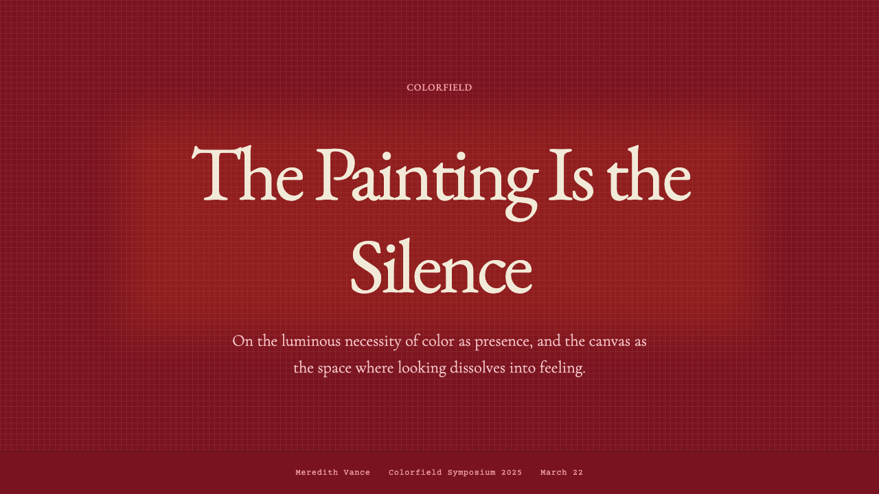
For presentation slides, the style works with particular authority on cover and section-divider pages. A cover designed in this tradition gives the full slide surface over to a single deep color field — burgundy, warm orange, or cream — with the title set in a classical serif at a generous scale, sitting low in the composition as Rothko's rectangles typically sat below center. Content slides should preserve the palette's contemplative quality through restraint: limited text per slide, large type, and substantial empty space treated as color rather than as absence. Data visualization in this style works best when charts are treated as geometric forms in their own right — bars and areas filled with palette colors at full saturation, no grid lines, generous padding that lets each element occupy its own territory.在演示文稿中,这种风格在封面与章节分隔页上具有特别的权威感。以这一传统设计的封面,将幻灯片的整个表面让给单一深色域——酒红、暖橙或奶油色——标题以古典衬线体以宽裕的尺度排列,位于构图偏低处,正如罗斯科的矩形通常位于中心偏下的位置。内容页应通过克制保持调色板的沉思品质:每页文字有限,字号大,留有充足的空白——将其作为色彩而非缺席来对待。以这种风格处理数据可视化,最有效的方式是将图表视为独立的几何形态——柱条与色域以满饱和度填充调色板色彩,无网格线,宽裕的内边距让每个元素占据自己的领地。
For web and digital interfaces, the style is well suited to contexts where gravitas, cultural authority, and emotional depth are valued over information density. Museum microsites, cultural institution landing pages, luxury brand experiences, and premium editorial platforms all benefit from the style's immersive quality. The approach: designate large sections of the page to a single palette color as full-width background, use the classical serif for headings and display text, and allow content to be sparser and more widely spaced than convention suggests. Dashboard and data-product applications can use the palette for section headers, sidebar backgrounds, or hero zones while maintaining conventional density in data tables and charts.对于网页与数字界面,这种风格适合在威严感、文化权威性与情感深度比信息密度更受重视的场景中使用。美术馆微型网站、文化机构落地页、奢侈品牌体验,以及高端编辑平台,均受益于这种风格的沉浸品质。方法如下:将页面的大面积区域指定为单一调色板色彩作为全宽背景,将古典衬线体用于标题与展示文字,允许内容比惯例更稀疏、间距更宽。仪表板与数据产品应用可以在章节标题、侧边栏背景或英雄区域使用这套调色板,同时在数据表格与图表中保持常规的密度。
For editorial and marketing applications, the style supports powerful hierarchy through color-field blocking rather than through typographic complexity. A marketing page can alternate full-width sections between the palette's three primary grounds — burgundy, orange, cream — each carrying a single headline and a brief text passage. The transitions between sections become the visual events, echoing the soft edges between Rothko's painted rectangles. Print editorial work benefits similarly: a feature opener that gives an entire spread to a single color field with one line of classical serif type set across it creates a pacing pause that orients the reader before the main text begins.对于编辑与营销应用,这种风格通过色域分块而非排版复杂性支持强大的层级感。一个营销页面可以在调色板三种主色底面之间交替排列全宽区块——酒红、橙、奶油色——每块承载一行标题与一段简短文字。区块之间的过渡成为视觉事件,呼应罗斯科画作矩形之间的柔边。印刷编辑内容同样受益:一个专题开篇将整个跨页让给单一色域,配以一行横跨其上的古典衬线字体,在正文开始之前创造一个定向读者的节奏停顿。
The most common mistake when applying this style is underdoing the color — using the palette at reduced saturation or small scale, then compensating with conventional design elements that undermine the style's core logic. Rothko's canvases worked because the color had nowhere to escape; it was total. A burgundy sidebar on a white page is not Rothko Color Field. A second frequent error is mixing the saturated palette with contemporary sans-serif typography, which breaks the period register and produces a hybrid that carries neither the warmth of the historical reference nor the clarity of a modern system. The classical serif is not decorative here — it is structural to the aesthetic.应用这种风格时最常见的错误,是降低色彩的饱和度——以低饱和度或小面积使用调色板,再以传统设计元素作补偿,从而破坏了这种风格的核心逻辑。罗斯科的画布之所以有效,是因为色彩无处逃脱;它是整体的。白色页面上的一条酒红侧边栏不是罗斯科色域风格。第二个常见错误是将饱和调色板与当代无衬线字体混用,打破了时代语调,产生一种既缺乏历史参照温度又缺乏现代系统清晰度的混杂物。古典衬线体在这里不是装饰性的——它对这一美学而言是结构性的。
A third error worth noting is treating the soft-edge effect as a technical effect to be applied uniformly, rather than as a considered choice about where color areas should meet. Blurred edges everywhere produce visual noise; the effect is most powerful when reserved for the transitions between major color zones and suppressed within those zones, where the color should feel flat, deep, and settled.
See the Mark Rothko Color Field (1950) design system查看 Mark Rothko Color Field (1950) 完整设计系统
Mark Rothko Color Field (1950) — FAQMark Rothko Color Field (1950) · 常见问题
Does this style require literal soft-glow or blur effects to be authentic?这种风格需要字面意义上的发光或模糊效果才算正宗吗?
Not necessarily. The soft edges in Rothko's paintings result from his painting technique — thin, layered washes that diffuse the boundary between adjacent color zones. In digital work, that quality can be achieved through actual blurred transitions, but it can also be suggested through careful color adjacency: placing warm tones next to warm tones so that the boundary is felt as gentle rather than harsh, even when it is technically hard. What matters is that the color areas feel settled and absorbed rather than placed and bounded. A design that achieves that quality through thoughtful palette pairing and generous scale is more authentically Rothko in spirit than one that simply applies a blur filter to every color boundary.未必。罗斯科画作中的柔边源自他的绘画技法——薄透的层叠涂抹使相邻色彩区域的边界趋于扩散。在数字作品中,这种品质可以通过实际的模糊过渡来实现,但也可以通过谨慎的色彩邻接来暗示:将暖调与暖调相邻,使边界感觉柔和而非强硬,即便技术上是硬边。重要的是色彩区域感觉是沉淀与被吸收的,而非被放置与被边界框定的。一个通过周到的调色板搭配与宽裕的尺度实现这种品质的设计,在精神上比单纯对每条色彩边界应用模糊滤镜更贴近罗斯科的本意。
Can this style work in a dark mode or light mode interface?这种风格能用于深色或浅色模式界面吗?
The palette as historically sourced is warm-ground: the canonical Rothko Color Field draws on burgundy, orange, and cream, which means the 'light mode' is actually a warm cream rather than a neutral white, and the 'dark mode' is a deep wine red or near-black burgundy rather than a conventional dark gray. Both work, but they produce very different registers. The cream and orange palette is expansive and warm — receptive. The deep burgundy and plum palette, as seen in the Rothko Chapel paintings, is more absorbing and severe. For digital products, the decision between the two should track the emotional register desired: the warm-light version for openness and cultural warmth, the deep-dark version for gravitas, luxury, or contemplative depth.从历史来源看,这套调色板以暖色为底面:典型的罗斯科色域风格以酒红、橙与奶油色为基础,这意味着「浅色模式」实际上是暖奶油色而非中性白,「深色模式」是深酒红或近黑色的勃艮第红,而非惯常的深灰色。两者均可行,但产生截然不同的情感语调。奶油与橙的调色板是开放的、温暖的——具有接纳感。深酒红与梅紫调色板,如罗斯科礼拜堂画作所见,则更具吸附感与严肃性。对于数字产品,两者之间的选择应与所期望的情感语调对应:暖浅色版本适合开放感与文化温度,深暗版本适合威严感、奢华感或沉思深度。
How does this style differ from other color-field or minimalist aesthetics like Swiss Style or contemporary flat design?这种风格与瑞士风格或当代扁平设计等其他色域或极简美学有何不同?
Swiss International Style and contemporary flat design both reduce visual complexity, but their underlying logic is organizational rather than emotional. Swiss Style uses grid rigor and typographic precision to create clarity; flat design uses simplified illustration and bold primary colors to achieve approachability and speed. Rothko Color Field, by contrast, is not primarily interested in clarity or speed — it is interested in saturation, depth, and duration. The palette is warmer and more specific than Swiss primaries; the typography is classical and serif rather than geometric and sans-serif; the spatial logic is immersive rather than informational. Where Swiss Style and flat design direct the eye, Rothko Color Field absorbs it.瑞士国际主义风格与当代扁平设计都减少了视觉复杂性,但其底层逻辑是组织性的而非情感性的。瑞士风格通过网格严谨性与排印精度创造清晰感;扁平设计通过简化插图与大胆三原色实现亲近感与速度感。相比之下,罗斯科色域风格的首要关切并非清晰或速度——它关注的是饱和度、深度与时间的延续。调色板比瑞士三原色更温暖、更具体;字体是古典衬线而非几何无衬线;空间逻辑是沉浸式的而非信息性的。瑞士风格与扁平设计引导目光,罗斯科色域风格则将其吸纳。
Is this style appropriate for brands that need to communicate warmth and human connection?这种风格适合需要传达温暖感与人文连接感的品牌吗?
The style carries warmth in its palette — wine burgundy and orange are among the warmest tones in painting's historical vocabulary — but it is a particular kind of warmth: dignified, contemplative, and somewhat austere. It suits brands that want to project cultural depth, seriousness of purpose, and refined taste rather than casual friendliness or playful energy. A museum, a publisher of serious nonfiction, a high-end hospitality brand, or a financial institution positioning itself as an enduring institution rather than a nimble startup would all benefit from this register. Brands that need to communicate lightness, humor, accessibility, or youth should look elsewhere — the style's deliberate slowness and saturated gravity do not accommodate those values.这种风格的调色板确实携带温暖感——酒红与橙色是绘画历史词汇中最温暖的色调之列——但它是一种特殊的温暖:庄重的、沉思的,带有几分肃穆。它适合希望传达文化深度、目的严肃性与精炼品味的品牌,而非随意的友好感或嬉戏活力。美术馆、严肃非虚构出版商、高端款待品牌,或将自身定位为经久机构而非灵活初创公司的金融机构,均可从这种语调中获益。需要传达轻盈感、幽默感、亲近感或年轻感的品牌应另寻他处——这种风格刻意的缓慢节奏与饱和的分量感无法容纳这些价值。
How many colors from the palette should be used simultaneously in a single composition?在单一构图中应同时使用调色板中的几种色彩?
Rothko himself typically used two or three colors per canvas, and the relational tension between them — the way a warm orange sitting above a deep burgundy changes both colors — was the core content of the work. Design compositions should follow the same discipline: two or three palette colors per layout, used in large fields, with one dominating and the others in secondary roles. Using all three palette colors at equal proportion eliminates the hierarchy that makes the system readable. The most effective single-surface compositions — a slide, a landing page section, a poster — will designate one color as ground, a second as a large secondary zone, and treat the third sparingly if at all.罗斯科本人每幅画布通常使用两到三种色彩,而它们之间的关系张力——暖橙叠于深酒红之上时两种色彩相互改变的方式——是作品的核心内容。设计构图应遵循同样的法则:每个版面两到三种调色板色彩,以大面积色域使用,其中一种占主导,其他作为次要角色。以等比例同时使用全部三种调色板色彩,会消除使这套系统可读的层级感。最有效的单一表面构图——一张幻灯片、一个落地页区块、一幅海报——将指定一种色彩为底面,第二种为大面积次要区域,第三种则极为节制地使用,甚至不使用。
Related design styles相关设计风格
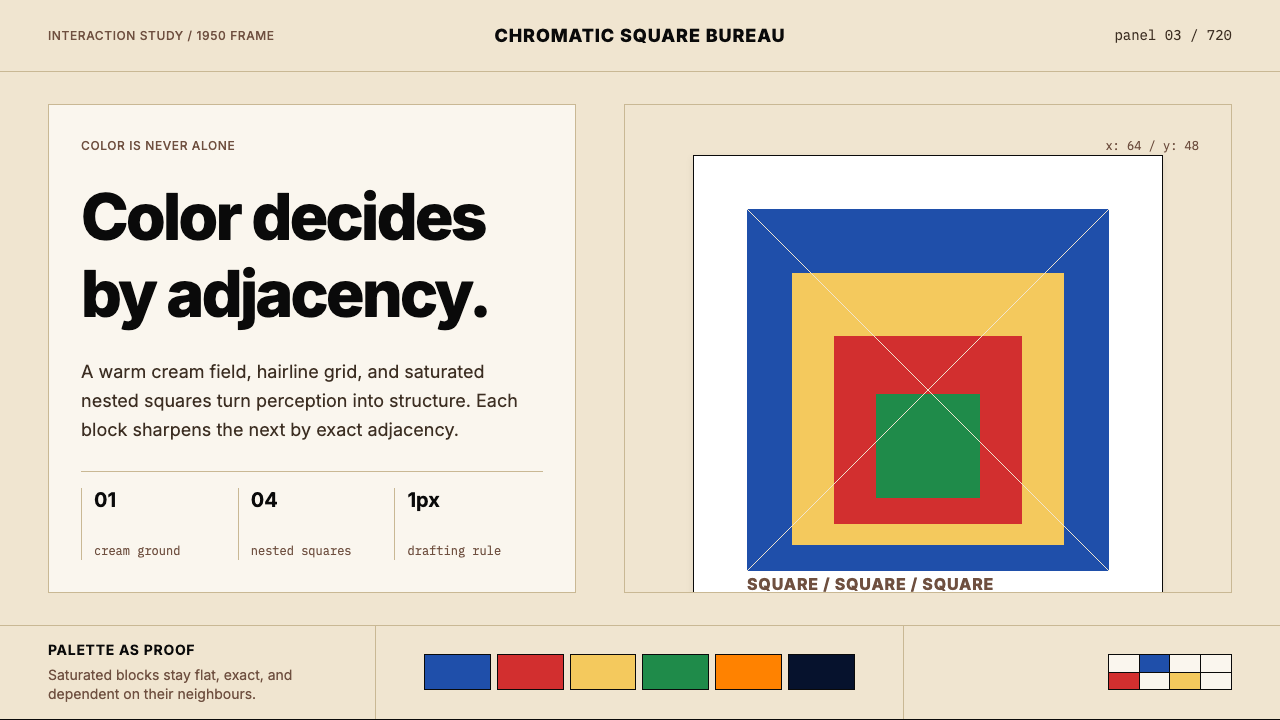 Josef Albers — Homage to the SquareColor becomes event. Warm cream, cobalt-red-yellow nested squares, exact hair…色彩成为事件。暖米底、钴蓝红黄嵌套方块与精确发丝线。
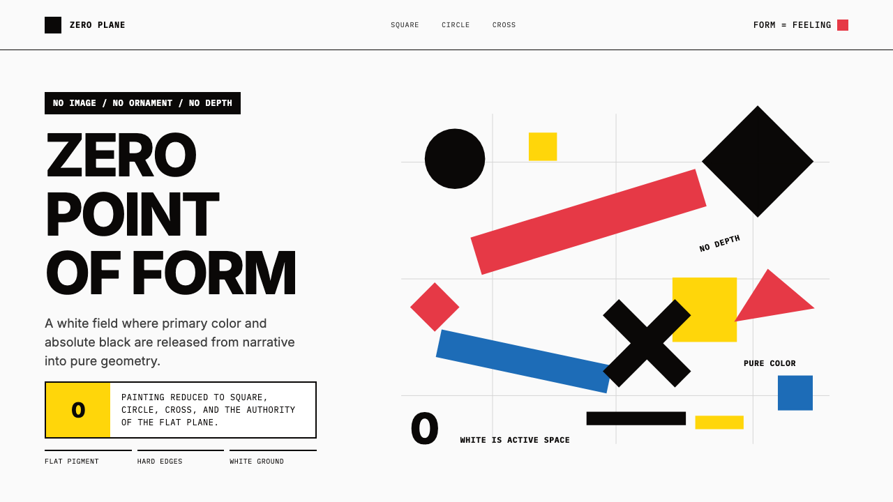 Malevich SuprematismGeometry declares zero. Red, yellow, blue and black blocks float on active wh…几何宣告零点:红黄蓝黑色块漂浮于主动白场。
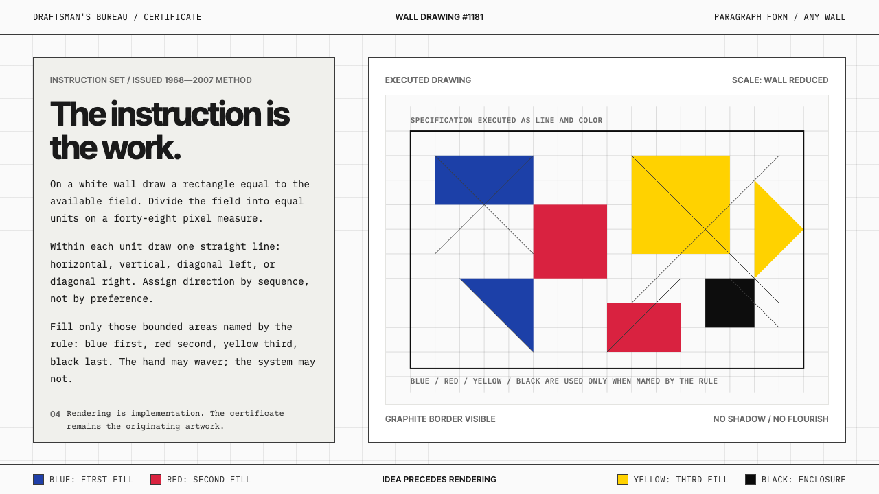 Sol LeWitt ConceptualInstruction becomes art. Mono certificates face wavering graphite grids in fo…指令即艺术:等宽证书对照颤动石墨网格与四色规则。
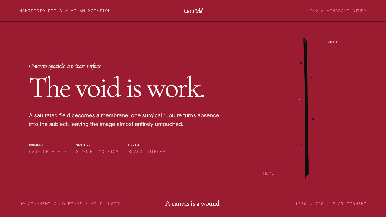 Spatialism (Fontana Cut, 1949)Absence becomes medium. Carmine field, Garamond restraint, one black incision.缺席成为媒介:胭脂红色场、Garamond克制排版、一道黑色切口。
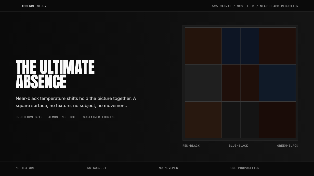 Ad Reinhardt Black Painting (1953)Austere absence. Near-black grid shifts reveal structure on sustained looking.苦行式缺席。近黑网格只在持续凝视中显形。
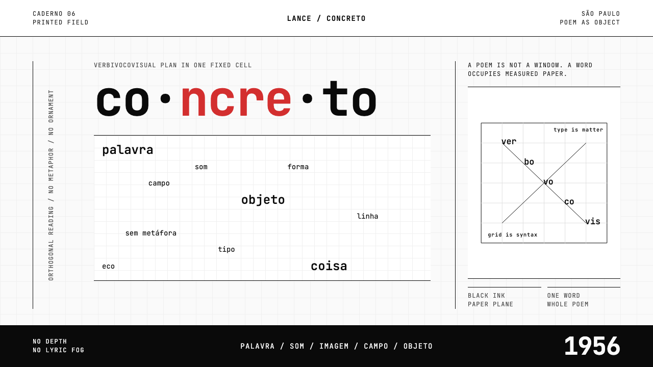 Brazilian Concrete PoetryWords become objects. Monospace cells, black-white paper, one cadmium red rup…字成为物。等宽格、黑白纸面,一处镉红断裂。