What is Josef Albers — Homage to the Square?什么是 Josef Albers — Homage to the Square?
Josef Albers spent twenty-six years painting nested squares to prove that color is not a fixed property but a living event created by the eye and its neighbors.约瑟夫·阿尔伯斯用二十六年时间画嵌套方块,只为证明一件事:颜色不是固定的属性,而是眼睛与相邻颜色共同制造的感知事件。
Josef Albers — Homage to the Square in briefJosef Albers — Homage to the Square 速览
Josef Albers — Homage to the Square is a design language derived from the most sustained single-series painting project of the twentieth century. Between 1950 and 1976, Albers produced more than a thousand paintings on the same formal premise: three or four concentric squares, nested according to a precise internal geometry, painted in fully saturated color on a warm cream gesso ground. No brushwork was visible. No texture. No narrative. The only variable was color — and through that single variable, Albers demonstrated that color perception is fundamentally relational.「约瑟夫·阿尔伯斯——向方形致敬」是一套从二十世纪最持久的单一系列绘画项目中提炼出的设计语言。1950至1976年间,阿尔伯斯依照同一形式前提创作了逾千幅画作:三或四个同心嵌套的方块,遵循精确的内部几何关系排布,以完全饱和的颜色绘制在暖米色石膏底上。笔触不可见,无纹理,无叙事。唯一的变量是颜色——而通过这一个变量,阿尔伯斯证明了色彩感知从根本上是一种关系性存在。
Translated into a visual system, the style reads as rigorous Bauhaus-modernist discipline applied to chromatic exploration. The foundation is a warm cream or off-white ground. Geometric forms — always rectilinear, always crisp — sit without shadows or depth simulation. A small palette of fully saturated chromatic colors is used in nested or adjacent configurations, so that each color modifies the apparent temperature, weight, and brightness of every color beside it. The effect is simultaneously scientific and sensory: the compositions feel tuned rather than decorated.转化为视觉系统后,这种风格呈现出严谨的包豪斯现代主义纪律与色彩探索的结合。底色是暖米色或近白色。几何形态——始终是直角边、始终轮廓清晰——不带任何投影或深度模拟地浮现其上。一小组完全饱和的色块以嵌套或相邻的方式出现,使得每一种颜色都改变着相邻颜色的视觉温度、重量与明度。效果同时是科学的与感官的:这些构图看起来像是被精确调校过,而非被装饰过。
Unlike many mid-century modernist styles, this one carries an explicit pedagogical dimension. Albers published his landmark book Interaction of Color in 1963, which documented with reproducible experiments how the same gray appears warm or cool depending on its surroundings, how a small area of color can appear to vibrate against a complementary neighbor, how the eye can be made to see colors that are not present. The design system inherits this spirit: every color decision is understood as an argument, not an accident.与许多中世纪现代主义风格不同,这一风格携带着明确的教学维度。阿尔伯斯于1963年出版了里程碑式的著作《色彩构成》,以可重复的实验记录了以下现象:同一灰色因周围环境不同而显暖或显冷;小面积色块可与互补色邻居产生振动感;眼睛甚至可以看见并不存在的颜色。这套设计系统继承了这种精神:每一个色彩决定都被视为一个论点,而非一次意外。
Where does Josef Albers — Homage to the Square come from?Josef Albers — Homage to the Square 从何而来?
Josef Albers was born in 1888 in Bottrop, Germany, and trained as a primary school teacher before studying at the Royal Art School in Berlin. He arrived at the Bauhaus in Weimar in 1920 as a student and became one of the few students ever promoted to the rank of master. He ran the preliminary course alongside László Moholy-Nagy and eventually directed the furniture workshop. When the Nazis closed the Bauhaus in 1933, Albers was among the first faculty invited to teach in the United States — at Black Mountain College in North Carolina, an experimental liberal arts institution that had gathered many of the European modernist emigres of the period.约瑟夫·阿尔伯斯1888年生于德国波特罗普,受训为小学教师后赴柏林皇家艺术学校深造。1920年,他以学生身份进入魏玛包豪斯,成为极少数晋升为大师级别的学生之一。他与拉兹洛·莫霍利-纳吉共同执教基础课程,并最终主持家具工坊。1933年纳粹关闭包豪斯后,阿尔伯斯是最早获邀赴美执教的教职人员之一——目的地是北卡罗来纳州的黑山学院,那所实验性文理学院汇聚了大批流亡美国的欧洲现代主义者。
Black Mountain College proved to be the crucible. Without the institutional structure of a European art academy, Albers was free to concentrate his pedagogy almost entirely on perception and the experience of color. He taught there from 1933 to 1949, and it was during this period that the ideas that would generate the Homage to the Square series fully matured. In 1950, the year he accepted a position as head of the design department at Yale University — where he would remain until 1960 — he began the series. The formal constraint was deliberate: by fixing everything except color, Albers created a controlled experiment that could run for decades.黑山学院是真正的熔炉。脱离欧洲艺术学院的体制框架,阿尔伯斯得以将教学几乎全部集中于感知与色彩体验。他在那里执教至1949年,正是在这段时期,日后催生「向方形致敬」系列的全部思想趋于成熟。1950年,他接受耶鲁大学设计系主任职位(并在那里工作至1960年),同年开始了这一系列创作。形式约束是刻意为之的:通过固定除颜色之外的一切变量,阿尔伯斯创造了一个可以运行数十年的受控实验。
The Homage to the Square series is inseparable from its publication companion. When Yale University Press published Interaction of Color in 1963, it was issued as a limited portfolio edition with hand-silkscreened color plates — each plate a physical demonstration of a perceptual principle. The book became one of the most influential texts in design education of the twentieth century, and its arguments directly shaped how subsequent generations of designers understood color relationships. The series and the book are best understood together: the paintings are the data, the book is the analysis.「向方形致敬」系列与它的出版伴侣密不可分。1963年,耶鲁大学出版社出版《色彩构成》,初版为限量版作品集,附手工丝网印刷彩色图版——每张图版本身就是一个感知原理的物理演示。这部著作成为二十世纪设计教育中最具影响力的文本之一,其论点直接塑造了后续几代设计师对色彩关系的理解。系列绘画与这部著作应被视为一个整体:画作是数据,书是分析。
Albers died in 1976 in New Haven, Connecticut — the same year the Homage to the Square series concluded. The Josef and Anni Albers Foundation, established to preserve and extend the legacy of both Josef and his wife Anni, a pioneering textile artist and weaver, has since documented the complete series. Anni Albers, who was herself a Bauhaus-trained artist, brought parallel rigor to the study of woven structure and surface, and the two together represent one of the most complete explorations of visual perception and material honesty in the history of modern design.阿尔伯斯于1976年在康涅狄格州纽黑文辞世——恰好是「向方形致敬」系列终结的同一年。约瑟夫与安妮·阿尔伯斯基金会此后对完整系列进行了系统整理。安妮·阿尔伯斯是同样受训于包豪斯的艺术家,一位先驱性的纺织艺术家与织造师,她以平行的严谨态度投身于编织结构与表面的研究。两人共同构成现代设计史上对视觉感知与材料诚实最完整的探索之一。
What defines the Josef Albers — Homage to the Square look?Josef Albers — Homage to the Square 的视觉特征是什么?
Nested Concentric Squares同心嵌套方块
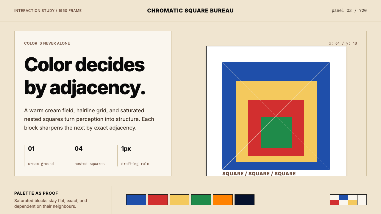
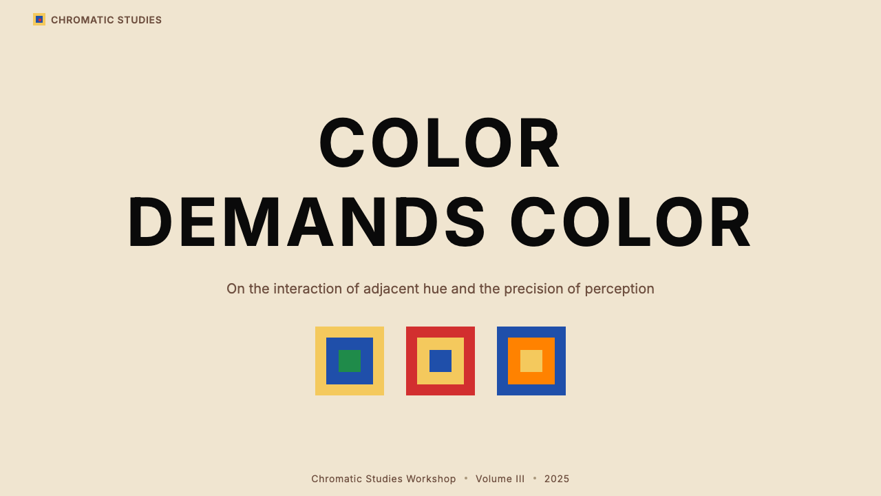
The defining compositional element is three or four squares arranged concentrically, each inset from the one outside it according to a fixed proportional system. The squares are never centered on the canvas; Albers positioned the inner square slightly lower and toward the center, creating an upward visual lift. This specific asymmetric nesting is what separates the style from generic geometric abstraction — the geometry is not arbitrary but precisely calibrated to control how the eye moves through the color relationships.最核心的构图元素是三或四个同心方块,每个方块依据固定比例系统内嵌于外侧方块之中。这些方块在画布上并非完全居中——阿尔伯斯将内侧方块稍微向下、向中心偏置,制造出一种向上的视觉提升感。这种特定的非对称嵌套,是将这一风格与泛泛几何抽象区分开来的关键:几何关系不是任意的,而是经过精确校准,以控制眼睛在色彩关系间的游走方式。
Warm Cream Ground暖米色底
The ground is never pure white. Albers worked on a warm cream gesso, and this ground color is active — it is the outermost color in the compositional system and interacts with all the chromatic squares inside it. In interface translation, the background reads as warm off-white rather than neutral white, and this distinction is perceptually significant: it prevents the overall composition from feeling clinical or inert, and it causes all other colors present to appear slightly warmer and more luminous than they would on a cold white ground.底色从不是纯白色。阿尔伯斯在暖米色石膏底上作画,这个底色是主动的——它是构图系统中最外层的颜色,与内部所有色块发生相互作用。在界面转化中,背景呈现为暖调的近白色,而非中性白色。这一区别在感知层面意义重大:它防止整体构图产生临床感或惰性感,并使画面中所有其他颜色看起来比在冷白色底上更温暖、更明亮。
Saturated Chromatic Palette高饱和色板
The chromatic colors used in the series are fully saturated — not muted, not pastel, not tinted. Albers favored colors at or near their maximum chroma: cobalt blue, cadmium red, cadmium yellow, emerald green, deep violet, and warm orange appear across the series. The key design decision is not which colors to include but which two or three to place in adjacency, because the perceptual effect of the whole depends almost entirely on the specific color relationships rather than on any individual color considered in isolation.系列中使用的色彩是完全饱和的——不是灰调的,不是粉彩,不是浅淡的。阿尔伯斯偏好处于或接近最高纯度的颜色:钴蓝、镉红、镉黄、翡翠绿、深紫、暖橙贯穿整个系列。关键的设计决策不是纳入哪些颜色,而是将哪两三种颜色置于相邻关系中——因为整体的感知效果几乎完全取决于具体的色彩关系,而非孤立考察的任何单个颜色。
Hairline Edges and Zero Radius发丝边缘与零圆角
Every boundary between color areas is a crisp, hard edge with no softening, blending, or anti-aliasing beyond what the medium requires. There are no rounded corners. The precision of these edges is what generates the perceptual intensity of the color interactions — a blurred or softened edge would dissipate the relational effect. In digital application, this means absolutely no border-radius on chromatic elements, no gradient transitions between color areas, and no glow or bloom effects at boundaries.色彩区域之间的每一条边界都是清晰的硬边,没有柔化、混合或超出媒介本身需要的过渡处理。没有圆角。这些边缘的精确度正是生成色彩相互作用感知强度的原因——模糊或柔化的边缘会消散这种关系效果。在数字应用中,这意味着色彩元素上绝对不使用圆角,色彩区域之间不使用渐变过渡,边界处不使用发光或光晕效果。
Typographic Restraint字体排印的克制
Where typography appears in Albers-derived work, it follows the Bauhaus lineage he was trained in: geometric sans-serif letterforms, set with deliberate spacing and strong scale contrast between hierarchical levels. No decorative typefaces, no script, no display faces with historical references. Text is treated as a structural element in the same grid as the geometric forms — it neither competes with the color relationships nor retreats into invisibility, but holds a clear functional position.在阿尔伯斯风格衍生作品中出现字体时,它遵循他所受训的包豪斯传统:几何无衬线字形,以刻意的字距排布,层级之间形成强烈的大小对比。不使用装饰性字体,不使用书法体,不使用带有历史典故的展示字体。文字被视为与几何形态同处一个网格中的结构性元素——它既不与色彩关系竞争,也不退隐到不可见的程度,而是占据清晰的功能性位置。
Flat Surfaces and No Depth Simulation平面与无深度模拟
There are no drop shadows, no cast shadows, no simulated three-dimensionality of any kind. The apparent depth that viewers perceive in Homage to the Square compositions — some inner squares appear to advance toward the viewer while others recede — is generated entirely by color relationships, not by spatial illusion. In interface design, this principle means achieving visual hierarchy through color temperature and saturation contrast rather than through shadow, elevation, or z-axis metaphors.没有投影,没有铸影,没有任何形式的三维模拟。观者在「向方形致敬」中感知到的视觉深度——某些内层方块似乎向前突出,另一些则向后退缩——完全由色彩关系生成,而非空间幻觉。在界面设计中,这一原则意味着通过色彩温度与饱和度对比来实现视觉层级,而非依赖投影、海拔感或Z轴隐喻。
Relational Color Logic关系性色彩逻辑
The most distinctive intellectual contribution of the Albers system is the explicit understanding that no color exists independently. Every color choice is simultaneously a choice about all neighboring colors. A cobalt blue square looks entirely different when nested inside cadmium red than when nested inside warm yellow — not because the blue has changed but because perception is comparative. Applied design that takes this seriously treats the color palette as a relational system: each color is selected not only for its own qualities but for what it does to the colors it touches.阿尔伯斯系统最独特的思想贡献,是对「没有颜色独立存在」的明确理解。每一个色彩选择同时也是关于所有相邻颜色的选择。钴蓝方块嵌套在镉红内时,与嵌套在暖黄内时,看起来截然不同——不是因为蓝色本身改变了,而是因为感知是比较性的。认真对待这一点的应用设计,将色板视为一个关系性系统:每种颜色的选择不仅基于其自身品质,还基于它对所接触颜色的影响。

Who shaped Josef Albers — Homage to the Square?谁塑造了 Josef Albers — Homage to the Square?
Albers was simultaneously a practicing painter, a design educator, and a theorist of perception. Trained at the Bauhaus under Paul Klee and Wassily Kandinsky, he absorbed the school's foundational rigor and then spent the rest of his career extending its color implications beyond what the Bauhaus itself had explored. At Black Mountain College and Yale, he taught an entire generation of American designers, architects, and artists — including Eva Hesse, Robert Rauschenberg, and Kenneth Noland — to think about color as a relational, perceptual, and argumentative phenomenon rather than as a property of pigment.阿尔伯斯同时是一位执业画家、设计教育者与感知理论家。他在包豪斯受训于保罗·克利和瓦西里·康定斯基门下,吸收了学校的基础严谨性,此后用整个职业生涯将其色彩蕴涵延伸至包豪斯本身从未探索的领域。在黑山学院和耶鲁大学,他培养了整整一代美国设计师、建筑师和艺术家——包括伊娃·黑塞、罗伯特·劳森伯格和肯尼斯·诺兰——使他们将色彩理解为一种关系性的、感知性的、论辩性的现象,而非颜料的物理属性。
Anni Albers was Josef's wife and an equally rigorous artist in her own right — a textile designer and weaver trained at the Bauhaus women's workshop, where she elevated weaving from craft to art through systematic investigation of structure, material, and surface. Her 1965 book On Weaving remains a foundational text. The Josef and Anni Albers Foundation that administers both their legacies reflects the deep intellectual collaboration that defined their shared practice: both were committed to understanding perception through constraint, repetition, and material honesty.安妮·阿尔伯斯是约瑟夫的妻子,也是同样严谨的独立艺术家——一位受训于包豪斯女子工坊的纺织设计师与织造师,她通过对结构、材料与表面的系统性探究,将织造从工艺提升为艺术。她1965年出版的《论织造》至今仍是基础性文本。负责管理两人遗产的约瑟夫与安妮·阿尔伯斯基金会,体现了定义他们共同实践的深刻智识合作:两人都致力于通过约束、重复与材料诚实来理解感知。
Kandinsky's Bauhaus-period theory of color-shape correspondence — which Albers encountered firsthand as a student and then colleague — provided one of the key intellectual foundations for the Homage to the Square project. Where Kandinsky sought to establish fixed emotional equivalences between colors and forms, Albers pushed back experimentally, demonstrating that apparent color properties shift with context. The Homage to the Square series can be read in part as a respectful but empirically rigorous rebuttal to Kandinsky's more symbolic approach.康定斯基在包豪斯时期的色彩-形态对应理论——阿尔伯斯作为学生和同事亲身接触过——为「向方形致敬」项目提供了重要的智识基础之一。康定斯基试图在颜色与形态之间建立固定的情感等价关系,而阿尔伯斯则以实验的方式提出质疑,证明色彩的表观属性会随语境变化。「向方形致敬」系列可以被部分解读为对康定斯基更具象征性方法的一次恭敬却实证严谨的反驳。
Klee was a Bauhaus master who taught alongside Albers, and his influence on Albers was direct and lasting. Klee's approach to color — which treated it as a living substance with internal logic rather than a fixed code — resonated deeply with Albers's own developing sensibility. Klee's Pedagogical Sketchbook and his Bauhaus courses on visual thinking helped establish the intellectual climate in which the questions Albers would spend his career answering were first seriously posed.克利是与阿尔伯斯并肩执教的包豪斯大师,他对阿尔伯斯的影响是直接而持久的。克利对色彩的态度——将其视为具有内在逻辑的活性物质,而非固定的符码——与阿尔伯斯正在形成的感性深度共鸣。克利的《教学素描簿》及其关于视觉思维的包豪斯课程,帮助确立了那个智识氛围——在那个氛围中,阿尔伯斯日后毕生致力于回答的问题被首次严肃提出。
Judd, the American minimalist sculptor and critic, engaged directly with Albers's work and shared its commitment to seriality, material precision, and the rejection of expressionistic gesture. Judd's boxes and stacks — industrial forms in precise chromatic surfaces — can be understood as a three-dimensional extension of the same inquiry that Albers conducted on the picture plane. Judd's critical writing also helped establish the theoretical framework within which the Homage to the Square series was received as rigorous intellectual work rather than decorative painting.美国极简主义雕塑家与批评家贾德与阿尔伯斯的作品直接对话,并分享了其对序列性、材料精确性以及拒绝表现主义姿态的承诺。贾德的盒子与堆叠——以精确色彩表面呈现的工业形态——可以被理解为对阿尔伯斯在画平面上所进行的同一探究的三维延伸。贾德的批评写作也帮助建立了理论框架,使「向方形致敬」系列作为严谨的智识工作而非装饰性绘画被接受。
How do you use Josef Albers — Homage to the Square today?今天怎么用 Josef Albers — Homage to the Square?
Applying the Albers — Homage to the Square system to designed artifacts requires committing to its core logic: color relationships do the work, and everything else exists to support those relationships. This means the background color, the border colors, and the accent colors must all be chosen as a relational set, not selected independently and then assembled. The designer's task is to compose a color argument, not to fill a palette.将阿尔伯斯「向方形致敬」系统应用于设计作品,需要完全接受其核心逻辑:色彩关系承担工作,其他一切都为支持这些关系而存在。这意味着背景色、边框色与强调色必须作为一个关系集合来选取,而非独立选定后再拼装。设计师的任务是构建一个色彩论点,而非填充一个色板。
For presentation slides, the style produces some of its strongest results on cover and section-divider pages. A cover built in this system places one large color field — a fully saturated block at the center or anchoring a corner — against the warm cream ground, then nests a contrasting inner block within it. The title and subtitle sit in clean geometric type, with scale used as the primary hierarchy signal. Content slides should be simpler: the warm ground stays consistent, structured colored blocks highlight key data or quotations, and section indicators use the nested square motif reduced to a small navigational marker. Data slides translate naturally — bar charts and table headers become geometric color objects governed by the same relational palette, so the data visualization and the slide design share a visual grammar.在演示文稿中,这一风格在封面与章节分割页上产生最强的效果。用这套系统构建的封面,将一个大面积色块——完全饱和的方块,居中或锚定一个角落——置于暖米色底上,然后在其中嵌套一个对比色内块。标题与副标题以简洁的几何字体呈现,以大小作为主要层级信号。内容页应当更为简洁:暖色底保持一致,结构性色块突出关键数据或引用语,章节指示符将嵌套方块母题缩减为小型导航标记。数据页面自然衔接——柱状图与表格标题成为受同一关系色板支配的几何色彩对象,使数据可视化与幻灯片设计共享同一视觉语法。
For web interfaces, the style is best deployed in contexts where analytical clarity and intellectual authority are the intended impression: dashboards, documentation sites, pricing and comparison pages, academic or research platforms. The approach begins with the background: a warm near-white rather than pure white. Primary navigation and structural dividers use fine lines rather than color fills. Chromatic colors — fully saturated, used sparingly — appear in interactive states, category tags, alert indicators, and tier differentiation. Card components are bordered with crisp lines and zero radius. Hover states shift color temperature or saturation rather than adding depth or shadow. The result is a UI that feels precise and considered rather than decorated.对于网页界面,这一风格最适合部署在分析清晰度与智识权威感为预期印象的场景中:仪表板、文档站点、定价与对比页面、学术或研究平台。着手点是背景色:暖调的近白色而非纯白色。主导航与结构性分割线使用细线而非色彩填充。完全饱和、使用克制的色彩出现在交互状态、分类标签、警示指示符与等级区分中。卡片组件以清晰线条描边,圆角为零。悬停状态通过改变色彩温度或饱和度响应,而非增加深度或投影。结果是一个感觉精确、经过深思熟虑而非被装饰的界面。
For editorial and marketing work, the system supports bold, poster-like compositions that age well. A feature spread or marketing section page works by treating the layout itself as a nested structure: a full-width colored band contains a secondary block in a contrasting color, and the typography sits within that inner field. Pull quotes and call-out figures can be given their own chromatic blocks, making the information hierarchy visually immediate. Marketing pages using this system benefit from restraint in the number of distinct colors used: two chromatic colors and the warm ground will be more powerful than four or five colors competing for attention.对于编辑与营销内容,这套系统支持大胆的、海报式的、经得住时间检验的构图。一个特色展开页或营销章节页的处理方法,是将版面本身视为一个嵌套结构:一条全宽色带内含一个对比色的次级色块,而文字排布于那个内层色场中。引用语与标注数字可以拥有各自的色块,使信息层级在视觉上立即可读。使用这一系统的营销页面,从色彩数量上的克制中获益:两种色彩加上暖色底,比四五种颜色相互竞争更具力量。
A common mistake when working in this style is selecting colors for their individual appeal rather than for their relational behavior. A color that looks strong in isolation may weaken or clash when placed inside or beside the colors surrounding it in the composition. The correct method is to evaluate every color only in context — assembled together on the ground color, in the nesting relationship they will actually occupy. A second common error is softening the edges between color areas with gradients or blurs, believing this will make the result feel more refined. It has the opposite effect: the perceptual intensity that gives the style its authority depends on precise, unapologetic hard edges.使用这一风格时最常见的错误,是根据颜色本身的吸引力而非其关系行为来选色。一种孤立时看起来强劲的颜色,放置在构图中周围颜色的内侧或旁边时,可能减弱或产生冲突。正确的方法是只在语境中评估每种颜色——将它们组合在底色上、在它们实际将要占据的嵌套关系中来审视。第二个常见错误是用渐变或模糊来柔化色彩区域之间的边界,以为这会让结果显得更精致。效果恰恰相反:赋予这一风格权威感的感知强度,依赖于精确、无歉意的硬边。
Josef Albers — Homage to the Square — FAQJosef Albers — Homage to the Square · 常见问题
Is this style the same as Bauhaus, or is it something different?这种风格和包豪斯是同一回事吗,还是有所不同?
It shares the Bauhaus lineage — Albers was Bauhaus-trained and the visual DNA is closely related — but the emphasis is different. Classic Bauhaus style uses primary red, blue, and yellow as symbolic carriers of structure, space, and energy, following Kandinsky's color-shape theory. The Albers system is more empirical and less symbolic: it uses fully saturated colors of any hue, and the selection principle is relational rather than hierarchical. Bauhaus color tends to be used declaratively; Albers color is used interrogatively. The result is a system that feels slightly more perceptually alive and less ideologically fixed than canonical Bauhaus work.它共享包豪斯血统——阿尔伯斯受训于包豪斯,视觉DNA高度相关——但侧重点不同。经典包豪斯风格以原色红、蓝、黄作为结构、空间与能量的象征载体,遵循康定斯基的色彩-形态理论。阿尔伯斯系统更具实证性,较少象征性:它使用任何色相的完全饱和颜色,选色原则是关系性的而非层级性的。包豪斯色彩倾向于被声明式地使用;阿尔伯斯色彩被质问式地使用。结果是一个比经典包豪斯作品感觉上更具感知活性、意识形态固定性更少的系统。
How many colors should a composition in this style use?这种风格的构图应该使用多少种颜色?
The Homage to the Square paintings themselves use only two or three chromatic colors per panel — the warm cream ground, and two or three nested color fields. This constraint is not accidental: with more than three chromatic colors, the relational dynamics become too complex to control, and the compositional logic starts to break down. In designed artifacts, this suggests a working palette of one background, one structural or typographic dark, and two chromatic colors at most — with one used more sparingly as a true accent. Using more colors is possible but requires significant experience with relational color work to avoid visual noise.「向方形致敬」的画作本身每幅只使用两到三种色彩——暖米色底加上两三个嵌套色场。这一约束不是偶然的:使用三种以上色彩,关系动态会变得过于复杂而难以控制,构图逻辑开始崩溃。在设计作品中,这意味着工作色板由一个背景色、一个结构性或字体性深色,以及最多两种色彩构成——其中一种更克制地用作真正的强调色。使用更多颜色是可能的,但需要在关系性色彩工作方面积累相当的经验,才能避免视觉噪声。
Can this style work in a dark-mode interface?这种风格能用于深色模式界面吗?
It can, but it requires rebuilding the relational logic from the ground up rather than simply inverting the light version. The warm cream ground is the outermost color in the nested system, and replacing it with a deep neutral changes every color relationship built on top of it. On a dark ground, fully saturated colors tend to feel more aggressive and luminous, which can easily tip into visual instability. A dark-mode Albers-derived system works best when it commits to a very limited chromatic palette — one or two chromatic colors at most — and treats them as deliberate accent against an otherwise achromatic dark structure. The disciplined version is powerful; the undisciplined dark version reads as garish.可以,但需要从头重建关系逻辑,而不仅仅是反转浅色版本。暖米色底是嵌套系统中最外层的颜色,将其替换为深色中性色,会改变建立在其上的所有色彩关系。在深色底上,完全饱和的颜色往往感觉更具攻击性和发光感,很容易倾向于视觉不稳定。深色模式下基于阿尔伯斯的系统,在将色板限制得非常有限时效果最好——最多一两种色彩——并将它们视为相对于其余无彩色深色结构的刻意强调。有纪律的版本是强力的;缺乏纪律的深色版本会显得俗艳。
How does this style handle typography — does it have its own typographic rules?这种风格如何处理字体排印——它有自己的字体规则吗?
The Albers system has no proprietary typeface, but its Bauhaus inheritance implies clear typographic preferences. Geometric sans-serif letterforms are the natural companion to the rectilinear geometry of the squares. Type should be treated with the same structural discipline as the color fields: clear hierarchical levels defined by scale contrast, deliberate spacing, and consistent alignment. The most important rule is that typography should not compete with the color system — it should occupy a distinct functional register, usually in the structural dark or in a neutral field, leaving the chromatic colors free to do their relational work without textual interruption.阿尔伯斯系统没有专属字体,但其包豪斯传承意味着清晰的字体偏好。几何无衬线字形是方块直角几何的自然伴侣。字体应当以与色场同样的结构纪律来处理:以大小对比定义清晰的层级,刻意的字距,一致的对齐。最重要的规则是:字体排印不应与色彩系统竞争——它应当占据一个独立的功能层次,通常在结构性深色或中性色场中,让色彩颜色自由地完成其关系性工作,不受文字的打断。
What kinds of products or brands is this style least suited to?这种风格最不适合哪类产品或品牌?
The Albers style projects intellectual precision, perceptual rigor, and a certain cool authority. These qualities align well with analytical tools, research platforms, design-forward technology products, educational institutions, and premium products that want to signal seriousness rather than warmth. The style struggles in contexts that require organic warmth, tactile richness, or cultural intimacy — food and hospitality brands, children's products, community platforms, wellness and lifestyle applications. It also tends to work poorly for brands that need to feel approachable and unpretentious: the system's intellectual heritage can read as exclusive or demanding. Knowing what values the style embodies is as important as knowing how to execute it technically.阿尔伯斯风格传递的是智识精确性、感知严谨性与某种冷静的权威感。这些品质与分析工具、研究平台、设计导向的科技产品、教育机构以及希望传达严肃性而非温暖感的高端产品高度契合。这种风格在需要有机温暖感、触觉丰富性或文化亲密性的场景中力不从心——餐饮与酒店品牌、儿童产品、社区平台、健康与生活方式应用。对于需要显得平易近人而非自命不凡的品牌,这种风格也往往表现欠佳:系统的智识传承可能被解读为排外或苛求。理解这种风格所承载的价值观,与知道如何技术性地执行它同样重要。
Related design styles相关设计风格
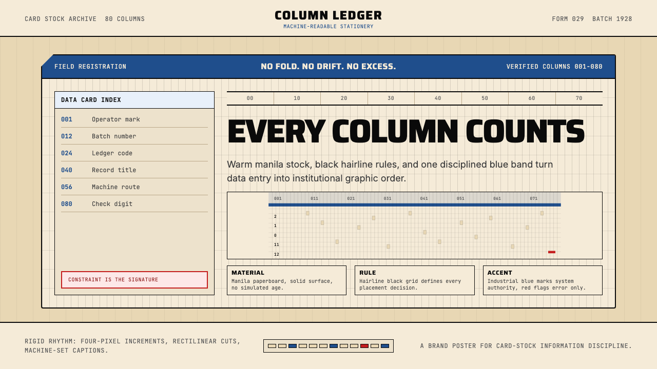 IBM Punchcard 029 (1928)Constraint becomes authority. Manila stock, hairline grid, industrial blue.约束即权威。米黄色卡纸、发丝网格与工业蓝。
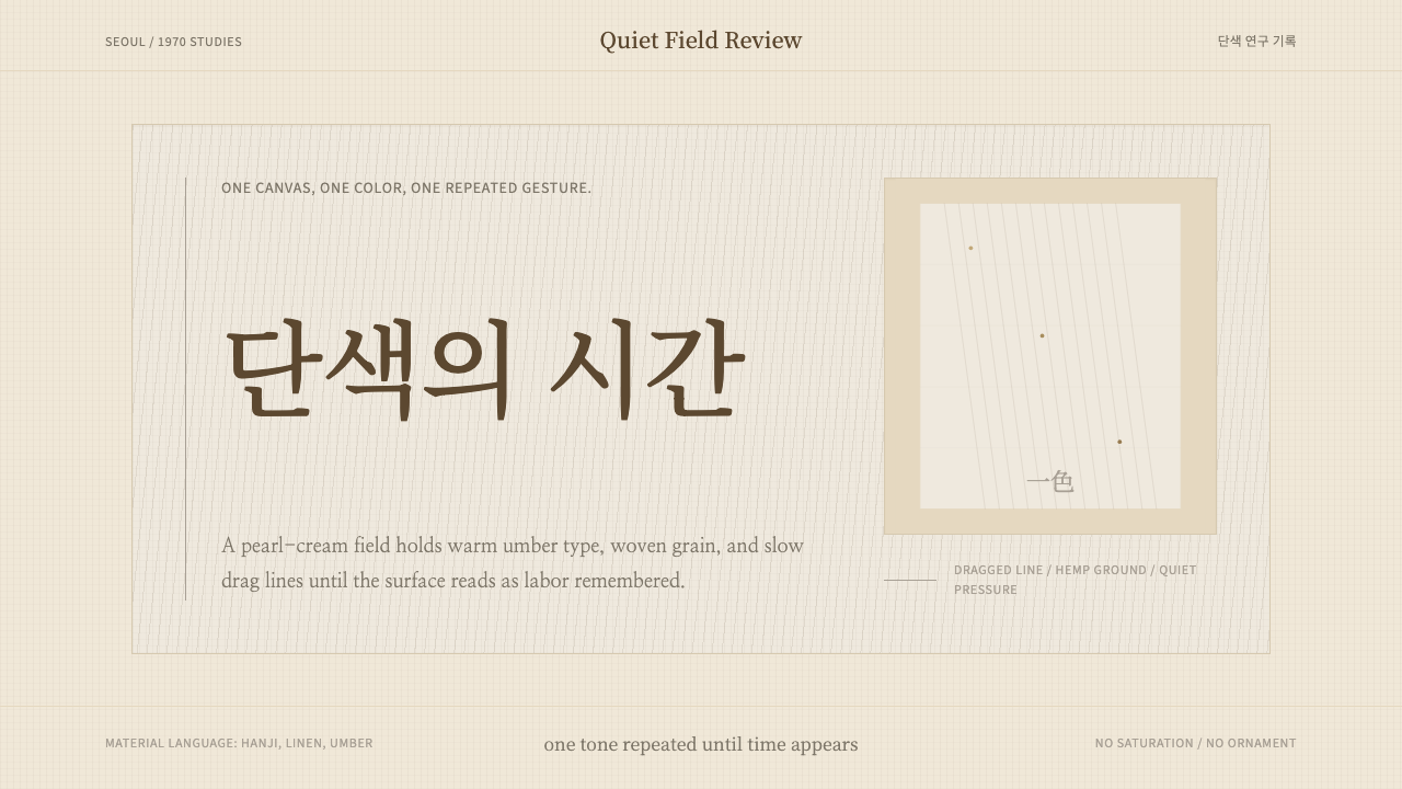 Korean Dansaekhwa MonochromeLabor becomes stillness. Umber serif type and drag lines on pearl cream.劳作化为静默。珍珠米底、褐色衬线和拖痕线条。
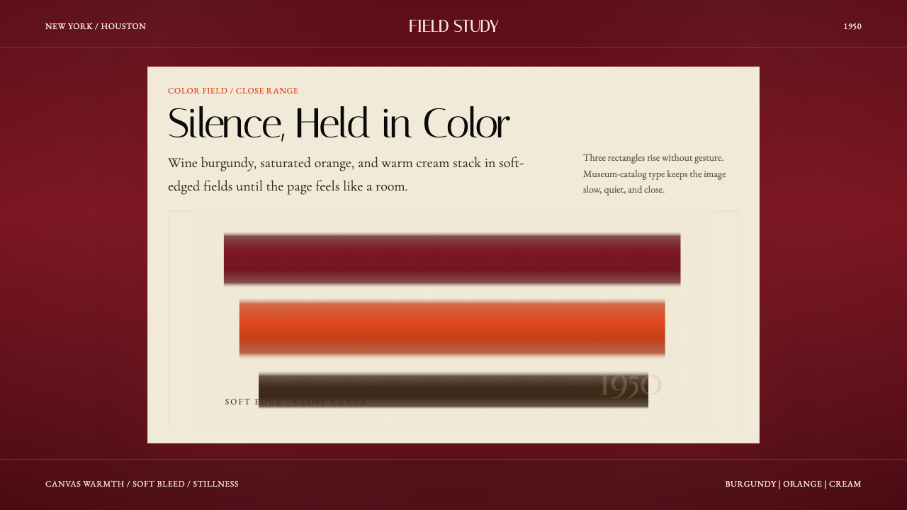 Mark Rothko Color Field (1950)Silence made visible. Burgundy, orange, and cream stack in soft-edged fields.把沉默变成可见。酒红、橙与奶油柔边堆叠成色域。
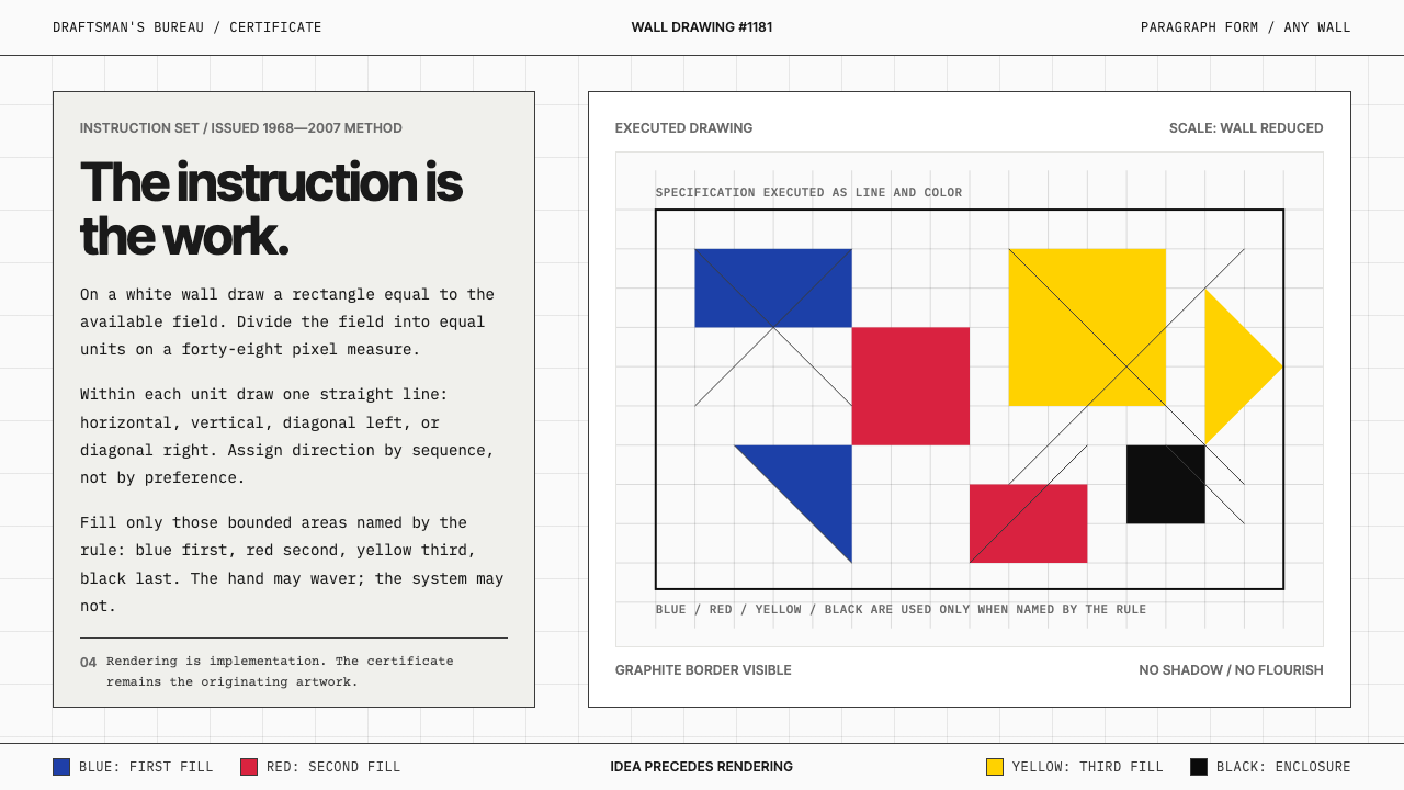 Sol LeWitt ConceptualInstruction becomes art. Mono certificates face wavering graphite grids in fo…指令即艺术:等宽证书对照颤动石墨网格与四色规则。
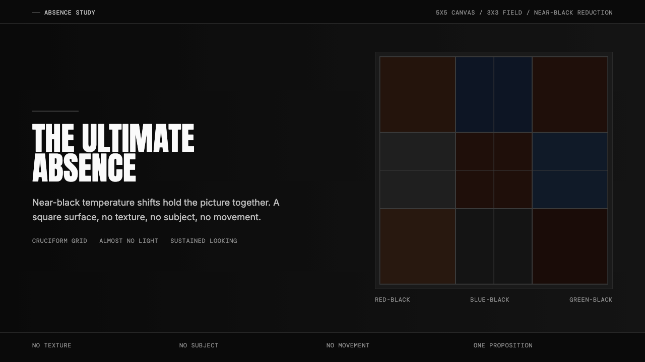 Ad Reinhardt Black Painting (1953)Austere absence. Near-black grid shifts reveal structure on sustained looking.苦行式缺席。近黑网格只在持续凝视中显形。
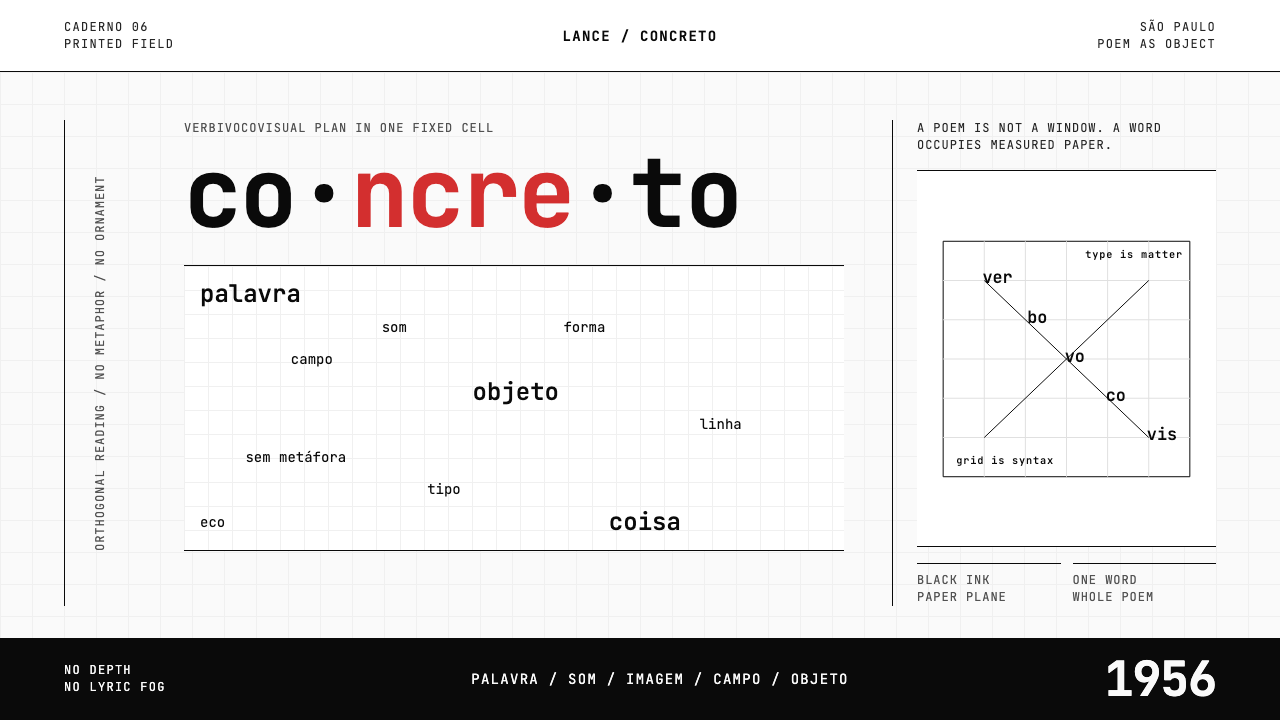 Brazilian Concrete PoetryWords become objects. Monospace cells, black-white paper, one cadmium red rup…字成为物。等宽格、黑白纸面,一处镉红断裂。