What is Brazilian Concrete Poetry?什么是 Brazilian Concrete Poetry?
Brazilian Concrete Poetry turned words into visual objects — stripping syntax down to single letters on a grid, replacing metaphor with geometric precision.巴西具体诗将文字变为视觉物件——把句法剥削至网格上的单个字母,以几何精确取代隐喻。
Brazilian Concrete Poetry in briefBrazilian Concrete Poetry 速览
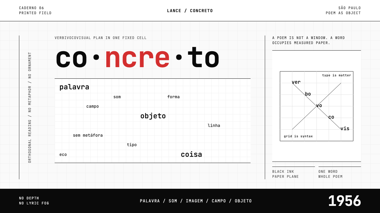
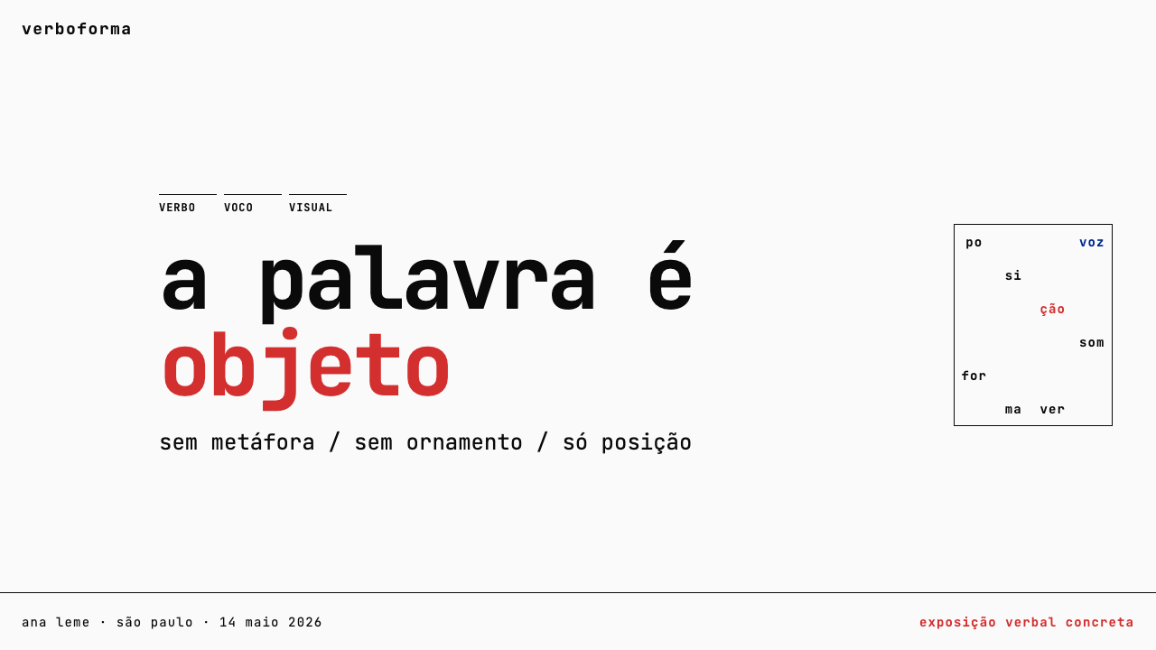
Brazilian Concrete Poetry is a typographic and poetic movement that emerged in São Paulo in the 1950s, insisting that a word's shape, position, and sound are as meaningful as its dictionary definition. Founded by the Noigandres group — Augusto de Campos, Décio Pignatari, and Haroldo de Campos — it abolished the poetic line and conventional syntax, treating each letter, syllable, or word as a self-sufficient visual object arranged on a strict geometric field. The page became a stage; white space became silence and structure simultaneously.巴西具体诗(Poesia Concreta)是一场兴起于1950年代圣保罗的排印与诗歌运动,它坚持认为:一个词的形态、位置与声音,与其词典释义同样富有意义。由奥古斯托·德·坎波斯、德西奥·皮尼亚塔里与阿洛尔多·德·坎波斯组成的 Noigandres 小组,废除了诗行与传统句法,将每个字母、音节或单词视为排布于严格几何场域之上的自足视觉物件。页面成为舞台;留白同时成为沉默与结构。
The movement's central doctrine was the 'verbivocovisual' poem — a work that operates on three registers at once: verbal (the word's meaning), vocal (its sound when spoken or chanted aloud), and visual (its spatial arrangement on the surface). In practice, this produced compositions where a single noun might be repeated in a diagonal scatter, where letters from one word could bleed into another, or where the entire poem consisted of a single word expanded and contracted across a white field. Ornament, narrative, and sentiment were deliberately excluded.这场运动的核心教义是「言-声-视」(verbivocovisual)诗——一种在三个维度上同时运作的作品:语言维度(词义)、声音维度(朗读或吟诵时的声响)、视觉维度(词语在页面上的空间布局)。在实践中,这产生了各种构成:一个名词可能以对角线散布的形式反复出现,一个词的字母可以向另一个词渗透,或者整首诗就是一个单词在白色场域上的扩张与收缩。装饰、叙事与情感被刻意排除在外。
Visually, the aesthetic is stark and uncompromising: pure black letterforms on paper-white grounds, monospace typewriter fonts whose every character occupies the same fixed cell, deep negative space that gives each word or letter room to be perceived as a discrete object, and occasional single-color punctuation — most famously, a single red element deployed as a rupture in an otherwise monochrome composition. The system is less about beauty in the decorative sense and more about precision as a form of argument.在视觉上,这套美学是严峻而不妥协的:纯黑字形置于纸白底面,等宽打字机字体使每个字符占据相同的固定格,深阔的留白让每个词或字母都能被感知为独立物件,偶尔出现的单色点缀——最具代表性的是一个红色元素,作为对原本单色构图的断裂——成为整个系统中唯一的强调手段。这套体系无关装饰意义上的美,更关乎精确作为一种论证方式的力量。
See the Brazilian Concrete Poetry design system查看 Brazilian Concrete Poetry 完整设计系统
Where does Brazilian Concrete Poetry come from?Brazilian Concrete Poetry 从何而来?
The founding moment of Brazilian Concrete Poetry can be traced to 1952, when Augusto de Campos, Haroldo de Campos, and Décio Pignatari began meeting in São Paulo to rethink the possibilities of language. They named their group Noigandres — a word lifted from Provençal troubadour poetry, a fragment whose meaning was disputed even by medieval scholars, chosen precisely for its resistance to transparent meaning. From the start, the movement was interested in language as material rather than language as vehicle.巴西具体诗的创立时刻可追溯至1952年:奥古斯托·德·坎波斯、阿洛尔多·德·坎波斯与德西奥·皮尼亚塔里开始在圣保罗定期聚会,重新思考语言的可能性。他们将小组命名为 Noigandres——这个词取自普罗旺斯吟游诗人的诗作,是一个连中世纪学者也争论不休其含义的残篇,被选用恰恰因为它对透明意义的抵抗。从一开始,这场运动就对语言作为材料、而非语言作为载体怀有兴趣。
Brazil in the 1950s was undergoing rapid modernization — Brasília was being built from scratch in the interior, the country was industrializing, and a generation of artists and intellectuals were looking for forms that matched the velocity of contemporary life. The Noigandres group found intellectual allies abroad: they read Stéphane Mallarmé's spatial experiments in 'Un Coup de Dés' (1897), Ezra Pound's ideogrammic method, and the Swiss Concrete poets gathered around Eugen Gomringer, who was working in parallel in Zurich. Gomringer and Décio Pignatari met in 1955, and their exchange formalized the international dimension of the movement.1950年代的巴西正经历快速现代化:巴西利亚正在内陆平地而起,国家工业化进程加速,一代艺术家和知识分子正在寻找与当代生活节奏相匹配的形式。Noigandres 小组在海外找到了思想盟友:他们研读斯特凡·马拉美在《骰子的一掷》(1897年)中的空间实验、埃兹拉·庞德的意象叠加方法,以及聚集在尤根·贡林格周围的瑞士具体派诗人——后者正在苏黎世平行推进类似的工作。贡林格与德西奥·皮尼亚塔里于1955年会面,两人的交流正式确立了这场运动的国际维度。
The watershed year was 1956. The Exposição Nacional de Arte Concreta — held first in São Paulo and then in Rio de Janeiro — placed concrete visual art and concrete poetry on the same platform, establishing the formal connection between the movement's typographic practice and the geometric abstraction being pursued by Brazilian painters and sculptors simultaneously. The exhibition made the movement visible to a Brazilian public for the first time and provoked immediate debate about what counted as art, what counted as poetry, and whether the two could meaningfully be separated.转折年份是1956年。全国具体艺术展先在圣保罗举办,后移至里约热内卢,将具体视觉艺术与具体诗歌置于同一平台,建立起排印实践与巴西画家、雕塑家同步追求的几何抽象之间的正式联系。这次展览使这场运动第一次被巴西公众所见,并立即引发关于什么是艺术、什么是诗歌、以及两者是否能够有意义地分离的激烈争论。
In 1958, the Noigandres group published the 'Plano-Piloto para Poesia Concreta' — the Pilot Plan for Concrete Poetry — a manifesto that codified the movement's principles with the precision of a design brief. The document declared that the concrete poem is 'an object in and by itself, not an interpreter of exterior objects,' laid out the verbivocovisual doctrine, and traced a lineage from Mallarmé and Joyce through Pound and e.e. cummings. The Pilot Plan circulated internationally, cementing the Noigandres group's position as the theoretical center of a global concrete poetry network that extended to Scotland, Germany, Japan, and Czechoslovakia. Through the 1960s and into the 1970s, the movement's visual logic influenced Brazilian graphic design, music album typography during the Tropicália era, and eventually the visual identity of Brazil's cultural modernization.1958年,Noigandres 小组发表了《具体诗试验计划》(Plano-Piloto para Poesia Concreta)——这份宣言以设计简报般的精确度编纂了运动的原则。文件宣称具体诗是「自足之物,而非外部对象的阐释者」,阐明了「言-声-视」教义,并追溯了从马拉美和乔伊斯经庞德和卡明斯的精神谱系。《试验计划》在国际间广泛传播,巩固了 Noigandres 小组作为延伸至苏格兰、德国、日本和捷克斯洛伐克的全球具体诗网络理论中心的地位。在整个1960年代直至1970年代,这场运动的视觉逻辑影响了巴西平面设计,以及热带主义(Tropicália)时代的唱片封面排印,并最终渗透进巴西文化现代化的视觉身份建构。
What defines the Brazilian Concrete Poetry look?Brazilian Concrete Poetry 的视觉特征是什么?
Monospace Grid等宽网格
Every character in a concrete poem occupies an identical cell — the spatial logic of the typewriter, where mechanical regularity eliminates any visual hierarchy between letters. This grid is not a background device but the poem's structural skeleton. Words, syllables, and letters are placed, rotated, or scattered within this cellular field, and the regularity of the grid makes every deviation from expected position feel deliberate and charged with meaning. The result is a typography where rhythm is spatial before it is phonetic.具体诗中的每个字符占据完全相同的格——打字机的空间逻辑,机械规律消除了字母之间的任何视觉层级。这个网格不是背景装置,而是诗歌的结构骨架。词语、音节与字母在这个格状场域中被放置、旋转或散布,网格的规律性使每一处对预期位置的偏离都显得刻意,并充满意义的张力。结果是一种节奏先于声音而存在于空间中的排印方式。
Black on White Austerity黑白克制
The foundational palette of concrete poetry is pure black letterforms on an unmediated white ground — the page reduced to its most elemental contrast. No tonal gradation, no gray midtones, no textural variation softens the encounter between ink and paper. This austerity is not absence of choice but a deliberate refusal: color would shift attention from the structural relationships between words toward surface affect. The monochrome field forces the reader to perceive each word or letter as a physical object defined entirely by its position and relation to others.具体诗的基础色板是纯黑字形置于未经调和的白底——页面被简化为最基本的对比。没有色调渐变,没有灰色中间调,没有质感变化来柔化墨水与纸张之间的相遇。这种克制不是无所选择,而是刻意的拒绝:色彩会将注意力从词语之间的结构关系转移至表面情感。单色场域迫使读者将每个词或字母感知为完全由其位置和与他者关系所界定的物理对象。
The Red Rupture红色断裂
When color appears in concrete poetry, it functions as rupture rather than decoration — a single element in cadmium red or a similarly saturated, warm hue breaking the monochrome field at a single precise point. The red does not coordinate or complement; it interrupts. Its rarity is essential: in a composition where every other element is black on white, a single red character or mark carries enormous semantic weight, functioning almost like a spoken exclamation in an otherwise written text. This is the most direct available signal of emphasis within a system that otherwise refuses all emphasis devices.当色彩出现在具体诗中,它的功能是断裂而非装饰——一个镉红色或类似高饱和度暖色调的单一元素,在精确的一处击破单色场域。这个红色不协调、不补充;它打断。它的稀有性至关重要:在一个所有其他元素都是黑底白字的构图中,一个红色字符或标记承载着巨大的语义重量,几乎就像书面文本中的一声口语感叹。这是在一套原本拒绝一切强调手段的系统中,最直接可用的强调信号。
Deep Negative Space深阔留白
Concrete poetry treats white space not as the absence of content but as content's equal partner. A poem may consist of a single word placed at the center of an otherwise empty page, or a cluster of letters set at one corner with the remainder of the surface left bare. This negative space is not wasted — it is the silence between words, the duration between utterances, the visual equivalent of rest in musical notation. Reducing the number of words on a page forces each remaining word to bear more perceptual and conceptual weight.具体诗将留白视为不是内容的缺席,而是内容的对等伙伴。一首诗可能只是一个词置于原本空白的页面中央,或是一组字母置于一角而页面其余部分保持空白。这种留白不是浪费——它是词与词之间的沉默,发声与发声之间的时长,是乐谱中休止符的视觉等价物。减少页面上的词语数量,迫使每个留存的词承担更多的感知与概念重量。
Spatial Syntax空间句法
In conventional poetry, syntax — the arrangement of words into grammatical sequence — governs meaning. Concrete poetry replaces grammatical sequence with spatial arrangement: the same set of words laid out in different positions on the page produces different meanings, because position, proximity, and direction carry semantic force. Words placed close together imply relationship; words at opposite corners imply tension or opposition. Reading direction becomes undetermined — the viewer must construct a path, and different paths yield different poems within the same composition.在传统诗歌中,句法——词语排列成语法序列的方式——支配着意义。具体诗以空间布局取代语法序列:同一组词以不同位置排列在页面上,产生不同的意义,因为位置、邻近关系和方向承载着语义力量。相互靠近的词暗示关联;处于对角位置的词暗示张力或对立。阅读方向变得不确定——观看者必须自行构建路径,而不同路径在同一构图中产生不同的诗。
Word as Atomic Unit词语作为原子单位
Where traditional poetry works at the level of the line or stanza, concrete poetry works at the level of the individual word — or, in more radical examples, the individual letter or syllable. Each unit is treated as both a linguistic sign and a visual form simultaneously. The concrete poet selects words partly for their phonetic texture (how they sound repeated), partly for their visual shape (how certain letters create visual rhythm when repeated), and partly for their semantic density (words that carry multiple meanings in multiple languages). A single word, geometrically placed, can constitute an entire poem.传统诗歌在诗行或诗节层面运作,具体诗在单个词的层面运作——或者在更激进的例子中,在单个字母或音节的层面运作。每个单位被同时视为语言符号和视觉形态。具体诗人选词部分依据声音质感(词语重复时的声响),部分依据视觉形状(某些字母重复时形成的视觉节奏),部分依据语义密度(在多种语言中携带多重含义的词)。一个几何放置的单词,可以构成一整首诗。
Geometric Composition几何构图
The placement of words and letters in concrete poetry follows geometric logic rather than decorative intuition — diagonal lines, symmetric grids, spiral arrangements, and cruciform patterns recur because they create relationships between elements that are spatial rather than grammatical. These geometric structures were influenced by the Brazilian concrete art movement occurring simultaneously, which held that visual composition should be governed by measurable, reproducible mathematical relationships rather than subjective expression. The poem and the painting shared a common method.具体诗中词语和字母的排布遵循几何逻辑而非装饰直觉——对角线、对称网格、螺旋排列和十字形图案反复出现,因为它们在元素之间创造的是空间关系而非语法关系。这些几何结构受到同期巴西具体艺术运动的影响,后者主张视觉构图应受可测量、可复现的数学关系支配,而非主观表达。诗歌与绘画共享同一种方法。
See the Brazilian Concrete Poetry design system查看 Brazilian Concrete Poetry 完整设计系统
Who shaped Brazilian Concrete Poetry?谁塑造了 Brazilian Concrete Poetry?
Augusto de Campos was the most visually inventive of the Noigandres founders, responsible for some of the movement's most recognized compositions. His work explored the permutational possibilities of individual words — rearranging letters to reveal embedded meanings, overlaying words in different colors to create simultaneous readings, and designing poems that functioned as visual objects intended to be exhibited rather than simply read on a page. His engagement with popular music and mass media in the 1960s extended concrete poetry's methods into sound and performance, and his critical translations of international avant-garde poetry helped position the Noigandres group within a global modernist lineage.奥古斯托·德·坎波斯是 Noigandres 创始人中视觉创造力最为突出的一位,负责了运动中一些最广为人知的构成作品。他的工作探索了单个词的排列组合可能性——重新排列字母以揭示隐含意义,将不同颜色的词叠加以创造同步阅读,并设计出作为视觉物件展览而非仅仅在页面上阅读的诗歌。他在1960年代与流行音乐和大众媒体的互动,将具体诗的方法延伸至声音与表演领域;他对国际先锋诗歌的批评性翻译帮助将 Noigandres 小组定位于全球现代主义谱系之中。
Pignatari served as the movement's most active international ambassador, whose 1955 meeting with Swiss concrete poet Eugen Gomringer was decisive in establishing concrete poetry as a genuinely international phenomenon rather than a Brazilian curiosity. His own poetry was deeply informed by information theory — he studied with Norbert Wiener's associates and brought the logic of signal, noise, and redundancy directly into his compositional practice. His 1957 poem 'beba coca cola' — a scathing visual transformation of an advertising slogan into an accusation — demonstrated that the concrete method could carry sharp political and cultural critique alongside its formal experiments.皮尼亚塔里是运动最活跃的国际使节,他与瑞士具体诗人尤根·贡林格在1955年的会面,对于将具体诗确立为真正的国际现象(而非巴西奇想)具有决定性意义。他自己的诗歌深受信息论影响——他与诺伯特·维纳的同仁共同学习,将信号、噪音和冗余的逻辑直接带入创作实践。他1957年的诗作《beba coca cola》——将一个广告口号以视觉方式转化为一场指控——证明了具体方法能够在其形式实验之外承载犀利的政治与文化批评。
Haroldo de Campos was the movement's primary theorist, whose scholarly reach extended from medieval troubadour poetry to Russian Formalism to Chinese classical poetics. He argued that the concrete poem's spatial and phonetic methods were not a modern invention but the recovery of ancient techniques that linear print culture had suppressed. His practice of 'transcreation' — translation understood as an act of poetic recreation rather than semantic transfer — produced Brazilian versions of Homer, Goethe, Dante, and the biblical Book of Qohelet that were received as major works in their own right. His theoretical writing remained influential in literary studies well beyond the movement's peak years.阿洛尔多·德·坎波斯是运动的主要理论家,其学术视野从中世纪吟游诗人诗歌延伸至俄国形式主义再至中国古典诗学。他主张,具体诗的空间与声音方法并非现代发明,而是对线性印刷文化所压制的古老技术的复原。他的「创译」(transcreation)实践——将翻译理解为诗歌再创造行为而非语义转移——产生了荷马、歌德、但丁和《传道书》的巴西版本,这些译作本身即被视为重要的文学作品。他的理论写作在运动鼎盛期之后,对文学研究的影响持续存在。
Dias-Pino was a Brazilian visual poet and book artist who pushed concrete poetry's material logic into its most physical dimension — the artist's book as a designed object where paper, binding, and page sequence were all part of the poem's meaning. His seminal work 'A Ave' (The Bird, 1956) is a hand-cut, engineered book whose pages reveal a bird built from letters only as they are turned in sequence, making the act of reading into the act of assembling the image. His practice demonstrated that concrete poetry's spatial logic did not end at the printed page but could expand into three-dimensional, time-based objects.迪亚斯-皮诺是一位巴西视觉诗人与书籍艺术家,他将具体诗的物质逻辑推向了最具实体性的维度——艺术家书籍作为设计物件,纸张、装订与翻页序列都成为诗歌意义的组成部分。他的代表作《A Ave》(《鸟》,1956年)是一本手工裁切、精心设计的书籍,随着页面依次翻动,一只完全由字母构成的鸟才逐渐显现,使阅读行为成为图像的组装行为。他的实践证明,具体诗的空间逻辑不止于印刷页面,还可以延伸至三维、时间性的物件。
Though Swiss rather than Brazilian, Gomringer is inseparable from the story of Brazilian Concrete Poetry because his independent parallel development of concrete poetic principles in Zurich — and his decisive meeting with Pignatari in 1955 — established the international framework within which the Noigandres group operated. His poem 'silencio' (1954), in which the word 'silencio' is arranged in a rectangular grid with a blank space at its center, is the canonical example of the form worldwide. The exchange between Gomringer and the Noigandres group turned a Brazilian literary experiment into an internationally recognized movement with agreed theoretical foundations.贡林格虽是瑞士人而非巴西人,但他与巴西具体诗的故事密不可分——因为他在苏黎世对具体诗原则的独立平行探索,以及他与皮尼亚塔里在1955年的决定性会面,确立了 Noigandres 小组运作其中的国际框架。他的诗作《silencio》(1954年)——词语「silencio」以矩形网格排列,中央留有一处空白——是该形式在全球范围内最具代表性的例子。贡林格与 Noigandres 小组的互动,将一场巴西文学实验转变为一场拥有共识理论基础的国际公认运动。
How do you use Brazilian Concrete Poetry today?今天怎么用 Brazilian Concrete Poetry?
Brazilian Concrete Poetry translates into contemporary design work as a system for giving language structural and visual weight — making words feel like objects rather than labels. Applying it correctly means understanding the logic behind the restraint: the monospace grid, the deep white space, the single-color rupture. These are not stylistic options to be selected individually; they function as an interdependent system where each element's power depends on the discipline of the others.巴西具体诗转化为当代设计实践,是一套赋予语言结构与视觉重量的系统——让词语感觉像物件而非标签。正确应用它,意味着理解克制背后的逻辑:等宽网格、深阔留白、单色断裂。这些不是可以单独选取的风格选项;它们作为相互依存的系统运作,每个元素的力量都依赖其他元素的自律。
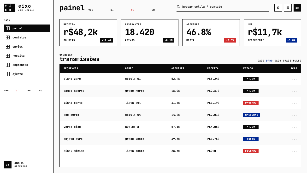
For presentation slides, the concrete poetry aesthetic works with particular force on cover pages and section dividers. A cover built on this system sets a single word or short phrase — a company name, a report title, an idea — in large monospace type against a full white field, with position determined geometrically rather than intuitively centered. The surrounding silence amplifies the text. Section dividers can use spatial repetition: a key word repeated across the slide in progressively smaller type along a diagonal axis, creating a typographic object rather than a conventional heading. Data slides should be approached as concrete compositions — each chart, number, or callout element placed within a strict grid, with heavy typographic hierarchy and no decorative framing.在演示文稿中,具体诗美学在封面页与章节分隔页上具有特别强烈的效果。以这套系统构建的封面,将一个词或短语——公司名称、报告标题、一个概念——以大号等宽字体置于全白场域,位置由几何逻辑而非直觉居中决定。周围的沉默放大了文字。章节分隔页可以运用空间重复:一个关键词沿对角轴以递减字号横贯整张幻灯片,创造出排印物件而非惯常标题。数据页应被当作具体构图来处理——每个图表、数字或标注元素置于严格网格之内,以重型排版层级为结构,无装饰性边框。
For web UI, the style is well matched to interfaces where hierarchy and precision are primary values: developer tools, analytics dashboards, pricing tables, and API documentation pages. The approach requires a fixed grid system with substantial gutter spacing, near-white or pure white backgrounds, and black as the default type color. Reserve any warm accent — the concrete poetry red — for a single interactive state or alert category, never for decoration. Card components should have clear, hard borders rather than soft shadows; empty space within components is a feature, not a failure. Navigation labels should be typographic, unadorned, and hierarchical.在网页界面中,这种风格与层级与精确性是首要价值的界面高度匹配:开发者工具、分析仪表板、定价表格和 API 文档页面。这种方法要求固定网格系统配以充足的槽间距、接近白色或纯白背景,以及黑色作为默认文字颜色。将任何暖调强调色——具体诗的红色——保留给单一的交互状态或警示类别,绝不用于装饰。卡片组件应有清晰的硬边边框而非柔和阴影;组件内部的空白是功能,不是失败。导航标签应是排印性的、无装饰的、层级分明的。
For editorial and marketing work, the style supports layouts that position the brand or product as rigorous, precise, and intellectually serious. A long-form article layout applies the concrete method by isolating key phrases in large-scale monospace type within the body of the page — not as pull-quotes in a decorative sense, but as visual resting points that carry the article's argument forward. Marketing pages work best when they resist the temptation to fill space: a feature announcement built on this system might show a single sentence, typographically expanded across a full-width section, with all supporting detail relegated to smaller type below. The total silence around a key claim makes the claim louder.在编辑与营销内容中,这种风格支持将品牌或产品定位为严谨、精确、具有智识分量的版面。长篇文章版面以具体方法应用的方式,是在页面正文内将关键短语以大号等宽字体孤立——不是装饰意义上的引用语,而是承载文章论点向前推进的视觉驻停点。营销页面在抵制填满空间的诱惑时效果最佳:以这套系统构建的功能发布页,可能只显示一个句子,在全宽区块中以排印方式展开,所有支持性细节退居较小字号之下。围绕核心主张的完全沉默使主张更加响亮。
A common mistake when working with this aesthetic is adding secondary type treatments — italic variants, decorative weight contrasts, soft-shadow text effects — to compensate for what feels like blankness. The blankness is the system. Every element added to relieve the emptiness dilutes the visual charge of the elements that remain. Similarly, using the accent color more than once per screen or slide destroys its function as rupture; the moment it becomes a palette color, it stops being a signal.使用这套美学时最常见的错误,是添加次级字体处理——斜体变体、装饰性字重对比、文字软阴影效果——以弥补感觉上的空旷。空旷就是系统本身。每一个为缓解空洞感而添加的元素,都会稀释留存元素的视觉张力。同样,在同一屏幕或幻灯片中使用强调色超过一次,就会摧毁它作为断裂的功能;一旦它变成调色板颜色,它就不再是信号。
See the Brazilian Concrete Poetry design system查看 Brazilian Concrete Poetry 完整设计系统
Brazilian Concrete Poetry — FAQBrazilian Concrete Poetry · 常见问题
How does Brazilian Concrete Poetry differ from Swiss Concrete typography?巴西具体诗与瑞士具体派排印有何不同?
They share a commitment to geometric structure and the removal of ornament, and their founders were in direct contact — Pignatari met Gomringer in 1955. But the differences are substantial. Swiss Concrete typography, as developed by designers like Gomringer, Max Bill, and the Zurich school, prioritized the mathematical grid as an organizing framework for mass communication: it is rational, systematic, and designed for legibility at scale. Brazilian Concrete Poetry is fundamentally literary and conceptual — its concern is the word as both linguistic and visual event, and it is willing to sacrifice legibility for semantic or visual effect. Swiss typography produces ordered clarity; Brazilian concrete poetry produces structured disruption.两者都致力于几何结构和去除装饰,其创始人也有直接往来——皮尼亚塔里于1955年与贡林格会面。但差异相当实质。由贡林格、马克斯·比尔和苏黎世学派等设计师发展的瑞士具体排印,将数学网格作为大众传播的组织框架置于首位:它是理性的、系统的,以规模化的可读性为设计目标。巴西具体诗根本上是文学性和观念性的——它关注词语作为语言事件与视觉事件的双重性,并愿意为语义或视觉效果牺牲可读性。瑞士排印产生有序的清晰;巴西具体诗产生结构化的扰动。
Can this style work for interfaces that handle large amounts of text?这种风格能用于处理大量文字的界面吗?
It can, but with significant adaptation. Concrete poetry's native mode is the single word or short phrase deployed with maximal spatial deliberation — it was not designed for sustained reading of dense prose. For text-heavy interfaces, the approach should be applied selectively: use the concrete aesthetic for structural and navigational elements — headings, categories, empty states, section markers — while allowing the body text to follow more conventional legibility standards. The monospace type, the deep margins, and the strict grid can all coexist with readable body text provided the body text is not forced to also be monospace.可以,但需要相当程度的调适。具体诗的原生形态是以最大空间慎思度部署单个词或短语——它并非为大段散文的持续阅读而设计。对于文字密集型界面,应选择性地应用这种方法:将具体美学用于结构性与导航性元素——标题、类目、空状态、章节标记——同时允许正文遵循更传统的可读性标准。等宽字体、深阔页边距和严格网格都可以与可读正文共存,前提是正文不被强制也使用等宽字体。
Does the accent color have to be red, or can other colors play that role?强调色必须是红色吗?还是其他颜色也可以担此角色?
The cadmium red accent is historically specific to the original Noigandres compositions, but the structural logic — one saturated, warm accent color against a monochrome field, used once, as rupture — can be executed with other strongly saturated hues provided they retain the same visual shock value against the black-and-white ground. A deep saturated orange or a vivid warm yellow could serve a similar function. What matters is the discipline: the accent must appear no more than once per composition, it must be distinctly warm and saturated against the cool monochrome field, and it must function as interruption rather than accent in the decorative sense.镉红强调色在历史上是 Noigandres 构成作品所特有的,但其结构逻辑——在单色场域中使用一种饱和暖色调强调色,仅使用一次,作为断裂——可以用其他高度饱和的色调来执行,前提是它们对黑白底面保持同等的视觉冲击力。深度饱和的橙色或鲜艳暖黄色都可以起到类似功能。重要的是自律:强调色每个构图中出现不超过一次,对冷调单色场域而言必须明确地暖调且饱和,并且必须作为打断而非装饰意义上的强调来运作。
Is this style appropriate for brands that want to feel warm or approachable?这种风格适合希望传递温暖感或亲和感的品牌吗?
Not directly. The concrete poetry aesthetic is founded on formal severity — the systematic removal of everything that could create sensory warmth, including rounded forms, soft gradients, natural textures, and the kind of white space that suggests human comfort rather than structural precision. Brands seeking warmth should look to other design systems. That said, the aesthetic can work for brands that want to signal rigor, precision, or intellectual seriousness while still communicating approachability through voice and content — the visual severity can be offset by warm, human editorial copy without compromising the system's structure.不是直接适合。具体诗美学建立在形式严肃性之上——系统性地去除一切能创造感官温暖的元素,包括圆润形态、柔和渐变、自然质感,以及那种暗示人文舒适而非结构精确的留白。寻求温暖感的品牌应当转向其他设计系统。话虽如此,这种美学可以适合那些希望传递严谨、精确或智识分量,同时又希望通过语调和内容传达亲和力的品牌——视觉上的严肃性可以被温暖、人文的编辑文案所平衡,而不损害系统的结构。
What is the most common misapplication of this style in modern UI design?这种风格在现代界面设计中最常见的误用是什么?
The most common failure is importing the monospace font and the white background while retaining all the visual complexity of a conventional UI — multiple type sizes, colored buttons, card shadows, hover animations, gradient backgrounds. Monospace type in a visually busy environment does not produce a concrete poetry aesthetic; it produces a retro-terminal pastiche. The style requires global commitment: reducing the number of elements, colors, and type treatments across the entire composition simultaneously. A partial application almost always fails because the concrete aesthetic depends on the absence of visual noise for its effects to register.最常见的失败是引入等宽字体和白色背景,同时保留传统界面的所有视觉复杂性——多种字号、彩色按钮、卡片阴影、悬停动画、渐变背景。等宽字体置于视觉繁杂的环境中,不能产生具体诗美学,只能产生复古终端仿制品。这种风格要求全局承诺:同时减少整个构图中的元素数量、颜色和字体处理手段。局部应用几乎总是失败,因为具体美学依赖视觉噪音的缺席才能使其效果得以显现。
Related design styles相关设计风格
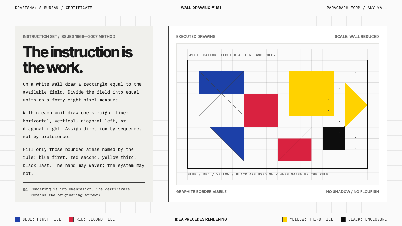 Sol LeWitt ConceptualInstruction becomes art. Mono certificates face wavering graphite grids in fo…指令即艺术:等宽证书对照颤动石墨网格与四色规则。
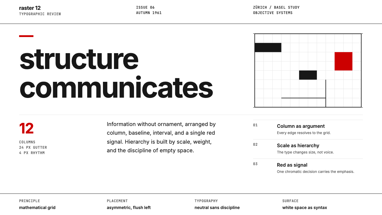 Swiss International StyleObjectivity made visible. Inter scale, white space, and one red block expose…客观性可见:Inter 尺度、留白与单一红块显露网格。
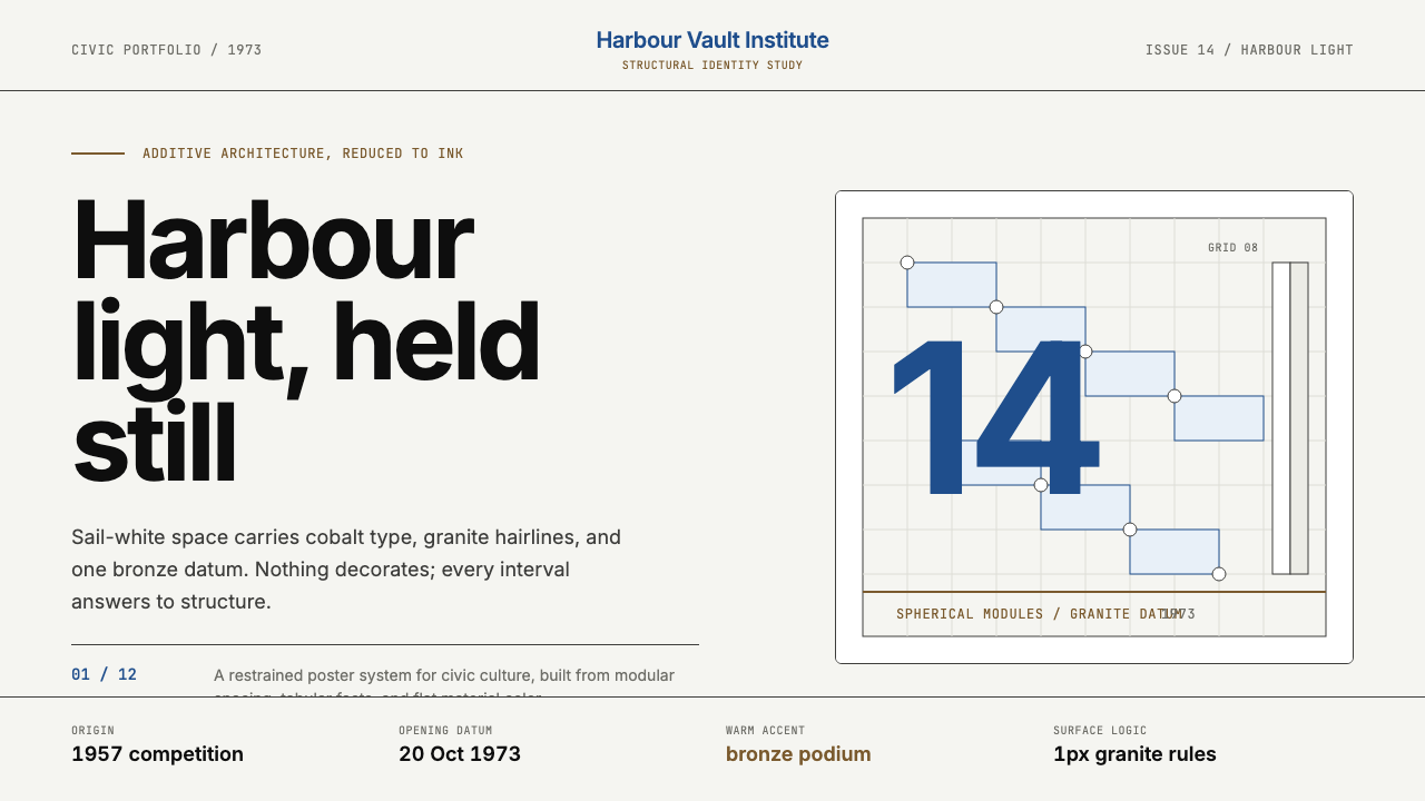 Sydney Opera House (Utzon, 1973)Civic restraint in harbour light. Sail-white space, cobalt type, bronze datum.港湾光里的市政克制:帆白留白、钴蓝字体、青铜基准线。
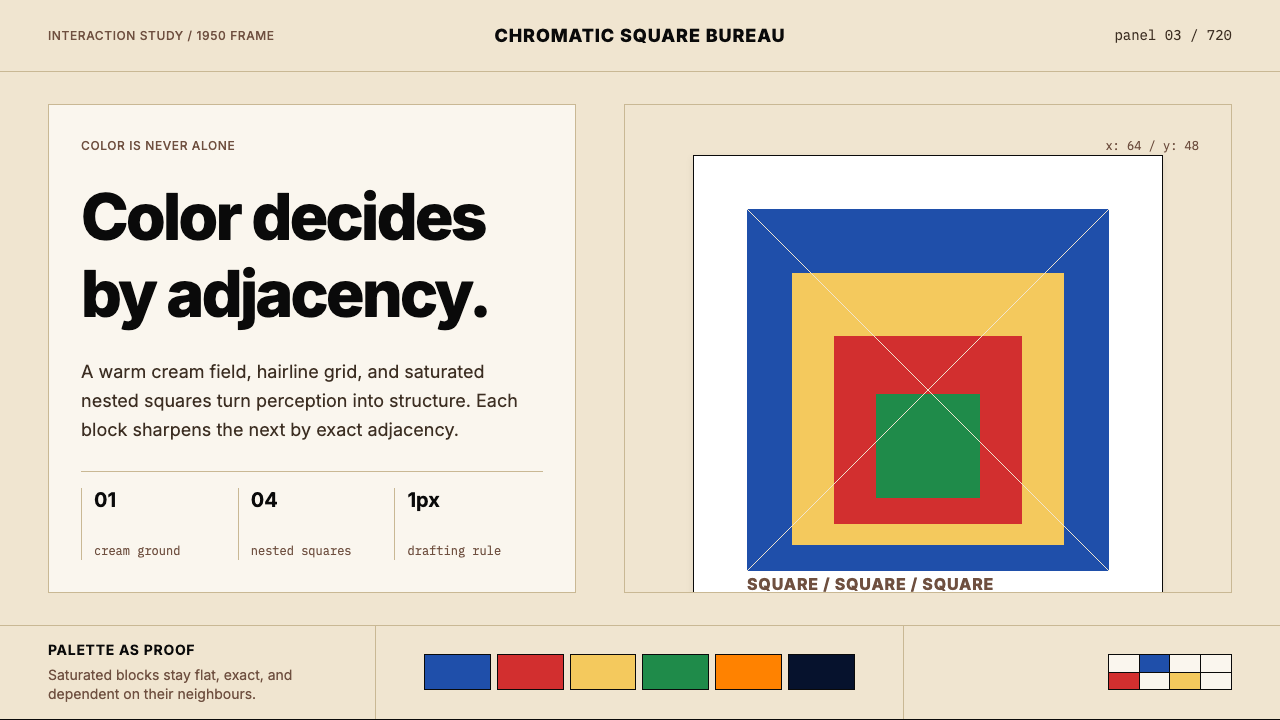 Josef Albers — Homage to the SquareColor becomes event. Warm cream, cobalt-red-yellow nested squares, exact hair…色彩成为事件。暖米底、钴蓝红黄嵌套方块与精确发丝线。
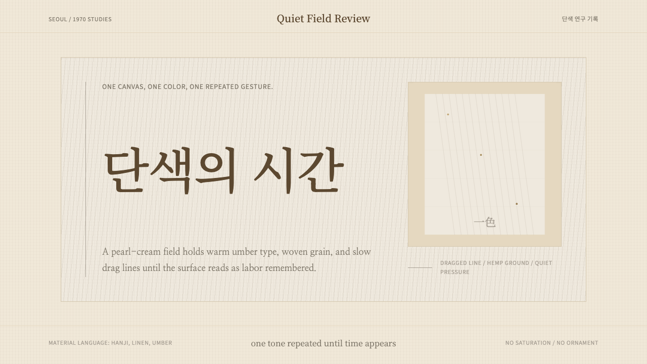 Korean Dansaekhwa MonochromeLabor becomes stillness. Umber serif type and drag lines on pearl cream.劳作化为静默。珍珠米底、褐色衬线和拖痕线条。
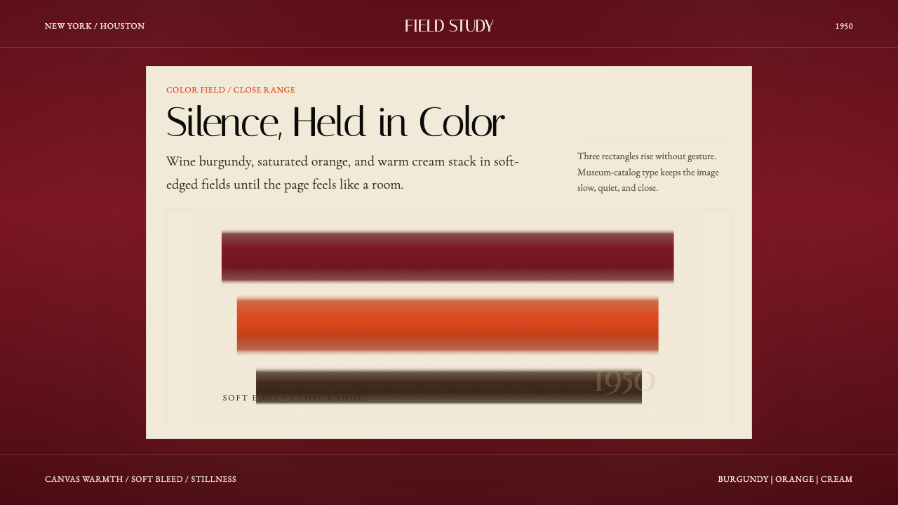 Mark Rothko Color Field (1950)Silence made visible. Burgundy, orange, and cream stack in soft-edged fields.把沉默变成可见。酒红、橙与奶油柔边堆叠成色域。