What is Korean Dansaekhwa Monochrome?什么是 Korean Dansaekhwa Monochrome?
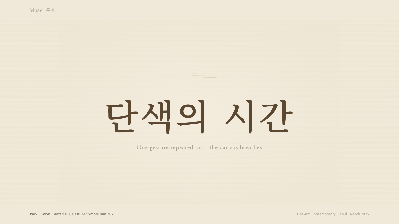
Dansaekhwa turns a single earth tone dragged across raw cloth into an act of meditation — and the quietest possible design system.단색화以一种土色反复拖过麻布,将劳作化为修行,也化为一套极度克制的设计语言。
Korean Dansaekhwa Monochrome in briefKorean Dansaekhwa Monochrome 速览
Dansaekhwa (단색화, literally 'monochrome painting') is the South Korean abstract movement that emerged in the 1970s and produced postwar Asia's most contemplative single-color canvases. Its key practitioners — Park Seo-bo, Lee Ufan, Ha Chong-Hyun, Chung Sang-Hwa, Yun Hyong-keun, and Kwon Young-Woo — worked with raw hemp, linen, and mulberry hanji paper, dragging, pressing, peeling, and knitting a single muted tone across the surface for hours at a time until the canvas became a record of accumulated time and physical labor.단색화(Dansaekhwa,字面意为「单色画」)是 1970 年代兴起于韩国的抽象运动,产出了战后亚洲最具静观性的单色画面。其核心人物——朴栖甫、李禹焕、河锺贤、郑相和、尹亨根、权宁禹——以生麻布、亚麻布和楮纸为载体,将一种低饱和色调反复拖、推、刮、织,一次数小时,直到整张画布成为时间积累与身体劳动的痕迹记录。
As a design system, Dansaekhwa speaks in a register of extreme restraint. The palette is narrow: warm beige, pearl cream, ash grey, umber, and the dark charcoal of scorched wood. Saturation is nearly absent. Ornament is entirely absent. What fills the surface instead is texture — the visible grain of the material, the trace of repeated gesture, the hairline variation that proves a human hand was present. This is not minimalism in the contemporary sense; it is the visual equivalent of a breathing pause.作为设计系统,단색화的语气极度克制。色板极窄:暖米色、珍珠白、灰白、土赭,以及焦木般的深炭褐。饱和度近乎缺席。装饰完全缺席。填满版面的,是质感——材料本身可见的纹路、重复手势留下的痕迹、证明人手曾经存在的细微变化。这不是当代意义上的极简主义;它是视觉上的呼吸暂停。
The movement was rediscovered internationally in the 2010s through gallery representation at Kukje, Tina Kim, Pace, and Hauser & Wirth, and canonized globally by the 2015 LACMA retrospective that introduced the term 'Dansaekhwa' to international audiences. Today the aesthetic informs a distinctive strand of East Asian visual culture that values quietude, process, and material honesty over novelty or spectacle.这一运动在 2010 年代经由国际画廊(Kukje、Tina Kim、Pace、Hauser & Wirth)重新进入全球视野,并于 2015 年 LACMA 回顾展后正式在国际上被经典化——那场展览首次将「Dansaekhwa」这个词带给国际观众。如今,这套美学为东亚视觉文化的独特脉络提供了养分,那个脉络推崇静默、过程与材料诚实,而非新奇与奇观。
See the Korean Dansaekhwa Monochrome design system查看 Korean Dansaekhwa Monochrome 完整设计系统
Where does Korean Dansaekhwa Monochrome come from?Korean Dansaekhwa Monochrome 从何而来?
The historical context that produced Dansaekhwa was harsh. South Korea in the late 1960s and early 1970s was emerging from the devastation of the Korean War while simultaneously living under the authoritarian modernization program of President Park Chung-hee. The artists who would form the movement had witnessed destruction, displacement, and state-directed industrialization that left little room for the contemplative. Their response was not political protest in any direct sense — it was a turn inward, a recovery of the meditative and the material against the noise of forced modernity.产生단색화的历史语境是严酷的。1960 年代末至 1970 年代初,韩国在朝鲜战争的废墟上艰难重建,同时承受着朴正熙威权现代化政策的重压。日后构成这一运动的艺术家们亲历了破坏、流离与国家主导的工业化——那个过程几乎不留任何空间给沉思与静观。他们的回应并非直接的政治抗议,而是一种向内的转身:在强制现代性的喧嚣中,重新寻回冥想的与材料的维度。
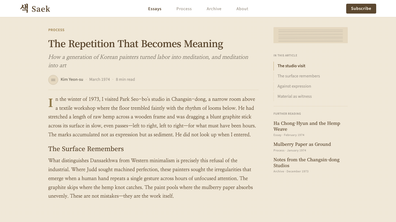
Park Seo-bo, often credited as the central figure of the movement, began his 'Ecriture' series in the early 1970s: thousands of repeated pencil lines drawn into wet paint on linen until line and ground became inseparable. Ha Chong-Hyun worked against the material itself, forcing paint through the back of burlap so that it bled through the weave in unpredictable patterns — a method he called 'conjunctive.' Chung Sang-Hwa cut grids into the surface of his canvas, peeled them back, then filled and re-painted, leaving a topography of creases and repairs. Each artist's method was a form of sustained physical and mental engagement with a single surface over time.通常被视为运动核心人物的朴栖甫,在 1970 年代初开始创作「描法」(Ecriture)系列:在亚麻布湿润的颜料上反复画出数千条铅笔线,直到线条与底面融为一体。河锺贤则与材料本身对抗,将颜料从麻布的背面强行穿透,让颜料以难以预料的方式渗出织纹——他将这一方法称为「结合法」。郑相和在画布表面切出网格,将其剥起,再填充、重新上色,留下褶皱与修补的地形图。每位艺术家的方法,都是一种持续的身体与精神介入——与单一表面的长时间对话。
The movement drew on multiple cultural and intellectual currents simultaneously. From traditional Korean aesthetics — particularly the philosophy of musim (無心, 'no-mind') and the craft traditions of celadon pottery and hanji paper — the artists inherited an understanding that beauty could emerge from disciplined repetition and material attentiveness rather than compositional invention. From the Japanese Mono-ha movement, with which Lee Ufan was directly associated, came a philosophy of placing the artist's gesture in relationship with raw material rather than transforming it entirely. These were not Western-imported ideas thinly applied; they were recognizable continuations of an East Asian philosophical lineage.这一运动同时汲取了多种文化与思想资源。从韩国传统美学——尤其是「无心」哲学,以及青瓷与楮纸的工艺传统——艺术家们继承了一种理解:美可以从有纪律的重复与对材料的专注中涌现,而无需依赖构图上的发明创造。从日本物派运动(李禹焕与之直接关联)那里,他们获得了一种哲学:将艺术家的姿态置于与原始材料的关系之中,而非将其彻底转化。这些并非西方观念的表面移植,而是东亚哲学传统可辨认的延续。
International visibility came slowly. Through the 1970s and 1980s, Dansaekhwa was largely known within Korea and among specialists in Asian contemporary art. The global shift came in the 2010s when the art market's renewed interest in process-based abstraction, combined with institutional backing from major international galleries, brought the work to auction houses and museum collections in Europe and the United States. The 2015 LACMA retrospective, the first comprehensive international survey, established the canonical grouping and introduced the term 'Dansaekhwa' as an art-historical category rather than a descriptive phrase. By that point the style had already begun to influence graphic design, interiors, and brand identity — particularly in contexts where cultural seriousness and material restraint were desired values.国际能见度来得缓慢。整个 1970 至 1980 年代,단색화主要在韩国国内及亚洲当代艺术专业圈中为人所知。真正的全球转变发生在 2010 年代:艺术市场对过程性抽象的重新兴趣,加上国际重量级画廊的机构背书,将这批作品带进了欧美的拍卖行与博物馆藏。2015 年 LACMA 的回顾展——首次全面的国际巡展——确立了经典的艺术家群体,并将「Dansaekhwa」确立为艺术史分类概念,而非单纯的描述性词汇。彼时,这套美学已开始影响平面设计、室内设计与品牌形象,尤其在那些将文化厚重感与材料克制作为核心价值的语境中。
What defines the Korean Dansaekhwa Monochrome look?Korean Dansaekhwa Monochrome 的视觉特征是什么?
Palette色板
The Dansaekhwa palette is built from the earth itself: warm beige, pearl cream, ash grey, warm umber, and a deep charcoal that reads as near-black without being absolute. Saturation is kept at its lowest possible level — these are tones that suggest color rather than assert it. A pearl-cream ground is canonical, carrying the warmth of natural cloth or hanji paper. Accent tones, where they appear, are darker relatives of the ground — umber against cream, charcoal against grey — never complementary contrasts or chromatic surprise.단색화的色板取自大地本身:暖米色、珍珠白、灰白、暖赭,以及一种接近黑色而非纯黑的深炭褐。饱和度保持在尽可能低的水平——这些色调暗示颜色,而不是断言颜色。珍珠白底面是经典形态,承载天然织物或楮纸的温度。强调色(若出现)是底色的深色近亲——米底上的赭色,灰底上的炭色——绝无互补对比或色彩惊喜。
Texture as Surface质感即表面
Where most design systems use flat color fields, Dansaekhwa uses textured ones. The visual interest of the surface comes from the trace of process: the directional drag of a palette knife, the visible weave of burlap showing through layers of paint, the hairline crack where dried medium caught the light. In digital or print application, this translates to subtle paper or cloth textures applied to backgrounds — never photographic, always secondary to the tonal field, and always directional rather than random.大多数设计系统使用平涂色块,而단색화使用的是有质感的色块。表面的视觉兴味来自过程的痕迹:调色刀拖动的方向感,颜料层下透出的麻布纹理,干燥介质捕捉光线的细纹。在数字或印刷应用中,这转化为底面上细腻的纸感或布感纹理——从不是摄影质感,始终附属于色调场,始终具有方向性而非随机散布。
Gestural Linearity手势性线条
A single repeated gesture — a horizontal drag, a diagonal stroke, a grid of pressed marks — is the primary compositional device. Lines are not decorative; they are the record of an action performed many times in the same direction. In design application, this quality appears as ruled hairlines, finely spaced parallel rules, or the grain of a paper texture running consistently across a background. The line does not frame or divide so much as it accumulates — building a surface from iteration.单一重复的手势——水平拖动、对角线笔触、一格格按压的印记——是首要的构图手段。线条不具装饰性;它是同一方向反复执行的动作的记录。在设计应用中,这种品质表现为细描线、间距均匀的平行细线,或者贯穿整个底面的纸纹理纹路。线条的功能不是框架或分割,而是积累——通过反复迭代建构表面。
Typography in Harmony与质感和谐的字体排印
Type in Dansaekhwa-influenced work is sparse, unhurried, and deferential to the texture beneath it. Serif faces — particularly those with fine strokes — echo the thin lines of the painted surface. Text is set in small quantities: a title, a date, a short statement. Long bodies of text are rare and, when necessary, set in a quiet weight at generous leading. The relationship between type and ground is one of respectful coexistence rather than contrast. Korean characters, with their own structural geometry, integrate naturally into this system.受단색화影响的作品中,字体排印稀疏、从容,对底面的质感保持谦逊。衬线字体——尤其是细笔画的款式——与画面表面的细线形成呼应。文字量少:一个标题,一个日期,一句简短陈述。长篇正文罕见;一旦出现,以舒展的行距设置于安静的字重中。字体与底面的关系是相互尊重的共存,而非对比。韩文字符以其自身的结构几何,自然地融入这套系统。
Temporal Depth时间深度
Dansaekhwa communicates the passage of time — the duration of the making — as a visual quality. A canvas covered with ten thousand repeated marks reads differently from one covered with a hundred, even if the surface tones are identical. In design, this translates to compositional patience: generous margins that allow a surface to breathe, single focal points placed without crowding, and the avoidance of multiple simultaneous claims on the viewer's attention. Busyness is the opposite of this aesthetic.단색화传递的是时间的流逝——制作过程的持续时长——作为一种视觉品质。覆盖着一万个重复印记的画布,与覆盖着一百个的读来截然不同,即便表面色调完全相同。在设计中,这转化为构图上的耐心:让表面得以呼吸的充裕留白,不拥挤的单一视觉焦点,以及对同时向观者提出多重要求的回避。热闹是这套美学的对立面。
Material Specificity材料特殊性
The original paintings were inseparable from their materials — raw hemp was not just a support but an active participant, absorbing, resisting, and responding to the applied medium. In design application, this principle becomes a commitment to the material qualities of the chosen medium: the particular off-white of uncoated paper stock, the slight tooth of a matte surface, the weight of a card that feels substantial in the hand. Choices are made for material reasons, not purely visual ones.原作与其材料不可分割——生麻布不仅是支撑体,更是积极的参与者,吸收、抵抗、回应施加的介质。在设计应用中,这一原则转化为对所选媒介材料特性的承诺:非涂布纸张特有的米白,哑面表面轻微的齿感,握在手中有分量感的卡纸。选择出于材料理由,而不仅仅是视觉理由。
Zero Saturation, Zero Ornament零饱和,零装饰
Where Bauhaus achieves restraint through the discipline of primary colors, Dansaekhwa achieves it through the near-total elimination of color. There are no accent hues borrowed from outside the earth-tone palette, no gradient transitions, no decorative borders or motifs, no illustrative elements. The surface contains exactly what the process deposited there, nothing more. This is not emptiness — it is completeness achieved through subtraction.包豪斯通过三原色的纪律实现克制,단색화则通过近乎彻底地消除色彩来实现克制。没有从土色色板之外借入的强调色,没有渐变过渡,没有装饰性边框或纹样,没有插图元素。表面只包含过程沉积在那里的东西,仅此而已。这不是空洞——这是通过减法实现的完整。
See the Korean Dansaekhwa Monochrome design system查看 Korean Dansaekhwa Monochrome 完整设计系统
Who shaped Korean Dansaekhwa Monochrome?谁塑造了 Korean Dansaekhwa Monochrome?
Park Seo-bo (born 1931) is the most internationally recognized figure of the movement and the artist most closely associated with its theoretical articulation. His 'Ecriture' series, begun in the early 1970s and continued across his entire career, involves drawing thousands of pencil or crayon lines into layers of wet paint on linen — a process so repetitive and physically demanding that it blurs the boundary between writing and erasure, mark-making and meditation. Park described the practice as a way of emptying the mind through the hand, aligning it explicitly with East Asian philosophical traditions of non-doing. His canvases, particularly those from the canonical 1970s period, are among the most studied objects in contemporary Korean art history.朴栖甫(1931 年生)是这一运动国际知名度最高的人物,也是与其理论阐释联系最为紧密的艺术家。他于 1970 年代初开始创作的「描法」(Ecriture)系列贯穿整个艺术生涯:在亚麻布的湿润颜料层中画入数千条铅笔或蜡笔线条——这一过程如此重复、如此耗费体力,以至于模糊了书写与擦除、留痕与冥想之间的界限。朴栖甫将这一实践描述为通过双手清空心灵的方式,明确将其与东亚「无为」哲学传统相连接。他的画布,尤其是 1970 年代经典时期的作品,是韩国当代艺术史上研究最深入的对象之一。
Lee Ufan (born 1936) occupies a singular position in the movement as the artist most deeply engaged with both Western phenomenology and East Asian philosophy — he studied at Nihon University in Tokyo and was a central voice in the Japanese Mono-ha movement before becoming associated with Dansaekhwa. His paintings typically place a few deliberate brushstrokes of pigment mixed with stone powder on an otherwise bare canvas, insisting that the unpainted area is as significant as the painted one. Lee theorized this relationship extensively in essays that have been widely translated and are considered foundational texts for understanding both Dansaekhwa and Mono-ha. His international gallery presence has been instrumental in bringing Dansaekhwa to audiences in Europe and North America.李禹焕(1936 年生)在这一运动中占据独特位置:他是其中最深入介入西方现象学与东亚哲学的艺术家——他在东京日本大学求学,是日本物派运动的核心声音之一,后与단색화产生关联。他的画面通常将几笔蓄意的混入石粉的颜料笔触置于几近空白的画布上,坚持认为未涂绘的区域与涂绘的区域同等重要。李禹焕以大量文章对这种关系进行了理论阐释;这些文章已被广泛翻译,被视为理解단색화与物派的奠基性文本。他在国际画廊的存在,对于将단색화带给欧美观众起到了关键作用。
Ha Chong-Hyun (born 1935) developed the most materially radical technique within the movement. His 'Conjunction' series, begun in the 1970s, involves forcing oil paint through the back of coarse burlap fabric so that it bleeds through the weave in patterns the artist can guide but not fully control. The resulting surface has a relief quality — the weave of the fabric is both structure and image — and the coloration, typically monochrome in warm or cool greys and ochres, records the precise resistance of the material. Ha's method is perhaps the clearest illustration of Dansaekhwa's insistence that the material itself must be an active participant in the work rather than a passive support.河锺贤(1935 年生)发展出运动内材料上最为激进的技法。他于 1970 年代开始创作的「结合」(Conjunction)系列,将油彩从粗麻布的背面强行穿透,让颜料以艺术家可以引导但无法完全控制的方式渗出织纹。由此形成的表面具有浮雕般的品质——织物的纹路既是结构,也是图像——色调通常是暖灰、冷灰或赭色的单色,精确记录了材料的阻力。河锺贤的方法也许是단색화坚持「材料本身必须是作品的积极参与者而非被动支撑体」这一理念的最清晰说明。
Yun Hyong-keun (1928–2007) worked almost exclusively with two colors across his entire career: umber and ultramarine blue, heavily diluted and applied to raw linen in thin, absorbed washes that settled into the weave rather than sitting on top of it. The result is a palette of extraordinary quietude — deep warm browns against the natural off-white of undyed cloth — that many critics have associated with the ink-wash tradition of East Asian monochrome painting. Yun's work, consistently overlooked during the canonical Dansaekhwa period, has been substantially reassessed since the 2010s revival, and his canvases are now among the most sought-after by international collectors of the movement.尹亨根(1928—2007)几乎一生只使用两种颜色:土赭与群青蓝,大量稀释后以薄而被吸收的水洗方式施于生麻布,颜料沉入纹理之中,而非浮于其上。由此产生的色板具有异常的静谧——深暖褐色映衬着未染麻布天然的米白——许多评论者将其与东亚单色绘画的水墨传统相联系。尹亨根的作品在단색화经典时期曾长期被忽视,2010 年代的复兴后得到大幅重新评价,其画布如今是国际藏家最为追捧的운동作品之一。
Chung Sang-Hwa (born 1932) developed a method that introduces structured destruction into the painting process. He applied paint to canvas in multiple layers, then cut the surface into a grid, carefully peeled back the sections, allowed the paint to dry and crack along the folds, and subsequently repainted the exposed areas. The final surface is a record of this cycle of application, rupture, and repair — a topography of healed wounds. Chung's work is among the most architecturally legible within the movement: the grid structure gives it a spatial quality that translates particularly well to large-format print and architectural applications.郑相和(1932 年生)发展出一种将结构性破坏引入绘画过程的方法。他在画布上涂抹多层颜料,然后将表面切割成网格,小心剥开各个区块,让颜料沿褶皱干裂,再重新涂绘暴露的区域。最终的表面是这一施加、破裂、修复循环的记录——一幅愈合伤口的地形图。郑相和的作品是运动内建筑感最强的:网格结构赋予其空间品质,在大幅面印刷与建筑应用场景中尤为突出。
How do you use Korean Dansaekhwa Monochrome today?今天怎么用 Korean Dansaekhwa Monochrome?
Dansaekhwa is among the most atmospherically distinct historical styles available to contemporary designers, because its visual logic is rooted in process and material rather than composition or color theory. Applying it well requires understanding what the system is actually communicating: quietude, duration, depth, and a form of dignity that comes from restraint rather than assertion. It is not suited to every context — but where it fits, it fits with unusual precision.단색화是当代设计师可用的历史风格中氛围感最为独特的之一,因为其视觉逻辑根植于过程与材料,而非构图或色彩理论。正确应用它,需要理解这套系统实际上在传达什么:静默、时长、深度,以及一种源自克制而非断言的尊严感。它并不适合所有语境——但当它合适时,合适得异常精准。
For presentation decks, Dansaekhwa performs at its best on cover and section-break slides rather than dense content pages. A cover built in this system uses a textured warm-cream ground, a single serif title set in a dark umber tone at a generous size, and perhaps a hairline rule or subtle parallel-line texture running beneath or beside the type. Nothing competes with the title. Section-break slides can carry a single word or short phrase and a full-bleed texture field — they function as breathing moments, resetting attention between content blocks. Data slides require more care: charts and graphs should be rendered in the earth-tone palette, avoiding all bright accent colors, with axis labels set small and quiet. The visual vocabulary can feel sparse with complex data, so use it for high-level summary slides rather than detailed tables.在演示文稿中,단색화在封面页与章节分隔页上的表现优于密集内容页。用这套系统构建的封面,以有质感的暖米底面为底,一行深赭色衬线标题以宽裕的字号设置,或许再有一条细描线或细腻的平行线纹理在字体下方或旁侧延伸。没有任何元素与标题竞争。章节分隔页可以只承载单个词或短语,以及满版肌理底面——它们作为呼吸时刻,在内容板块之间重置注意力。数据页面需要更多细心:图表与表格应以土色色板渲染,避免所有亮色强调色,坐标轴标签设置得小而安静。面对复杂数据,这套视觉词汇可能显得过于稀疏,因此将其用于高层次摘要幻灯片而非详细数据表格。
For web UI and dashboards, the aesthetic translates best to products where seriousness, cultural depth, and a non-corporate quality are desired. Gallery and museum sites, cultural institution platforms, high-end craft brand storefronts, editorial platforms, and premium service offerings benefit most. The approach: a near-white or warm cream background, dark umber or near-black for body text and navigation, hairline dividers and fine borders rather than heavy rules, and photography treated in muted tones — desaturated rather than black-and-white, slightly warm in cast. Pricing pages work well with this system if tiers are differentiated by subtle tonal shifts rather than bright color coding; interactive states use the darker earth tones rather than a contrast color.对于网页 UI 与仪表板,这套美学最适合那些需要严肃感、文化厚度与非企业化气质的产品。画廊与博物馆网站、文化机构平台、高端工艺品牌电商、编辑型平台与高端服务都是最佳受益场景。具体做法:近乎白色或暖米色的背景,深赭或近黑用于正文与导航,细描线与细边框替代粗线条,摄影处理为低饱和色调——不是黑白,而是轻微去饱和并带暖调。如果价格层级需要区分,用细微的色调深浅差异而非亮色编码;交互状态使用较深的土色而非对比色。
For editorial layouts and marketing collateral, the style supports long-form content with unusual grace. A Dansaekhwa-influenced editorial layout uses generous margins — approaching or exceeding the column width — as a visual anchor, with body text set at a deliberate pace with ample leading. Pull quotes appear in a slightly larger serif weight, sitting in the margin or breaking the column quietly. Section openers might use a full-bleed textured warm field with a single line of type, recalling the movement's canvas-as-ground principle. Marketing pages can adopt a poster-like gravity: one dominant typographic element, one textured ground tone, and extended silence around both. This system resists the impulse toward dense feature lists or aggressive calls to action.对于编辑版面与营销物料,这套风格以非同寻常的优雅支撑长篇内容。受단색화影响的编辑版面使用宽裕的留白——接近或超过正文栏宽——作为视觉锚点,正文以从容的节奏与充裕的行距排列。引用语以略大的衬线字重出现,安静地置于边白或打破栏位。章节起始页可使用满版暖色质感底面配单行文字,呼应这一运动的「画布即底面」原则。营销页面可采用海报式的庄重感:一个主导性的字体元素,一个质感地色,以及两者周围延伸的沉默。这套系统抗拒密集功能列表与强攻式行动号召的冲动。
A common mistake when working in this system is confusing restraint with emptiness and then compensating by adding more elements. Dansaekhwa's surfaces are not empty — they are full of texture, process, and accumulated gesture. The designer's equivalent of that fullness is achieved through quality of material choices, careful typographic spacing, and the deliberate selection of a single strong tonal ground rather than through the addition of graphic elements. A second common error is importing bright accent colors from outside the earth-tone palette — a vivid blue call-to-action button or a saturated red alert state will destroy the system's atmospheric coherence instantly. If interactive or alert states are needed, use the darkest available earth tone or near-black against the warm ground, never a chromatic contrast.在使用这套系统时,一个常见错误是把克制误解为空洞,然后通过添加更多元素来弥补。단색화的表面并不空洞——它充满了质感、过程与积累的手势。设计师等效的那种「充满」,是通过材料选择的品质、字体间距的细心,以及对单一强烈色调底面的刻意选取来实现的,而非通过增加图形元素。另一个常见错误是从土色色板之外引入亮色强调——一个鲜艳的蓝色按钮或高饱和的红色警示状态,会立刻摧毁这套系统的氛围连贯性。如果需要交互或警示状态,使用色板中最深的土色或近黑色对抗暖底面,绝不使用色相对比色。
See the Korean Dansaekhwa Monochrome design system查看 Korean Dansaekhwa Monochrome 完整设计系统
Korean Dansaekhwa Monochrome — FAQKorean Dansaekhwa Monochrome · 常见问题
How is Dansaekhwa different from Japanese wabi-sabi aesthetics?단색화与日本侘寂美学有何不同?
Both traditions value restraint, imperfection, and the beauty of natural materials, and both draw on East Asian philosophical traditions that see value in incompleteness and transience. The difference lies in intention and visual outcome. Wabi-sabi celebrates the imperfect and aged — the crack in a ceramic glaze, the asymmetry of a hand-thrown vessel — as beautiful in their departure from the ideal. Dansaekhwa is less interested in imperfection than in accumulation: the beauty of ten thousand identical marks, the dignity of sustained repetition. Its surfaces are not accidentally imperfect — they are intentionally complex, built through labor. The mood is closer to contemplative effort than to resigned acceptance of decay.两种传统都重视克制、不完美与天然材料之美,也都汲取东亚哲学传统中对不完整与无常的珍视。差异在于意图与视觉结果。侘寂颂扬不完美与时间侵蚀——陶瓷釉面的裂纹,手工拉坯器皿的非对称——认为这种对理想的偏离本身即是美。단색화对不完美的兴趣不及对积累的兴趣:一万个相同印记的美,持续重复的尊严。其表面不是偶然的不完美——而是经由劳动建构的有意为之的复杂性。它的气质更接近静观的努力,而非对衰老的从容接受。
Can Dansaekhwa be used in digital products with dark backgrounds?단색화可以用在深色背景的数字产品中吗?
A dark inversion is possible but requires care. The canonical Dansaekhwa palette is warm-light — pearl cream and warm beige grounds are central — and the dark materials (umber, charcoal) appear as mark-making elements against that light ground. Inverting this to a dark ground with lighter type and texture can work, but the warmth of the palette must be maintained: a warm near-black ground rather than a cold one, text and texture in warm cream or pearl rather than pure white, and no introduction of cool or chromatic tones. The risk of dark Dansaekhwa is that it slides toward generic dark mode rather than retaining the specific atmospheric warmth of the original. Use it sparingly — for a single dramatic section rather than an entire product.深色反转是可能的,但需要谨慎。경典단색화色板是暖亮调的——珍珠白与暖米色底面是核心——深色材质(赭色、炭色)作为留痕元素出现在亮底之上。将其反转为深底配浅色文字与质感是可行的,但色板的暖度必须维持:暖近黑底面而非冷近黑,文字与质感用暖奶油或珍珠白而非纯白,不引入冷色或有色相的色调。深色단색화的风险是滑向通用深色模式,而失去原作特定的氛围暖度。谨慎使用——用于单个戏剧性板块而非整个产品。
How do I incorporate Korean or East Asian typography without it feeling like cultural pastiche?如何融入韩文或东亚字体而不显得像文化拼贴?
The key is to treat Korean or Chinese characters as a structural element of the composition, not as decoration or cultural signaling. In authentic Dansaekhwa-influenced design, any language — Korean, Chinese, or Latin — sits quietly on the surface with the same weight and restraint as everything else. Avoid using East Asian characters purely as visual texture or background motif; that reduces them to ornament, which this system explicitly rejects. Instead, use them functionally: if the product speaks to audiences who read those languages, use them for their communicative purpose. If they appear alongside Latin text, treat the typographic systems with equal care and at similar scales. The cultural specificity of the aesthetic comes from the color and texture choices, not from the presence of non-Latin letterforms.关键是将韩文或汉字作为构图的结构性元素,而非装饰或文化信号。在真正受단색화影响的设计中,任何语言——韩文、中文或拉丁文——都以同样的分量与克制安静地置于表面。避免仅仅将东亚文字用作视觉肌理或背景纹样;那样会将它们降格为装饰,而这套系统明确拒绝装饰。相反,功能性地使用它们:如果产品面向阅读这些语言的受众,为其传达目的而使用。如果与拉丁文字并置,以同等细心与相近字号对待两套字体系统。这套美学的文化特殊性来自色彩与质感的选择,而非非拉丁字形的存在。
What kinds of imagery or photography work with this system?什么类型的图像或摄影与这套系统相融?
Photography in a Dansaekhwa-influenced system should be treated with the same restraint as the rest of the visual field. The ideal is imagery that carries its own quiet texture: close-up material details, surfaces, handcraft processes, still objects against plain grounds, or landscapes in low light. Color photography should be desaturated significantly — toward the warm grey and ochre range of the palette — without going fully monochrome. High-contrast or heavily stylized photography competes with the surface quality of the system and should be avoided. Figurative imagery with strong compositional drama, vibrant colors, or high energy is antithetical to the aesthetic. Where photography is not essential, consider replacing it with material texture fields or carefully composed typographic elements.受단색화影响的系统中,摄影应以与其他视觉元素同等的克制来处理。理想的图像是那些自身携带安静质感的:材料细节特写、表面、手工工艺过程、素底上的静物,或低光照下的风景。彩色摄影应大幅去饱和——趋向色板的暖灰与赭色范围——而不必完全变为黑白。高对比度或风格化强烈的摄影会与系统的表面品质相竞争,应当避免。具有强烈构图张力、鲜艳色彩或高能量的人物摄影与这套美学背道而驰。在摄影非必要之处,考虑以材料质感底面或精心构成的字体元素替代。
Is this aesthetic appropriate for consumer-facing digital products, or mainly for cultural institutions?这套美学适合面向消费者的数字产品,还是主要适合文化机构?
Dansaekhwa is well-suited to cultural institutions — galleries, museums, arts foundations, publishers — but its application is not limited to that sector. Any brand or product that positions itself around values of depth, craftsmanship, slowness, and non-mass-market distinctiveness can use this system credibly. High-end lifestyle brands, independent publishing platforms, premium hospitality, specialty food and craft brands, and professional services oriented toward considered clients are natural fits. Consumer-facing mass-market products — apps that need to onboard large numbers of users quickly, e-commerce platforms requiring aggressive conversion, or any context where warmth and friendliness are primary UX goals — are poor fits. The system communicates authority and seriousness rather than accessibility and approachability. Knowing which of those qualities your product needs is the first question to answer.단색화非常适合文化机构——画廊、博物馆、艺术基金会、出版商——但其应用不限于这个领域。任何围绕深度、工艺感、慢速、非大众市场独特性定位自身的品牌或产品,都可以可信地使用这套系统。高端生活方式品牌、独立出版平台、精品酒店、特色食品与工艺品牌、以及面向审慎客户的专业服务,都是天然的适配场景。面向消费者的大众市场产品——需要快速引导大量用户的应用、依赖强攻式转化的电商平台,或任何以温暖与亲和力为主要用户体验目标的场景——都是差的适配。这套系统传达的是权威感与严肃性,而非可及性与亲近感。你的产品需要哪种品质,是首先需要回答的问题。
Related design styles相关设计风格
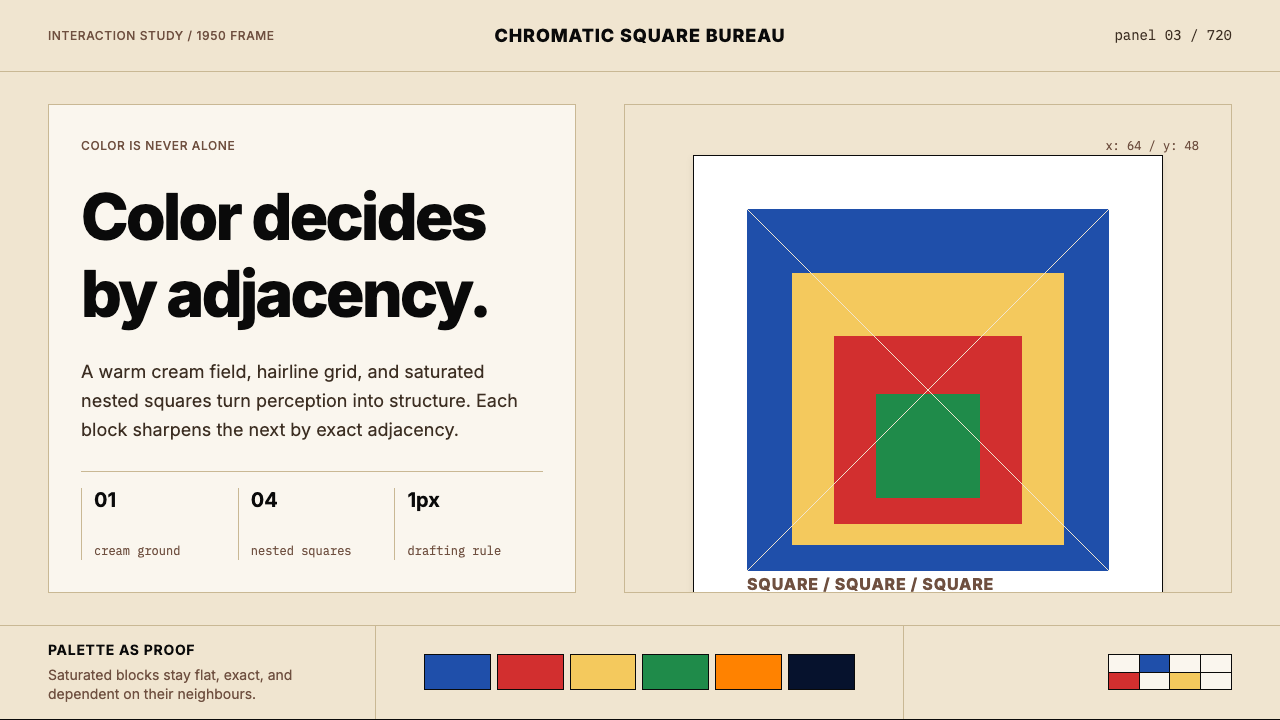 Josef Albers — Homage to the SquareColor becomes event. Warm cream, cobalt-red-yellow nested squares, exact hair…色彩成为事件。暖米底、钴蓝红黄嵌套方块与精确发丝线。
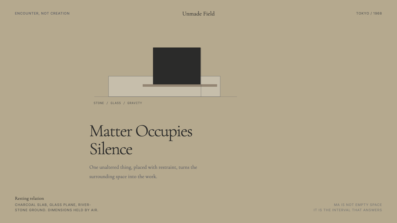 Mono-ha (Lee Ufan, 1968)Silence has weight. River-stone ground, Cormorant type, and one charcoal slab…沉默有重量。河石底、Cormorant 字体与一块炭黑板撑起空场。
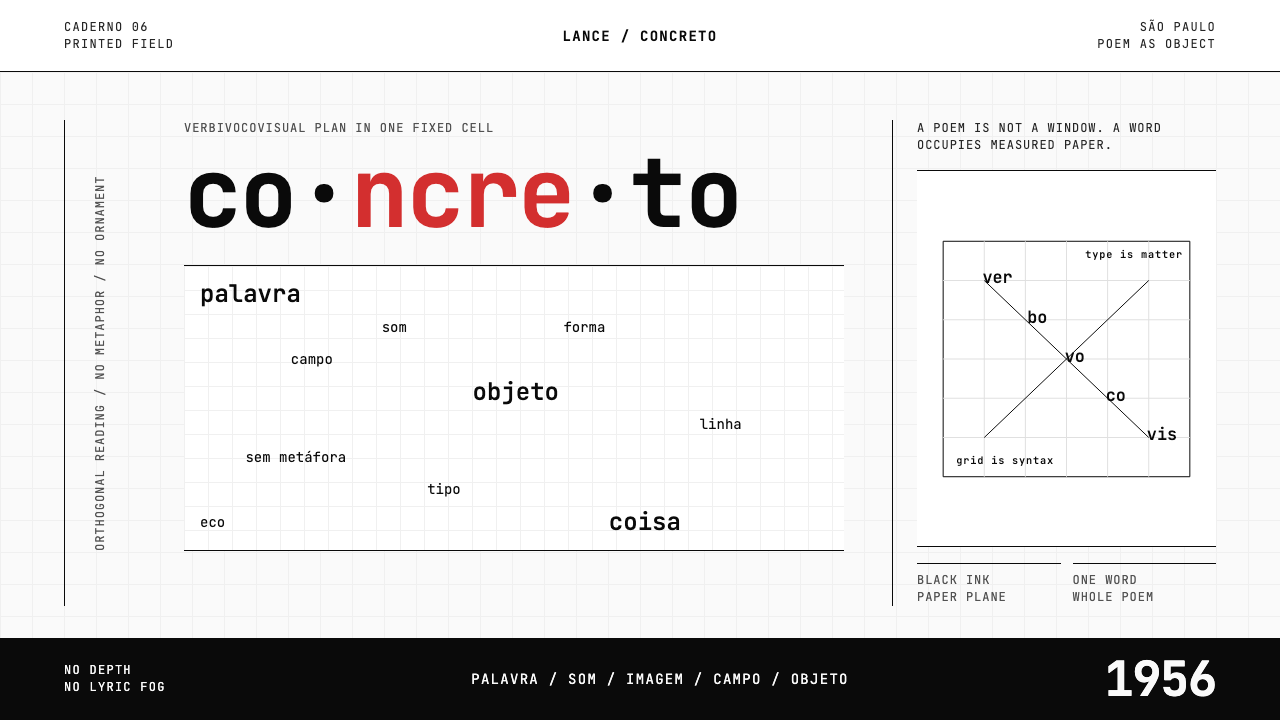 Brazilian Concrete PoetryWords become objects. Monospace cells, black-white paper, one cadmium red rup…字成为物。等宽格、黑白纸面,一处镉红断裂。
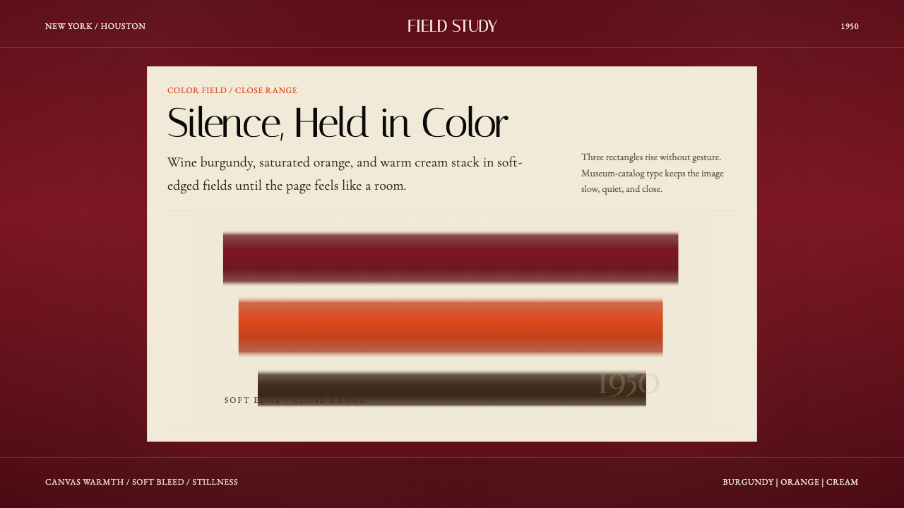 Mark Rothko Color Field (1950)Silence made visible. Burgundy, orange, and cream stack in soft-edged fields.把沉默变成可见。酒红、橙与奶油柔边堆叠成色域。
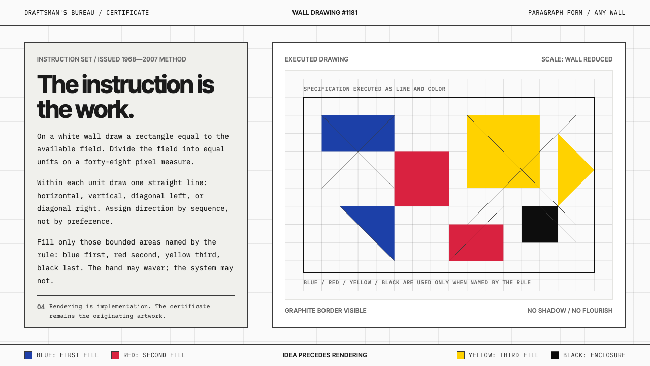 Sol LeWitt ConceptualInstruction becomes art. Mono certificates face wavering graphite grids in fo…指令即艺术:等宽证书对照颤动石墨网格与四色规则。
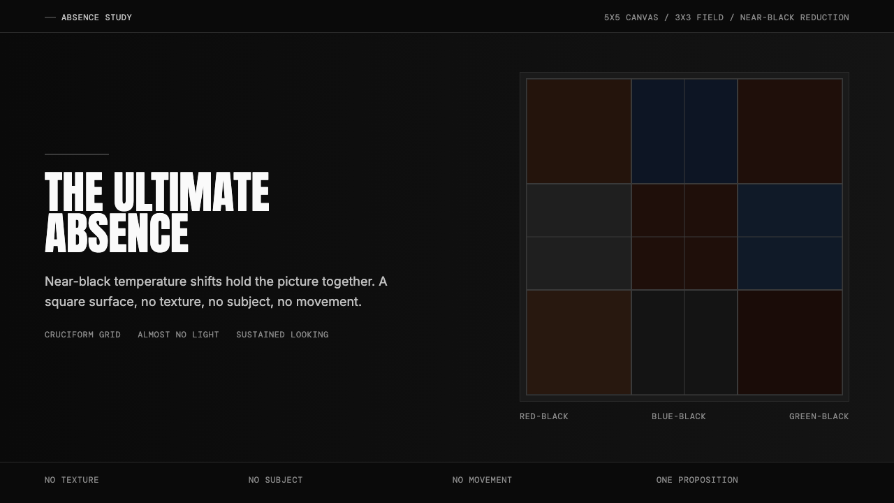 Ad Reinhardt Black Painting (1953)Austere absence. Near-black grid shifts reveal structure on sustained looking.苦行式缺席。近黑网格只在持续凝视中显形。