What is Ad Reinhardt Black Painting (1953)?什么是 Ad Reinhardt Black Painting (1953)?
Ad Reinhardt pushed painting to its logical vanishing point — surfaces that appear uniformly black until sustained attention reveals a barely-visible cruciform grid of near-black variations, making absence itself the subject.阿德·莱因哈特将绘画推至其逻辑上的消失点——表面看似纯黑,直至持续凝视才显现出近黑色变体构成的十字形网格,令缺席本身成为主题。
Ad Reinhardt Black Painting (1953) in briefAd Reinhardt Black Painting (1953) 速览
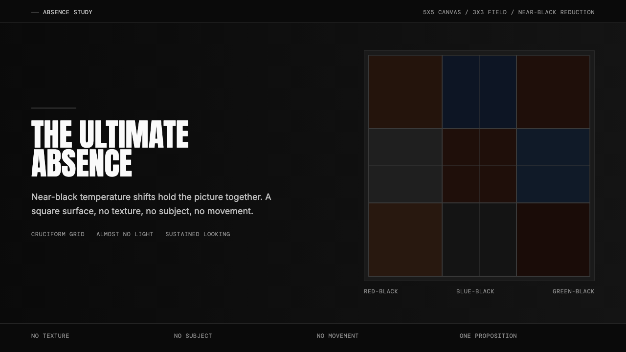
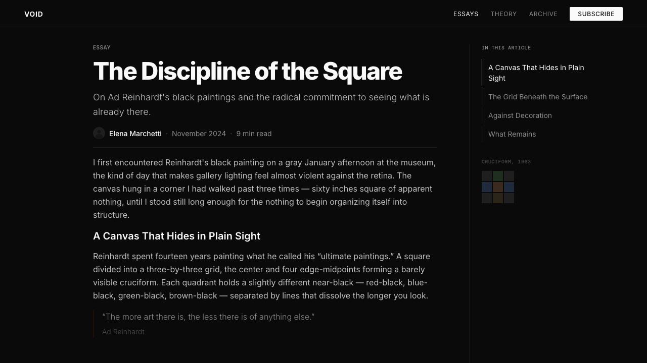
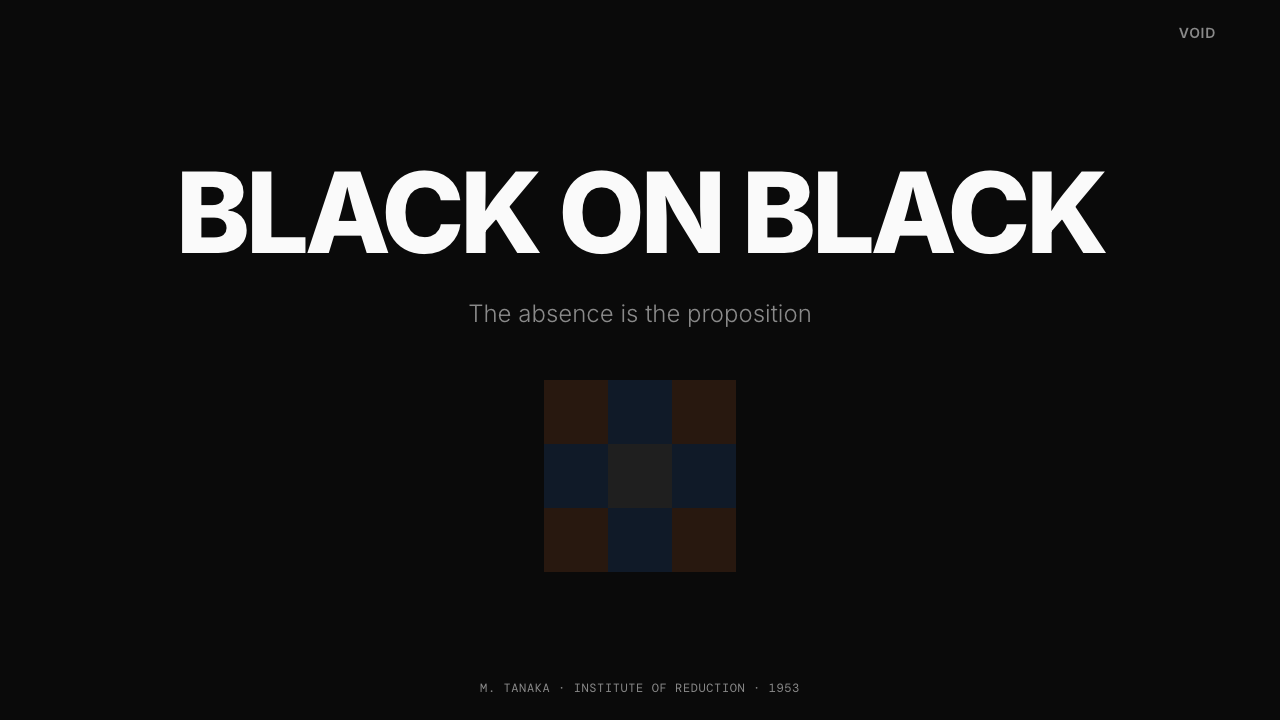
Ad Reinhardt's Black Paintings are the most dogmatically reductionist works in post-war American art. Executed between 1953 and 1967, each canvas is a five-foot square painted with near-black variations — red-blacks, blue-blacks, and green-blacks — arranged in a nine-part cruciform grid. At ordinary viewing distance and in ordinary light the paintings appear to be uniform matte black. Only after prolonged looking, and only in favorable lighting, do the tonal divisions emerge: three rows, three columns, each section a subtly different temperature of dark.阿德·莱因哈特的」黑色绘画」是战后美国艺术中最具教条色彩的还原主义作品。这些画布创作于1953至1967年间,每幅均为五英尺见方,以红黑、蓝黑、绿黑等近黑色变体绘成九宫格十字形网格。在普通观看距离和普通光线下,画面呈现为均匀的哑光黑色。只有经过长时间凝视,并在适宜的光线条件下,色调分区才会浮现:三行三列,每个区域是微妙不同温度的深色。
Reinhardt described the Black Paintings not as meditations but as propositions — a series of rules he followed with near-mechanical consistency. The format was always square. The scale was always the same. The palette was always near-black, never pure black. The surface was always matte. No brushstroke was to be legible; no gesture was to be visible; no atmosphere was to accumulate. He called them 'the last paintings anyone can paint' — terminal objects that refused to yield symbolic content, narrative, or expression.莱因哈特将」黑色绘画」描述为命题,而非冥想——他以近乎机械的一致性遵循的一套规则。画布永远是正方形,尺寸永远相同,色板永远是近黑而非纯黑,表面永远是哑光。没有可辨读的笔触,没有可见的手势,没有积累的氛围。他称之为」任何人能画的最后一批画」——拒绝产生象征内容、叙事或表达的终结性对象。
As a design system, the Black Paintings translate into a visual language of near-absolute restraint: surfaces that are almost-but-not-quite uniform, structures revealed only to patient attention, the elimination of every decorative, atmospheric, or expressive element. The system is not minimalism in the contemporary commercial sense — it is a principled philosophical position, and working with it demands a willingness to let structure do all the communicative work that color, imagery, and ornament are ordinarily asked to perform.作为设计系统,」黑色绘画」转化为一种近乎绝对克制的视觉语言:几乎但不完全均匀的表面,只向耐心的注意力显现的结构,对一切装饰性、氛围性或表达性元素的彻底排除。这套系统并非当代商业意义上的极简主义——它是一种有原则的哲学立场,与之共事需要一种意愿:让结构承担色彩、图像与装饰通常被要求完成的全部传达工作。
See the Ad Reinhardt Black Painting (1953) design system查看 Ad Reinhardt Black Painting (1953) 完整设计系统
Where does Ad Reinhardt Black Painting (1953) come from?Ad Reinhardt Black Painting (1953) 从何而来?
Ad Reinhardt was born in Buffalo in 1913 and moved to New York City as a young man, studying art history at Columbia University under Meyer Schapiro. He became active in the New York art world in the late 1930s, initially as a political cartoonist for PM magazine and other left-leaning publications. His early paintings were Cubist-influenced abstractions; through the 1940s he moved toward progressively flatter, more geometric compositions, influenced by his deep engagement with Asian art — particularly Zen Buddhist calligraphy and the monochrome ink paintings of the Song dynasty — which he encountered through his research into non-Western art history.阿德·莱因哈特1913年生于布法罗,青年时迁居纽约市,在哥伦比亚大学师从迈耶·夏皮罗研修艺术史。20世纪30年代末,他开始活跃于纽约艺术界,起初以《PM》杂志及其他左翼出版物的政治漫画家身份出道。早期画作受立体主义影响,属抽象构成;整个40年代,他逐渐走向更为平面化、几何化的构图,这一转变与他对亚洲艺术的深度研究密切相关——尤其是禅宗书法和宋代水墨画,他通过研究非西方艺术史与之相遇。
By the early 1950s Reinhardt had begun eliminating color from his palette systematically, moving through blue monochromes and red monochromes before arriving at near-black. The first fully resolved Black Paintings appear around 1953. The decision was not sudden but cumulative — a logical extension of his conviction, sharpened through arguments with his contemporaries, that painting had been corrupted by the expressive self-dramatization of Abstract Expressionism. Where artists like Jackson Pollock and Willem de Kooning made the mark and the gesture the subject of painting, Reinhardt wanted to make painting about nothing at all outside of itself — a closed, self-referential object.1950年代初,莱因哈特开始系统性地从色板中消除色彩,经历蓝色单色阶段和红色单色阶段之后,最终抵达近黑色。第一批完全成熟的」黑色绘画」约出现于1953年。这一决定并非突然,而是累积性的——是他信念的逻辑延伸,这一信念通过与同时代人的论争而愈加尖锐:绘画已被抽象表现主义的表现性自我戏剧化所腐蚀。杰克逊·波洛克和威廉·德·库宁等艺术家将笔触与姿态作为绘画的主题,而莱因哈特则希望绘画与其自身之外的一切毫无关联——一个封闭的、自我指涉的对象。
Reinhardt was a combative and prolific theorist as well as a painter. His essays and art-world satires, collected in the volume 'Art-as-Art,' lay out his position in deliberately absolutist terms: 'Art is art. Everything else is everything else.' He was particularly hostile to commercial application of fine-art aesthetics, to the idea that paintings could serve decorative or expressive social functions, and to any confusion between the painted object and the world it exists within. This intellectual militancy set him apart from the Abstract Expressionist mainstream even as he participated in many of the same institutional contexts — the same galleries, the same critical conversations.莱因哈特既是画家,也是好战而多产的理论家。他的文章与艺术界讽刺作品汇集成《作为艺术的艺术》(Art-as-Art)一书,以刻意绝对主义的语气阐明立场:」艺术是艺术,其他的一切都是其他的一切。」他尤其反对将纯艺术美学用于商业、反对绘画服务于装饰或表达性社会功能的观念,以及任何将画布对象与其所存在的世界相混淆的做法。这种智识上的好战性使他有别于抽象表现主义主流,尽管他参与了许多相同的机构语境——相同的画廊,相同的批评话语。
The cultural context of the Black Paintings includes Thomas Merton, the Trappist monk and writer with whom Reinhardt maintained a long correspondence. Merton's interest in apophatic theology — the idea that the divine can only be approached by negating all positive descriptions — resonated with Reinhardt's aesthetic position. The critic Clement Greenberg, though a supporter of Reinhardt's early work, grew skeptical of the Black Paintings; Donald Judd, by contrast, recognized in them a direct precursor to Minimalism, citing their serial consistency, their refusal of illusionistic depth, and their treatment of the canvas as a literal object rather than a pictorial window. When Reinhardt died in 1967, the Minimalist movement was consolidating around exactly those principles — making the Black Paintings a historical pivot between two major currents of post-war American art.「黑色绘画」的文化语境还包括特拉普派修士、作家托马斯·默顿,莱因哈特与他保持着长期通信。默顿对否定神学的兴趣——以否定一切正面描述来趋近神圣的思路——与莱因哈特的美学立场产生共鸣。批评家克莱门特·格林伯格虽曾支持莱因哈特早期作品,却对」黑色绘画」持保留态度;唐纳德·贾德则相反,他在其中发现了极简主义的直接先驱,援引其序列一致性、拒绝幻觉深度,以及将画布视为字面对象而非图像窗口的处理方式。1967年莱因哈特去世时,极简主义运动正围绕这些原则走向成熟——使」黑色绘画」成为战后美国艺术两大主流之间的历史轴心。
What defines the Ad Reinhardt Black Painting (1953) look?Ad Reinhardt Black Painting (1953) 的视觉特征是什么?
Near-Black Palette近黑色板
The defining visual quality is the use of near-black rather than true black — surfaces rendered in dark red-blacks, blue-blacks, and green-blacks that appear identical at a glance but differ in subtle chromatic temperature. This refusal of absolute black is deliberate: a pure black would be dead and undifferentiated, while near-blacks create an internal structure that rewards sustained attention. The palette communicates that absence is not emptiness — it has gradations, relationships, and a quiet internal logic.这套系统最核心的视觉品质是使用近黑而非纯黑——表面以深红黑、蓝黑、绿黑呈现,乍看相同,细辨之下却有微妙的色温差异。这种拒绝绝对黑色的做法是刻意为之:纯黑将是死寂而无差别的,而近黑创造出一种奖励持续关注的内在结构。色板传达出这样一个信念:缺席并非空无——它有层次、有关系,有安静的内在逻辑。
Matte Surface哑光表面
All surfaces in this system are uniformly matte. Any sheen, gloss, or reflectivity would introduce atmospheric variation — the suggestion of light sources, spatial depth, or environmental context. Matte surfaces absorb attention rather than returning it to the viewer; they create the condition of sustained looking rather than immediate visual reward. In digital application this translates to flat, non-glossy treatments: no specular highlights, no gradient sheen, no glass-like finish on any element.这套系统中的所有表面均为均匀哑光。任何光泽、亮光或反射都将引入氛围变化——暗示光源、空间深度或环境语境。哑光表面吸收注意力而非将其返还给观者;它创造持续凝视的条件,而非即时的视觉回报。在数字应用中,这转化为平面、无光泽的处理方式:任何元素上均无镜面高光、无渐变光泽、无玻璃质感。
Cruciform Grid Structure十字形网格结构
The underlying structure is always a three-by-three grid organized around a cruciform center. This grid is not decorative — it is the painting's entire architecture, and it is visible only as tonal difference rather than line. In design application the principle translates to rigorous invisible-grid discipline: content should be organized by an underlying structure that is felt rather than seen, with zones differentiated by very subtle tonal or weight variation rather than explicit borders or rules.底层结构始终是以十字形为核心的三乘三网格。这个网格并非装饰——它是绘画的全部建筑,且仅以色调差异而非线条的方式显现。在设计应用中,这一原则转化为严格的隐性网格纪律:内容应由一种被感知而非被看见的底层结构组织,各区域以极其微妙的色调或轻重变化加以区分,而非以明确的边框或分割线标示。
Serial Consistency序列一致性
Every Black Painting follows the same format, the same scale, the same structural logic. This serial consistency is not repetition in the pejorative sense — it is a refusal to treat individual works as expressions of mood or circumstance. In design terms this principle argues against one-off decisions: every screen, every slide, every component should be derivable from the same small set of rules. Variation for its own sake violates the system; only variation that serves a structural purpose is permitted.每一幅」黑色绘画」都遵循相同的格式、相同的尺寸、相同的结构逻辑。这种序列一致性并非贬义上的重复——它是拒绝将个别作品视为情绪或境遇表达的立场。从设计角度而言,这一原则反对一次性决定:每个屏幕、每张幻灯片、每个组件都应可从同一套简小规则中推导而出。为变化而变化违反了系统;只有服务于结构目的的变化才被允许。
Erasure of the Gesture姿态的消除
Reinhardt applied paint in thin, overlapping layers specifically to erase any trace of the brushstroke. The hand of the artist was to be invisible; the surface was to appear as if it had always existed in that state. In design, this principle argues for the elimination of any element that signals the designer's presence — decorative flourishes, expressive typeface choices, atmospheric treatments, or any decision that reads as personal taste rather than structural necessity. The work should appear inevitable, not authored.莱因哈特以薄层叠加的方式涂抹颜料,专门用于消除任何笔触痕迹。艺术家的手应当是不可见的;表面应当看起来仿佛一直就是这个样子。在设计中,这一原则要求消除任何显示设计师存在的元素——装饰花饰、表达性字体选择、氛围性处理,或任何被解读为个人趣味而非结构必要性的决定。作品应当看起来是必然的,而非被创作的。
Square Format正方形格式
The square is the format of maximum neutrality — it has no dominant axis, implies no direction, creates no hierarchy between width and height. Reinhardt's insistence on the square was a refusal of compositional drama. In design contexts where the style is applied, this principle argues for centered, symmetrical layouts where the format itself makes no argument — content is organized within a neutral field rather than one whose proportions already perform a visual function.正方形是最大中立性的格式——它没有主导轴线,不暗示方向,在宽度与高度之间不创造层级。莱因哈特对正方形的坚持是对构图戏剧性的拒绝。在应用这种风格的设计语境中,这一原则主张采用居中、对称的版面,使格式本身不发出任何主张——内容在一个中立的场域内被组织,而非在一个比例本身已在发挥视觉功能的场域中。
Radical Exclusion彻底排除
The logic of the Black Paintings is subtractive: everything that can be removed has been removed, and what remains is only what cannot be removed without destroying the work entirely. This differs from contemporary minimalism, which often adds carefully chosen elements for visual appeal. Reinhardt's exclusion is principled to the point of hostility — there is no concession to the viewer's comfort or desire for visual stimulation. In design application this demands genuine discipline: the absence of decorative elements should not be compensated by clever negative-space arrangements. The emptiness should be allowed to remain empty."黑色绘画"的逻辑是减法式的:所有能被移除的都已被移除,剩下的仅是不移除就会彻底摧毁作品的东西。这不同于当代极简主义——后者往往为视觉吸引力而精心添加某些元素。莱因哈特的排除具有原则性,近乎敌意——没有任何对观者舒适感或视觉刺激欲望的让步。在设计应用中,这要求真正的自律:装饰性元素的缺席不应以聪明的负空间安排来补偿。空旷应当被允许保持空旷。

See the Ad Reinhardt Black Painting (1953) design system查看 Ad Reinhardt Black Painting (1953) 完整设计系统
Who shaped Ad Reinhardt Black Painting (1953)?谁塑造了 Ad Reinhardt Black Painting (1953)?
Reinhardt (1913–1967) was simultaneously a painter, a polemicist, and one of the sharpest satirists of the New York art world. His 'Art Rules' and cartoon series lampooning art-world pretension were widely circulated; his theoretical writings in 'Art-as-Art' remain essential documents of American post-war aesthetics. He taught at Brooklyn College for most of his career, maintaining a position outside the mainstream gallery system while influencing generations of students. His death at fifty-three, just as Minimalism was consolidating, cut short what might have been an extended dialogue between his position and the movement he had helped to make possible.莱因哈特(1913—1967年)同时是一位画家、一位论战者,以及纽约艺术界最犀利的讽刺者之一。他的」艺术规则」与讽刺艺术界做作的漫画系列广为流传;他的理论著述《作为艺术的艺术》(Art-as-Art)至今仍是美国战后美学的重要文献。他在布鲁克林学院执教大半职业生涯,保持在主流画廊体系之外的独立立场,同时影响了几代学生。他在五十三岁时离世,恰在极简主义走向成熟之际,中断了一场本可延伸的对话——他与他所助力开创的那场运动之间的对话。
Judd (1928–1994) was among the first to articulate the historical connection between Reinhardt's Black Paintings and the emerging Minimalist movement. His critical writing in the early 1960s identified Reinhardt's serial consistency, refusal of illusionistic depth, and treatment of the canvas as a literal object as foundational to what Judd called 'specific objects' — artworks that existed in real space rather than creating pictorial illusions. Judd's own stacked and cantilevered metal structures extended Reinhardt's logic from the painted surface into three-dimensional space, making explicit the architectural potential implicit in the Black Paintings.贾德(1928—1994年)是最早阐明莱因哈特」黑色绘画」与新兴极简主义运动历史关联的人之一。他在1960年代初的批评文章中,将莱因哈特的序列一致性、拒绝幻觉深度以及将画布视为字面对象的处理,认定为贾德所称」特定物体」的基础——即存在于真实空间而非创造图像幻觉的艺术作品。贾德自己的叠放与悬挑金属结构,将莱因哈特的逻辑从绘画表面延伸至三维空间,使」黑色绘画」中隐含的建筑潜能变得明确。
Merton (1915–1968), the Trappist monk and writer, maintained a long correspondence with Reinhardt that illuminates the non-Western and contemplative dimensions of the Black Paintings. Merton's interest in apophatic theology — the via negativa, the tradition of approaching the divine by systematically negating all positive attributes — provided Reinhardt with a framework for understanding his own reductionism as something other than nihilism. Their exchange suggests that the Black Paintings' refusal of expression was not the absence of meaning but a different kind of meaning-making: one that requires the viewer to bring sustained, patient attention rather than receiving pre-packaged content.特拉普派修士、作家托马斯·默顿(1915—1968年)与莱因哈特保持着长期通信,这些通信照亮了」黑色绘画」中非西方与沉思性的维度。默顿对否定神学的兴趣——否定之路(via negativa),通过系统性否定一切正面属性来趋近神圣的传统——为莱因哈特提供了一个框架,使他得以将自身的还原主义理解为某种不同于虚无主义的东西。他们之间的交流表明,」黑色绘画」对表达的拒绝并非意义的缺席,而是一种不同的意义生产方式:它要求观者带来持续、耐心的注意力,而非接收预先打包好的内容。
Greenberg (1909–1994) was the dominant American art critic of the post-war period and the primary theorist of Abstract Expressionism. He was an early supporter of Reinhardt's work but grew increasingly skeptical of the Black Paintings, which he found too hermetic and too theoretically self-enclosed to advance the formalist project he championed. The tension between Greenberg and Reinhardt represents a broader fault line in post-war American art: between a formalism that still celebrated visual sensation and a reductionism that sought to eliminate it. Reinhardt's explicit rejection of Greenberg's critical authority — he wrote parody rules mocking the critical establishment — was part of what made him an outsider figure even within the avant-garde.格林伯格(1909—1994年)是战后时期最具支配力的美国艺术批评家,也是抽象表现主义的主要理论家。他早期支持莱因哈特的作品,但对」黑色绘画」日益持怀疑态度,认为它们过于隐秘、过于理论上自我封闭,无法推进他所倡导的形式主义事业。格林伯格与莱因哈特之间的张力代表了战后美国艺术中更深层的断层线:一边是仍然颂扬视觉感受的形式主义,另一边是寻求消除它的还原主义。莱因哈特明确拒绝格林伯格的批评权威——他写了讽刺批评圈子的戏谑规则——这也是使他即便在前卫圈内也成为局外人形象的原因之一。
Rothko (1903–1970) is the artist most often compared to Reinhardt, though the two occupied opposite poles of late Abstract Expressionism. Where Reinhardt systematically eliminated atmosphere, expression, and viewer affect, Rothko cultivated all three — his large color-field paintings were designed to produce intense emotional responses, and he described them explicitly in terms of tragedy and ecstasy. The comparison clarifies what is distinctive about Reinhardt: the Black Paintings are deliberately anti-expressive in a way Rothko's work never was. Both artists arrived at near-monochrome surfaces, but through fundamentally opposed commitments — Rothko by maximizing emotional resonance, Reinhardt by refusing it.罗斯科(1903—1970年)是最常与莱因哈特相提并论的艺术家,尽管两人占据了晚期抽象表现主义的对立两极。莱因哈特系统性地消除氛围、表达与观者情感,罗斯科则将三者一一培育——他的大幅色域绘画旨在产生强烈的情感反应,他明确以悲剧与狂喜来描述它们。这种对比阐明了莱因哈特的独特之处:」黑色绘画」是刻意反表达性的,而罗斯科的作品从未如此。两位艺术家都抵达了接近单色的表面,但出发点截然相反——罗斯科通过最大化情感共鸣,莱因哈特通过拒绝它。
How do you use Ad Reinhardt Black Painting (1953) today?今天怎么用 Ad Reinhardt Black Painting (1953)?
The Ad Reinhardt Black Painting system is among the most demanding to apply correctly, because its power depends entirely on discipline: the moment any decorative, atmospheric, or expressive element is introduced, the logic collapses. Used well, the system produces interfaces and layouts of extraordinary authority and calm — surfaces that reward the viewer who pays close attention rather than grabbing attention through stimulation. Used carelessly, it produces designs that read as merely gloomy, unfinished, or inaccessible.阿德·莱因哈特」黑色绘画」系统是最难正确应用的系统之一,因为其力量完全依赖于自律:一旦引入任何装饰性、氛围性或表达性元素,逻辑便随之崩溃。用得好,这套系统产生具有非凡权威感与宁静感的界面和版面——奖励专注凝视的观者,而非通过刺激抓取注意力。用得不好,则产生只是显得阴郁、未完成或难以亲近的设计。
For presentation slides, the style is particularly effective on high-stakes cover pages and keynote openers where gravitas is required. A cover in this system uses a near-black ground — not pure black, but a dark surface with subtle internal variation — with the title set in a near-white typeface of generous weight and scale. No imagery, no decorative mark, no background texture. Content slides should be treated as grids of near-black zones differentiated by tonal variation rather than visible lines, with text occupying clearly defined columns at a generous scale. Data slides carry an exceptional quality in this system: charts and tables rendered in near-black variations on a slightly lighter near-black ground read as austere, credible, and authoritative — closer to scientific instrumentation than to commercial infographics.对于演示文稿,这种风格在需要庄重感的高风险封面页和主题演讲开场尤为有效。这套系统中的封面使用近黑色底面——不是纯黑,而是有微妙内部变化的深色表面——标题以分量感和尺度感充足的近白色字体排印。无图像,无装饰标记,无背景纹理。内容页应作为以色调变化而非可见线条区分的近黑色区域网格处理,文字以宽裕的尺寸占据清晰定义的列。数据页在这套系统中呈现出非凡品质:在略浅的近黑底面上以近黑色变体呈现的图表和表格,读来朴素、可信、权威——更接近科学仪器而非商业信息图形。
For web interfaces, the system is best suited to dashboards, financial platforms, and developer tools where precision and authority are primary values. The approach: a single near-black background tone, body text in a near-white of slightly warm temperature, interactive states signaled by a shift from one near-dark to another — never by introducing a bright accent color. Navigation should be purely typographic, set at a scale that communicates confidence. Borders, if they appear at all, should be extremely subtle tonal separations rather than visible lines. The goal is a surface that reads as composed and serious, in which every element appears to have been placed by necessity rather than choice.对于网页界面,这套系统最适合精确性与权威感是首要价值的仪表板、金融平台和开发者工具。方法如下:单一的近黑色背景色调,略带暖温度的近白色正文,交互状态通过从一种近暗色向另一种近暗色的转变来传达——绝不通过引入明亮的强调色。导航应纯粹是字体性的,以传达自信的尺度排印。边框(若出现)应是极其微妙的色调分隔,而非可见的线条。目标是一个读来沉稳而严肃的表面,其中每个元素看起来都是出于必要而非选择而被置于其处。
For editorial and marketing applications, the system requires careful calibration because its aesthetic can conflict with the warmth and accessibility that consumer-facing communications typically require. Where the system works well in editorial contexts is in academic publishing, high-end cultural institutions, and luxury sectors where restraint and seriousness are brand values. In these contexts, a full-width near-black feature with near-white body text, section breaks marked by a near-invisible tonal shift rather than a rule or ornament, and images treated as flat rectangular zones of near-dark rather than atmospheric photographs, produces a layout of exceptional distinction. Marketing pages benefit from the system's poster-like finality: a single statement, set at scale, on a near-black ground, with no supporting visual noise.对于编辑与营销应用,这套系统需要仔细校准,因为其美学可能与面向消费者的传播通常要求的温暖感和可亲性相冲突。该系统在编辑语境中表现良好的领域是学术出版、高端文化机构以及以克制和严肃为品牌价值的奢侈品领域。在这些语境中,以近白色正文排印在全宽近黑色特写区域上,以近乎不可见的色调转变而非规则线或装饰元素标记段落分隔,以近暗色的平面矩形区域而非氛围摄影处理图像,产生出具有非凡格调的版面。营销页面受益于这套系统的海报式终结性:一句陈述,以大尺度排印在近黑色底面上,没有任何支撑性视觉噪音。
The most common mistake when working with this system is compensating for its austerity by introducing visual complexity elsewhere — adding subtle gradients to the background, using a typeface with expressive character, or placing graphic elements to break the monotony. Each of these interventions violates the logic of the system. The near-black variations in Reinhardt's paintings are almost invisible; they are not a substitute for visual richness but a different kind of rigor. A second common mistake is using pure black rather than near-black: a pure black ground flattens everything on it into sameness, while near-black creates the subtle internal structure that gives the system its peculiar depth. The discipline required is real: working in this system means resisting the designer's instinct to solve problems through addition.运用这套系统时最常见的错误是通过在别处引入视觉复杂性来补偿其苦行感——为背景添加微妙渐变、使用具有表达性格的字体,或放置图形元素来打破单调。每一种干预都违反了系统的逻辑。莱因哈特绘画中的近黑色变体几乎是不可见的;它们不是视觉丰富性的替代品,而是一种不同的严格性。第二个常见错误是使用纯黑而非近黑:纯黑底面将其上的一切压平为千篇一律,而近黑创造出赋予这套系统其特殊深度的微妙内部结构。所要求的自律是真实的:在这套系统中工作,意味着抵制设计师通过添加来解决问题的本能。
See the Ad Reinhardt Black Painting (1953) design system查看 Ad Reinhardt Black Painting (1953) 完整设计系统
Ad Reinhardt Black Painting (1953) — FAQAd Reinhardt Black Painting (1953) · 常见问题
Is this style actually usable for digital design, or is it only appropriate for fine-art contexts?这种风格在数字设计中真的可用吗?还是说它只适合纯艺术语境?
It is genuinely usable in digital design, but only for specific product types and audience contexts. It works exceptionally well for developer tools, financial data platforms, high-end portfolio sites, and any product where the audience values precision and authority over warmth and approachability. It works poorly for consumer-facing products that require emotional accessibility — onboarding flows, family-oriented applications, products targeting first-time users who need visual guidance rather than visual restraint. The style assumes a viewer willing to bring sustained attention to the interface; many digital contexts cannot make that assumption.它在数字设计中确实可用,但仅适用于特定的产品类型和受众语境。它在开发者工具、金融数据平台、高端作品集网站,以及任何受众重视精确性和权威感而非温暖感和可亲性的产品中表现出色。它在需要情感可及性的面向消费者产品中表现欠佳——引导流程、面向家庭的应用、针对需要视觉引导而非视觉克制的首次用户的产品。这种风格假设观者愿意对界面投入持续的注意力;许多数字语境无法做出这种假设。
How is this different from simply using a dark theme or dark mode?这与单纯使用深色主题或暗色模式有什么区别?
The difference is structural and philosophical, not just visual. A conventional dark theme typically inverts a light-mode design — swapping white backgrounds for dark backgrounds while keeping accent colors, gradients, and visual hierarchy intact. The Black Painting system eliminates accent colors entirely, uses only near-black variations rather than a single dark background color, and applies a logic of radical exclusion rather than aesthetic preference. The result reads differently: a dark theme is a legibility solution; the Black Painting system is an epistemological position about what a designed surface is allowed to do.区别是结构性和哲学性的,而非仅仅是视觉上的。常规深色主题通常是对浅色模式设计的反转——将白色背景替换为深色背景,同时保持强调色、渐变和视觉层级完整。」黑色绘画」系统则完全消除强调色,仅使用近黑色变体而非单一深色背景色,并应用彻底排除的逻辑而非审美偏好。结果读来截然不同:深色主题是一种易读性解决方案;」黑色绘画」系统是一种关于设计表面被允许做什么的认识论立场。
Can this system accommodate any color at all, or must everything be near-black?这套系统能容纳任何颜色吗?还是说一切必须都是近黑色?
Authentic application of the system uses only near-black variations and near-white for text. Any introduction of chromatic color — even a muted one — shifts the system's identity fundamentally. That said, a disciplined minimal departure is possible: a single near-neutral dark warm tone, or a near-neutral dark cool tone, can be used as a structural accent to mark section boundaries or interactive states without destroying the system's logic. What the system cannot absorb is bright, saturated color — that immediately signals a different visual language and undermines the authority the near-black palette creates through its restraint.这套系统的正宗应用仅使用近黑色变体和用于文字的近白色。引入任何有色彩的颜色——哪怕是低饱和度的——都会从根本上改变系统的特性。话虽如此,有纪律的极小偏离是可能的:单一的近中性深暖色调或近中性深冷色调,可用作结构性强调来标记段落边界或交互状态,而不破坏系统逻辑。系统无法吸收的是明亮、高饱和度的颜色——那会立即传达出不同的视觉语言,并削弱近黑色色板通过其克制所建立的权威感。
What typographic approach works best within this system?在这套系统中,哪种排版方式效果最好?
Typography in this system should be as structurally neutral as the surfaces it sits on — meaning typefaces with minimal expressive character and high legibility at varied scales. Geometric or humanist letterforms with clean construction work well; anything with calligraphic influence, strong personality, or decorative details works against the system. Type scale and weight carry the entire communicative load in the absence of color hierarchy: a generous differential between heading and body scale, with perhaps one intermediate level for subheadings, provides all the structure the system needs. Set in near-white on near-black, type should feel inevitable — present because it must be, not because it was chosen.这套系统中的排版应当与其所在的表面一样在结构上保持中立——意味着表达性格最小、在不同尺度下可读性高的字体。具有清晰构造的几何或人文主义字形效果良好;任何带有书法影响、强烈个性或装饰细节的字体都与系统相悖。在缺少色彩层级的情况下,字体尺寸和字重承担全部传达功能:标题与正文尺寸之间宽裕的差异,加上也许一个用于小标题的中间级别,为系统提供所需的全部结构。以近白色排印在近黑色表面上,字体应当感觉是必然的——因为它必须存在,而非因为它被选择。
How does this style relate to Minimalism as a contemporary design trend?这种风格与当代设计趋势中的极简主义有何关联?
Contemporary design minimalism and the Reinhardt Black Painting system share an aesthetic surface — both favor restraint, remove decoration, and reduce visual complexity. But their motivations and results diverge significantly. Contemporary minimalism is typically a visual preference that retains the option to introduce carefully selected accents, imagery, and interactive warmth. Reinhardt's reductionism is a philosophical refusal: it does not remove decoration to reveal elegance, it removes everything to refuse the expectation of elegance entirely. The practical difference shows in extremity: contemporary minimalist design can accommodate a hero image, a brand color, a warm interaction animation. The Black Painting system cannot. Understanding this distinction prevents the most common misapplication — using Reinhardt as an aesthetic justification for a design that is actually just understated contemporary minimalism.当代设计极简主义与莱因哈特」黑色绘画」系统共享一种美学外观——两者都偏爱克制、移除装饰、减少视觉复杂性。但它们的动机与结果有显著分歧。当代极简主义通常是一种视觉偏好,保留了引入精心选择的强调色、图像和交互温暖感的选项。莱因哈特的还原主义是一种哲学拒绝:它不是通过移除装饰来显现优雅,而是通过移除一切来拒绝对优雅的期望本身。实际差异体现在极端性上:当代极简主义设计可以容纳一张主视觉图像、一种品牌色、一个温暖的交互动画。」黑色绘画」系统不能。理解这一区别可以防止最常见的误用——将莱因哈特作为一种美学依据,用于实际上只是低调的当代极简主义设计。
Related design styles相关设计风格
 Josef Albers — Homage to the SquareColor becomes event. Warm cream, cobalt-red-yellow nested squares, exact hair…色彩成为事件。暖米底、钴蓝红黄嵌套方块与精确发丝线。
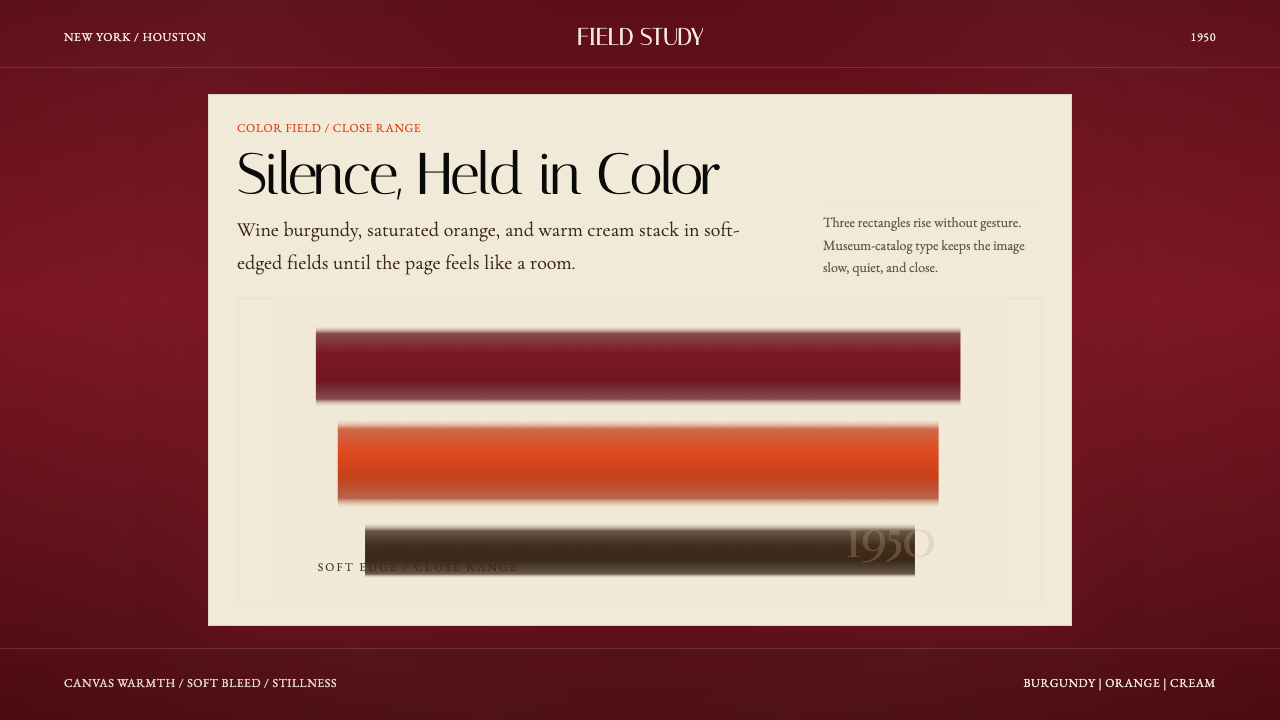 Mark Rothko Color Field (1950)Silence made visible. Burgundy, orange, and cream stack in soft-edged fields.把沉默变成可见。酒红、橙与奶油柔边堆叠成色域。
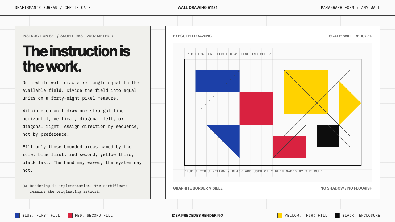 Sol LeWitt ConceptualInstruction becomes art. Mono certificates face wavering graphite grids in fo…指令即艺术:等宽证书对照颤动石墨网格与四色规则。
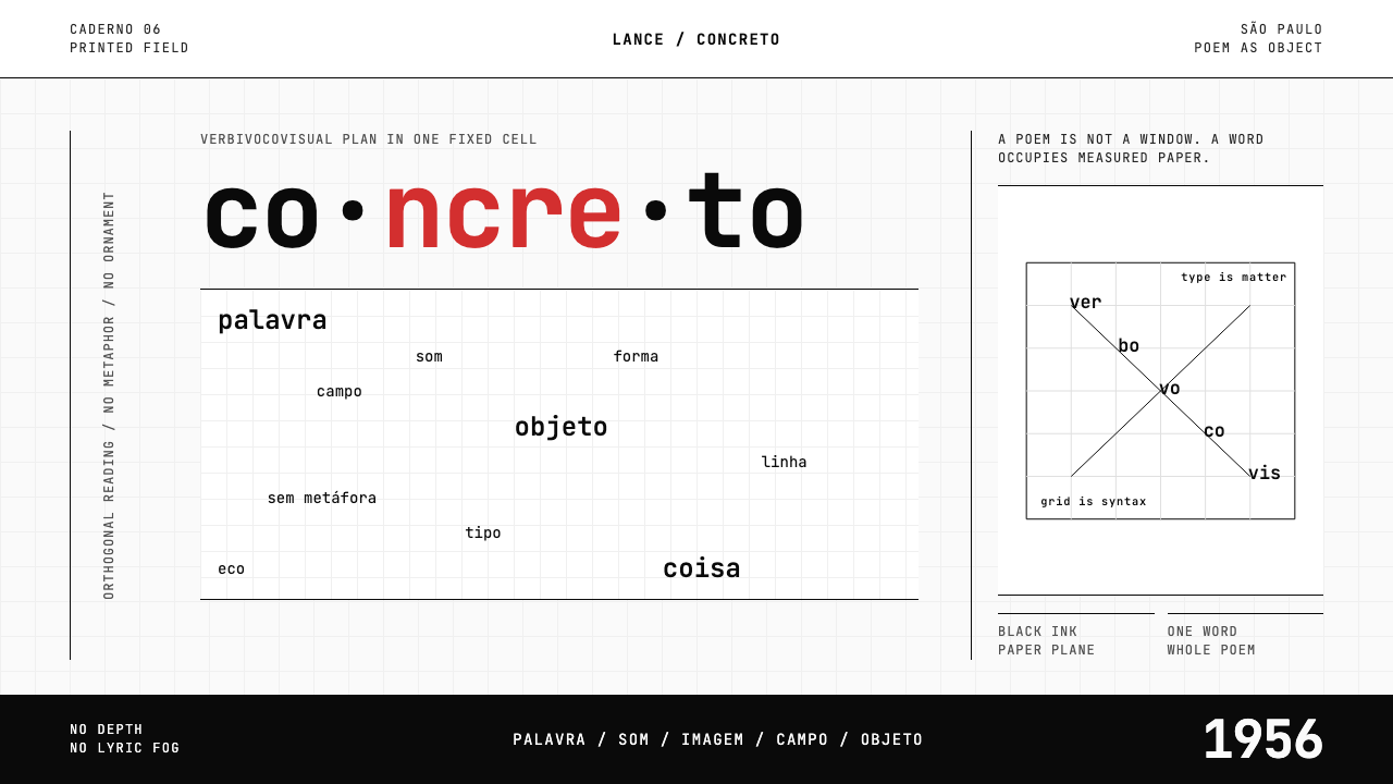 Brazilian Concrete PoetryWords become objects. Monospace cells, black-white paper, one cadmium red rup…字成为物。等宽格、黑白纸面,一处镉红断裂。
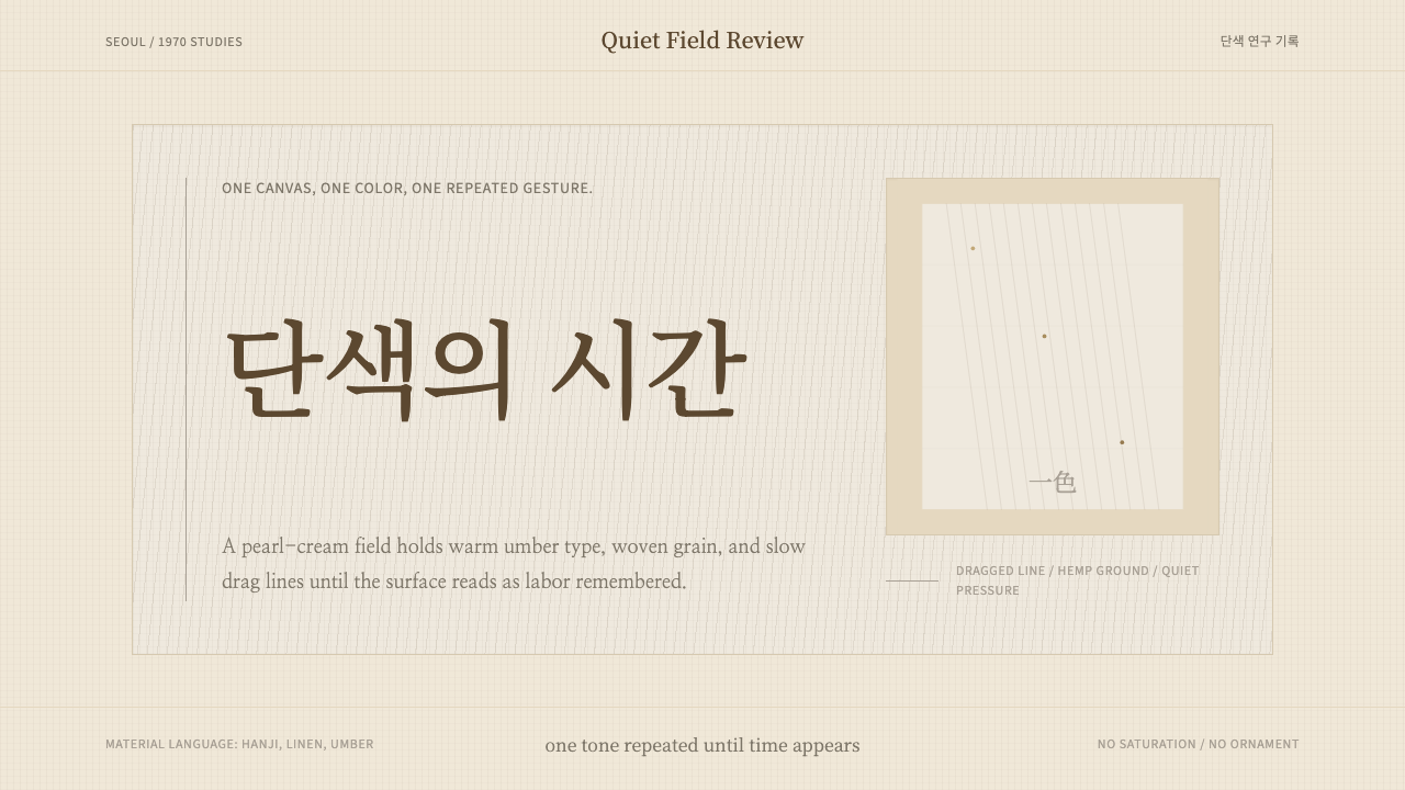 Korean Dansaekhwa MonochromeLabor becomes stillness. Umber serif type and drag lines on pearl cream.劳作化为静默。珍珠米底、褐色衬线和拖痕线条。
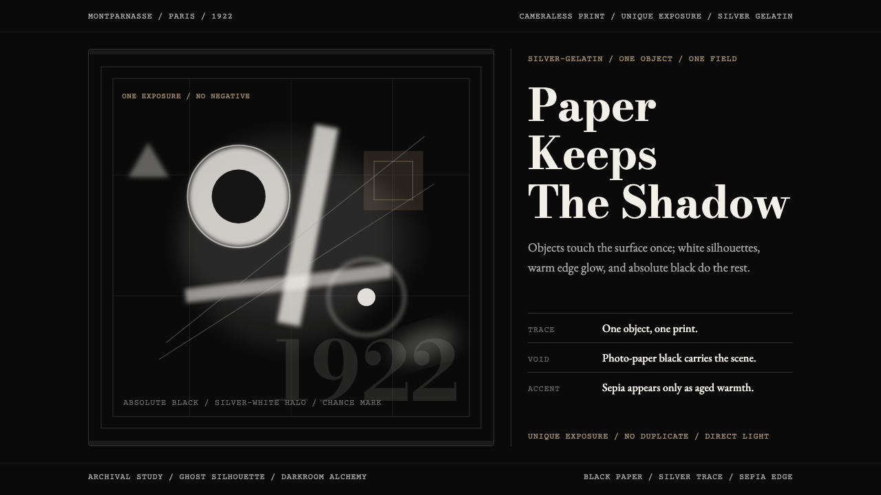 Man Ray Rayograph (1922)Light leaves the trace. Black voids, silver type, and sepia edges stage one g…光留下痕迹。黑底、银字与赭边,共构一张幽影印迹。