What is Sol LeWitt Conceptual?什么是 Sol LeWitt Conceptual?
Sol LeWitt proved that the written instruction is the artwork — the lines on the wall are merely its echo.索尔·勒维特证明了书面指令本身即是作品——墙上的线条不过是它的回声。
Sol LeWitt Conceptual in briefSol LeWitt Conceptual 速览
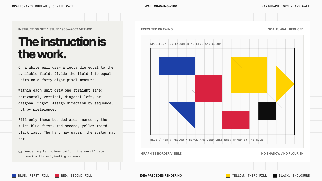
Sol LeWitt Conceptual is a design aesthetic drawn directly from the visual grammar of Sol LeWitt's Wall Drawings series (1968–2007), in which the artwork exists as a written instruction set and the executed drawing is its implementation. The visual system is defined by gallery-wall white grounds, graphite pencil lines that carry the subtle tremor of human hand, and a strict four-color rule: red, yellow, blue, and black appear only when the system's logic commands them.索尔·勒维特观念风格是直接从勒维特《墙上绘画》系列(1968—2007年)的视觉语汇中提炼出的设计美学。在那些作品中,艺术品以书面指令集的形式存在,而绘制在墙上的图形只是指令的执行。这套视觉系统以画廊墙白为底,以承载人手微颤的石墨铅笔线条为肌理,并遵守严格的四色规则:红、黄、蓝与黑色只在系统逻辑要求时才出现。
What distinguishes this style from other minimal aesthetics is its emphasis on the instruction itself as a visible artifact. Typewritten or monospaced text — paragraph-form directives set in an even, unornamented typeface — appears alongside or beneath geometric constructions. The result reads simultaneously as document and image: a certificate of logic rendered in line and letterform.将这种风格与其他极简美学区别开来的,是它对指令本身作为可见物件的强调。打字机体或等宽字体排出的段落式规则文本——均匀、不加修饰——与几何构造并置或置于其下。结果同时呈现为文件与图像:一纸以线条与字形书写的逻辑证书。
The underlying proposition is that concept precedes and governs execution. Any draftsman following the rules correctly produces a valid instance of the work. This delegation of authorship is not a weakness but the central argument: the system, not the hand, is the author. Applied to design, this means every visual decision should be derivable from a small set of explicit rules, and any element that cannot be so derived should not exist.其根本命题是:概念先于并支配执行。任何正确遵守规则的画工都能产出作品的一个有效实例。作者权的委托并非弱点,而是核心论点:系统而非手,才是作者。应用于设计,这意味着每一个视觉决定都应能从一组明确规则中推导而出,而任何无法如此推导的元素都不应存在。
See the Sol LeWitt Conceptual design system查看 Sol LeWitt Conceptual 完整设计系统
Where does Sol LeWitt Conceptual come from?Sol LeWitt Conceptual 从何而来?
Sol LeWitt was born in Hartford, Connecticut in 1928 and trained at Syracuse University before moving to New York in the 1950s, where he worked briefly as a graphic designer and later as a night receptionist at the Museum of Modern Art — a position that gave him extended after-hours access to the collection. By the mid-1960s he was associated with the emerging Minimalist scene, but his thinking quickly diverged from the Minimalists' focus on the perceptual experience of physical objects. For LeWitt, the interest lay not in the object but in the idea that generated it.索尔·勒维特1928年生于康涅狄格州哈特福德,就读于雪城大学后于1950年代移居纽约,曾短暂从事平面设计工作,后担任现代艺术博物馆夜班前台——这份工作让他在闭馆后得以长时间独处于馆藏之中。1960年代中期,他已与新兴的极简主义圈子产生关联,但他的思考很快偏离了极简主义对物理对象感知体验的关注。对勒维特而言,兴趣所在不是对象,而是生成对象的观念本身。
In 1967 he published 'Paragraphs on Conceptual Art' in Artforum, one of the founding documents of the Conceptual Art movement. The core argument was direct: 'In conceptual art the idea or concept is the most important aspect of the work. When an artist uses a conceptual form of art, it means that all of the planning and decisions are made beforehand and the execution is a perfunctory affair.' The essay was followed in 1969 by 'Sentences on Conceptual Art,' a numbered list of thirty-five aphorisms that reads as both manifesto and operating manual.1967年,他在《艺术论坛》杂志发表《关于观念艺术的段落》,这是观念艺术运动的奠基文献之一。核心论点直白而有力:「在观念艺术中,观念或概念是作品最重要的方面。当艺术家采用观念艺术形式时,意味着所有规划与决定均已预先做出,执行只是一件例行之事。」这篇文章之后,1969年又有《关于观念艺术的句子》问世——三十五条格言的编号清单,既是宣言也是操作手册。
The first Wall Drawing — Wall Drawing #1 — was executed in 1968 at the Paula Cooper Gallery in New York, establishing the format that would define LeWitt's practice for nearly four decades. Each drawing was accompanied by a certificate: a typed sheet stating the instructions, signed by LeWitt, which constituted the legal and artistic identity of the work. The certificate could be sold; the wall drawing could be erased and redrawn elsewhere by any qualified draftsman following the instructions. This separation of concept from execution was unprecedented in scope and consistency.第一件《墙上绘画》——《墙上绘画第1号》——于1968年在纽约宝拉·库珀画廊完成,确立了此后近四十年间定义勒维特实践的格式。每件绘画都附有一份证书:一张打印的指令说明书,经勒维特签名后构成作品在法律与艺术上的身份认定。证书可以出售;墙上绘画可以被抹去,由任何合格的画工在其他地方按指令重新绘制。这种概念与执行的分离,在规模与一致性上是前所未有的。
LeWitt drew on several immediate contexts: the Minimalism of Donald Judd and Dan Flavin, the instruction-based works of Fluxus artists such as Yoko Ono, the process-oriented thinking of Eva Hesse and Mel Bochner, and the grid as a structural device already present in both Minimalism and the emerging systems art movement. His contribution was to formalize the instruction set as the primary artistic medium and to demonstrate — across more than eleven hundred wall drawings over nearly forty years — that this approach was not a one-time provocation but a coherent, expandable artistic language.勒维特的创作汲取了几个直接语境:唐纳德·贾德与丹·弗莱文的极简主义、小野洋子等激浪派艺术家基于指令的作品、伊娃·海塞与梅尔·博克纳的过程导向思维,以及在极简主义与新兴系统艺术运动中已然存在的网格结构。他的贡献在于将指令集正式化为首要艺术媒介,并通过近四十年间逾一千一百件墙上绘画证明——这不是一次性的挑衅,而是一套连贯、可扩展的艺术语言。
What defines the Sol LeWitt Conceptual look?Sol LeWitt Conceptual 的视觉特征是什么?
The Instruction as Visual Object作为视觉物件的指令
The typewritten or monospaced directive is not documentation — it is part of the composition. Set in an even, unornamented typeface with minimal spacing variation, the text block occupies space as deliberately as any drawn line. Paragraph-form instructions, numbered lists, and single declarative sentences each carry a distinct visual weight. The appearance of text-as-rule gives the overall composition a double identity: image and operating manual simultaneously.打字机体或等宽字体排出的指令不是文档说明——它本身就是构图的组成部分。以均匀、不加修饰的字体排版,行距变化极小,文字块占据空间的刻意程度与任何一条绘制的线条相当。段落式指令、编号清单与单句陈述各自承载着截然不同的视觉重量。文字作为规则的呈现方式赋予整体构图双重身份:图像与操作手册同时并存。
Gallery White and Graphite Ground画廊白与石墨底调
The canonical background is a near-pure, slightly warm white — the white of a prepared gallery wall rather than the clinical white of a printed page. Against this ground, graphite pencil lines carry their characteristic quality: precise in direction, subtly uneven in pressure, bearing the visible mark of human execution. This combination gives the style its particular tension — rational instruction rendered by imperfect hand — and distinguishes it from purely digital or mechanical geometric work.标准背景是接近纯白、略带暖意的白色——画廊粉刷墙面的白,而非印刷纸张的冷白。在这一底色上,石墨铅笔线条呈现其特有品质:方向精准,力度微妙不均,留有人手执行的可见痕迹。这种组合赋予了这种风格其特有的张力——理性的指令由不完美的手来实现——并使其与纯数字或机械几何作品区别开来。
The Four-Color System四色系统
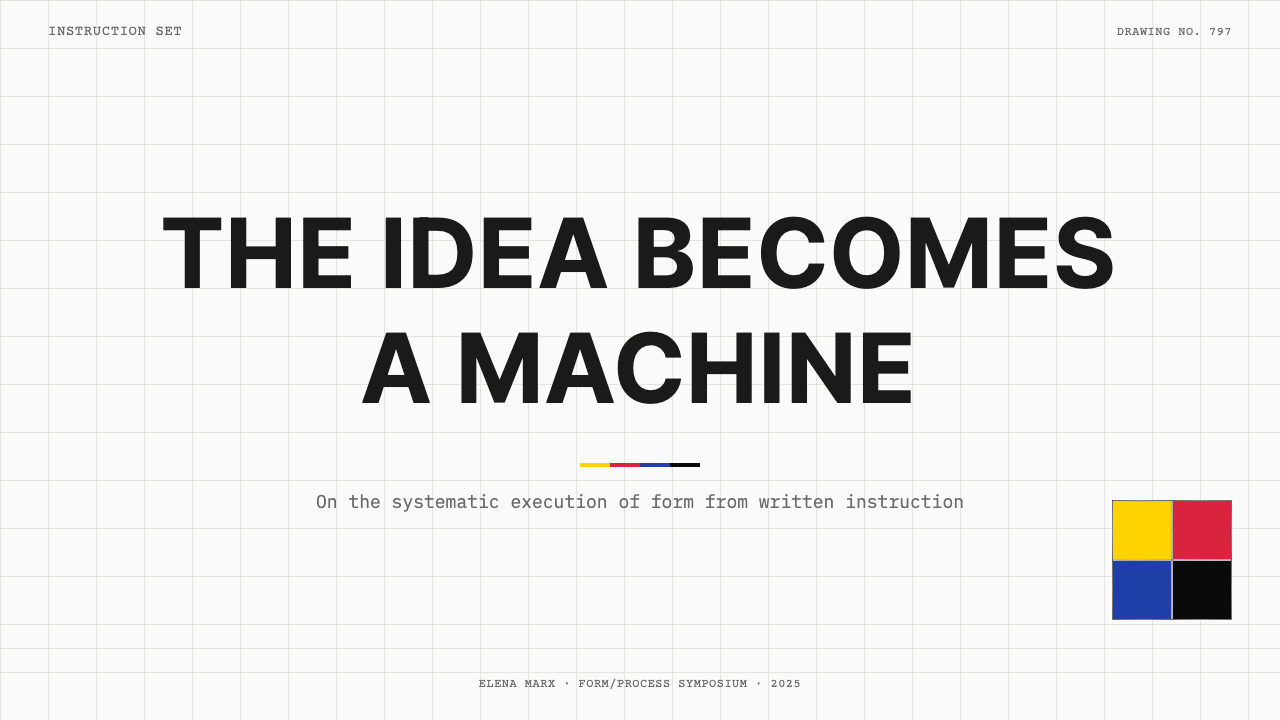
Red, yellow, blue, and black constitute the complete color vocabulary. These four appear not as expressive choices but as the designated terms of a system — LeWitt's wall drawings frequently specify which colors to use and in what combinations, with the selection governed by rule rather than aesthetic preference. In applied design, this means color is never decorative: each hue signals a categorical distinction, a system state, or a structural boundary. Color used outside the system's logic is an error, not a variation.红、黄、蓝与黑构成完整的色彩词汇。这四种颜色并非表达性选择,而是系统的规定术语——勒维特的墙上绘画经常明确指定使用哪些颜色及其组合方式,选择由规则而非审美偏好支配。应用于设计,这意味着色彩从不用于装饰:每种色相标示着一种类别区分、系统状态或结构边界。在系统逻辑之外使用颜色是错误,而非变体。
Line as Primary Form线条作为基本形态
Where other geometric styles build from filled shapes, this aesthetic builds from lines. Straight lines in prescribed directions — horizontal, vertical, diagonal at forty-five degrees, and diagonal at other prescribed angles — fill planes, divide fields, and create density through repetition. The line is both the smallest unit and the organizing principle: its direction, density, and length are the variables the instruction controls. Filled geometric solids appear rarely and carry particular emphasis when they do.其他几何风格从填充形状出发构建,这种美学则从线条出发构建。以规定方向延伸的直线——水平、垂直、四十五度对角及其他规定角度的对角——填充平面、分割区域、通过重复制造密度。线条既是最小单元,也是组织原则:其方向、密度与长度是指令控制的变量。填充的几何实体极少出现,一旦出现便承载着特别的强调意义。
Systematic Variation without Ornamentation系统性变化而非装饰
Complexity in this style arises from permutation, not decoration. A single instruction — draw all possible combinations of two lines in four directions — generates dense, intricate surfaces without any element added purely for visual enrichment. The richness is an emergent consequence of the system's operation, not an intended visual effect. Applied to design, this means complex layouts should be generated by rule: grid intersections, typographic scales, color assignments all derived from the same small set of parameters.这种风格中的复杂性来自排列组合,而非装饰。一条单一指令——画出四个方向中两条线的所有可能组合——能够生成密集、繁复的表面,而无需添加任何纯粹用于视觉丰富的元素。丰富性是系统运作的涌现结果,而非预设的视觉效果。应用于设计,这意味着复杂的版面应由规则生成:网格交叉点、字体比例、颜色分配均从同一组小参数推导而来。
Certificate Typography证书式排版
The certificate — a typed sheet stating the instruction — is the legal and artistic identity of the work. Its typography is correspondingly formal and neutral: monospaced or near-monospaced letterforms, left-aligned text blocks, consistent vertical rhythm, no typographic hierarchy beyond the distinction between the instruction text and the identifying metadata (title, date, signature line). This certificate quality — impersonal, administrative, declarative — defines how text should function throughout the system: as rule, not as rhetoric.证书——一张写明指令的打印页——是作品在法律与艺术上的身份认定。其排版相应地正式而中立:等宽或近等宽字形,左对齐文字块,一致的垂直节奏,除指令文本与识别元数据(标题、日期、签名行)之间的区分外,无其他排版层级。这种证书品质——非个人化的、行政式的、陈述性的——定义了文字在整个系统中应有的功能方式:作为规则,而非修辞。
Delegation and Reproducibility委托与可复现性
A design built on this aesthetic should be reproducible by any practitioner following its rules. If the visual outcome depends on a specific designer's taste, intuition, or personal touch — rather than on the system's explicit logic — then the system has failed. This principle has a practical implication: the style favors designs that can be specified in a style guide that a collaborator could follow without ambiguity. Every visual decision should be answerable by pointing to a rule.建立在这种美学上的设计应能由任何遵循规则的实践者复现。如果视觉结果依赖于特定设计师的品味、直觉或个人风格——而非系统的明确逻辑——那么系统就已失败。这一原则有其实践含义:这种风格偏向于那些能够以风格指南明确说明、协作者无歧义地遵照执行的设计。每一个视觉决定都应能通过指向一条规则来得到解释。
See the Sol LeWitt Conceptual design system查看 Sol LeWitt Conceptual 完整设计系统
Who shaped Sol LeWitt Conceptual?谁塑造了 Sol LeWitt Conceptual?
LeWitt (1928–2007) was the originator and primary practitioner of instruction-based wall drawing. Over nearly four decades he produced more than eleven hundred wall drawings, each defined by a typed certificate that constituted the work's legal and artistic identity. His 1967 essay 'Paragraphs on Conceptual Art' and 1969 'Sentences on Conceptual Art' remain the foundational texts of the Conceptual Art movement. LeWitt worked and exhibited internationally, with significant retrospectives at the Museum of Modern Art and the San Francisco Museum of Modern Art, and maintained studios in New York and later in Chester, Connecticut.勒维特(1928—2007年)是基于指令的墙上绘画的创始人与主要实践者。近四十年间,他创作了逾一千一百件墙上绘画,每件均以一张打印证书定义其法律与艺术身份。他1967年的文章《关于观念艺术的段落》与1969年的《关于观念艺术的句子》至今仍是观念艺术运动的奠基文本。勒维特在国际范围内工作与展览,曾在现代艺术博物馆与旧金山现代艺术博物馆举办重要回顾展,并在纽约及后来的康涅狄格州切斯特设有工作室。
Weiner was a central figure of the Conceptual Art movement and a close peer of LeWitt's. His practice also centered on the written statement as artwork — typically single declarative sentences describing material actions or conditions, presented as wall text, publications, or public signage. Where LeWitt's instructions were procedural and generative, Weiner's statements were declarative and static, but both shared the conviction that language could function as a fully realized artistic medium without requiring physical execution.韦纳是观念艺术运动的核心人物,也是勒维特的密切同行。他的实践同样以书面陈述作为作品核心——通常是描述材料动作或状态的单句陈述,以墙上文字、出版物或公共标识呈现。勒维特的指令是程序性的、生成性的,韦纳的陈述是申明性的、静态的,但两者都共享这一信念:语言可以作为充分实现的艺术媒介发挥作用,而无需物理执行。
Bochner was an early theorist and practitioner of systems-based art whose 1966 exhibition 'Working Drawings And Other Visible Things On Paper Not Necessarily Meant To Be Viewed As Art' at the School of Visual Arts is often cited as a foundational Conceptual Art event. His process of making the working document the artwork — displaying artists' notes, measurements, and diagrams as the exhibition content — ran parallel to LeWitt's instruction-based practice and helped establish the legitimacy of the administrative and procedural document as an artistic form.博克纳是系统艺术的早期理论家与实践者,他1966年在纽约视觉艺术学校举办的展览《工作草图及纸上其他可见物,不一定以艺术方式观看》常被引用为观念艺术的奠基性事件。他将工作文件本身作为作品的做法——将艺术家的笔记、尺寸标注与图表作为展览内容展示——与勒维特基于指令的实践并行推进,共同确立了行政性与程序性文件作为艺术形式的合法性。
Hesse was a close friend and peer of LeWitt's who developed a complementary but contrasting practice: where LeWitt pursued the rational, serialist logic of the grid and the system, Hesse worked with organic, irregular forms and industrial materials — latex, fiberglass, rope — that resisted systematic reduction. Their friendship and artistic dialogue in the mid-1960s helped each clarify the boundaries of their respective approaches. Hesse's work demonstrates the human, tactile dimension that LeWitt's system deliberately suppresses.海塞是勒维特的密友与同行,她发展出一套互补而对立的实践:勒维特追求网格与系统的理性、序列主义逻辑,海塞则与有机、不规则的形态及乳胶、玻璃纤维、绳索等抵抗系统性化约的工业材料共事。他们在1960年代中期的友谊与艺术对话帮助双方各自厘清了各自方法的边界。海塞的作品呈现了勒维特的系统刻意压制的人性、触觉维度。
Ono's Fluxus instruction pieces — most systematically collected in her 1964 artist's book 'Grapefruit' — constitute an important precedent for the instruction-as-artwork concept. Her pieces are typically brief, sometimes paradoxical, and range from the materially executable to the purely imaginary. While LeWitt's instructions were procedural and geometrically specific, Ono's were often poetic and open-ended; together, both practices established instruction as a legitimate artistic medium in the early 1960s, before the term 'Conceptual Art' had fully cohered.小野洋子的激浪派指令作品——最系统地收录于她1964年的艺术家书籍《葡萄柚》——是指令作为艺术作品这一概念的重要先例。她的作品通常简短,有时带有悖论性,从可在物质层面执行的到纯粹想象性的不等。勒维特的指令是程序性的、几何上具体的,小野的指令则常常是诗意的、开放性的;这两种实践共同在1960年代初期——在「观念艺术」这一术语尚未完全成形之前——确立了指令作为合法艺术媒介的地位。
How do you use Sol LeWitt Conceptual today?今天怎么用 Sol LeWitt Conceptual?
Sol LeWitt Conceptual is among the most intellectually coherent design aesthetics to apply when a product or communication needs to project systematic rigor, transparency of process, and a kind of principled austerity. The style works best when the product's own logic is genuinely rule-based — when you can describe what the interface or document is doing in terms analogous to an instruction set. If the product is an analytics platform, a developer tool, an educational system, or any artifact where the process is as important as the outcome, this aesthetic makes the underlying logic visible rather than concealing it behind polished surfaces.索尔·勒维特观念风格是所有设计美学中知识逻辑最为完整的体系之一,适用于产品或传播物需要呈现系统严谨性、过程透明度与有原则的简朴感的场合。这种风格在产品本身的逻辑确实基于规则时表现最佳——当你能以类似指令集的语言描述界面或文档在做什么时。如果产品是分析平台、开发者工具、教育系统,或任何过程与结果同等重要的物件,这种美学能使底层逻辑可见,而非将其掩盖于精抛光的表面之下。
For presentation slides, the style functions most powerfully when the cover is treated as a certificate: a monospaced or near-monospaced typeface setting out the title as if it were an instruction, on a white or near-white ground, accompanied by a field of fine parallel lines or a sparse grid. Content slides should resist the impulse to fill space — an instruction-derived design leaves substantial white areas, treating them as structural rather than empty. Data visualizations take on a diagrammatic quality: bar charts built from ruled lines rather than filled bars, scatter plots where point markers are small geometric primitives, all elements positioned on a visible or implied grid.对于演示文稿,这种风格在将封面处理为证书时效果最为有力:以等宽或近等宽字体将标题设置得如同一条指令,置于白色或近白色底面上,并配以细密平行线或稀疏网格。内容页面应抵制填满空间的冲动——基于指令的设计保留大量白色区域,将其视为结构性存在而非空白。数据可视化呈现出示意图式品质:由直线而非填充色块构成的柱状图,以小几何图元为点标记的散点图,所有元素按可见或隐含的网格定位。
For web interfaces, dashboards and documentation pages are the natural habitat of this aesthetic. The approach: a near-white or slightly warm white background, all body text in a monospaced or near-monospaced face, structural divisions marked by fine rules rather than color fills or shadows. Interactive elements signal their state through categorical color drawn from the four-color system — an alert is red, a success state is a pale echo of one of the primaries, a neutral state is graphite — never through gradient or animation alone. Navigation is typographic and declarative: it names what it does, without icons or metaphorical imagery.对于网页界面,仪表板与文档页面是这种美学最自然的栖居地。方法如下:近白色或略带暖意的白色背景,所有正文使用等宽或近等宽字体,结构性分割以细线而非色块或阴影标示。交互元素通过来自四色系统的类别性色彩传达状态——警示是红色,成功状态是某一主色的淡化回响,中性状态是石墨灰——绝不仅靠渐变或动画传达。导航是字体性的、陈述性的:它命名自己所做的事,不使用图标或比喻性图像。
For editorial and marketing work, the style supports a particular kind of authority — the authority of the procedure, the numbered list, the annotated diagram. A long-form article in this aesthetic uses a narrow, ragged-right text column, a wide margin populated with concise rule-statements or numerical annotations, and section breaks marked by fine horizontal rules rather than decorative elements. Marketing pages can use the style's poster-quality boldness — a large field of one of the four colors occupying a full section, white or black text set in a monospaced face against it — but should resist accumulating too many distinct visual effects, which would contradict the style's commitment to derivability from a small rule set.对于编辑与营销内容,这种风格支持一种特定的权威感——程序的权威、编号列表的权威、注释示意图的权威。以这种美学呈现的长篇文章使用窄幅、右边不对齐的文字栏,宽阔的页边留白中填以简洁的规则陈述或数字注释,段落分隔以细水平线而非装饰元素标示。营销页面可以利用这种风格的海报式大胆感——四色之一的大面积色块占据整个版块,白色或黑色等宽字体文字置于其上——但应避免积累过多不同的视觉效果,那会与这种风格对小规则集可推导性的承诺相矛盾。
A common mistake is importing the look of the style without its logic: using a monospaced typeface and fine lines as decoration while the actual compositional decisions remain arbitrary. Authentic application of this aesthetic requires that every visual element be justifiable by rule. If you cannot articulate why a particular line is present, at what density, in which direction, it should not be there. The same applies to color: using the four permitted colors as a free palette, mixing them simultaneously at equivalent weight, reads as pastiche. The system demands that color appear because the rule requires it, not because the designer wants variety.最常见的错误是引入这种风格的外观而非其逻辑:将等宽字体与细线作为装饰使用,而实际的构图决定仍是任意的。真正应用这种美学要求每一个视觉元素都能以规则为由。如果你无法说明某条线为何存在、以什么密度、以什么方向,它就不应该在那里。这同样适用于色彩:将四种允许的颜色当作自由调色板、以相当的分量同时混用,读起来像是仿作。系统要求颜色的出现是因为规则的要求,而非因为设计师想要变化。
See the Sol LeWitt Conceptual design system查看 Sol LeWitt Conceptual 完整设计系统
Sol LeWitt Conceptual — FAQSol LeWitt Conceptual · 常见问题
How is Sol LeWitt Conceptual different from Swiss International Style or grid-based minimalism?索尔·勒维特观念风格与瑞士国际主义风格或基于网格的极简主义有何不同?
Swiss International Style and grid minimalism are typographic and compositional disciplines: they govern how elements are arranged and how type is set, but they do not require that the logic of arrangement be visible or legible as text. Sol LeWitt Conceptual makes the rule itself a visible, coequal element of the composition. The instruction exists alongside the image; the monospaced text block is as much a design element as the field of lines. Additionally, this aesthetic is specifically tethered to graphite-line quality and the four-color system rather than the broader typographic palette of Swiss design.瑞士国际主义风格与网格极简主义是排版与构图规范:它们管理元素如何排列与字体如何设置,但不要求排列逻辑本身以可见文字的形式呈现。索尔·勒维特观念风格使规则本身成为构图中可见的、平等的元素。指令与图像并存;等宽字体文字块与线条区域同样是设计元素。此外,这种美学明确绑定于石墨线条品质与四色系统,而非瑞士设计更宽广的排版调色板。
Can this style work for consumer-facing products, or is it too cold?这种风格适合面向消费者的产品吗,还是太冷峻了?
The style carries a certain deliberate impersonality — it is designed to communicate system and rule rather than warmth or personality. This makes it well-suited for developer tools, research platforms, financial instruments, and educational materials where the impersonality reads as trustworthiness and rigor. It is less well-suited for products where the primary value proposition is warmth, pleasure, or emotional resonance — consumer wellness, social applications, food and beverage brands. Used in those contexts without adaptation, it risks feeling detached or clinical. The test is whether the product's own proposition is rule-based and transparent: if so, the style's impersonality becomes an asset.这种风格带有一种刻意的非个人性——它被设计为传达系统与规则,而非温暖或个性。这使它非常适合开发者工具、研究平台、金融工具与教育材料,在这些场景中非个人性被解读为可信度与严谨性。它不太适合主要价值主张是温暖、愉悦或情感共鸣的产品——消费者健康、社交应用、食品饮料品牌。在这些场景中不经调适地使用,有产生疏离感或临床感的风险。判断标准是:产品本身的主张是否基于规则且透明——如果是,这种风格的非个人性便成为资产。
Does every layout need visible instruction text, or can the style work without it?每个版面都需要可见的指令文字吗,还是这种风格也可以在没有文字的情况下运作?
The visible instruction text is the most direct expression of the aesthetic, but it is not required in every application. The deeper principle — that the composition is governed by an explicit, derivable rule set — can be expressed through purely geometric and typographic means: a line field at a prescribed angle, a grid whose logic is apparent from the spacing of its divisions, color appearing only according to a stated hierarchy. When text is absent, the design should still read as if an instruction could be written for it: its logic should be apparent rather than intuitive. If the composition only works because of the designer's eye, the style has not been applied.可见的指令文字是这种美学最直接的表达,但并非每个应用中都必需。更深层的原则——构图受制于一套明确、可推导的规则——可以通过纯几何与排版手段表达:以规定角度延伸的线条区域、网格逻辑从分割间距中一目了然、颜色仅按照陈述的层级出现。当文字缺席时,设计仍应呈现出好像可以为其写出指令的感觉:其逻辑应当是显而易见的,而非凭直觉感受的。如果构图只因设计师的眼光而成立,这种风格就没有被真正应用。
How should the graphite-line quality be handled in digital design?石墨线条品质在数字设计中应如何处理?
In print and physical media, graphite line quality — slight pressure variation, subtle wavering, the grain of pencil on paper — can be incorporated directly through production choices. In digital design, perfect geometric precision is the default, which loses the characteristic tension between the rational instruction and the imperfect human execution that defines LeWitt's work. Digital approximations include using a slightly reduced opacity for line elements, choosing stroke weights that suggest pencil rather than technical pen, and introducing minimal variation in line density rather than uniform fills. The goal is not to simulate graphite artificially but to avoid the over-precision that digital tools default toward — leaving some visible acknowledgment that the execution, however consistent, was carried out by a human process.在印刷与实体媒介中,石墨线条品质——轻微的力度变化、微妙的颤动、铅笔在纸上的颗粒感——可以通过制作选择直接纳入。在数字设计中,完美的几何精度是默认状态,这失去了定义勒维特作品特征的理性指令与不完美人手执行之间的张力。数字近似手法包括:对线条元素使用略微降低的不透明度,选择暗示铅笔而非制图笔感觉的描边粗细,在线条密度中引入极小的变化而非均匀填充。目标不是人工模拟石墨质感,而是避免数字工具默认的过度精确——留下某种可见的承认,表明执行过程,无论多么一致,都是由人的过程完成的。
What is the right way to handle color in this style — when does a color appear, and how much of it?这种风格中处理色彩的正确方式是什么——颜色何时出现,出现多少?
Color should appear because a rule requires it, not because the designer decides the composition needs more visual interest. In practice, this means defining your color rule before you begin: for example, red marks categorical errors or boundary violations, yellow marks active or in-progress states, blue marks completed or verified states, and black is the default. Then apply the rule consistently and exclusively. The most common failure mode is using the four colors simultaneously at equivalent visual weight across an entire composition, which reads as decoration rather than system. Historically, LeWitt's drawings often featured one or two colors prominently, with others appearing in defined combinatorial zones. In design, leading with one primary and allowing the others to appear only when their categorical meaning requires it produces a composition that reads as intentional rather than arbitrary.颜色应因规则的要求而出现,而非因设计师认为构图需要更多视觉趣味而出现。在实践中,这意味着在开始之前就定义你的颜色规则:例如,红色标示类别错误或边界违规,黄色标示活跃或进行中的状态,蓝色标示完成或已验证的状态,黑色是默认值。然后一致地、专一地应用规则。最常见的失败模式是在整体构图中以等量视觉重量同时使用四种颜色,这读起来像是装饰而非系统。从历史上看,勒维特的绘画经常突出呈现一两种颜色,其他颜色出现在规定的组合区域中。在设计中,以一种主色为主导,让其他颜色只在其类别含义要求时才出现,产生的构图读起来是刻意为之的,而非任意的。
Related design styles相关设计风格
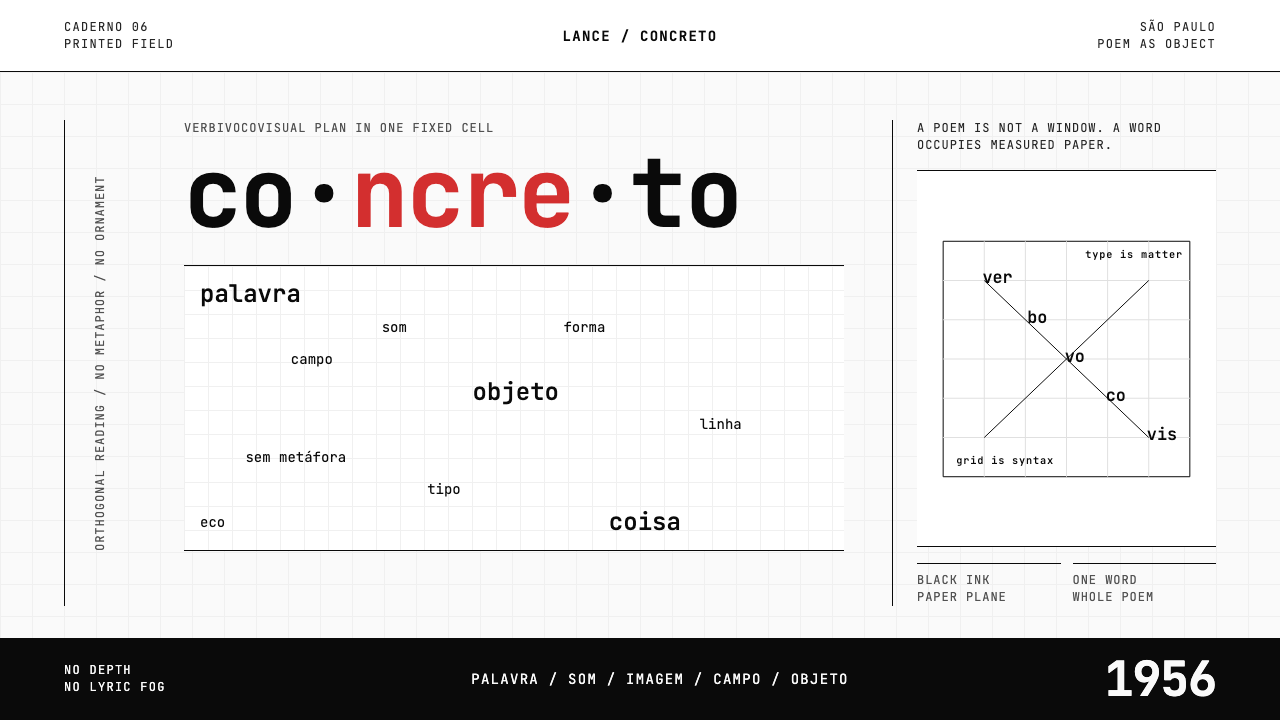 Brazilian Concrete PoetryWords become objects. Monospace cells, black-white paper, one cadmium red rup…字成为物。等宽格、黑白纸面,一处镉红断裂。
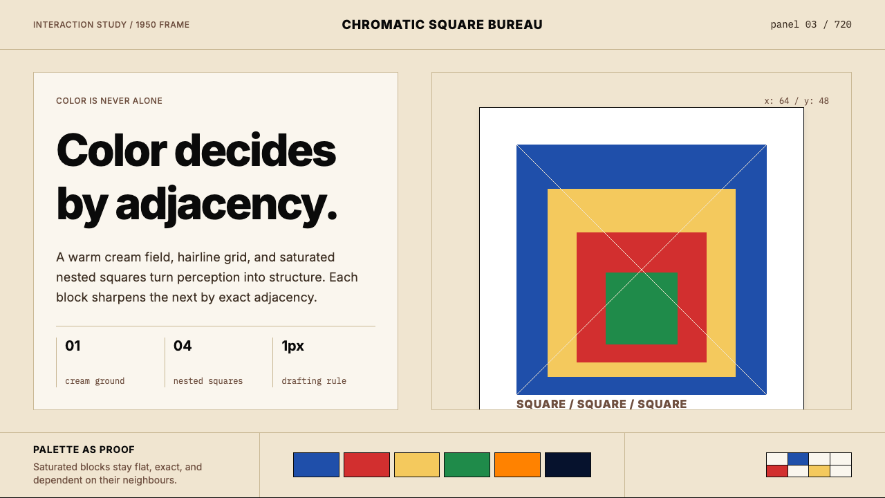 Josef Albers — Homage to the SquareColor becomes event. Warm cream, cobalt-red-yellow nested squares, exact hair…色彩成为事件。暖米底、钴蓝红黄嵌套方块与精确发丝线。
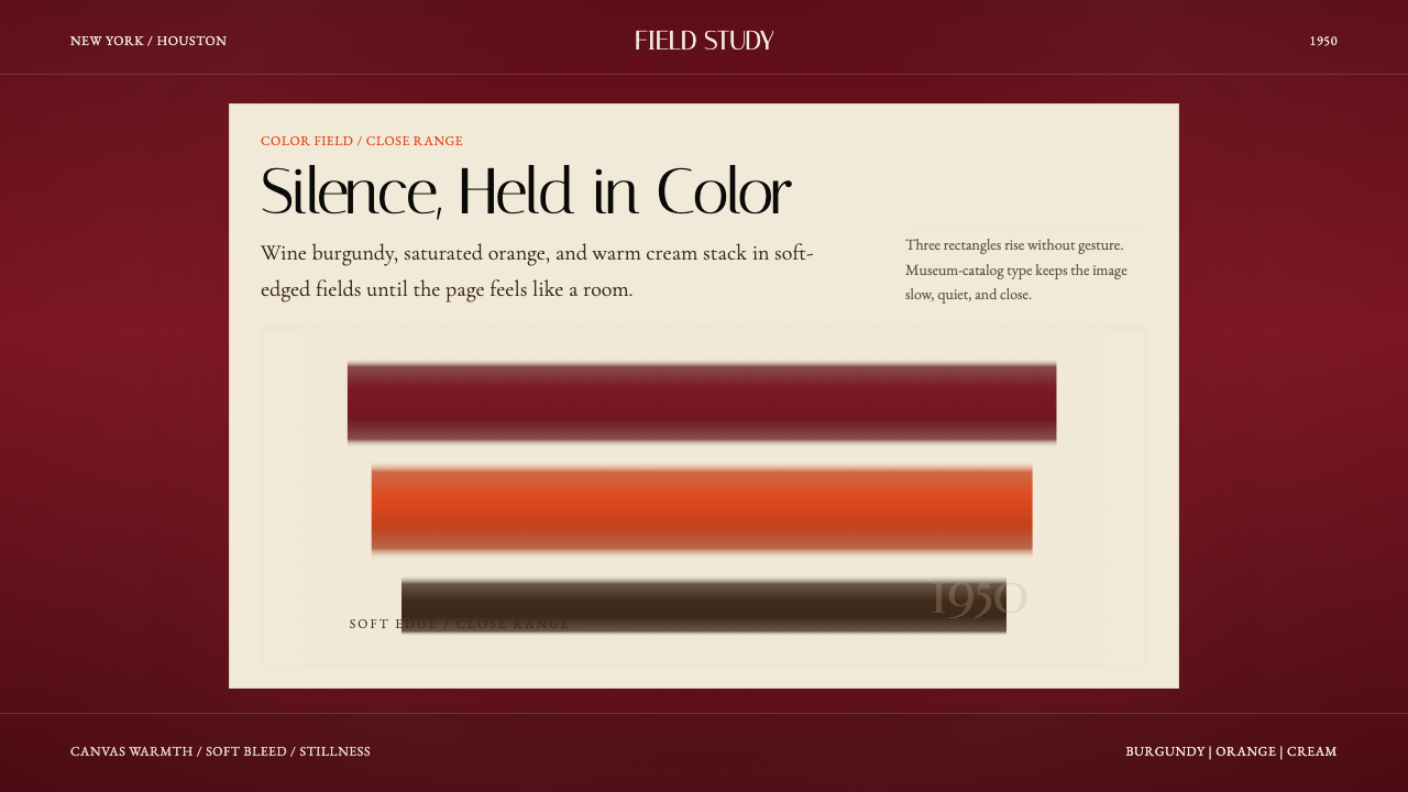 Mark Rothko Color Field (1950)Silence made visible. Burgundy, orange, and cream stack in soft-edged fields.把沉默变成可见。酒红、橙与奶油柔边堆叠成色域。
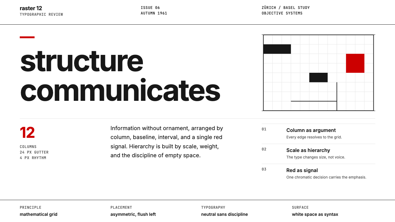 Swiss International StyleObjectivity made visible. Inter scale, white space, and one red block expose…客观性可见:Inter 尺度、留白与单一红块显露网格。
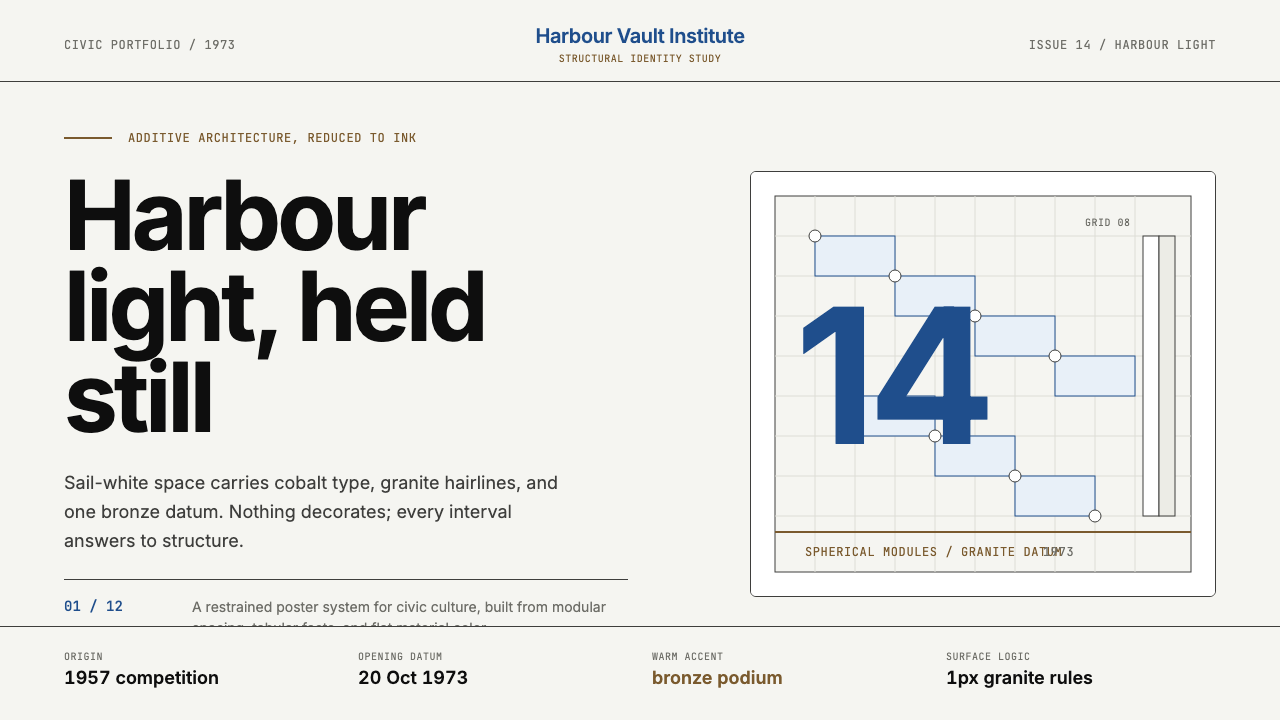 Sydney Opera House (Utzon, 1973)Civic restraint in harbour light. Sail-white space, cobalt type, bronze datum.港湾光里的市政克制:帆白留白、钴蓝字体、青铜基准线。
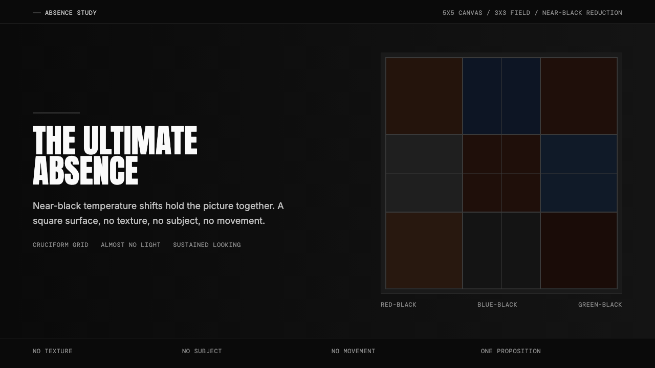 Ad Reinhardt Black Painting (1953)Austere absence. Near-black grid shifts reveal structure on sustained looking.苦行式缺席。近黑网格只在持续凝视中显形。