What is Swiss International Style?什么是 Swiss International Style?
Swiss International Style made objectivity beautiful — the mathematical grid, the disciplined sans-serif, and the principled silence of white space became the visual grammar of global modernism.瑞士国际主义风格让客观性变得美丽——数学网格、严谨的无衬线字体与白空间的克制沉默,成为全球现代主义的视觉语法。
Swiss International Style in briefSwiss International Style 速览
Swiss International Typographic Style — also called International Style or Swiss Style — is a design movement that emerged from Zürich and Basel in the 1950s with a single, radical ambition: communication should be achieved through structure, proportion, and hierarchy, never through decoration. Where earlier modernisms had experimented with abstraction and expression, Swiss Style systematized those experiments into a rigorous methodology applicable to any medium, at any scale, for any audience.瑞士国际排版风格——亦称国际主义风格或瑞士风格——是一场于1950年代在苏黎世与巴塞尔兴起的设计运动,抱持一个激进的单一目标:传达应通过结构、比例与层级实现,绝不依赖装饰。此前的现代主义运动曾在抽象与表达上进行诸多实验,而瑞士风格则将这些实验系统化为一套严格的方法论,适用于任何媒介、任何尺度、任何受众。
Its visual identity is immediately recognizable: a mathematical grid underlying every layout, sans-serif typefaces set at controlled weights and sizes to establish hierarchy, asymmetric composition balanced through tension rather than mirror symmetry, and expansive white space treated not as emptiness but as an active structural element. Photography, when used, is integrated as a precise rectangular element of the composition rather than as illustration. Color, when present, tends toward flat and restrained: a single accent or a strictly limited palette in service of clarity, not mood.其视觉面貌极易辨认:每一版面之下都有数学网格作为基础;以受控的字重与字号设置的无衬线字体建立层级;构图非对称,依靠张力而非镜像取得平衡;宽阔的白空间不被视为空洞,而是主动的结构性元素。摄影图像(若使用)作为构图中精确的矩形单元被整合,而非作为插图存在。色彩(若出现)通常平涂而克制:一种强调色或极为有限的色板,服务于清晰性,而非情绪。
The style was not merely an aesthetic preference — it was a philosophical position. Information design should be neutral, precise, and universally legible regardless of the reader's cultural background. This ambition for universality explains both the style's enormous influence on corporate identity, wayfinding, and editorial design across six decades, and its critics' charge that it can feel cold or institutionally impersonal. Both assessments are, in their way, accurate.这种风格并非单纯的审美偏好,而是一种哲学立场:信息设计应当中立、精确,无论读者的文化背景如何都应具备普遍可读性。对普遍性的这种追求,既解释了该风格在六十年间对企业标识、导视系统与编辑设计的深远影响,也解释了批评者指其冷漠甚至带有机构性疏离感的质疑。这两种评价,以各自的方式,都是准确的。
See the Swiss International Style design system查看 Swiss International Style 完整设计系统
Where does Swiss International Style come from?Swiss International Style 从何而来?
The style's intellectual roots run back to the New Typography movement of the 1920s, particularly the typographic writings and practice of Jan Tschichold, whose 1928 book 'Die neue Typographie' argued for asymmetric layouts, sans-serif typefaces, and the active use of white space. The Bauhaus in Dessau had explored similar territory, but its output was more experimental and politically charged than the systematic professionalism that Swiss Style would embody. What happened in Switzerland in the 1950s was a crystallization: the scattered modernist experiments of the previous generation were refined into a teachable, reproducible discipline.这一风格的思想根源可追溯至1920年代的新排版运动,尤其是扬·奇肖尔德的排版著作与实践——他在1928年出版的《新排版》(Die neue Typographie)中论证了非对称版面、无衬线字体与白空间主动运用的合理性。德绍包豪斯也曾探索类似领域,但其产出更具实验性与政治色彩,与瑞士风格后来所体现的系统性专业主义有所不同。1950年代瑞士发生的,是一场结晶化:上一代零散的现代主义实验,被精炼为一套可以教授、可以复制的严格学科。
Two cities drove the crystallization. In Basel, Armin Hofmann and Emil Ruder developed an approach to typographic education at the Allgemeine Gewerbeschule (Basel School of Design) that treated the grid, the typeface, and white space as the primary instruments of communication. Ruder's 1967 book 'Typographie' became an international standard text. In Zürich, Josef Müller-Brockmann worked as a graphic designer and teacher whose poster work for institutions such as the Zürich Tonhalle concert hall demonstrated that mathematical precision and visual poetry were not mutually exclusive. His 1961 book 'Grid Systems in Graphic Design' codified the underlying methodology with an explicitness that no earlier modern designer had attempted.这场结晶由两座城市共同推动。在巴塞尔,阿明·霍夫曼与埃米尔·鲁德在巴塞尔设计学校(Allgemeine Gewerbeschule)发展出一套排版教育方法,将网格、字体与白空间视为传达的首要工具。鲁德1967年出版的《排版学》(Typographie)成为国际标准教材。在苏黎世,约瑟夫·米勒-布罗克曼以平面设计师与教师的双重身份工作,他为苏黎世音乐厅等机构创作的海报证明数学精确性与视觉诗意并不互斥。他1961年出版的《平面设计中的网格系统》以前所未有的明确性将这套基础方法论系统化。
The political and economic context of postwar Switzerland mattered. As a neutral country untouched by wartime destruction, Switzerland was in an unusual position: a functional, export-oriented economy needing clear, internationally legible communication for its products and institutions. The Swiss printing and publishing industry was sophisticated and technically demanding. Design clients — pharmaceutical companies, cultural institutions, international organizations headquartered in Geneva — required a visual language that would work across linguistic and cultural borders. The style answered precisely that need, which is why it spread so quickly beyond its origins.战后瑞士的政治与经济语境至关重要。作为一个未被战时破坏触及的中立国,瑞士处于一种特殊的位置:一个功能性的出口导向型经济体,其产品与机构需要清晰、具有国际可读性的传达。瑞士的印刷与出版业成熟而技术要求严苛。设计委托方——制药公司、文化机构、总部设于日内瓦的国际组织——需要一种能够跨越语言与文化边界的视觉语言。这种风格恰好满足了这一需求,这也是它能够如此迅速地超越原产地传播的原因。
By the early 1960s, the style had become genuinely international. American corporations including IBM, Knoll, and the New York subway system adopted its principles directly or hired designers trained in its methods. The influence passed through designers who emigrated — or whose students emigrated — to New York, London, and Tokyo. Helvetica, designed by Max Miedinger in 1957, became the movement's typographic ambassador, eventually the most widely used typeface in the world. When Massimo Vignelli designed the New York subway map and identity system in 1970, he was essentially transplanting a Zürich methodology into one of the world's most complex wayfinding problems.到1960年代初,这种风格已真正国际化。IBM、诺尔(Knoll)与纽约地铁系统等美国机构直接采纳了其原则,或聘用了受过其方法训练的设计师。影响经由移民的设计师——或其学生的移民——传至纽约、伦敦与东京。马克斯·米丁格尔于1957年设计的Helvetica字体成为这一运动的字体大使,最终发展为世界上使用最广泛的字体。当马西莫·维涅利于1970年设计纽约地铁地图与标识体系时,他实质上是将一套苏黎世方法论移植进了世界上最复杂的导视问题之一。
What defines the Swiss International Style look?Swiss International Style 的视觉特征是什么?
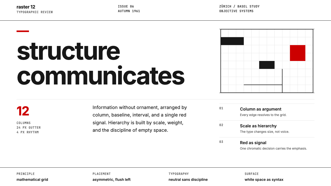
The Mathematical Grid数学网格
The grid is not a guideline in Swiss Style — it is the fundamental architecture of every composition. Page area is divided into precise modules, with consistent margins, gutters, and column widths that establish a spatial logic governing the placement of every text block, image, and caption. The grid makes hierarchy visible through position as much as through scale: elements anchored to the primary columns carry more visual authority than those set in secondary zones. Unlike decorative frameworks, the Swiss grid is invisible in the finished work — what the viewer perceives is not the grid itself but the order and legibility it produces.在瑞士风格中,网格不是一条参考线——它是每一构图的基础建筑。页面被划分为精确的模块,以一致的页边距、装订线与栏宽建立空间逻辑,支配每一文字块、图像与图注的位置。网格通过位置与比例同等地使层级可见:锚定于主栏的元素比置于次要区域的元素具有更强的视觉权威性。与装饰性框架不同,瑞士网格在成品中是隐形的——观者感知的不是网格本身,而是它所产生的秩序与可读性。
Sans-Serif Typography无衬线字体排印
Swiss Style elevated the sans-serif typeface from a display novelty to the universal vehicle of modern communication. The rationale was functional: serifs were considered vestigial ornament, and the clean geometry of sans-serif letterforms was held to be more legible at small sizes, more reproducible across print media, and more neutral in voice. Hierarchy is created entirely through size, weight, and spatial relationship — a large, heavy heading above a compact body paragraph communicates primacy without any decorative intervention. Tight, precise letter-spacing and controlled line-lengths are treated with the same care as the grid itself.瑞士风格将无衬线字体从展示性字体提升为现代传达的通用载体。其理由是功能性的:衬线被认为是遗留的装饰,无衬线字形的干净几何形态被认为在小字号时更易读、在各类印刷媒介中更易复制、在声调上更为中立。层级完全通过尺寸、字重与空间关系来建立——一个大而粗重的标题置于紧凑的正文段落之上,无需任何装饰介入即可传达主次。紧凑而精确的字距与经过控制的行长,与网格本身受到同等程度的关注。
Objective Photography客观摄影
Where earlier graphic traditions used illustration to interpret subject matter, Swiss Style embraced photography as the objective record of fact. Images are selected and cropped with structural rigor — usually rectangular, aligned to the grid, and scaled to carry their exact informational weight within the composition, no more, no less. A photograph of a product is expected to communicate the product's form clearly and without editorializing. Photographic montage and layering are used sparingly; when they appear, the combination is compositionally geometric rather than painterly or expressive.此前的图形传统使用插图来诠释主题,而瑞士风格则将摄影视为客观的事实记录。图像以结构性的严谨方式被选择与裁切——通常呈矩形、与网格对齐,并以其在构图中精确的信息分量来确定尺寸,不多不少。一张产品照片应当清晰传达产品的形态,不加评论。摄影蒙太奇与叠加手法使用节制;若出现,其组合方式是构图几何性的,而非绘画性或表达性的。
Asymmetric Balance非对称平衡
Swiss compositions never achieve balance through bilateral symmetry — the traditional device of classical layouts. Instead, elements of differing sizes and visual weights are positioned across the grid so that the composition reads as dynamically stable rather than static. A large photograph on one side of a spread is balanced by a column of text and a narrow block of caption on the other; a single bold number might anchor an otherwise quiet field of body type. This asymmetric balance creates a directed reading path — the viewer's eye moves through the composition in a designed sequence, not randomly.瑞士构图从不通过双边对称——古典版面的传统手法——来实现平衡。不同大小与视觉重量的元素在网格中定位,使构图呈现动态稳定而非静止。一张展开页一侧的大幅照片,由另一侧的一列文字与一块窄小的图注来平衡;单个粗重的数字可能锚定一整片其他方面均为安静正文的区域。这种非对称平衡创造了一条定向阅读路径——观者的视线沿着设计好的顺序移动,而非随机游走。
White Space as Structure白空间作为结构
In Swiss Style, white space is not the absence of design — it is one of its primary materials. Generous margins, open gutters, and deliberate breathing room around typographic elements are as carefully measured as the elements themselves. White space performs multiple functions simultaneously: it separates and groups information, it establishes the hierarchy of sections, it provides visual rest that makes sustained reading possible, and it signals precision and authority. Crowding the grid with elements is treated as a failure of discipline, not a sign of thoroughness.在瑞士风格中,白空间不是设计的缺席——它是设计的首要材料之一。宽裕的页边距、开阔的装订线,以及排印元素周围刻意留出的呼吸空间,与元素本身受到同等程度的精确测量。白空间同时发挥多重功能:它分隔与聚合信息,建立各节的层级,提供使持续阅读成为可能的视觉休息,并传达精确性与权威性。在网格中堆砌元素被视为纪律的失败,而非尽责的标志。
Restrained Color克制色彩
Swiss Style does not mandate monochrome, but it is highly selective with color. When color appears, it is typically a single strong hue deployed to signal a specific hierarchy level — a section marker, an accent on a key data point, or a categorical distinction in a chart or diagram. The background is almost invariably white or a near-white, allowing the typographic and photographic elements to carry maximum contrast. Gradients, tints, and multi-color decorative schemes are avoided as deviations from the discipline of direct communication. Color earns its place by doing a specific job, or it is not used at all.瑞士风格并不强制要求单色,但对色彩极为挑剔。若色彩出现,通常是单一强烈色调,用于标示特定的层级——一个章节标记、关键数据点上的强调,或图表中的类别区分。背景几乎无一例外是白色或接近白色,使排印与摄影元素保持最大对比度。渐变、色调变化与多色装饰方案被视为对直接传达原则的偏离而予以回避。色彩以完成特定任务来赢得自己的位置,否则就不使用。
Neutrality as Method中立性作为方法
Underlying every formal decision in Swiss Style is an aspiration toward communicative neutrality — the idea that the designer's voice should be subordinated entirely to the message's clarity. This distinguishes Swiss Style from expressive modernisms such as Constructivism or Italian Futurism, where formal choices carry the designer's personal or political signature. In Swiss Style, the grid, the typeface, and the white space are chosen because they are the most effective vehicles for information, not because they are beautiful or because they signal the designer's sensibility. Paradoxically, this self-effacement produces a highly consistent and recognizable aesthetic — the discipline of restraint has its own unmistakable signature.瑞士风格每一形式决策背后,都有一种对传达中立性的追求——即设计师的声音应当完全服从于信息的清晰性。这使瑞士风格有别于构成主义或意大利未来主义等表达性现代主义,后者的形式选择携带着设计师个人或政治的署名。在瑞士风格中,网格、字体与白空间之所以被选择,是因为它们是信息最有效的载体,而非因为它们美丽或能彰显设计师的感性。吊诡的是,这种自我消解产生了一种高度一致且可辨识的美学——克制的纪律有其独一无二的署名。

See the Swiss International Style design system查看 Swiss International Style 完整设计系统
Who shaped Swiss International Style?谁塑造了 Swiss International Style?
Müller-Brockmann is the most widely cited practitioner of Swiss Style, and his poster work for the Zürich Tonhalle concert series — produced between the late 1940s and 1970s — remains the canonical demonstration of how mathematical grid structures and geometric form can achieve both precision and emotional resonance simultaneously. His 1961 book 'Grid Systems in Graphic Design' provided the methodology's first fully explicit codification and remains in print today. As a teacher and theorist, he articulated the philosophical underpinning of the style with unusual clarity: the designer's responsibility is to the communication, not to personal expression.米勒-布罗克曼是瑞士风格被引用最广泛的实践者。他为苏黎世音乐厅系列音乐会创作的海报——制作于1940年代末至1970年间——至今仍是数学网格结构与几何形态如何同时实现精确性与情感共鸣的经典示范。他1961年出版的《平面设计中的网格系统》提供了这套方法论的首次完整明确的系统化表述,时至今日仍在印行。作为教师与理论家,他以罕见的清晰度阐明了这种风格的哲学基础:设计师的责任在于传达,而非个人表达。
Hofmann taught at the Basel School of Design for over four decades and shaped the visual thinking of an entire generation of international designers, many of whom brought his methods to American and British design schools. His poster work is distinguished by an extreme economy of means — a single strong image or form, black type at a powerful scale, and white space treated as a compositional equal to the positive elements. His 1965 book 'Graphic Design Manual' described the Basel methodology and became required reading at design schools worldwide. Hofmann's approach was more perceptual and experimentally rigorous than Müller-Brockmann's more analytical grid thinking, but both men shared the conviction that visual communication could be taught systematically.霍夫曼在巴塞尔设计学校执教逾四十年,塑造了整整一代国际设计师的视觉思维,其中许多人将他的方法带入了美国与英国的设计学院。他的海报作品以极度的手段经济性为特色——单一强烈的图像或形态,以强大比例呈现的黑色字体,以及被视为与正形元素平等的白空间。他1965年出版的《平面设计手册》描述了巴塞尔方法论,成为全球设计学院的必读教材。霍夫曼的方法比米勒-布罗克曼更偏向感知性与实验性严格性,但两人共同坚信视觉传达可以系统性地教授。
Ruder was Hofmann's colleague at Basel and approached typography as a discipline in its own right, insisting that the typeface, letter-spacing, word-spacing, and line length were together as important as any illustrative or photographic element. His 1967 book 'Typographie' — simultaneously a theoretical text and a visual demonstration — showed how a single well-chosen typeface, set with rigor and sensitivity, was sufficient to carry an entire designed work. Ruder's emphasis on legibility as the primary criterion of typographic quality influenced not only Swiss Style but the entire subsequent development of western typographic education. He also championed the work of Adrian Frutiger, whose Univers typeface system — designed with a logical family structure across weights and widths — became one of the movement's preferred instruments.鲁德是霍夫曼在巴塞尔的同事,他将排版学视为一门独立学科,坚持字体、字距、词距与行长共同构成的重要性不亚于任何插图或摄影元素。他1967年出版的《排版学》——既是理论文本又是视觉示范——展示了单一经过精心选择的字体如何在以严格性与敏感性设置之后,足以承载一件完整的设计作品。鲁德对可读性作为字体品质首要标准的强调,不仅影响了瑞士风格,也影响了此后西方排版教育的整体发展。他也是阿德里安·弗鲁提格作品的倡导者——后者设计的Univers字体系统以在字重与字宽间逻辑连贯的字体家族结构,成为这一运动最钟爱的工具之一。
Bill was a Bauhaus-trained Swiss designer, architect, and artist who served as a crucial bridge between the earlier Bauhaus experiments and the systematic Swiss Style of the 1950s. After studying at Dessau, he returned to Switzerland and worked across graphic design, industrial design, sculpture, and architecture, applying the same rationalist discipline across every medium. He was founding director of the Hochschule für Gestaltung Ulm (Ulm School of Design) from 1951, which extended and formalized the Bauhaus methodology for postwar industrial contexts. His work demonstrated that a rationalist aesthetic was not a constraint on visual invention but its most productive condition.比尔是受过包豪斯训练的瑞士设计师、建筑师与艺术家,在包豪斯早期实验与1950年代系统化的瑞士风格之间发挥了关键的桥梁作用。在德绍学习后回到瑞士,他横跨平面设计、工业设计、雕塑与建筑领域工作,将同一种理性主义纪律应用于每一种媒介。他从1951年起担任乌尔姆设计学院的创始院长,为战后工业语境延伸并规范化了包豪斯方法论。他的工作证明理性主义美学不是对视觉创造力的约束,而是其最富生产性的条件。
Frutiger was a Swiss typeface designer whose work became inseparable from Swiss Style's identity. His Univers type family, released in 1957, was the first major sans-serif typeface systematically designed across a comprehensive range of weights and widths under a unified visual logic — a rationalist grid for letterform design. His Frutiger typeface, designed originally for the signage system of Paris's Charles de Gaulle airport in 1975, demonstrated that the Swiss typographic principles of neutrality and legibility could function in large-scale wayfinding environments as effectively as on the printed page. Both typefaces became foundational to international corporate and institutional design.弗鲁提格是瑞士字体设计师,其作品与瑞士风格的身份认同密不可分。他于1957年发布的Univers字体家族,是第一款在统一视觉逻辑下系统性设计涵盖大量字重与字宽的主要无衬线字体——一个用于字形设计的理性主义网格。他为巴黎戴高乐机场标识系统于1975年设计的Frutiger字体,证明了瑞士排版原则中的中立性与可读性,能够在大型导视环境中与在印刷页面上同等有效地发挥作用。两款字体都成为国际企业与机构设计的基础工具。
How do you use Swiss International Style today?今天怎么用 Swiss International Style?
Swiss International Style is one of the most directly applicable historical design systems to contemporary work, because its principles are architectural rather than decorative. Applying it correctly means thinking structurally first: define the grid, establish the typographic hierarchy, determine what the communication needs to do — and then trust those decisions to carry the design, rather than adding visual elements to compensate for structural weakness.瑞士国际主义风格是当代设计实践中最可直接应用的历史设计系统之一,因为它的原则是建筑性的而非装饰性的。正确应用它意味着首先从结构上思考:定义网格,建立字体层级,确定传达需要完成什么——然后信任这些决定来承载设计,而非通过添加视觉元素来弥补结构上的弱点。
For presentation slides, Swiss Style delivers exceptional results on both cover and content pages. A strong cover uses the asymmetric compositional logic: a large photograph or bold typographic element anchors one zone of the grid while title text sits in controlled contrast on a white or near-white field. Rule lines or minimal geometric accents can mark the grid without decorating it. Content slides should be treated as grid layouts with strict column logic — one or two type sizes, a single accent for highlighted information, generous margins that let the content breathe. Data slides gain from the style's diagrammatic clarity: charts become grid-aligned geometric objects, labels are typographic rather than decorative, and the absence of gratuitous color lets the data pattern itself communicate.对于演示文稿,瑞士风格在封面页与内容页上都能带来出色结果。有力的封面运用非对称的构图逻辑:一张大幅照片或粗重的排印元素锚定网格的某一区域,而标题文字以受控的对比置于白色或近白色的区域。线条或极简几何强调可以标记网格而不装饰它。内容页应被视为具有严格栏逻辑的网格版面——一到两个字号,一种用于突出信息的强调色,宽裕的页边距让内容得以呼吸。数据页从这种风格的示意图式清晰性中受益:图表成为与网格对齐的几何对象,标签是排印性而非装饰性的,而多余色彩的缺失让数据模式本身来传达。
For web interfaces, Swiss Style is particularly well-suited to information-dense applications: dashboards, analytics tools, pricing pages, and documentation. Establish a consistent column grid across all views; use a single sans-serif typeface at no more than three distinct weight levels; keep the background white or very slightly warm; reserve color strictly for interactive states and categorical distinctions. Navigation should be purely typographic — no icon decoration beyond functional indicators. Cards and containers should have clear geometric boundaries through line or shadow rather than color fill. The resulting interface reads as confident and precise rather than styled.对于网页界面,瑞士风格尤其适合信息密集型应用:仪表板、分析工具、定价页面与文档。在所有视图中建立一致的列网格;使用单一无衬线字体,不超过三个不同字重级别;保持背景为白色或非常轻微的暖白;将色彩严格保留给交互状态与类别区分。导航应当是纯排印性的——除功能性指示符外无图标装饰。卡片与容器应通过线条或阴影而非色彩填充来具有清晰的几何边界。由此产生的界面读来自信而精确,而非“有设计感”。
For editorial and marketing applications, Swiss Style supports strong information hierarchy without visual noise. An editorial layout benefits from the characteristic wide margin: body text occupies the inner columns while the outer margin holds captions, pull quotes, or section numbers — a spatial device that communicates structure at a glance. Marketing pages can use the style's poster-like boldness: full-width type at an assertive scale, alternating light and dark sections, and a single accent color applied consistently to calls to action. The photographic integration principle applies directly to marketing: images should be rectangular, grid-aligned, and sized to their informational role rather than scaled for decorative impact.对于编辑与营销应用,瑞士风格在无视觉噪音的情况下支持强劲的信息层级。编辑版面从特有的宽页边距中受益:正文占据内部各栏,而外侧页边距用于图注、引用语或章节编号——这是一种瞬间传达结构的空间手法。营销页面可以利用该风格海报般的大胆感:以坚定比例呈现的全幅文字,明暗区块交替,以及一致应用于行动号召的单一强调色。摄影整合原则直接适用于营销:图像应当是矩形的、与网格对齐的,并按其信息角色来确定尺寸,而非为装饰性冲击力而缩放。
The most common failure when applying Swiss Style is confusing its formal characteristics for its actual content. Using a sans-serif typeface and a white background does not produce Swiss Style — those are surface features. The deeper work is in the grid: every placement decision must be justified by the grid's logic, not by visual instinct or decorative preference. A second frequent error is under-using white space; designers accustomed to filling layouts tend to crowd the grid, which destroys the hierarchy that the style's precision is meant to create. Restraint is not emptiness — it is the structure that makes each element's position and weight legible.应用瑞士风格时最常见的失败,是将其形式特征误认为其实际内容。使用无衬线字体与白色背景不能产生瑞士风格——那些是表面特征。更深层的工作在于网格:每一个位置决定都必须以网格的逻辑为依据,而非凭借视觉直觉或装饰偏好。另一个频繁出现的错误是白空间使用不足;习惯于填满版面的设计师往往会将网格塞满,而这会摧毁该风格的精确性本应创造的层级。克制不是空洞——它是使每个元素的位置与重量清晰可读的结构。
See the Swiss International Style design system查看 Swiss International Style 完整设计系统
Swiss International Style — FAQSwiss International Style · 常见问题
What is the difference between Swiss International Style and Bauhaus?瑞士国际主义风格与包豪斯有什么区别?
Bauhaus (1919–1933) established the foundational principles — geometric form, rejection of ornament, the grid, the sans-serif typeface — that Swiss Style then systematized and professionalized. Swiss Style is typographically more rigorous, more committed to the mathematical grid as a prescriptive tool, and more restrained in color, typically working within a neutral or single-accent palette rather than the Bauhaus primary triad. Swiss Style also embraces photography as a structural element in a way Bauhaus work rarely did, and its ambition is explicitly communicative and universal rather than politically or artistically expressive. You can think of Swiss Style as the disciplined, post-ideological successor to Bauhaus experimentation — the same underlying logic, refined into a reproducible professional method.包豪斯(1919—1933年)确立了基础原则——几何形态、拒绝装饰、网格、无衬线字体——而瑞士风格随后将这些原则系统化并专业化。瑞士风格在排版上更为严格,更致力于将数学网格作为规定性工具,在色彩上更为克制,通常在中性或单一强调色的色板内工作,而非包豪斯的三原色组合。瑞士风格还以包豪斯作品鲜少采用的方式将摄影作为结构性元素,且其目标明确是传达性与普遍性的,而非政治性或艺术表达性的。可以将瑞士风格理解为包豪斯实验的有纪律的、后意识形态的继承者——相同的基础逻辑,精炼为可复制的专业方法。
Is Swiss Style always black and white, or can it use color?瑞士风格总是黑白的,还是也可以使用色彩?
Swiss Style is not inherently monochrome — it is selective with color. The style's classical output included strong use of a single accent color: think of the red in a Müller-Brockmann concert poster, or the precise color categories in an Otl Aicher wayfinding system. What Swiss Style avoids is decorative color — hues chosen for visual richness, mood, or brand personality rather than communicative function. When color appears in authentic Swiss Style work, it has a job: marking a category, distinguishing a hierarchy level, or directing the eye to a specific element. Two or more colors can coexist if each has a distinct, non-overlapping function. What does not belong is color that exists purely to make the composition more attractive.瑞士风格本质上并非单色——它是对色彩有所选择的。该风格的经典产出包含对单一强调色的有力运用:米勒-布罗克曼音乐会海报中的红色,或奥托·艾舍导视系统中精确的色彩类别,皆可为证。瑞士风格回避的是装饰性色彩——出于视觉丰富性、情绪或品牌个性而非传达功能选择的色调。当色彩出现在真正的瑞士风格作品中时,它有一项任务:标记类别、区分层级,或引导视线至特定元素。若每种色彩各有明确且不重叠的功能,两种或更多色彩可以共存。不属于这种风格的,是纯粹为了让构图更具吸引力而存在的色彩。
Why did Swiss Style become the standard for corporate identity design?瑞士风格为何成为企业标识设计的标准?
Several properties of Swiss Style made it unusually well-suited to corporate identity: its emphasis on mathematical precision and reproducibility meant that a system designed in Switzerland could be applied consistently in print, on signage, in publications, and later on screen, across any language and any scale. Its deliberate neutrality — the aspiration to communicate without imposing a cultural or personal perspective — aligned with corporations' need to project authority and competence across diverse markets. And the grid system made it possible to define a visual identity as a set of rules rather than a set of specific designs, which meant different designers and vendors could implement it consistently. These properties are why organizations from the Lufthansa brand system to the early Apple interface drew directly on Swiss principles.瑞士风格的几种特性使其异常适合企业标识设计:对数学精确性与可复制性的强调意味着一套在瑞士设计的系统,可以在任何语言与任何比例下,在印刷品、标识、出版物乃至后来的屏幕上一致地应用。其刻意的中立性——不施加文化或个人视角的传达追求——契合了企业向多元市场投射权威与专业能力的需求。网格系统使视觉标识得以定义为一套规则而非一套具体设计,这意味着不同的设计师与供应商可以一致地执行它。这些特性解释了为何从汉莎品牌系统到早期苹果界面,众多组织都直接借鉴了瑞士原则。
Can Swiss Style work for consumer products, or is it better suited to institutional contexts?瑞士风格适用于消费品吗,还是更适合机构语境?
Swiss Style performs best where clarity, precision, and authority are the primary desired qualities — which does include some consumer products but excludes many others. It works strongly for financial services, technology platforms, healthcare information, premium packaging where rigorous restraint signals quality, and any context where the user needs to process information quickly and accurately. It is less effective for products whose primary appeal is warmth, sensory pleasure, cultural belonging, or playfulness — food, children's products, fashion, hospitality, and wellness are all contexts where the style's neutrality can read as cold or uninviting. The practical question is whether the product's core promise aligns with the values that Swiss Style communicates: precision, objectivity, and structural confidence.瑞士风格在清晰性、精确性与权威性是首要期望品质的场景中表现最佳——这确实包含部分消费品,但排除了许多其他品类。它在金融服务、科技平台、医疗信息、严格克制感传达品质的高端包装,以及任何用户需要快速准确处理信息的场景中表现强劲。它在产品核心吸引力是温暖感、感官愉悦、文化归属感或玩乐性的场景中则效果欠佳——食品、儿童产品、时尚、酒店业与健康类都是这种风格的中立性可能被读为冷淡甚至不友好的语境。实际问题是:产品的核心承诺是否与瑞士风格所传达的价值观对齐——精确、客观与结构性自信。
How does Swiss Style treat illustration versus photography?瑞士风格如何对待插图与摄影?
Swiss Style strongly prefers photography over illustration as a matter of principle. Photography is treated as the objective record of fact — it documents the appearance of a subject without imposing interpretive style. When Swiss Style does use illustration, it tends toward the diagrammatic: charts, information graphics, maps, and schematic drawings that present data or structure clearly and without decorative elaboration. Expressive or hand-crafted illustration is almost entirely absent from classical Swiss Style work, as it reintroduces the personal voice that the style's neutrality aspires to eliminate. This photographic preference was partly a philosophical commitment and partly a practical consequence of postwar printing technology, which made high-quality halftone reproduction of photography newly accessible at commercial scale.瑞士风格原则上强烈偏好摄影而非插图。摄影被视为客观的事实记录——它记录主题的外观,不施加诠释性风格。当瑞士风格确实使用插图时,倾向于示意图式的表达:图表、信息图形、地图与示意图,以清晰且无装饰修饰的方式呈现数据或结构。表达性或手工制作的插图在经典瑞士风格作品中几乎完全缺席,因为它会重新引入该风格的中立性所致力于消除的个人声音。这种对摄影的偏好,一半是哲学承诺,一半是战后印刷技术的实际结果——当时商业规模的高质量半色调摄影复制首次变得触手可及。
Related design styles相关设计风格
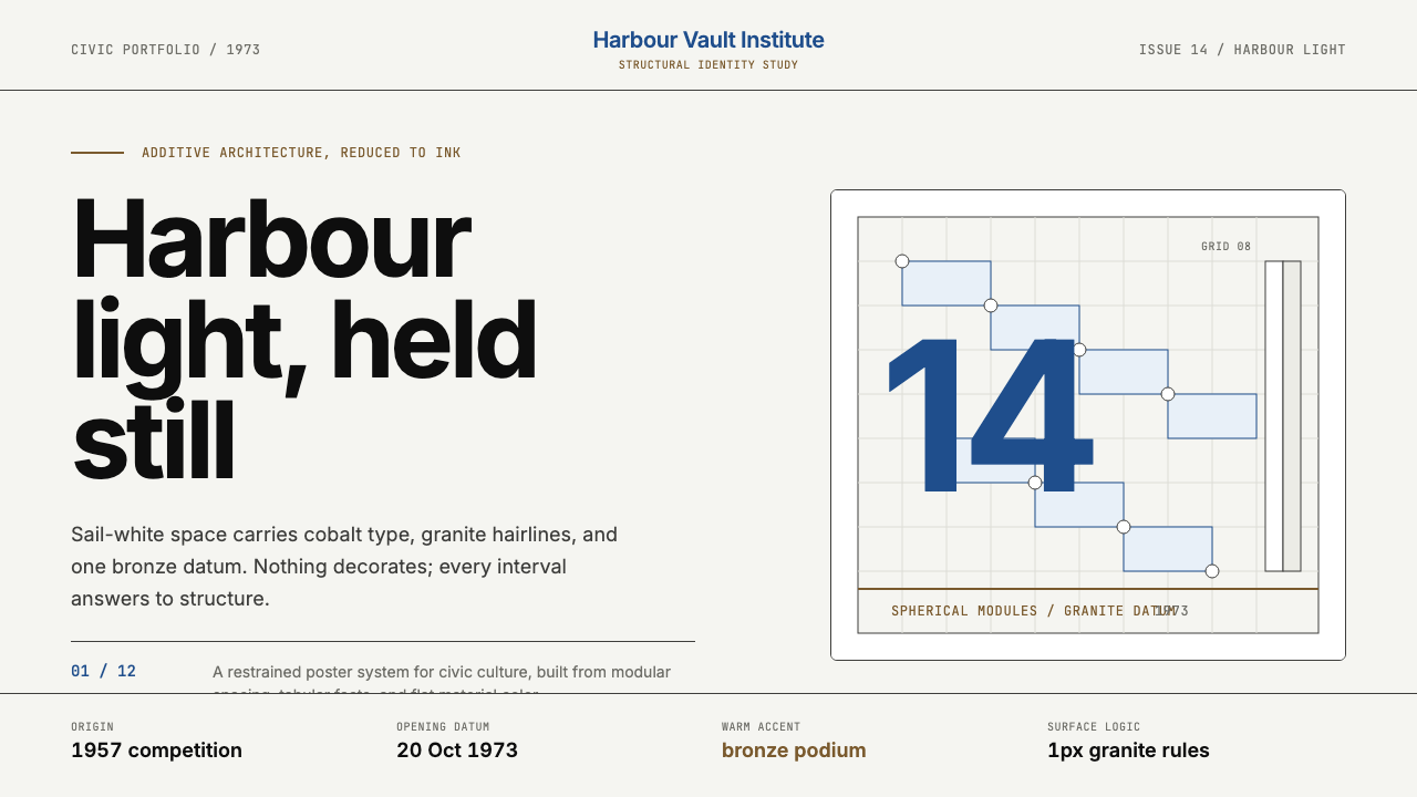 Sydney Opera House (Utzon, 1973)Civic restraint in harbour light. Sail-white space, cobalt type, bronze datum.港湾光里的市政克制:帆白留白、钴蓝字体、青铜基准线。
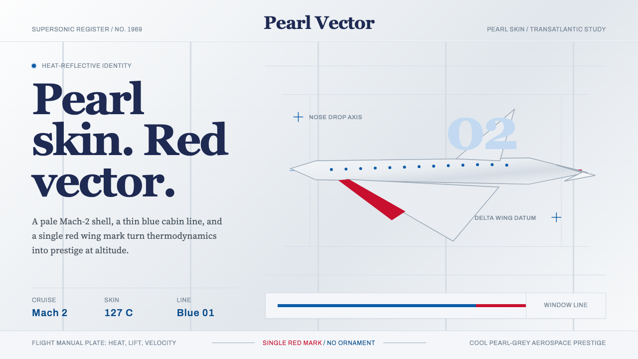 Concorde SupersonicPhysics made prestige. Pearl grey, sky-blue window line, and one red wing vec…物理成就尊贵:珍珠灰、天蓝舷窗线和一枚红翼矢量。
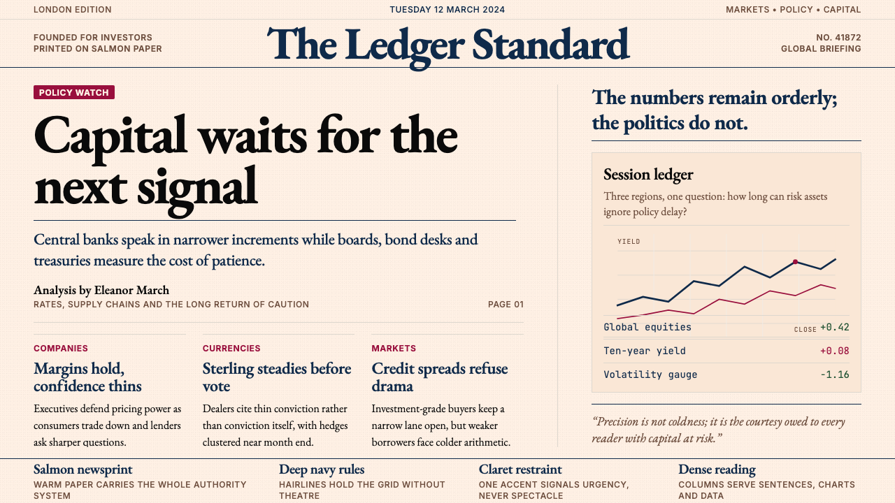 Financial Times (Pink Paper)Authority on salmon paper. Deep navy rules and claret accents discipline dens…三文鱼粉纸上的权威:深海军蓝细线与酒红点缀,约束密集衬线栏。
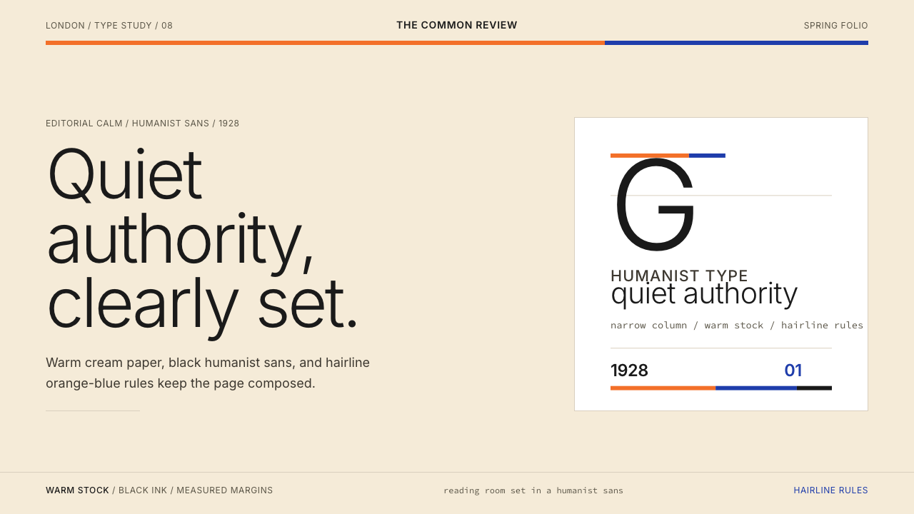 Gill Sans (BBC, 1928)Quiet authority, clearly set. Warm cream, black humanist sans, and hairline o…安静而权威。奶油底、黑色人文无衬线与橙蓝细线。
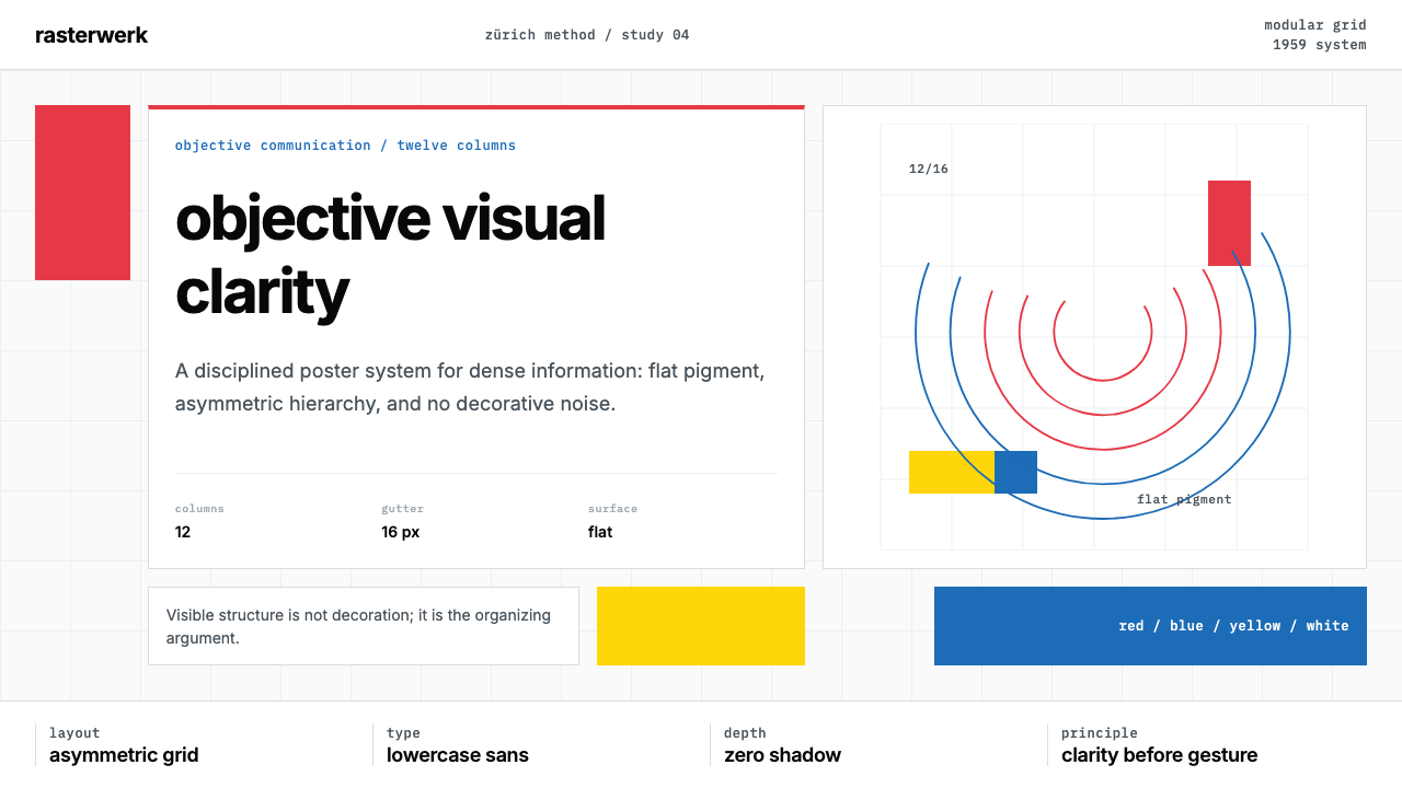 Müller-Brockmann SwissClarity is the system. Inter grids, red-blue blocks, and concentric arcs make…清晰即系统:Inter网格、红蓝色块与同心弧显露结构。
 Penguin Classics OrangePaperback authority. Orange tri-bands, serif title panel, and flat ink enforc…平装书的权威感:橙色三段、衬线标题与平面油墨建立克制秩序。