What is Müller-Brockmann Swiss?什么是 Müller-Brockmann Swiss?
Müller-Brockmann made the grid visible — and in doing so, turned rational structure itself into a form of beauty.米勒-布罗克曼让网格变得可见——也因此,将理性结构本身转化为一种美。
Müller-Brockmann Swiss in briefMüller-Brockmann Swiss 速览
Swiss International Style, as codified by Josef Müller-Brockmann and his contemporaries in Zürich during the 1950s and 1960s, is the most disciplined and systematically articulated visual language in the history of modern graphic design. Built on the conviction that communication should be objective, clear, and free of personal expression or decorative caprice, it treats the typographic grid not as a background constraint but as the fundamental content of design itself.瑞士国际主义风格,由约瑟夫·米勒-布罗克曼及其同时代人于1950至60年代在苏黎世系统确立,是现代平面设计史上最严格、最系统化的视觉语言。它建立在这样一种信念上:传达应当客观、清晰,不受个人表达或装饰随想的干扰;排版网格不是背景约束,而是设计本身最根本的内容。
Where earlier modernisms — including the Bauhaus — operated on intuition shaped by principle, Swiss Style aspires to method: every spacing decision traceable to the module, every typographic choice reducible to a small number of sanctioned relationships. The result is a visual language that appears calm and inevitable, as though the design could not have been arranged any other way. Asymmetric compositions achieve balance through mathematical proportion rather than visual guessing; text aligns to baselines and columns with millimetric consistency.相比此前的现代主义运动(包括包豪斯)——那些运动以原则为形、以直觉操作——瑞士风格追求的是方法论:每一个间距决定都可溯源至模块,每一个排版选择都可还原为少数几种认可的关系。结果是一种看似平静而必然的视觉语言,仿佛设计别无他法,只能如此排布。非对称构图依靠数学比例而非视觉猜测来取得平衡;文字以毫米级精度对齐基线与栏位。
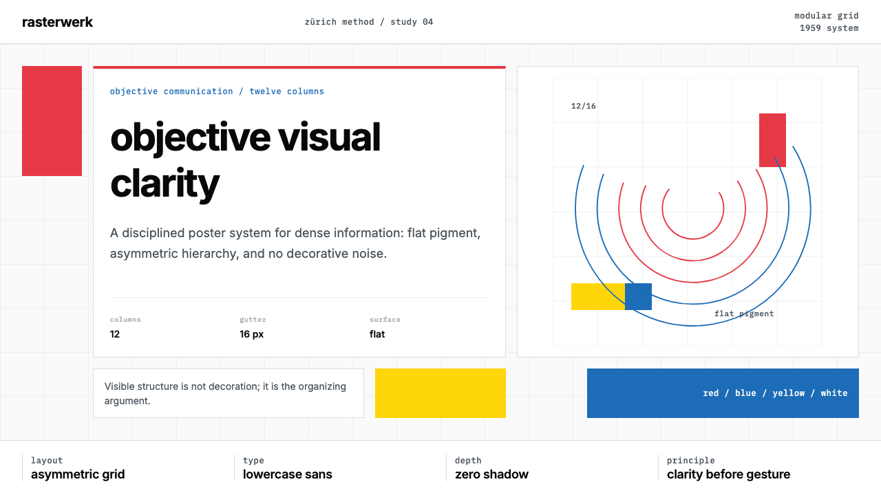
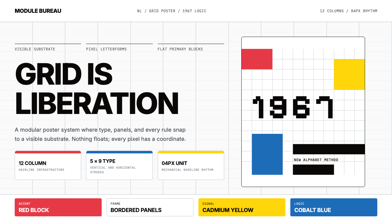
The visual vocabulary is spare: a near-white or absolute white ground, a single dominant sans-serif typeface, one or two saturated flat color accents against white, and the occasional use of concentric geometric arcs or ruled lines as structural — never decorative — devices. Photography, when present, is cropped to fit the grid precisely. Nothing floats free. Every element is positioned, measured, and justified.视觉词汇极为简约:接近白色或纯白的底面,一种主导性无衬线字体,白色底面上的一两种饱和平面强调色,以及偶尔作为结构性(绝非装饰性)设备出现的同心弧线或直线。摄影图像(若出现)被裁切得与网格严丝合缝。没有什么是自由漂浮的——每一个元素都经过定位、测量与理由充分的安置。
See the Müller-Brockmann Swiss design system查看 Müller-Brockmann Swiss 完整设计系统
Where does Müller-Brockmann Swiss come from?Müller-Brockmann Swiss 从何而来?
The movement that would become Swiss International Style emerged from two parallel schools in postwar Switzerland: the Zürich school, centered on practitioners like Müller-Brockmann, and the Basel school, anchored by Armin Hofmann and Emil Ruder at the Basel School of Design. Both schools shared the conviction that visual communication could and should be elevated into a principled discipline, but the Zürich practitioners tended toward the poster and the public commission, while Basel emphasized typographic theory and pedagogy. Their combined influence made Switzerland the undisputed center of global modernist design through the 1960s and 1970s.后来成为瑞士国际主义风格的这场运动,从战后瑞士的两所平行学校中涌现:以米勒-布罗克曼等从业者为核心的苏黎世学派,以及阿明·霍夫曼与埃米尔·鲁德在巴塞尔设计学院奠基的巴塞尔学派。两所学派都坚信视觉传达可以也应当被提升为一门有原则的学科,但苏黎世从业者倾向于海报与公共委托,而巴塞尔则更强调排版理论与教学法。两者合力,使瑞士在1960至70年代成为全球现代主义设计无可争议的中心。
Josef Müller-Brockmann was born in Rapperswil in 1914 and trained in Zürich as a graphic designer and illustrator. His breakthrough came with the series of concert posters he produced for the Tonhalle Zürich, the city's principal concert hall, beginning in the early 1950s and continuing through 1972. These posters — most famously the Musica Viva series — are among the most analyzed artifacts in the history of graphic design. They employ concentric arcs of varying weight and density to evoke the acoustic experience of music, organizing those arcs with a mathematical precision that the viewer intuits even without measuring. The posters made visible something that had previously been felt but rarely demonstrated: that a rigorous geometric system could generate compositions of genuine expressive power.约瑟夫·米勒-布罗克曼1914年生于拉珀斯维尔,在苏黎世接受平面设计与插图训练。他的突破来自于为苏黎世音乐厅——该市主要音乐会场馆——设计的系列海报,这批创作从1950年代初延续至1972年。这些海报——最著名的是Musica Viva系列——是平面设计史上被分析最多的视觉物件之一。它们以不同粗细与密度的同心弧线唤起音乐的声学体验,并以数学精度组织这些弧线——即便不用尺量,观者也能直觉感知这种精准。这批海报使此前只可感受、难以示范的东西变得清晰可见:一套严格的几何系统足以生成具有真正表现力的构图。
The theoretical framework behind the practice was laid out in two landmark publications. The journal Neue Grafik, which Müller-Brockmann co-founded with Richard Paul Lohse, Josef Müller-Brockmann, Hans Neuburg, and Carlo Vivarelli in 1958, published the movement's principles in German, English, and French simultaneously, establishing an international audience. Then in 1961, Müller-Brockmann published The Graphic Artist and His Design Problems, a systematic account of his method. His definitive statement came twenty years later with Grid Systems in Graphic Design (1981), which remains in print and remains the single most cited technical reference in professional typographic practice worldwide.支撑这一实践的理论框架,由两部里程碑式出版物确立。1958年,米勒-布罗克曼与理查德·保罗·洛泽、汉斯·诺伊堡、卡洛·维瓦雷利共同创办了期刊《新平面》(Neue Grafik),同步以德语、英语和法语发表该运动的原则,建立起国际受众。1961年,米勒-布罗克曼出版了《平面艺术家与其设计问题》,系统陈述了他的方法论。二十年后,他以《平面设计中的网格系统》(1981年)发出决定性宣言——这部著作至今仍在印刷,是全球职业排版实践中被引用次数最多的单一技术参考书。
The broader context was a postwar Switzerland that was simultaneously rebuilding its export economy and positioning itself as a neutral international forum. Swiss corporations — pharmaceutical, chemical, watch-making, financial — needed a visual identity that could communicate credibility and precision to audiences across language and cultural barriers. The clear, grid-governed, internationally legible aesthetic of Swiss Style was a direct answer to that demand. Karl Gerstner's work for Geigy pharmaceutical and Müller-Brockmann's corporate campaigns demonstrated that the same principles that produced beautiful concert posters could produce equally coherent annual reports and product branding — a proof of universality that confirmed the style's dominant position through the end of the twentieth century.更宏观的背景是战后瑞士:这个国家同时在重建出口经济,并将自身定位为中立的国际论坛。瑞士企业——制药、化工、制表、金融——需要一套能跨越语言与文化障碍、向各地受众传达信誉与精确度的视觉形象。瑞士风格清晰、以网格治理、具有国际可读性的美学,正是对这一需求的直接回应。卡尔·格尔斯特纳为盖基制药所做的设计以及米勒-布罗克曼的企业推广活动,证明了产生精美音乐会海报的同一原则,也能产生同样连贯的年度报告与产品品牌——这一普遍性的证明,巩固了这种风格在二十世纪末之前的主导地位。
What defines the Müller-Brockmann Swiss look?Müller-Brockmann Swiss 的视觉特征是什么?
The Mathematical Grid数学网格
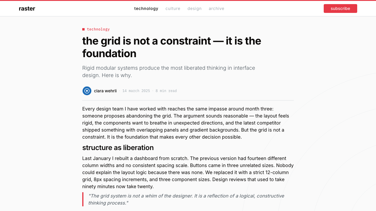
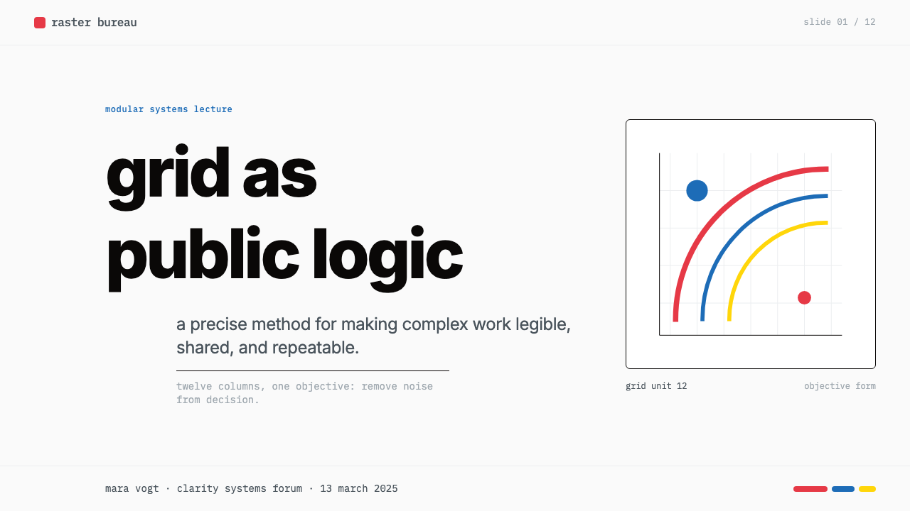
The grid in Swiss Style is not a guide or a suggestion — it is the architecture of the page. Müller-Brockmann advocated for a modular grid whose proportions are calculated before a single element is placed, with column widths, gutter measurements, and row intervals all derived from a shared unit. Every element — headline, body text, caption, photograph, rule — aligns to this structure. The visible order that results is not imposed on content but generated from within it.瑞士风格中的网格不是参考线,也不是建议——它是页面的建筑结构。米勒-布罗克曼主张,在放置任何元素之前,先用计算确定模块化网格的比例:列宽、栏间距与行间距都从同一基本单元推导而来。每一个元素——标题、正文、图注、照片、线条——都对齐这一结构。由此呈现的可见秩序,不是强加于内容之上的,而是从内容内部生成的。
Typographic Hierarchy by Measure以尺度建立的排版层级
In Swiss Style, hierarchy is established through size and weight differentials within a single typeface family, not through multiple faces or decorative devices. A headline sits at a significantly larger scale than subheadings, which sit at a significantly larger scale than body text. Each step in the hierarchy is deliberate and mathematically proportional. Color is rarely used to distinguish hierarchy — structure and scale do the work that decoration performs elsewhere.在瑞士风格中,层级通过同一字体家族内的字号与字重差异来建立,而非依赖多种字体或装饰手段。标题在尺度上明显大于副标题,副标题明显大于正文。层级中的每一级步进都是刻意且成数学比例的。色彩极少用于区分层级——由结构与尺度完成其他地方由装饰承担的工作。
Flat Saturated Accents on White白底上的饱和平面强调色
The characteristic color gesture of Swiss Style is a field of saturated, unmodulated color — typically a strong red or a clear blue — placed as a flat block against a white or near-white ground. There are no gradients, no tints, no shadows within the color field itself. The saturation is high enough that the color reads as a structural element, not as decoration. Secondary palettes are rare; the accent color chosen for a given project is typically used consistently throughout, reinforcing system coherence.瑞士风格标志性的色彩手势,是将一块饱和、均匀的色彩——通常是强烈的红色或纯净的蓝色——作为平面色块置于白色或接近白色的底面上。色块内部没有渐变、没有色调变化、没有阴影。饱和度足够高,使色彩读起来是一个结构性元素,而非装饰。辅助色板极少出现;某个项目选定的强调色通常贯穿始终,强化系统的连贯性。
Geometric Structural Elements几何结构性元素
Müller-Brockmann's most distinctive contribution beyond the grid is the use of concentric arcs, ruled horizontal lines, and bold geometric shapes as expressive structural devices. In his concert posters, concentric arcs of increasing density create a sense of acoustic accumulation — structure that also carries meaning. In more strictly typographic work, a single bold rule or a pair of vertical lines can organize a layout and carry visual weight without any decorative intent. Geometry is always working, never simply present.米勒-布罗克曼在网格之外最具辨识度的贡献,是将同心弧线、横向直线与大胆几何形用作具有表现力的结构性设备。在他的音乐会海报中,密度渐增的同心弧线创造出一种声学积累感——既是结构,也承载意义。在更纯粹的排版作品中,一根粗直线或一对竖线就能组织版面、承载视觉重量,而不含任何装饰意图。几何形始终在工作,从不只是在场。
Objective Typography客观排版
Emil Ruder and Müller-Brockmann both argued that typography should be neutral enough to communicate content without calling attention to itself. The typeface should have no personality that competes with the message. This led Swiss practitioners to favor clean, upright, geometrically regular sans-serif letterforms — typefaces that read as institutional rather than expressive. Text is set with even word spacing and careful tracking; rivers in justified setting are considered a failure of craft.埃米尔·鲁德与米勒-布罗克曼都主张,排版应当足够中性,能传达内容而不引起对自身的注意。字体不应有与信息竞争的个性。这使瑞士从业者倾向于选择简洁、直立、几何规则的无衬线字体——读起来带有机构感而非表现性的字体。文字以均匀字间距与精细字距排设;两端对齐排版中出现的文字河流,被视为工艺失败。
Photography as Grid Element摄影作为网格元素
When photography enters Swiss Style layouts, it is treated as a rectangular block that occupies grid columns precisely, with no feathered edges, no vignettes, no free-form cropping. High-contrast black-and-white photography was preferred for its graphic clarity and its compatibility with the surrounding typographic elements. Color photography, when used, is cropped and scaled to fit the module, not the other way around. The photograph is a structured element, subject to the same discipline as the text.当摄影图像进入瑞士风格版面时,它被作为精确占据网格列位的矩形色块处理,没有羽化边缘,没有晕影,没有自由形裁切。高对比度黑白摄影因其平面图形的清晰度以及与周边排版元素的兼容性而受到青睐。彩色摄影(若使用)被裁切和缩放以适应模块,而非反过来。照片是受结构约束的元素,服从与文字相同的纪律。
Total Rejection of Ornament彻底拒绝装饰
Swiss Style carries forward the Bauhaus anti-ornament position and applies it with even greater consistency. Decorative borders, flourishes, illustrative ornaments, gradient backgrounds, and drop shadows that exist purely to add visual interest are entirely absent. Where a border appears, it is a structural rule — marking a boundary that the grid requires. Where a line appears, it is a grid line made visible. The discipline is not aesthetic minimalism in the contemporary sense; it is an ethical position about the purpose of design.瑞士风格延续了包豪斯的反装饰立场,并以更高的一致性加以贯彻。装饰性边框、花饰、插图性装饰元素、渐变背景,以及纯粹为增添视觉趣味而存在的投影阴影——全部缺席。若边框出现,它是结构性直线——标记网格所要求的边界。若线条出现,它是被显现的网格线。这种自律不是当代意义上的美学极简主义;它是关于设计目的的伦理立场。

See the Müller-Brockmann Swiss design system查看 Müller-Brockmann Swiss 完整设计系统
Who shaped Müller-Brockmann Swiss?谁塑造了 Müller-Brockmann Swiss?
Müller-Brockmann (1914–1996) is the central figure of the movement. His concert posters for the Tonhalle Zürich — particularly the Musica Viva series produced between 1950 and 1972 — became canonical demonstrations that mathematical structure and visual emotion were not opposites. His books, including The Graphic Artist and His Design Problems and Grid Systems in Graphic Design, systematized the method and gave it an international audience. His insistence that design should serve communication rather than express the designer's personality remains the defining ethical position of the Swiss school.米勒-布罗克曼(1914—1996)是这场运动的核心人物。他为苏黎世音乐厅制作的音乐会海报——尤其是1950至1972年间创作的Musica Viva系列——成为数学结构与视觉情感并非对立两极的典范证明。他的著作,包括《平面艺术家与其设计问题》与《平面设计中的网格系统》,将这套方法系统化并赋予其国际受众。他坚持设计应服务于传达而非表达设计者个性,这至今仍是瑞士学派的核心伦理立场。
Hofmann taught at the Basel School of Design from 1947 and developed a parallel pedagogical tradition that placed equal emphasis on visual tension, contrast, and the expressive potential of the letter as form. His 1965 book Graphic Design Manual: Principles and Practice is the Basel counterpart to Müller-Brockmann's grid publications — rigorous, systematic, and deeply committed to the idea that visual training precedes stylistic preference. Hofmann's influence spread globally through the many international students he trained, including American designers who brought Basel methodology to Yale and other institutions.霍夫曼自1947年起执教于巴塞尔设计学院,发展出一套平行的教学传统,同样强调视觉张力、对比,以及字母作为形态所具有的表现潜力。他1965年的著作《平面设计手册:原则与实践》是巴塞尔对应米勒-布罗克曼网格出版物的答案——严谨、系统,并深信视觉训练先于风格偏好。霍夫曼通过他培养的众多国际学生将影响传播至全球,其中包括将巴塞尔方法论带至耶鲁及其他机构的美国设计师。
Ruder was Hofmann's colleague at Basel and the movement's leading typographic theorist. His 1967 book Typography: A Manual of Design argued that type's purpose was the communication of language, and that any typographic decision that impeded reading — through decorative distraction, inconsistent spacing, or visual noise — was a failure of purpose. Ruder's analysis of white space as an active element, not an absence, was particularly influential, and his thinking about the relationship between typeface, column width, and reading rhythm continues to underpin serious typographic practice.鲁德是霍夫曼在巴塞尔的同事,也是这场运动最重要的排版理论家。他1967年的著作《排版:设计手册》主张,字体的目的是传达语言,任何通过装饰干扰、不一致间距或视觉噪音阻碍阅读的排版决定都是目的的失败。鲁德将空白作为主动元素而非空缺的分析尤为影响深远;他关于字体、栏宽与阅读节奏之间关系的思考,至今仍是严肃排版实践的基础。
Gerstner was the movement's most systematic thinker. His 1964 book Designing Programmes proposed that graphic design problems could be solved through the construction of a program — a rule-set that generates all valid solutions rather than prescribing a single answer. He applied this thinking to corporate identity work for companies including Geigy pharmaceutical, demonstrating that the Swiss method scaled from the single poster to the complex multi-application brand system. Gerstner's work bridges Swiss Style and the later development of design systems methodology in digital product design.格尔斯特纳是这场运动中最具系统性的思考者。他1964年的著作《设计程序》提出,平面设计问题可以通过构建一个「程序」来解决——一套生成所有有效解的规则集,而非规定单一答案。他将这一思路应用于盖基制药等企业的视觉识别工作,证明瑞士方法可以从单张海报扩展至复杂的多应用品牌体系。格尔斯特纳的工作衔接了瑞士风格与后来数字产品设计中设计系统方法论的发展。
Lohse was a painter and graphic designer who co-founded the journal Neue Grafik with Müller-Brockmann in 1958. The journal, published simultaneously in three languages until 1965, was the primary vehicle through which Swiss Style reached an international professional audience. As a painter, Lohse developed serial and modular color systems that paralleled the movement's typographic concerns — demonstrating that the same systematic thinking applied equally to fine art and commercial design, a continuity the Swiss school held as a matter of principle.洛泽是一位画家与平面设计师,1958年与米勒-布罗克曼共同创办了期刊《新平面》。这份期刊同步以三种语言出版至1965年,是瑞士风格触达国际专业受众的主要媒介。作为画家,洛泽发展出与运动排版关切相平行的序列式与模块化色彩系统——证明同样的系统性思维在纯艺术与商业设计上同样适用,这种连续性是瑞士学派作为原则所秉持的立场。
How do you use Müller-Brockmann Swiss today?今天怎么用 Müller-Brockmann Swiss?
Swiss International Style is one of the most reliable and transferable visual systems for contemporary professional design, because its underlying logic — grid before decoration, hierarchy through measure, one strong accent against white — produces legible, authoritative results across an unusually wide range of applications. Applying it correctly, however, requires internalizing the method, not borrowing the surface. The test is always whether the structure could be explained in systematic terms: if elements are placed by eye rather than by module, the system is being imitated, not applied.瑞士国际主义风格是当代专业设计中最可靠、可移植性最强的视觉系统之一,因为它的底层逻辑——装饰之前先定网格,以尺度建立层级,白底上的一种强烈强调色——在异常宽泛的应用范围内都能产生清晰、权威的结果。然而,正确应用它需要内化这套方法,而非借用表面。检验标准始终是:元素的位置是否能以系统性术语加以说明——如果元素是凭目测而非依模块放置,那么你在模仿这个系统,而非应用它。
For presentation slides, the Swiss method produces results that are simultaneously bold and calm. A cover slide benefits from a single large geometric element — a bold horizontal band of saturated color, or a field of concentric arcs — anchoring the composition while a left-aligned title in a single weight occupies the upper portion of the grid. Content slides should be strictly columnar: text blocks occupy one, two, or three columns with no orphaned elements; a single strong rule or thin line can separate sections where vertical rhythm demands it. Data visualization slides become their own form of grid: bar charts whose bar widths correspond to column widths, pie charts reduced to clean circular arcs, all labeled in a single typeface at two sizes only.在演示文稿中,瑞士方法产生的结果同时具备大胆与平静。封面页适合以单一大型几何元素锚定构图——一条粗重的饱和色水平色带,或一组同心弧线——同时一段左对齐、单一字重的标题占据网格上部。内容页应严格遵循栏位:文字块各自占据一、二或三个栏位,没有孤立的游离元素;在垂直节奏有需求之处,一根强有力的线条或细线可分隔段落。数据可视化页成为网格的另一种形态:柱状图的条宽对应栏宽,饼图简化为清洁的弧线,所有标注仅以两个字号的同一字体排设。
For web user interfaces — particularly dashboards, analytics tools, pricing pages, and documentation systems — the Swiss method translates directly into component architecture. Define a twelve-column grid and make it the single source of spatial truth. Backgrounds should be white or very near white; all body text in a dark neutral; one saturated color reserved exclusively for interactive states, selected values, and primary calls to action. Cards and containers are bordered or elevated with a minimal structural shadow rather than the ambient soft shadows common in consumer interfaces. Navigation is typographic, not icon-driven: labels at consistent weight and scale, with visual emphasis created by size and position rather than color or decoration.对于网页用户界面——尤其是仪表板、分析工具、定价页面与文档系统——瑞士方法直接转化为组件架构。定义十二列网格,并将其作为空间的唯一真理来源。背景应为白色或极接近白色;所有正文采用深色中性色;将一种饱和色专门保留给交互状态、选中值与主要行动号召。卡片与容器以边框或极简结构性阴影处理,而非消费级界面中常见的柔和环境阴影。导航以排版为主,而非图标驱动:标签以一致的字重与尺度排设,视觉强调通过尺寸与位置而非色彩或装饰来创造。
For editorial layouts and marketing materials, the Swiss system provides what most editorial design lacks: genuine hierarchy. A long-form article layout built on Swiss principles uses a narrow primary text column, a wide outer margin reserved for pull quotes, captions, and section markers, and section breaks marked by a single bold rule rather than decorative ornament. Full-width feature blocks — alternating between a white ground with dark type and a saturated accent ground with reversed type — create rhythm without novelty. Marketing pages derive poster-like impact from disciplined restraint: one primary message, one saturated color accent, one typographic scale differential between headline and supporting text.对于编辑版面与营销物料,瑞士系统提供了大多数编辑设计所欠缺的东西:真正的层级。基于瑞士原则构建的长文版面,主正文栏采用窄行宽,宽阔的外侧留白保留给引用语、图注与章节标记,章节分隔以单根粗线而非装饰元素标示。全宽特性区块——在白底深色文字与饱和强调色底反色文字之间交替——在不引入新奇感的前提下创造节奏。营销页面从有纪律的克制中提炼出海报式的冲击力:一条主要信息,一种饱和强调色,标题与支撑文字之间仅一个字体尺度差。
The most common mistake when applying Swiss Style is mistaking cleanliness for emptiness and compensating with additional elements. The white space in a Swiss layout is not wasted space — it is structural space, held in reserve to give the weighted elements their authority. A second common error is applying the style's rationalist surface without its underlying grid: aligning elements visually rather than mathematically produces layouts that look like Swiss Style from a distance but lack its characteristic inevitability up close. A third mistake is using the accent color in too many roles — as background, as type color, as border, and as button state simultaneously. The accent color works because it is rare; multiplying its uses dilutes exactly the contrast that makes it effective.应用瑞士风格时最常见的错误,是将整洁误读为空洞,并以增加更多元素来补偿。瑞士版面中的白色空间不是被浪费的空间——它是结构性空间,被预留下来以赋予有分量的元素以权威。第二个常见错误是应用这种风格的理性主义表面而不建立其底层网格:以视觉而非数学方式对齐元素,产生的版面从远处看像瑞士风格,但近看缺乏其标志性的必然感。第三个错误是将强调色用于过多角色——同时作为背景、文字颜色、边框与按钮状态。强调色之所以有效,正因为它很少出现;增加其使用场合,会稀释使其有效的那种对比度。
See the Müller-Brockmann Swiss design system查看 Müller-Brockmann Swiss 完整设计系统
Müller-Brockmann Swiss — FAQMüller-Brockmann Swiss · 常见问题
How is Swiss International Style different from Bauhaus?瑞士国际主义风格与包豪斯有何不同?
Bauhaus and Swiss Style share the rejection of ornament and the commitment to sans-serif typography, but they operate differently and feel different. Bauhaus is bolder, more symbolic in its color use, and more willing to use primary colors expressively — its work often has a confrontational, political energy. Swiss Style is more systematic, more typographically rigorous, and more committed to the mathematical grid as a precondition for every layout decision. Where Bauhaus designs feel composed, Swiss designs feel constructed. Swiss Style is also more neutral in color: it uses color to structure, not to symbolize, and it incorporates photography in a way that Bauhaus practice rarely did.包豪斯与瑞士风格都拒绝装饰、坚持无衬线字体,但两者的运作方式与感受截然不同。包豪斯更大胆,色彩运用更具象征性,更愿意以表现性方式使用原色——其作品常带有一种对抗性的政治能量。瑞士风格更具系统性,排版更严格,对数学网格作为每个版面决定的前提更为坚守。包豪斯设计感觉是被构图的,瑞士设计感觉是被建造的。瑞士风格在色彩上也更中性:它用色彩来组织结构,而非用于象征;它以一种包豪斯实践极少采用的方式纳入摄影图像。
Does Swiss Style require photography, or can it work purely typographically?瑞士风格必须用摄影吗?纯排版能否成立?
Swiss Style works equally well — and often more powerfully — without photography. Müller-Brockmann's most celebrated work, including the Musica Viva concert poster series, is almost entirely typographic and geometric, with no photographic content. The style's grid-based discipline and its use of geometric structural elements provide more than enough visual material for a complete composition. Photography, when included, must be disciplined enough to behave as a grid element; if the available photography does not meet that standard, working without it produces more coherent results.瑞士风格在没有摄影的情况下同样有效——通常更为有力。米勒-布罗克曼最受推崇的作品,包括Musica Viva音乐会系列海报,几乎完全是排版性与几何性的,不含任何摄影内容。这种风格基于网格的纪律以及对几何结构性元素的运用,已为完整构图提供了充足的视觉材料。摄影图像若被纳入,必须足够受纪律约束以作为网格元素行事;若现有摄影达不到这一标准,不使用反而产生更连贯的结果。
Can Swiss Style accommodate more than one accent color?瑞士风格能容纳不止一种强调色吗?
Historically, Swiss Style work tends to commit to a single accent color per piece or per campaign, and that restraint is part of what gives the accent its structural power. Two accent colors are possible but require careful management: they should be used to mark a genuine categorical distinction — primary action versus secondary information, for instance — not simply to add visual variety. Using two saturated colors without a clear semantic reason undermines the clarity that the style exists to produce. Three or more accents move the work away from Swiss Style and toward a different visual logic entirely.从历史上看,瑞士风格作品倾向于在单件作品或单次推广中只使用一种强调色,而这种克制正是强调色获得结构性力量的部分原因。使用两种强调色是可能的,但需要谨慎管理:它们应用于标记真实的类别区分——例如主要操作与次要信息——而非单纯增加视觉变化。在没有明确语义理由的情况下使用两种饱和色,会削弱这种风格存在的初衷:清晰。三种或更多强调色则会将作品带离瑞士风格,走向完全不同的视觉逻辑。
Is Swiss Style suitable for brands that want to feel warm or approachable?瑞士风格适合希望传递温暖感或亲和力的品牌吗?
Swiss Style is not naturally warm. Its white grounds, mathematical spacing, and objective typography communicate precision, authority, and rational clarity — values that suit financial, analytical, pharmaceutical, technical, and educational contexts very well. For brands where the primary emotional register is warmth, softness, or organic human presence — food, wellness, children's products, community-oriented services — the style's rationalist severity tends to create a mismatch between visual tone and brand promise. It is possible to soften Swiss Style slightly through more generous spacing and a warmer accent color, but the underlying structure remains cool; brands that need genuine warmth are usually better served by a different visual system.瑞士风格本质上不温暖。它的白色底面、数学间距与客观排版传达的是精确、权威与理性清晰——这些价值非常适合金融、分析、制药、技术与教育场景。对于核心情感基调是温暖、柔软或有机人文气息的品牌——食品、健康、儿童产品、以社区为导向的服务——这种风格的理性主义严肃性往往在视觉基调与品牌承诺之间制造错位。通过更宽松的间距和更温暖的强调色,可以在一定程度上软化瑞士风格,但底层结构依然保持冷峻;真正需要温暖感的品牌,通常由不同的视觉系统更好地服务。
What makes a Swiss Style application feel authentic versus superficial?是什么让瑞士风格的应用感觉真实而非流于表面?
Authentic Swiss Style work has a quality of inevitability: every element feels as though it could not be placed anywhere else. This quality comes from building the layout on a genuine modular grid and making every sizing and spacing decision in relation to that grid — not from choosing the right typeface or the right color. The superficial version has the visual markers — white ground, sans-serif type, a saturated block — but the spacing is arbitrary, the proportions are inconsistent, and the overall composition lacks the internal logic that makes the style feel resolved rather than assembled. The discipline required is mostly invisible in the finished work, which is precisely what makes it hard to fake.真实的瑞士风格作品具有一种必然性的品质:每一个元素感觉都不可能被放置在其他地方。这种品质来自于在真实的模块化网格上构建版面,并将每一个尺寸与间距决定与网格相关联——而不仅仅是选择正确的字体或正确的颜色。流于表面的版本具备视觉标记——白色底面、无衬线字体、一块饱和色——但间距是任意的,比例是不一致的,整体构图缺乏使这种风格感觉被解决而非被拼凑的内在逻辑。所需的纪律在成品中几乎是不可见的,而这正是它难以被仿冒的原因。
Related design styles相关设计风格
 Wim Crouwel GridGrid becomes freedom. Cobalt, red and yellow blocks lock Inter type to a 12-c…网格即自由。钴蓝、红与黄块把Inter锁进12栏基底。
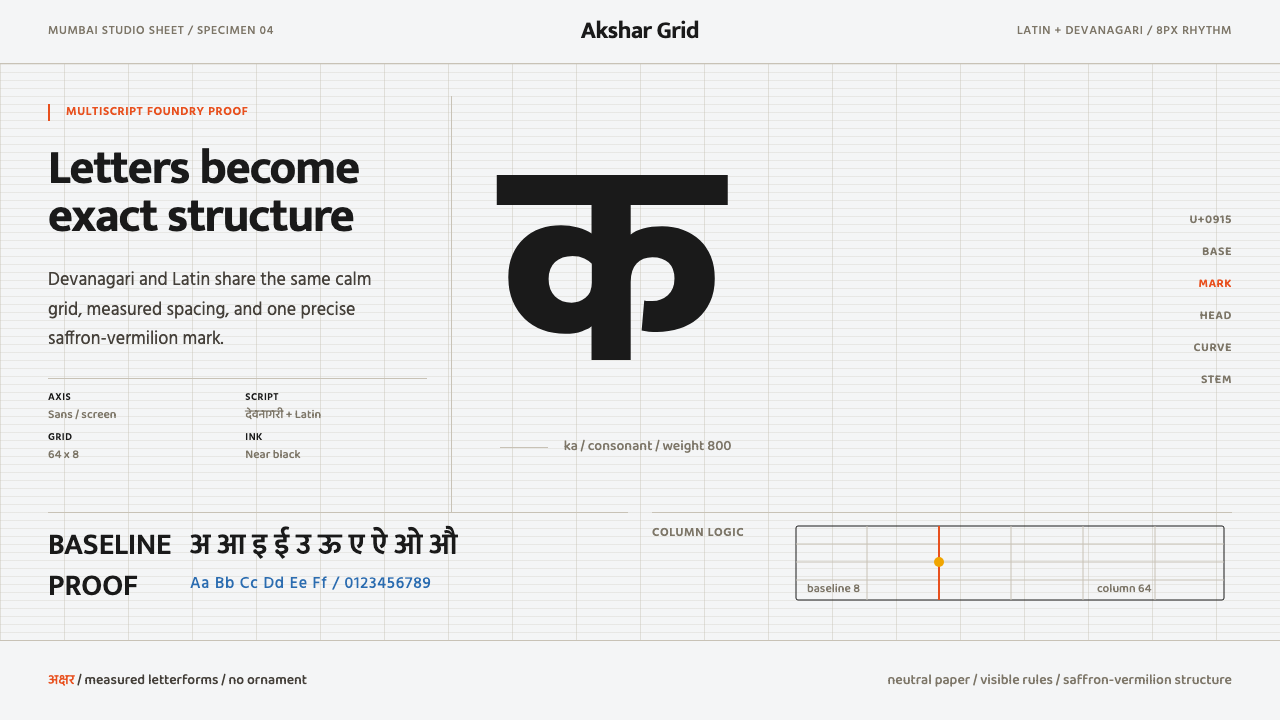 Modern Devanagari TypeType is the subject. Warm off-white grid, giant glyphs, one saffron-vermilion…字形即主角:暖灰网格、巨字形与一抹藏红朱橙。
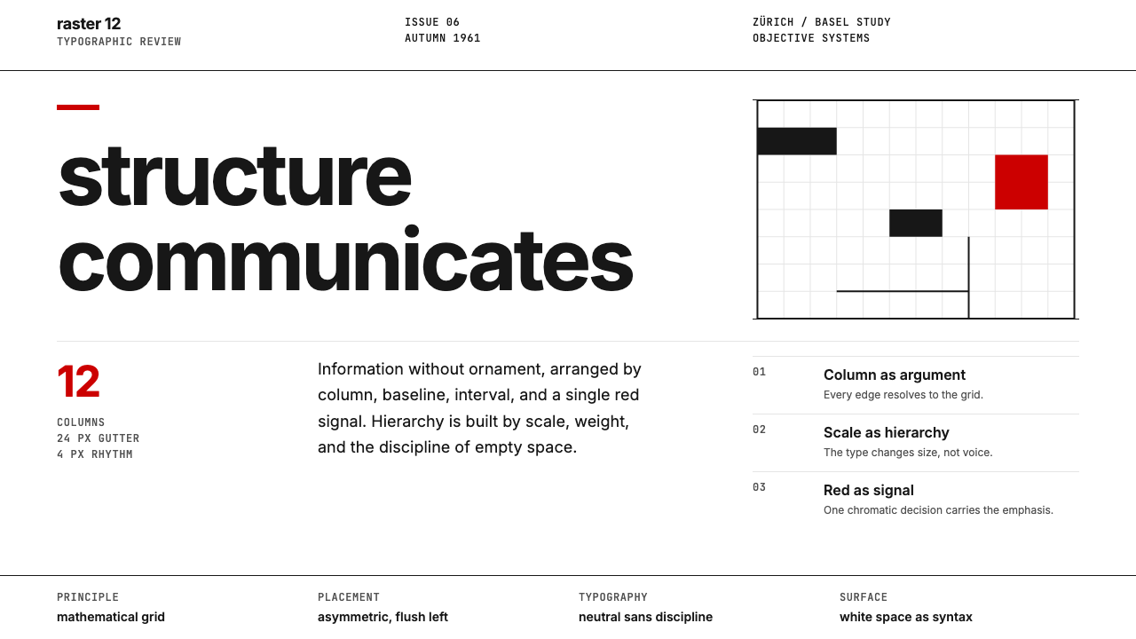 Swiss International StyleObjectivity made visible. Inter scale, white space, and one red block expose…客观性可见:Inter 尺度、留白与单一红块显露网格。
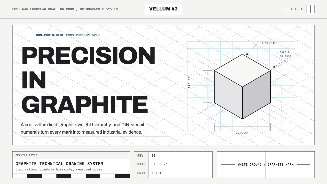 Graphite Technical DrawingDrafting-room precision. Non-photo-blue grid and graphite DIN lettering do th…制图室般精确:淡蓝网格与石墨DIN字母构成秩序。
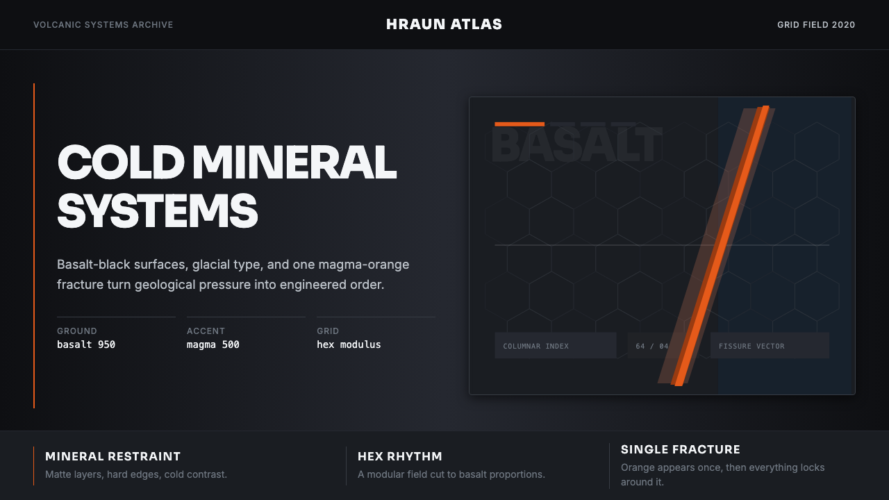 Icelandic Basalt VolcanoCold geology, engineered. Basalt black, Sora type, and one magma fissure hold…冷硬地质感:玄武黑、Sora 字体与岩浆裂缝锁定网格。
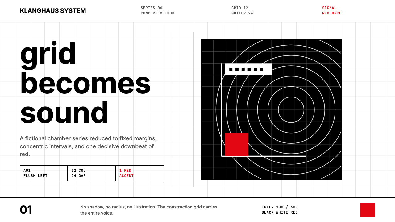 Müller-Brockmann GridOrder becomes force. Black-white 12-column grid, Inter type, one red downbeat.秩序化为力量:黑白十二栏网格、Inter 字体、一记红色重音。