What is Wim Crouwel Grid?什么是 Wim Crouwel Grid?
Wim Crouwel turned the grid from a tool into a conviction — proving that absolute structure, far from imprisoning a designer, is the only thing that sets one free.维姆·克劳威尔将网格从工具升华为信念——证明绝对的结构非但不会囚禁设计师,反而是令人真正自由的唯一途径。
Wim Crouwel Grid in briefWim Crouwel Grid 速览
The Wim Crouwel Grid style is a design system rooted in the Dutch modernist tradition of the 1960s and 1970s, built around the principle that every element on a surface — type, color, rule, margin — must submit to a single underlying geometric order. It inherits from Crouwel's decade-long collaboration with the Stedelijk Museum in Amsterdam, where he produced catalogues, posters, and announcements of extraordinary disciplinary consistency: strict column grids, weight-bearing white space, flat saturated primary accents deployed with surgical economy, and typography treated as a structural rather than decorative element.维姆·克劳威尔网格风格是植根于1960至70年代荷兰现代主义传统的设计系统,其核心原则是:画面上的每一个元素——文字、色彩、线条、页边距——都必须服从于同一套底层几何秩序。这一风格源自克劳威尔与阿姆斯特丹市立博物馆长达十年的合作,他为博物馆制作了大量画册、海报与展览公告,呈现出惊人的一致性:严格的分栏网格、具有支撑力量的白色空间、以外科手术般精准节制铺陈的饱和原色,以及被视为结构性而非装饰性元素的排版。
At the center of the style sits the grid as philosophical commitment rather than mere layout aid. Crouwel famously stated that the grid is not a limitation but a liberating framework — once the constraints are accepted and internalized, every decision within them is made faster and with greater coherence. In practice this means absolute alignment to column boundaries, no decorative flourish that breaks the horizontal or vertical rhythm, and a typographic hierarchy established entirely through scale and weight rather than color or ornamentation. The visual result is austere, deliberate, and instantly readable.这一风格的核心,是将网格视为哲学承诺而非单纯的版面辅助工具。克劳威尔有一句著名的论断:网格不是束缚,而是解放性的框架——一旦接受并内化了这些约束,在约束之内做出的每一个决定都会变得更快、更连贯。在实践中,这意味着绝对对齐于分栏边界、没有任何打破水平或垂直节奏的装饰性元素,以及完全通过尺度与字重而非色彩或装饰来建立的排版层级。视觉结果是简朴的、深思熟虑的,且一目了然。
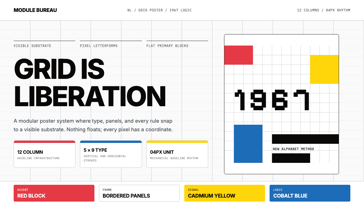
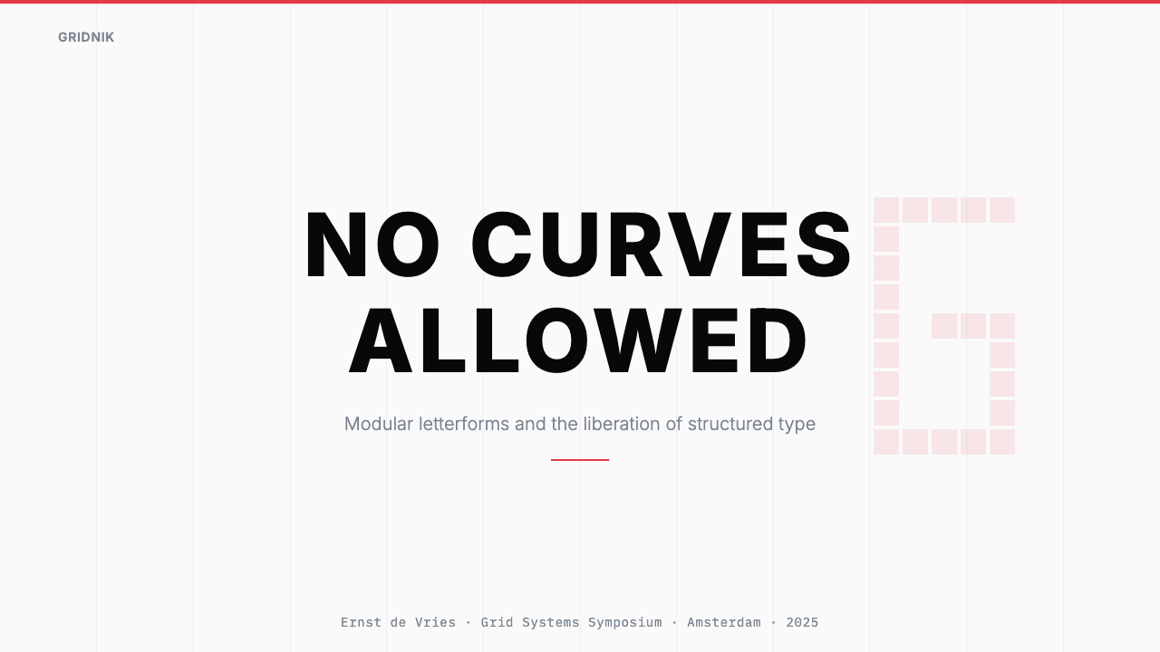
The style shares ancestry with Swiss International Style but diverges in temperament. Where Swiss Style tends toward cool neutrality and universal applicability, the Wim Crouwel Grid carries a more assertive, almost confrontational clarity — a quality directly traceable to Crouwel's 1967 New Alphabet, in which he reduced letterforms to pure horizontal and vertical strokes on a five-by-nine pixel grid. That exercise, designed to anticipate the constraints of cathode-ray tube displays a decade before personal computers existed, distilled his entire design philosophy: accept the grid as given, work within it without apology, and discover that constraint is generative.这一风格与瑞士国际主义风格同源,但在气质上有所分歧。瑞士风格倾向于冷静的中立性与普遍适用性,而维姆·克劳威尔网格则带有一种更具断言感、近乎对抗性的清晰——这种特质可以直接追溯至他1967年的「新字母」。在那套字体中,他将字形简化为纯粹的水平与垂直笔画,构建在五乘九像素的网格之上。这项练习旨在预判阴极射线管显示器的约束条件,比个人电脑的诞生早了整整十年,并将他的整套设计哲学提炼至极致:接受网格作为既定前提,在其中毫无歉意地工作,并发现约束本身具有生产性。
See the Wim Crouwel Grid design system查看 Wim Crouwel Grid 完整设计系统
Where does Wim Crouwel Grid come from?Wim Crouwel Grid 从何而来?
The story of the Wim Crouwel Grid begins in 1963, when Crouwel co-founded Total Design in Amsterdam — the Netherlands' first multidisciplinary design studio, operating on the principle that visual identity should be systematic rather than intuitive. The studio brought together architects, typographers, and graphic designers under a single methodological roof and took on clients whose communication demands required genuine consistency across dozens or hundreds of printed artifacts. The approach was professional in the most radical sense: design as a discipline with verifiable principles, not a craft governed by individual taste.维姆·克劳威尔网格风格的故事始于1963年——克劳威尔在阿姆斯特丹联合创立了Total Design,荷兰第一家多学科设计工作室,其运营原则是:视觉识别应当是系统性的,而非直觉性的。工作室将建筑师、字体设计师与平面设计师汇聚于同一套方法论框架之下,承接那些跨越数十乃至数百件印刷物要求真正一致性的客户委托。这种工作方式在最根本的意义上是专业的:设计是一门拥有可验证原则的学科,而非由个人趣味支配的手工艺。
Crouwel's appointment as visual identity designer for the Stedelijk Museum — Amsterdam's leading contemporary art and design institution — gave his grid philosophy its most sustained and visible platform. Beginning in the mid-1960s and continuing through the 1970s, he designed an unbroken series of exhibition catalogues, invitations, posters, and printed ephemera using the same structural logic: a strict multi-column grid, Akzidenz-Grotesk or similarly neutral grotesque type, white or near-white grounds, and carefully rationed primary color blocks. The body of work is remarkable not because each piece is individually brilliant but because the system is coherent across hundreds of pieces produced over more than a decade.克劳威尔被任命为市立博物馆——阿姆斯特丹领先的当代艺术与设计机构——的视觉识别设计师,为他的网格哲学提供了最持久、最显眼的舞台。从1960年代中期开始,延续至整个1970年代,他用同一套结构逻辑设计了一系列连贯的展览画册、邀请函、海报与印刷品:严格的多栏网格、Akzidenz-Grotesk或同类中性无衬线字体、白色或近白色底面,以及精心配给的原色色块。这批作品的非凡之处,不在于每一件单品都灵光四射,而在于这套系统在逾十年间、数百件作品中保持了连贯一致。
The 1967 New Alphabet was the theoretical apex of Crouwel's grid thinking. Concerned that digital display technology — then in its earliest, crudest form — would degrade conventional letterforms into illegibility, he designed a complete alphabet using only horizontal and vertical strokes on a rigidly regular matrix. The result was not intended for immediate commercial use; it was a demonstration that legibility and beauty were achievable within absolute constraint. The New Alphabet attracted wide attention in design circles, was exhibited internationally, and has been periodically revived — most famously on the cover of Joy Division's 1988 compilation Substance, designed by Peter Saville.1967年的「新字母」是克劳威尔网格思维的理论顶点。出于对数字显示技术——彼时尚处于最原始的粗糙形态——将传统字形降格至难以辨认的担忧,他仅用水平与垂直笔画在严格规则的矩阵上设计了一套完整字母。这套字母并非为立即商业应用而生;它是一次论证——在绝对约束之内,可读性与美感同样可以实现。「新字母」在设计界引发广泛关注,曾在国际范围内展出,并被周期性地重新唤起——其中最著名的,是彼得·萨维尔1988年为Joy Division合辑《Substance》所设计的封面。
The intellectual context for Crouwel's work was the postwar Dutch design culture, which had absorbed both the Swiss International Style arriving from Zurich and Basel and a native tradition of rigorous craft in printing and typography. The Netherlands had one of Europe's most sophisticated printing industries, and Dutch designers were deeply familiar with the technical possibilities and constraints of letterpress, offset lithography, and early phototypesetting. Crouwel's grids were not abstract idealism; they were grounded in an intimate knowledge of how ink behaves on paper, how column measures affect reading comfort, and how a modular system scales from a small invitation card to a full-scale exhibition catalogue without losing coherence.克劳威尔工作的思想背景,是战后荷兰的设计文化——它同时吸收了从苏黎世与巴塞尔传入的瑞士国际主义风格,以及本土在印刷与排版领域严谨工艺的传统。荷兰拥有欧洲最精良的印刷业之一,荷兰设计师对凸版、胶版印刷与早期光学排版的技术可能性及其约束条件了如指掌。克劳威尔的网格并非抽象的理想主义;它建立在对油墨在纸上行为方式的亲身熟悉、对栏宽如何影响阅读舒适度的深刻理解,以及对模块化系统如何从小幅邀请卡扩展至大型展览画册而不失连贯性的具体把握之上。
What defines the Wim Crouwel Grid look?Wim Crouwel Grid 的视觉特征是什么?
The Sovereign Grid主权网格
The defining characteristic is an unwavering commitment to a strict column grid, typically twelve columns with consistent gutters and a fixed baseline rhythm. Every element — headline, caption, image, color block, rule — aligns to this underlying structure without exception. The grid is not a starting point from which rules are selectively broken for visual interest; it is the permanent governing logic. The discipline produces layouts that feel inevitable rather than designed, as if the content has been allowed to find its own correct position.这一风格最鲜明的特征是对严格分栏网格的坚定承诺——通常为十二栏,配以一致的栏间距与固定的基线节奏。每一个元素——标题、说明文字、图像、色块、线条——无一例外地对齐于这套底层结构。网格不是一个出发点,不允许为了视觉趣味而选择性打破规则;它是永久的支配逻辑。这种自律产生出令人感觉不可避免而非精心设计的版面,仿佛内容被允许找到了自己正确的位置。
Primary Color as Function原色即功能
Color in this system is restricted to a tight palette of saturated primaries — cobalt blue, pure red, and clear yellow — deployed against white or near-white grounds. These colors are never decorative; each appears because it performs a structural or hierarchical task: differentiating a category, marking a section boundary, drawing attention to a single datum. The colors are used one at a time, or in carefully considered pairs, never all simultaneously at full saturation. White space itself is treated as a fourth color — active, structural, and never treated as mere absence.这套系统中的色彩被限定在一组饱和原色的紧凑色板之内——钴蓝、纯红与清澈的黄色——铺陈于白色或近白色的底面之上。这些颜色从不具有装饰性;每一种出现,都因为它承担了结构性或层级性的任务:区分类别、标记段落边界、将注意力引向单一数据。色彩一次使用一种,或在深思熟虑的配对中使用,绝不同时以全饱和度三色齐现。白色空间本身被视为第四种颜色——主动的、结构性的,绝不被当作单纯的缺席。
Typographic Structure Without Ornament无装饰的排版结构
Typography in this system is treated as architecture. Hierarchy is established through scale and weight contrast alone — a headline might be dramatically larger than the body text with which it shares a column, creating tension and reading direction through proportion rather than through color changes or decorative separators. Neutral grotesque typefaces are preferred because they impose no personality of their own, allowing the structural logic to remain visible. Tracking and leading are set with the same rigor as column widths — not approximated, but determined.这套系统中的排版被视为建筑。层级完全通过尺度与字重的对比来建立——标题可能比与之共处同一分栏的正文大幅放大,通过比例而非色彩变化或装饰性分隔符来制造张力和阅读方向。中性无衬线字体是首选,因为它们本身不带有任何个性,使结构逻辑得以保持可见。字距与行距以与栏宽同等的严格程度设定——不是近似,而是被确定。
Hairline Rules and Hard Edges发丝细线与硬边
Where rules appear — horizontal dividers, column separators, frame lines — they are as thin as the printing medium will allow, reducing the rule to pure concept rather than visible mass. The contrast between these hairline elements and the dense blocks of type or solid color panels is a key aesthetic tension in the system. Edges throughout are hard: color meets color or color meets white at a clean boundary, with no softening transition. This hardness is not severity for its own sake but a consequence of treating the surface as a rational system rather than a perceptual illusion.当线条出现——水平分隔线、栏间分隔线、边框——它们尽可能地细,薄至印刷媒介所允许的极限,使线条还原为纯粹的概念而非可见的质量。这些发丝般的元素与浓密的文字块或实心色彩面板之间的对比,是这套系统的核心美学张力。整体边缘处处皆硬:色彩与色彩相遇,或色彩与白色相遇,均以清晰的边界为界,没有任何柔化过渡。这种硬朗并非为严厉而严厉,而是将画面视为理性系统而非感知幻觉的必然结果。
Modular Panels模块化面板
Content is organized into modular rectangular panels that occupy whole column units or multiples thereof — never arbitrary widths. A text block might occupy three columns, an image five, a color accent bar one. The modularity means any element can be repositioned or resized within the grid without disrupting the underlying logic, and different pages or slides in a system can vary considerably in content while remaining visually unified by the same structural language. This quality makes the style particularly suited to information-dense environments where variety in content must coexist with systemic consistency.内容被组织进模块化的矩形面板之中,这些面板占据整数个分栏单位或其倍数——从不是任意宽度。一个文字块可能占三栏,一张图片占五栏,一个色彩强调条占一栏。这种模块性意味着任何元素都可以在网格内重新定位或调整尺寸,而不破坏底层逻辑;同一系统中不同的页面或幻灯片,内容可以差异相当显著,却依然在视觉上被同一套结构语言所统一。这一特质使这种风格特别适合信息密集的环境——在那里,内容的多样性必须与系统性的一致性共存。
Flatness and Literal Surfaces平面性与字面表面
No element in this system simulates depth, texture, or material. There are no shadows, no gradients, no layered transparency effects that suggest one element exists above or below another. Color panels are flat. Type has no drop shadow. The surface of the composition is exactly what it appears to be — a flat plane organized by rational rules. This literalness is not a limitation; it is the logical endpoint of the grid philosophy. When you have accepted the grid as the source of all order, you need nothing else to create hierarchy or structure.这套系统中没有任何元素模拟深度、质感或材料。没有投影,没有渐变,没有暗示某个元素位于另一个元素之上或之下的分层透明效果。色彩面板是平的,文字没有阴影。构图的表面就是它看起来的样子——一个由理性规则组织的平面。这种字面性并非局限;它是网格哲学的逻辑终点。当你已经接受网格作为所有秩序的来源,你便不再需要任何其他东西来创造层级或结构。
Systematic Repetition系统性重复
The power of this style is cumulative. A single poster designed according to its logic may look rigorous; a catalogue of forty pages, or an exhibition program spanning a decade, reveals the true character of the system. Repetition is not laziness — it is how the grid proves its thesis. When the same structural logic appears across different formats, scales, and content types while maintaining its internal consistency, it demonstrates that the system is genuinely modular and genuinely rational, not merely the result of one designer's particular preferences applied to one particular problem.这种风格的力量是累积性的。依据其逻辑设计的单张海报或许显得严谨;而四十页的画册,或跨越十年的展览计划,才真正揭示这套系统的本质特征。重复不是惰性——它是网格证明其论题的方式。当同一套结构逻辑在不同格式、不同尺寸与不同内容类型之间保持其内在一致性时,它证明了这套系统是真正模块化且真正理性的,而非仅仅是某位设计师将个人偏好应用于某一特定问题的结果。

See the Wim Crouwel Grid design system查看 Wim Crouwel Grid 完整设计系统
Who shaped Wim Crouwel Grid?谁塑造了 Wim Crouwel Grid?
Crouwel (1928–2019) was the central figure of postwar Dutch graphic design and the originator of the visual philosophy this style is named for. Trained in fine arts in Groningen and Amsterdam, he co-founded Total Design in 1963 and led its work for the Stedelijk Museum across two decades. His 1967 New Alphabet demonstrated that a complete typographic system could be built from horizontal and vertical strokes alone — a radical proposition that anticipated digital typography by a full decade. He was a consistent and articulate advocate for design as a rational, systematic discipline, famously resistant to expressive or personal approaches, and his debates with Jan van Toorn on the social responsibilities of design remain among the most significant exchanges in twentieth-century design discourse.克劳威尔(1928—2019)是战后荷兰平面设计的核心人物,也是这一以他命名的视觉哲学的创始者。他在赫罗宁根与阿姆斯特丹接受纯艺术训练,于1963年联合创立Total Design,并在此后二十年间主导了为市立博物馆所做的设计工作。他1967年的「新字母」论证了一套完整的排印系统可以仅从水平与垂直笔画中构建——这一激进命题比数字排印的到来早了整整十年。他始终是设计作为理性、系统性学科的坚定倡导者,以抵抗表现性或个人化方式著称;他与扬·凡·托恩之间关于设计社会责任的辩论,至今仍是二十世纪设计话语中最重要的交锋之一。
A co-founder of Total Design alongside Crouwel, Wissing contributed to establishing the studio's reputation for rigorous systematic identity design in the 1960s and 1970s. His work helped demonstrate that the Total Design approach — treating visual identity as a programmable system rather than a collection of individual artifacts — was viable across large institutional clients with complex communication needs. His contribution to the studio's foundational years shaped the professional context within which Crouwel's grid philosophy could be developed and applied at scale.威辛与克劳威尔同为Total Design的联合创始人,对于1960至70年代建立工作室在严格系统性识别设计领域的声誉贡献卓著。他的工作有助于证明Total Design的方法论——将视觉识别视为可编程的系统而非单件作品的集合——在拥有复杂传播需求的大型机构客户中是切实可行的。他对工作室初创时期的贡献,塑造了克劳威尔的网格哲学得以发展并规模化应用的专业语境。
As director of the Stedelijk Museum from 1963 to 1985, De Wilde was the institutional patron whose sustained confidence in Crouwel's approach made the extended Stedelijk visual identity project possible. A director willing to commission genuinely systematic design over two decades is as important to the resulting body of work as the designer who executes it. De Wilde's consistent support for Crouwel's rigorous, unglamorous, and occasionally controversial grid-based approach — at a museum whose programming was adventurous and internationally prominent — stands as a model of enlightened institutional patronage.德·威尔德于1963至1985年担任市立博物馆馆长,正是这位机构赞助人对克劳威尔方法的持续信任,使得历时数十年的市立博物馆视觉识别项目得以实现。一位愿意在二十年间持续委托真正系统性设计的馆长,对最终作品的意义不亚于执行设计的设计师本身。德·威尔德始终如一地支持克劳威尔严格、朴素、有时颇具争议的网格化方法——在一家节目编排富有冒险精神且享有国际声誉的博物馆中——堪称开明的机构赞助的典范。
Another founding member of Total Design, Suyling was part of the core group that established the studio's working methodology and client base during its formative years. The studio's collective model — in which projects were approached as shared intellectual problems rather than individual authorial statements — was central to developing the kind of systematic thinking that Crouwel's grid philosophy embodies. Suyling's participation in building that collaborative professional culture contributed to the environment in which the Wim Crouwel Grid approach could be articulated, tested, and refined over time.苏林也是Total Design的创始成员之一,参与建立了工作室在初创时期的工作方法论与客户基础。工作室的集体模式——将项目作为共同的智识问题而非个人作者陈述来处理——对于发展出克劳威尔网格哲学所体现的那种系统性思维至关重要。苏林在构建这种协作专业文化方面的参与,为维姆·克劳威尔网格方法得以随时间被清晰表述、检验与精炼的环境作出了贡献。
How do you use Wim Crouwel Grid today?今天怎么用 Wim Crouwel Grid?
The Wim Crouwel Grid is among the most structurally coherent historical styles available to contemporary designers, precisely because its logic is architectural rather than decorative. Applying it well requires genuinely committing to the underlying grid — not using it as a loose guide while allowing exceptions wherever they seem convenient. The discipline of the style is also its creative engine: once you accept that every element must align and that color must serve function rather than atmosphere, a large number of compositional decisions resolve themselves, leaving you free to focus on hierarchy and proportion.维姆·克劳威尔网格是当代设计师可以使用的结构最为严密的历史风格之一,正因为它的逻辑是建筑性的而非装饰性的。良好地应用它,需要真正承诺于底层网格——而非将其用作松散的参考,同时在任何看似方便之处为例外留出空间。这种风格的自律同时也是其创造力的引擎:一旦接受了每个元素都必须对齐、色彩必须服务于功能而非氛围,大量的构图决策便自行解决,使你得以专注于层级与比例。
For presentation slides, this style works with particular force on cover and section divider pages. A cover in this mode uses the grid to organize a single bold typographic statement — the title at a scale that commands the space — flanked by a column-width color panel in a single saturated primary. Content slides benefit from the style's information architecture strengths: each data point or text block occupies a defined column unit, visual weight is distributed across the grid rather than centered, and one restrained primary-color accent marks the single most important element on the page. Data visualization slides become diagrammatic objects — charts are treated as flat geometric constructions whose bars, segments, or lines inherit the grid's column structure, with color used to distinguish categories rather than to decorate.对于演示文稿,这种风格在封面页与章节分隔页上发挥着特别有力的作用。这种模式下的封面利用网格组织单一的大胆排版陈述——标题以统治空间的尺度呈现——由一条栏宽的单饱和原色面板侧翼。内容页得益于这种风格在信息架构方面的优势:每个数据点或文字块占据一个定义好的分栏单位,视觉重量在网格中分布而非居中,一个节制的原色强调标记页面上最重要的单一元素。数据可视化幻灯片成为示意图式的对象——图表被视为平面几何构造,其柱条、扇区或折线继承网格的分栏结构,色彩用于区分类别而非装饰。
For web interfaces and dashboards, the style is especially well matched to environments where dense information must be quickly navigated. The approach is to establish a strict column grid at the layout level, assign each major information category to a fixed number of columns, and use color only to encode state or priority — an alert condition, an active selection, a primary call to action — rather than to create visual warmth or personality. Cards and panels have hard edges and no shadows; borders replace shadow as the mechanism that separates one region of the interface from another. Navigation is typographic: labels and numerals, not icons; horizontal rules, not chevrons.对于网页界面与仪表板,这种风格与密集信息必须被快速导航的环境尤为匹配。方法是在版面层面建立严格的分栏网格,将每个主要信息类别分配至固定数量的分栏,并仅使用色彩来编码状态或优先级——警示条件、活跃选择、主要行动呼唤——而非创造视觉温暖或个性。卡片与面板有硬边且无投影;边框而非阴影是将界面一个区域与另一个区域分隔开的机制。导航是字体性的:标签与数字,而非图标;水平线,而非箭头符号。
For editorial design and marketing materials, the style's poster heritage gives it natural authority in contexts where a single strong visual statement must carry a page. A magazine feature applying this approach would use a narrow body-text column set at a consistent measure, a wide outer margin reserved for captions, pull quotes, or section labels, and section breaks marked by a full-width solid rule rather than decorative ornaments. Marketing pages work well with alternating full-width blocks — white ground for body content, a saturated primary for feature callouts — with type set large enough that the typographic structure is itself the visual. Color shifts between blocks are hard cuts, never gradients.对于编辑设计与营销材料,这种风格的海报传统赋予它在单一强烈视觉陈述必须承载一个页面的语境中天然的权威感。应用这种方法的杂志专题,会使用以一致行宽排列的窄幅正文栏、为说明文字、引语或章节标签保留的宽外边距,以及以全宽实线而非装饰元素标记的段落分隔。营销页面适合采用交替的全宽区块——白色底面用于正文内容,饱和原色用于特性引语——文字排设得足够大,使排版结构本身成为视觉主体。区块之间的色彩切换是硬切,绝不是渐变。
A common mistake when working in this style is interpreting the primary-color palette as permission to use all three colors freely and simultaneously. Authentic Wim Crouwel Grid work is far more austere: one primary is selected as the accent for a given project or document, and that color appears only at functional moments — a section header, a key data point, a single interactive element. The second and third primaries, if they appear at all, play subordinate structural roles. A related error is allowing the grid to become visible in the final output — adding column guides or structure lines as decorative elements rather than letting the invisible logic of the alignment speak for itself. The grid should be felt, not seen.在这种风格中工作时,一个常见错误是将原色色板解读为自由而同时使用三种颜色的许可。真实的维姆·克劳威尔网格作品要朴素得多:为某一特定项目或文档选定一种原色作为强调色,这种颜色仅在功能性时刻出现——章节标题、关键数据点、单一交互元素。第二与第三种原色若出现,也只承担从属的结构性角色。另一个相关错误是允许网格在最终输出中变得可见——将分栏参考线或结构线条作为装饰性元素添加,而非让对齐的无形逻辑自己说话。网格应该被感知到,而不是被看见。
See the Wim Crouwel Grid design system查看 Wim Crouwel Grid 完整设计系统
Wim Crouwel Grid — FAQWim Crouwel Grid · 常见问题
How is the Wim Crouwel Grid different from Swiss International Style?维姆·克劳威尔网格与瑞士国际主义风格有何不同?
Both traditions share a commitment to the grid, neutral grotesque typography, and rational organization. The key differences are in temperament and color. Swiss International Style — as practiced by designers such as Josef Müller-Brockmann — tends toward a cooler, more universal neutrality, uses photography extensively, and applies color quite sparingly. The Wim Crouwel Grid is more assertive in its primary-color use, tends toward bolder typographic scale contrasts, and carries the particular clarity of Dutch printing culture rather than Swiss neutrality. Crouwel was also more theoretically radical: his New Alphabet represented a willingness to push the grid logic until letterforms themselves were transformed, which goes beyond what most Swiss Style practitioners attempted.两种传统都对网格、中性无衬线排版与理性组织有所承诺。关键区别在于气质与色彩。瑞士国际主义风格——以约瑟夫·米勒-布罗克曼等设计师的实践为代表——倾向于更冷静、更普遍的中立性,大量使用摄影,色彩运用相当节制。维姆·克劳威尔网格在原色使用上更具断言感,倾向于更大胆的排版尺度对比,带有荷兰印刷文化特有的清晰性而非瑞士式中立性。克劳威尔在理论上也更为激进:他的「新字母」代表了一种将网格逻辑推进至连字形本身都被改变的意愿,这超出了大多数瑞士风格实践者所尝试的范畴。
Does this style work for dark-background layouts?这种风格适用于深色背景版面吗?
The canonical Crouwel palette is light-ground: white or near-white backgrounds are the historical norm. A dark inversion is possible and has precedent in contemporary applications of the style, but it requires particular discipline. On a dark ground, saturated primary yellow tends to become visually dominant and can overwhelm the structural clarity the style depends on. A dark variant of this style works best when it commits to a single primary color as the foreground accent — typically a warm red or a cool cobalt — and reserves the others entirely for typographic or structural roles. The grid logic should remain equally strict; it is the surface, not the structure, that changes.经典的克劳威尔色板是浅色底面:白色或近白色背景是历史常态。深色反转版本是可行的,在这种风格的当代应用中也有先例,但需要格外的自律。在深色底面上,饱和原色黄往往会在视觉上变得强势,可能压倒这种风格所依赖的结构清晰度。这种风格的深色变体最有效的做法是:以一种原色作为前景强调色——通常是暖红或冷钴蓝——并将其余颜色完全保留给排版性或结构性角色。网格逻辑应该保持同等的严格;改变的是表面,而非结构。
Can this style accommodate photography and imagery?这种风格能容纳摄影与图像吗?
Yes, but with strict conditions. In the Crouwel tradition, photography is treated as a flat rectangular element that occupies a defined number of column units — it is cropped to fit the grid, not allowed to break free of it. Images are used for documentary or informational purposes rather than atmospheric effect; they are not blurred, vignetted, or treated with overlays that soften their edges. If color is an issue — if a photograph's color palette conflicts with the primary-color system — high-contrast black-and-white treatment resolves the conflict while reinforcing the flat, diagrammatic quality of the overall composition. The photograph becomes another geometric element on the grid, not a window into a separate visual world.可以,但有严格条件。在克劳威尔传统中,摄影被视为占据定义好的分栏单位数量的平面矩形元素——它被裁切以适应网格,而不允许从中脱逃。图像用于纪录性或信息性目的,而非营造氛围效果;它们不会被模糊处理、加晕影,或施以柔化边缘的叠加效果。如果色彩是问题——如果照片的色调与原色系统相冲突——高对比度黑白处理可以解决冲突,同时强化整体构图平面的、示意图式的品质。照片成为网格上的又一个几何元素,而非通往另一个视觉世界的窗口。
Is the New Alphabet typeface required to use this style?使用这种风格是否必须采用「新字母」字体?
No. The New Alphabet was a theoretical demonstration, not a commercially deployed typeface, and Crouwel's own Stedelijk Museum work used conventional grotesque typefaces — Akzidenz-Grotesk being the primary choice. The style calls for a neutral, geometric grotesque type that imposes no personality and allows the structural logic of the grid to dominate. The New Alphabet's underlying principle — that letterforms should submit fully to grid constraints — is what matters, not the specific typeface. Using the New Alphabet as a display element is a legitimate homage, but it is the structural discipline and not any particular typeface choice that defines the system.不需要。「新字母」是一次理论性论证,而非商业化应用的字体;克劳威尔自己在市立博物馆的工作中使用的是传统无衬线字体——Akzidenz-Grotesk是主要选择。这种风格要求一种不带有任何个性、允许网格结构逻辑占主导地位的中性几何无衬线字体。重要的是「新字母」的底层原则——字形应完全服从于网格约束——而非具体的字体选择。将「新字母」作为展示性元素使用是合理的致敬,但定义这套系统的是结构性自律,而非任何特定的字体选择。
What kinds of products or contexts does this style suit least?这种风格最不适合哪类产品或语境?
The Wim Crouwel Grid is optimally suited to contexts where rational clarity, systematic trustworthiness, and information density are valued: institutional identities, data products, analytical dashboards, exhibition materials, and platforms positioning themselves as precise and principled. It is poorly suited to products that depend on warmth, organic texture, sensory richness, or cultural intimacy — food brands, children's products, wellness applications, social platforms, and any context where the designed surface should feel inviting and human rather than logical and structural. The style's austerity, which is its greatest strength in information-dense environments, can read as cold, institutional, or alienating in consumer emotional contexts. The most important question before applying it is whether the product's values and the style's values actually align.维姆·克劳威尔网格最适合理性清晰、系统可信度与信息密度被视为价值的语境:机构识别、数据产品、分析仪表板、展览材料,以及将自身定位为精确且有原则的平台。它不适合依赖温暖感、有机质感、感官丰富性或文化亲密性的产品——食品品牌、儿童产品、健康应用、社交平台,以及任何设计表面应当令人感到亲切而富有人情味而非逻辑性与结构性的语境。这种风格的简朴——在信息密集环境中是其最大优势——在消费者情感语境中可能被解读为冷漠、机构感或疏离感。在应用它之前,最重要的问题是:产品的价值观与这种风格的价值观是否真正一致。
Related design styles相关设计风格
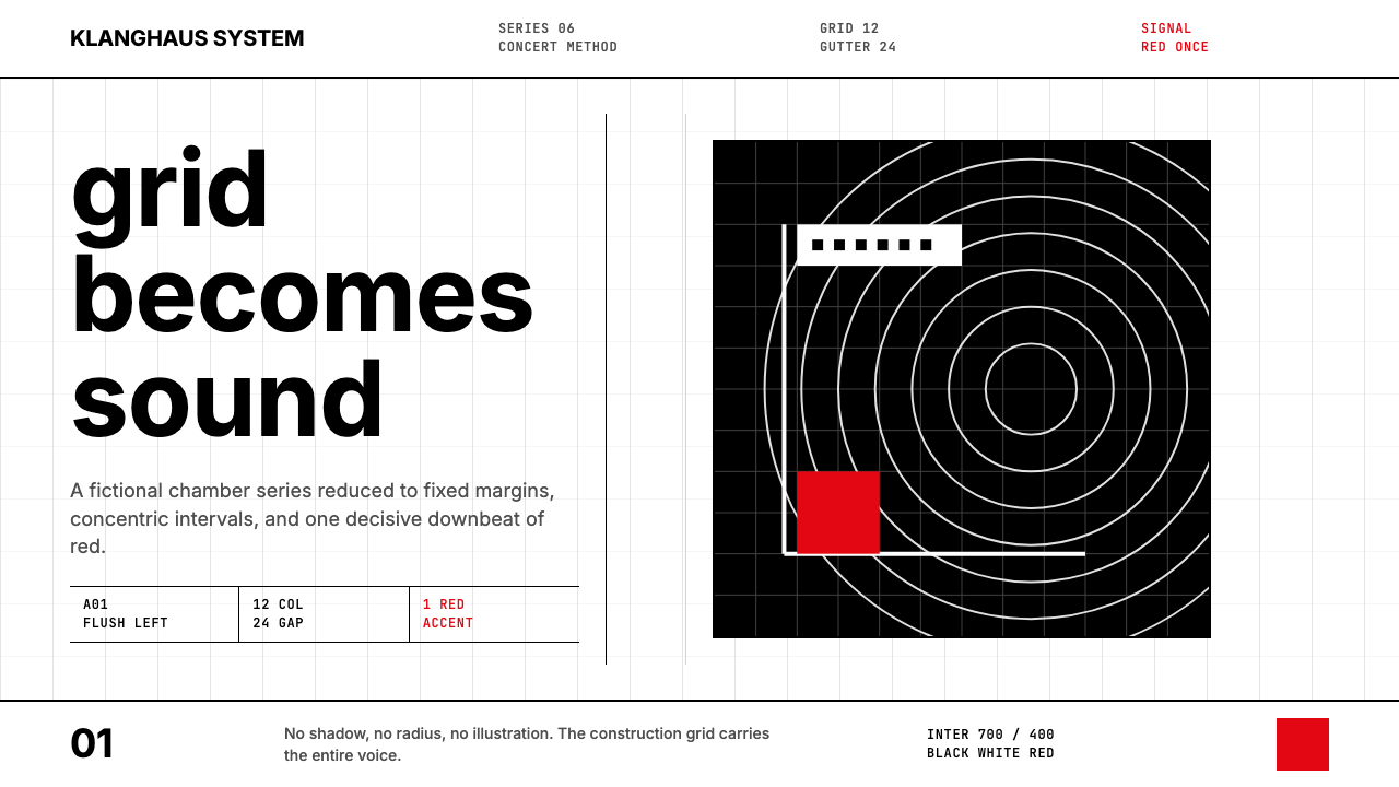
 Müller-Brockmann SwissClarity is the system. Inter grids, red-blue blocks, and concentric arcs make…清晰即系统:Inter网格、红蓝色块与同心弧显露结构。
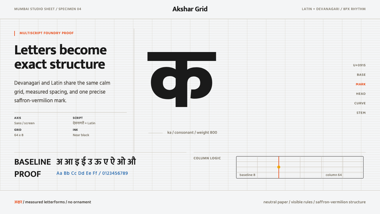 Modern Devanagari TypeType is the subject. Warm off-white grid, giant glyphs, one saffron-vermilion…字形即主角:暖灰网格、巨字形与一抹藏红朱橙。
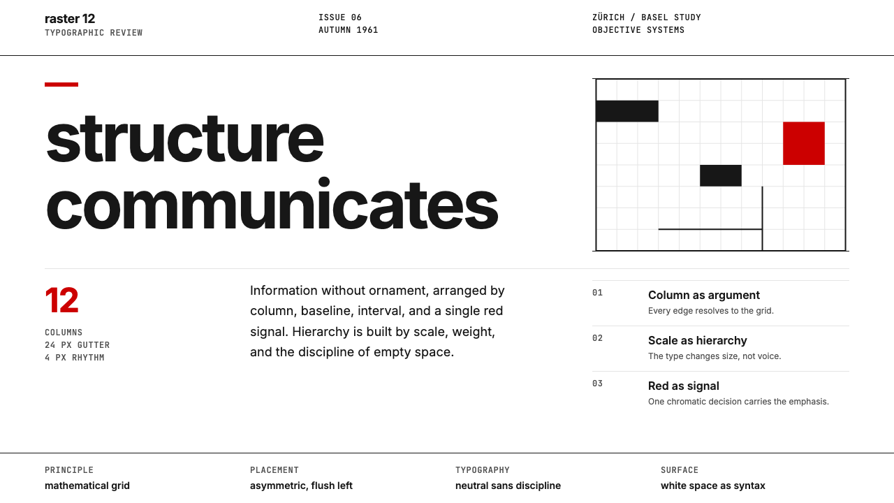 Swiss International StyleObjectivity made visible. Inter scale, white space, and one red block expose…客观性可见:Inter 尺度、留白与单一红块显露网格。
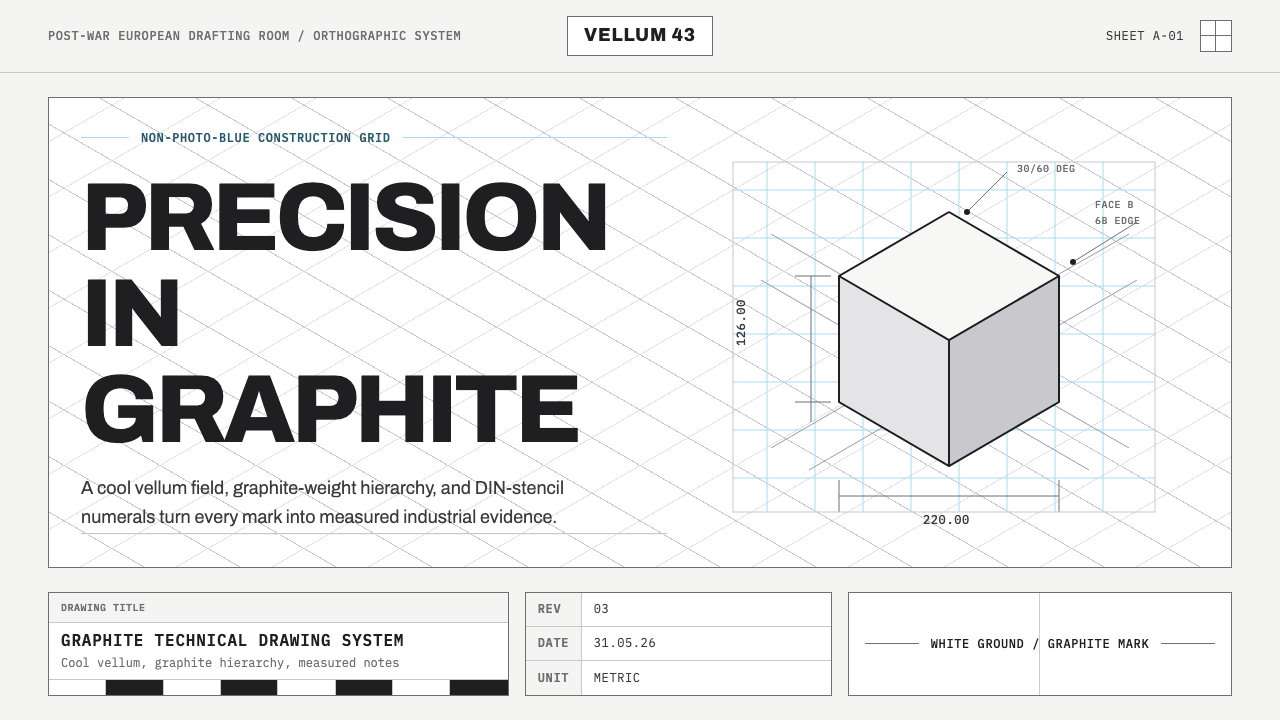 Graphite Technical DrawingDrafting-room precision. Non-photo-blue grid and graphite DIN lettering do th…制图室般精确:淡蓝网格与石墨DIN字母构成秩序。
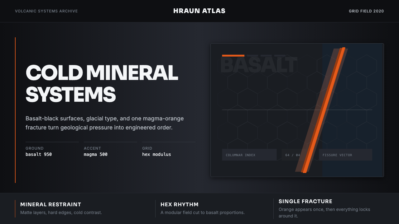 Icelandic Basalt VolcanoCold geology, engineered. Basalt black, Sora type, and one magma fissure hold…冷硬地质感:玄武黑、Sora 字体与岩浆裂缝锁定网格。
 Müller-Brockmann GridOrder becomes force. Black-white 12-column grid, Inter type, one red downbeat.秩序化为力量:黑白十二栏网格、Inter 字体、一记红色重音。