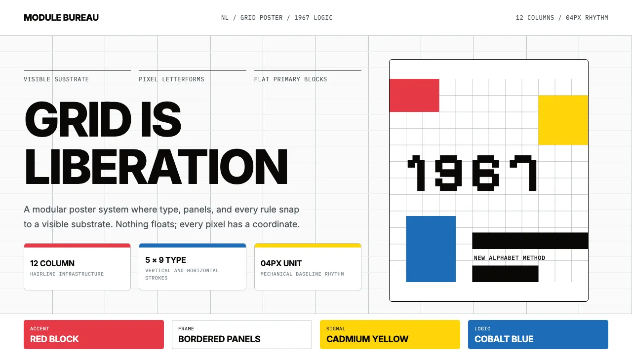
About Wim Crouwel Grid
Wim Crouwel's 1967 New Alphabet reduced letterforms to pure horizontal and vertical strokes on a 5×9 pixel grid — anticipating digital typography a decade before personal computers existed. His work at Total Design Amsterdam for the Stedelijk Museum defined Dutch modernist graphic identity: strict 12-column grids, Akzidenz-Grotesk type, and saturated primary-color accents on white ground.
This system channels Crouwel's "grid is liberation" philosophy into interface design — hairline rules, modular panels, flat Swiss surfaces, and typographic hierarchy that treats every pixel as deliberate.
- Origin
- Netherlands — Amsterdam, Rotterdam
- Era
- 1963 (Total Design founded) – 1985; New Alphabet typeface 1967
- Key figures
- Wim Crouwel · Benno Wissing · Karel Suyling · Edy de Wilde
- Movements
- Dutch modernism · Total Design school · Swiss International Style
Wim Crouwel Grid design spec
Colors
Typography
The other 11 sections — buttons, cards, spacing, motion, techniques and more — open once you unlock. Download the DESIGN.md or send it to your AI in one click. Unlock once, yours forever.
Sign up nowStyles similar to Wim Crouwel Grid
Also inspired by art & artists, with a close feel.
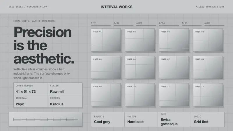 Donald Judd Milled AluminumPrecision made visible. Cool mill-silver boxes repeat on a hard concrete grid.
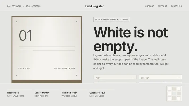 Robert Ryman White PaintingWhite becomes material. Cool grey wall, raw edges and metal fasteners expose each layer.
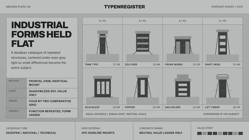 Bechers Industrial TypologyDeadpan order. Mid-grey ground, Archivo labels, and strict hairline grids reveal variation.
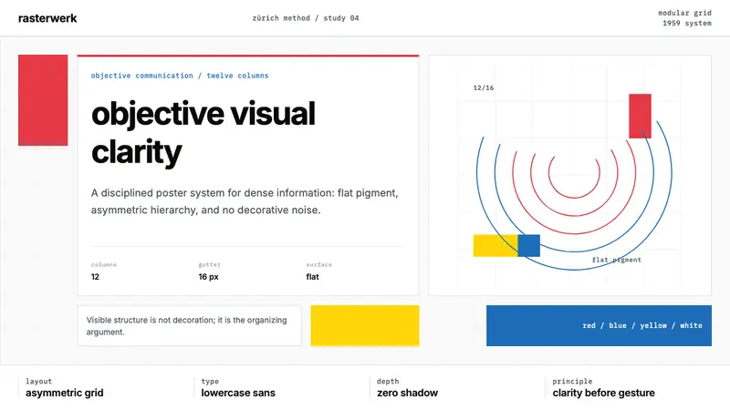 Müller-Brockmann SwissClarity is the system. Inter grids, red-blue blocks, and concentric arcs make structure visible.