Design style guide设计风格指南
What is Icelandic Basalt Volcano?什么是 Icelandic Basalt Volcano?
Iceland's volcanic geology — hexagonal basalt columns, fissuring lava, and glacial-cold silence — forged a design language harder and more elemental than any Scandinavian minimalism that came before it.冰岛的火山地质——六角玄武岩柱、裂隙熔岩与冰川般的寂静——锻造出一种比任何北欧极简主义都更冷硬、更原始的设计语言。
Icelandic Basalt Volcano in briefIcelandic Basalt Volcano 速览
Icelandic Basalt Volcano is a contemporary design system that draws its entire visual logic from the geological character of Iceland: the interlocking hexagonal columns of Reynisfjara's black-sand beaches, the incandescent fissures of the Fagradalsfjall eruptions, and the stark contrast between mineral darkness and glacial white that defines the island's landscape at every scale. Where Scandinavian minimalism softens and invites, this system is cold, structural, and unyielding — a design language shaped by forces far older than human intention.冰岛玄武岩火山是一套当代设计系统,其全部视觉逻辑源于冰岛独特的地质特征:雷尼斯黑沙滩互锁的六角玄武岩柱、法格拉达尔火山的炽热裂缝,以及在各个尺度上定义这座岛屿景观的矿物黑暗与冰川白之间的强烈对比。北欧极简主义柔软、邀人进入,而这套系统则是冷硬的、结构性的、不妥协的——一种由远比人类意志更古老的力量所塑造的设计语言。
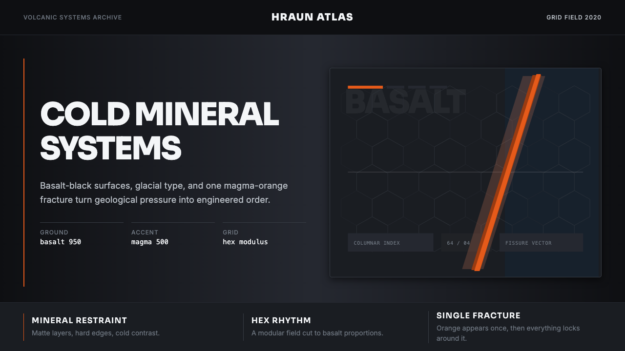
The aesthetic is fundamentally dark. Deep mineral black surfaces dominate, interrupted only by a single, controlled accent the color of cooling magma — a vivid orange-red that reads as geological heat rather than decorative warmth. Glacial white appears as a counterpoint, as cold and precise as the ice that covers much of Iceland's interior. The result is a palette with the contrast ratio of a volcanic landscape at midnight: absolute in its darks, startling in its highlights, with no comfortable middle ground.这套美学从根本上是深色的。深沉的矿物黑色表面占主导,仅被一种单一、受控的强调色打断——那是冷却岩浆的颜色,一种鲜明的橙红,读起来像地质热度而非装饰性的温暖。冰川白作为对位出现,如同覆盖冰岛内陆的冰原一般寒冷而精确。结果是一个具有火山景观对比度的色板:暗处是绝对的黑,亮处令人震惊,中间没有任何舒适的过渡地带。
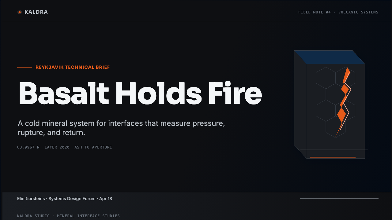
The structural language is hexagonal. Iceland's basalt columns — formed when lava cools slowly and contracts into near-perfect six-sided prisms — provide the grid module. This is not decoration borrowed from nature but a structural principle directly derived from geology: the hexagon is the form that lava itself produces when physics and chemistry resolve into equilibrium. Layouts built on hexagonal grids feel simultaneously natural and engineered, organic in origin but rigorous in execution.结构语言是六角形的。冰岛玄武岩柱——熔岩缓慢冷却收缩后形成近乎完美的六棱柱——提供了网格模块。这不是从自然中借来的装饰,而是直接从地质学中派生出的结构原则:六边形是熔岩在物理与化学达到平衡时自行产生的形态。建立在六角网格上的版面同时具有天然与工程的气质——起源有机,执行严格。
See the Icelandic Basalt Volcano design system →查看 Icelandic Basalt Volcano 完整设计系统 →
Where does Icelandic Basalt Volcano come from?Icelandic Basalt Volcano 从何而来?
Iceland's design culture emerged slowly from geographic isolation. For much of the twentieth century, the island's small population — concentrated in Reykjavik and a handful of coastal towns — produced craft and visual culture shaped more by the landscape than by European movements. The volcanic terrain, the perpetual tug between darkness and light across the seasons, and the physical rawness of basalt, ice, and geothermal steam became the ambient visual vocabulary of Icelandic makers long before those qualities were theorized as design principles.冰岛的设计文化在地理隔绝中缓慢生长。二十世纪大部分时间里,这座岛屿上的小规模人口——集中于雷克雅未克和少数几个沿海小镇——所生产的工艺与视觉文化,与其说受欧洲思潮影响,不如说受地景塑造。火山地貌、四季间黑暗与光明的永恒拉锯,以及玄武岩、冰雪与地热蒸汽的原始质感,在被理论化为设计原则之前,早已是冰岛创作者的环境视觉词汇。
The post-Eyjafjallajökull design wave — named informally after the 2010 eruption that grounded European air traffic and pushed Iceland to global attention — marked a turning point. A generation of Reykjavik designers, architects, and visual artists who had trained at the Iceland Academy of the Arts and at schools in Copenhagen and Helsinki returned home to find that the landscape they had always lived within was suddenly legible to the world as an aesthetic. Studio Granda, founded by Margrét Harðardóttir and Steve Christer, had already been developing an architecture of monolithic materiality — buildings that looked as though they had been carved from the same basalt as the cliffs around them. Their practice gave younger designers a visual precedent for treating geology as design logic rather than as scenery.后眼焦拉冰盖(Eyjafjallajökull)设计浪潮——以2010年那次迫使欧洲航空停飞、让冰岛进入全球视野的火山喷发非正式命名——标志着一个转折点。一批在冰岛艺术学院以及哥本哈根、赫尔辛基求学的雷克雅未克设计师、建筑师与视觉艺术家回到家乡,发现他们一直生活其中的地景突然向全世界呈现为一种美学。由玛格丽特·哈达多蒂尔(Margrét Harðardóttir)和史蒂夫·克里斯特(Steve Christer)创立的 Studio Granda,此前已在发展一种整块材料建筑学——建筑仿佛从周围悬崖中与玄武岩一同雕凿而出。他们的实践为年轻设计师提供了一个将地质学作为设计逻辑而非风景的视觉先例。
Olafur Eliasson, the Danish-Icelandic artist whose large-scale installations have made the physics of light, water, and geometry into gallery experiences, contributed a different lineage. His work — particularly the geometric light chambers and the systematic manipulation of natural phenomena into structured visual fields — demonstrated that Iceland's elemental vocabulary could sustain rigorous conceptual ambition without resorting to nostalgia or folklore. Eliasson's influence on the design system is visible in its treatment of the single accent color: a precise, almost scientific deployment of one vivid hue against an otherwise achromatic field, replicating the effect of a fissure glow in a dark landscape.丹麦裔冰岛艺术家奥拉维尔·埃利亚松(Olafur Eliasson)带来了另一脉传承。他将光、水与几何的物理学转化为画廊体验的大型装置作品——尤其是几何光线空间与将自然现象系统化处理为结构性视觉场域——证明了冰岛的元素词汇能够承载严格的概念雄心,而无需诉诸怀旧或民俗。埃利亚松对这套设计系统的影响,在其单一强调色的处理方式上清晰可见:以一种精确、近乎科学的方式,将一个鲜艳色彩部署于其他一切消色的底面,复现暗色地景中裂隙发光的效果。
The outdoor apparel brand 66°North, founded in 1926 and reinvented in the early 2000s as a premium global identity, provided the commercial precedent. Their visual system — built on stark photography, engineering-derived typography, and a palette that never softened the harshness of the North Atlantic environment — showed that Iceland's geological severity could anchor a product identity legible to international markets without domesticating it. The brand's refusal to aestheticize discomfort, to make the cold seem cozy, became a template for how a design system rooted in volcanic geology might behave in the marketplace. Þorvaldur Skúlason, the painter whose stark Icelandic landscapes reduced the island's terrain to near-abstract masses of dark rock and pale sky, contributed to the art-historical foundation that gave the design system its legitimacy as a visual tradition rather than a commercial invention.户外服装品牌 66°North 创立于1926年,在21世纪初被重塑为全球高端品牌,提供了商业先例。他们的视觉系统——建立于严肃的摄影、工程学派生的排版,以及从不柔化北大西洋环境严酷性的色板——证明冰岛地质的严冽可以在不驯化它的前提下,锚定一个对国际市场可读的产品身份。这个品牌拒绝将不适美化、拒绝让寒冷看起来舒适的态度,成为一套根植于火山地质的设计系统在市场中如何行事的模板。画家索瓦尔杜尔·斯库拉松(Þorvaldur Skúlason)将冰岛地景简化为近乎抽象的深色岩石与苍白天空的大面积色块,为这套设计系统作为视觉传统而非商业发明奠定了艺术史基础。
The contemporary iteration of the system — as a formalized digital design language — emerged from the synthesis of these influences in the 2010s and 2020s, as Icelandic digital studios began applying the geological vocabulary to interface design, data visualization, and brand identity for global technology clients. The hexagonal grid module crystallized as the system's signature structural device, functioning simultaneously as a reference to basalt columns, a nod to the geometric formalism of Northern European modernism, and a practical scaffolding for organizing modular digital interfaces.这套系统当代版本——作为一种正式的数字设计语言——在2010至2020年代的综合中出现,当时冰岛数字工作室开始将地质词汇应用于界面设计、数据可视化以及面向全球科技客户的品牌识别。六角网格模块作为系统的标志性结构装置结晶成形,同时充当对玄武岩柱的引用、对北欧现代主义几何形式主义的致意,以及组织模块化数字界面的实用脚手架。
What defines the Icelandic Basalt Volcano look?Icelandic Basalt Volcano 的视觉特征是什么?
Palette and Tonal Register色板与调性
The palette operates at the extremes. Deep mineral black — not the warm black of ink nor the neutral black of a printer default, but the matte, absorptive black of basalt stone — forms the dominant ground. Against it, a single magma accent introduces the only warm chromatic note in the system: the orange-red of cooling lava as seen in long-exposure photography of active fissures. Glacial white and near-white provide the typographic field and structural highlights. The system deliberately refuses any middle chromatic territory — no muted greens, no atmospheric grays-blues, none of the softening that Scandinavian palettes typically permit. The result is maximum geological contrast: darkness interrupted by fire.色板在两极运作。深沉的矿物黑——不是墨水的暖黑,也不是打印机默认的中性黑,而是玄武岩石的哑光、吸光之黑——构成主导底面。与之相对,单一岩浆强调色引入系统中唯一温暖的色彩音符:活跃裂缝长曝光摄影中冷却熔岩的橙红。冰川白与接近白色的色调提供排版底面与结构高光。这套系统刻意拒绝任何中间色彩地带——没有柔和的绿色,没有大气感的灰蓝,没有北欧色板通常允许的任何柔化。结果是最大限度的地质对比:被火焰打断的黑暗。
Hexagonal Grid Structure六角网格结构
The hexagon is both the structural and symbolic center of the system. Unlike rectangular grids, which impose a human logic of right angles and cardinal directions, hexagonal grids carry the authority of natural formation — they are the shape that basalt columns and honeycomb both arrive at independently, through processes of thermal contraction and material efficiency. In the design system, the hexagonal module governs spatial organization: elements align to hexagonal cells, icons and data units are framed within hexagonal containers, and the negative space between tiled hexagons creates a secondary visual rhythm. This grid does not feel imposed from outside; it feels as though it was already there, waiting to be discovered.六边形既是这套系统的结构中心,也是象征中心。不同于矩形网格——那是直角与基本方向的人类逻辑——六角网格携带着自然形成的权威:玄武岩柱与蜂窝各自独立地通过热收缩与材料效率过程抵达的形态。在这套设计系统中,六角模块支配空间组织:元素沿六角单元对齐,图标与数据单元被框入六角容器,平铺六边形之间的负空间创造出次级视觉节奏。这个网格不像是从外部强加的,而是仿佛早已在那里,等待被发现。
Surface Texture and Material Suggestion表面质感与材料暗示
Surfaces in this system do not simulate material — they suggest geological properties through visual weight and density rather than through imitative texture. The dark ground reads as stone because of its opacity and the way light interacts with its edges: hard, uncompromising, without the diffuse softness of fabric or the reflective shimmer of plastic. Where surface variation occurs — in background treatments or structural dividers — it is achieved through tonal shifts of near-identical dark values rather than through added texture. The effect is that of surfaces caught under low-angle raking light: revealing structure through shadow without introducing naturalistic detail.这套系统的表面不模拟材料——它们通过视觉重量与密度暗示地质属性,而非通过模仿性纹理。深色底面读起来像石头,因为它的不透明性以及光线与其边缘交互的方式:硬朗、不妥协,没有织物的漫散柔软,也没有塑料的反光闪烁。当表面变化出现时——在背景处理或结构分隔线中——是通过近乎相同的深色调值的色调偏移来实现的,而非通过添加纹理。效果如同在低角度斜侧光下被捕捉的表面:通过阴影揭示结构,同时不引入自然主义细节。
Typographic Temperature字体排印的温度
Type in this system carries a cold, engineered quality. Weight is used to establish hierarchy without warmth — heavy type anchors structure the way a column of basalt anchors a cliff face, through mass rather than invitation. Letterforms tend toward geometric construction: the same underlying logic that generates hexagonal modules governs the preference for type whose skeletons are built on circles, straight strokes, and right angles rather than the calligraphic curves of humanist typefaces. Spacing is generous at macro scale and precise at micro scale — the white space around a headline should feel like the silence of a volcanic plain, not the cozy margin of a printed book.这套系统中的字体携带着一种冷峻、工程性的气质。字重用于建立层级,但不带温暖——粗重文字锚定结构的方式,如同玄武岩柱锚定悬崖:靠的是质量而非邀请感。字形倾向于几何构造:生成六角模块的同样底层逻辑,支配着对以圆形、直笔画和直角为骨架构建的字体的偏好,而非人文主义字体的书法曲线。宏观尺度上间距宽裕,微观尺度上精确——标题周围的留白应该感觉像火山平原的寂静,而不是印刷书籍的温馨页边距。
The Singular Fissure Accent唯一裂隙强调
The most distinctive visual decision in the system is the use of a single, carefully constrained accent color that evokes molten rock. This accent appears sparingly — as a glow at a component's active state, as a data highlight in an otherwise monochromatic visualization, as a call-to-action element that stands out precisely because everything around it is dark and mineral. The discipline of restricting warmth to a single channel replicates the geological reality of Iceland: cold, dark stone punctured at rare intervals by intense, localized heat. When this accent is overused — when it appears too frequently or at too large a scale — the entire logic of the system collapses; the geological tension that gives the accent its power requires that darkness remain dominant.这套系统中最具辨识度的视觉决策,是使用单一、受严格约束的强调色来唤起熔融岩石。这种强调色出现得极为克制——作为组件激活状态的光晕,作为原本单色可视化中的数据高光,作为行动召唤元素,其突出感恰恰来自周围一切都是黑暗与矿物质感。将温暖限制在单一通道的自律,复现了冰岛的地质现实:冰冷、黑暗的石头被罕见的、局部的强烈热量所穿透。当这种强调色被过度使用——出现得过于频繁或尺度过大——整套系统的逻辑就会崩溃;赋予强调色力量的地质张力,要求黑暗保持主导。
Geometric Precision Without Softening无柔化的几何精度
Edges in this system are decided, not softened. Where many contemporary dark interfaces rely on rounded corners, soft shadows, and graduated blurs to create depth and approachability, this system insists on the hardness of geological forms: edges are cut, not smoothed; depth is created through layering of opaque surfaces rather than through transparency or blur. This is not severity for its own sake — it is a formal commitment consistent with the source material. Basalt does not round its corners. Lava fissures do not graduate to soft boundaries. The precision is geological, not mechanical.这套系统中的边缘是被决定的,而非被柔化的。许多当代深色界面依赖圆角、柔和阴影和渐进模糊来创造深度和亲近感,而这套系统坚持地质形态的硬朗:边缘被切割,而非被磨圆;深度通过不透明表面的叠加而非透明度或模糊来创造。这不是为严格而严格——这是与源材料一致的形式承诺。玄武岩不会磨圆它的棱角。熔岩裂缝不会渐变为柔和边界。这种精度是地质性的,而非机械性的。
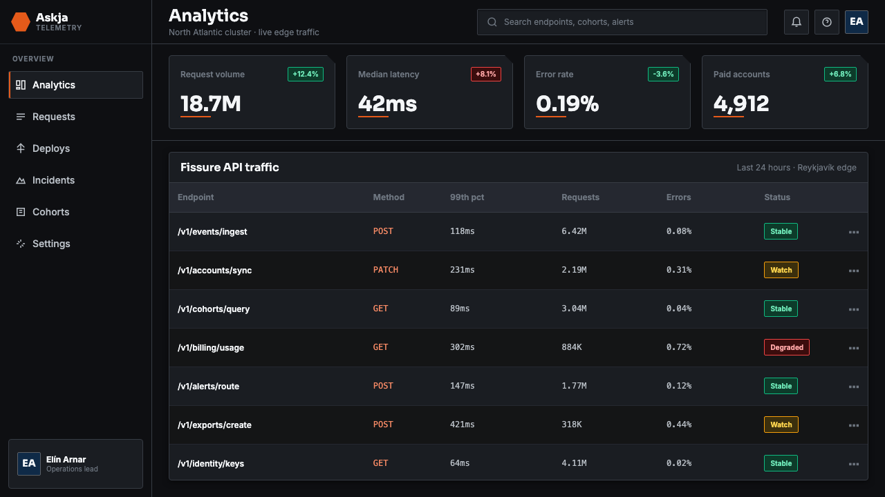
Data and the Volcanic Sublime数据与火山崇高
The system has a particular affinity for data-dense environments. Hexagonal grids naturally accommodate irregular datasets — each cell can hold a unit of information, and the grid's visual rhythm absorbs density without feeling cluttered in the way rectangular layouts do. When visualizing data — topographic maps, seismic readings, environmental monitoring — the volcanic palette gives numbers a physical weight that abstract charting conventions lack. The dark field lets data points glow rather than sit passively on a white ground, and the single accent color can mark outliers or critical values with the intensity of an actual geological event.这套系统与数据密集型环境有着特别的亲和力。六角网格天然适应不规则数据集——每个单元可容纳一个信息单位,网格的视觉节奏能吸收密度,而不像矩形版面那样感觉拥挤。在可视化数据时——地形图、地震读数、环境监测——火山色板赋予数字一种物理重量,是抽象图表惯例所缺乏的。深色底面让数据点发光而非被动地搁置于白色底面,单一强调色能以实际地质事件的强度标记异常值或关键数值。
See the Icelandic Basalt Volcano design system →查看 Icelandic Basalt Volcano 完整设计系统 →
Who shaped Icelandic Basalt Volcano?谁塑造了 Icelandic Basalt Volcano?
The Reykjavik architecture practice founded by Margrét Harðardóttir and Steve Christer established the foundational aesthetic logic that the Icelandic Basalt Volcano design system inherits: an insistence that the built environment should participate in, rather than contrast with, the geological character of its site. Their Reykjavik City Hall — set into the water of Lake Tjörnin, its volcanic stone facades absorbing light rather than reflecting it — became a key reference for how mineral darkness could serve as a primary design material rather than a background condition. Studio Granda's work gave the design system its architectural seriousness.由玛格丽特·哈达多蒂尔和史蒂夫·克里斯特创立的雷克雅未克建筑事务所,确立了冰岛玄武岩火山设计系统所继承的基础美学逻辑:坚持认为建成环境应当参与而非对抗其所在地的地质特征。他们设计的雷克雅未克市政厅——嵌入特约宁湖水面,火山石立面吸收光线而非反射——成为矿物黑暗如何作为首要设计材料而非背景条件的关键参照。Studio Granda 的工作赋予了这套设计系统建筑的严肃性。
The Danish-Icelandic artist's large-scale installations — from the indoor sun of The Weather Project at Tate Modern to the geometric light chambers of his studio practice — provided the design system's conceptual framework for using a single intense accent against an otherwise achromatic field. Eliasson's systematic interest in how natural phenomena could be abstracted into repeatable visual structures, combined with his deployment of hexagonal and geometric modules in sculptural installations, directly influenced the hexagonal grid and accent-as-phenomenon principles that define the system's most distinctive characteristics.这位丹麦裔冰岛艺术家的大型装置作品——从泰特现代美术馆的《气象计划》室内太阳,到其工作室实践中的几何光线空间——为这套设计系统提供了在消色底面上使用单一强烈强调色的概念框架。埃利亚松对自然现象如何被抽象为可重复视觉结构的系统性兴趣,结合他在雕塑装置中对六角与几何模块的运用,直接影响了定义这套系统最具辨识度特征的六角网格原则与「强调即现象」原则。
The Icelandic graphic designer and art director represents a generation of Reykjavik visual practitioners who brought the island's geological visual sensibility into commercial and cultural communication. Her work in editorial design and cultural identity — consistently rooted in the dark tonal register and structural rigor of Icelandic material culture — helped establish that the volcanic aesthetic was not merely a landscape response but a fully developed design language capable of sustaining complex information hierarchies and serving global audiences without losing its geographic specificity.这位冰岛平面设计师与艺术总监代表了一代雷克雅未克视觉从业者,他们将这座岛屿的地质视觉感性带入商业与文化传播。她在编辑设计与文化识别方面的工作——始终根植于冰岛物质文化的深色调性与结构严格性——帮助确立了火山美学不仅是对地景的回应,更是一种完全发展成熟的设计语言:能够支撑复杂的信息层级,在不失去地理特殊性的前提下服务全球受众。
The twentieth-century Icelandic painter who reduced Iceland's volcanic terrain to near-abstract fields of dark basalt and pale sky gave the design system its fine-art historical legitimacy. Skúlason's landscapes, painted in the mid-twentieth century, demonstrated that Iceland's geological extremity could sustain serious visual inquiry rather than simply function as dramatic backdrop. His reduction of the island's complexity to a few high-contrast tonal relationships — deep earth against luminous sky, dark rock against pale ice — prefigured the palette decisions at the core of the contemporary design system.这位二十世纪冰岛画家将冰岛火山地貌简化为近乎抽象的深色玄武岩与苍白天空的视觉场域,赋予了这套设计系统纯艺术史上的合法性。斯库拉松在二十世纪中叶创作的地景画作,证明了冰岛地质的极端性能够承载严肃的视觉探究,而不只是充当戏剧性背景。他将这座岛屿的复杂性简化为少数高对比度调性关系——深沉大地对照发光天空,暗色岩石对照苍白冰雪——预示了当代设计系统核心色板决策。
The Icelandic outdoor brand, founded in Reykjavik in 1926 and redesigned for global markets in the early twenty-first century, established the commercial template for translating volcanic geology into a sustainable product identity. Their refusal to soften the harshness of the North Atlantic climate — in photography, in typography, in the palette's exclusion of warm intermediary tones — demonstrated that an uncompromising dark aesthetic could carry aspirational value rather than feeling merely austere. The brand's identity work proved that geological severity was a viable commercial position, not just an art statement.这个冰岛户外品牌创立于1926年的雷克雅未克,在21世纪初为全球市场重新设计,建立了将火山地质转化为可持续产品识别的商业模板。他们拒绝柔化北大西洋气候的严酷——在摄影、排版、以及色板对温暖中间调的排除中——证明了一种不妥协的深色美学可以携带向往感,而不只是感觉朴素。该品牌的识别工作证明地质严冽是一个可行的商业立场,而非仅是艺术声明。
How do you use Icelandic Basalt Volcano today?今天怎么用 Icelandic Basalt Volcano?
Applying the Icelandic Basalt Volcano system correctly requires accepting its foundational premise: darkness is not a constraint to work around but the primary design material. The system does not ask you to choose between dark and light — it establishes darkness as ground and asks you to introduce structure, hierarchy, and calls-to-action within that ground. Designers accustomed to building on white or near-white backgrounds will need to invert their habitual assumptions about contrast, legibility, and visual weight before the system begins to cohere.正确应用冰岛玄武岩火山系统,需要接受其基本前提:黑暗不是需要绕过的限制,而是首要的设计材料。这套系统不要求你在深色与浅色之间选择——它将黑暗确立为底面,并要求你在这个底面内引入结构、层级与行动召唤。习惯于在白色或接近白色背景上构建的设计师,在这套系统开始凝聚之前,需要颠覆自己关于对比度、可读性与视觉重量的惯常假设。
For presentation slides, the system excels at data-heavy and technical communications where authority and precision are desired. A cover slide benefits from the full geological treatment: a dark mineral ground, the title set in cold, heavy type at generous scale, and a single hexagonal graphic element — perhaps a tiled column array or a fissure-line motif — providing visual structure without decoration. Content slides should use the hexagonal module to organize information: text blocks, data cells, and visual elements aligned to the hexagonal grid feel systematically integrated rather than arbitrarily placed. Data slides are where the system's power becomes most apparent: bar charts and network graphs rendered against a dark field, with the magma accent marking the most important data series or critical threshold, have a visual intensity that white-ground equivalents cannot achieve.对于演示文稿,这套系统在数据密集型和技术传达领域表现出色,尤其是权威性与精确性是期望价值的场合。封面幻灯片适合完整的地质处理:深沉矿物质底面,标题以冷峻粗重的字体以充裕的尺度排布,加上单一六角图形元素——也许是一组平铺柱状阵列或裂缝线纹样——提供视觉结构而无装饰。内容页应使用六角模块组织信息:沿六角网格对齐的文本块、数据单元与视觉元素,感觉是系统性整合的,而非随意放置的。数据页是这套系统力量最为明显的地方:在深色底面上渲染的柱状图与网络图,以岩浆强调色标记最重要的数据系列或关键阈值,具有白色底面同类图表无法达到的视觉强度。
For web interfaces and dashboards, the system is suited to applications where the data itself is the product — monitoring tools, analytics platforms, geospatial applications, and any interface that needs to communicate measured, technical information at high density. The hexagonal grid maps naturally to dashboard card layouts: information units tile into a continuous field that reads as systematic rather than assembled. Interaction states — hover, active, selected — are where the magma accent earns its position: a single element glowing against the dark field communicates activation more immediately than any color change on a light background could.对于网页界面与仪表板,这套系统适合数据本身就是产品的应用——监控工具、分析平台、地理空间应用,以及任何需要在高密度下传达精确技术信息的界面。六角网格自然映射到仪表板卡片版面:信息单元平铺成连续的场域,感觉是系统性的而非拼装的。交互状态——悬停、激活、选中——是岩浆强调色发挥作用的地方:一个单元素在深色底面上发光,比浅色背景上的任何颜色变化都更直接地传达激活状态。
For editorial and marketing applications, the system works best when the subject matter carries natural associations with the geological vocabulary: environmental technology, materials science, architecture, outdoor and performance products, and any brand positioning itself as elemental, enduring, or engineered from first principles. A marketing page in this system uses full-width dark sections alternating with near-white data or feature blocks, with the hexagonal motif appearing as a background texture or structural organizer rather than as a headline graphic. The single accent color should appear no more than once per viewport — as a button, a highlighted figure, or a featured data point — to preserve its significance.对于编辑与营销应用,这套系统在主题内容与地质词汇有天然关联时效果最佳:环境科技、材料科学、建筑、户外与性能产品,以及任何将自身定位为元素性、持久性或从第一原则工程化构建的品牌。这套系统中的营销页面,使用全宽深色区块与接近白色的数据或特性区块交替,六角母题作为背景纹理或结构组织者出现,而非作为标题图形。单一强调色在每个视口中出现不应超过一次——作为按钮、高亮数字或特色数据点——以保持其意义。
The most common failure mode when applying this system is treating the dark palette as permission for general moodiness: adding blue-tinted dark backgrounds, introducing multiple accent colors to create variety, or softening edges with diffuse shadows to make the interface feel friendlier. Each of these moves dissolves the geological logic that gives the system its identity. The palette should be cold, not atmospheric. The accent should be singular and restrained, not colorful. Edges should be decided, not rounded into approachability. If the result feels severe, that severity is correct — the Icelandic landscape is severe, and the design system is honest about its source.应用这套系统时最常见的失败模式,是将深色色板理解为普遍忧郁感的许可:添加蓝色调深色背景,引入多种强调色制造多样性,或用漫散阴影柔化边缘使界面感觉更友善。这些举动每一个都会消解赋予系统身份的地质逻辑。色板应当是冷的,而非大气感的。强调色应当是单一而克制的,而非丰富多彩的。边缘应当是被决定的,而非被磨圆为亲近感的。如果结果感觉严峻,那种严峻是正确的——冰岛地景是严峻的,这套设计系统对其源头是诚实的。
See the Icelandic Basalt Volcano design system →查看 Icelandic Basalt Volcano 完整设计系统 →
Icelandic Basalt Volcano — FAQIcelandic Basalt Volcano · 常见问题
How does this system differ from other dark-mode design systems?这套系统与其他深色模式设计系统有何不同?
Most dark-mode design systems are inverted versions of light-mode systems: they swap a white background for a dark one and adjust contrast ratios accordingly, but the underlying visual logic remains the same. The Icelandic Basalt Volcano system is not an inversion — darkness is its native state, and every decision flows from that premise. The hexagonal grid, the single accent color, the hard-edged surfaces, and the cold typographic register are all expressions of a coherent geological metaphor, not accommodations made to a dark background. This gives the system a visual consistency that purely functional dark modes lack: it has a point of view, not just a palette swap.大多数深色模式设计系统是浅色模式系统的反转版本:它们将白色背景换成深色背景并相应调整对比度,但底层视觉逻辑保持不变。冰岛玄武岩火山系统不是反转——黑暗是它的原生状态,每一个决策都源于这个前提。六角网格、单一强调色、硬边表面和冷峻的排版调性,都是一个连贯地质隐喻的表达,而非对深色背景所做的适应。这赋予系统一种纯粹功能性深色模式所缺乏的视觉一致性:它有一个观点,而不只是颜色互换。
Can the hexagonal grid be adapted for content that isn't data-centric?六角网格能适应非数据中心的内容吗?
Yes, with some adjustment of scale and density. The hexagonal grid works for data-dense applications at small cell sizes, but at larger scales it becomes a compositional organizing device rather than a data container. A full-page hexagonal background grid at low opacity provides structural rhythm for editorial or narrative content without requiring every element to snap to hexagonal alignment. The grid can also appear as a motif in isolated regions — a header background, a feature section divider — while the rest of the layout operates on a conventional column grid. The key is that the hexagonal element should feel geological and inevitable, not decorative and applied.可以,但需要在尺度和密度上做一些调整。六角网格在小格尺寸下适用于数据密集型应用,但在更大尺度上,它成为构图组织装置而非数据容器。低透明度的全页六角背景网格为编辑或叙事内容提供结构节奏,而不要求每个元素都对齐六角。这个网格也可以作为母题出现在孤立区域——页眉背景、特性区块分隔线——而布局其余部分在常规列网格上运作。关键是六角元素应感觉是地质性的和不可避免的,而非装饰性的和外加的。
Is this system appropriate for consumer-facing products, or only technical and industrial applications?这套系统适合面向消费者的产品吗,还是只适合技术与工业应用?
The system's severity makes it best suited for consumer contexts where the product's values align with geological or engineering qualities: cold-weather gear, environmental technology, precision instruments, architecture and materials brands, and cultural institutions with a connection to natural phenomena. It struggles in consumer contexts that call for warmth, playfulness, or organic comfort — food, children's products, wellness, and anything where the user experience depends on feeling welcomed rather than impressed. The test is whether the product's own character is cold-precise-enduring, or warm-organic-approachable. If the former, the system is a genuine match; if the latter, it will feel like a costume.这套系统的严峻感使其最适合产品价值与地质或工程品质相一致的消费者场景:寒冷天气装备、环境科技、精密仪器、建筑与材料品牌,以及与自然现象有关联的文化机构。它在需要温暖感、趣味性或有机舒适感的消费者场景中则力不从心——食品、儿童产品、健康,以及任何用户体验依赖于被欢迎感而非被震撼感的场合。测试方法是:产品自身的特质是冷峻-精确-持久的,还是温暖-有机-亲近的。如果是前者,这套系统是真正的匹配;如果是后者,它会感觉像一件戏服。
What happens if the magma accent is used too liberally?如果岩浆强调色使用得过于随意,会发生什么?
The system depends on scarcity for its accent to carry meaning. The magma color works because it is the only warm element in an otherwise cold, mineral environment — its appearance reads as an event, the way an actual lava fissure is an event in a landscape of stone. When the accent appears multiple times per screen, on large areas of background, or in low-importance interface elements, the geological metaphor dissolves and the interface reads as a merely fashionable dark design with orange accents. The discipline required is similar to the geological reality: Iceland has fire beneath it, but the surface is mostly stone. The design should be mostly stone.这套系统依赖稀缺性使强调色携带意义。岩浆色之所以有效,是因为它是一个原本冷峻、矿物质感环境中唯一温暖的元素——它的出现读起来像一个事件,就像真实的熔岩裂缝是石头地景中的一个事件。当强调色在每个屏幕上出现多次、在大面积背景上、或在低重要性界面元素中出现时,地质隐喻就消解了,界面读起来只是一个带橙色强调的时髦深色设计。所需的自律与地质现实类似:冰岛地下有火,但表面大多是石头。设计应该大多是石头。
How should accessibility be handled given the system's extreme contrast approach?考虑到这套系统的极端对比度方式,应如何处理可访问性?
The system's high-contrast foundation — deep black ground against cold white type — actually exceeds standard accessibility contrast requirements for text, which is one of its practical strengths. The challenge is the accent color: orange-red at full saturation against a deep black background achieves excellent contrast for large text and graphic elements, but may need careful calibration for small text or interactive states where precision is required. The hexagonal grid structure, when used for data visualization, should rely on more than color alone to encode information — position, size, and texture pattern should carry the data meaning independently, with the accent serving as emphasis rather than as the sole distinguishing mark.这套系统的高对比度基础——深黑底面对照冷白文字——实际上超过了标准可访问性对比度要求,这是其实践优势之一。挑战在于强调色:全饱和橙红在深黑背景上对大型文字和图形元素实现了出色的对比度,但对于需要精确度的小型文字或交互状态,可能需要仔细调校。当六角网格结构用于数据可视化时,应依赖颜色之外的更多手段来编码信息——位置、尺寸和纹理模式应独立承载数据含义,强调色作为重点标记而非唯一区分标志。
Related design styles相关设计风格
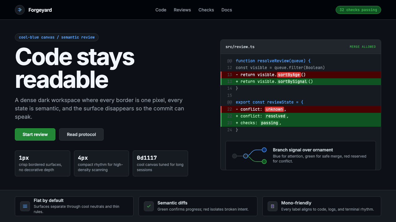 GitHub DarkCode-first darkness. Cool-blue canvas, 1px borders, green/red diff lines.代码优先的暗色:冷蓝画布、1px边框、绿红diff线。
 Linear 2024Precision down to the millisecond. Near-black, indigo-violet accents, Inter D…开发者工具美学的标杆:近乎纯黑、克制靛紫点缀、Inter Display 字体…
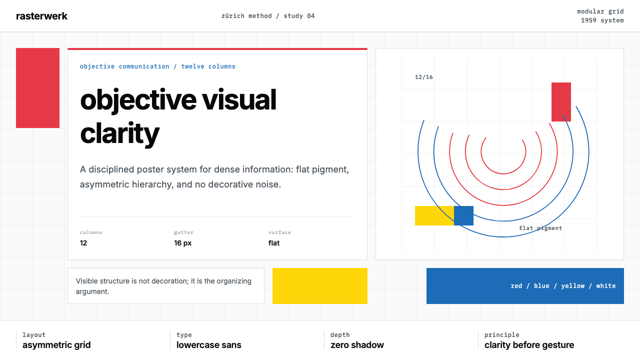 Müller-Brockmann SwissClarity is the system. Inter grids, red-blue blocks, and concentric arcs make…清晰即系统:Inter网格、红蓝色块与同心弧显露结构。
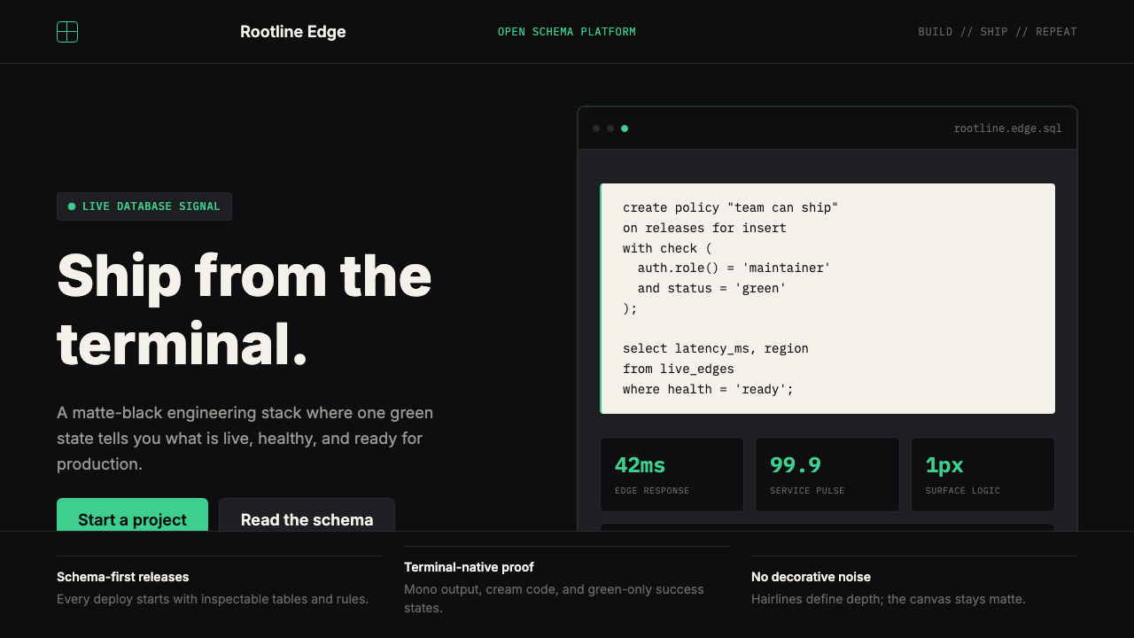 Supabase Postgres Green (2024)Midnight-terminal confidence. Matte black, Inter, mono code, and one electric…深夜终端般笃定:哑光黑、Inter、等宽代码与一抹电子绿。
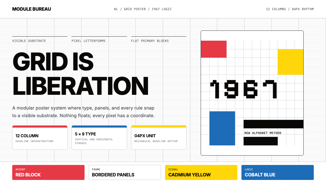 Wim Crouwel GridGrid becomes freedom. Cobalt, red and yellow blocks lock Inter type to a 12-c…网格即自由。钴蓝、红与黄块把Inter锁进12栏基底。
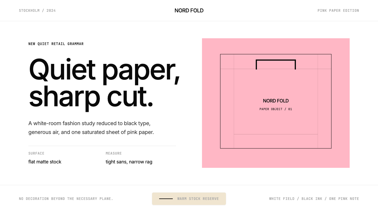 Acne Studios Pink-PaperQuiet luxury in one pink plane. Inter type floats on white with a bag-like re…粉色平面定义安静奢华:Inter 黑字漂浮于白场,像一只纸袋。