What is GitHub Dark?什么是 GitHub Dark?
GitHub Dark turned developer infrastructure into a visual language — cool-blue canvas, semantic diff colors, and crisp hairline borders that code every decision in restraint.GitHub Dark 将开发者基础设施转化为视觉语言——冷蓝色调画布、语义化差异比较色彩,以及将每一个决策都编码为克制的清晰发丝边框。
GitHub Dark in briefGitHub Dark 速览
GitHub Dark is the canonical dark-mode interface of the world's largest code-hosting platform, introduced in September 2020. It rapidly became the most widely referenced dark UI among technical users, establishing a visual standard that rippled outward into developer tooling, documentation sites, terminal emulators, and productivity software across the industry.GitHub Dark 是全球最大代码托管平台的标志性暗色模式界面,于2020年9月正式推出。它迅速成为技术用户中被引用最广泛的暗色 UI,建立起一套向外辐射至整个行业的视觉标准——开发者工具、文档网站、终端模拟器与生产力软件无不受其影响。
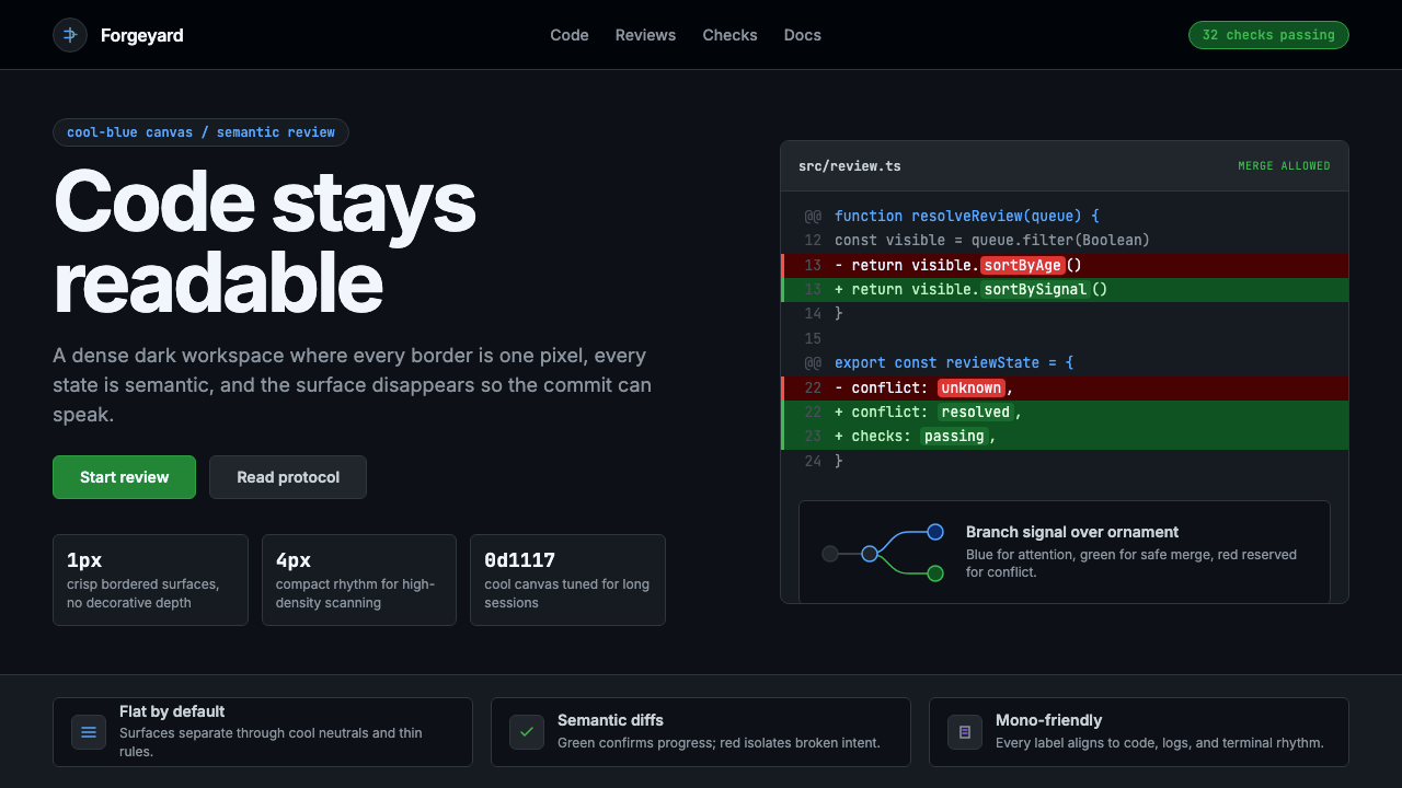
Its visual identity rests on a cool-blue-tinted canvas — neither the absolute black of a terminal nor the neutral charcoal of generic dark themes — that gives the interface a distinctive, immediately recognizable atmospheric quality. Against this ground, a tight hierarchy of surface tones separates code panels from sidebars, modals from backgrounds, and active states from resting ones, all without ever reaching for drop shadows or gradient transitions.其视觉识别建立在冷蓝色调的画布之上——既非终端的纯黑,也非通用暗色主题的中性炭灰——赋予界面独特且一眼可辨的氛围质感。在这一底色之上,一套紧凑的表面色调层级将代码面板与侧边栏、模态框与背景、激活态与静止态彼此区分,全程不借助阴影或渐变过渡。
The design philosophy is unapologetically utilitarian. Every visual decision serves the reading and writing of code: monospace-friendly column structures, hairline borders that delineate without adding visual mass, and a carefully restrained semantic color system where green signals a successfully merged addition and red marks a conflicting deletion. Decoration that does not carry meaning does not appear. What remains is a system that feels designed by engineers for engineers — disciplined, information-dense, and quietly confident.其设计哲学毫不掩饰地指向实用主义。每一个视觉决策都服务于代码的阅读与书写:等宽字体友好的列式结构、勾勒边界而不增添视觉重量的发丝边框,以及一套经过审慎克制的语义化色彩系统——绿色意味着成功合并的新增内容,红色标记冲突的删除行。不承载意义的装饰不会出现。最终留下的,是一套感觉由工程师为工程师所设计的系统:严格、信息密度高、静静地透着自信。
Where does GitHub Dark come from?GitHub Dark 从何而来?
GitHub was founded in San Francisco in 2008 by Tom Preston-Werner, Chris Wanstrath, PJ Hyett, and Scott Chacon, and quickly became the dominant platform for open-source software collaboration. For its first twelve years, the site operated with a single light-mode interface — a practical default for the era, when dark mode was associated with terminal windows rather than polished web products. By the late 2010s, the conversation had shifted. macOS introduced system-wide dark mode in 2018, and users began expecting their everyday web tools to follow suit.GitHub 由汤姆·普雷斯顿-沃纳、克里斯·万斯特拉斯、PJ·海耶特和斯科特·沙孔于2008年在旧金山共同创立,迅速成为开源软件协作的主导平台。在最初的十二年里,该网站以单一的浅色界面运营——这是那个时代的实用默认选择,当时暗色模式与终端窗口相关联,而非精致的网页产品。到2010年代末,对话开始转变。macOS 于2018年引入了系统级暗色模式,用户开始期待他们的日常网页工具能够跟进。
GitHub's dark mode launched in September 2020, after years of community requests that had accumulated in its public feedback forums. The project was led in part by Diana Mounter, GitHub's Head of Design at the time, whose team worked within the constraints of the open-source Primer Design System — GitHub's own systematized design foundation. The challenge was not simply inverting the existing light palette. The team had to construct a new tonal hierarchy from scratch, one that preserved all the semantic meaning of the light interface — status colors, diff highlighting, syntax themes — while working coherently in low-light conditions.GitHub 暗色模式于2020年9月推出,此前社区在其公开反馈论坛中积累了多年的呼声。该项目由时任 GitHub 设计负责人黛安娜·芒特主导,其团队在开源 Primer 设计系统的约束下开展工作——Primer 是 GitHub 自有的系统化设计基础。挑战不仅仅在于简单地反转现有浅色色板。团队必须从头构建一套新的色调层级,既保留浅色界面所有的语义含义——状态色彩、差异比较高亮、语法主题——又能在低亮度环境下协调一致地呈现。
The Primer Design System, which GitHub open-sourced and maintains publicly, provided the structural scaffolding for the dark mode rollout. Primer encodes design decisions as variables — semantic color roles rather than fixed values — which meant the dark mode could be implemented as an alternative theme rather than a parallel codebase. This architecture also meant that third-party projects built on Primer could adopt GitHub Dark semantics with relatively little effort, accelerating the style's spread across the developer ecosystem.GitHub 开源并公开维护的 Primer 设计系统,为暗色模式的推出提供了结构性脚手架。Primer 将设计决策编码为变量——语义化的色彩角色而非固定值——这意味着暗色模式可以作为一套替代主题实现,而非并行代码库。这一架构也意味着,基于 Primer 构建的第三方项目能够以相对较少的工作量采用 GitHub Dark 的语义,加速了这种风格在开发者生态系统中的传播。
Since its launch, GitHub Dark has remained largely stable in its core visual character, evolving through refinements rather than overhauls. Its influence is visible in the dark-mode implementations of documentation platforms, code editors, developer-facing SaaS tools, and design systems that emerged after 2020. Alongside the aesthetic, Mona the Octocat — GitHub's mascot, a playful hybrid creature — persisted as a humanizing counterpoint to the interface's technical rigor, appearing in onboarding flows and empty states as a reminder that the platform serves people, not just code.自推出以来,GitHub Dark 的核心视觉风格保持了相当程度的稳定,通过细化迭代而非彻底翻新持续演进。其影响力清晰可见于2020年后涌现的文档平台、代码编辑器、面向开发者的 SaaS 工具以及设计系统的暗色模式实现。与这一美学并行存在的,是 GitHub 的吉祥物——Mona the Octocat,一个俏皮的混合生物形象——作为界面技术严肃性的人性化对位持续存在,出现在引导流程与空状态页面中,提醒人们这个平台服务的是人,而不仅仅是代码。
What defines the GitHub Dark look?GitHub Dark 的视觉特征是什么?
Cool-Blue Canvas冷蓝色调画布
The base surface is a deep blue-leaning dark tone rather than a neutral dark grey or pure black. This chromatic lean is subtle but pervasive: it gives the interface a cooler, crisper atmosphere than warmer dark alternatives and aligns visually with the bluish light of monitors in low-ambient environments. The effect is an interface that feels like a professional workspace rather than a void — purposefully chosen, not default-dark.基础表面是一种偏蓝的深色调,而非中性深灰或纯黑。这种色相倾向微妙而无处不在:它赋予界面比暖色调暗色替代方案更为清冷、清晰的氛围,在视觉上契合低环境光条件下显示器的蓝调光线。最终效果是一个感觉像专业工作空间的界面——经过刻意选择,而非默认的黑暗。
Tonal Surface Hierarchy色调表面层级
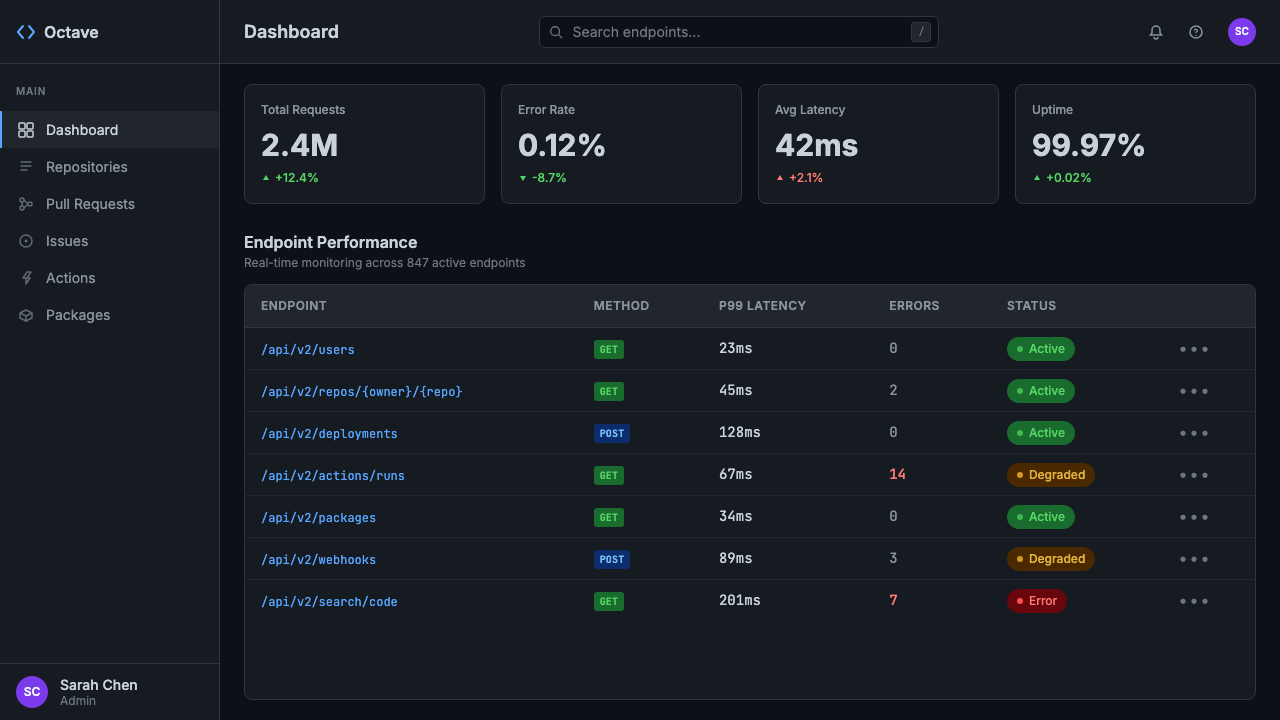
Rather than relying on elevation shadows to separate UI layers, GitHub Dark uses a progression of subtly distinct surface tones — each slightly lighter or darker than its neighbors — to create depth and structure. Code blocks, sidebars, modals, and active list items each occupy their own tonal register. This shadowless hierarchy feels flat in the geometric sense but informationally layered, with every region clearly distinguishable without visual noise.GitHub Dark 不依赖高度投影来分隔 UI 层级,而是使用一系列微妙有别的表面色调递进——每一层比相邻层略浅或略深——来创造深度与结构。代码块、侧边栏、模态框与激活列表项各自占据其固有的色调区间。这种无阴影的层级在几何意义上是平面的,但在信息意义上是分层的,每个区域都清晰可辨,无需视觉噪声。
Semantic Diff Colors语义化差异比较色彩
The green-and-red diff palette is perhaps the most culturally resonant element of GitHub Dark. Green backgrounds mark added lines in a code review; red backgrounds mark removed lines. These are not decorative choices but communicative ones with direct operational meaning: green is safe passage, red is a site of conflict or removal. The saturation is deliberately moderate — vivid enough to scan instantly across hundreds of diff lines, muted enough not to create fatigue during extended review sessions.绿红差异比较调色板也许是 GitHub Dark 中文化共鸣最强的元素。绿色背景标记代码审查中新增的行;红色背景标记删除的行。这不是装饰性选择,而是具有直接操作意义的传达性选择:绿色是安全通行,红色是冲突或删除的位置。饱和度被刻意控制在适中水平——足够鲜明,可在数百行差异中一扫即辨;又足够沉稳,不会在长时间审查中造成视觉疲劳。
Hairline Borders Over Shadows发丝边框取代投影
Where other dark interfaces rely on drop shadows to communicate element boundaries, GitHub Dark uses hairline borders — single-pixel-weight lines in a tone slightly elevated from the surrounding surface. This choice maintains crispness at all zoom levels and screen densities, avoids the blurring effect that soft shadows introduce, and gives the interface a technical, almost schematic quality. The result is an aesthetic that reads as engineered rather than styled.在其他暗色界面依赖阴影来传达元素边界的地方,GitHub Dark 使用发丝边框——单像素粗细的线条,色调略高于周围表面。这一选择在所有缩放级别和屏幕密度下保持清晰,避免了软阴影引入的模糊效果,并赋予界面技术性、近乎图纸式的品质。最终呈现的是一种被设计过、而非被装扮过的美感。
Restrained Accent Palette克制的强调色板
Beyond the diff greens and reds, GitHub Dark uses a small set of accent colors with clear semantic assignments: a muted blue for links and interactive text, a purple tone for visited states or certain label categories, an amber-orange for warnings. Each accent appears sparingly and carries a consistent meaning throughout the interface. The discipline prevents color inflation — the state where so many things are highlighted that nothing is emphasized.在差异比较的绿色和红色之外,GitHub Dark 使用一组具有明确语义分配的小型强调色:沉稳的蓝色用于链接与交互文本,紫色调用于访问过的状态或特定标签类别,琥珀橙用于警告信息。每种强调色出现的场合都很少,并在整个界面中保持一致的含义。这种自律防止了色彩通胀——那种太多东西都被高亮,以至于什么都没有被强调的状态。
Monospace-First Layout Logic等宽字体优先的布局逻辑
Code is the primary content type on GitHub, and the layout system reflects this priority. Column widths, line heights, and spacing rhythms are calibrated for the reading of code in monospace type — fixed-width glyphs that align vertically into columns. Prose content shares the same underlying grid but is rendered in a proportional typeface, creating a clear visual register difference between documentation and code without requiring structural changes to the layout.代码是 GitHub 的主要内容类型,布局系统反映了这一优先级。列宽、行高与间距节奏都针对以等宽字体阅读代码而校准——固定宽度的字形垂直对齐成列。散文内容共享相同的底层网格,但以比例字体渲染,在文档与代码之间创造清晰的视觉层次差异,而无需对布局结构进行改动。
Status-Color Consistency状态色彩一致性
Pull request states, issue lifecycle stages, build pipeline results, and security alerts each carry consistent color coding throughout the interface. Open states are green, closed states are purple, merged states are a deeper violet, and failed builds are red. This consistency means an experienced user can parse the status of a repository at a glance from a list view, without reading a single label. The color system functions as a secondary language layered over the typographic one.拉取请求状态、议题生命周期阶段、构建流水线结果与安全警报,在整个界面中各自携带一致的色彩编码。开放状态为绿色,关闭状态为紫色,已合并状态为更深的紫罗兰,失败的构建为红色。这种一致性意味着有经验的用户可以从列表视图中一眼解析出仓库的状态,无需阅读任何标签文字。色彩系统作为第二语言叠加在字体排印语言之上运作。
Who shaped GitHub Dark?谁塑造了 GitHub Dark?
Diana Mounter served as GitHub's Head of Design during the development and launch of dark mode, and is one of the central figures behind the project's thoughtful execution. Her team's work went far beyond a simple palette inversion: they rearchitected GitHub's color system into semantic roles, ensuring that every state — from diff highlighting to alert severity — remained legible and meaningful across both light and dark contexts. Mounter has spoken publicly about the accessibility considerations that shaped the rollout, including contrast ratios for users with low vision, and about the organizational challenge of threading a major visual change through a mature, complex product.黛安娜·芒特在暗色模式的开发与推出期间担任 GitHub 设计负责人,是该项目周全执行背后的核心人物之一。她的团队所做的工作远不止于简单地反转色板:他们将 GitHub 的色彩系统重新架构为语义化角色,确保每种状态——从差异比较高亮到警报严重程度——在浅色与暗色环境中都保持清晰且有意义。芒特曾公开谈及塑造这次推出的无障碍可及性考量,包括为低视力用户设计的对比度比值,以及在成熟复杂产品中推行重大视觉变更所面临的组织挑战。
As one of GitHub's co-founders, Tom Preston-Werner set the platform's founding ethos: open, developer-first, and built by people who use the tools they create. The early GitHub interface reflected his sensibility — functional, unadorned, oriented toward the needs of people reading and writing code rather than passive consumers. While Preston-Werner left GitHub in 2014, the product philosophy he established — that the interface should serve the code, not frame it — persisted as a cultural inheritance that shaped how later design leaders, including those who built dark mode, approached visual decision-making.作为 GitHub 的联合创始人之一,汤姆·普雷斯顿-沃纳确立了这个平台的创立精神:开放、以开发者为先,由使用自己所造工具的人构建。早期的 GitHub 界面体现了他的感性——功能性的、朴素无华的、面向阅读和书写代码的人的需求,而非面向被动消费者。尽管普雷斯顿-沃纳于2014年离开 GitHub,但他所确立的产品哲学——界面应当服务于代码而非装裱代码——作为一种文化传承持续存在,影响着后来的设计领导者(包括构建暗色模式的人)处理视觉决策的方式。
Mona the Octocat is GitHub's mascot — a whimsical hybrid of octopus and cat, designed to be technically absurd and humanly warm. Created originally as a stock illustration and adopted by GitHub around its founding, Mona has evolved into a versatile icon that appears throughout the product in empty states, onboarding flows, and error pages. Within GitHub Dark, Mona serves a specific tonal function: she is the counterweight to the interface's clinical precision, a reminder that behind the pull requests and code reviews are people with a sense of humor. Her visual presence keeps the platform from feeling like pure infrastructure.Mona the Octocat 是 GitHub 的吉祥物——一个章鱼与猫的异想天开混合体,设计上技术性地荒诞,人文性地温暖。最初作为图库插图创作,在 GitHub 创立之初被采用,Mona 已演化为一个多功能图标,出现在产品各处的空状态页面、引导流程与错误页面中。在 GitHub Dark 中,Mona 扮演着特定的基调功能:她是界面临床精准性的对重,提醒人们在那些拉取请求和代码审查背后,是有幽默感的活生生的人。她的视觉存在使这个平台免于沦为纯粹的基础设施。
Primer is GitHub's open-source design system — the systematized foundation of components, tokens, and guidelines that underpins the entire GitHub interface. Its role in GitHub Dark's creation was architectural: by encoding color decisions as semantic variables (background default, border muted, accent emphasis, and so on) rather than literal values, Primer made it possible to ship dark mode as a theme overlay rather than a ground-up rebuild. The open-source nature of Primer also meant that its dark-mode token conventions became a freely available reference point for teams building their own developer-facing interfaces, spreading GitHub Dark's visual logic well beyond GitHub itself.Primer 是 GitHub 的开源设计系统——支撑整个 GitHub 界面的系统化组件、令牌与规范基础。它在 GitHub Dark 创建中扮演的角色是架构性的:通过将色彩决策编码为语义化变量(如默认背景、静音边框、强调重点等),而非字面值,Primer 使暗色模式得以作为主题覆盖层而非从头重建来推出。Primer 的开源特性也意味着,其暗色模式令牌约定成为各团队构建自己的面向开发者界面时可自由参考的基准点,将 GitHub Dark 的视觉逻辑传播到远超 GitHub 本身的范围。
How do you use GitHub Dark today?今天怎么用 GitHub Dark?
GitHub Dark translates well into professional contexts where technical credibility and information density are core values. Its design language communicates rigor and craft without resorting to decorative assertiveness — an important quality in environments where the audience is trained to distrust visual noise. Applying it correctly means internalizing its logic: tonal layering instead of shadows, hairline borders instead of elevation, semantic color instead of expressive color.GitHub Dark 在技术可信度与信息密度是核心价值的专业场景中具有良好的可移植性。其设计语言传达出严谨与工艺感,而不诉诸装饰性的强势表达——这在受众被训练为不信任视觉噪声的环境中是重要特质。正确应用它,意味着内化其逻辑:用色调分层取代投影,用发丝边框取代高度感,用语义化色彩取代表达性色彩。
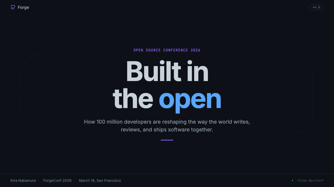
For presentation slides, GitHub Dark works best when the content is itself technical or data-driven. A cover slide benefits from the style's atmospheric quality: a cool-tinted dark field with crisp, high-contrast type in a weight that reads from a distance, and a minimal accent color to anchor the title. Content slides should use the tonal hierarchy to separate sections — a slightly elevated surface for callout boxes, the base tone for body text regions — rather than relying on dividers or decorative rules. Data slides become particularly effective: charts rendered against the dark canvas with bars and lines colored according to semantic conventions (green for positive, amber for warning, red for critical) carry the interface's operational legibility into the presentation format.在演示文稿中,GitHub Dark 在内容本身具有技术性或数据驱动性质时表现最佳。封面幻灯片受益于这种风格的氛围感:一片冷色调的暗色底面,搭配清晰、高对比度、从远处即可辨读字重的字体,以及一种最简化的强调色来锚定标题。内容幻灯片应利用色调层级来分隔区段——略微提升的表面用于引用框,基础色调用于正文区域——而非依赖分割线或装饰性规则。数据幻灯片尤其有效:在暗色画布上渲染的图表,柱条与折线按语义约定着色(绿色代表正向,琥珀色代表警告,红色代表关键),将界面的操作可读性带入演示格式。
For web UI and dashboards, GitHub Dark is directly at home. Developer tool dashboards, API documentation portals, monitoring interfaces, and analytics platforms all benefit from its information-density ethos. The practical approach: establish a clear surface hierarchy using three or four tonal levels, reserve accent colors strictly for interactive and status-bearing elements, use borders to delineate cards and panels rather than box shadows. Navigation should be text-forward with minimal iconography; active states should shift surface tone rather than adding color overlays. The result is an interface that lets data and functionality lead, with the visual layer serving as scaffolding rather than statement.对于网页 UI 与仪表板,GitHub Dark 如鱼得水。开发者工具仪表板、API 文档门户、监控界面与分析平台都受益于其信息密度精神。实际做法是:用三到四个色调层级建立清晰的表面层级,将强调色严格保留给交互性与状态承载性元素,用边框而非盒子阴影来界定卡片与面板。导航应当以文字为主,图标用量最少;激活状态应通过改变表面色调而非叠加色彩覆盖层来体现。最终呈现的界面让数据与功能主导,视觉层作为脚手架而非宣言服务其间。
For editorial and marketing contexts, the style rewards selectivity. Developer-facing landing pages — product announcements, open-source project pages, technical blog headers — suit the aesthetic naturally. A full-width dark banner with a prominent code sample or terminal output establishes authority immediately. Section breaks can use the tonal step between surface levels rather than graphic separators. When color appears in a marketing context following this style, it should be purposeful: a green accent for a core capability, an amber accent for a pricing tier, never a gradient or a purely decorative hue. Marketing copy benefits from the style's typographic restraint — generous sizing for headlines, comfortable measure for body text, no decorative type treatments.对于编辑与营销场景,这种风格回报选择性应用。面向开发者的落地页——产品公告、开源项目页面、技术博客题图——天然契合这种美学。一幅全宽的暗色横幅,搭配醒目的代码示例或终端输出,即刻建立权威感。段落分隔可以使用表面色调层级之间的色调步阶,而非图形分隔符。当色彩在遵循这种风格的营销场景中出现时,应当是有目的的:绿色强调核心能力,琥珀色强调定价层级,绝不使用渐变或纯装饰性色相。营销文案受益于这种风格的排版克制——标题以充裕的字号呈现,正文以舒适的行宽排布,无装饰性字体处理。
A common mistake when working with GitHub Dark aesthetics is overextending the semantic color system into pure decoration. The green and red of diff highlighting carry strong associative weight — applying green to positive marketing claims and red to competitor comparisons can feel manipulative rather than informative. Similarly, layering too many surface tones without clear structural purpose produces muddiness rather than depth. The style's power comes from its restraint: a single tonal step between surface levels communicates hierarchy more clearly than three competing levels of shadow, and a single semantic accent color communicates more than five gradient stops trying to express brand warmth.运用 GitHub Dark 美学时最常见的错误,是将语义化色彩系统过度延伸至纯粹的装饰目的。差异比较高亮的绿色和红色承载着强烈的联想重量——将绿色用于正向营销主张、将红色用于对比竞争对手,可能给人以操纵性而非信息性的感受。同样,在没有清晰结构目的的情况下堆叠过多的表面色调,会产生混浊而非深度。这种风格的力量来自其克制:表面层级之间的单一色调步阶,比三层竞争性投影更清晰地传达层级;单一语义化强调色,比五个试图表达品牌温度的渐变色阶传达更多。
GitHub Dark — FAQGitHub Dark · 常见问题
Is GitHub Dark the same as any dark mode?GitHub Dark 和任意一种暗色模式是一回事吗?
No. Most dark modes are achieved by inverting a light palette or substituting a neutral dark grey for white, with minimal structural thought. GitHub Dark is a distinct visual system built on a cool-blue-tinted base tone, a semantic color hierarchy where every accent carries operational meaning, and a hairline-border architecture that replaces elevation shadows. The result has a specific atmospheric quality — technical, cool, information-dense — that is immediately distinguishable from generic dark themes. Many dark interfaces have borrowed elements from it, which sometimes creates confusion, but the full system has a coherence that goes well beyond palette choice.不是。大多数暗色模式是通过反转浅色色板或用中性深灰替代白色来实现的,几乎没有结构性的思考。GitHub Dark 是一套独特的视觉系统,建立在冷蓝色调基础色之上,以每种强调色都承载操作意义的语义化色彩层级为核心,并以发丝边框架构取代高度投影。最终呈现出特定的氛围质感——技术性的、冷峻的、信息密集的——与通用暗色主题一眼可辨。许多暗色界面借鉴了其中的元素,这有时会造成混淆,但完整的系统具有远超色板选择的连贯性。
Can GitHub Dark work for non-developer products?GitHub Dark 能用于非开发者产品吗?
It can, but with meaningful trade-offs. The style's authority comes partly from its strong association with technical contexts — applying it outside that zone can feel borrowed or incongruent without careful adaptation. Products that emphasize analytical rigor, data transparency, or professional seriousness (financial dashboards, monitoring tools, research platforms) can adopt the style's logic coherently. Products oriented toward warmth, creativity, leisure, or broad consumer audiences will find that the style's cool technical register works against their emotional goals. The question to ask is not whether the style can be applied, but whether its implied values — engineering discipline, information density, technical credibility — match the product's desired perception.可以,但需要接受有意义的权衡。这种风格的权威感部分来自于其与技术场景的强烈关联——在该范围之外应用它,若不经过审慎的适配,可能给人以借用或不协调的感觉。强调分析严谨性、数据透明度或专业严肃性的产品(金融仪表板、监控工具、研究平台)可以连贯地采用这种风格的逻辑。面向温暖感、创造性、休闲或广泛消费者受众的产品,则会发现这种风格的冷峻技术基调与其情感目标相悖。需要问的问题不是这种风格能否被应用,而是其隐含价值观——工程纪律、信息密度、技术可信度——是否与产品的期望感知相匹配。
How does GitHub Dark handle accessibility in a dark interface?GitHub Dark 如何在暗色界面中处理无障碍可及性?
Accessibility was a primary concern in GitHub Dark's development, not an afterthought. The team calibrated contrast ratios for text against each surface tone, ensuring that body text, code, and interactive labels met or exceeded standard legibility thresholds across all surface levels. The semantic color system was also tested for color-blindness scenarios — particularly for the green-red diff palette, which is critical for code review workflows and directly affects users with red-green color vision deficiency. GitHub later introduced additional color themes (including high-contrast variants) partly in response to feedback from users with specific visual needs, demonstrating that the semantic variable architecture of Primer made such extensions relatively practical.无障碍可及性是 GitHub Dark 开发过程中的首要关注点,而非事后补救。团队针对每个表面色调校准了文本的对比度比值,确保正文、代码与交互标签在所有表面层级上都达到或超过标准可读性阈值。语义化色彩系统也针对色盲场景进行了测试——尤其是绿红差异比较调色板,它对代码审查工作流至关重要,直接影响具有红绿色觉缺陷的用户。GitHub 后来推出了额外的色彩主题(包括高对比度变体),部分原因是响应有特定视觉需求的用户的反馈,这也证明了 Primer 的语义变量架构使此类扩展在实践上相当可行。
What makes GitHub Dark different from terminal or code-editor dark themes?GitHub Dark 与终端或代码编辑器的暗色主题有何不同?
Terminal and code-editor themes are designed for a single primary task: rendering and distinguishing syntax tokens in a monospace code context. Their color systems optimize for syntax highlighting variety — they typically use six to ten distinct accent colors to differentiate keywords, strings, comments, functions, and types. GitHub Dark has a completely different design scope: it must handle prose, navigation, forms, status indicators, avatars, charts, and code simultaneously within a complex application UI. Its color system is therefore much more restrained in accent variety and much more systematic in semantic assignment. It borrows the cool-tinted dark atmosphere from terminal culture but applies a web product's structural discipline to every other element.终端和代码编辑器主题是为单一主要任务而设计的:在等宽代码环境中渲染并区分语法标记。它们的色彩系统针对语法高亮的多样性进行优化——通常使用六到十种不同的强调色来区分关键词、字符串、注释、函数和类型。GitHub Dark 的设计范围完全不同:它必须在复杂的应用程序 UI 中同时处理散文、导航、表单、状态指示器、头像、图表和代码。因此,其色彩系统在强调色多样性上要克制得多,在语义分配上要系统得多。它从终端文化中借鉴了冷色调暗色氛围,但将网页产品的结构纪律应用于其他所有元素。
Is it appropriate to mix GitHub Dark aesthetics with warmer or more colorful styles?将 GitHub Dark 美学与更温暖或更多彩的风格混合是否合适?
Mixing is possible but requires a clear hierarchy of decisions. GitHub Dark's visual logic depends on restraint — the moment warm tones, expressive gradients, or decorative color enter the system, the semantic clarity of the original language starts to dissolve. If hybridization is intentional, the better approach is to treat GitHub Dark's tonal surface structure and border conventions as fixed, and introduce warmer or more colorful elements only in content zones (illustrations, marketing imagery, icon sets) rather than in the structural chrome of the interface. This preserves the information architecture while allowing brand expression in bounded regions. Attempting to warm the structural layer itself — replacing cool-tinted surfaces with neutral or warm-tinted ones — tends to produce something that is neither coherent GitHub Dark nor a coherent alternative, simply a weakened version of both.混合是可能的,但需要清晰的决策层级。GitHub Dark 的视觉逻辑依赖于克制——一旦暖色调、表达性渐变或装饰性色彩进入系统,原始语言的语义清晰度就开始瓦解。如果混合是有意为之,更好的做法是将 GitHub Dark 的色调表面结构和边框约定视为固定的,只在内容区域(插图、营销图像、图标集)引入更温暖或更多彩的元素,而非引入界面的结构性外壳。这在保持信息架构的同时,允许在有边界的区域进行品牌表达。试图温暖结构层本身——用中性或暖色调表面替换冷色调表面——往往会产生一种既不是连贯的 GitHub Dark、也不是连贯的替代方案的东西,只是两者的弱化版本。
Related design styles相关设计风格
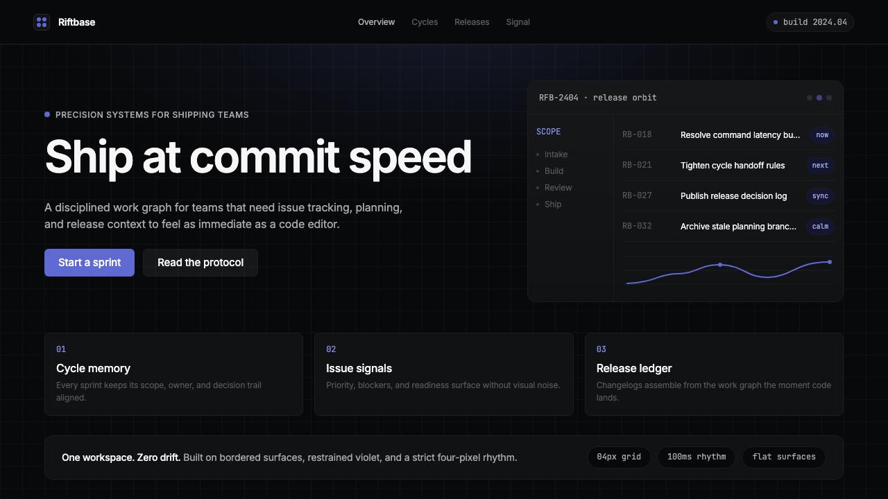 Linear 2024Precision down to the millisecond. Near-black, indigo-violet accents, Inter D…开发者工具美学的标杆:近乎纯黑、克制靛紫点缀、Inter Display 字体…
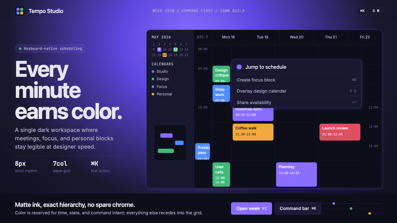 Cron CalendarDesigner-tech restraint. Purple wash, ink grid, mono shortcuts, surgical even…设计师科技的克制:紫色光晕、墨色网格、等宽快捷键与精准色块。
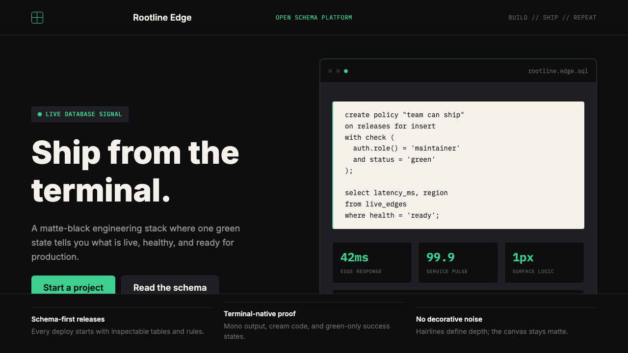 Supabase Postgres Green (2024)Midnight-terminal confidence. Matte black, Inter, mono code, and one electric…深夜终端般笃定:哑光黑、Inter、等宽代码与一抹电子绿。
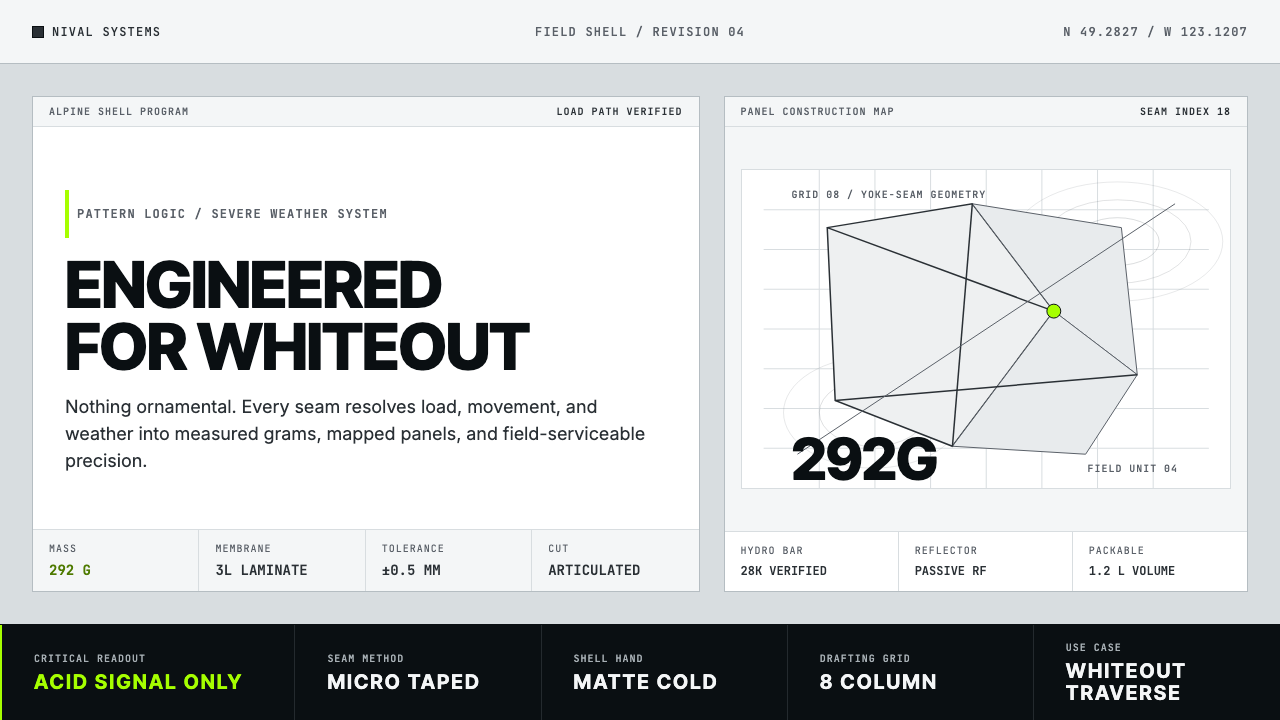 Arc'teryx Technical OutdoorEngineered, never ornamental. Glacier silver grid, mono specs, one acid-green…只讲工程,不作装饰。冰川银网格、等宽规格与一处酸绿信号。
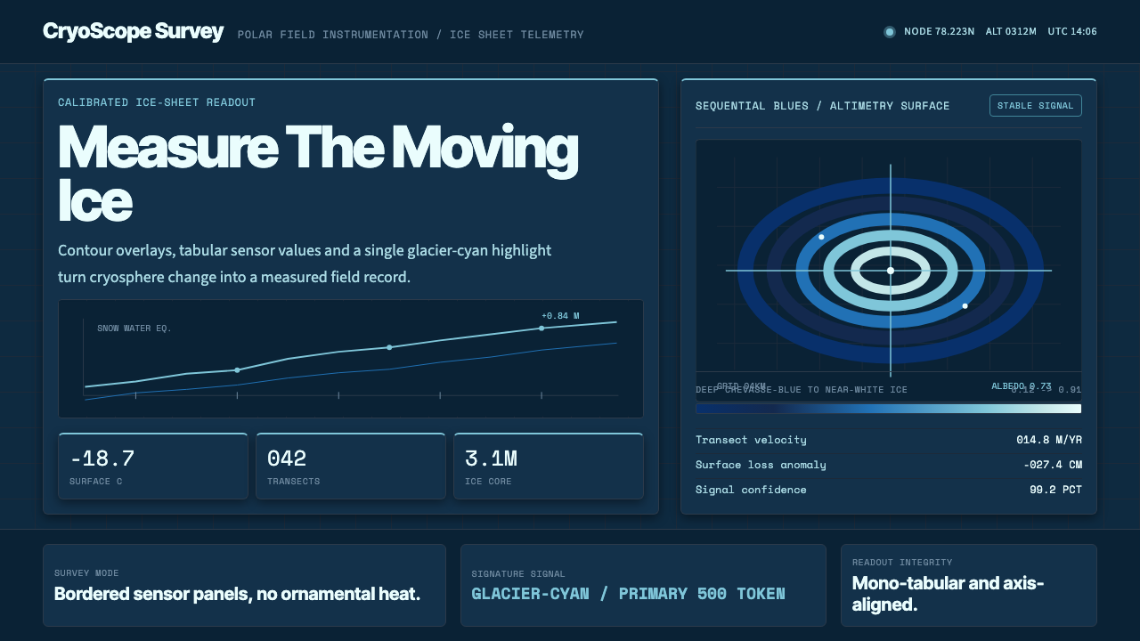 Glacier Arctic SurveyCold precision. Crevasse-blue panels, cyan readouts and contour grids calibra…冷峻精准:冰裂蓝面板、冰川青读数与等高网格校准每个数值。
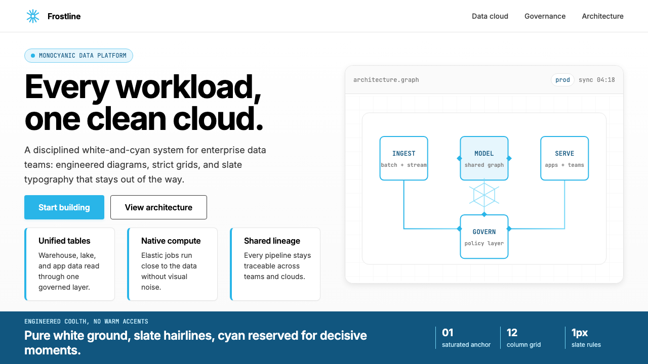 Snowflake Data CloudCool precision wins. Icy cyan, Inter grids, and hex data diagrams stay engine…冷峻精确取胜:冰蓝青、Inter 网格与六角数据图保持工程感。