Design style guide设计风格指南
What is Supabase Postgres Green (2024)?什么是 Supabase Postgres Green (2024)?
Supabase Postgres Green is the design language of the open-source Firebase alternative that chose darkness, a single electric accent, and the quiet confidence of a terminal window over everything the pastel SaaS world had agreed to take for granted.Supabase Postgres Green 是这家开源 Firebase 替代品的设计语言——它选择了深色、一抹电子绿强调色和终端窗口式的从容笃定,以此对抗 SaaS 世界默认的柔和粉彩。
Supabase Postgres Green (2024) in briefSupabase Postgres Green (2024) 速览
Supabase Postgres Green is the visual identity system that Supabase — a developer-tools company offering a Postgres-powered backend-as-a-service — refined into its mature form across roughly 2022 to 2024. The system is anchored by a matte-black canvas, a single electric green that functions as the brand's sole signature hue, and a strict two-typeface hierarchy in which a humanist sans-serif handles editorial prose while a monospaced workhorse handles all code, CLI output, and data. Every other variable — border expression, shadow, motion, illustration — is subordinated to the logic of a terminal environment.Supabase Postgres Green 是 Supabase 的视觉识别体系——Supabase 是一家以 Postgres 为核心提供后端即服务的开发者工具公司,其视觉语言大致在2022至2024年间演化成熟。这套体系的核心是哑光黑底色、一抹作为品牌唯一标志性色调的电子绿,以及严格的双字体层级:人文无衬线字体处理编辑性文字,等宽字体负责所有代码、CLI 输出和数据内容。其他所有变量——边框、投影、动效、插图——都服从于终端环境的逻辑。
The overarching aesthetic proposition is one of antithesis. At a moment when the dominant visual language of developer-facing SaaS products converged on softness — light backgrounds, lavender gradients, rounded cards, and friendly illustration — Supabase moved in the opposite direction. The matte-black field reads less like a design decision about color and more like a philosophical stance: seriousness, precision, and the idea that a tool intended for people who write SQL at midnight should look like the environment they already live in.这套美学的核心命题是「反叛」。在面向开发者的 SaaS 产品主流视觉语言已收敛于柔和——浅色背景、薰衣草渐变、圆角卡片、友好插图——的时刻,Supabase 选择了截然相反的方向。哑光黑底色与其说是一个关于颜色的设计决定,不如说是一种哲学立场:严肃、精准,以及「为深夜写 SQL 的人打造的工具,理应长得像他们本已生活其中的环境」这一信念。
Visually, the system is exceptionally taut. The electric green appears almost nowhere except as a signal: a status indicator, a call-to-action button, a pulsing connection dot. All other work is done in gradations of near-black, slate, and carefully stratified whites. The result is a palette that feels not sparse but loaded — each appearance of the green carries informational weight that it would lose if used more broadly.在视觉上,这套系统紧绷到极致。电子绿几乎仅作为信号出现:状态指示器、行动号召按钮、跳动的连接状态点。其他所有工作由深浅不一的近黑色、石板灰与精心分层的白色完成。最终的色板感觉并非贫瘠,而是满载——绿色每次出现都携带着信息重量,一旦使用频率增加,这种重量便会消散。
See the Supabase Postgres Green (2024) design system →查看 Supabase Postgres Green (2024) 完整设计系统 →
Where does Supabase Postgres Green (2024) come from?Supabase Postgres Green (2024) 从何而来?
Supabase was founded in 2020 by Paul Copplestone and Ant Wilson, both of whom had backgrounds in building developer infrastructure. The company's stated mission was to be the open-source alternative to Google Firebase — meaning a suite of backend services (authentication, real-time subscriptions, storage, edge functions) built on top of PostgreSQL, the battle-tested open-source relational database that Supabase chose to treat not as a commodity layer but as the product itself. The Postgres elephant, a heritage symbol from the PostgreSQL project, was adopted as a quiet brand mark — worn not as a mascot but as a statement of lineage.Supabase 由 Paul Copplestone 和 Ant Wilson 于2020年创立,两人均有开发者基础设施的从业背景。公司明确的使命是成为 Google Firebase 的开源替代品——即基于 PostgreSQL(经过实战考验的开源关系型数据库)构建一套后端服务(身份验证、实时订阅、存储、边缘函数),且将 Postgres 不视为商品层,而视为产品本身。PostgreSQL 项目传承下来的大象符号被 Supabase 采纳为品牌标志——不是作为吉祥物,而是作为血统声明。
The company was remote-distributed from the outset, with founding operations nominally in Singapore, engineering concentrated in San Francisco and London, and contributors spread across dozens of countries. This global, asynchronous structure shaped the product's communication instincts: documentation had to be extraordinarily clear, UI states had to be immediately legible without verbal explanation, and the visual environment had to feel familiar to developers regardless of their cultural context. A terminal aesthetic travels well because the terminal is itself a global visual vernacular among software practitioners.公司从一开始就是远程分布式结构,名义上在新加坡成立,工程团队集中于旧金山与伦敦,贡献者遍布数十个国家。这种全球化、异步化的组织结构塑造了产品的传达本能:文档必须异常清晰,UI 状态必须无需语言解释即可立即读懂,视觉环境必须让开发者无论身处何种文化背景都感到熟悉。终端美学的迁移性极强,因为终端本身就是软件从业者之间的全球视觉通用语言。
The visual identity was not established at founding — early Supabase adopted the relatively neutral conventions of the developer-tools category. The more distinctive matte-black and electric-green identity solidified as the product matured and as a small design team, led in significant part by Jonny Summers-Muir and informed by community feedback, began treating the interface itself as a brand surface rather than a neutral container. Tyler Shukert contributed substantially to design system thinking in this period, working to make the interface coherent across an expanding surface area of dashboard panels, documentation, and marketing materials.这套视觉识别并非在创立时就已确立——早期 Supabase 沿用了开发者工具品类相对中性的视觉惯例。更具辨识度的哑光黑与电子绿身份在产品走向成熟时逐步固化:一支小型设计团队(Jonny Summers-Muir 在其中发挥了重要作用,同时也受到社区反馈的塑造)开始将界面本身当作品牌表面而非中性容器来对待。Tyler Shukert 在这一时期对设计系统思维贡献良多,致力于在不断扩展的仪表板面板、文档与营销材料等界面之间保持一致性。
The Postgres Green is not an arbitrary choice of hue. The specific quality of green chosen — electric, slightly acid, carrying a quality of luminescence that reads as a screen glow rather than a natural pigment — deliberately evokes cathode-ray tube terminal displays and the phosphorescent readouts of early computing. This is green as cultural shorthand for machine intelligence and command-line authority, not green as nature or growth. The lineage runs through the monochromatic green screens of the 1970s and 1980s, through the green text on black that became a cultural cipher for hacker culture, and into the present moment where Supabase reactivates the association to signal that its product belongs to a lineage of serious technical infrastructure.Postgres Green 并非随机选取的色调。这一绿色的特定品质——电气感、略带酸性、携带着屏幕余晖而非天然颜料的发光质感——刻意唤起阴极射线管终端显示器和早期计算机的荧光读数。这里的绿色是机器智能与命令行权威的文化速记,而非自然或生长的绿色。其谱系上溯至1970至80年代的单色绿色屏幕,穿越黑底绿字成为黑客文化密码的年代,抵达当下 Supabase 重新激活这一联想的此刻——以此昭示自己属于严肃技术基础设施的传承。
What defines the Supabase Postgres Green (2024) look?Supabase Postgres Green (2024) 的视觉特征是什么?
Dark Ground深色底面
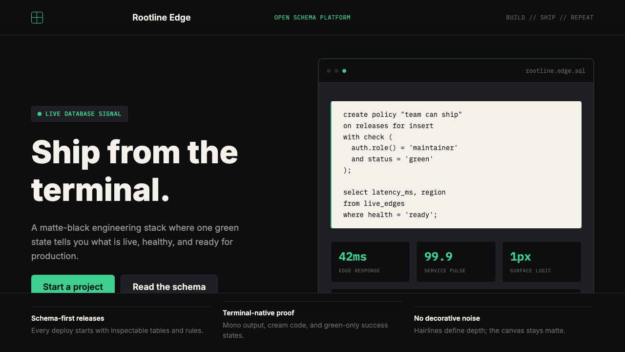
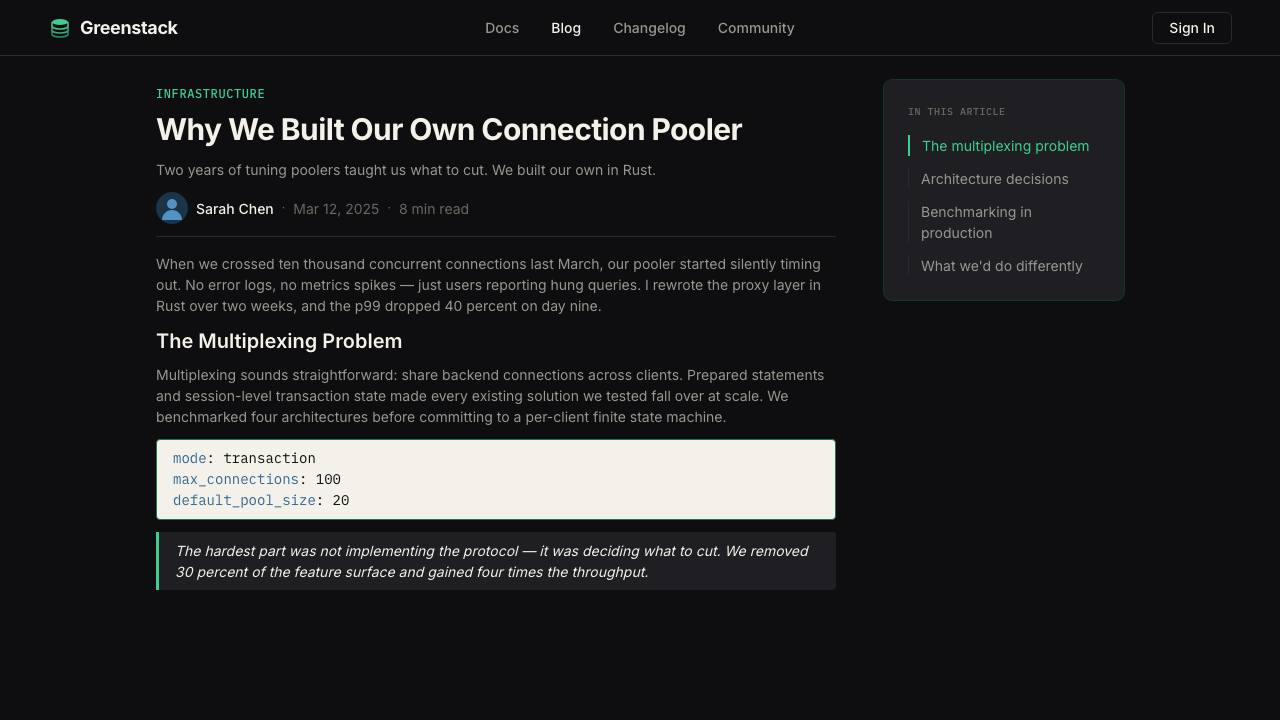
The matte-black background is not simply a dark mode toggle — it is the primary field from which all other elements are read. It is deep without being void, carrying a slight warmth that prevents it from reading as pure neutral. This quality means the electric green accent can vibrate against it with maximum contrast while still feeling like it belongs to the same surface. The dark ground also makes monospaced code blocks legible without a secondary background treatment — the field itself is the code environment.哑光黑背景不是简单的深色模式切换——它是所有其他元素赖以被阅读的主底面。它深沉而不空洞,带有一丝暖意,使其不会被解读为纯粹的中性色。这一特质使得电子绿强调色能以最大对比度在其上跳动,同时仍感觉属于同一界面。深色底面还使等宽代码块无需额外背景处理即可清晰辨读——底面本身就是代码环境。
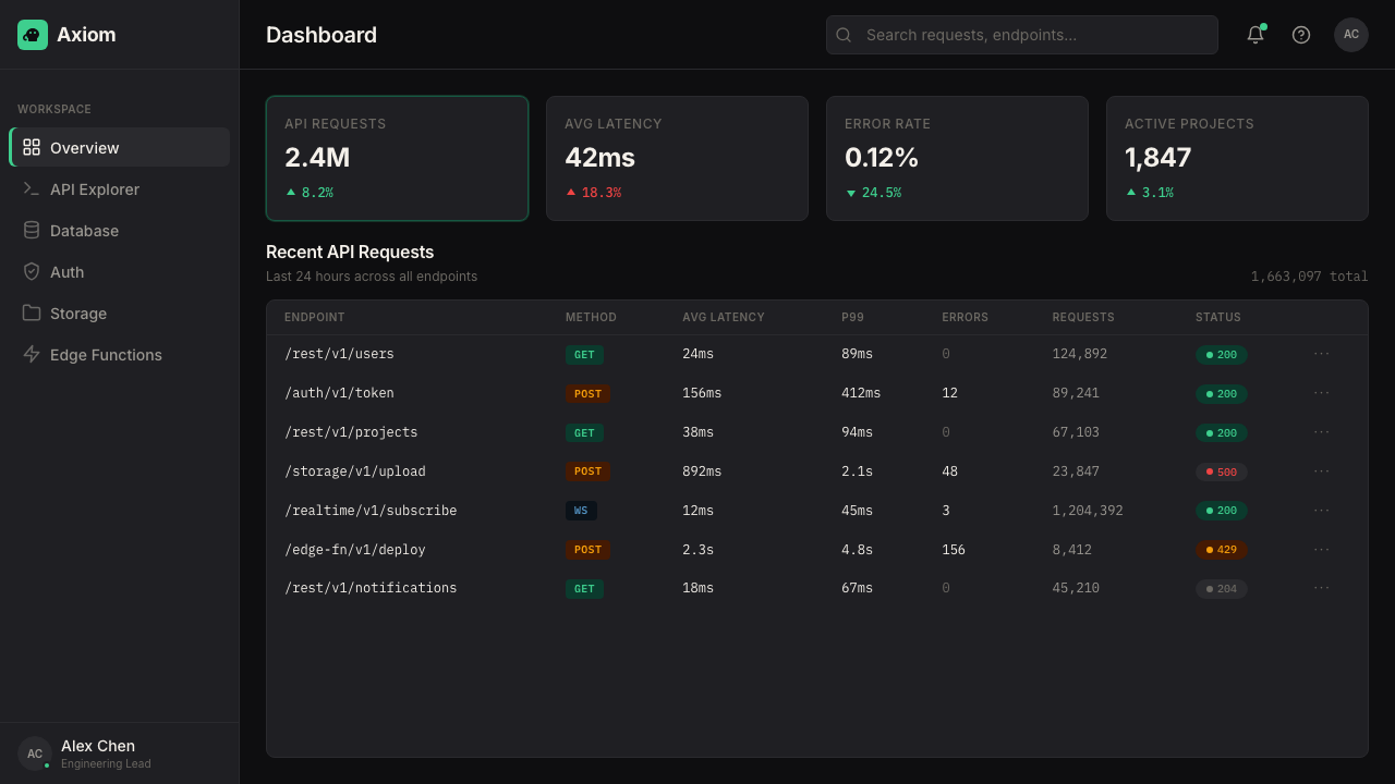
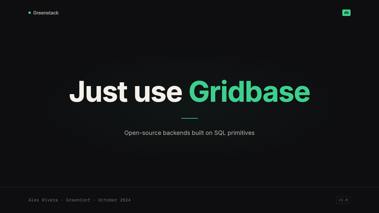
Electric Green Signal电子绿信号
The electric green functions as a signal color, not a palette color. It appears at interactive boundaries: buttons that confirm an action, indicators that a service is connected and healthy, highlighted syntax in a code block, the blinking cursor of an active input. The color carries a quality of luminescence — as though it is emitting rather than reflecting light — that reinforces its role as status information. Because it appears rarely, it retains full semantic weight every time it shows up.电子绿是信号色,而非调色板色。它出现在交互边界处:确认某个操作的按钮、服务连接正常的指示器、代码块中高亮的语法、活跃输入框的闪烁光标。这种颜色带有一种发光质感——仿佛在发光而非反光——强化了它作为状态信息的角色。因为出现频率极低,每次出现时它都保有完整的语义重量。
Type Hierarchy字体层级
The system uses two typefaces to create a clear semantic split. The humanist sans-serif handles all editorial content — marketing prose, UI labels, navigational items, documentation body copy — and brings a quality of legibility and human warmth that prevents the dark environment from feeling cold. The monospaced typeface handles all code, SQL snippets, CLI commands, API responses, and log output. This split is never mixed: editorial text does not appear in mono, and code does not appear in the humanist face. The boundary between them is the boundary between explanation and execution.这套系统使用两种字体建立清晰的语义分工。人文无衬线字体处理所有编辑性内容——营销文案、UI 标签、导航项、文档正文——带来的易读性与人文温度防止深色环境显得冷漠。等宽字体处理所有代码、SQL 片段、CLI 命令、API 响应和日志输出。两者之间绝不混用:编辑文字不出现在等宽字体中,代码不出现在人文字体中。二者的边界,就是解释与执行之间的边界。
Surface Stratification界面分层
In the absence of color to create hierarchy, the system relies on carefully graduated surface values — distinctions between the base field, card surfaces, panel backgrounds, hover states, and active selections — all rendered as very slight shifts in darkness or lightness. These stratifications are disciplined: there are only a few distinct surface levels, and each has a consistent role. Hair-thin borders reinforce separations that the surface values alone might not sustain at high ambient brightness.在没有颜色来建立层级的情况下,这套系统依靠精心分级的界面值——底面、卡片表面、面板背景、悬停状态与激活选项之间的区分——以非常细微的深浅变化来呈现。这些分层是有纪律的:只有少数几个独立的界面层级,每个层级都承担固定角色。发丝般细的边框强化着仅靠界面值在高环境亮度下可能难以维持的分隔。
Edge Glow边缘微光
A distinctive technique in the system is the use of very subtle edge glows — slight luminous halos applied to card borders or panel edges — that make components read as slightly elevated without introducing the softness of drop shadows. These glows are restrained to the point of near-invisibility at normal viewing distances; they register as depth rather than as a specific visual effect. The technique borrows from the visual grammar of illuminated screen bezels and reinforces the terminal-screen metaphor.这套系统的一个标志性技法是使用极其克制的边缘微光——施加于卡片边框或面板边缘的极细发光晕——使组件在不引入投影柔和感的情况下呈现出轻微的层次感。这些微光克制到在正常视距下几近隐形的程度,更像是作为深度感而非具体视觉效果被感知到。这一技法借鉴了发光屏幕边框的视觉语法,强化了终端屏幕的隐喻。
Zero Decoration零装饰
Illustration, iconography, and decorative graphic elements are used with extreme restraint. When icons appear, they are geometric and line-weight consistent — never playful, never filled with secondary color, never illustrative. Marketing surfaces occasionally employ circuit-board-derived line art or abstract topographic patterns, but these serve as textural backgrounds rather than focal illustrations. The Postgres elephant appears as a mark of heritage, not as a character with personality. The overall position is that decoration competes with information, and in a tool used for managing databases, information always wins.插图、图标和装饰性图形元素的使用极为克制。图标出现时,形态几何、线条粗细统一——从不俏皮,从不填充二次色,从不具象插图化。营销表面偶尔使用电路板衍生的线条图或抽象地形图案,但这些仅作为纹理背景而非焦点插图。Postgres 大象作为传承标志出现,而非具有个性的角色。整体立场是:装饰与信息相互竞争,而在一个用于管理数据库的工具中,信息永远赢。
Motion as State Change动效即状态变化
Animation in the system is strictly functional. Transitions communicate state changes — a connecting indicator pulses, a loading spinner turns, a modal slides in — rather than adding expressive delight. Durations are short and easing curves are close to linear, reflecting the expectation that developers interacting with infrastructure tooling want immediate feedback, not choreographed moments. The single exception is the occasional use of a gently pulsing green dot, which persists as an ambient signal that a connection is live — the one animation that is allowed to be noticed.这套系统中的动效严格服务于功能。过渡传达状态变化——连接指示器脉动、加载旋转器转动、模态框滑入——而非增加表达性的愉悦感。持续时间短暂,缓动曲线接近线性,这反映了开发者与基础设施工具交互时期待即时反馈而非编排时刻的心理预期。唯一的例外是偶尔出现的轻柔脉动绿点,作为连接正常的持续环境信号——这是唯一被允许被注意到的动效。
See the Supabase Postgres Green (2024) design system →查看 Supabase Postgres Green (2024) 完整设计系统 →
Who shaped Supabase Postgres Green (2024)?谁塑造了 Supabase Postgres Green (2024)?
Co-founder and CEO of Supabase, Copplestone drove the product philosophy that placed PostgreSQL at the center of the platform rather than treating it as an implementation detail. His background in building developer tooling informed the decision to expose database primitives directly rather than abstracting them away — a choice that shaped the visual identity in turn, since a product built on raw SQL and direct database access has a visual register very different from one built on magic abstractions. Copplestone's public-facing communication style — direct, technically precise, often written in the voice of a developer talking to peers — influenced the content tone that the visual identity had to support.Supabase 联合创始人兼 CEO。Copplestone 推动了将 PostgreSQL 置于平台核心而非视为实现细节的产品哲学。他在开发者工具领域的从业经验影响了直接暴露数据库原语而非将其抽象化的决策——这一选择反过来塑造了视觉语言,因为一个建立在原始 SQL 和数据库直接访问之上的产品,其视觉调性与建立在魔法抽象之上的产品截然不同。Copplestone 面向公众的沟通风格——直接、技术上精准、常以开发者对同伴说话的口吻书写——影响了视觉语言所需支撑的内容基调。
Co-founder and CTO, Wilson's engineering philosophy emphasized open-source transparency and community participation. His influence is visible in the way the Supabase visual identity treats the database log and the dashboard status panel as first-class design surfaces — not as behind-the-scenes utilities but as the central communicative interface of the product. The decision to surface raw SQL responses and live query logs prominently in the interface, rather than abstracting them into friendlier formats, is both an engineering stance and a visual one, and it required a design system that could make raw technical output legible and even beautiful.联合创始人兼 CTO。Wilson 的工程哲学强调开源透明与社区参与。他的影响体现在 Supabase 视觉语言对待数据库日志和仪表板状态面板的方式上——不将其视为幕后工具,而视为产品的核心传达界面。在界面中突出显示原始 SQL 响应和实时查询日志,而非将其抽象成更友好的格式,既是工程立场,也是视觉立场,这要求一套能让原始技术输出清晰可读乃至美观的设计系统。
Summers-Muir was a key figure in shaping the Supabase visual identity during the period when it transitioned from a functional but undistinguished early-stage look to the more codified matte-black and electric-green system. His contribution was not simply the selection of a color or typeface but the articulation of a visual philosophy — that the interface should feel like an environment a developer already inhabits, not a consumer product trying to be approachable. This shift required making difficult decisions about restraint: resisting the temptation to add warmth through illustration, to soften edges through rounded corners, or to signal ambition through gradient fills.Summers-Muir 是 Supabase 视觉语言从功能性但缺乏辨识度的早期形态,演化为更为规范的哑光黑与电子绿体系这一过渡期中的关键人物。他的贡献不仅是选择了某种颜色或字体,而是阐明了一种视觉哲学——界面应感觉像开发者本已生活其中的环境,而非试图显得亲切的消费品。这一转变需要在克制上做出艰难抉择:抵制通过插图增添温度、通过圆角软化边缘、或通过渐变填充彰显野心的诱惑。
Shukert contributed to the Supabase design system in a period of rapid product expansion, when the challenge was scaling a visual identity across an increasingly complex surface area — dashboard panels, documentation, authentication flows, storage management, edge function tooling, and a growing library of community-created extensions. His work on systematizing the design language ensured that elements introduced for new features felt native rather than bolted on, and that the terminal-aesthetic vocabulary remained coherent as it was applied to UI contexts its originators had not anticipated.Shukert 在产品快速扩张期间为 Supabase 设计系统做出了贡献——彼时的挑战是在日益复杂的界面表面将视觉语言进行规模化:仪表板面板、文档、身份验证流程、存储管理、边缘函数工具以及不断增长的社区扩展库。他在设计语言系统化方面的工作确保了为新功能引入的元素感觉是原生的而非强行附加的,并使终端美学词汇在被应用于原创者未曾预见的 UI 场景时仍保持连贯。
How do you use Supabase Postgres Green (2024) today?今天怎么用 Supabase Postgres Green (2024)?
Applying Supabase Postgres Green correctly requires understanding that the style's visual authority comes entirely from discipline — from what is refused rather than what is added. The dark field and single accent color create the system's characteristic tension only when both are held consistently. A layout that drifts toward mid-gray backgrounds, or that introduces a second accent color to handle additional hierarchy, immediately loses the terminal-environment logic that gives the style its distinctiveness.正确应用 Supabase Postgres Green 需要理解:这种风格的视觉权威感完全来自纪律——来自拒绝了什么,而非添加了什么。深色底面与单一强调色只有在两者都被始终如一地坚守时,才能制造出这套系统标志性的张力。一旦版面开始向中灰背景漂移,或引入第二种强调色来处理额外的层级关系,那种赋予这种风格独特性的终端环境逻辑便立刻消失。
For presentation slides, the style works best when treated as a command-line interface with narrative intent. Cover slides should be nearly empty: the title in the humanist typeface against the dark ground, the electric green reserved for a single element — a status badge, a logo glow, an underline on a key term. Content slides should adopt a log-output aesthetic: text aligned to a left baseline, code blocks given prominent but unstyled treatment, visual separation achieved through spacing alone rather than through divider lines or card backgrounds. Data slides are where the style earns its keep — charts and diagrams rendered in the dark-ground palette, with the electric green used to highlight the data series that matters, and all other series rendered in the neutral stratification.在演示文稿中,这种风格在被当作具有叙事意图的命令行界面来处理时效果最佳。封面页应近乎空白:标题以人文字体置于深色底面上,电子绿只保留给单个元素——一枚状态徽章、一道 Logo 微光、一个关键词的下划线。内容页应采用日志输出美学:文字向左基线对齐,代码块给予突出但无额外样式的处理,视觉分隔仅通过间距而非分割线或卡片背景来实现。数据页是这种风格最能展示价值的地方——图表和示意图以深色底面色板呈现,电子绿用于高亮最重要的数据系列,其余系列以中性分层色处理。
For web interfaces, the style maps naturally onto dashboard products, database management tools, and any interface whose primary users are developers or data practitioners. Navigation should be typographic and unadorned. Cards should use the edge-glow technique rather than drop shadows; borders should be hair-thin and near-invisible rather than decorative. Empty states and loading states are opportunities for the style to shine — a pulsing green dot or a simple monospaced waiting message is more fitting than an illustrated empty-state graphic. Error and warning states should use the electric green sparingly for confirmation and a warm-shifted neutral for destructive warnings, avoiding the cliché of traffic-light color coding.对于网页界面,这种风格自然契合仪表板产品、数据库管理工具,以及任何主要用户为开发者或数据从业者的界面。导航应以字体排印为主,朴素无饰。卡片应使用边缘微光技法而非投影;边框应细如发丝、近乎不可见,而非用于装饰。空状态和加载状态是这种风格大放异彩的机会——一个脉动的绿点或一条简单的等宽字体等待信息,远比一张插图式空状态图更为恰当。错误与警告状态应将电子绿克制地用于确认信息,以偏暖的中性色用于破坏性警告,避免落入红绿黄交通灯配色的俗套。
For editorial and marketing work, the style supports technically credible long-form content without visual fatigue. Documentation pages should treat code blocks as first-class layout elements — no smaller than body text, given their own subtle surface stratification, with syntax highlighted using the electric green for keywords and neutral whites for literals. Marketing pages can amplify the style through scale: a full-width hero on the dark ground with a single electric-green headline creates immediate recognition. Testimonials and case studies benefit from the monospaced type treatment — a pulled quote in monospaced face creates the visual impression of a log entry and reinforces the idea that these are peer endorsements from practitioners, not consumer marketing.对于编辑与营销内容,这种风格无需视觉疲劳即可支撑技术可信度强的长篇内容。文档页面应将代码块视为一级版面元素——尺寸不小于正文,给予其自身微妙的界面分层处理,语法高亮以电子绿处理关键词,以中性白色处理字面量。营销页面可通过尺度放大这种风格:在深色底面上以全宽主视觉 + 单行电子绿标题,制造即时的识别感。证言与案例研究受益于等宽字体处理——用等宽字体呈现的引用语在视觉上产生日志条目的印象,强化了「这些是从业者的同行认可而非消费品营销」的意涵。
The most common mistake when applying this style is treating the dark background as a dark-mode equivalent of an ordinary light-background design — inverting colors, softening shadows, and adding glows without understanding the terminal logic that makes those choices coherent. A genuine terminal aesthetic has no soft shadows, no gradients, no playfully rounded corners, and no illustration. The second most common mistake is reaching for a second accent color to handle hierarchy that the stratification system should be managing. If the layout requires a warm amber for warnings and a blue for links and the electric green for actions, the palette has lost its discipline. All three roles should be resolvable through neutral surface values, scale, and selective use of the single accent.应用这种风格时最常见的错误,是将深色背景当作普通浅色设计的深色模式等价物来处理——颠倒颜色、软化投影、添加微光,却不理解使这些选择连贯的终端逻辑。真正的终端美学没有柔和投影、没有渐变、没有俏皮的圆角,也没有插图。第二个最常见的错误是引入第二种强调色来处理本应由分层系统管理的层级关系。如果版面需要暖琥珀色处理警告、蓝色处理链接、电子绿处理操作,那么这套色板的纪律已经失守。这三种角色都应该能通过中性界面值、比例关系和对单一强调色的选择性使用来解决。
See the Supabase Postgres Green (2024) design system →查看 Supabase Postgres Green (2024) 完整设计系统 →
Supabase Postgres Green (2024) — FAQSupabase Postgres Green (2024) · 常见问题
Is Supabase Postgres Green a dark mode, or is the dark background its definitive form?Supabase Postgres Green 是深色模式,还是深色背景就是它的确定形态?
The dark background is definitional, not optional. Supabase offers a light mode for users who need it, but the light mode is not where the brand identity lives — it is a usability accommodation. The electric green signal color, the edge-glow technique, the terminal-environment metaphor, and the hierarchy built on surface stratification rather than color all depend on the dark field for their meaning. A light-background application of the style produces something that resembles many other developer-tools brands; the dark ground is what makes it legibly Supabase.深色背景是这套风格的定义性特征,而非可选项。Supabase 为有需要的用户提供浅色模式,但浅色模式并非品牌识别存在的地方——它是一种易用性适配。电子绿信号色、边缘微光技法、终端环境隐喻,以及建立在界面分层而非色彩之上的层级关系,其意义都依赖深色底面而存在。将这种风格应用于浅色背景会产生与众多其他开发者工具品牌相似的结果;深色底面才是使其清晰地识别为 Supabase 的所在。
Why does Supabase use the Postgres elephant as a brand element rather than developing its own mascot?Supabase 为什么用 Postgres 大象作为品牌元素,而不是发展自己的吉祥物?
The adoption of the Postgres elephant is a brand argument, not a design limitation. Supabase's positioning is that it is a serious Postgres-powered platform — not a layer that happens to use Postgres underneath, but a product whose identity is entangled with the database itself. Foregrounding the Postgres elephant signals to the developer audience that this is infrastructure, not consumer software. It also communicates something about the company's values: an openness to the existing open-source community's symbols rather than building a proprietary brand mythology from scratch. The elephant appears as a mark of lineage, worn quietly rather than performed loudly.采用 Postgres 大象是一个品牌论点,而非设计局限。Supabase 的定位是:它是一个严肃的 Postgres 驱动平台——不是碰巧底层使用了 Postgres 的某个中间层,而是一个身份认同与数据库本身深度交织的产品。将 Postgres 大象置于前台,向开发者受众传递的信号是:这是基础设施,而非消费软件。它也传达了公司价值观的某种信息:对现有开源社区符号的开放态度,而非从头构建专有品牌神话。大象作为血统徽记出现,以安静的方式被佩戴,而非被大声展演。
How does the style handle the tension between being developer-focused and being a product that also needs to be sold to non-technical stakeholders?这套风格如何处理「面向开发者」与「同时需要向非技术决策者销售」之间的张力?
The Supabase visual identity resolves this tension by making technical authenticity the primary value, and trusting that non-technical stakeholders will read technical credibility as a signal of quality. A matte-black interface with monospaced type and no friendly illustration reads as serious and competent to a CTO; it reads the same way to a VP of Engineering who may have less Postgres fluency but understands the register. The style does not attempt to be approachable to all audiences simultaneously — it commits to one, and benefits from the halo effect that commitment creates. Marketing materials soften the terminal aesthetic slightly for broader audiences, but the core product identity is never compromised.Supabase 视觉语言通过将技术真实性置为首要价值来解决这一张力,并相信非技术决策者会将技术可信度读解为质量信号。一个带有等宽字体、没有友好插图的哑光黑界面,在 CTO 眼中传达的是严肃与能力;对于 Postgres 知识较少但理解这种调性的工程副总裁而言,传达的是同样的信息。这种风格不试图同时对所有受众显得亲切——它向一类受众作出承诺,并从这种承诺带来的光环效应中获益。营销材料会为更广泛的受众略微软化终端美学,但核心产品识别从不被妥协。
What distinguishes authentic use of this style from a generic 'dark mode developer tool' look?真正运用这种风格与通用的「深色模式开发者工具」外观,区别在哪里?
The generic dark-mode developer aesthetic typically involves a dark background with multiple accent colors, rounded cards with subtle drop shadows, and a combination of icon-heavy navigation and illustrated empty states. Supabase Postgres Green diverges on every one of these conventions. It uses one accent color, not several. It uses edge glow rather than drop shadow. It has essentially no illustration. Its navigation is typographic rather than icon-dependent. The result is a visual density and a sense of precision that generic dark-mode interfaces do not achieve. The key diagnostic is the single accent: if a layout using this style requires a second color to solve a hierarchy problem, the layout is solving the problem incorrectly.通用的深色模式开发者美学通常包括深色背景搭配多种强调色、带细微投影的圆角卡片,以及重度图标导航加插图空状态的组合。Supabase Postgres Green 在每一个惯例上都选择背道而驰:它使用一种强调色而非几种;使用边缘微光而非投影;基本没有插图;导航以字体排印为主而非依赖图标。结果是一种通用深色模式界面所无法达到的视觉密度与精准感。最关键的诊断标准是单一强调色:如果一个使用这种风格的版面需要第二种颜色来解决层级问题,那么这个版面解决问题的方式本身就是错的。
Is this style suitable for non-developer-facing products, such as consumer apps or marketing sites in unrelated industries?这种风格适合非面向开发者的产品吗——比如其他行业的消费应用或营销网站?
The style carries strong connotative baggage that does not travel well outside the developer and technical infrastructure context. The electric green on matte black is immediately legible as a signal from the world of terminals, command lines, and server infrastructure. In a wellness app, a food brand, or an entertainment product, the same combination would read as misaligned — technically competent but emotionally incorrect. The style works in fintech and data analytics contexts where technical authority is a desired association, and in certain creative-technology or audio-visual production contexts where the terminal aesthetic has been absorbed into subculture iconography. Outside these zones, it is worth asking whether the visual authority the style confers is actually the authority the product needs.这种风格携带着强烈的内涵包袱,在开发者与技术基础设施语境之外迁移性较差。哑光黑上的电子绿,作为来自终端、命令行和服务器基础设施世界的信号,识别度极强。在健康应用、食品品牌或娱乐产品中,同样的组合会被读解为错位——技术上有能力,情感上却失当。这种风格在金融科技和数据分析场景中有效,因为技术权威是期望的联想;在某些创意技术或音视频制作场景中也有效,因为终端美学已被吸收进了亚文化图像志。在这些区域之外,值得思考的是:这种风格赋予的视觉权威,是否真的是这个产品所需要的权威。
Related design styles相关设计风格
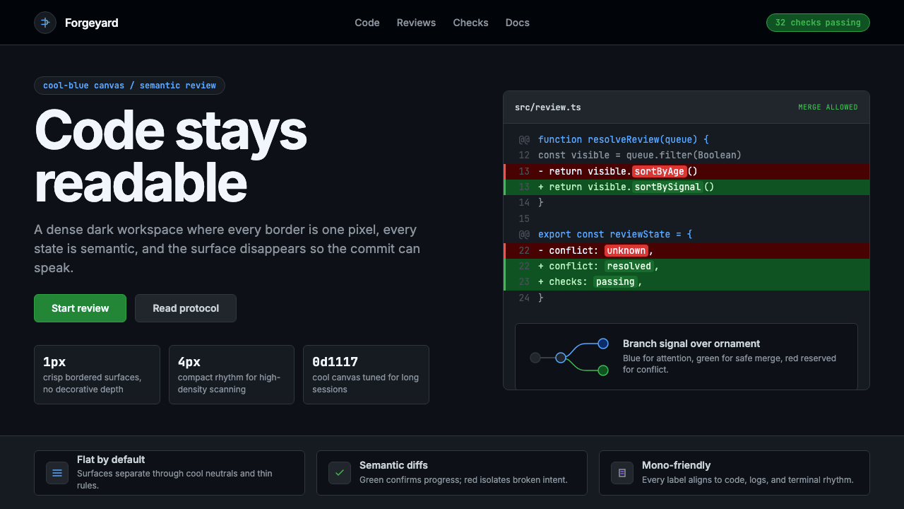 GitHub DarkCode-first darkness. Cool-blue canvas, 1px borders, green/red diff lines.代码优先的暗色:冷蓝画布、1px边框、绿红diff线。
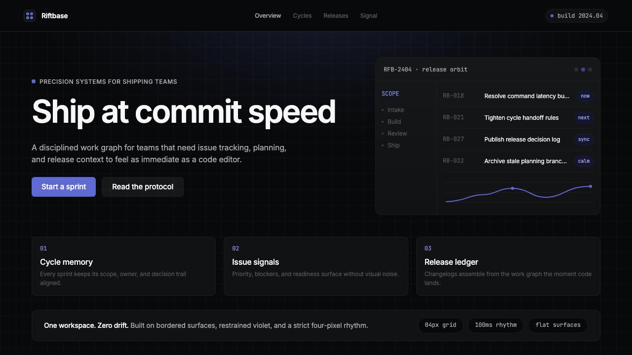 Linear 2024Precision down to the millisecond. Near-black, indigo-violet accents, Inter D…开发者工具美学的标杆:近乎纯黑、克制靛紫点缀、Inter Display 字体…
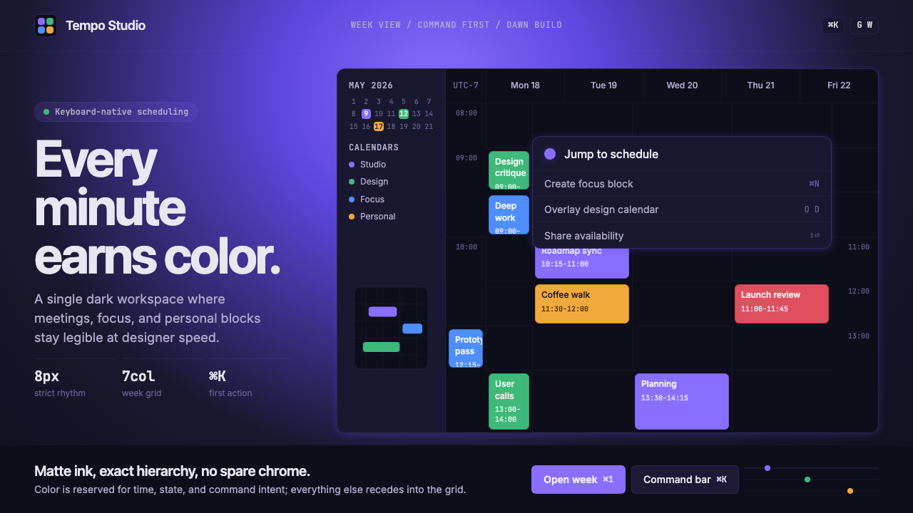 Cron CalendarDesigner-tech restraint. Purple wash, ink grid, mono shortcuts, surgical even…设计师科技的克制:紫色光晕、墨色网格、等宽快捷键与精准色块。
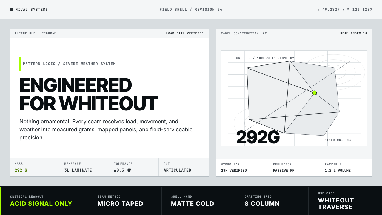 Arc'teryx Technical OutdoorEngineered, never ornamental. Glacier silver grid, mono specs, one acid-green…只讲工程,不作装饰。冰川银网格、等宽规格与一处酸绿信号。
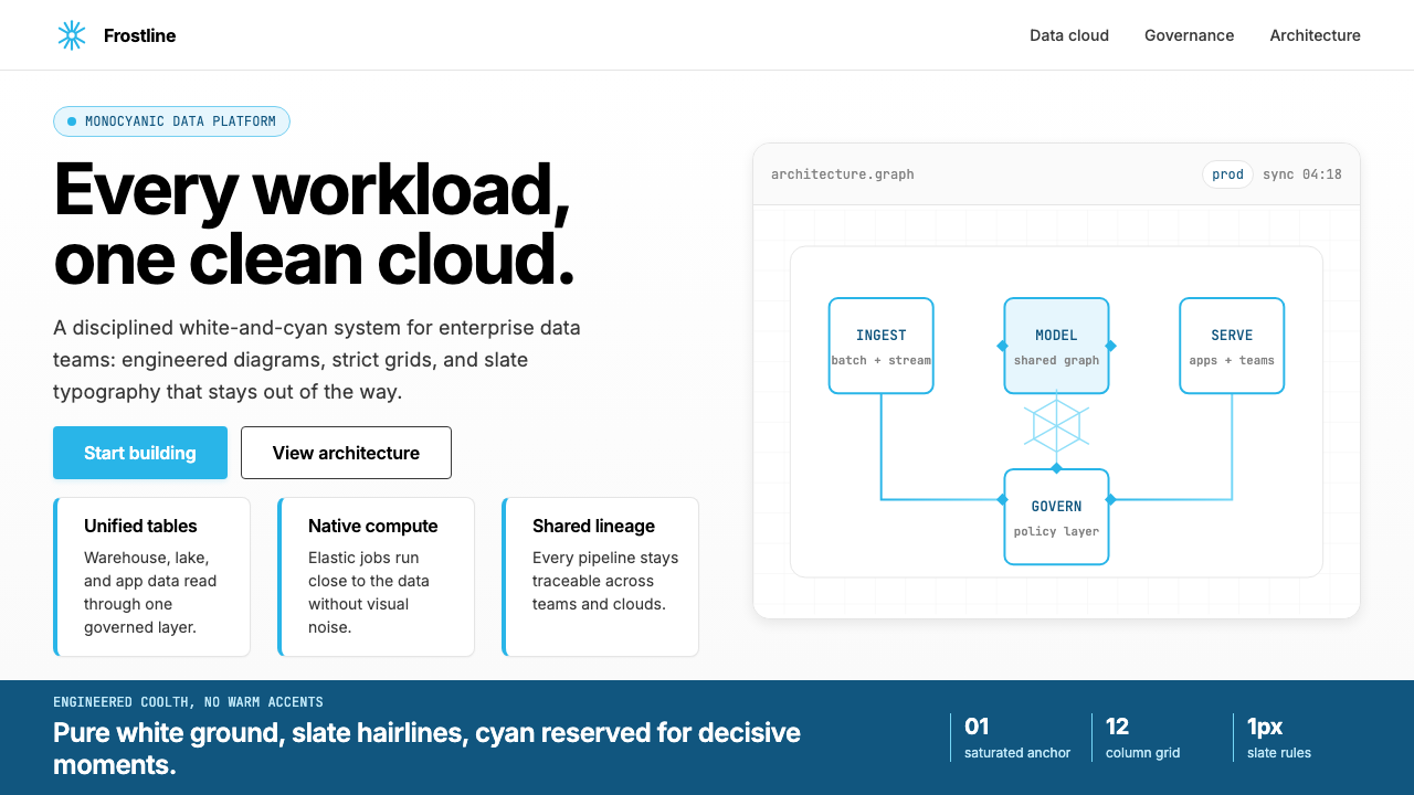 Snowflake Data CloudCool precision wins. Icy cyan, Inter grids, and hex data diagrams stay engine…冷峻精确取胜:冰蓝青、Inter 网格与六角数据图保持工程感。
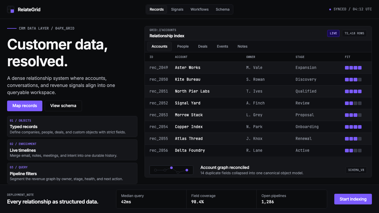 Attio CRMCRM stripped to its data layer. Single-pixel borders, monospaced IDs, violet…把 CRM 还原为纯粹数据层:单像素边框、等宽 ID、紫罗兰作为唯一强调色——…