What is Linear 2024?什么是 Linear 2024?
Linear turned project management software into a design benchmark — proving that extreme precision, near-darkness, and a single restrained accent color can define an entire era of developer-tool aesthetics.Linear 将项目管理软件变成了设计标杆——证明了极致精密、接近纯黑的底色与单一克制的强调色,足以定义一整个开发者工具美学时代。
Linear 2024 in briefLinear 2024 速览
Linear 2024 is the visual language of Linear, a project-management tool that became the most-imitated interface in the SaaS industry over the 2022–2024 period. Its defining qualities are a near-black background of extraordinary depth, restrained indigo-violet accents deployed with surgical precision, clean geometric typography, and animations timed so exactly they feel engineered rather than designed. The system is built on a single conviction: density and elegance are not in conflict.Linear 2024 是 Linear 这款项目管理工具的视觉语言。在 2022 至 2024 年间,Linear 成为 SaaS 行业被模仿最多的界面。其核心特质是:一种深度惊人的近乎纯黑底色、以外科手术般精准克制部署的靛紫色点缀、干净的几何字体排印,以及精确到毫秒的动效——精确到让人感觉是工程造物而非设计产物。整套体系建立在一个信念之上:信息密度与优雅可以共存。
What separates Linear's aesthetic from ordinary dark-mode design is its rejection of atmospheric decoration. There are no gradients on UI surfaces, no glowing halos around elements, no layered blurs softening the space. Every surface is flat and intentional. Depth is communicated through subtle tonal steps between background layers rather than through shadows or lighting effects. The result is an interface that reads more like precision engineering than consumer software.将 Linear 美学与普通深色模式设计区分开来的,是它对氛围装饰的彻底拒绝。界面表面没有渐变,元素周围没有发光光晕,没有层叠模糊来柔化空间。每一个表面都是平整且有意为之的。深度感通过背景层之间细微的色调台阶来传递,而非依靠阴影或光照效果。最终呈现的界面,读起来更像精密工程产品,而非消费软件。
The style has spread far beyond Linear itself. By 2024, the visual grammar of near-black grounds, cool violet or indigo accents, tight geometric type, and sub-one-second micro-animations had been adopted — often explicitly — by dozens of developer tools, infrastructure products, and SaaS dashboards. Recognizing Linear 2024 as a distinct aesthetic vocabulary, rather than simply as one company's interface, reflects how completely its design principles have propagated through the industry.这种风格的影响早已超出 Linear 本身。到 2024 年,近乎纯黑底色、冷调紫罗兰或靛蓝强调色、紧凑几何字体、亚秒级微动效的视觉语法,已被数十款开发者工具、基础设施产品和 SaaS 仪表板明确采纳。将 Linear 2024 视为一种独立的美学词汇——而非某家公司的界面——恰恰反映了它的设计原则在整个行业中传播的彻底程度。
Where does Linear 2024 come from?Linear 2024 从何而来?
Linear was founded in San Francisco in 2019 by Karri Saarinen and Tuomas Artman. Saarinen had served as design system lead at Airbnb, where he worked at the intersection of engineering culture and product design. Artman brought a deep engineering sensibility from his own background. The two founders shared a frustration with existing project-management tools — tools that had accumulated decades of feature clutter, inconsistent interaction patterns, and interfaces designed for breadth rather than speed. They wanted to build something that felt like it was made by and for software engineers: fast, precise, and stripped of everything unnecessary.Linear 于 2019 年在旧金山由 Karri Saarinen 与 Tuomas Artman 联合创立。Saarinen 曾担任 Airbnb 设计系统负责人,在工程文化与产品设计的交汇处积累了丰富经验;Artman 则拥有深厚的工程师背景。两位创始人共同对现有项目管理工具感到失望——那些工具积累了数十年的功能杂乱、不一致的交互模式,以及为广度而非速度而设计的界面。他们想打造一款感觉是由软件工程师、为软件工程师而造的产品:快速、精密、去除一切多余之物。
The visual language that emerged drew on a confluence of influences. Swiss typography — with its commitment to clean grid systems, restrained type hierarchies, and the removal of decorative elements — provided a structural foundation. The developer-tool minimalism already present in command-line interfaces and early code editors (where darkness serves both contrast and focus) shaped the decision to build around a near-black ground. Finnish design sensibility, part of Saarinen's background, contributed an emphasis on honest material treatment and purposeful restraint that distinguished Linear's aesthetic from the more theatrical dark-mode designs that had become common in consumer applications.由此形成的视觉语言汇聚了多重影响。瑞士字体排印——以干净的网格系统、克制的字体层级、去除装饰元素为核心承诺——提供了结构基础。命令行界面与早期代码编辑器中已然存在的开发者工具极简主义(在那里,暗色既服务于对比度,也服务于专注感)塑造了以近乎纯黑底色为核心的决策。芬兰设计感性——Saarinen 背景的一部分——带来了对诚实材料处理与有目的性克制的强调,使 Linear 的美学与当时在消费类应用中已变得普遍的、更具戏剧性的深色模式设计区分开来。
The current visual language stabilized roughly between 2022 and 2024, as Linear moved from a narrow audience of early adopters into a broader professional market. The indigo-violet accent — cool enough to avoid warmth, saturated enough to carry attention precisely where needed — became the signature mark of the system. Aaron Iker, whose motion and interaction design work contributed directly to the product, played a significant role in defining the micro-animation language: transitions timed in the tens of milliseconds, entrance and exit curves that feel instantaneous but are perceptibly smooth.当前这套视觉语言大致在 2022 至 2024 年间趋于成熟,彼时 Linear 从早期采用者的小众受众扩展至更广泛的专业市场。靛紫色强调色——冷到不带温度,又饱和到能将注意力精确引导至所需之处——成为整套系统的标志性印记。Aaron Iker 的动效与交互设计工作直接参与了产品塑造,在定义微动效语言方面发挥了重要作用:以数十毫秒计时的过渡、让人感觉瞬间完成却可感知为流畅的入场与退场曲线。
By the time the style reached its mature form, it had become something larger than a single product's interface. Design communities began identifying the aesthetic as a category — sometimes called the 'Linear aesthetic,' sometimes 'dev-tool minimalism' or 'dark precision UI.' The imitation it attracted was the sincerest form of validation: competitors, tools built on different product premises, and even non-developer SaaS products began adopting its visual grammar as a signal of seriousness, technical credibility, and modern taste. Linear 2024 thus occupies an unusual position in design history: it is both a specific product interface and a movement that exceeded its origin.当这套风格发展至成熟形态时,它已成为远超单一产品界面的存在。设计社区开始将这种美学识别为一个类别——有时称为「Linear 美学」,有时称为「开发者工具极简主义」或「暗色精密 UI」。它所吸引的模仿是最真诚的验证:竞争者、基于不同产品前提构建的工具,乃至非开发者的 SaaS 产品,都开始采纳其视觉语法,将其作为严肃性、技术可信度与现代品味的信号。Linear 2024 因此在设计史上占据了一个不寻常的位置:它既是一款具体产品的界面,也是一场超越了自身起源的运动。
What defines the Linear 2024 look?Linear 2024 的视觉特征是什么?
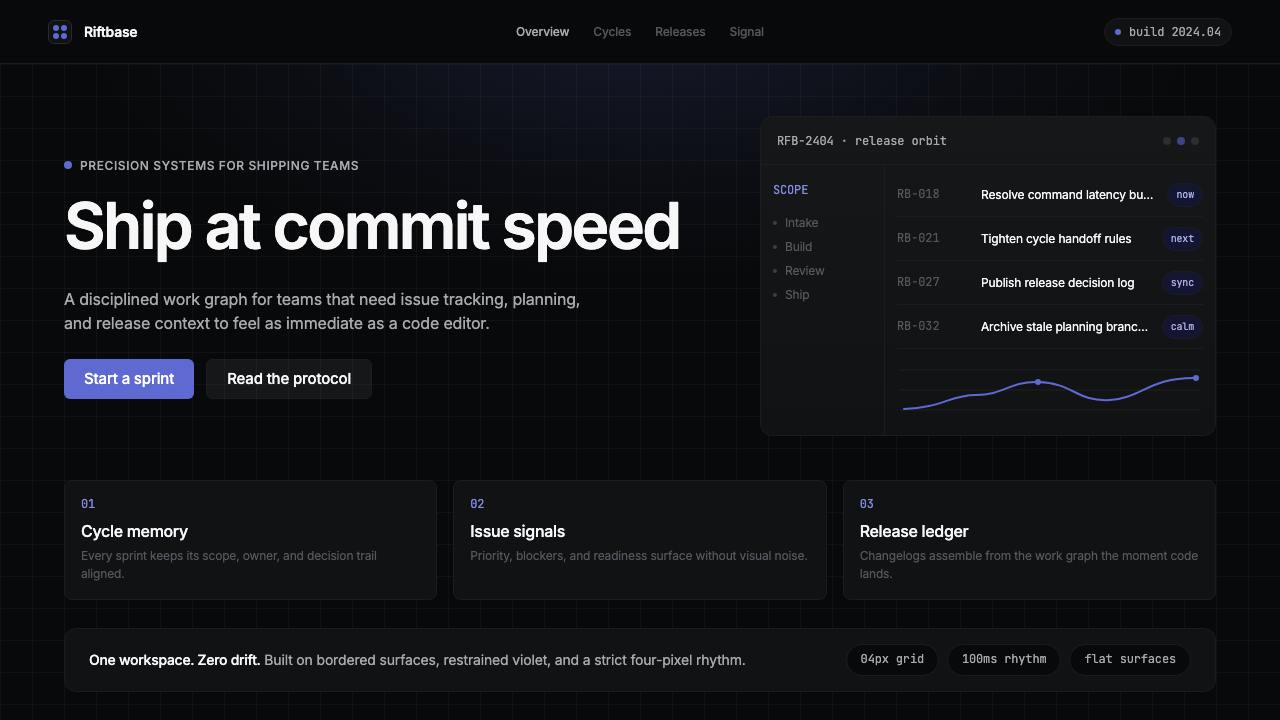
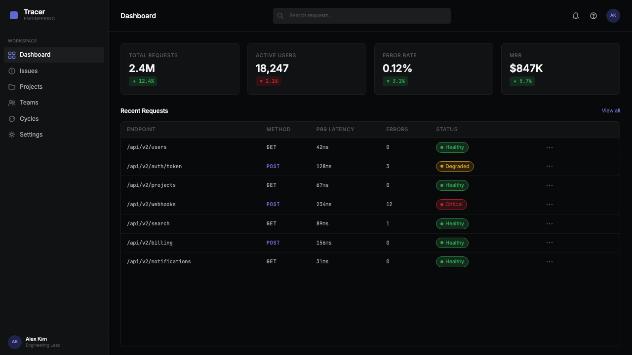
Near-Black Ground近乎纯黑的底色
The background is not pure black but a very deep, slightly warm or neutral dark tone that avoids the harshness of absolute black while still reading as darkness at any ambient light level. This near-black serves multiple purposes simultaneously: it reduces eye strain during extended use, it makes cool-toned accents vibrate with quiet intensity, and it communicates seriousness without the theatrical quality of full-black. The difference between the page ground and elevated surface layers is communicated through minimal tonal steps — barely perceptible in isolation but immediately readable in context.背景并非纯黑,而是一种极深、略带暖意或中性的深色调,避免了绝对黑色的刺眼感,同时在任何环境光照下都清晰地呈现为暗色。这种近乎纯黑的底色同时服务于多重目的:减少长时间使用的视觉疲劳,使冷调强调色以安静的强度振动,以及传递严肃感而不带有全黑的戏剧性。页面底色与抬升表面层之间的差异,通过极为细微的色调台阶来传达——单独看几乎难以察觉,但置于语境中立刻清晰可读。
Indigo-Violet Accent靛紫色强调
A single cool accent in the indigo-to-violet range is the system's primary color vehicle. It is used with exceptional restraint — interactive states, the current active item in a list, a progress indicator — and almost never applied as a background fill on large surfaces. The hue sits between blue and purple, cool enough to feel technical and precise rather than warm or friendly. Its saturation is calibrated so that it reads clearly against the near-black ground without creating visual fatigue. This is not a multi-color accent system; the discipline of a single accent is fundamental to the style's coherence.靛蓝到紫罗兰范围内的单一冷调强调色是整套系统的主要色彩载体。它被以极度克制的方式使用——交互状态、列表中当前激活的条目、进度指示符——几乎从不作为大面积背景填充。这个色相介于蓝色与紫色之间,冷到让人感觉技术性与精准性,而非温暖或友好。它的饱和度经过精确校准,在近乎纯黑的底色上清晰可读,同时不造成视觉疲劳。这不是多色强调系统;单一强调色的纪律性,是这种风格连贯性的根本所在。
Zero Decorative Surface零装饰表面
No gradients appear on any UI surface — not as background fills, not as button states, not as panel treatments. Every surface is flat and mono-tonal. Where depth is required, it is achieved through the tonal-step system between layers rather than through lighting simulation. Borders, when they appear, are hairline-thin and used to separate content regions rather than to frame or decorate them. This zero-decoration discipline extends to iconography: glyphs are outline-weight geometric forms with no fills, no perspective tricks, no decorative detail beyond what the shape minimally requires to be recognizable.任何界面表面都不出现渐变——不作为背景填充,不作为按钮状态,不作为面板处理方式。每一个表面都是平整、单色调的。需要深度感时,通过层级之间的色调台阶系统来实现,而非通过光照模拟。边框(若出现)是细如发丝的,用于分隔内容区域,而非框定或装饰它们。这种零装饰的纪律性延伸至图标设计:字形是轮廓线粗细的几何形态,无填充、无透视技巧、无超出形状被识别所最低需求的装饰细节。
Typographic Density字体排印密度
Linear's typography is built for information density rather than spacious readability. Type sizes step down tightly across hierarchical levels — headlines are noticeably larger than metadata, but the range between them is compressed compared to consumer product conventions. Line spacing is close, allowing more information per viewport. The typeface leans geometric — clean, regular, and modern — with a neutral character that does not compete with content. The result is that a Linear-style layout holds more information per unit of space than most contemporary SaaS interfaces, and does so without feeling cluttered because the hierarchy is unambiguous.Linear 的字体排印为信息密度而设计,而非为宽松的可读性。字体尺寸在层级之间紧凑递减——标题明显大于元数据,但二者之间的范围比消费类产品的惯例更为压缩。行距紧凑,每个视口能容纳更多信息。字体风格偏向几何——干净、规整、现代——具有不与内容竞争的中性气质。结果是,Linear 风格的版面在每单位空间内承载的信息量远超大多数当代 SaaS 界面,且因层级明确而不显凌乱。
Millisecond Motion毫秒级动效
Animations in the Linear system are timed with unusual precision — transitions are short enough to feel instantaneous, but long enough that their easing curves are perceptible on close inspection. This approach treats motion as a form of feedback rather than a form of decoration: an element entering or exiting communicates a state change, not a brand personality. There are no looping ambient animations, no idle-state motion, no scroll-triggered flourishes. Everything moves because something happened, and it stops moving the moment the event is complete.Linear 系统中的动画以不寻常的精准度计时——过渡时间短到让人感觉瞬间完成,但长到仔细观察时其缓动曲线清晰可辨。这种方式将动效作为反馈形式而非装饰形式:一个元素的入场或退场传达的是状态变化,而非品牌个性。没有循环的环境动画,没有闲置状态的动效,没有滚动触发的华彩。一切移动皆因某件事发生,事件结束后立刻停止运动。
Structural Elevation Model结构性层级模型
Rather than using drop shadows or glow effects to indicate that a panel or modal sits above the base layer, the Linear system communicates elevation purely through the tonal-step hierarchy — each higher layer is a fraction lighter than the layer below. This means depth is a property of the surface itself, not of any effect applied to it. Modals and popovers therefore appear clearly differentiated from their context without any shadow casting, creating an effect that feels simultaneously flatter and more precise than shadow-based elevation models.Linear 系统不使用投影或发光效果来表示面板或模态框位于基础层之上,而是纯粹通过色调台阶层级来传达高度——每个更高的层比下方的层稍微亮一些。这意味着深度是表面本身的属性,而非叠加于其上的效果。模态框与弹出层因此无需任何投影便能清晰地与其上下文区分,营造出一种比基于阴影的层级模型既更扁平又更精密的效果。
Command-Palette Centrality命令面板的核心地位
The command palette — a keyboard-invoked overlay listing all available actions, searchable by typing — is not just a feature of Linear but a statement about its design philosophy. By treating the command palette as a primary navigation surface rather than a secondary power-user shortcut, the interface signals that efficiency and keyboard fluency are first-class values. Visually, the command palette embodies the aesthetic in concentrated form: dark floating surface, geometric type, a single accent on the active selection, zero decorative framing.命令面板——通过键盘唤出的、列出所有可用操作并可通过输入检索的覆盖层——不仅仅是 Linear 的一项功能,更是其设计哲学的一种声明。通过将命令面板作为主要导航表面而非次要的高级用户快捷方式,界面表明效率与键盘流畅度是第一优先级的价值观。在视觉上,命令面板以浓缩形式体现了整套美学:深色浮动表面、几何字体、当前选中项上的单一强调色、零装饰边框。
Who shaped Linear 2024?谁塑造了 Linear 2024?
Saarinen co-founded Linear and served as its chief design driver. His prior role as design system lead at Airbnb gave him both deep familiarity with the mechanics of large-scale design systems and a clear view of what those systems often got wrong — accumulated complexity, inconsistency under the surface, interfaces designed for feature breadth rather than task speed. At Linear, he channeled those observations into a system built from the opposite set of constraints: every decision justified by use, every visual element earning its presence. Saarinen's Finnish design background — with its emphasis on functional honesty and quiet material confidence — is evident in the aesthetic's particular tone of restraint.Saarinen 联合创立了 Linear,并担任其核心设计驱动者。他此前在 Airbnb 担任设计系统负责人的经历,使他既深刻理解大规模设计系统的运作机制,也清晰看到这些系统常见的问题——积累的复杂性、表面之下的不一致、为功能广度而非任务速度而设计的界面。在 Linear,他将这些观察转化为一套建立在相反约束之上的系统:每一个决策以使用为正当依据,每一个视觉元素都在为自己的存在赢得理由。Saarinen 的芬兰设计背景——强调功能诚实与沉静的材料自信——在这套美学特有的克制基调中清晰可见。
Artman co-founded Linear and brought the engineering-first perspective that shaped the product's relationship to performance and precision. His technical background meant that aesthetic decisions in Linear were consistently stress-tested against the question of whether they could be implemented with the performance characteristics the team considered non-negotiable — sub-hundred-millisecond response times, smooth animation at any frame rate, interfaces that never visually stall. This engineering constraint influenced the aesthetic directly: effects that degrade gracefully are preferred over effects that are striking but expensive, which is part of why the system avoids gradients, blur layers, and complex shadow stacks.Artman 联合创立了 Linear,带来了工程优先的视角,这一视角塑造了产品与性能和精密度之间的关系。他的技术背景意味着 Linear 中的美学决策始终经受这一问题的考验:这些决策能否以团队视为不可妥协的性能特征来实现——亚百毫秒的响应时间、任何帧率下的流畅动画、从不在视觉上卡顿的界面。这一工程约束直接影响了美学:在任何降级情况下都能优雅表现的效果,比引人注目但成本高昂的效果更受青睐——这也是该系统回避渐变、模糊层与复杂阴影叠加的原因之一。
Iker's work on Linear's motion and interaction design gave the product its distinctive animation vocabulary. The micro-animations he developed — transitions measured in tens of milliseconds, easing curves that feel physically grounded rather than programmatically linear — became one of the most-discussed and most-imitated aspects of the Linear aesthetic. His work demonstrated that motion quality in a dark, precision-focused UI is not a luxury but a core component of the experience: the difference between an interface that feels engineered and one that merely looks engineered.Iker 在 Linear 动效与交互设计上的工作,赋予了这款产品其独特的动画语汇。他开发的微动效——以数十毫秒计量的过渡、感觉有物理依据而非程序线性的缓动曲线——成为 Linear 美学中被讨论最多、被模仿最广的方面之一。他的工作表明,在一个暗色、精密专注的界面中,动效质量不是奢侈品,而是体验的核心组成部分:它是让界面感觉是工程造物与看起来像工程造物之间的差别。
While not a person, the Swiss International Typographic Style — developed in Switzerland from the 1950s onward and characterized by mathematical grid systems, neutral sans-serif typefaces, and the removal of decorative elements from information design — is a direct ancestor of Linear's visual language. Linear 2024 inherits its commitment to grid discipline, its preference for type hierarchies built on weight and size rather than decoration, and its underlying conviction that information should be organized to serve the reader's efficiency rather than the designer's expressiveness. Understanding this lineage helps explain why Linear's restraint feels principled rather than merely minimal.瑞士国际排印风格——从 1950 年代起在瑞士发展、以数学网格系统、中性无衬线字体和从信息设计中移除装饰元素为特征——是 Linear 视觉语言的直接祖先,尽管它并非一个具体的人。Linear 2024 继承了其对网格纪律的承诺、对以字重和尺寸而非装饰构建字体层级的偏好,以及其根本信念:信息应当为服务读者的效率而组织,而非为展示设计师的表现力。理解这一传承脉络,有助于解释为何 Linear 的克制感觉是有原则的,而非仅仅是极简。
How do you use Linear 2024 today?今天怎么用 Linear 2024?
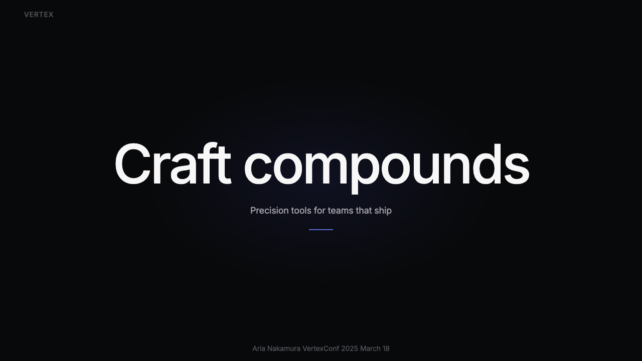
Linear 2024 translates well to presentation slides when the goal is to project technical authority and precise thinking. A cover slide built in this style uses a near-black ground with the title set in clean geometric type at high weight — occupying a confident left-aligned or center position — and a single indigo or violet accent element used sparingly: a thin rule, a highlighted keyword, or an active state on a UI screenshot. Content slides should resist the temptation to fill space: generous margins, a strict two- or three-level type hierarchy defined only by size and weight, and no decorative dividers or border elements. Data slides benefit from the style's diagrammatic quality — charts and graphs become precision instruments, with axis labels in a lighter tonal step, data marks or bars using the accent color only for the primary data series, and all supporting elements in a restrained neutral.当目标是传达技术权威与精密思考时,Linear 2024 在演示文稿幻灯片中表现出色。以这种风格制作的封面页使用近乎纯黑的底色,标题以干净的几何字体、较重的字重呈现——占据自信的左对齐或居中位置——并以单一的靛蓝或紫罗兰强调色元素克制点缀:一条细线、一个高亮关键词、或界面截图上的一个激活状态。内容页应当抵制填充空间的诱惑:充足的页边距,仅以尺寸和字重定义的严格两级或三级字体层级,无装饰性分割线或边框元素。数据页得益于这种风格的示意图式品质——图表成为精密仪器,坐标轴标签使用更浅的色调台阶,数据标记或柱条仅对主数据系列使用强调色,所有辅助元素保持克制的中性。
For web UI applications, the style is most naturally suited to dashboards, analytics views, developer tooling interfaces, and pricing pages where the audience already expects information density and keyboard fluency. The implementation discipline is strict: establish a clear elevation hierarchy using tonal steps rather than shadows; use the accent color for interactive and active states only, never for decoration; keep iconography outline-weight and geometric; and ensure that every interactive element has a motion response short enough to feel instantaneous but smooth enough to feel physically grounded. Navigation structures should be typographic and compact — sidebar labels with no icon embellishment, breadcrumbs in a lighter tonal step, command-palette invocation as the primary search surface.对于网页 UI 应用,这种风格最自然地适合仪表板、分析视图、开发者工具界面和定价页面——这些场景中受众已然期待信息密度与键盘流畅度。实现纪律是严格的:用色调台阶而非阴影建立清晰的高度层级;强调色仅用于交互与激活状态,绝不用于装饰;保持图标为轮廓线粗细的几何形态;确保每个交互元素都有动效响应,短到感觉瞬间完成,却流畅到感觉有物理依据。导航结构应当是字体性且紧凑的——无图标装饰的侧边栏标签、以更浅色调台阶呈现的面包屑导航、以命令面板调用作为主要搜索表面。
Editorial and marketing applications require adapting the style's density to contexts where a single message — rather than a complex information space — is the primary goal. A marketing page in this language works through alternating full-width sections: a dark near-black section with a large headline and a single accent-colored word or phrase, followed by a slightly elevated dark section with supporting body text at comfortable reading density. Feature callout blocks use the elevation model to distinguish them from surrounding content without adding borders or drop shadows. Motion enters through subtle entrance animations timed to scroll position — brief, directional, and never decorative.编辑与营销应用需要将这种风格的密度适配至以单一信息——而非复杂信息空间——为主要目标的语境。以这种语言制作的营销页面通过交替的全宽区块运作:一个近乎纯黑的深色区块,配以大标题和单一强调色词语或短语;随后是一个略微抬升的深色区块,以舒适的阅读密度呈现支撑性正文。特性说明块使用层级模型与周围内容区分,无需添加边框或投影。动效通过与滚动位置同步的细微入场动画呈现——短暂、方向明确、从不具装饰性。
When applied to editorial long-form content, Linear 2024 demands careful attention to reading comfort. The style's preferred tight line spacing and high information density work well in short-form contexts but can create fatigue in extended prose. The adaptation is to increase line spacing on body text while maintaining the tight spacing in metadata, captions, and labels. The near-black ground should be lightened slightly or replaced with a very deep neutral that has more perceptible warmth — this single adjustment makes sustained reading substantially more comfortable without breaking the visual language.将 Linear 2024 应用于编辑长文内容时,需要对阅读舒适度给予细心关注。这种风格倾向的紧凑行距与高信息密度在短文场景中表现良好,但在长篇散文中可能造成阅读疲劳。适配方法是增加正文行距,同时在元数据、说明文字和标签中保持紧凑间距。近乎纯黑的底色应当略微变浅,或替换为具有更多可感知温度的极深中性色——这一单一调整能在不破坏视觉语言的前提下,使持续阅读体验大幅改善。
The most common mistake when applying Linear 2024 is misunderstanding the accent color's role. Designers accustomed to systems with multiple brand colors sometimes introduce secondary accent colors, gradient highlights, or colorful data visualizations in hopes of adding vibrancy to the otherwise restrained palette. This breaks the system fundamentally: the entire visual logic depends on the single cool accent being the only source of color energy in the composition. A second accent color doesn't complement the first — it competes with it and destroys the hierarchy that the first accent was doing the work of establishing. The correct response to a layout that feels too austere is not to add color but to examine whether the typographic hierarchy, the spacing scale, or the tonal step model is working hard enough.应用 Linear 2024 时最常见的错误是误解强调色的作用。习惯于拥有多种品牌色系统的设计师,有时会引入次要强调色、渐变高亮或色彩丰富的数据可视化,希望为原本克制的色板增添活力。这从根本上破坏了系统:整套视觉逻辑依赖于单一冷调强调色是构图中唯一色彩能量来源这一前提。第二种强调色不是对第一种的补充——它与第一种竞争,并摧毁了第一种强调色正在建立的层级关系。当版面感觉过于严苛时,正确的回应不是增加色彩,而是检查字体层级、间距比例或色调台阶模型是否已经发挥了足够的作用。
Linear 2024 — FAQLinear 2024 · 常见问题
Is Linear 2024 just dark mode with a purple accent?Linear 2024 只是带紫色点缀的深色模式吗?
The description is accurate on the surface but misses what makes the style distinctive. Dark mode as a category simply means a light-on-dark color scheme; it says nothing about the quality of surface treatment, the discipline of the accent color, the density of the type system, or the precision of the motion language. Linear 2024 is a complete, internally consistent visual system in which every element is in a specific relationship with every other element. The near-black is a particular tone chosen for reasons of visual comfort and accent legibility, not as a generic inversion. The indigo-violet accent is used according to strict constraints that prevent it from appearing as decoration. The result feels qualitatively different from most dark-mode interfaces — more engineered, less atmospheric — and that difference is the style.这个描述表面上准确,但遗漏了使这种风格独特的部分。深色模式作为一个类别,仅仅意味着浅色文字在深色背景上的配色方案;它对表面处理的质量、强调色的纪律性、字体系统的密度或动效语言的精密度毫无说明。Linear 2024 是一个完整的、内部一致的视觉系统,其中每个元素都与其他每个元素处于特定的关系之中。近乎纯黑的底色是基于视觉舒适度与强调色可读性的考量而选择的特定色调,而非通用的色彩反转。靛紫色强调色按照严格约束使用,以防止其以装饰形式出现。最终结果在质感上与大多数深色模式界面截然不同——更具工程感,更少氛围感——而这种差异正是这种风格本身。
Can this style be used for consumer-facing products, or is it only suited to developer tools?这种风格能用于面向消费者的产品吗,还是只适合开发者工具?
The style can be used for consumer-facing products, but the fit depends heavily on what values the product communicates. Linear 2024 is effective wherever technical credibility, precision, and efficiency are aspirational qualities for the user — productivity apps, financial tools, professional creative software, and platforms where the audience self-identifies as technically sophisticated. It is poorly suited to products whose value proposition depends on warmth, approachability, sensory richness, or emotional intimacy — food and hospitality, health and wellness, children's products, or social platforms built around casual sharing. The most revealing question is whether the aesthetic's particular kind of seriousness matches what the user wants to feel while using the product.这种风格可以用于面向消费者的产品,但适配程度在很大程度上取决于产品传达的价值观。Linear 2024 在技术可信度、精密度与效率是用户憧憬品质的场合最为有效——生产力应用、金融工具、专业创意软件,以及受众自我认同为技术成熟者的平台。它不适合价值主张依赖于温暖感、亲和力、感官丰富性或情感亲密感的产品——餐饮与酒店、健康与养生、儿童产品,或以轻松分享为核心的社交平台。最具揭示性的问题是:这套美学特有的严肃感,是否与用户在使用产品时希望感受到的情绪相匹配。
How does Linear 2024 relate to earlier dev-tool aesthetics like terminal interfaces and code editors?Linear 2024 与终端界面、代码编辑器等早期开发者工具美学有何关联?
There is a direct lineage. Terminal interfaces and early code editors established the foundational premise: a dark ground reduces eye strain during extended use, monospaced type organizes dense information efficiently, and the absence of decorative chrome keeps focus on content. What Linear 2024 adds to this foundation is design intentionality — the near-black is not simply the default terminal color but a specific tone calibrated for legibility; the typeface is not monospaced but a geometric proportional design chosen for its neutral authority; the accent color is not the legacy green or amber of command-line culture but a cool contemporary hue. Linear translates the functional logic of developer tools into the visual language of modern product design without losing the efficiency values that made the source aesthetic credible.这里存在直接的传承关系。终端界面与早期代码编辑器确立了基础前提:深色底色减少长时间使用的视觉疲劳,等宽字体高效组织密集信息,去除装饰性外壳使注意力集中于内容。Linear 2024 在这一基础上增加的是设计意图性——近乎纯黑的底色不仅仅是默认终端颜色,而是为可读性精确校准的特定色调;字体不是等宽字体,而是以其中性权威感被选择的几何比例设计;强调色不是命令行文化遗留的绿色或琥珀色,而是一种冷调的当代色相。Linear 将开发者工具的功能逻辑翻译为现代产品设计的视觉语言,同时没有失去使原始美学具有可信度的效率价值观。
What happens when the Linear 2024 style is applied to light-mode contexts?将 Linear 2024 风格应用于浅色模式语境时会发生什么?
A light-mode adaptation is possible but requires genuine re-derivation rather than a simple color inversion. The near-black ground becomes a near-white or very light neutral; the indigo-violet accent retains its hue but needs its lightness adjusted to maintain legibility and contrast against the light ground; the tonal-step elevation model inverts so that higher layers are slightly darker rather than slightly lighter. The resulting aesthetic shifts character substantially — it loses some of the precision-engineering quality that the dark ground communicates and gains a cleaner, more approachable tone. It can still work well for the same categories of products, but it reads differently: less like a technical instrument, more like a refined professional tool. Designers who want the full Linear 2024 effect should commit to the dark ground rather than attempting to port the system to light mode.浅色模式的适配版本是可能的,但需要真正的重新推导,而非简单的色彩反转。近乎纯黑的底色变为近乎纯白或极浅的中性色;靛紫色强调色保留其色相,但需要调整明度以在浅色底色上维持可读性与对比度;色调台阶层级模型反转,使更高的层略微更深而非略微更浅。由此产生的美学在气质上发生了实质性转变——它失去了深色底色传达的部分精密工程品质,获得了更干净、更亲和的基调。它仍然可以在相同类别的产品中表现良好,但读起来有所不同:更少像技术仪器,更多像精致的专业工具。希望获得完整 Linear 2024 效果的设计师,应当坚持深色底色,而非尝试将这套系统移植至浅色模式。
Is there a risk of looking derivative if this style is used in 2025 and beyond?在 2025 年及以后使用这种风格,是否有看起来像模仿品的风险?
The risk is real and worth taking seriously. Because Linear 2024 was so widely imitated, the visual vocabulary is now strongly associated with a specific era and a specific product origin. Using it without differentiation risks the product reading as a generic entry in a crowded category rather than as a confident design choice. The productive response is not to avoid the style but to understand what problem it was solving and to apply those underlying principles with a layer of additional specificity — a particular typographic choice, a distinctive approach to data visualization, a motion language tuned to the product's specific interactions. The best successors to influential styles are not copies but responses: work that understands why the original made the decisions it made and applies that understanding to produce something that is recognizable in lineage but not interchangeable in identity.这种风险是真实存在的,值得认真对待。由于 Linear 2024 被广泛模仿,这套视觉词汇现在已与特定时代和特定产品起源强烈关联。不加差异化地使用它,有让产品读起来像拥挤类别中的通用条目——而非自信的设计选择——的风险。有建设性的回应不是回避这种风格,而是理解它在解决什么问题,并以额外的特异性层来应用那些基本原则——一个特定的字体选择、一种独特的数据可视化方式、一套为产品特定交互调校的动效语言。对有影响力风格的最佳继承者不是复制品,而是回应:理解原创为何做出那些决策的作品,并运用这种理解产出在传承上可辨认、但在身份上不可互换的东西。
Related design styles相关设计风格
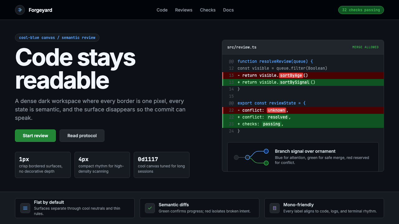 GitHub DarkCode-first darkness. Cool-blue canvas, 1px borders, green/red diff lines.代码优先的暗色:冷蓝画布、1px边框、绿红diff线。
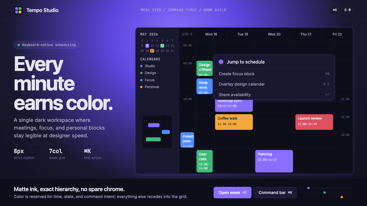 Cron CalendarDesigner-tech restraint. Purple wash, ink grid, mono shortcuts, surgical even…设计师科技的克制:紫色光晕、墨色网格、等宽快捷键与精准色块。
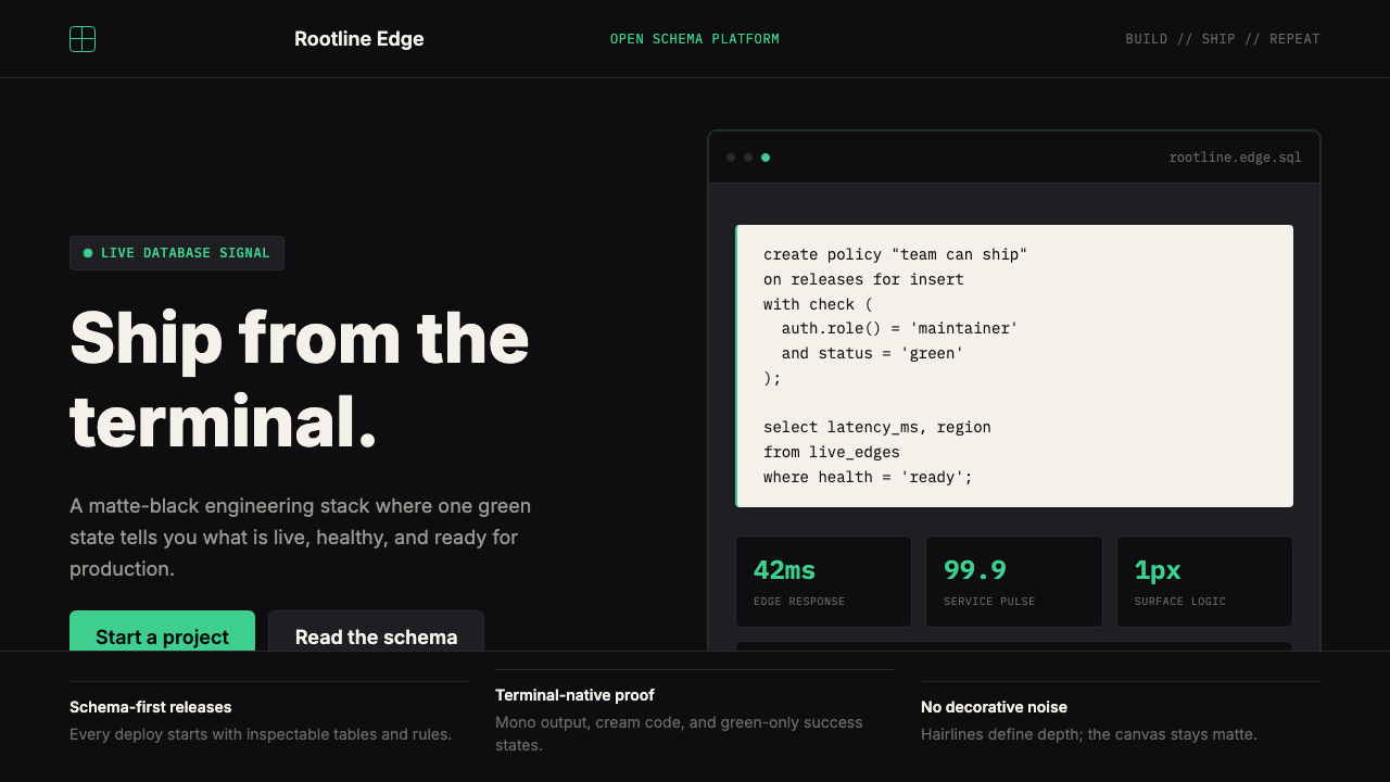 Supabase Postgres Green (2024)Midnight-terminal confidence. Matte black, Inter, mono code, and one electric…深夜终端般笃定:哑光黑、Inter、等宽代码与一抹电子绿。
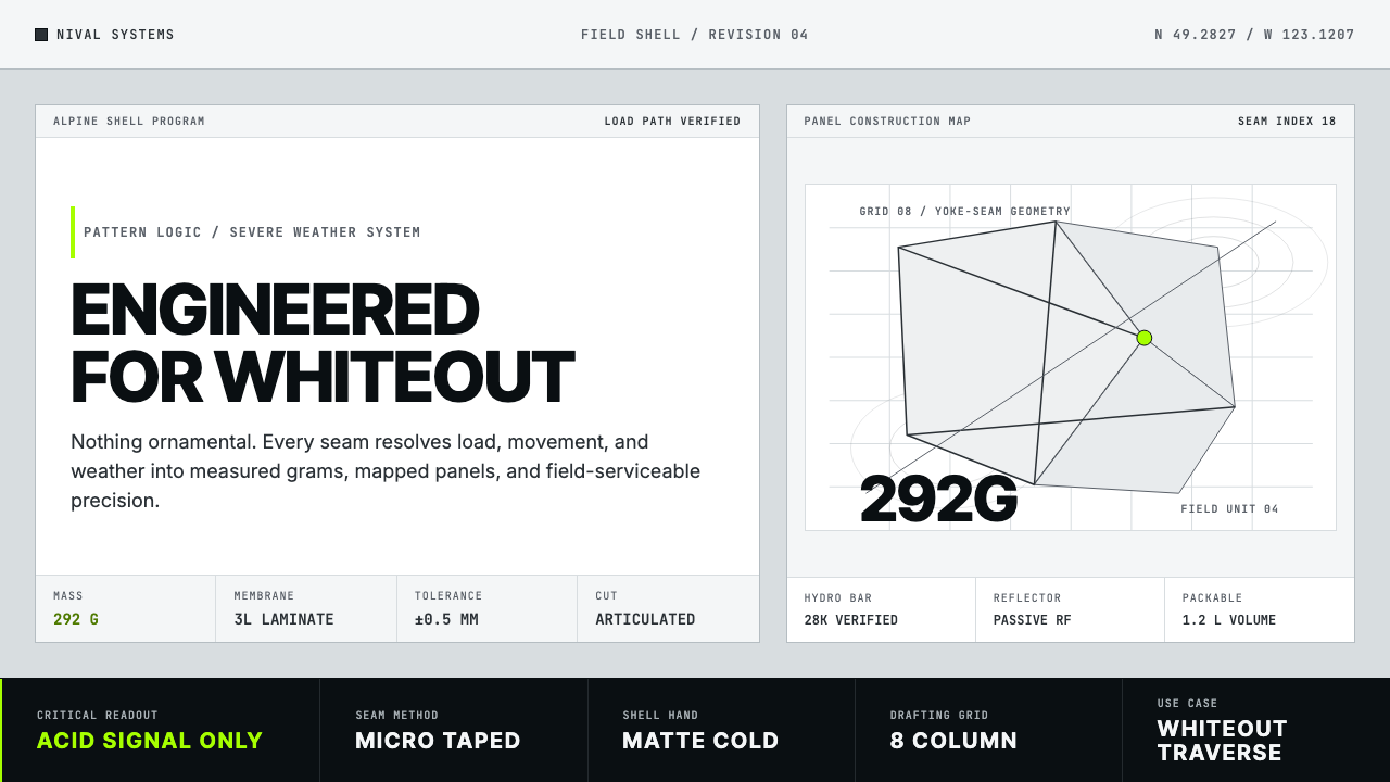 Arc'teryx Technical OutdoorEngineered, never ornamental. Glacier silver grid, mono specs, one acid-green…只讲工程,不作装饰。冰川银网格、等宽规格与一处酸绿信号。
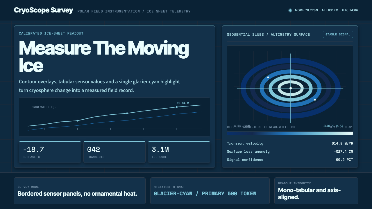 Glacier Arctic SurveyCold precision. Crevasse-blue panels, cyan readouts and contour grids calibra…冷峻精准:冰裂蓝面板、冰川青读数与等高网格校准每个数值。
 Snowflake Data CloudCool precision wins. Icy cyan, Inter grids, and hex data diagrams stay engine…冷峻精确取胜:冰蓝青、Inter 网格与六角数据图保持工程感。