What is Arc'teryx Technical Outdoor?什么是 Arc'teryx Technical Outdoor?
Arc'teryx built a visual language where every element earns its place — glacier-cold grounds, hairline geometry, and a single electrified accent that reads like a safety beacon on a white slope.始祖鸟构建了一套视觉语言,其中每个元素都必须证明自身存在的价值——冰川般冷静的底面、发丝级几何线条,以及一处如白雪坡面上求救信号灯般的单一荧光强调色。
Arc'teryx Technical Outdoor in briefArc'teryx Technical Outdoor 速览
Arc'teryx Technical Outdoor is a design aesthetic derived from the visual language of high-performance alpine equipment — a language that treats engineering specifications, panel-construction geometry, and certification marks as the entirety of its decorative vocabulary. The palette is relentlessly cool: glacier silver and deep slate anchor the ground, while a single acid-green or glacier-blue signal accent appears in exactly one place, functioning the way a hazard light functions on a mountain ridge.始祖鸟技术户外风格是一种源自高性能高山装备视觉语言的设计美学——它以工程规格数据、面板剪裁几何线条与认证标识作为全部装饰词汇。配色方案毫不妥协地偏冷:冰川银与深板岩灰构成底面,而一处酸绿或冰蓝信号色仅出现在唯一一个位置,其功能如同山脊上的危险警示灯。
The typographic posture is monospace and specification-driven. Text is laid out as if it belongs in a technical data sheet rather than a lifestyle advertisement — weight in grams, Gore-Tex layer count, seam-tape coverage expressed as precise labels in compact, uniform letterforms. Nothing is set in a warm, humanist face; the tone is that of an instrument panel. Whitespace is structural, not decorative: it separates data fields rather than softening atmosphere.排版姿态是等宽的、规格驱动的。文字被排列得仿佛属于技术数据表而非生活方式广告——克重、Gore-Tex层数、接缝胶带覆盖率以紧凑、统一的字形呈现为精确标注。没有任何温暖的人文字体;整体基调如同仪器面板。留白是结构性的而非装饰性的:它用于分隔数据字段,而非软化氛围。
What distinguishes this aesthetic from generic minimalism is its systematic relationship to function. Hairline rules map seam lines and panel cuts. Grid structures echo the modular construction of a shell jacket. The restraint is not fashionable emptiness but the discipline of a product that cannot afford unnecessary weight. Every visual decision is justified by the same logic that governs the gear itself: if it does not contribute to performance, it does not belong.使这种美学区别于泛泛极简主义的,是它与功能之间的系统性关系。发丝般细的线条映射接缝线与面板裁切。网格结构呼应冲锋衣的模块化构造。这种克制并非时髦的空洞,而是一款不能承受多余重量的产品所必须遵守的纪律。每一个视觉决定都遵循着与装备本身相同的逻辑:若不贡献于性能,它就不应存在。
See the Arc'teryx Technical Outdoor design system查看 Arc'teryx Technical Outdoor 完整设计系统
Where does Arc'teryx Technical Outdoor come from?Arc'teryx Technical Outdoor 从何而来?
Arc'teryx was founded in 1989 on the Coast Salish territory of Vancouver, British Columbia, by Dave Lane and Jeremy Guard. The company took its name from Archaeopteryx lithographica, the prehistoric transitional fossil between dinosaurs and birds — a deliberate signal that the founders saw themselves as engineering a category that had not yet fully existed. From the beginning, every design decision was tested against the demands of technical alpinism: routes on glaciated peaks where gear failure is not an inconvenience but a consequence.始祖鸟于1989年由Dave Lane与Jeremy Guard在加拿大不列颠哥伦比亚省温哥华的海岸萨利希原住民领地创立。公司名称取自始祖鸟化石(Archaeopteryx lithographica)——这种恐龙与鸟类之间的史前过渡物种——这是一个刻意的信号,表明创始人将自己视为正在开创一个尚未完全存在的品类的工程师。从一开始,每一个设计决定都在技术登山运动的严苛要求下接受检验:在冰川化山峰的攀登路线上,装备失效的代价不是不便,而是后果。
The early visual language followed directly from the product philosophy. Arc'teryx had no history of lifestyle branding to inherit and no aesthetic tradition to negotiate with. The design vocabulary emerged from the objects themselves — the silver-gray of waterproof membranes, the dark seam tape along panel joins, the Velcro storm flap annotations, the RECCO reflector patches that appeared in exactly one place. When the brand eventually needed a visual identity that extended beyond hangtags, it simply codified what the product had already established: cool grounds, technical annotation, functional accent.早期视觉语言直接源自产品哲学。始祖鸟没有任何生活方式品牌遗产需要继承,也没有任何美学传统需要协商。设计词汇从物品本身中涌现——防水膜的银灰色、面板接缝处的深色胶带、魔术贴风暴盖板标注、仅出现在唯一位置的RECCO反射贴片。当品牌最终需要一套超越吊牌的视觉识别时,它只是将产品已经建立的东西加以编纂:冷静的底面、技术标注、功能性强调色。
The Veilance line, launched in 2009, marked the moment the aesthetic became self-consciously urban without abandoning its technical basis. Conroy Nachtigall, who led design at Arc'teryx through a formative period, helped articulate a design language that could move from Whistler couloirs to Vancouver meeting rooms without changing register. The same hairline geometry, the same monospace annotation logic, the same solitary accent — now deployed on merino-shell hybrid garments worn in cities. Veilance proved that the aesthetic was structurally coherent enough to survive the removal of the mountain.2009年推出的Veilance支线标志着这种美学在不放弃技术基础的前提下有意识地走向都市的时刻。在始祖鸟成形期主导设计的Conroy Nachtigall,帮助提炼出一套能够在惠斯勒山沟与温哥华会议室之间无缝转换的设计语言,毋需改变调性。同样的发丝几何线条、同样的等宽标注逻辑、同样孤立的强调色——如今被部署在城市中穿着的美利奴-硬壳混纺服装上。Veilance证明了这种美学在结构上足够连贯,足以在去除山岳背景后依然成立。
The broader techwear movement — whose other key voices include Errolson Hugh's Acronym studio and Salomon's S/Lab performance line — absorbed and amplified this language through the 2010s. The gorpcore phenomenon of the early 2020s brought technical outdoor aesthetics into mainstream fashion discourse, and by the mid-2020s the Arc'teryx visual system had become a cultural reference point, reproduced across product categories that had nothing to do with alpine performance. The aesthetic had achieved what the Bauhaus achieved in another era: a design vocabulary so internally consistent that it generates recognition even in entirely new contexts.更广泛的techwear运动——其他重要声音包括Errolson Hugh的Acronym工作室与Salomon S/Lab性能线——在整个2010年代吸纳并放大了这种语言。2020年代初期的gorpcore现象将技术户外美学带入主流时尚话语,到2020年代中期,始祖鸟视觉系统已成为文化参照点,被复制到与高山性能毫无关联的产品品类中。这种美学实现了包豪斯在另一个时代所实现的成就:一套内在如此一致的设计词汇,即便在全新的语境中也能产生即时认知。
What defines the Arc'teryx Technical Outdoor look?Arc'teryx Technical Outdoor 的视觉特征是什么?
Color System色彩体系
The palette is organized around three roles, not three hues. The ground is always cool and recessive — glacier silver, cloud white, or a near-black slate that reads as a dark-mode ground. The structural layer uses mid-tone grays to articulate panel divisions, annotation fields, and secondary typography. The signal accent — acid green, glacier blue, or a sharp safety orange — appears in one location per composition, functioning as the single navigational beacon. Warm colors are absent by principle; the entire system reads as if it were calibrated under overcast alpine light.配色方案围绕三个角色而非三种色相组织。底面始终是冷静而退缩的——冰川银、云白或在深色模式下呈现为地面的近黑板岩色。结构层使用中调灰色来表达面板分割、标注区域与次级排版。信号强调色——酸绿、冰川蓝或锐利的安全橙——在每个构图中仅出现在唯一一处,充当单一的导航信标。暖色按原则缺席;整套系统的读感仿佛是在多云的高山光线下校准的。
Typography as Specification规格化排版
Type is treated as data annotation rather than expression. Monospace or condensed sans-serif letterforms dominate, chosen because they evoke engineering documents, terminal output, and gear specification sheets. Labels are compact, tightly tracked, and arranged in tabular structures. There is a deliberate tension between the microscopic scale of annotation text and the occasional large-scale typographic element — a product number set at display size, a weight-in-grams figure used as a hero graphic. Italics and decorative variants are avoided; the system trusts scale and weight contrast to do all organizational work.字体被视为数据标注而非表达工具。等宽或紧缩无衬线字形占主导,之所以如此选择,是因为它们令人联想到工程文件、终端输出与装备规格表。标签紧凑、字距收紧,以表格结构排列。标注文字的微观尺度与偶尔出现的大尺度排版元素之间存在刻意的张力——以展示尺寸排列的产品编号、用作视觉主角的克重数字。斜体与装饰变体均被回避;整套系统相信尺度与字重对比足以完成全部组织工作。
Hairline Geometry发丝几何
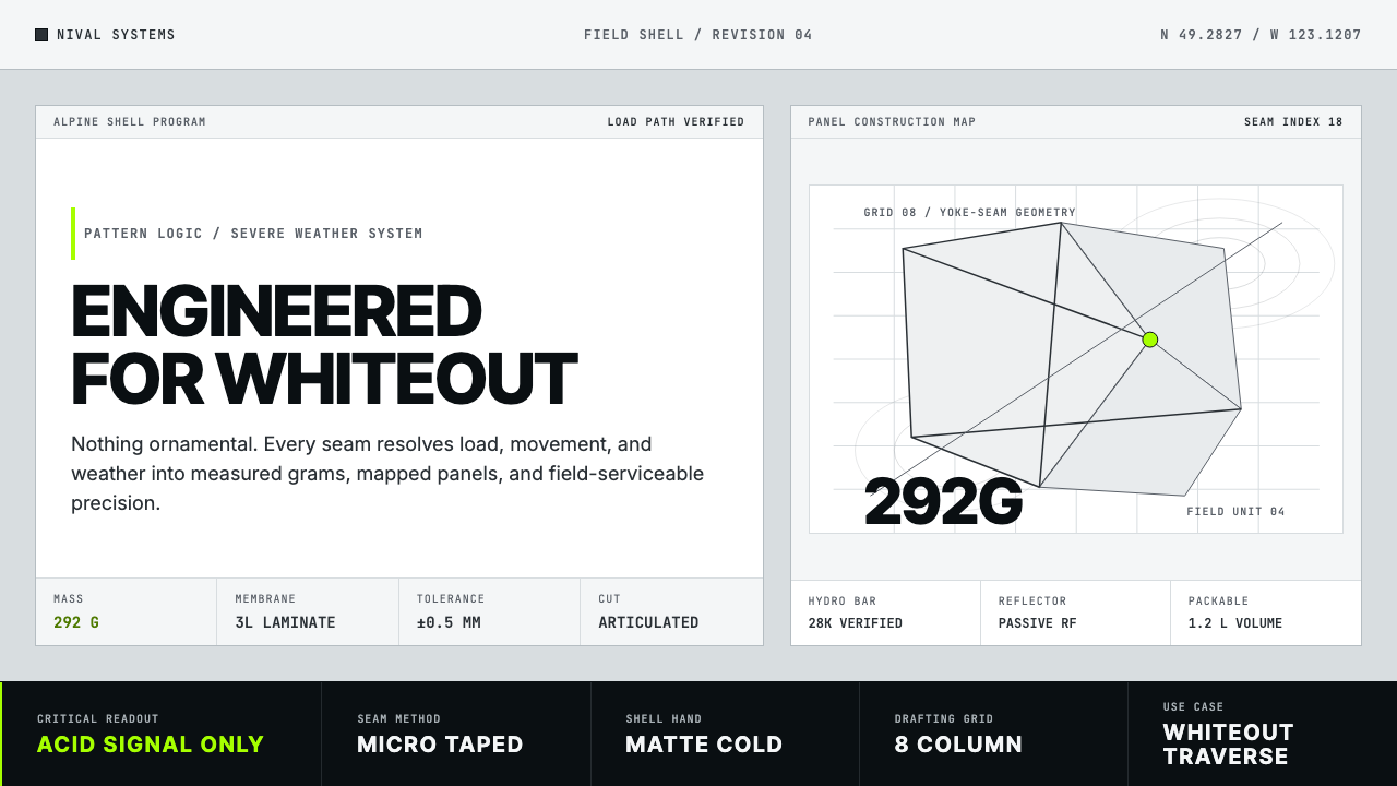
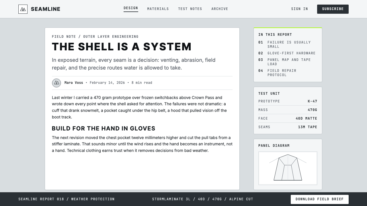
The structural vocabulary is built from lines so thin they read as precision measurements rather than graphical decoration. These hairline rules — horizontal, vertical, and occasionally diagonal — map panel boundaries, separate data zones, and create grid scaffolding across the composition. They reference the construction lines of a technical sewing pattern or an engineering blueprint. Where shapes occur, they are rectangles and parallelograms associated with gear panels, never curves or organic forms. The geometry is always cool, angular, and explicitly constructed.结构词汇由细到如同精密测量刻度而非图形装饰的线条构成。这些发丝级线条——水平、垂直,偶尔对角——映射面板边界,分隔数据区域,在构图中创建网格脚手架。它们参照的是技术缝纫样版或工程蓝图的构造线。出现的形状是与装备面板相关联的矩形与平行四边形,绝无曲线或有机形态。几何形态始终是冷静的、有棱角的、明确构造的。
Information Density信息密度
Arc'teryx design is unapologetically data-rich. A single product page or layout might contain material composition percentages, certifications, weight specifications, and construction annotations — all treated as design elements rather than legal footnotes. This density is not clutter; it is organized into tight hierarchical zones with clear visual separation. The effect communicates both technical authority and earned trust: a brand that shows its specifications publicly is a brand confident its specifications will impress. Negative space is used to make high-density zones legible, not to replace them.始祖鸟的设计毫不掩饰地信息丰富。单个产品页面或版面可能包含材料成分百分比、认证标识、重量规格与构造标注——所有这些都被视为设计元素而非法律脚注。这种密度并非杂乱;它被组织进具有清晰视觉分隔的严密层级区域中。效果传达出技术权威性与赢得的信任:公开展示规格的品牌,是一个对自身规格足以令人印象深刻充满信心的品牌。留白被用于使高密度区域易于阅读,而不是用于取代它们。
Single Signal Accent单一信号强调
Perhaps the most disciplined and recognizable feature of the aesthetic is the strict use of one accent color per composition. In an alpinist context, this mirrors the function of a safety signal — a vivid color that exists purely to be found in an emergency. Applied to visual design, the same logic governs: the accent marks the one thing that must be acted upon, the primary call to action, the critical measurement, the key navigation element. It is never used decoratively and never repeated. When the eye finds the acid-green tab or the glacier-blue status indicator, it has found the functional center of the layout.这种美学最具纪律性和辨识度的特征,或许是每个构图中严格使用唯一一处强调色。在登山语境中,这镜像了安全信号的功能——一种纯粹为了在紧急情况下被发现而存在的鲜明色彩。应用于视觉设计时,同样的逻辑适用:强调色标记那唯一必须被操作的事物、主要行动号召、关键测量值、核心导航元素。它从不用于装饰,也从不重复出现。当眼睛找到酸绿色标签或冰川蓝状态指示器时,它已找到了版面的功能中心。
Material Referencing材料指涉
Textures and surfaces, when they appear at all, are drawn from actual gear materials: the subtle grid weave of ripstop nylon, the matte sheen of a laminated membrane, the mechanical regularity of a load-bearing webbing pattern. These references are never decorative simulations of natural materials. They do not evoke wood grain or leather; they evoke constructed systems designed for controlled performance. Used at low opacity as background texture or as a structural motif, they reinforce the gear-culture credibility of the composition without overpowering the information layer above.纹理与表面——若有出现的话——均取自真实的装备材料:防撕裂尼龙的细微网格编织、层压膜的哑光光泽、承重织带图案的机械规律性。这些指涉从不是自然材料的装饰性模拟。它们不令人联想到木纹或皮革;它们令人联想到为受控性能而设计的构造系统。以低不透明度用作背景纹理或结构性母题时,它们在不压制上层信息层的前提下强化了构图的装备文化公信力。
Dark-Mode Discipline深色模式纪律
The aesthetic operates with equal authority in both light and dark configurations. The dark variant — near-black ground, light annotation text, single acid-green or glacier-blue accent — is arguably more natural to the system, evoking night operations, altimeter readouts, and GPS device interfaces. When switching between modes, the signal accent remains constant and the structural hairlines simply invert. The absence of warm tones ensures that neither mode reads as domestic or comfortable; both read as operational. This environmental neutrality is rare among established design systems and is one reason the aesthetic translates across digital products ranging from professional dashboards to outdoor navigation apps.这种美学在浅色与深色两种配置中都以同等权威性运作。深色变体——近黑底面、浅色标注文字、单一酸绿或冰川蓝强调色——可以说对这套系统来说更为自然,令人联想到夜间操作、高度计读数与GPS设备界面。在模式切换时,信号强调色保持不变,结构性发丝线条简单反转。暖色调的缺席确保两种模式都不会读起来像家居或舒适的感觉;两者都读起来像是操作性的。这种环境中立性在成熟设计系统中十分罕见,也是这种美学能够跨越从专业仪表板到户外导航应用等数字产品进行迁移的原因之一。

See the Arc'teryx Technical Outdoor design system查看 Arc'teryx Technical Outdoor 完整设计系统
Who shaped Arc'teryx Technical Outdoor?谁塑造了 Arc'teryx Technical Outdoor?
Co-founders of Arc'teryx in 1989, Lane and Guard established the engineering-first philosophy that still governs the brand's visual approach. Their insistence on resolving every design problem through technical innovation rather than conventional craft or aesthetics created a company culture in which the product's own requirements became the design brief. The visual language that emerged — cool, technical, specification-annotated — was not designed by a branding agency; it was extruded from a product development process that had no tolerance for unnecessary elements.始祖鸟于1989年的联合创始人Lane与Guard确立了至今仍主导品牌视觉取向的工程优先哲学。他们坚持通过技术创新而非传统工艺或美学来解决每一个设计问题,由此创造了一种以产品自身需求作为设计简报的企业文化。随之涌现的视觉语言——冷静、技术性、带有规格标注——并非由品牌代理机构设计;它是从一个对多余元素零容忍的产品开发流程中挤压而出的。
Nachtigall led design at Arc'teryx through a critical period in the brand's maturation, helping to articulate and systematize the visual language beyond gear tags and product photography. His work involved translating the implicit logic of product construction — panel maps, material layering sequences, load-distribution geometry — into a coherent graphic language that could operate across retail environments, digital surfaces, and brand communications. The Veilance line, which he helped develop, demonstrated that the technical outdoor aesthetic was capable of carrying urban and luxury-adjacent contexts without softening.Nachtigall在品牌成熟的关键时期主导了始祖鸟的设计工作,帮助将视觉语言从装备吊牌和产品摄影中提炼并系统化。他的工作涉及将产品构造的隐性逻辑——面板图、材料分层顺序、受力分配几何——转化为一套能够跨越零售环境、数字界面与品牌传播运作的连贯图形语言。他参与开发的Veilance支线证明,技术户外美学有能力承载都市与近奢侈品语境,而无需软化自身。
The co-founder of Acronym — Arc'teryx's most technically extreme adjacent label and an independent studio — Hugh is perhaps the most articulate theorist of the techwear aesthetic that Arc'teryx visual language helped originate. His design practice extends the same principles into fashion: modularity, system thinking, single-signal accent color, typographic annotation, and the absolute subordination of aesthetics to engineered function. Hugh's public statements about design have been widely cited as a theoretical framework for the broader movement, making him the closest analogue to a movement ideologist within the technical outdoor design world.Acronym——始祖鸟最具技术极端性的相邻品牌与独立工作室——的联合创始人Hugh,或许是对始祖鸟视觉语言所助力开创的techwear美学表达最为清晰的理论家。他的设计实践将同样的原则延伸至时尚领域:模块化、系统思维、单一信号强调色、排版标注,以及美学对工程功能的绝对服从。Hugh关于设计的公开表述被广泛引用为更广泛运动的理论框架,使他成为技术户外设计世界中最接近运动意识形态代言人的角色。
The S/Lab performance division of Salomon — the French alpine equipment company with roots in 1947 Annecy — developed a visual identity running in close parallel to Arc'teryx: the same restricted cool palette, the same monospace annotation logic, the same single-accent discipline. S/Lab's design emerged from the requirements of elite trail-running and ski-racing where weight, aerodynamic construction, and material transparency are non-negotiable. Together with Arc'teryx and Acronym, Salomon S/Lab established the visual coordinates of what became recognizable as the techwear aesthetic movement across the 2010s and 2020s.Salomon——这家根植于1947年法国安纳西的高山装备公司——旗下S/Lab性能部门发展出一套与始祖鸟几乎平行运行的视觉识别:同样受限的冷调色板、同样的等宽标注逻辑、同样的单一强调色纪律。S/Lab的设计源自精英越野跑与滑雪竞速的需求,在这些领域,重量、空气动力学构造与材料透明度是不可妥协的。与始祖鸟和Acronym一道,Salomon S/Lab在整个2010至2020年代确立了techwear美学运动视觉坐标系。
How do you use Arc'teryx Technical Outdoor today?今天怎么用 Arc'teryx Technical Outdoor?
Arc'teryx Technical Outdoor is a high-discipline system that rewards precision and punishes approximation. Before applying it, establish the three-role color structure: ground, structure, and signal. The ground is chosen from the cool-neutral range — silver-white, cloud gray, or near-black slate depending on whether the execution is light or dark mode. The structural layer uses mid-tone grays to define zones, borders, and annotation fields. The signal accent is selected once and applied once. If you find yourself using the accent color in two locations, you have broken the system's most fundamental rule.始祖鸟技术户外是一套高纪律性系统,精确时得到回报,近似时受到惩罚。在应用之前,建立三角色色彩结构:底面、结构与信号。底面从冷中性范围中选择——银白、云灰或近黑板岩色,取决于执行的是浅色还是深色模式。结构层使用中调灰色定义区域、边框与标注字段。信号强调色只选择一次,只应用一次。若发现自己在两处位置使用了强调色,则已违反了这套系统最基本的规则。
For presentation slides, the aesthetic works powerfully on both cover and content pages. A cover should establish the compositional logic immediately: a near-full-bleed cool ground, a product or data visualization treated as a technical object rather than a hero image, a title set in a compact sans-serif at high contrast, and the signal accent appearing in exactly one typographic or graphical element — perhaps the category label, perhaps a version number. Content slides should function as data sheets: tabular organization of information, hairline rules separating fields, annotation text at small scale alongside feature callouts at display scale. Data slides take on a schematic quality — charts become engineering diagrams, with bar fills drawn from the structural gray range and one accent-colored series marking the primary variable.对于演示文稿,这种美学在封面页和内容页上都能发挥强大的作用。封面应当立即建立构图逻辑:近全出血的冷调底面,产品或数据可视化被视为技术对象而非主视觉图像,标题以紧凑无衬线字体高对比度排列,信号强调色恰好出现在唯一一个排版或图形元素中——或许是品类标签,或许是版本号。内容页应当像数据表一样运作:表格化的信息组织、分隔字段的发丝线条、小尺度标注文字与展示尺度特性说明并置。数据页呈现出示意图式的品质——图表成为工程图示,条形填充取自结构灰色范围,一个强调色数列标记主要变量。
For web interfaces and dashboards, the system is particularly well-adapted to environments where operators need to scan high-density information quickly. The approach: set the background to the cool ground tone, define a strict grid with visible hairline column rules, use the structural gray range for card borders and dividers, and reserve the signal accent exclusively for interactive states — hover, selected, active alert. Navigation should be typographic, using compact monospace or condensed labels rather than icon sets. Status indicators, notification badges, and progress meters are the natural home of the signal accent; using it anywhere else dilutes its attention-directing function. Pricing pages benefit from the tier-differentiation logic: each pricing column is anchored by structural gray, and the recommended tier — and only that tier — receives the accent color on its header.对于网页界面与仪表板,这套系统尤其适合操作者需要快速扫描高密度信息的环境。方法:将背景设为冷调底面色调,以可见发丝列线定义严格网格,使用结构灰色范围用于卡片边框与分割线,将信号强调色专门保留给交互状态——悬停、选中、活跃警报。导航应当是字体性的,使用紧凑等宽或紧缩标签而非图标集。状态指示器、通知徽章与进度计量器是信号强调色的自然归宿;在其他任何地方使用它都会稀释其注意力引导功能。定价页面受益于等级区分逻辑:每个定价列由结构灰色锚定,而推荐等级——且仅该等级——的标题栏获得强调色。
For editorial layouts and marketing materials, the aesthetic supports strong information hierarchy without sacrificing the engineered severity that gives it authority. An editorial layout in this mode uses a narrow body-text column with a generous technical margin for specifications, cross-references, and pull-data. Section breaks are marked by hairline horizontal rules, never by decorative ornaments or abstract dividers. Marketing pages work best when they adopt a poster logic: full-bleed cool-ground panels alternate with near-black panels, body copy is compact and specification-rich, and the single call-to-action element is the one place the signal accent appears. Photography, when used, is treated as a technical object — high-contrast, tightly cropped, ideally set against the cool ground rather than contained in rounded cards.对于编辑版面与营销材料,这种美学在不牺牲赋予其权威性的工程严肃感的情况下支持强劲的信息层级。这种模式下的编辑版面使用窄正文栏配以宽阔的技术留白区,用于规格数据、交叉引用与摘出数据。段落分隔以发丝水平线标记,从不使用装饰性花饰或抽象分隔符。营销页面在采用海报逻辑时效果最佳:全出血冷调底面面板与近黑面板交替出现,正文紧凑且富含规格信息,唯一的行动号召元素是信号强调色唯一出现的地方。摄影图像若使用的话,被视为技术对象——高对比度、紧密裁切,理想情况下衬于冷调底面而非被圆角卡片包裹。
A common and costly mistake is distributing the signal accent across multiple elements in the name of visual interest or brand reinforcement. This destroys the navigational logic that makes the system effective. A second common mistake is warming the palette with off-whites that carry a yellow or beige cast — the visual system depends on the ground reading as genuinely cool and neutral, not as parchment or cream. A third mistake is using a humanist or serif typeface in the belief that it adds approachability; the appropriate typeface is always on the technical, engineered side of the spectrum, and softening the typography softens the entire system's authority. If warmth or approachability are genuine requirements for the project, this aesthetic is the wrong choice — it should not be diluted but replaced.一个常见且代价高昂的错误是以视觉趣味或品牌强化为由将信号强调色分配到多个元素上——这会摧毁使系统有效运作的导航逻辑。第二个常见错误是用带有黄色或米色倾向的非纯白色暖化色板——这套视觉系统依赖底面读起来真正冷静中性,而非羊皮纸或奶油色。第三个错误是使用人文主义或衬线字体,以为这样能增加亲和力;合适的字体始终处于技术性、工程性的一端,软化排版会软化整套系统的权威性。若温暖感或亲和力是项目的真实需求,这种美学就是错误的选择——它不应被稀释,而应被替换。
See the Arc'teryx Technical Outdoor design system查看 Arc'teryx Technical Outdoor 完整设计系统
Arc'teryx Technical Outdoor — FAQArc'teryx Technical Outdoor · 常见问题
How is Arc'teryx Technical Outdoor different from generic minimalism?始祖鸟技术户外风格与泛泛的极简主义有何不同?
Generic minimalism reduces elements in the service of calm and openness. Arc'teryx Technical Outdoor reduces elements in the service of precision and operational clarity — and replaces what it removes with data, annotation, and specification. A minimalist layout might have one sentence of body copy with generous whitespace; a technical outdoor layout at the same element count would have that same sentence plus a weight specification, a material code, and a hairline grid, all organized into a tight tabular field. The emotional register is also different: minimalism aspires to tranquility, while technical outdoor design aspires to the functional confidence of a well-engineered instrument.泛泛的极简主义以服务于平静与开放为目的减少元素。始祖鸟技术户外风格以服务于精确与操作清晰为目的减少元素——并用数据、标注与规格取代它所去除的东西。极简主义版面可能有一句正文配以宽阔留白;而在相同元素数量下,技术户外版面会有同样那句话加上重量规格、材料代码与发丝网格,全部组织进紧密的表格字段中。情感基调也不同:极简主义追求宁静,而技术户外设计追求的是精良工程仪器的功能性自信。
Can this aesthetic work for products unrelated to outdoor sports?这种美学能应用于与户外运动无关的产品吗?
Yes, with intentionality. The aesthetic's values — precision, transparency of specification, zero decorative waste, operational clarity — transfer well to any product category that shares those values: financial analytics tools, professional hardware, medical devices, developer-facing software, and performance audio equipment, among others. It transfers poorly to categories where warmth, narrative richness, or cultural belonging are primary values — consumer food brands, children's products, wellness applications, and anything relying on organic texture or lived-in familiarity. The test is whether the product genuinely benefits from communicating precision and engineered confidence. If it does, the aesthetic will feel native; if it does not, it will feel cold and alienating.可以,但需要主动性。这种美学的价值观——精确、规格透明、零装饰浪费、操作清晰——能很好地迁移到任何共享这些价值观的产品品类:金融分析工具、专业硬件、医疗设备、面向开发者的软件以及高性能音频设备等。它向温暖感、叙事丰富性或文化归属感是主要价值的品类迁移效果较差——消费食品品牌、儿童产品、健康应用,以及任何依赖有机质感或生活化亲切感的产品。检验标准是:产品是否真正受益于传达精确性与工程自信。若是,这种美学会感觉原生自然;若否,它会感觉冷漠而疏离。
The design calls for a single accent color — how do I choose which one?设计要求单一强调色——如何选择用哪种?
The choice is governed by the signal function the accent needs to perform and the ground it sits against. Acid green reads as the most urgent and technical — it is the classic techwear signal, associated with night-vision optics, safety marking, and alpine emergency equipment. It works on both light and dark grounds but can dominate aggressively if the composition is not well-controlled. Glacier blue is cooler and more precise, reading as instrument-grade rather than emergency-grade; it suits dashboard interfaces and analytics products where calm authority is needed. Safety orange or warm amber provide a slight departure from the cold system and work well when the content involves physical products or real-world performance data where a small degree of energy is appropriate. Whatever the choice, it must be the only warm or vivid element in the composition.选择由强调色需要执行的信号功能以及它所处的底面来决定。酸绿读起来最为紧迫和技术性——它是经典的techwear信号色,与夜视光学设备、安全标记和高山紧急装备相关联。它在浅色和深色底面上都有效,但若构图控制不善可能会强势主导。冰川蓝更冷静、更精确,读起来像仪器级而非紧急级;它适合需要平静权威感的仪表板界面与分析产品。安全橙或暖琥珀色与冷系统稍有背离,在内容涉及实体产品或现实世界性能数据、略微需要一点能量感的场合效果良好。无论选择哪种,它都必须是构图中唯一温暖或鲜艳的元素。
How should photography be used within this system?在这套系统中应当如何使用摄影图像?
Photography in the Arc'teryx technical outdoor system is treated as a technical object, not a lifestyle window. The preferred treatment is high-contrast, tightly cropped, and either set directly on the cool ground or silhouetted against it. Imagery showing gear or product should emphasize construction detail — seam lines, material texture at close range, hardware in use — rather than aspirational scenery or human lifestyle. When human figures appear, they are typically shown in active functional contexts, often partially cropped to emphasize gear and movement rather than face and expression. Softbox portraiture and warm-toned lifestyle photography are inconsistent with the system and should be avoided. Monochrome or near-monochrome treatments, with the signal accent appearing in a single detail element, can be particularly effective.始祖鸟技术户外系统中的摄影被视为技术对象而非生活方式窗口。首选处理方式是高对比度、紧密裁切,并直接置于冷调底面上或做剪影处理。展示装备或产品的图像应当强调构造细节——接缝线、近距离的材料质感、使用中的五金件——而非理想化的风景或生活方式。当人物出现时,通常是在主动功能性语境中,经常被局部裁切以强调装备与动态而非面部与表情。柔光箱人像摄影与暖调生活方式摄影与这套系统不兼容,应予回避。单色或近单色处理,配以信号强调色出现在单一细节元素上,可以特别有效。
Is this aesthetic suitable for dark mode as a default, or should light mode be primary?这种美学适合默认使用深色模式,还是应当以浅色模式为主?
Unlike many design systems where dark mode is an afterthought or inversion, the Arc'teryx technical outdoor aesthetic is genuinely bicultural — both modes are structurally native. The light mode, with its glacier-silver or cloud-white ground, emphasizes the documentation and specification character of the system, reading as a technical data sheet or product page. The dark mode, with its near-black slate ground, emphasizes the instrument and operational character, reading as a GPS interface, altimeter display, or night-operations dashboard. The choice should be driven by context: light for editorial and print-adjacent applications, dark for ambient-light-variable interfaces and professional dashboards. Products that must work in both should ensure the signal accent is equally vivid against both grounds — typically this means the acid-green or glacier-blue choice, both of which are viable at high contrast on dark or light backgrounds.与许多将深色模式视为事后补充或反转的设计系统不同,始祖鸟技术户外美学是真正双文化的——两种模式在结构上都是原生的。浅色模式以冰川银或云白为底面,强调系统的文献记录与规格特性,读起来像技术数据表或产品页面。深色模式以近黑板岩为底面,强调仪器与操作特性,读起来像GPS界面、高度计显示或夜间操作仪表板。选择应由语境驱动:浅色适用于编辑类与接近印刷的应用,深色适用于环境光线可变的界面和专业仪表板。必须在两种模式下运作的产品应确保信号强调色在两种底面上同样鲜明——这通常意味着选择酸绿或冰川蓝,两者在深色或浅色背景上的高对比度下都可行。
Related design styles相关设计风格
 Cron CalendarDesigner-tech restraint. Purple wash, ink grid, mono shortcuts, surgical even…设计师科技的克制:紫色光晕、墨色网格、等宽快捷键与精准色块。
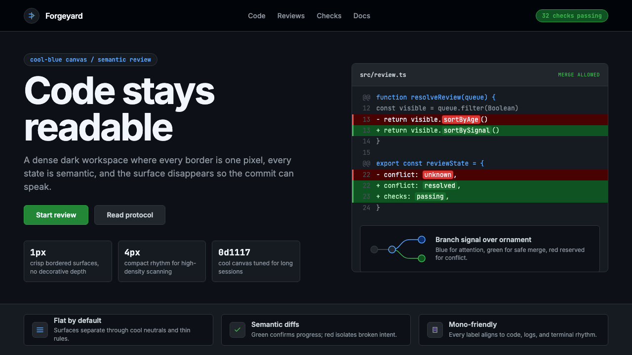 GitHub DarkCode-first darkness. Cool-blue canvas, 1px borders, green/red diff lines.代码优先的暗色:冷蓝画布、1px边框、绿红diff线。
 Linear 2024Precision down to the millisecond. Near-black, indigo-violet accents, Inter D…开发者工具美学的标杆:近乎纯黑、克制靛紫点缀、Inter Display 字体…
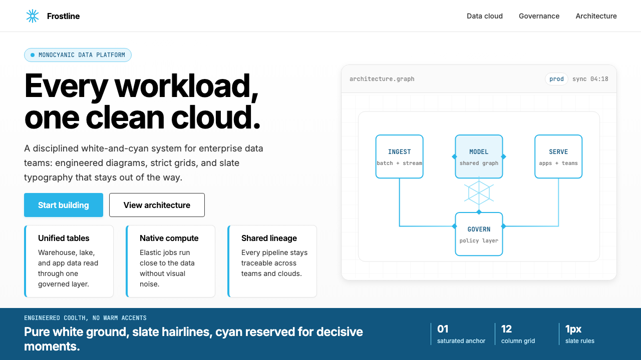 Snowflake Data CloudCool precision wins. Icy cyan, Inter grids, and hex data diagrams stay engine…冷峻精确取胜:冰蓝青、Inter 网格与六角数据图保持工程感。
 Glacier Arctic SurveyCold precision. Crevasse-blue panels, cyan readouts and contour grids calibra…冷峻精准:冰裂蓝面板、冰川青读数与等高网格校准每个数值。
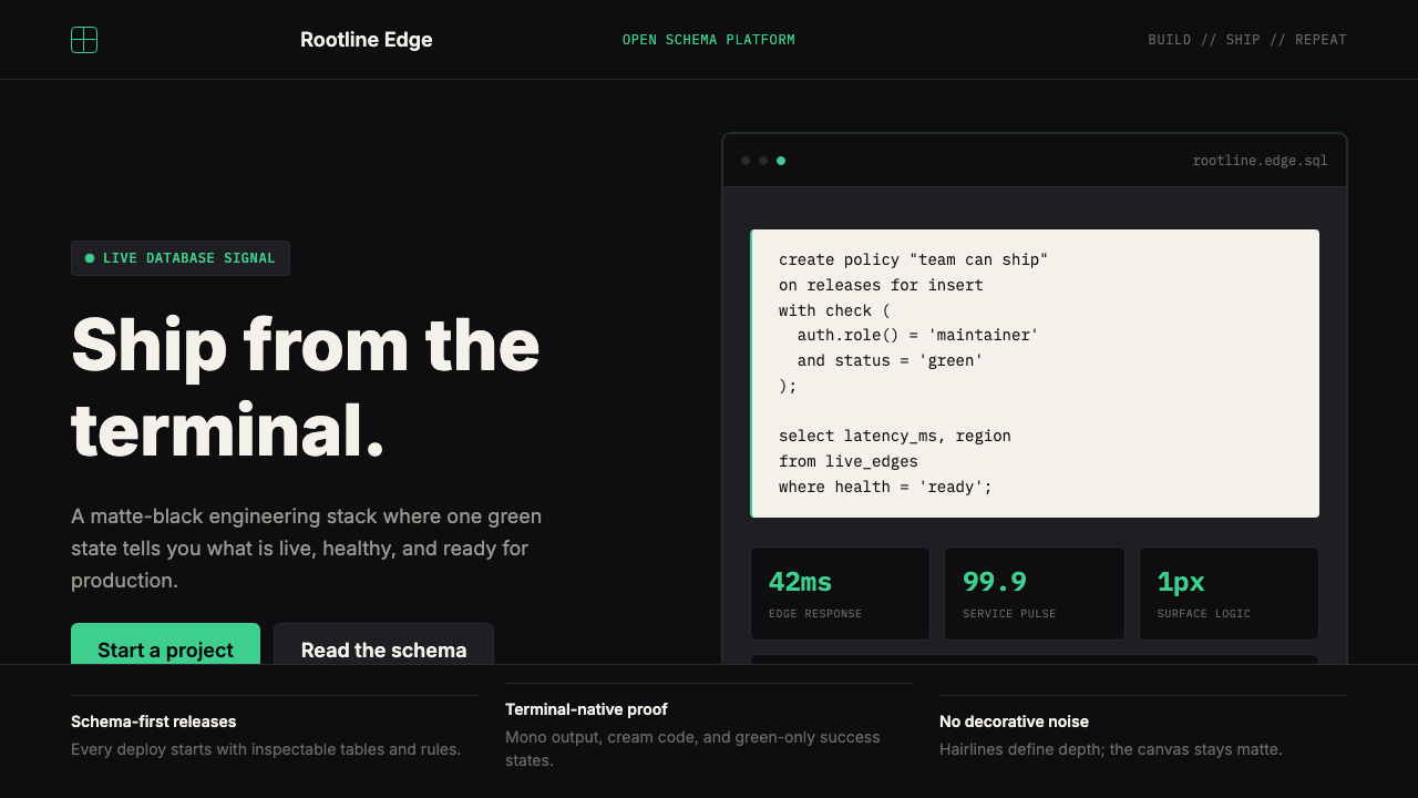 Supabase Postgres Green (2024)Midnight-terminal confidence. Matte black, Inter, mono code, and one electric…深夜终端般笃定:哑光黑、Inter、等宽代码与一抹电子绿。