What is Glacier Arctic Survey?
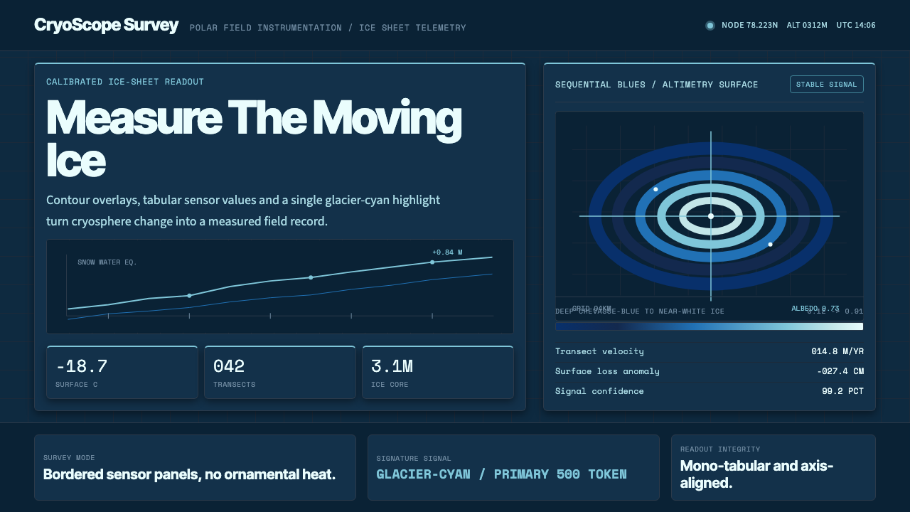
Glacier Arctic Survey renders an interface like a polar research instrument — dark ice-blue panels, cyan readouts, and contour-map precision standing in for warmth.
Glacier Arctic Survey in brief
Glacier Arctic Survey is a contemporary data-visualization aesthetic that borrows its entire visual vocabulary from polar field science: the deep, near-black blue of glacier ice as the working ground, a bright glacier-cyan reserved for instrument highlights, and the perceptually-uniform sequential blue ramps that agencies like NSIDC, NASA, and the IPCC use to chart sea ice extent and cryosphere change over time.
It reads as a climate-monitoring dashboard rather than a consumer product: contour-line overlays standing in for topographic data, hairline axis ticks, monospaced tabular readouts, and charts kept sparse and legible against dark sensor-panel backgrounds. There is no attempt at warmth or approachability — the aesthetic borrows its authority from scientific instrumentation, where every value on screen is implicitly a calibrated measurement rather than a decorative flourish.
The style belongs to a broader family of 'data-as-evidence' interfaces, in which restraint itself is the argument: a chart with no unnecessary color, no playful illustration, and no rounded, friendly framing reads as more trustworthy precisely because it looks like something a field scientist would actually use to track a receding ice shelf.
Where does Glacier Arctic Survey come from?
Unlike historical movements tied to a founder or a manifesto, Glacier Arctic Survey descends from a working discipline: scientific data visualization as it developed inside polar and climate research institutions from roughly 2010 onward, once satellite remote sensing made continuous, high-resolution monitoring of sea ice and glacier mass routine rather than exceptional.
Its color logic traces to a specific methodological reform. For decades, scientific charts defaulted to rainbow colormaps — the familiar red-to-violet spectrum — because they looked vivid and covered a wide visual range. Cartographer Cynthia Brewer's ColorBrewer project, begun in the late 1990s, demonstrated that rainbow ramps actually distort data: they are not perceptually uniform, meaning equal steps in the underlying number do not read as equal steps in color, and they mislead colorblind viewers and grayscale printouts alike. Brewer's sequential blue palettes, engineered so that lightness changes in strict proportion to data value, became the standard the cryosphere-science community adopted for mapping ice thickness, melt extent, and temperature anomaly.
Oceanographer and visualization researcher Kristen Thyng extended this work in the 2010s, building on perceptually-uniform color theory to produce colormap tools tailored to Earth-science data — further cementing sequential blues and related ramps as the default palette anywhere ice, ocean depth, or temperature needed to be mapped rather than merely illustrated. Institutions like the National Snow and Ice Data Center (NSIDC) then operationalized these palettes across their public sea-ice trackers and reports, giving the aesthetic its institutional, evidentiary weight.
By the 2020s, this scientific-monitoring look had migrated outward from research papers and agency dashboards into broader software design — any interface that wanted to signal 'this is measured, not decorated' could borrow the same dark ground, cyan instrument accent, and contour-line motif, regardless of whether the underlying data had anything to do with ice at all.
What defines the Glacier Arctic Survey look?
Color
The ground is a deep, saturated crevasse-blue that reads as almost black under normal viewing conditions — the shade of ice seen through a fissure, not the pale white of a glacier's surface. Glacier-cyan is reserved strictly for the things that matter: active readouts, live values, selected states, and instrument highlights. Beyond these two anchors, color is drawn exclusively from a sequential blue ramp — each additional hue a controlled step lighter or more saturated than the last, never a jump to an unrelated color family. There is no warm accent anywhere in the system; warmth would undercut the sense that everything on screen is a calibrated reading.
Typography
Two registers coexist without blending. Labels, headings, and any explanatory text use a clean, technical sans-serif chosen for legibility at small sizes rather than personality. Numeric readouts — the actual measurements — switch to a monospaced face, so that every digit occupies the same width and columns of numbers align into a tabular grid the eye can scan instantly. This monospace switch is the single clearest tell of the style: the moment a number appears, the typography itself announces that it is data, not prose.
Contour and Grid Motifs
Faint contour-line overlays — the kind used on topographic ice-sheet maps to show elevation or thickness bands — appear as ambient texture rather than functional data in most interface contexts, sitting quietly behind content at low opacity. Paired with this is a persistent hairline grid: thin, precise tick marks along chart axes and panel edges that reinforce the sense of a measuring instrument. Neither element is ever heavy-handed; both stay subordinate to the actual content, present as atmosphere rather than decoration.
Charts and Data Density
Charts are kept deliberately sparse: a single clear line or a restrained set of bars, generous surrounding space, and no chart-junk — no drop shadows on bars, no 3D tilt, no decorative fill patterns. Where multiple series must be shown, they are differentiated by position along the sequential blue ramp rather than by introducing unrelated hues, so a chart with five lines still reads as one coherent family of data rather than five competing colors.
Panels and Surfaces
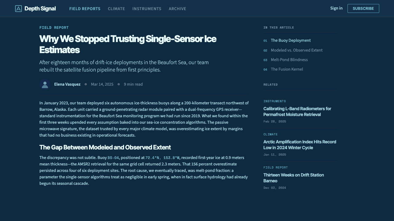
Content lives inside flat, rectangular panels with barely-there separation from the ground — a hairline border or a single shade of lightness distinguishing panel from backdrop, never a heavy card shadow. The effect resembles the housing of a physical instrument: sober, flush, built for function. Rounded corners, when present, are kept minimal rather than soft and friendly, preserving the sense of precision engineering over consumer comfort.
Iconography and Indicators
Icons and status indicators are geometric and diagrammatic — small triangular markers, crosshair-style pointers, simple line-drawn glyphs — echoing the symbology found on survey instruments and scientific plotting software rather than the rounded, friendly icon sets common to consumer apps. Status is communicated primarily through the sequential blue ramp itself: a value further along the ramp toward glacier-cyan reads as more active or more urgent, without needing an unrelated warning color to say so.
Restraint as Authority
The unifying discipline behind every element above is that nothing exists to be attractive; everything exists to be legible and trustworthy. Where a consumer product might add a gradient for visual richness or a playful accent color for brand personality, Glacier Arctic Survey refuses both, on the same logic that a seismograph or a satellite telemetry feed refuses them — decoration would compromise the reader's confidence that what they are looking at is real.
Who shaped Glacier Arctic Survey?
A cartographer whose ColorBrewer project, launched in the late 1990s, systematically demonstrated that the rainbow colormaps long defaulted to in scientific charting distort the data they claim to represent. Her perceptually-uniform sequential palettes — in which lightness steps track data value in strict proportion — became the methodological foundation that cryosphere and climate researchers adopted for mapping ice and temperature data, and they underpin the entire logic of this style's restricted blue ramp.
An oceanographer and scientific visualization researcher who extended perceptually-uniform color theory into tools built specifically for Earth-science data in the 2010s. Her work helped cement sequential blue and related ramps as the working default anywhere ice extent, ocean depth, or temperature anomaly needed to be charted for a research or public-facing audience, reinforcing color as measurement rather than decoration.
The US-based data center that operationalized perceptually-uniform colormaps across its public sea-ice extent trackers and reports, giving this visual language its institutional authority. NSIDC's charts — dark grounds, sequential blues, sparse annotation — are among the most widely seen public artifacts of cryosphere science, and they are the direct visual ancestor of this style's dashboard aesthetic.
How do you use Glacier Arctic Survey today?
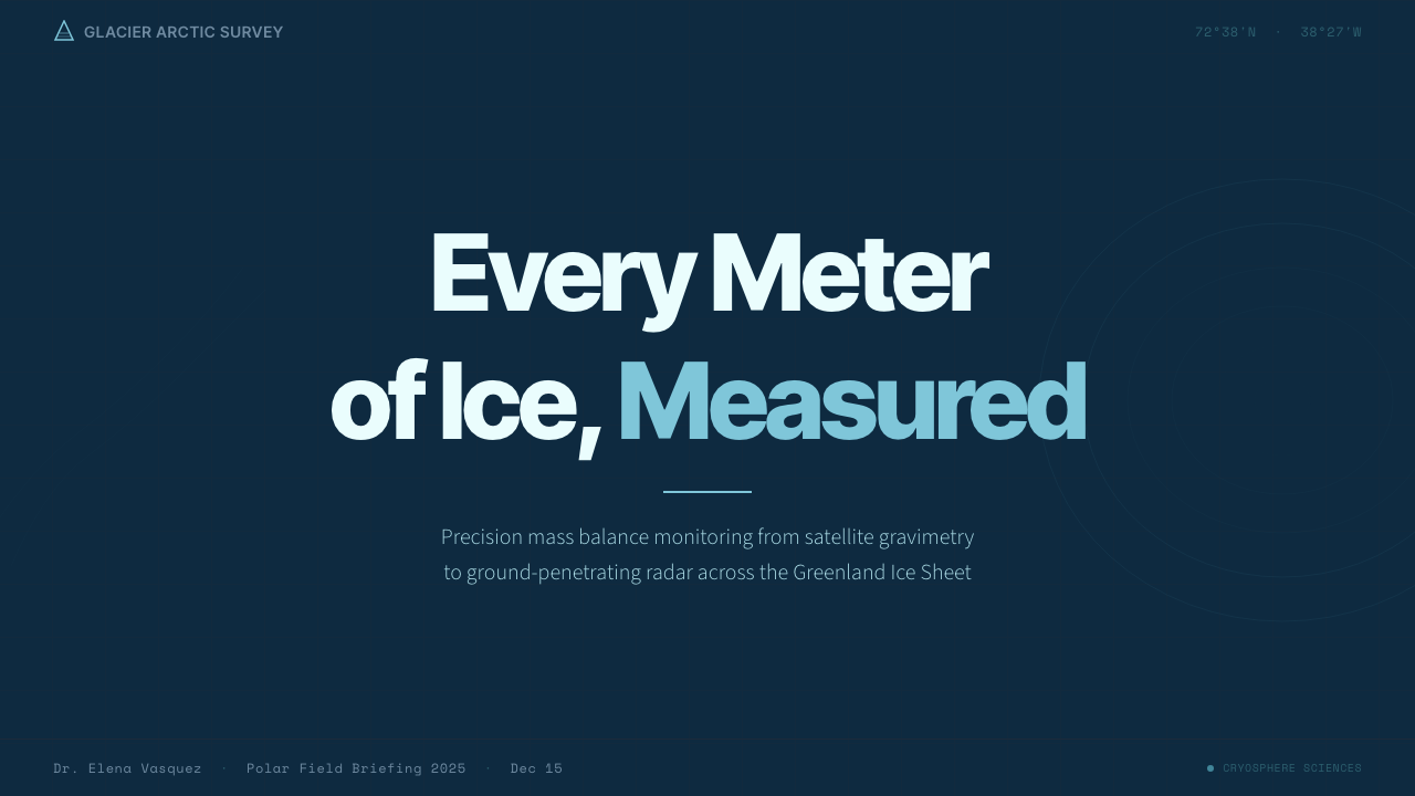
For presentation cover slides, the style works best when it commits fully to the dark crevasse-blue ground rather than treating it as an accent: a single large title in the clean technical sans-serif, a thin contour-line texture kept faint in the background, and one glacier-cyan detail — a rule, a small marker, a single highlighted word — as the only bright note on the slide. The effect should feel like the title screen of a research instrument, not a marketing poster.
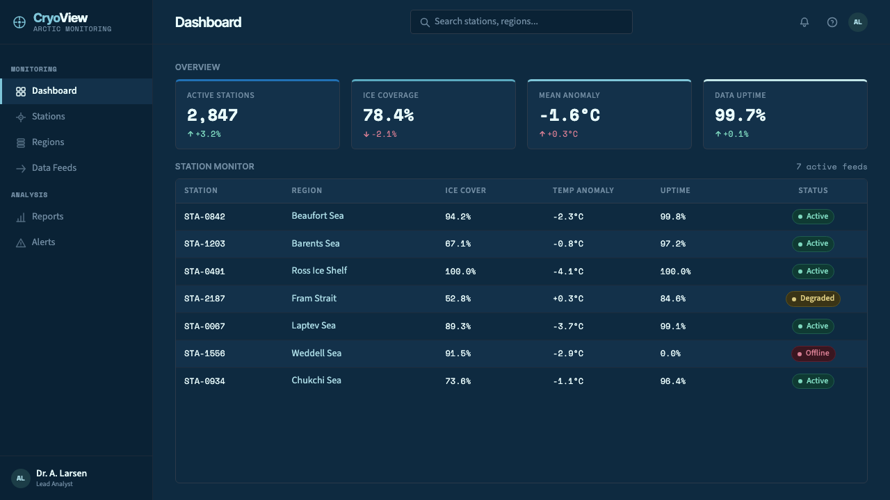
Content and data slides are where this style earns its keep. Body text stays in the technical sans-serif at a restrained size; any number that matters — a metric, a date, a measurement — switches into the monospaced face so it visually announces itself as data. Charts should stay sparse and use only the sequential blue ramp for multiple series, with glacier-cyan reserved for the one series or data point the slide is actually about. A hairline grid behind the chart reinforces the instrument-panel feel without competing with the data itself.
For web interfaces, this style is a natural fit for dashboards and monitoring products — anywhere a user needs to trust that a number on screen reflects a real, live measurement rather than a marketing estimate. Panels should sit flush against the dark ground with minimal separation, numeric fields throughout the interface should default to the monospaced face, and interactive or 'live' states should be the only elements permitted to use glacier-cyan at full brightness. On pricing pages, the same discipline can lend an unexpected sense of rigor: tiers differentiated by position on the blue ramp rather than by arbitrary accent colors read as more considered and less arbitrary.
In editorial and marketing contexts, the style suits any subject that benefits from a tone of scientific seriousness — climate reporting, technical journalism, research-backed product claims, sustainability disclosures. A feature article can use the contour-line motif as a section-break device and reserve monospaced numerals for any statistic quoted in the body text, signaling to the reader that the figure has been checked rather than estimated. Marketing pages for climate, energy, or scientific tooling products benefit especially, since the aesthetic itself does argumentative work: it says 'measured' before a single word of copy does.
The most common mistake is treating the palette as merely 'a dark blue theme' and reaching for arbitrary accent colors — a green for success states, an orange for warnings — the moment something needs to stand out. This breaks the system's core discipline: every accent in an authentic application of this style should come from further along the same sequential blue ramp, with glacier-cyan as the single ceiling value. A second mistake is over-decorating the contour-line and grid motifs until they compete with the actual data, when their entire function is to stay so quiet they are barely noticed — texture, not illustration.
Glacier Arctic Survey — FAQ
Is Glacier Arctic Survey the same as a generic 'dark mode' theme?
No. A generic dark mode simply inverts a light interface's lightness values while keeping arbitrary accent colors. Glacier Arctic Survey is far more restricted: it commits to a single deep crevasse-blue ground, permits color variation only along one sequential blue ramp, and reserves a single cyan as the sole bright accent. The discipline is the point — a dark interface with a rainbow of accent colors is not this style, no matter how dark its background is.
Why blue specifically, rather than white or gray for a 'scientific' look?
The blue is inherited directly from its subject matter — glacier ice genuinely reads as deep blue in cross-section, and the sequential blue colormaps used across cryosphere science were engineered specifically for mapping ice and cold-temperature data. A white or gray scientific interface would borrow generic 'clinical' associations, but it would not carry the specific evidentiary lineage this style trades on: the same blue ramps appear in NSIDC reports, IPCC figures, and satellite ice-extent maps, so the color itself functions as a citation to that body of work.
Can this style work for products that have nothing to do with climate or ice?
Yes, and this is in fact how the style is most often used today. Any product that wants to signal 'the numbers on this screen are measured, not marketed' — financial monitoring tools, infrastructure and server dashboards, scientific instrumentation software, research platforms — can borrow the aesthetic's authority without any literal connection to polar science. What must travel intact is the discipline: dark blue ground, one sequential ramp, one cyan ceiling, monospaced numerals for real data. Without that discipline, the borrowing is only surface-level and the trustworthy effect does not follow.
How does this style differ from other dark, data-dense dashboard aesthetics?
Many dark dashboard styles reach for saturated multi-color palettes — a green here, a red there, a purple for a third category — because they optimize for fast visual differentiation between categories. Glacier Arctic Survey optimizes for a different goal: conveying that the data itself is continuous and measured, which is why it restricts itself to one sequential ramp rather than a categorical palette. It is closer in spirit to a scientific instrument readout than to a general-purpose analytics dashboard, and it sacrifices some at-a-glance category differentiation in exchange for a stronger impression of calibrated precision.
Does the style require a dark background, or can it be adapted to a light one?
The dark crevasse-blue ground is close to essential — it is what makes the glacier-cyan and sequential blue ramp read as instrument light against a sensor panel rather than as ordinary chart colors on a page. A light adaptation is possible for print or editorial contexts that require a white background, but it should keep the same sequential-blue-only discipline and monospaced numerals; without the dark ground, the design leans more on typography and grid precision to carry the 'measured, not decorated' impression that color alone provides in the dark version.
Related design styles
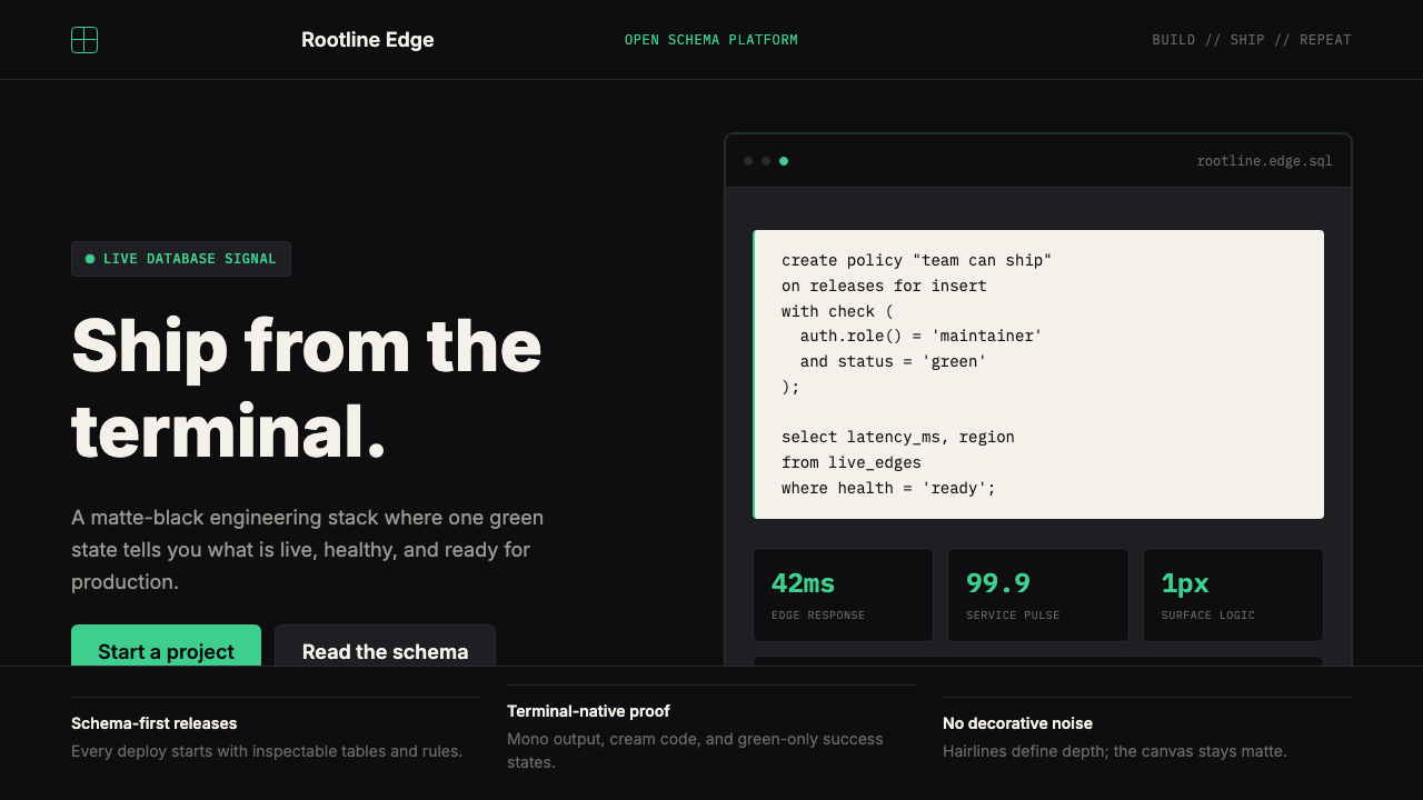 Supabase Postgres Green (2024)Midnight-terminal confidence. Matte black, Inter, mono code, and one electric…
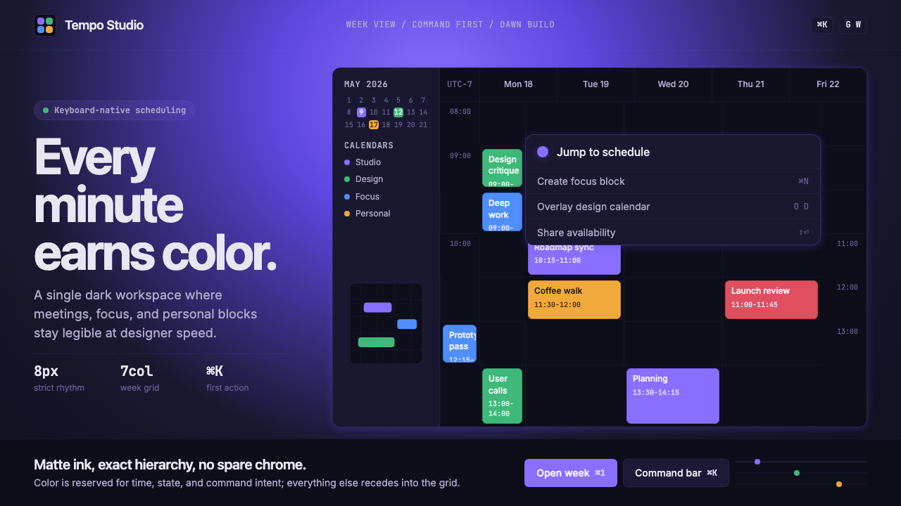 Cron CalendarDesigner-tech restraint. Purple wash, ink grid, mono shortcuts, surgical even…
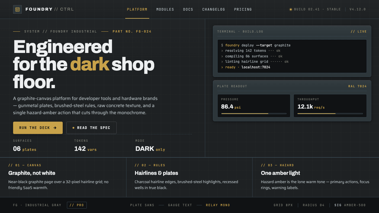 Foundry Industrial GrayBuilt for the dark shop floor. Graphite canvas, hairline plates, mono labels,…
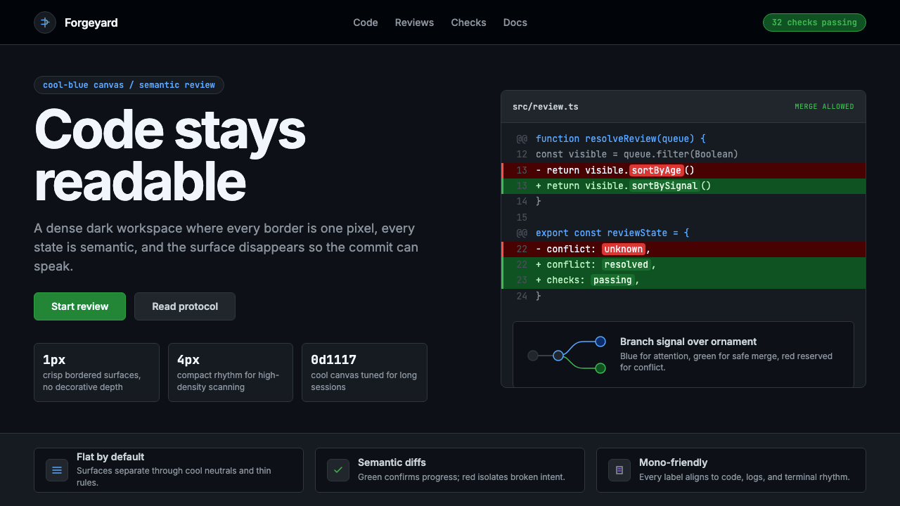 GitHub DarkCode-first darkness. Cool-blue canvas, 1px borders, green/red diff lines.
 Linear 2024Precision down to the millisecond. Near-black, indigo-violet accents, Inter D…
 Snowflake Data CloudCool precision wins. Icy cyan, Inter grids, and hex data diagrams stay engine…