What is Snowflake Data Cloud?什么是 Snowflake Data Cloud?
Snowflake built an enterprise data cloud on a single icy cyan and the discipline never to use a second saturated color.Snowflake 用一抹冰蓝青和永不引入第二种饱和色的自律,搭建起一座企业数据云的视觉王国。
Snowflake Data Cloud in briefSnowflake Data Cloud 速览
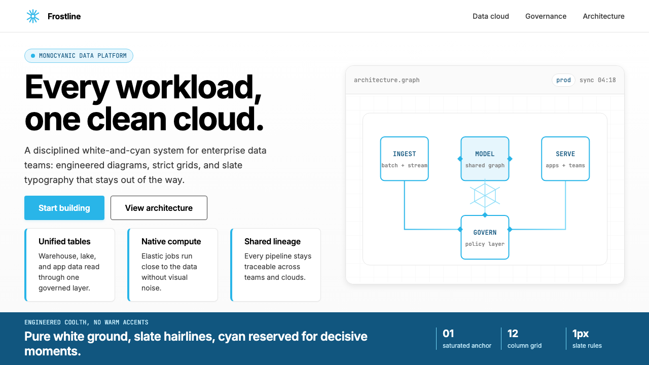
The Snowflake Data Cloud visual system is a study in deliberate restraint. Where most enterprise software brands rely on a palette of competing accent colors, Snowflake commits entirely to a single saturated brand anchor — a cool, luminous cyan — and pairs it with pure white grounds, near-black slate text, and the geometric hexagonal snowflake mark that appears on every surface. The result is not minimalism for its own sake, but a precisely engineered visual language designed to communicate reliability, precision, and scale.Snowflake 数据云的视觉系统是一场经过深思熟虑的克制练习。在大多数企业软件品牌依赖一组竞争性强调色的背景下,Snowflake 只忠于一个饱和的品牌锚点——冷峻、明亮的青色——并将其与纯白底面、接近黑色的深板岩灰文字,以及无处不在的几何六角雪花标志相配合。其结果不是为克制而克制的极简主义,而是一套专门为传达可靠性、精确感与规模感而精心工程化的视觉语言。
The aesthetic rejects warmth. There is no cream, no off-white, no ambient gradient, no illustrative mascot. The visual system is grounded in generous whitespace, thin structural hairlines, and a strict modernist sans-serif that keeps reading effortless at every scale. Abstract data-architecture diagrams — stylized hexagonal node-and-edge networks — replace stock photography throughout marketing and documentation, reinforcing the sense that this is a brand built by engineers for engineers.这套美学拒绝温度。没有奶油色,没有米白,没有环境渐变,没有说明性吉祥物。视觉系统建立在充裕的留白、细如发丝的结构线、以及一种严格的现代主义无衬线字体之上,使阅读在任何尺度下都毫不费力。抽象的数据架构示意图——风格化的六角节点与连线网络——取代了整个营销与文档体系中的摄影素材,不断强化这样一个信号:这是一个由工程师为工程师构建的品牌。
What distinguishes the Snowflake style from generic tech minimalism is its commitment to geometric identity. The snowflake mark is not merely a logo; it is a repeating motif that propagates into diagrams, grid patterns, and decorative dividers. The hexagonal grid becomes the connective tissue of the brand, evoking the crystalline structure of ice while simultaneously referencing the distributed-node topology of cloud data infrastructure. Cold precision and technical credibility are the constant messages.将 Snowflake 风格与泛化的科技极简主义区别开来的,是它对几何身份的彻底贯彻。雪花标志不仅仅是一个商标;它是一个不断繁殖的视觉母题,蔓延进示意图、网格图案与装饰性分割元素之中。六角网格成为品牌的结缔组织——既唤起冰晶的结构美感,又同时指涉云数据基础设施的分布式节点拓扑。冷峻精确与技术可信度,是这套语言永恒的双重叙事。
See the Snowflake Data Cloud design system查看 Snowflake Data Cloud 完整设计系统
Where does Snowflake Data Cloud come from?Snowflake Data Cloud 从何而来?
Snowflake was founded in 2012 in Bozeman, Montana — an unlikely birthplace for a technology company that would eventually become one of the most valuable cloud platforms in history. Three data warehousing veterans, Benoit Dageville, Thierry Cruanes, and Marcin Zukowski, conceived a cloud-native architecture that separated compute from storage at a time when on-premise data warehouses still dominated enterprise infrastructure. The company operated in stealth for two years before emerging to a market increasingly ready for a cloud-first approach to data.Snowflake 于2012年创立于美国蒙大拿州博兹曼——对于一家日后将成为历史上最具价值云平台之一的科技公司而言,这是一个出人意料的出生地。三位数据仓库领域的老兵——Benoit Dageville、Thierry Cruanes 与 Marcin Zukowski——在本地部署数据仓库仍然主导企业基础设施的年代,构想出一种将计算与存储彻底分离的云原生架构。公司在隐秘模式下运作了两年,才浮出水面,迎接一个正日益为云优先数据方案所准备的市场。
The visual identity that would become globally recognized crystallized alongside the company's growth into a platform business. By the time Frank Slootman joined as CEO in 2019, Snowflake was preparing for what would become the largest software IPO in history when it went public in September 2020, raising nearly four billion dollars on its first day of trading. The visual language needed to communicate not merely a product, but an ecosystem — the Data Cloud — a shared infrastructure where organizations could exchange and monetize data across company boundaries. The brand had to feel at once technically authoritative and categorically new.这套日后举世瞩目的视觉身份,随公司向平台商业模式的演进而逐渐成型。2019年 Frank Slootman 出任 CEO 时,Snowflake 正在筹备一场历史性的资本事件——2020年9月,公司完成了软件史上规模最大的 IPO,首日交易筹集近四十亿美元。视觉语言需要传达的不仅是一款产品,而是一个生态系统——数据云(Data Cloud)——一套允许组织跨越公司边界交换和变现数据的共享基础设施。品牌必须同时散发技术权威感与品类颠覆感。
The current visual system, refined through approximately 2022 to 2024, reflects the shift from a data warehouse product to a multi-cloud data platform. The geometric snowflake mark, the monochromatic cyan palette, and the hexagonal data diagram language all emerged from a brand identity effort designed to signal architectural elegance and engineering rigor. The choice of cyan as the sole saturated color was deliberate: unlike the warmer blues common in enterprise software, cyan reads cold, precise, and digital — closer to the color of a data center's LED indicators than to the reassuring blues of legacy IT brands.约在2022至2024年间逐步精炼的当前视觉系统,反映了从数据仓库产品向多云数据平台的身份转变。几何雪花标志、单色调青色色板、六角形数据图解语言,均脱胎于一次旨在传达架构优雅与工程严谨的品牌识别建构。选择青色作为唯一饱和色是经过深思的:与企业软件中常见的偏暖蓝色不同,青色读来冷峻、精确、数字感十足——更接近数据中心 LED 指示灯的色调,而非传统 IT 品牌那种令人安心的蓝色。
The surrounding landscape of cloud data competitors shaped the identity by contrast. Amazon Web Services anchors on orange; Google Cloud uses a multicolored primary palette; Microsoft Azure deploys a range of blues; Databricks built around a high-energy red. Snowflake's decision to occupy the cool, restrained end of the spectrum — a single engineered cyan against fields of white — established a visual territory that no other major data platform had claimed. In a category defined by complexity, Snowflake made visual simplicity its competitive differentiator.云数据竞争者的环境格局,以对比的方式塑造了这一身份的定位。AWS 以橙色为锚,Google Cloud 使用多彩的主色调,Microsoft Azure 部署一系列蓝色,Databricks 围绕高能量的红色建构品牌。Snowflake 选择占据色谱的冷峻、克制一端——纯白底面上一抹经过工程化的青色——标定了其他任何主要数据平台都未曾占领的视觉领地。在一个以复杂性为定义的品类中,Snowflake 将视觉的简洁变成了竞争优势。
What defines the Snowflake Data Cloud look?Snowflake Data Cloud 的视觉特征是什么?
Monochromatic Cyan Accent单色青色强调
The entire system operates from a single saturated color: a cool, luminous cyan that functions as brand anchor, interactive indicator, and compositional focal point simultaneously. Every other element — backgrounds, body text, structural lines, diagrams — exists in achromatic territory. This discipline creates an immediate hierarchy: wherever cyan appears, the eye goes first. The restraint is total; no second saturated hue is permitted to compete.整套系统从单一饱和色出发运作:一种冷峻、明亮的青色,同时承担品牌锚点、交互指示符与构图焦点三重职能。其余所有元素——背景、正文、结构线、示意图——均存在于无彩色领域。这种自律创造出即时的视觉层级:青色出现之处,视线必然首先抵达。克制是彻底的;不允许任何第二种饱和色参与竞争。
Geometric Snowflake Identity几何雪花身份
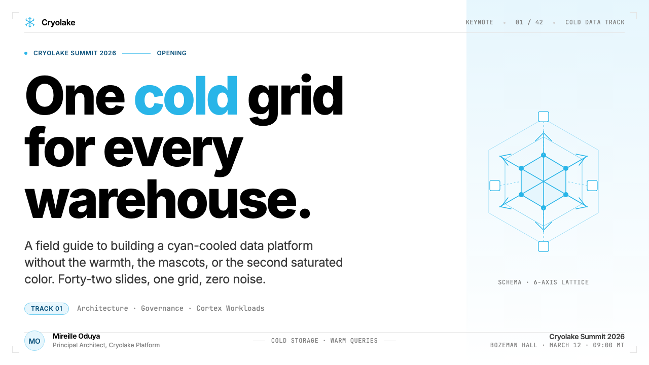
The hexagonal snowflake mark functions as more than a logo — it is a generative visual grammar. The six-sided symmetry propagates outward into data diagrams, grid overlays, decorative dividers, and background textures. This self-similar repetition ties every designed surface back to the same crystalline geometry, giving the brand a coherence that persists across formats and scales without requiring the literal mark to appear on every element.六角雪花标志的作用远不止于商标——它是一套生成性视觉语法。六边形对称性向外蔓延,进入数据图解、网格叠加、装饰性分割与背景纹理之中。这种自相似的重复将每一个被设计的表面都联结回同一套晶体几何,赋予品牌一种跨越格式与尺度持续存在的整体性,而无需在每个元素上都印上字面意义上的标志。
Pure White Grounds and Generous Whitespace纯白底面与充裕留白
The default background is pure white — not ivory, not warm off-white, not gray. This coldness is intentional: it amplifies the luminosity of the cyan accent and sharpens the contrast of slate-toned text. Layouts commit to generous whitespace, treating empty space not as something to fill but as a structural element that isolates and elevates each piece of content. The cumulative effect is an impression of clarity and engineered precision.默认背景是纯白——不是象牙色,不是温暖的米白,不是灰色。这种冷调是有意为之:它放大了青色强调的发光质感,并使深板岩灰文字的对比度更加锐利。版面致力于充裕的留白,将空白空间不视为需要填充之物,而是一种隔离并提升每段内容的结构元素。累积的效果是一种清晰感与工程化精确感的印象。
Abstract Data-Architecture Diagrams抽象数据架构示意图
Photography is systematically displaced by a proprietary diagram language: stylized node-and-edge networks, hexagonal cluster maps, and abstract flow charts rendered in the brand's achromatic palette with cyan highlights on active nodes or critical paths. These illustrations serve as both technical explanation and brand expression, reinforcing the sense that the company's product is architecture — invisible, distributed, and geometrically elegant — rather than any single tangible artifact.摄影被一套专有的图解语言系统性地取代:风格化的节点与连线网络、六角簇群地图、以及用品牌无彩色调渲染的抽象流程图——活跃节点或关键路径以青色高亮标出。这些插图同时服务于技术解释与品牌表达,不断强化这样一种感知:公司的产品是架构本身——无形的、分布式的、几何上优雅的——而非任何单一的有形物件。
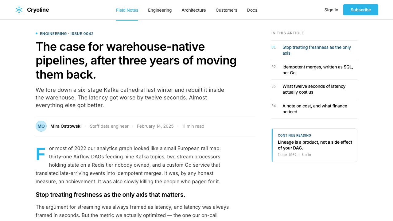
Strict Modernist Typography严格的现代主义字体排印
The typographic system rests on a single geometric sans-serif family deployed across all weights and sizes, with no decorative alternatives introduced for headlines or pull-quotes. Hierarchy is established through scale and weight contrast alone. Type is set with comfortable reading measure on a generous leading, giving dense technical content room to breathe. The overall effect is clinical and precise — perfectly matched to an audience of data engineers and enterprise architects.字体排印系统依托单一几何无衬线字体家族,以所有字重和尺寸跨全面部署,标题或引用文字中不引入任何装饰性替代方案。层级仅通过尺度与字重对比建立。正文以舒适的行宽和充裕的行高排版,给密集的技术内容以呼吸空间。整体效果是临床般的精确——与数据工程师和企业架构师的受众群体完美匹配。
Hairline Grid Structure发丝般的网格结构
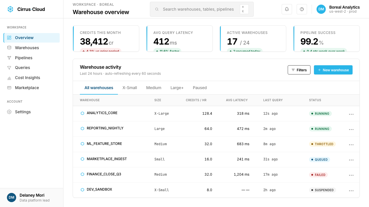
Layouts are organized by a visible but unobtrusive grid of thin slate-colored lines that divide space into columns, rows, and data cells without competing with content. These structural hairlines — used in data tables, pricing grids, and dashboard interfaces — serve the same function as the thin lines in a ledger or circuit diagram: they organize information spatially while signaling the systematic, rule-governed nature of the underlying data. The grid is never hidden and never apologized for.版面由一套纤细的深板岩灰色线条组成的可见但不突兀的网格所组织,将空间划分为列、行与数据单元格,而不与内容竞争。这些结构性发丝线——用于数据表格、定价网格与仪表板界面——与账本或电路图中的细线功能相同:它们在空间上组织信息,同时传递出底层数据系统化、规则驱动的本质。网格从不隐藏,也不需要为其存在道歉。
Engineered Flatness工程化的平面性
Shadows, where they exist, are subtle and functional — used to establish card elevation or interactive depth — rather than decorative or naturalistic. Gradients are limited to contained, purposeful applications such as loading states or subtle background washes, never applied as general visual enrichment. Illustrations are flat-rendered. The overall surface is not austere; it is meticulous. Every depth cue is a decision, not a default.投影在存在时是微妙而功能性的——用于建立卡片的层叠关系或交互深度——而非装饰性或自然主义的。渐变仅限于加载状态或微妙背景晕染等有节制的、有目的的应用,从不作为通用的视觉丰富手段。插图以平面方式渲染。整体表面不是苦涩的简朴;它是一丝不苟的。每一个深度提示都是一个决定,而非一个默认值。
See the Snowflake Data Cloud design system查看 Snowflake Data Cloud 完整设计系统
Who shaped Snowflake Data Cloud?谁塑造了 Snowflake Data Cloud?
Dageville, formerly a principal engineer and architect at Oracle, co-founded Snowflake with the technical conviction that a cloud-native architecture separating compute from storage could outperform anything built on legacy on-premise assumptions. His engineering philosophy — that the data platform should be invisible infrastructure, not a product users wrestle with — directly shaped the brand's visual emphasis on clarity, precision, and the absence of friction. The aesthetic language of engineered simplicity mirrors the architectural principles he embedded in the platform itself.Dageville 曾任 Oracle 首席工程师与架构师,他以一种技术信念共同创立了 Snowflake:将计算与存储分离的云原生架构,能够超越一切建立在遗留本地部署假设之上的方案。他的工程哲学——数据平台应当是无形的基础设施,而非用户需要与之搏斗的产品——直接塑造了品牌在清晰、精确与无摩擦感上的视觉强调。工程化简洁的美学语言,映照着他嵌入平台本身的架构原则。
Cruanes, also an Oracle veteran, brought deep expertise in database engine design and query optimization to Snowflake's founding team. His focus on the mathematical underpinnings of data processing — the relationship between parallelism, partitioning, and performance — is reflected in the brand's affinity for grid structures, node-and-edge diagrams, and the visual language of distributed systems. The hexagonal cluster diagrams prominent in Snowflake's marketing materials are, in a sense, visualizations of the architectural problems he spent his career solving.同样来自 Oracle 的 Cruanes,为 Snowflake 创始团队带来了深厚的数据库引擎设计与查询优化专长。他对数据处理数学基础的专注——并行性、分区与性能之间的关系——在品牌对网格结构、节点连线图以及分布式系统视觉语言的偏好中有所映射。Snowflake 营销材料中突出的六角簇群图解,在某种意义上,正是他毕生致力于解决的架构问题的可视化呈现。
Zukowski brought the research perspective of a database academic — his doctoral work at CWI Amsterdam on vectorized query execution influenced the design of analytical database engines across the industry. His presence on the founding team gave Snowflake intellectual credibility in academic and research circles, and this positioning as a rigorously principled engineering endeavor rather than a pure commercial venture is part of what the visual language communicates. The brand reads like peer-reviewed work: structured, cited, reproducible.Zukowski 带来了数据库学者的研究视角——他在阿姆斯特丹 CWI 关于向量化查询执行的博士研究影响了整个行业的分析型数据库引擎设计。他在创始团队中的存在赋予了 Snowflake 在学术与研究圈的智识可信度,而这种将自身定位为严格工程事业而非纯粹商业风险投资的取向,正是视觉语言所传达内容的一部分。这个品牌读来像同行评审的论文:结构化、有据可查、可复现。
Slootman joined as CEO in 2019, bringing the operational intensity and enterprise sales discipline he had previously applied at ServiceNow and Data Domain. Under his leadership, Snowflake executed the largest software IPO in history in 2020 and expanded the brand's positioning from data warehouse to Data Cloud — a much larger category claim. The visual system's shift toward ecosystem-scale diagrams and its emphasis on network and connectivity imagery reflects the brand narrative Slootman drove: Snowflake is not a product you buy, but infrastructure you plug into.Slootman 于2019年加入担任 CEO,带来他此前在 ServiceNow 和 Data Domain 所施展的运营强度与企业销售纪律。在他的领导下,Snowflake 于2020年完成了软件史上最大规模的 IPO,并将品牌定位从数据仓库扩展至数据云(Data Cloud)——一个更宏大的品类主张。视觉系统向生态系统规模图解的转变,以及对网络与连接性图像的强调,映照着 Slootman 所推动的品牌叙事:Snowflake 不是你购买的产品,而是你接入的基础设施。
How do you use Snowflake Data Cloud today?今天怎么用 Snowflake Data Cloud?
The Snowflake Data Cloud visual system transfers well to any context where cold authority, technical precision, and enterprise credibility are the desired emotional register. The key to applying it correctly is understanding that the system's power comes from discipline, not decoration: a single saturated color, geometric consistency, pure white grounds, and the willingness to let whitespace carry as much weight as content. Mimicking the aesthetic without respecting the restraint produces something that looks neither tech-polished nor intentionally designed.Snowflake 数据云视觉系统适用于任何以冷峻权威感、技术精确性与企业可信度为期望情感基调的语境。正确应用它的关键在于理解这套系统的力量来自自律,而非装饰:单一饱和色、几何一致性、纯白底面,以及让留白与内容承担同等重量的意愿。在不尊重克制的前提下模仿美学,会产出一种既不像科技精品、也不像刻意设计的东西。
For presentation slides, the style suits both cover and content pages in distinct ways. A cover slide benefits from a bold geometric composition: the snowflake motif or a hexagonal grid element in the brand cyan anchors one quadrant while the title sits in high-contrast type against a pure white or deep slate background. Avoid centering everything — the asymmetric, grid-anchored layout is part of the visual identity. Content slides should be treated as data surfaces: one or two text hierarchies defined purely by size and weight, no decorative dividers, and any charts or diagrams rendered as clean flat objects in the achromatic palette with cyan reserved for the most critical data series or call-to-action annotations. Data slides — pipeline architecture overviews, query performance comparisons, cluster topology maps — are where the style is most at home: use node-and-edge diagrams with thin hairline connectors and hexagonal node shapes, keeping the color logic consistent throughout.在演示文稿中,这种风格以不同方式适用于封面页与内容页。封面页适合大胆的几何构图:品牌青色的雪花母题或六角网格元素锚定某个象限,标题以高对比度字体置于纯白或深板岩灰底面上。避免居中对齐一切——非对称的网格锚定布局是视觉身份的一部分。内容页应被当作数据表面处理:仅以尺寸和字重定义一至两级文字层级,无装饰性分割线,图表以无彩色调渲染为干净的平面对象,青色保留给最关键的数据系列或行动号召标注。数据页——管道架构概览、查询性能对比、集群拓扑图——是这种风格最如鱼得水之处:使用带细发丝连线与六角节点形态的节点图,在整个页面中保持一致的色彩逻辑。
For web interfaces, the system is especially well-matched to dashboards, data catalog pages, and pricing tables where hierarchy and scannability are primary concerns. Establish a strict column grid; keep backgrounds pure white; use near-black for all body text and label copy; reserve the brand cyan exclusively for active states, selected items, primary buttons, and data highlights. Card components should have minimal shadow depth — just enough to establish layer separation — rather than the deep atmospheric shadows common in softer consumer interfaces. Navigation should be type-driven, with no icon decoration beyond clean geometric indicators. Data tables benefit from the thin slate-line grid structure, which makes dense rows of figures legible without visual noise.对于网页界面,这套系统尤其适合层级性与可扫描性是首要关切的仪表板、数据目录页与定价表格。建立严格的列网格;背景保持纯白;近黑色用于所有正文与标签文案;品牌青色专属保留给活跃状态、选中项、主要按钮与数据高亮。卡片组件应当只有最小化的投影深度——仅够建立层叠分隔——而非软性消费界面中常见的深层大气投影。导航应由字体主导,除简洁几何指示符外无图标装饰。数据表格受益于细板岩色线条网格结构,使密集的数字行在不产生视觉噪音的前提下保持可读。
For editorial and marketing applications, the style supports a poster-like boldness that works well in conference materials, industry reports, and demand-generation campaigns. Full-width feature sections can alternate between a pure white ground with cyan accents and an inverted deep slate ground with white type and cyan highlights — this creates visual rhythm without introducing any new colors. Section headers benefit from the typographic scale contrast the style endorses: large, weight-forward headers against tight body copy. Infographics and data visualizations should follow the diagram language: flat rendering, hexagonal or circular node shapes, thin connectors, and a consistent rule that cyan marks the most important element in any given graphic.对于编辑与营销应用,这种风格支持一种海报式的大胆感,在会议材料、行业报告与需求生成活动中表现出色。全宽特性区块可在纯白底面加青色强调与反转深板岩底面加白色文字及青色高亮之间交替——这在不引入任何新色彩的前提下创造视觉节奏。节标题受益于这种风格所认可的字体尺度对比:大号、字重突出的标题与紧凑的正文形成呼应。信息图与数据可视化应遵循图解语言:平面渲染、六角形或圆形节点形态、细连线,以及青色标注任何图形中最重要元素的一致规则。
A common mistake when applying this style is importing color habits from other enterprise tech brands. The temptation to add a warm amber for warnings, a green for success states, or a purple for premium tiers must be resisted — each addition dilutes the identity and undermines the authority that comes from visual commitment to a single accent. If a second color is genuinely necessary for a semantic purpose such as error states, use a muted, desaturated variant so it reads as utilitarian rather than expressive. Similarly, resist the urge to warm the backgrounds or introduce textural gradients for visual richness: the coldness and flatness are not limitations, they are the message.应用这种风格时最常见的错误,是从其他企业科技品牌引入配色习惯。想要为警告添加暖琥珀色、为成功状态添加绿色、为高级层级添加紫色的冲动必须被克制——每一次添加都会稀释身份,并削弱来自对单一强调色视觉承诺的权威感。如果第二种颜色确实因语义目的(如错误状态)而必要,请使用低饱和度的暗淡变体,使其读来是功能性的而非表达性的。同样,克制将背景暖化或引入纹理渐变以增加视觉丰富性的冲动:冷调与平面性不是局限,它们就是信息本身。
See the Snowflake Data Cloud design system查看 Snowflake Data Cloud 完整设计系统
Snowflake Data Cloud — FAQSnowflake Data Cloud · 常见问题
Can the Snowflake style work on dark backgrounds?Snowflake 风格能在深色背景上使用吗?
Yes, and it is one of the style's more natural inversions. A deep slate or near-black background with white type and cyan accents reads as a night-mode extension of the same logic rather than a departure from it. The key is maintaining the same discipline: cyan remains the only saturated color, whitespace is preserved, and the hexagonal diagram language carries through unchanged. Avoid adding warm tones — the temptation to soften a dark layout with amber or gold accents works against the cold precision that defines the identity. A well-executed dark variant should feel like switching a data terminal to night mode, not like a different brand.可以,而且这是这种风格最自然的反转变体之一。深板岩灰或近黑色底面配白色文字和青色强调,读来像是同一逻辑的夜间模式延伸,而非背离。关键是保持同等的自律:青色仍然是唯一的饱和色,留白被保留,六角图解语言原封不动地延续。避免引入暖色调——用琥珀色或金色强调色来软化深色版面的冲动,与定义这一身份的冷峻精确背道而驰。执行良好的深色变体,应当像把数据终端切换到夜间模式,而不是像一个不同的品牌。
How should data visualizations be colored in this style?在这种风格中,数据可视化应该如何配色?
The preferred approach is to use the brand cyan as the primary data series color, with secondary series rendered in stepped lightness values of the same hue or in muted slate tones, so that the overall chart reads as achromatic with cyan emphasis rather than as a multicolored graphic. For categorical data with more than two or three series, resist the temptation to introduce arbitrary accent colors; instead, use varying opacity levels of the cyan or systematic gray steps. Reserve any saturated color departure — such as a muted red for an alert threshold line — for strictly semantic purposes, and ensure it appears only once across the entire visualization.推荐的做法是将品牌青色作为主要数据系列颜色,次要系列以同一色相的递进明度值或暗淡的板岩灰调渲染,使整个图表读来像是带青色强调的无彩色图形,而非多彩图形。对于超过两三个系列的分类数据,克制引入任意强调色的冲动;转而使用青色的递进不透明度或系统化的灰度步级。将任何饱和色的偏离——例如警报阈值线使用暗淡红色——保留给严格的语义目的,并确保它在整个可视化中只出现一次。
Is this style appropriate for consumer-facing products, or only enterprise?这种风格适合面向消费者的产品,还是仅限于企业级?
The Snowflake style is architected for enterprise and technical audiences, and it carries unmistakable signals of that positioning: cold color temperature, geometric abstraction, information density, and the absence of warmth or playfulness. Applied to consumer products — especially in categories involving food, wellness, children, or personal finance — the coldness reads as clinical or even uninviting rather than prestigious. The style works well in any context where the user's mental model is professional and analytical: developer tools, analytics platforms, infrastructure dashboards, financial data terminals, and B2B SaaS products. For consumer contexts, consider whether the target user wants to feel informed and in control (compatible with the style) or relaxed and welcomed (incompatible).Snowflake 风格是为企业与技术受众而构建的,并传递出鲜明的定位信号:冷色温、几何抽象、信息密度,以及温度感与趣味性的缺席。应用于消费者产品——尤其是涉及食品、健康、儿童或个人理财的品类——时,冷调会被读解为临床感甚至令人望而生畏,而非高端感。这种风格在用户心智模型是职业化和分析性的任何语境中都表现良好:开发者工具、分析平台、基础设施仪表板、金融数据终端,以及 B2B SaaS 产品。对于消费者语境,请考虑目标用户是想感到信息充分且掌控自如(与风格相容)还是放松且受到欢迎(与风格不相容)。
What is the difference between using this style and generic tech minimalism?使用这种风格与泛化的科技极简主义有什么区别?
Generic tech minimalism typically means white backgrounds, system sans-serif type, and reduced visual clutter — it is a default, not a design system. The Snowflake style is a specific, principled identity with three distinguishing commitments: a single saturated brand anchor color that cannot be augmented, a geometric motif (the hexagonal snowflake) that must propagate consistently through diagrams and decorative elements, and a preference for abstract data-architecture illustration over photography or friendly illustration. Generic minimalism can apply to almost any product; the Snowflake style communicates a specific worldview — engineered, distributed, data-centric — that only fits contexts where that worldview is authentic.泛化的科技极简主义通常意味着白色背景、系统无衬线字体和减少视觉杂乱——它是一种默认状态,而非设计系统。Snowflake 风格是一套具体的、有原则的身份,有三项区分性承诺:一个不可补充的单一饱和品牌锚点色;一个必须在图解和装饰元素中一致传播的几何母题(六角雪花);以及偏好抽象数据架构插图而非摄影或亲切插画。泛化极简主义几乎可以适用于任何产品;Snowflake 风格传达的是一种具体的世界观——工程化的、分布式的、以数据为中心的——只适合这种世界观真实存在的语境。
How does this style handle human imagery and illustration?这种风格如何处理人物图像和插画?
The canonical approach is to avoid representational human photography entirely in product and marketing contexts, substituting abstract data-architecture diagrams. When people must appear — in case study photography, event marketing, or human-interest editorial — the photographic treatment should match the brand's cold precision: high contrast, neutral or cool color grading, professional context, and integration into the layout as flat-cropped elements rather than expressive focal points. Illustration should always be geometric and diagrammatic rather than organic or character-driven. Any figurative element in the Snowflake style is a data point with a human attached, not a story told through a face.在产品与营销语境中,规范做法是完全回避具象的人物摄影,以抽象的数据架构图解取而代之。当人物必须出现时——在案例研究摄影、活动营销或人文编辑内容中——摄影处理应与品牌的冷峻精确相匹配:高对比度、中性或冷色调的色彩处理、职业化语境,以及作为平面裁剪元素而非表达性焦点整合进版面。插画应始终是几何和图解式的,而非有机的或角色驱动的。在 Snowflake 风格中,任何具象元素都是一个附带了人的数据点,而不是一张脸讲述的故事。
Related design styles相关设计风格
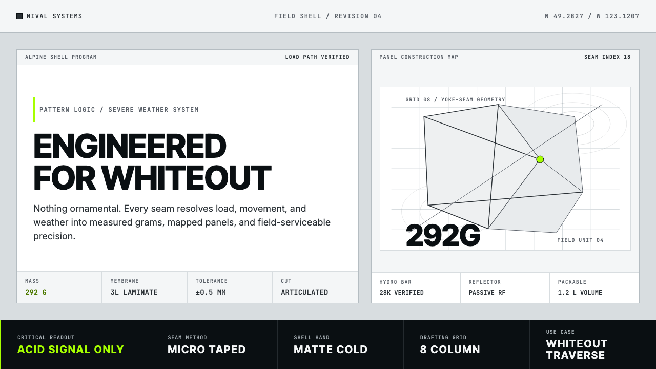 Arc'teryx Technical OutdoorEngineered, never ornamental. Glacier silver grid, mono specs, one acid-green…只讲工程,不作装饰。冰川银网格、等宽规格与一处酸绿信号。
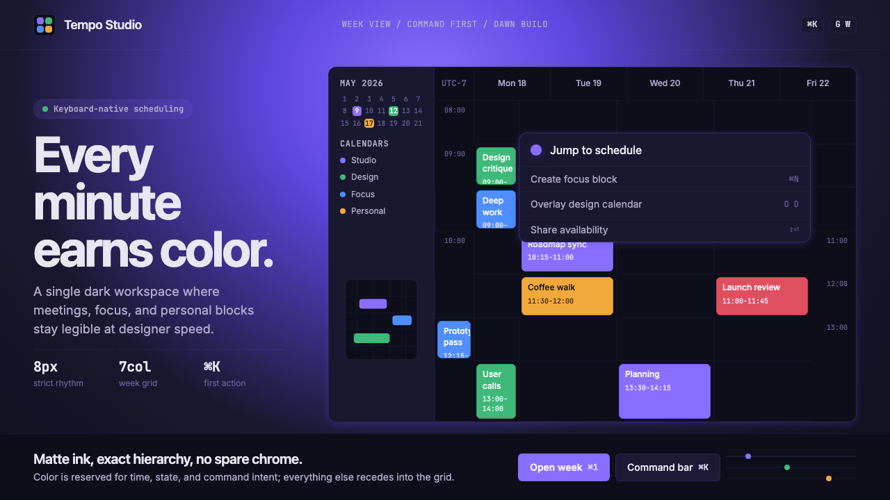 Cron CalendarDesigner-tech restraint. Purple wash, ink grid, mono shortcuts, surgical even…设计师科技的克制:紫色光晕、墨色网格、等宽快捷键与精准色块。
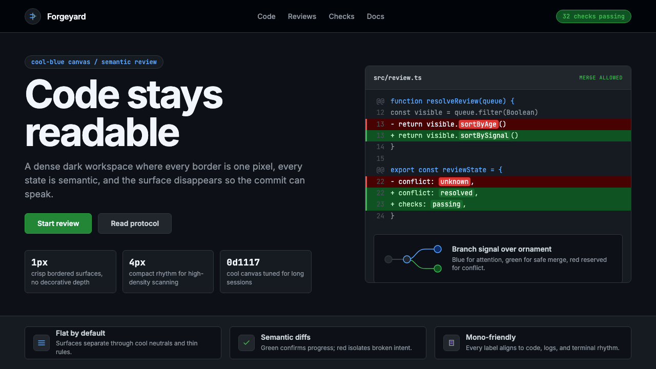 GitHub DarkCode-first darkness. Cool-blue canvas, 1px borders, green/red diff lines.代码优先的暗色:冷蓝画布、1px边框、绿红diff线。
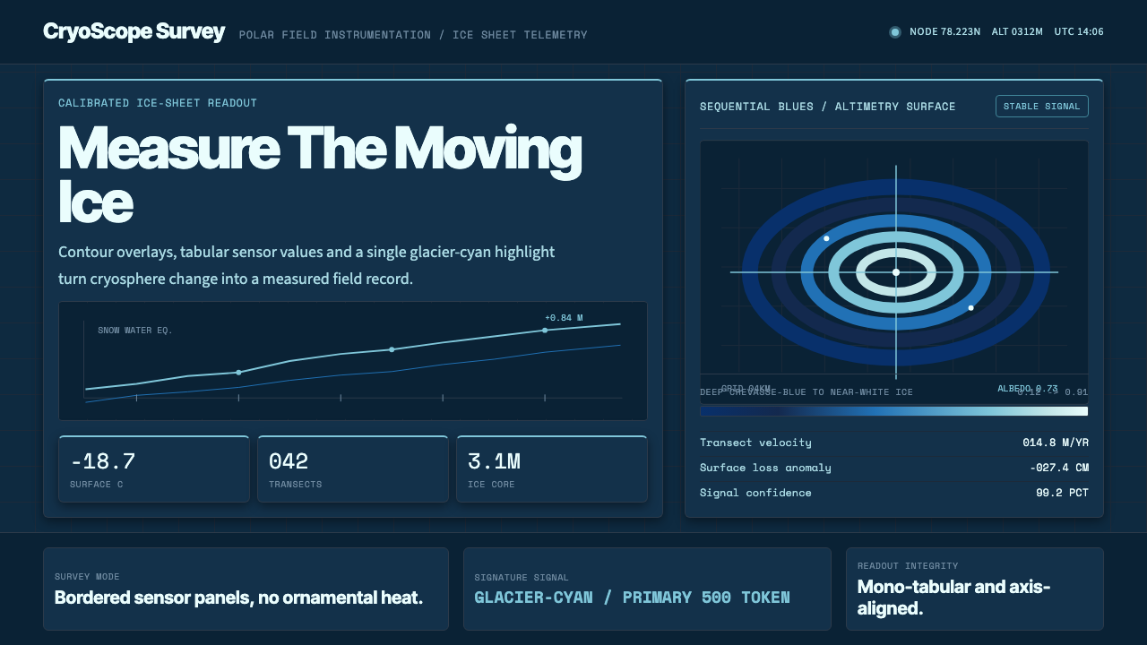 Glacier Arctic SurveyCold precision. Crevasse-blue panels, cyan readouts and contour grids calibra…冷峻精准:冰裂蓝面板、冰川青读数与等高网格校准每个数值。
 Linear 2024Precision down to the millisecond. Near-black, indigo-violet accents, Inter D…开发者工具美学的标杆:近乎纯黑、克制靛紫点缀、Inter Display 字体…
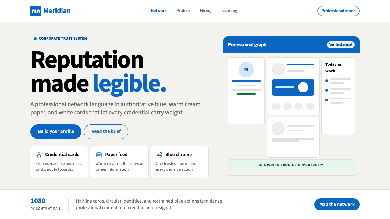 LinkedInCorporate trust, digitized. Authoritative blue frames white cards on warm cre…企业信任数字化:权威蓝框住暖奶油纸面上的白卡。