What is Cron Calendar?什么是 Cron Calendar?
Cron crystallized a new vocabulary for serious software — deep ink surfaces, a saturated purple glow, and the radical idea that a keyboard shortcut could be the most beautiful thing on screen.Cron 为严肃软件确立了一套新语汇——深墨色表面、饱和紫色光晕,以及「键盘快捷键可以是屏幕上最美之物」这一激进主张。
Cron Calendar in briefCron Calendar 速览
Cron Calendar is the visual design system pioneered by the Cron calendar application in the early 2020s — a style built on matte dark backgrounds washing into deep purple gradients, monospaced typography that elevates keyboard shortcuts to first-class interface citizens, and surgical event colors that cut through the darkness with precise, saturated accent blocks. Unlike the playful darkness of gaming interfaces or the cool neutrality of developer terminals, Cron's dark mode feels intentional in a different register: it is the aesthetic of craft, of something made by people who care too much.Cron Calendar 是由 Cron 日历应用在 2020 年代初期开创的视觉设计体系——以哑光深色背景向深紫色渐变过渡为基底,以等宽字体将键盘快捷键提升为一等公民,以精准、饱和的强调色块在暗色中精确切割出日程内容。与游戏界面那种张扬的暗色调或开发者终端的冷峻中性相比,Cron 的深色模式有着截然不同的质感:那是一种工艺感——一种出自过度在乎之人之手的美学。
The system is rigorously restrained. Every element earns its presence: the subtle grid anchors time without screaming for attention, the event blocks occupy exactly the space they need and no more, the command palette appears and disappears like a thought completing itself. Chrome is stripped to near nothing. What remains is pure density — the feeling of a city seen from altitude at night, all signal and no noise.这套设计体系高度克制。每一个元素都要赢得自己存在的理由:微妙的网格锚定时间而不争抢注意力,日程色块恰好占据它们需要的空间,命令面板如一个完成中的念头般出现又消失。界面装饰被削减至几乎于无。剩下的是纯粹的信息密度——如同从高空俯瞰夜晚的城市,全是信号,毫无噪声。
Cron's influence spread quickly because it solved a real problem: how to make productivity software feel like something a designer would actually want to use. Before Cron, calendar apps leaned either corporate-flat or consumer-cheerful. Cron proposed a third register — precision instruments for people who ship things — and that register resonated so strongly with the designer-developer demographic that it became the benchmark against which subsequent productivity tools measured their taste.Cron 的影响迅速蔓延,因为它解决了一个真实问题:如何让生产力软件感觉像是设计师真正愿意使用的东西。在 Cron 之前,日历应用要么偏向企业扁平,要么偏向消费者欢快。Cron 提出了第三种语调——为交付产品的人准备的精密仪器——而这种语调与设计师-开发者群体产生了强烈共鸣,以至于成为后续生产力工具衡量自身品味的标杆。
Where does Cron Calendar come from?Cron Calendar 从何而来?
Cron was founded in New York City in 2018 by Raphael Schaad and Brian Hough, two designers who had grown impatient with the state of calendar software. Their founding premise was simple and almost confrontational: the people building the internet spent enormous portions of their lives in calendar applications, and those applications were, almost without exception, aesthetically negligent. Schaad and Hough set out to build the calendar they wanted to use — one that treated keyboard interaction as primary, visual density as a virtue, and the designer's eye as a constraint rather than a luxury.Cron 由 Raphael Schaad 与 Brian Hough 于 2018 年在纽约市创立。这两位设计师对日历软件的现状已然失去耐心。他们的创业前提简单而近乎对抗性:构建互联网的人们将大量时间花在日历应用上,而这些应用几乎无一例外地在美学上漫不经心。Schaad 与 Hough 决心打造一款他们自己想用的日历——将键盘交互置于首位,将视觉密度视为一种美德,将设计师的眼光当作约束条件而非奢侈品。
The visual identity that defined Cron emerged through the early 2020s as the product matured. The signature deep purple-to-near-black gradient — a wash of saturated violet that gives the application its twilight quality — was not borrowed from any design system or trend report. It grew from a specific functional insight: dark surfaces reduce eye strain during long working sessions, but pure black backgrounds read as harsh and terminal-like. The purple middle ground felt alive without being loud, technical without being cold. It became the style's most recognizable and most copied element.定义 Cron 的视觉身份随着产品成熟在 2020 年代初期逐渐成形。那道标志性的深紫到近黑色渐变——赋予应用暮色质感的饱和紫罗兰光晕——并非借鉴自任何设计体系或趋势报告,而是从一个具体的功能洞察中生长出来:深色表面能在长时间工作中减轻眼部疲劳,但纯黑背景读起来过于严苛,带有终端感。紫色中间地带让界面感觉鲜活而不嘈杂,有技术感而不冷漠。它成为这种风格最易辨认、也被模仿最多的元素。
Keyboard shortcuts, in most software, are a power-user escape hatch — hidden, reluctant, undocumented. Cron made them the interface itself. Shortcut badges appeared as first-class typographic objects, rendered in monospaced type against rounded containers, visible in the UI rather than buried in a help document. This decision reflected the founding team's understanding of their audience: designers and developers who navigate primarily through keyboards and who read shortcut notation as naturally as they read prose. Riley Tomasek, who joined the core team, contributed significantly to the interaction model that made this feel natural rather than nerdy.键盘快捷键在大多数软件中是高级用户的逃生通道——隐藏的、勉强的、缺乏文档的。Cron 将它们变成了界面本身。快捷键标识以等宽字体渲染于圆角容器内,作为一等字体对象出现在界面中,而非藏于帮助文档深处。这一决定折射出创始团队对其受众的理解:主要通过键盘导航的设计师与开发者,他们阅读快捷键符号就像阅读散文一样自然。Riley Tomasek 加入核心团队后,对使这一切感觉自然而非书呆子气的交互模型做出了重要贡献。
The acquisition by Notion in 2022 — led by Notion co-founder Ivan Zhao — marked the peak of Cron's influence as an independent visual statement. By that point the aesthetic had already propagated beyond the application itself: it had become a reference point, a way of saying 'we take design seriously' that competing tools understood and responded to. When Notion rebranded the product as Notion Calendar in 2024, the Cron visual language was absorbed into a larger system, but its core decisions — the dark ground, the purple accent, the monospaced shortcut culture — survived as the clearest expression of what designer-tech taste looked like in that moment.2022 年被 Notion 收购——由 Notion 联合创始人 Ivan Zhao 主导——标志着 Cron 作为独立视觉宣言影响力的顶点。彼时,这套美学已经从应用本身向外传播:它成为一个参照点,一种竞争工具能够理解并回应的「我们认真对待设计」的表达方式。2024 年 Notion 将产品更名为 Notion Calendar 时,Cron 的视觉语言被吸纳进更大的体系,但其核心决策——深色底面、紫色强调、等宽快捷键文化——作为那个时代设计师科技品味最清晰的表达而留存了下来。
What defines the Cron Calendar look?Cron Calendar 的视觉特征是什么?
Dark Ground with Purple Wash深色底面与紫色光晕
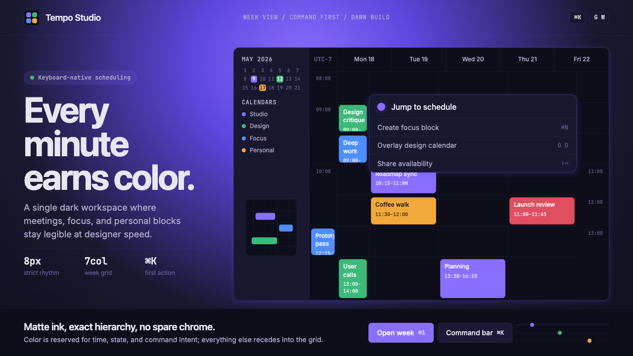
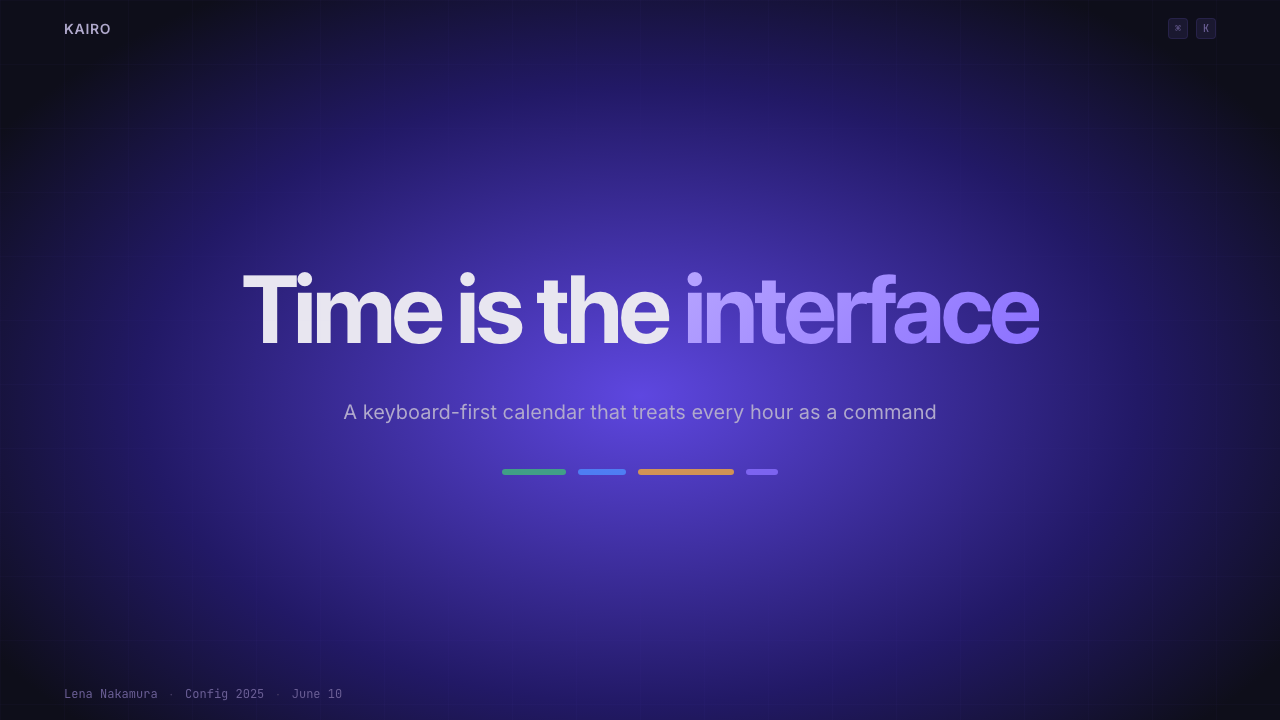
The defining surface is a near-black background that subtly blooms into deep violet toward the center or top of the composition — a gradient that reads not as decoration but as ambient light, as though the interface itself is slightly illuminated from within. This creates warmth without brightness, depth without theatrics. The dark ground is never pure black; the purple undertone prevents the heaviness of a true terminal aesthetic and keeps the surface feeling alive.最具定义性的表面是一块近黑色背景,在构图的中心或上方微妙地绽放为深紫色——一种渐变,读起来不像装饰,而像是环境光,仿佛界面本身从内部被轻轻照亮。这创造出温暖感而不失于明亮,营造出深度而不流于戏剧性。深色底面从不是纯黑;紫色底调阻止了真正终端美学的沉重感,让表面持续充满生机。
Monospaced Shortcut Culture等宽快捷键文化
Keyboard shortcut indicators are not tooltips or documentation afterthoughts — they are typographic objects placed directly in the interface at full visibility. Rendered in monospaced letterforms against rounded, subtly outlined containers, they communicate that this software rewards keyboard fluency. The monospaced choice is deliberate: fixed-width characters align predictably, read like code, and signal precision. The shortcut badge has become as much a stylistic signature as the purple gradient.键盘快捷键指示符不是工具提示,也不是文档的事后补充——它们是直接以完全可见的方式放置在界面中的字体对象。以等宽字形渲染于圆角、带有微妙轮廓的容器内,传达出这款软件奖励键盘熟练度的信息。选择等宽字体是刻意为之:固定宽度的字符对齐方式可预期,读来如同代码,传递出精准感。快捷键标识已成为与紫色渐变同等重要的风格签名。
Surgical Event Colors精准日程配色
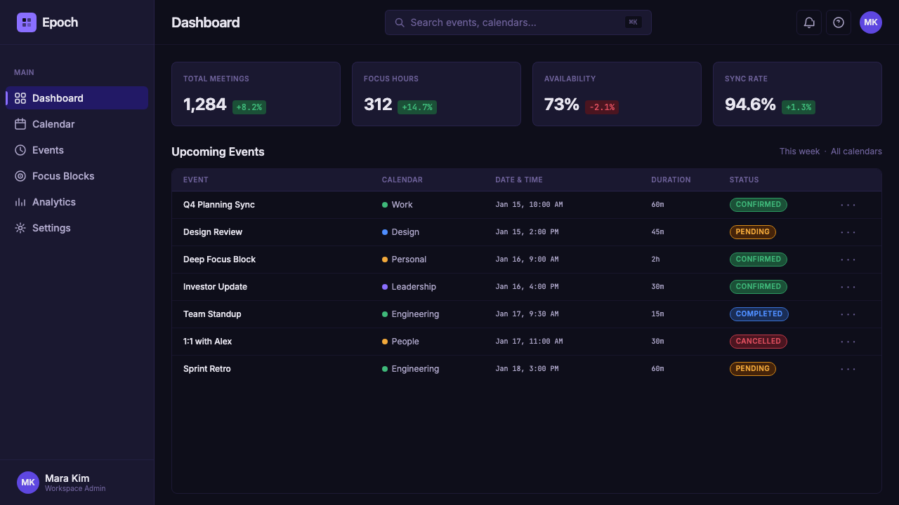
Event blocks are rendered in saturated accent colors — distinct hues assigned to different calendars or categories — that cut through the dark ground with confident clarity. These colors are never soft or desaturated; they are chosen to read at a glance against deep ink. Yet they are also disciplined: each color occupies only the block it owns, never bleeding into surrounding space, never used decoratively outside the context of a specific event. The result is an information layer that feels surgical — every color means something, and nothing is colored arbitrarily.日程色块以饱和的强调色渲染——不同日历或类别分配不同色相——在深墨底面上以自信的清晰度切割而出。这些颜色从不柔和或去饱和;它们被选择为能在深色背景下一眼辨认。然而它们同样受到约束:每种颜色只占据它所属的色块,从不渗出至周围空间,从不在特定日程的语境之外用于装饰。结果是一个感觉精准的信息层——每种颜色都有意义,没有任何东西被任意着色。
Restrained Grid and Negative Space克制的网格与负空间
The underlying calendar grid is expressed through the lightest possible marks — thin lines that organize time without asserting themselves visually. Between events, negative space is treated as a breathing room rather than an emptiness to fill. This restraint is counterintuitive in software design, where the tendency is to fill every available cell with affordances. Cron's grid says: the empty hour is also part of the interface. The discipline of not filling space is as active a design decision as any element that appears.底层日历网格通过尽可能轻盈的标记来表达——细线组织时间而不在视觉上强行主张自身。在日程之间,负空间被视为呼吸空间而非等待填充的空洞。这种克制在软件设计中是反直觉的,因为后者的倾向是用可供性填满每一个可用格子。Cron 的网格在说:空白的一小时也是界面的一部分。不填充空间的自律,与任何出现的元素一样是主动的设计决定。
Command Palette Primacy命令面板的首要地位
The command palette — a floating search-and-action layer invoked by a single keystroke — is treated as the primary navigation paradigm rather than a convenience shortcut. Visually, it is rendered with a distinct elevation: a slightly lighter or more luminous surface appearing above the main canvas, with enough contrast to read as a separate plane. Its appearance and disappearance feel immediate and decisive. This elevates the command palette from a feature to a philosophy: the ideal interface is one where the user never needs to reach for the mouse.命令面板——通过单次按键唤起的浮动搜索与操作层——被视为首要导航范式而非便利捷径。在视觉上,它以明显的层级渲染:一个比主画布略亮或更具发光感的表面浮现其上,对比度足以读作独立的平面。它的出现与消失感觉即时而果决。这将命令面板从一个功能提升为一种哲学:理想界面是用户永远不需要伸手去抓鼠标的界面。
Zero Decorative Chrome零装饰界面外壳
Cron's surfaces carry no decorative embellishment — no gradients applied for visual interest, no borders drawn for visual rhythm, no icons used to make a button feel warmer. The restraint is total. What look like aesthetic decisions are almost always functional ones: a dividing line exists because it separates information hierarchies, a lighter surface exists because it signals an interactive layer, a rounded corner exists to soften the visual weight of a dense block. Nothing is there for visual appeal alone.Cron 的界面表面不携带任何装饰性点缀——没有为了视觉趣味而添加的渐变,没有为了视觉节奏而画出的边框,没有为了让按钮更温暖而使用的图标。克制是彻底的。看起来像美学决定的东西几乎总是功能性决定:分割线存在是因为它区分信息层级,较亮的表面存在是因为它标示交互层,圆角存在是为了软化密集色块的视觉重量。没有任何东西仅仅因为视觉吸引力而存在。
Typographic Hierarchy Through Weight Contrast通过字重对比构建的字体层级
Text hierarchy in the Cron system is established primarily through weight and luminosity rather than color. Primary information — event titles, times, date numbers — appears at full brightness against the dark ground. Secondary information — calendar labels, metadata, day names — appears at reduced brightness, present but subordinate. Tertiary information recedes further. The result is a layered reading experience where the eye is guided by light itself, not by ornamental devices. Typeface choices lean toward geometric or neutral sans-serifs that do not assert personality over function.Cron 体系中的文字层级主要通过字重和亮度而非色彩来建立。主要信息——日程标题、时间、日期数字——以完全亮度在深色底面上呈现。次要信息——日历标签、元数据、星期名称——以降低的亮度呈现,存在但处于从属地位。三级信息进一步隐退。结果是一种分层阅读体验,眼睛被光本身引导,而非被装饰性手段引导。字体选择倾向于不以个性压过功能的几何或中性无衬线字体。
Who shaped Cron Calendar?谁塑造了 Cron Calendar?
Schaad co-founded Cron and served as the primary design voice shaping its visual language. His background in interaction design informed the system's most distinctive decisions: treating keyboard shortcuts as typographic objects, using negative space as actively as positive space, and maintaining a discipline of zero decorative chrome that distinguishes Cron from calendar apps that merely look dark. After the Notion acquisition, Schaad's design principles continued to influence how the broader Notion design team approached productivity interface aesthetics.Schaad 联合创立了 Cron,并作为主要设计声音塑造了其视觉语言。他的交互设计背景影响了该体系最具特色的决策:将键盘快捷键视为字体对象,像对待正空间一样主动运用负空间,以及坚守零装饰界面外壳的纪律——这使 Cron 有别于那些仅仅看起来很深色的日历应用。被 Notion 收购后,Schaad 的设计原则继续影响着更广泛的 Notion 设计团队处理生产力界面美学的方式。
Hough co-founded Cron with Schaad, bringing engineering precision to the product's founding philosophy. His insistence that calendar software should be fast — genuinely, perceptibly fast — shaped the interaction model in ways that fed back into the visual language: an interface designed around instantaneous keyboard response looks and feels different from one designed around click-and-wait patterns. The snappiness that users associate with Cron is not only a technical achievement but a design position embedded in every transition and animation decision.Hough 与 Schaad 共同创立了 Cron,为产品的创立哲学带来了工程师的精准性。他对日历软件应该快速——真正的、可感知的快速——的坚持,以反馈至视觉语言的方式塑造了交互模型:一个围绕即时键盘响应设计的界面,其观感与一个围绕点击等待模式设计的界面截然不同。用户与 Cron 关联的那种「脆爽感」不仅是技术成就,也是嵌入每一个过渡与动效决定中的设计立场。
Tomasek contributed to the interaction and product design of Cron, with particular influence on the keyboard-first navigation model that became the application's signature. His work on making shortcut discoverability feel natural — showing the right hints at the right moment without cluttering the interface — represents one of the most difficult design problems the team solved. The shortcut badge design, which manages to feel both technical and refined, reflects the kind of typographic care Tomasek brought to interaction details.Tomasek 参与了 Cron 的交互与产品设计,对成为应用标志性特征的键盘优先导航模型产生了特别影响。他在使快捷键可发现性感觉自然方面的工作——在正确时机展示正确提示而不杂乱界面——代表了团队解决的最困难设计问题之一。快捷键标识设计同时传递出技术感与精致感,折射出 Tomasek 在交互细节上带来的字体排印层面的用心。
As Notion's co-founder and the architect of the 2022 acquisition, Ivan Zhao recognized in Cron a visual intelligence that aligned with Notion's own commitment to software that respects its users' aesthetic sensibility. Zhao's decision to acquire Cron rather than build a competing calendar product from scratch preserved the Cron visual language long enough for it to influence a generation of productivity tools. His understanding that design culture is a product asset — not merely a surface quality — made the acquisition strategically coherent beyond its functional rationale.作为 Notion 联合创始人和 2022 年收购行动的设计者,Ivan Zhao 在 Cron 中识别出一种与 Notion 自身对尊重用户审美感受之软件的承诺相契合的视觉智识。Zhao 选择收购 Cron 而非从零构建竞争性日历产品,这一决定使 Cron 视觉语言得以保留足够长的时间,从而影响了整整一代生产力工具。他对设计文化是产品资产而非仅仅是表面品质的理解,使这次收购在功能理由之外具备了战略上的内在一致性。
How do you use Cron Calendar today?今天怎么用 Cron Calendar?
Applying the Cron Calendar style begins with committing to the dark ground — and understanding that the dark ground is not simply a light layout with colors inverted. The surface carries warmth from its purple undertone; stripping that warmth and substituting a neutral dark grey produces an interface that looks like a developer tool rather than a design artifact. The purple wash should be subtle and central, not dramatic or edge-heavy. Think of it as the ambient temperature of the composition rather than a spotlight.应用 Cron Calendar 风格,首先要承诺于深色底面——并理解深色底面并不只是把浅色布局的颜色反转。这个表面从其紫色底调中汲取温暖;剥去那份温暖、以中性深灰替代,产出的界面看起来像开发者工具而非设计作品。紫色光晕应当微妙而居中,而不是戏剧化或集中于边缘。把它想象成构图的环境温度,而非一道聚光灯。
For presentation slides, the style is most effective on cover and title sequences where the dark surface can assert itself at scale. A cover designed in this register places event-color accent blocks as the primary visual anchor — a horizontal bar or a set of stacked indicators that establish the palette before any text appears. Shortcut badge typographic objects, rendered in monospaced type within rounded containers, can be used decoratively on slides that introduce product features or workflow concepts. For content slides, the discipline is restraint: light text against the dark ground, with hierarchy established through brightness variation rather than color or decorative devices. Data visualization on content slides should use the surgical accent palette — each data series in a distinct, saturated color — against the dark background, which gives charts an almost luminous quality.对于演示文稿,这种风格在封面与标题序列上最为有效,深色表面可以在大尺度上充分主张自身。以这种语调设计的封面将日程色强调色块作为主要视觉锚点——一条横向色条或一组叠加的指示符,在任何文字出现之前建立色板。以等宽字体渲染于圆角容器内的快捷键标识字体对象,可在介绍产品功能或工作流概念的幻灯片上装饰性地使用。对于内容幻灯片,纪律是克制:浅色文字配深色底面,层级通过亮度变化而非色彩或装饰手段来建立。内容幻灯片上的数据可视化应使用精准强调色板——每个数据系列采用独特的饱和色——配以深色背景,赋予图表近乎发光的品质。
For web interfaces, the style is most at home in dashboards, command-driven tools, and any product positioning itself as a serious instrument for focused work. The approach requires genuine commitment to the dark ground as the canonical state — do not offer a light mode as an afterthought that undermines the visual system's coherence. Interactive elements should appear at slightly higher luminosity than their surroundings, creating a light-on-dark hierarchy that guides attention without decorative cues. Navigation should be typographic: wordmarks and text labels in appropriate weight hierarchies, with no icon-only affordances and no decorative separators. Keyboard shortcut indicators, rendered as typographic badges, can appear on hover states to reward keyboard-literate users without cluttering the default view.对于网页界面,这种风格在仪表板、命令驱动工具以及任何将自身定位为专注工作精密仪器的产品中最为得体。这套方法需要真正承诺于深色底面作为规范状态——不要将浅色模式作为事后添加的补丁来破坏视觉体系的连贯性。交互元素应以比其周围略高的亮度呈现,创造出暗底亮图层级以在无装饰提示的情况下引导注意力。导航应当是字体性的:文字标识和适当字重层级的文字标签,无仅图标可供性,无装饰性分隔符。以字体标识渲染的键盘快捷键指示符可在悬停状态下出现,在不杂乱默认视图的情况下奖励熟悉键盘的用户。
For editorial and marketing applications, the style's most powerful register is the full-bleed dark background used as a stage for product screenshots or interface details. A marketing page built in this system alternates between the dark-ground feature sections — where product UI appears at near-full scale — and brief light-ground sections for pricing or testimonials, creating rhythm without abandoning the system's character. Event colors from the palette can be used as accent elements in calls to action, section indicators, or typographic highlights, always at high saturation and always tied to a specific semantic role rather than deployed decoratively.对于编辑和营销应用,这种风格最有力的表达是以全出血深色背景作为产品截图或界面细节的舞台。以这套体系构建的营销页面在深色底面功能区段——产品界面近乎全尺寸呈现——与简短的浅色底面区段(用于定价或推荐语)之间交替,创造节奏而不放弃体系的性格。来自色板的日程颜色可作为强调元素用于行动号召、区段指示符或字体高亮,始终保持高饱和度,始终与特定语义角色挂钩,而非装饰性地部署。
A common mistake when adapting this style is confusing darkness for minimalism and stripping out the purple warmth in favor of pure black or cold dark grey. The purple undertone is not optional decoration — it is what prevents the interface from reading as a terminal emulator or a gaming surface. A second common error is overusing the accent color palette: in authentic Cron-derived work, saturated colors appear only on objects that carry specific information meaning (events, categories, status states). When they appear on borders, backgrounds, or typographic elements without informational justification, the surgical quality that makes the system compelling collapses into visual noise.改编这种风格时最常见的错误,是将黑暗混同于极简主义,以纯黑或冷深灰取代紫色温暖。紫色底调不是可选的装饰——它正是防止界面被读作终端模拟器或游戏界面的关键。第二个常见错误是过度使用强调色板:在真正源自 Cron 的作品中,饱和色只出现在携带特定信息意义的对象上(日程、类别、状态标识)。当它们无信息依据地出现在边框、背景或字体元素上时,使该体系引人入胜的那种精准品质就会崩解为视觉噪声。
Cron Calendar — FAQCron Calendar · 常见问题
Is the Cron style the same as dark mode?Cron 风格就是深色模式吗?
Dark mode is a preference setting; Cron is a design language. Many applications implement dark mode by inverting a light layout, which produces surfaces that feel flat, cool, or terminal-like. The Cron visual system is architected from the dark ground up: the purple warmth in the background, the luminosity-based hierarchy, the surgical event colors, and the monospaced shortcut culture all depend on each other and were designed as a unified whole. Stripping the purple warmth or transplanting individual elements into a generic dark layout produces something that looks dark without feeling like Cron.深色模式是一种偏好设置;Cron 是一套设计语言。许多应用通过反转浅色布局来实现深色模式,产出的表面感觉扁平、冷淡或像终端。Cron 视觉体系是从深色底面向上构建的:背景中的紫色温暖、基于亮度的层级、精准的日程颜色,以及等宽快捷键文化,相互依存,作为统一整体被设计。剥去紫色温暖或将个别元素移植进通用深色布局,产出的东西看起来很暗,但感觉不像 Cron。
How does this style handle information-dense layouts without feeling cluttered?这种风格如何在信息密集的布局中保持整洁感?
The system achieves density without clutter through luminosity hierarchy. In a light-background design, the eye distinguishes information levels primarily through color and typographic weight. In the Cron system, brightness does that work: primary information appears at full luminosity, secondary information at reduced brightness, tertiary information nearly at the darkness of the ground itself. Because the eye naturally moves toward light, this creates a scanning path without requiring decorative devices like rules, borders, or color blocks to separate information layers. The dark ground essentially provides infinite depth for information to recede into.该体系通过亮度层级在不产生杂乱感的情况下实现信息密度。在浅色背景设计中,眼睛主要通过色彩和字体字重来区分信息层级。在 Cron 体系中,亮度承担这项工作:主要信息以完全亮度呈现,次要信息亮度降低,三级信息几乎接近底面的暗度。因为眼睛天然向亮处移动,这创造了一条扫描路径,而不需要分割线、边框或色块等装饰手段来分隔信息层级。深色底面本质上为信息退远提供了无限深度。
Can the Cron aesthetic work for non-productivity products — a brand, a publication, a food business?Cron 美学能用于非生产力产品吗——比如一个品牌、一本出版物或一家食品企业?
With significant adaptation, some elements transfer — but the system's soul is built around a specific type of user and a specific set of values: precision, focus, keyboard fluency, and the belief that information density is a feature rather than a problem. These are not universal values. A food brand needs warmth, organic texture, and sensory richness that the dark ink surface and surgical accent colors actively suppress. A publication might use the dark ground for a tech-focused section, but will struggle to apply the shortcut-badge culture outside that context. The Cron aesthetic is most authentic when the product it describes genuinely rewards the same values the aesthetic expresses.经过重大改编,某些元素可以迁移——但该体系的灵魂围绕着特定类型的用户和特定价值观构建:精准、专注、键盘熟练度,以及信息密度是特性而非问题的信念。这些并非普世价值。一个食品品牌需要温暖感、有机质感和感官丰富性——而深墨色表面和精准强调色正是在主动压制这些。一本出版物或许能将深色底面用于科技专题,但在该语境之外运用快捷键标识文化会显得格格不入。Cron 美学在所描述的产品真正奖励与该美学所表达的相同价值观时,才最为真实可信。
What is the relationship between Cron Calendar and Linear's design aesthetic?Cron Calendar 与 Linear 的设计美学是什么关系?
They are parallel expressions of the same broader movement — designer-tech taste, sometimes called the indie productivity-tool renaissance — that emerged in the early 2020s. Both chose dark grounds, monospaced type for technical notation, and keyboard-first navigation as load-bearing structural decisions rather than stylistic choices. Where Cron's signature move was the purple warm gradient and the saturated calendar event palette, Linear's visual identity leaned toward a cooler, more neutral dark with violet accents expressed through geometric interface elements. They influenced each other and their contemporaries collectively, establishing the visual grammar that now reads as the standard for premium productivity software in that era.它们是同一更广泛运动的平行表达——设计师科技品味,有时被称为独立生产力工具文艺复兴——这一运动在 2020 年代初期兴起。两者都将深色底面、技术标注用等宽字体和键盘优先导航作为承重的结构性决定而非风格选择。Cron 的标志性动作是紫色暖调渐变与饱和日历日程色板,而 Linear 的视觉身份则倾向于更冷、更中性的深色,通过几何界面元素表达紫罗兰色强调。它们相互影响,共同影响了同时代的设计,确立了如今被读作那个时代顶级生产力软件标准的视觉语法。
How do you avoid making the style feel dated as dark-mode interfaces become ubiquitous?随着深色模式界面日趋普遍,如何避免这种风格显得过时?
The elements most likely to date are the most imitated ones: the purple gradient background and the monospaced shortcut badge. As these spread across productivity tools, they shift from distinctive decisions to generic conventions. To keep the style's logic alive without its most recognizable surface features, focus on the underlying principles rather than the specific motifs: luminosity-based hierarchy, information density without decoration, color tied strictly to meaning rather than mood. An interface built on those principles will feel contemporary even as the specific purple-on-ink palette recedes into period style. The goal is to inherit Cron's discipline, not its surface.最可能显得过时的,恰恰是被模仿最多的元素:紫色渐变背景和等宽快捷键标识。随着这些扩散至各类生产力工具,它们从独特的决定转变为通用的惯例。要在不依赖最易辨认表面特征的情况下保持这种风格逻辑的生命力,应聚焦于底层原则而非特定母题:基于亮度的层级,无装饰的信息密度,色彩严格与意义而非情绪挂钩。建立在这些原则之上的界面,即使在特定的紫色叠墨色色板退为时代风格之后,仍会感觉当代。目标是继承 Cron 的纪律,而非其表面。
Related design styles相关设计风格
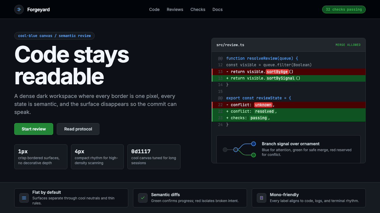 GitHub DarkCode-first darkness. Cool-blue canvas, 1px borders, green/red diff lines.代码优先的暗色:冷蓝画布、1px边框、绿红diff线。
 Linear 2024Precision down to the millisecond. Near-black, indigo-violet accents, Inter D…开发者工具美学的标杆:近乎纯黑、克制靛紫点缀、Inter Display 字体…
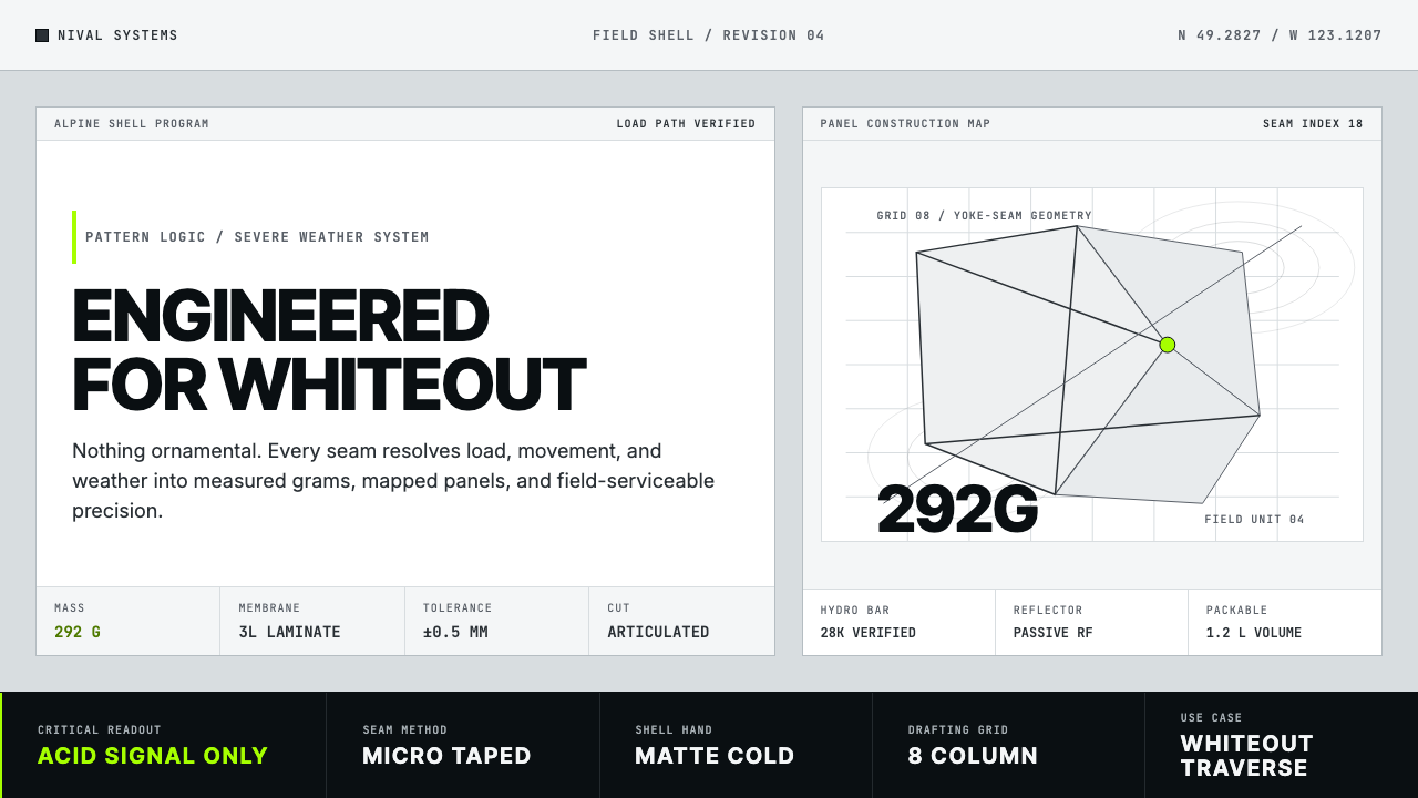 Arc'teryx Technical OutdoorEngineered, never ornamental. Glacier silver grid, mono specs, one acid-green…只讲工程,不作装饰。冰川银网格、等宽规格与一处酸绿信号。
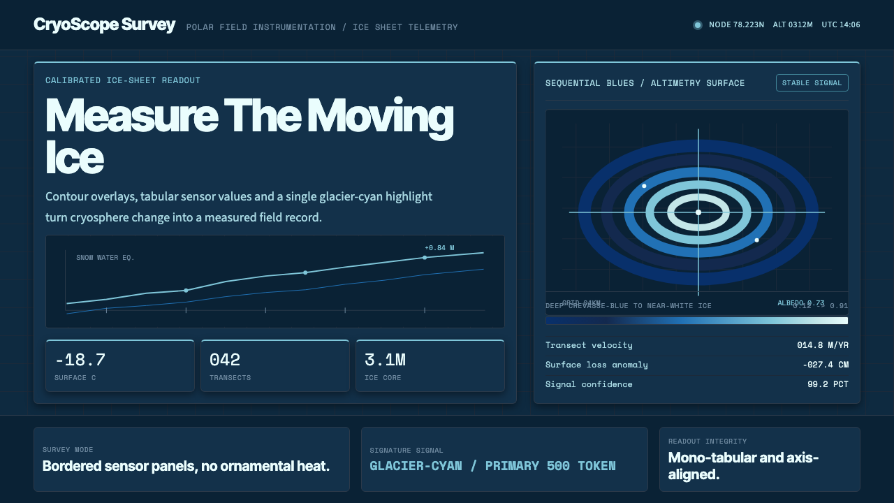 Glacier Arctic SurveyCold precision. Crevasse-blue panels, cyan readouts and contour grids calibra…冷峻精准:冰裂蓝面板、冰川青读数与等高网格校准每个数值。
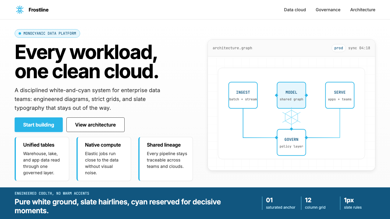 Snowflake Data CloudCool precision wins. Icy cyan, Inter grids, and hex data diagrams stay engine…冷峻精确取胜:冰蓝青、Inter 网格与六角数据图保持工程感。
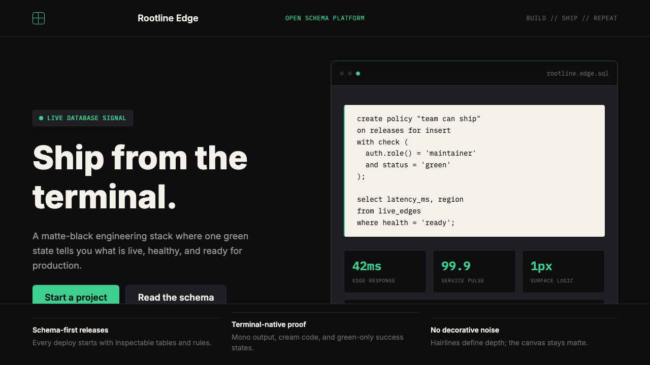 Supabase Postgres Green (2024)Midnight-terminal confidence. Matte black, Inter, mono code, and one electric…深夜终端般笃定:哑光黑、Inter、等宽代码与一抹电子绿。