What is LinkedIn?什么是 LinkedIn?
LinkedIn's visual language is corporate trust rendered in pixels — a single authoritative blue against warm cream paper, where every card is a business card and every interaction carries the weight of professional reputation.领英的视觉语言是企业信任的数字化表达——以权威的品牌蓝搭配温暖的奶油色背景,每张卡片都如同一张名片,每次互动都承载着职业声誉的分量。
LinkedIn in briefLinkedIn 速览
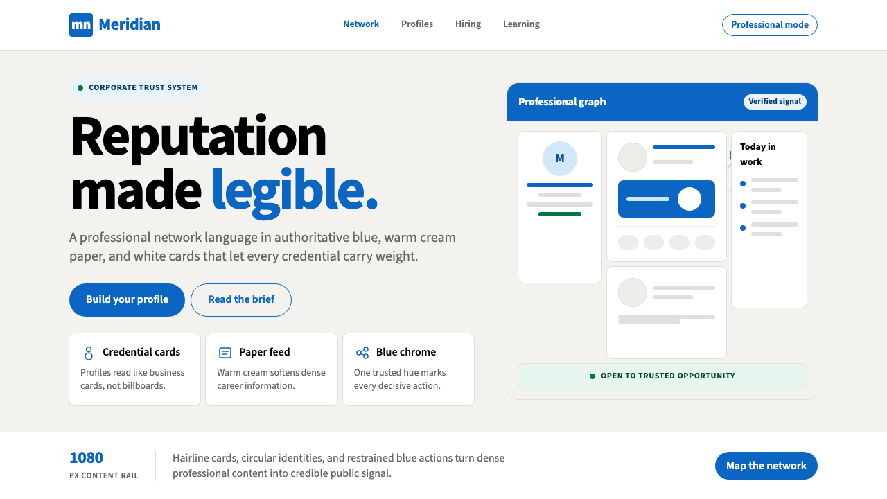
LinkedIn's design system is one of the most widely recognized corporate digital aesthetics in the world — a disciplined palette of cool authoritative blue, white card surfaces, and warm cream backgrounds that has come to signify professional credibility itself. The system is not expressive; it is declarative. Every visual choice asserts that what happens here is serious, structured, and consequential.领英的设计系统是全球最具辨识度的企业数字美学之一——以冷调权威蓝、白色卡片界面和温暖奶油色背景构成的克制色板,已成为职业可信度的视觉符号。这套系统不追求表达性,而是宣告性的:每一个视觉选择都在说明,这里发生的事情是严肃的、有结构的、有分量的。
At its core, the LinkedIn visual language prioritizes information hierarchy over personality. Content — résumés, posts, endorsements, job listings — is the protagonist. The interface recedes into reliable scaffolding: blue for navigation and primary actions, white for content cards, cream for page backgrounds, and controlled typographic scale to distinguish names, headlines, and supporting metadata. There is no playfulness, no organic texture, no expressive color variation. The design system trusts its content to generate interest.在核心层面,领英的视觉语言将信息层级置于个性表达之上。内容——简历、动态、技能认可、职位列表——才是主角。界面则退居为可靠的脚手架:蓝色用于导航和主要操作,白色用于内容卡片,奶油色用于页面背景,受控的字体比例区分姓名、标题和辅助信息。没有趣味性,没有有机质感,没有富于表情的色彩变化。这套设计系统相信内容本身能够产生吸引力。
The effect is immediately legible as professional. LinkedIn's palette and card-based layout have trained an entire generation of white-collar workers to associate these visual conventions with career authority. Using the style outside of LinkedIn — in a résumé, a professional presentation, a business pitch deck — instantly borrows that connotation, signaling seriousness and institutional belonging without a word of copy.这种效果作为职业感是即刻可读的。领英的色板和卡片式布局已经训练了整整一代白领工作者,将这些视觉惯例与职业权威关联起来。在领英之外使用这种风格——用于简历、职业演示、商业路演——能够即刻借用这种内涵,无需一字文案,便传递出严肃感和机构归属感。
Where does LinkedIn come from?LinkedIn 从何而来?
LinkedIn was founded in December 2002 and launched publicly in May 2003 by Reid Hoffman, Allen Blue, and a small co-founding team in Mountain View, California. The platform entered a web landscape that was still dominated by dial-up aesthetics and busy portal designs — think the cluttered link-lists of early Yahoo or the dense text pages of Monster.com. From the outset, LinkedIn positioned itself as something different: a professional network, not a social network, and its design choices reflected that distinction at every level.领英由雷德·霍夫曼、艾伦·布卢及一小支联合创始人团队于2002年12月创立,2003年5月在加利福尼亚州山景城向公众开放。平台进入的是一个仍由拨号上网美学和拥挤门户设计主导的网络环境——想想早期雅虎杂乱的链接列表,或Monster.com密集的文字页面。从一开始,领英就将自己定位为与众不同的存在:一个职业网络,而非社交网络,其设计选择在每个层面都体现了这种区别。
The early LinkedIn interface was modest and functional — white pages, blue navigation bars, text-heavy profiles. This was less a deliberate aesthetic choice than a practical one: the site needed to feel authoritative and safe to the business professionals it was courting, many of whom were skeptical of social networking in a corporate context. Blue, the color of bank logos and enterprise software, was the obvious choice. White card surfaces signaled document-like formality. The visual language borrowed from the conventions of business software rather than consumer social platforms.早期的领英界面朴素而实用——白色页面、蓝色导航栏、文字密集的个人主页。这与其说是刻意的美学选择,不如说是务实的决定:网站需要让它所吸引的商务专业人士感到权威和安全,而他们中许多人对职场语境中的社交网络持怀疑态度。蓝色——银行标志和企业软件的颜色——是显而易见的选择。白色卡片界面传达出类似文件的正式感。这套视觉语言借鉴的是商务软件的惯例,而非消费者社交平台。
The platform's visual identity matured significantly during the tenure of Jeff Weiner, who became CEO in 2009 and presided over the company's IPO in 2011 and its growth from a niche professional tool to a mainstream career platform. Microsoft's acquisition of LinkedIn in 2016 for $26.2 billion marked a new phase: deeper enterprise integration, expanded product surface area, and a more systematic approach to design. The current visual identity — cleaner, more consistent, with a refined blue system and a cream-toned background — emerged primarily in the 2019 to 2021 period under CEO Ryan Roslansky, who succeeded Weiner in 2020.平台的视觉识别在杰夫·韦纳任职期间(2009年出任首席执行官)显著成熟——他主持了公司2011年的上市,并见证了平台从小众职业工具成长为主流求职平台的历程。微软于2016年以262亿美元收购领英,标志着一个新阶段的开始:更深的企业整合、更大的产品界面,以及更系统化的设计方法。当前的视觉识别——更简洁、更一致,拥有经过精炼的蓝色体系和奶油色调背景——主要在2019至2021年间成形,彼时瑞安·罗斯兰斯基已于2020年接替韦纳担任首席执行官。
The design choices that define LinkedIn's aesthetic are inseparable from its product positioning. LinkedIn sells professional reputation and career opportunity — abstract, high-stakes, deeply personal values — to an audience that is simultaneously wary of informality and hungry for connection. A design that felt playful or consumer-facing would undermine trust. A design that felt too cold or institutional would suppress engagement. The warm cream background is a precise calibration: it softens the authority of blue and white without abandoning corporate seriousness. The card metaphor — each profile, each post, each listing as a discrete contained rectangle — maps directly onto the physical business card, one of the most loaded objects in professional culture.定义领英美学的设计选择与其产品定位密不可分。领英向一群既警惕随意感又渴望连接的受众,出售职业声誉和职业机会——抽象、高风险、极为个人化的价值。一种轻松或消费向的设计会破坏信任;一种过于冷漠或机构化的设计则会抑制参与。温暖的奶油色背景正是精确的校准:它在不放弃企业严肃性的前提下,柔化了蓝白配色的权威感。卡片隐喻——每份个人主页、每条动态、每个职位列表都是一个独立的矩形容器——直接映射到名片这一职业文化中负载最重的实物之一。
What defines the LinkedIn look?LinkedIn 的视觉特征是什么?
Authoritative Blue权威蓝
The signature blue sits in the cool, medium-depth register — darker than a sky blue, lighter than navy, with enough saturation to read as confident without veering into aggressive. It anchors navigation bars, primary buttons, links, and brand marks. The blue is used sparingly on content surfaces, appearing as an accent rather than a fill, which preserves its authority: every blue element is significant. Secondary blue tones — lighter, more muted variants — support hover states and secondary actions without diluting the primary signal.标志性的蓝色位于冷调、中等深度的区间——比天空蓝深,比深蓝浅,饱和度足以呈现出自信而不至于过于强硬。它锚定导航栏、主要按钮、链接和品牌标识。蓝色在内容界面上使用克制,以强调色而非填充色的形式出现,从而保留其权威性:每个蓝色元素都是有意义的。次级蓝调——更浅、更柔和的变体——支持悬停状态和次要操作,而不稀释主要信号。
Warm Cream Ground暖奶油色底面
The background is not pure white — it carries a faint warmth, somewhere between white paper and aged ivory. This calibration is deliberate: pure white reads as clinical or stark; the cream tone humanizes the interface without crossing into warmth that would undermine professional authority. All content cards sit as white rectangles against this cream ground, creating a shallow depth effect that organizes the page without resorting to heavy borders or harsh shadows.背景并非纯白——它带有淡淡的暖意,介于白色纸张与陈旧象牙色之间。这一校准是刻意的:纯白色显得过于临床或生硬;奶油色调在不跨越到会削弱职业权威的温暖感之前,为界面增添了人情味。所有内容卡片以白色矩形置于这片奶油色底面之上,形成浅层深度效果,在不依赖沉重边框或强烈阴影的情况下组织页面结构。
Card-as-Business-Card卡片即名片
The card is LinkedIn's fundamental compositional unit. Every discrete piece of content — a profile block, a post, a job listing, a company summary — occupies its own rounded-corner white rectangle. This is not merely a layout device: it maps the interface onto the physical metaphor of a business card, one of professional culture's most charged objects. Cards create containment and equality — each piece of content gets the same frame — while their stacking arrangement establishes a feed logic that feels familiar to both document readers and social network users.卡片是领英最基本的构图单元。每一块独立内容——个人主页模块、动态、职位列表、公司简介——都占据自己的圆角白色矩形。这不仅仅是一种布局手段:它将界面映射到名片这一职业文化中最具符号意义的实物隐喻上。卡片创造了容纳感和平等性——每条内容获得相同的框架——而它们的堆叠排列建立起一种信息流逻辑,对文件阅读者和社交网络用户都同样熟悉。
Restrained Shadow and Depth克制的阴影与深度
LinkedIn uses shadow minimally and softly. Card shadows are diffuse and low-contrast — a barely perceptible lift from the cream background rather than a dramatic three-dimensional effect. This restraint is intentional: heavy shadows would introduce expressiveness and drama inconsistent with professional credibility. The depth system exists to separate layers — cards from ground, modal dialogs from page — not to create visual interest for its own sake.领英对阴影的使用极为克制,且以柔和为主。卡片阴影漫射而低对比——从奶油色背景中勉强可察觉地浮起,而非戏剧性的立体效果。这种克制是刻意的:厚重的阴影会引入与职业可信度不符的表现力和戏剧感。深度系统的存在是为了分离层级——卡片与底面、模态对话框与页面——而非为了视觉趣味本身。
Typographic Hierarchy by Scale以尺度建立排版层级
Text hierarchy on LinkedIn is organized primarily through size and weight contrast — large, medium-bold for names and section headers; smaller, regular-weight for supporting information; muted and condensed for metadata like timestamps and connection degrees. There is little reliance on decorative type treatments, unusual weights, or expressive letterforms. The system reads quickly and consistently because it prioritizes recognition over personality. Profile names carry the most visual weight; everything else organizes around them.领英的文字层级主要通过尺寸和字重对比来组织——姓名和章节标题使用较大、中等粗体;辅助信息使用较小的常规字重;时间戳和连接度数等元数据则更为低调和紧凑。几乎不依赖装饰性排版处理、非常规字重或富于表情的字形。这套系统的快速和一致可读性,源于它将可识别性置于个性之上。个人主页姓名承载最重的视觉分量;其他一切都围绕它来组织。
Iconography as Function图标服务于功能
LinkedIn's icon set is understated and strictly functional. Icons are line-based, thin-stroked, and monochromatic — they convey action and category without competing with content. The profile photo — always a human face in a circle — is the most visually prominent image element in any interface context, a deliberate choice that foregrounds individual identity. Decorative illustration is minimal; when it appears, it is flat and abstract, typically in the blue-and-cream palette of the broader system.领英的图标集低调而严格功能化。图标以线条为基础,笔画纤细,单色呈现——传达操作和类别,而不与内容竞争。个人照片——始终是圆形内的人脸——是任何界面语境中视觉上最突出的图像元素,这是将个人身份推至前景的刻意选择。装饰性插图极少;当它出现时,是扁平而抽象的,通常使用更广泛系统的蓝白奶油配色。
Professional Neutrality职业中立性
The LinkedIn visual system consciously avoids cultural specificity, regional associations, or lifestyle connotations. The palette has no warmth that reads as leisure, no darkness that reads as luxury, no brightness that reads as playfulness. It is calibrated to feel appropriate across industries, geographies, and seniority levels — the same design language works for a software engineer in Seoul, a finance director in São Paulo, and a recruiter in Amsterdam. This neutrality is itself a strong signal: it says that professional context overrides personal identity.领英的视觉系统刻意回避文化特殊性、地域联想或生活方式内涵。色板没有透露出休闲感的温暖,没有奢华感的深沉,没有趣味感的明亮。它被校准为在行业、地域和资历层级之间都感觉合适——同一套设计语言适用于首尔的软件工程师、圣保罗的财务总监和阿姆斯特丹的招聘人员。这种中立性本身就是一个强烈信号:它表明职业语境凌驾于个人身份之上。
Who shaped LinkedIn?谁塑造了 LinkedIn?
Hoffman co-founded LinkedIn in 2002 after his experience at SocialNet and PayPal, where he had observed how professional relationships functioned as infrastructure for economic opportunity. His foundational product insight — that career capital was a network effect, not a static résumé document — shaped every design decision that followed. The card-as-profile, the connection as endorsement, the feed as professional signal: all trace back to Hoffman's conception of professional identity as something actively maintained and publicly declared. He remained executive chairman after Microsoft's acquisition and continues to write extensively on professional culture and network theory.霍夫曼在SocialNet和PayPal工作后,于2002年联合创立领英,彼时他已观察到职业关系如何充当经济机会的基础设施。他的核心产品洞察——职业资本是一种网络效应,而非静态简历文档——塑造了此后的每一个设计决策。将个人主页视为卡片、将人脉视为背书、将信息流视为职业信号:这一切都可追溯至霍夫曼对职业身份的构想——一种主动维护、公开宣示的东西。微软收购后,他继续担任执行董事长,并持续就职业文化和网络理论撰写大量文章。
Blue was one of LinkedIn's five co-founders and served as Vice President of Product Management. He is closely associated with the platform's early product philosophy — particularly the emphasis on authentic professional identity over anonymous or pseudonymous social interaction. His thinking helped establish LinkedIn's design principle that every element of the interface should reinforce the gravity and authenticity of real professional identity, a principle that explains the insistence on real names, profile photos, and verifiable credentials that still shapes the platform's visual and product logic today.艾伦·布卢是领英五位联合创始人之一,曾任产品管理副总裁。他与平台早期的产品哲学密切相关——尤其是强调真实职业身份,而非匿名或化名的社交互动。他的思想有助于确立领英的设计原则:界面的每个元素都应强化真实职业身份的分量和真实性,这一原则解释了平台对真实姓名、个人照片和可验证资质的坚持,至今仍塑造着平台的视觉和产品逻辑。
Weiner served as LinkedIn's CEO from 2009 to 2020, presiding over the platform's most consequential growth period. Under his leadership, LinkedIn expanded from roughly 30 million users at his arrival to over 700 million by the time he transitioned to executive chairman. He oversaw the platform's IPO in 2011, the Microsoft acquisition in 2016, and a significant maturation of the design system — from the utilitarian early interface to a more polished, consistent visual language. Weiner's emphasis on compassionate management and mission-driven culture permeated the product philosophy: the design had to feel both professional and human.韦纳于2009至2020年担任领英首席执行官,主持了平台最具影响力的成长阶段。在他的领导下,领英从他入职时约3000万用户扩展到他过渡为执行董事长时的逾7亿用户。他主持了2011年的IPO、2016年的微软收购,以及设计系统的显著成熟——从实用主义的早期界面演进为更为精炼、一致的视觉语言。韦纳对富有同理心的管理和使命驱动文化的强调渗透进产品哲学:设计需要同时兼具职业感和人文温度。
Roslansky became LinkedIn's CEO in June 2020, succeeding Weiner after fifteen years of product leadership at the company. The visual identity refinement that produced the current blue system, cream background, and more consistent card language happened substantially under his tenure. Roslansky has pushed LinkedIn toward being a broader content and learning platform, not just a professional directory — a shift that required the design system to accommodate longer-form posts, video content, and newsletter publishing while maintaining the core visual language of professional authority. His product vision continues to expand the contexts in which LinkedIn's blue-and-cream aesthetic appears.罗斯兰斯基于2020年6月接替韦纳出任领英首席执行官,此前他在公司担任了十五年的产品领导职务。产生当前蓝色体系、奶油色背景和更一致卡片语言的视觉识别精炼,主要发生在他任职期间。罗斯兰斯基推动领英成为更广泛的内容和学习平台,而不仅仅是职业名录——这一转变要求设计系统能够容纳长篇动态、视频内容和时事通讯发布,同时保持职业权威的核心视觉语言。他的产品愿景持续拓展着领英蓝白奶油美学出现的语境。
Following the 2016 acquisition, Microsoft's design organization brought the Fluent Design System's influence to bear on LinkedIn's interface — most visibly in the refinement of depth, motion, and consistency across platforms. The collaboration between LinkedIn's in-house design team and Microsoft's broader enterprise design language produced a more systematic approach to the blue hierarchy, shadow usage, and typographic scale. This period also introduced deeper integration with Microsoft Office aesthetics, particularly in LinkedIn's enterprise products like Talent Solutions and Sales Navigator, where the visual language aligns closely with Microsoft's own professional software conventions.2016年收购后,微软的设计团队将Fluent设计系统的影响引入领英界面——在深度、动效和跨平台一致性的精炼上最为明显。领英内部设计团队与微软更广泛企业设计语言之间的协作,催生了对蓝色层级、阴影使用和排版比例更为系统化的处理方法。这一时期也引入了与微软Office美学更深的整合,尤其体现在领英的企业产品(如人才解决方案和销售导航)中——在这些产品里,视觉语言与微软自身的职业软件惯例高度对齐。
How do you use LinkedIn today?今天怎么用 LinkedIn?
The LinkedIn visual system is one of the most immediately legible professional aesthetics in contemporary design — which is both its greatest strength and its primary constraint. Used correctly, it transfers corporate authority, digital-era credibility, and organizational belonging to whatever it frames. Used carelessly, it reads as corporate cliché or as a direct imitation of the platform itself.领英的视觉系统是当代设计中最即刻可读的职业美学之一——这既是它最大的优势,也是它主要的限制。使用得当,它能将企业权威、数字时代可信度和组织归属感传递给任何被它框定的内容。使用不当,则会读起来像企业陈词滥调,或对平台本身的直接模仿。
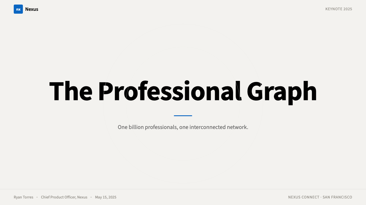
For presentation slides, the LinkedIn style works especially well on both cover and professional summary pages. A cover slide benefits from the card logic: a centered or slightly offset white panel against a cream or cool-light background, carrying name, title, and organizational affiliation in clean typographic hierarchy. The authoritative blue should appear as a single accent — a thick top border on the card, a logo mark, a highlighted label — rather than flooding the background. Content slides should use the card-as-container principle: each data point, quote, or evidence block occupies its own white rectangle, with the cream or white ground providing breathing room between cards. Avoid using blue for body text; reserve it entirely for interactive or primary labeling functions. Data visualizations work well rendered as clean bar or line charts with blue as the primary data series color, white backgrounds, and light gray gridlines — the aesthetic equivalent of a Bloomberg or financial terminal readout without the terminal grimness.对于演示文稿,领英风格尤其适用于封面和职业摘要页面。封面页受益于卡片逻辑:一个居中或略微偏移的白色面板置于奶油色或冷调浅色背景上,以简洁的排版层级承载姓名、职位和所属机构。权威蓝应作为单一强调色出现——卡片顶部的粗色边、品牌标识、突出标签——而非大面积填充背景。内容页应运用容器式卡片原则:每个数据点、引文或证据块占据其自己的白色矩形,奶油色或白色底面在卡片之间提供呼吸空间。避免将蓝色用于正文;将其完全保留给交互性或主要标签功能。数据可视化以蓝色为主要数据系列颜色、白色背景和浅灰色网格线呈现的简洁柱状图或折线图效果出色——美学上相当于彭博终端或金融终端的读取界面,但没有终端的阴郁感。
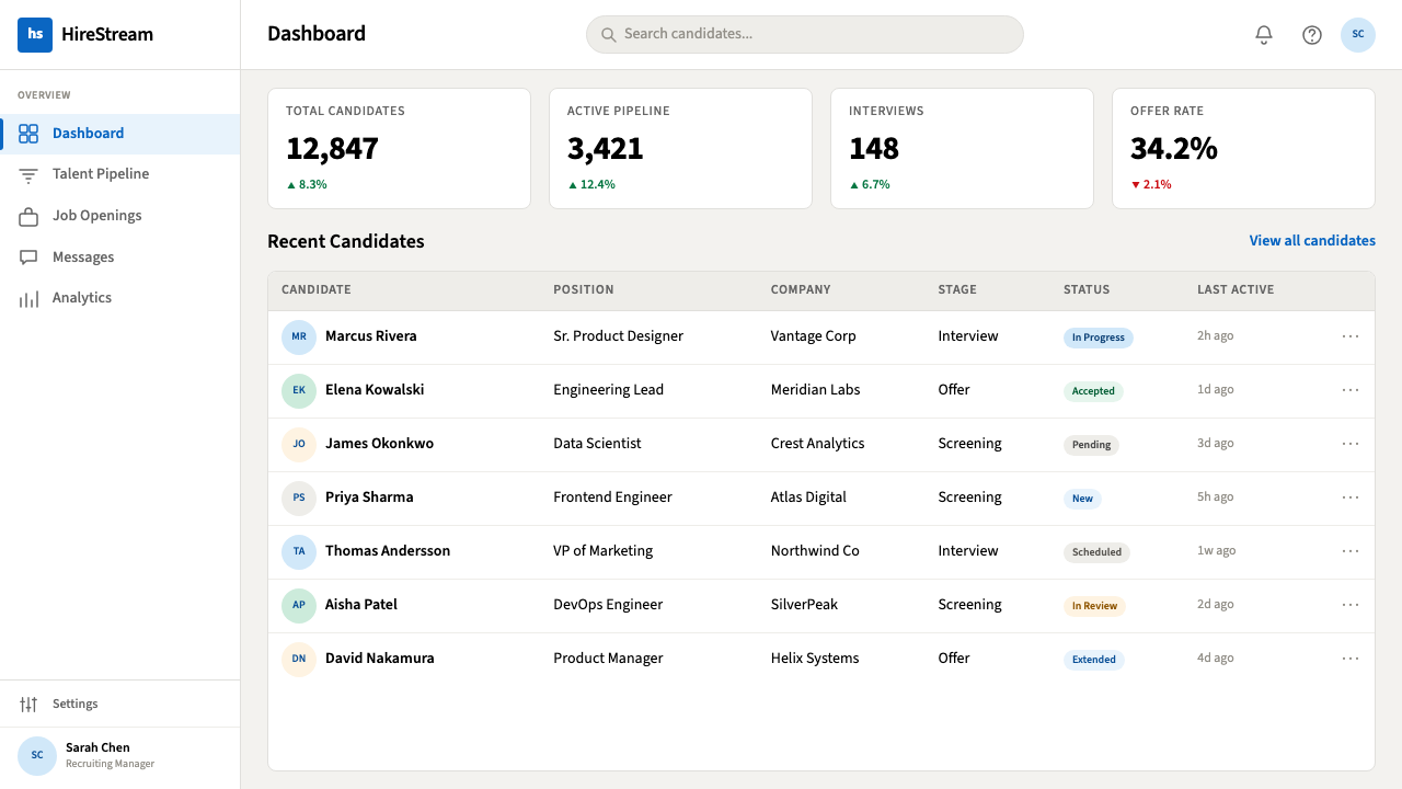
For web UI, the LinkedIn aesthetic is a natural fit for professional dashboards, SaaS pricing pages, and enterprise onboarding flows. The grid should be strict and generous — wide gutters, clearly delineated columns, no edge-to-edge color floods except in the navigation bar. The cream ground holds the page together while white cards layer atop it; the visual hierarchy is immediately clear without requiring borders or heavy separation lines. Interactive elements — buttons, tabs, selected states — carry the authoritative blue; inactive and secondary elements use gray or muted type. Profile-like modules (user cards, team member listings, credential badges) directly quote LinkedIn's own conventions, which users will recognize as a trust signal. Navigation is typographic and compact, without decorative icon ornamentation.对于网页界面,领英美学天然适合职业仪表板、SaaS定价页面和企业入职流程。网格应当严格而宽裕——宽阔的行间距、清晰划定的列,除导航栏外不做边到边的色彩填充。奶油色底面将页面凝聚在一起,白色卡片在其上叠加;视觉层级无需边框或沉重的分隔线便可即刻清晰。交互元素——按钮、标签、选中状态——承载权威蓝;非活跃和次要元素使用灰色或低调文字。类个人主页的模块(用户卡片、团队成员列表、资质徽章)直接引用领英自身的惯例,用户会将其识别为信任信号。导航在排版上紧凑,不加装饰性图标点缀。
For editorial and marketing materials, the style supports strong professional positioning. A business report or white paper in the LinkedIn aesthetic uses a cream or warm-white ground, a strong typographic header hierarchy, and section breaks marked by thin blue rules rather than decorative dividers. Photography, when used, should be professional in subject — real people in real contexts rather than stock-photo artificiality — cropped to rectangular cards and never bled to the edge in a way that feels editorial or magazine-like. The cover of a white paper or case study can use the card metaphor literally: a white panel centered on a cream background, with the title in large medium-weight type and a blue rule or logo mark as the sole accent element. Marketing pages for professional services benefit from alternating card sections rather than cinematic full-bleed photography; this reinforces the systematic, trustworthy feeling over emotional spectacle.对于编辑和营销材料,这种风格支持强劲的职业定位。领英美学风格的商业报告或白皮书使用奶油色或暖白色底面,强劲的排版标题层级,以及用细蓝色规则而非装饰性分割线标记的章节分隔。使用摄影时,内容应当职业——真实环境中的真实人物,而非廉价图库的人造感——裁切为矩形卡片,绝不以编辑或杂志感的方式出血至边缘。白皮书或案例研究的封面可以字面意义上使用卡片隐喻:一个白色面板居中置于奶油色背景上,标题以较大的中等字重排印,蓝色规则或品牌标识作为唯一强调元素。专业服务的营销页面受益于交替的卡片章节,而非电影感的全幅出血摄影;这强化了系统性、值得信赖的感觉,而非情感奇观。
A common mistake when applying the LinkedIn aesthetic is treating the authoritative blue as a dominant fill color — using it for large backgrounds, section panels, or heavy graphic shapes. In LinkedIn's own system, blue is an accent and signaling color, not a primary surface. Large blue backgrounds shift the register from corporate authority toward government branding or generic enterprise software. A second common error is eliminating the cream ground entirely and working on pure white, which removes the warmth that distinguishes LinkedIn from colder, more clinical interfaces like hospital software or legal databases. The cream is load-bearing: without it, the white cards have nothing to lift from, and the depth system collapses into a flat document feel. Finally, resist the temptation to add expressive color accents — orange highlights, green success states, purple tags — beyond the minimal secondary palette. Each additional color chips away at the professional neutrality that makes the system work.应用领英美学时最常见的错误,是将权威蓝作为主导填充色使用——用于大面积背景、章节面板或厚重的图形形状。在领英自身的系统中,蓝色是强调色和信号色,而非主要界面底色。大面积蓝色背景会将感知从企业权威转向政府品牌或通用企业软件。第二个常见错误是完全消除奶油色底面、改在纯白色上作业——这会去除将领英与更冷、更临床的界面(如医院软件或法律数据库)区分开来的温暖感。奶油色是承重结构:没有它,白色卡片就没有可以浮起的底面,深度系统就会坍缩为平淡的文档感。最后,克制添加表达性色彩强调的冲动——橙色高亮、绿色成功状态、紫色标签——这些超出了最小次要色板的范围。每增加一种颜色,都会削弱使这套系统奏效的职业中立性。
LinkedIn — FAQLinkedIn · 常见问题
How does LinkedIn's design language differ from other enterprise software aesthetics?领英的设计语言与其他企业软件美学有何不同?
Most enterprise software — think legacy ERP systems, financial terminals, or database management tools — prioritizes information density and functional utility over perceived warmth or social legibility. LinkedIn occupies a different position: it is enterprise in its authority but social in its interaction model. The cream background, the circular profile photo, the card metaphor, and the generous white space are all concessions to social engagement that a pure enterprise aesthetic would not make. LinkedIn's design is closer to a premium business publication — the Financial Times, Harvard Business Review — than to enterprise software proper. It is corporate but not cold, structured but not mechanical.大多数企业软件——想想传统ERP系统、金融终端或数据库管理工具——将信息密度和功能实用性置于感知温暖感或社交可读性之上。领英占据着不同的位置:在权威性上是企业感,但在交互模型上是社交感。奶油色背景、圆形个人照片、卡片隐喻和宽裕的留白,都是纯粹的企业美学不会做出的社交参与让步。领英的设计更接近高端商业出版物——《金融时报》、《哈佛商业评论》——而非纯粹的企业软件。它是企业感的,但不是冷漠的;是结构化的,但不是机械的。
Can the LinkedIn aesthetic work for consumer-facing products, or is it limited to B2B and professional contexts?领英美学能用于面向消费者的产品吗,还是仅限于B2B和职业语境?
The aesthetic works in consumer contexts where professional credibility is the desired signal — financial services, legal technology, healthcare platforms, insurance, credentialing systems, and professional education. It struggles in contexts where warmth, playfulness, cultural specificity, or sensory richness are primary values: food, fashion, wellness, children's products, or entertainment. The style's neutrality is an asset when you want the user to project their own identity into the interface; it becomes a liability when the product needs to project a personality of its own. A useful test: if the product's primary promise involves trust, clarity, and consequence rather than delight, discovery, or belonging, LinkedIn's design language is likely an appropriate register.这种美学在职业可信度是期望信号的消费者语境中有效——金融服务、法律科技、医疗平台、保险、资质认证系统和职业教育。在温暖感、趣味性、文化特殊性或感官丰富性是主要价值的语境中则力不从心:食品、时尚、健康、儿童产品或娱乐。当你希望用户将自身身份投射到界面时,这种风格的中立性是资产;当产品需要投射自身个性时,它就成为负担。一个有用的检验:如果产品的主要承诺涉及信任、清晰和结果,而非愉悦、探索或归属,那么领英的设计语言很可能是合适的表达音域。
Is this style the same as what is sometimes called 'SaaS design' or 'B2B boring'?这种风格和有时被称为「SaaS设计」或「B2B枯燥风」的东西是一回事吗?
There is significant overlap, but LinkedIn's design language is more specific and more considered than the generic 'SaaS boring' category suggests. The SaaS design trope — blue-and-white, card-based, generous white space, sans-serif type — is partly derived from LinkedIn's conventions and partly from a convergence of Figma templates, component libraries, and design-system defaults that spread similar patterns across thousands of products. The pejorative 'B2B boring' label points to the failure mode: applying the conventions without understanding why they exist, producing interfaces that are merely safe rather than meaningfully professional. LinkedIn's own design is distinguished by the deliberateness of the cream ground, the restraint in using blue, and the consistency of the card metaphor — details that generic SaaS design often abandons in favor of pure white backgrounds and decorative gradients.两者有显著重叠,但领英的设计语言比通常所说的「SaaS枯燥风」更具体、更经过深思熟虑。所谓SaaS设计套路——蓝白配色、卡片式布局、宽裕留白、无衬线字体——部分源自领英的惯例,部分源自Figma模板、组件库和设计系统默认值的汇聚,这些类似模式在数千个产品中广泛传播。贬义的「B2B枯燥」标签指向的是失败模式:照搬惯例而不理解其存在的原因,产出的界面只是安全的,而非有意义地职业的。领英自身的设计以奶油色底面的刻意性、对蓝色使用的克制,以及卡片隐喻的一致性区别于其他设计——这些细节是通用SaaS设计常常放弃的,取而代之的是纯白背景和装饰性渐变。
What is the biggest risk of using this style for a brand that is not actually LinkedIn?对于一个并非领英的品牌,使用这种风格的最大风险是什么?
The primary risk is recognition confusion — users immediately read the blue-and-cream card aesthetic as LinkedIn-adjacent, which can undermine brand distinctiveness. If a competitor or complementary product uses a visual language that strongly echoes LinkedIn, users may unconsciously assume a closer relationship with the platform than exists, or they may find the imitation derivative. The solution is not to avoid the style entirely but to introduce a distinctive element — an unusual typeface character, a non-standard accent color in a secondary role, a different card radius, a proprietary illustration style — that anchors the brand identity while still operating within the professional register that the style provides. The goal is to borrow the authority without borrowing the identity.主要风险是识别混淆——用户会立即将蓝白奶油卡片美学读作与领英相关,这可能削弱品牌独特性。如果一个竞争对手或互补产品使用与领英高度呼应的视觉语言,用户可能在潜意识中假设与该平台之间存在比实际更密切的关系,或者认为这种模仿缺乏原创性。解决方案不是完全回避这种风格,而是引入一个独特元素——一种不寻常的字体特征、一种担任次要角色的非标准强调色、不同的卡片圆角半径、专有的插图风格——在仍然在这种风格所提供的职业音域内运作的同时,锚定品牌身份。目标是借用权威感,而非借用身份。
Does the style work in dark mode?这种风格能在深色模式下使用吗?
LinkedIn itself offers a limited dark mode, but the classic aesthetic is fundamentally a light-ground system — the cream-and-white hierarchy depends on lightness to function. A dark inversion is possible and increasingly common in professional tools, but it requires rethinking several elements. The signature authoritative blue needs to shift lighter and more saturated to maintain contrast on a dark ground; the card system, which separates content from ground using lightness, must instead use subtle surface tints and restrained glow-shadows. The cream tone has no direct equivalent in a dark palette — a very dark warm gray can suggest the same warmth without sacrificing legibility. The risk in dark mode is that the professional neutrality collapses into either a luxury dark aesthetic or a developer-tool darkness, both of which carry different connotations. Dark LinkedIn is possible, but it is a more fragile system that requires more careful calibration to maintain the specific signal of corporate professional authority.领英本身提供了有限的深色模式,但经典美学从根本上是一个浅色底面系统——奶油白层级依赖亮度来运作。深色反转是可能的,在职业工具中也越来越常见,但需要重新考量几个元素。标志性的权威蓝需要变得更浅、更饱和,以在深色底面上保持对比度;依靠亮度将内容与底面分离的卡片系统,必须改用微妙的界面色调和克制的发光阴影。奶油色调在深色色板中没有直接对应物——非常深的暖灰色可以暗示同样的温暖感,而不牺牲可读性。深色模式的风险在于,职业中立性可能崩溃为奢华深色美学或开发者工具感的黑暗,两者都携带不同的内涵。深色领英是可能的,但它是一个更脆弱的系统,需要更仔细的校准才能维持企业职业权威的特定信号。
Related design styles相关设计风格
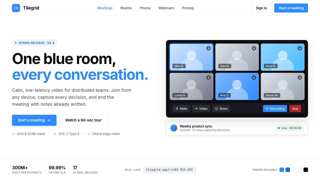 Zoom Meeting BlueRemote work's default discipline. One saturated cobalt on pure white, Inter s…远程办公的默认纪律:饱和电子钴蓝压在纯白底上,Inter 无衬线,4px 柔角。
 Android Bugdroid GreenFriendly tech, reduced to geometry. Vivid green pops from Grey 900 and rounde…友好科技化为几何:明绿从 Grey 900 与圆润字形中跃出。
 AsanaCalm productivity breathes. Cream canvas, lavender panels, coral-blue-yellow…安静生产力会呼吸:奶油画布、薰衣草面板与三色圆点。
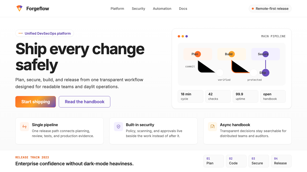 GitLab 2023DevOps in daylight. Tanuki orange-to-purple gradient, Inter, warm enough for…DevOps 走出暗色房间:标志性狸猫橙紫渐变、宽松行高、Inter 字体——…
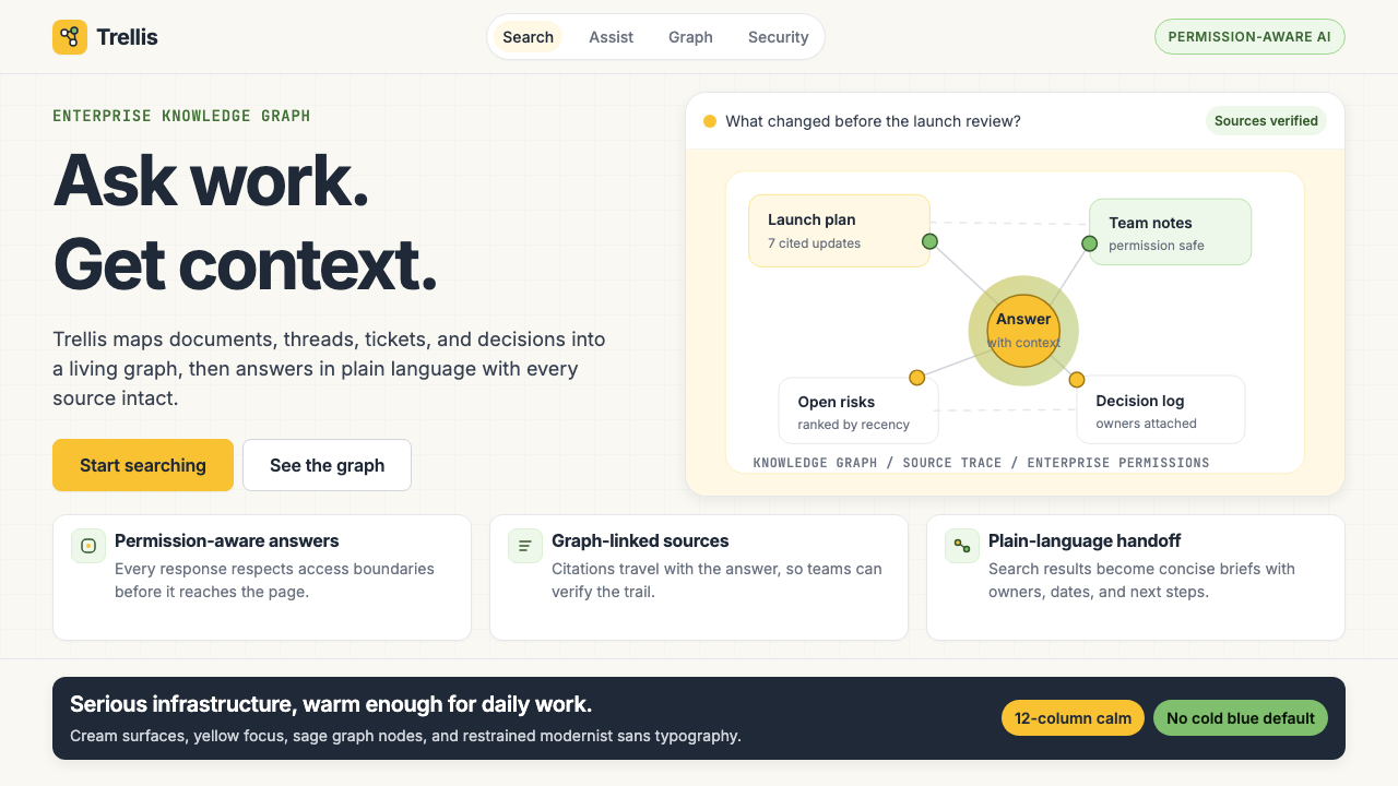 Glean Enterprise-SearchWarm enterprise AI. Cream ground, yellow focus, sage graph nodes, and sans ca…温暖的企业 AI:奶油底、黄焦点、鼠尾草节点与无衬线克制。
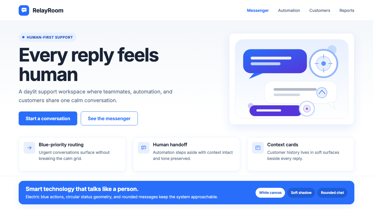 Intercom ModernWarm chat, sharp software. Electric blue bubbles on a daylit white grid.温暖对话,清晰软件。日光白网格托起电光蓝气泡。