What is Intercom Modern?什么是 Intercom Modern?
Intercom Modern proves that enterprise software can feel like a conversation — warm, direct, and unmistakably human.Intercom Modern 证明了企业软件也可以像对话一样温暖、直接、充满人情味。
Intercom Modern in briefIntercom Modern 速览
Intercom Modern is the visual design language developed by Intercom — the customer messaging and AI support platform — during its brand evolution from 2022 through 2024. It represents a deliberate synthesis of two values that most software design treats as opposites: the clinical precision of enterprise SaaS and the personal warmth of direct human conversation. The style is built around a signature electric indigo-blue, oversized portrait photography of real people, rounded chat-bubble geometry, and a white-dominant grid that keeps everything legible and airy.Intercom Modern 是客户通讯与 AI 支持平台 Intercom 在 2022 至 2024 年品牌演进过程中发展出的视觉设计语言。它有意将大多数软件设计视为对立面的两种价值融合为一:企业级 SaaS 的精准克制,与直接人际对话的真实温度。这套风格围绕标志性的电光靛蓝、真实人物的大幅肖像摄影、圆润的气泡几何造型,以及保持整体清晰透气的白色主导网格构建而成。
What distinguishes this aesthetic from generic productivity software design is its commitment to the human figure. At a time when most SaaS brands retreated into abstract illustration and icon systems, Intercom leaned into large, expressive photographs of people — faces visible, expressions readable, bodies present. This was not decorative photography but a philosophical statement: the platform's purpose is human connection, and the design should embody that purpose at every scale.将这一美学与通用生产力软件设计区别开来的,是它对人物形象的坚定投入。当大多数 SaaS 品牌退守抽象插图和图标体系时,Intercom 选择以大幅、富有表现力的真实人物照片为核心——面孔清晰可见,表情真实可读,身体在场感强烈。这不是装饰性摄影,而是一种哲学宣言:平台的使命是人与人的连接,设计在每一个尺度上都应当体现这一使命。
The style also reflects Intercom's evolution into AI-powered support with the launch of its Fin AI agent. Rather than making the AI feel mechanical or clinical, the visual language extended its warmth to cover automated interactions. The result is a design system that holds together enterprise functionality and approachable personality without sacrificing either — a balance that makes it a compelling reference for any product navigating the same tension.这套风格同样折射出 Intercom 随 Fin AI 客服助手发布而进行的技术演进。品牌视觉语言并未因 AI 的引入而变得机械或冷漠,而是将一贯的温度延伸至自动化交互场景。最终的设计系统在不牺牲任何一方的前提下,同时容纳了企业级功能与平易近人的个性——这种平衡使其成为任何正在应对同一张力的产品团队的有力参照。
See the Intercom Modern design system查看 Intercom Modern 完整设计系统
Where does Intercom Modern come from?Intercom Modern 从何而来?
Intercom was founded in Dublin, Ireland in 2011 by Eoghan McCabe, Des Traynor, Ciaran Lee, and David Barrett. The founding insight was deceptively simple: business software had become so transactional and impersonal that companies had lost the ability to talk to their users like human beings. The original product was a small in-app messenger widget — a chat bubble in the corner of a web application — that let companies reach customers in real time, in context, inside the product they were already using. This widget, visually modest at first, became the seed of what would grow into both a product empire and a distinctive design vocabulary.Intercom 于 2011 年由 Eoghan McCabe、Des Traynor、Ciaran Lee 和 David Barrett 在爱尔兰都柏林共同创立。其创立洞察看似简单却一针见血:商业软件已变得如此交易化、非人格化,以至于企业丧失了以人的方式与用户交谈的能力。最初的产品是一个小巧的应用内即时聊天窗口——网页应用角落里的一个对话气泡——让企业得以在用户正在使用的产品内部,实时、在情境中触达客户。这个最初视觉上不起眼的气泡,成为了一个产品帝国与一套独特设计语汇的种子。
Through the mid-2010s, Intercom expanded from simple messaging into a full customer communication platform covering marketing automation, onboarding flows, help center content, and live support. Its early visual identity was clean and professional but relatively conventional for the SaaS era — blue-dominant, grid-structured, and cautious. The company's brand was well-regarded but had not yet found the bold distinctiveness that would come to define it. The product was ahead of the brand.2010 年代中期,Intercom 从简单的即时通讯扩展为涵盖营销自动化、用户引导流程、帮助中心内容和实时支持的完整客户通讯平台。早期视觉识别体系整洁专业,但在 SaaS 时代的大背景下相对常规——以蓝色为主导,依附网格,态度谨慎。公司品牌颇受好评,但尚未找到后来定义其身份的那种大胆独特性。产品走在了品牌前面。
The transformation began in earnest around 2022, when Intercom undertook a comprehensive brand refresh. The new identity committed to the electric indigo-blue that had been a presence in earlier iterations but now became unmistakably ownable — a color that read as digital and energetic without losing the trustworthiness that enterprise buyers require. Portrait photography moved from supporting role to headline: marketing pages, campaign materials, and product interfaces all began foregrounding human faces at scale that felt more like editorial fashion than enterprise software.转变在 2022 年前后真正启动——Intercom 展开了一次全面的品牌焕新。新视觉识别体系全力押注电光靛蓝:这一颜色在早期版本中已有所呈现,但此刻成为无可争议的专属标识——一种兼具数字感与活力感、同时又不失企业买家所要求的可信度的色彩。人物肖像摄影从配角跃升为主角:营销页面、推广素材与产品界面全面将真实人脸以大尺寸推向前台,其调性更接近时尚编辑而非企业软件。
The launch of Fin, Intercom's AI support agent, in 2023 tested whether this warm, human-centered aesthetic could extend to artificial intelligence. The design team's answer was to resist the temptation to render AI as robotic or futuristic, instead representing it through the same human warmth and approachable geometry that defined the broader system. Chat-bubble shapes — inherently conversational, inherently soft — became the visual metaphor for AI interaction. The result was a design language that did not need to choose between being a technology platform and being a human one.2023 年 Fin AI 客服助手的发布,考验了这套温暖、以人为中心的美学能否延伸至人工智能场景。设计团队的答案是抵制将 AI 渲染为机械或未来感的诱惑,转而以定义整套系统的人文温度和平易近人的几何语言来呈现它。聊天气泡的造型——天然具有对话感,天然柔和——成为 AI 交互的视觉隐喻。最终,这套设计语言无需在技术平台与人性化平台之间做出取舍,两者并驾齐驱。
What defines the Intercom Modern look?Intercom Modern 的视觉特征是什么?
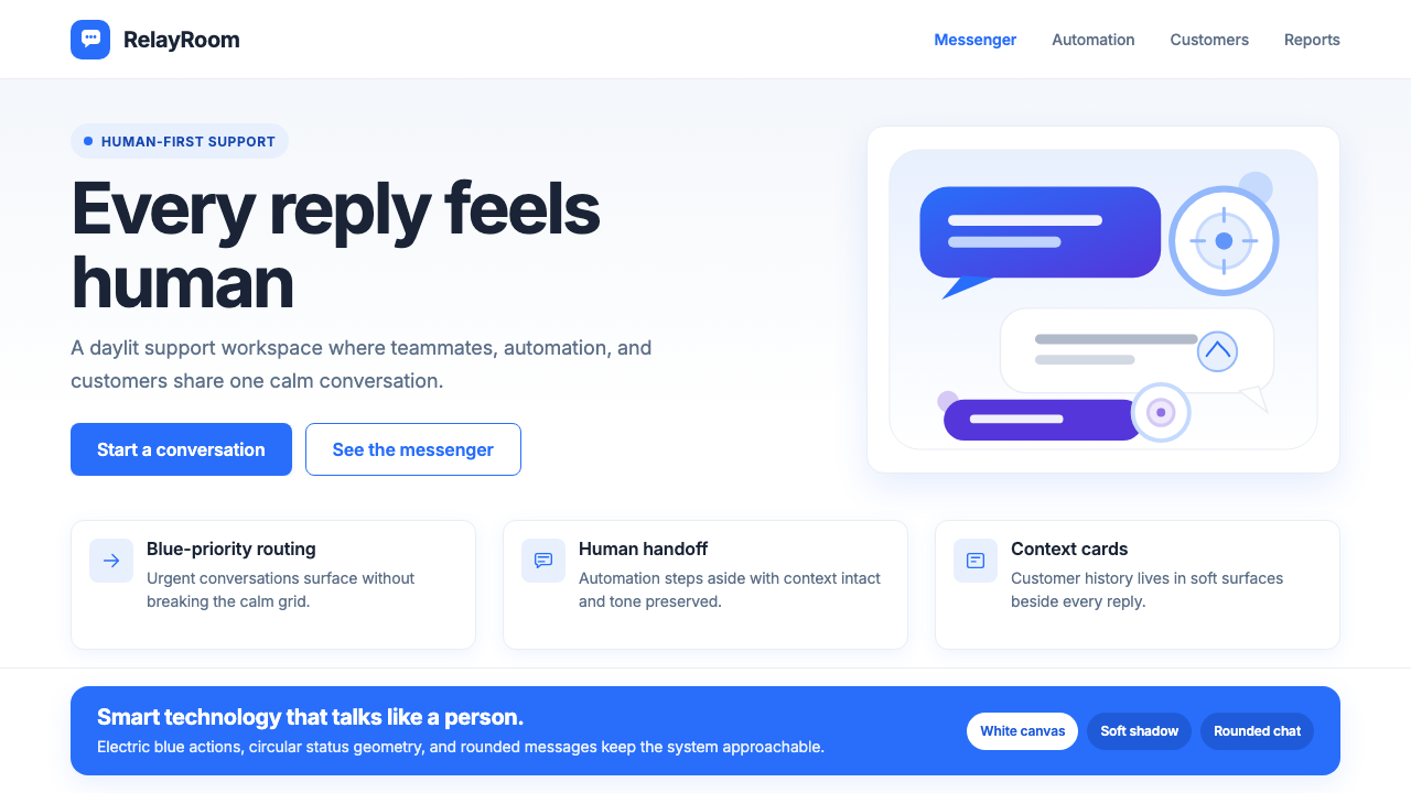
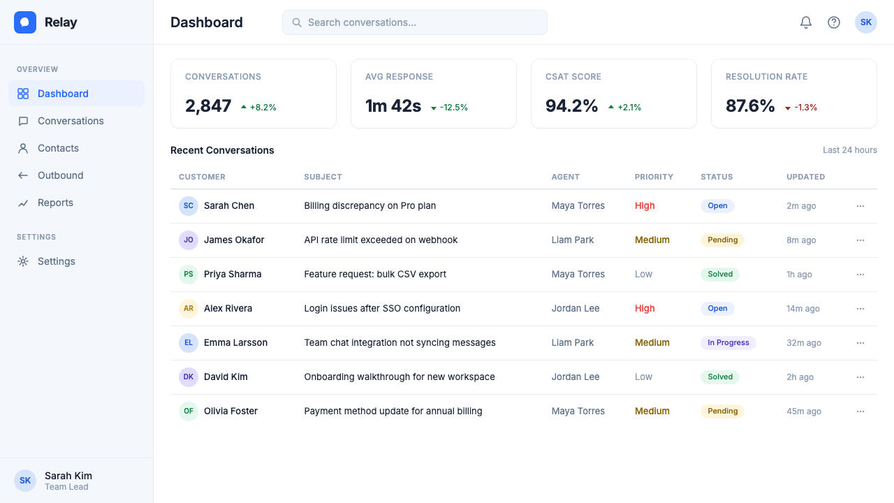
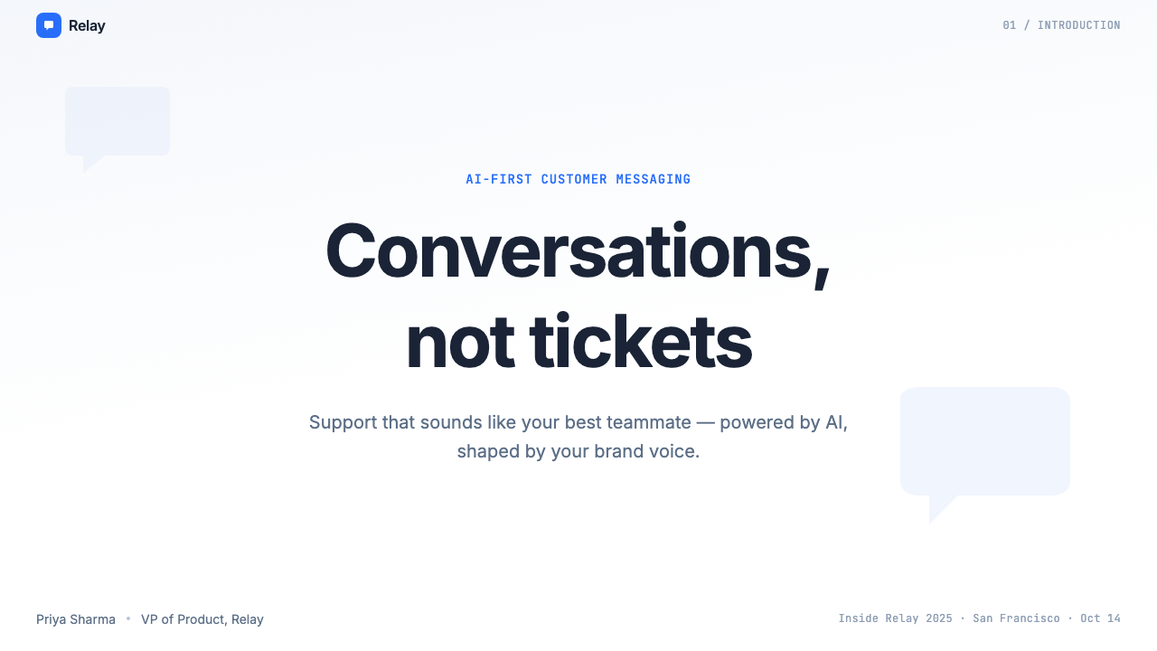
Electric Indigo-Blue电光靛蓝
The signature hue sits in the saturated blue-violet range — vivid enough to read as digital and contemporary, restrained enough to carry the trust associations of classic corporate blue. It appears on primary buttons, active states, data highlights, and brand moments. Its role is to orient the eye without overwhelming a layout dominated by white space. When used on dark grounds, the same hue deepens into an anchoring, near-navy weight; on white, it vibrates forward with controlled urgency.标志性色相坐落于饱和的蓝紫区间——足够鲜活以传递数字感与当代感,又足够克制以保留经典企业蓝的信任联想。它出现在主要按钮、激活状态、数据高亮与品牌时刻中。其作用是在以留白为主导的版面中引导视线,而不至于喧宾夺主。用于深色底面时,同一色相沉淀为锚定性的近深海军蓝;用于白色底面时,它以受控的紧迫感向前振动。
Portrait-Led Photography人像主导的摄影
Oversized, close-cropped photographs of real people — customers, support agents, team members — anchor the most prominent visual real estate in the system. The photography style is warm and direct: subjects face the camera, expressions are open, and lighting tends toward soft natural rather than dramatic studio. Images are treated as full-bleed blocks that interrupt the grid deliberately, giving layouts a human punctuation mark amid the interface geometry. This is not stock photography deployed generically; it is a specific visual argument that the product's purpose is human.真实人物——客户、客服人员、团队成员——的大幅特写照片,占据着系统中最显眼的视觉区域。摄影风格温暖而直接:主体面向镜头,表情开放,布光倾向于柔和自然而非戏剧性棚拍。图像以满版出血的形式有意打断网格,在界面几何图形中为版面注入人性化的标点。这不是泛用的图库摄影,而是一种特定的视觉论点:产品的目的是人。
Rounded Chat-Bubble Geometry圆润气泡几何
The chat bubble — with its generous corner radius and characteristic tail — is the origin myth of the entire product, and the design system keeps faith with it at every scale. Card components, modal containers, pill-shaped tags, avatar thumbnails, and feature illustration all share the same rounded vocabulary. The roundness is not decorative softness for its own sake; it is a legible reference to the conversational act that defines what the platform does. Hard edges and sharp corners are reserved for structural elements like grid lines and dividers.聊天气泡——以其圆润的大圆角和标志性的气泡尾巴——是整个产品的起源神话,设计系统在每一个尺度上都对其保持忠诚。卡片组件、模态框容器、胶囊形标签、头像缩略图、功能插图,全部共享同一套圆润词汇。这种圆润并非为了软化而软化的装饰性选择,而是对定义平台功能的对话行为的可读性引用。硬边与尖角被保留给网格线和分割线等结构性元素。
White-Dominant Grid白色主导网格
The background architecture of the system is overwhelmingly white — a daylit, neutral ground that lets both the indigo-blue accent and the warm photography read at full strength without competing against a busy surface. The grid is structured and generous: content columns are padded to breathe, and vertical rhythm is consistent enough to feel intentional without feeling rigid. Sections are separated by subtle tonal shifts or thin ruled lines rather than decorative dividers or abrupt color blocks.系统的背景架构压倒性地以白色为主——一个日光般的中性底面,让靛蓝强调色与温暖摄影在不与繁忙底面竞争的前提下以足够的力度呈现。网格结构化而慷慨:内容列有充足的内边距以供呼吸,垂直节奏一致,有意而为却不显僵硬。各区域之间以细微的色调转变或纤细的分割线相隔,而非装饰性分割元素或突兀的色块。
Warm, Direct Typography温暖直接的字体排印
The typographic system favors rounded or humanist letterforms over geometric or strictly neutral alternatives — a choice that aligns with the conversational personality of the brand. Headlines are set large and with confident weight, projecting authority without coldness. Body text is spaciously leaded and set at a comfortable reading measure. The hierarchy is clear without being aggressive: the system avoids the high-contrast, oversized type pairings that define more confrontational software aesthetics, preferring a measured progression from headline to label to caption.字体系统偏好圆润或人文主义字形,而非几何或严格中性的替代方案——这一选择与品牌的对话性人格高度契合。标题以大号、有分量的字重设置,传递权威而不失温度。正文行距宽松,设置在舒适的阅读行宽内。层级清晰而不咄咄逼人:系统回避了更具对抗性的软件美学所惯用的高对比度超大字体配对,转而选择从标题到标签再到说明文字的有节制递进。
Subtle Depth and Layering克制的深度与层次
Unlike the flat, zero-shadow orthodoxy of some minimalist systems, Intercom Modern uses soft, diffuse elevation shadows to distinguish interactive cards and modal layers from the page ground. These shadows are restrained — they suggest a single, consistent light source from above rather than multiple competing light models — and they serve a functional purpose: indicating which elements are actionable and how layers are stacked. The approach reads as physically grounded without tipping into skeuomorphism.与某些极简主义体系的无阴影扁平正统不同,Intercom Modern 使用柔和、漫射的升降投影来区分可交互卡片、模态层与页面底层。这些阴影是克制的——它们暗示一个来自正上方的单一、一致的光源,而非多个相互竞争的光照模型——并服务于功能目的:指示哪些元素是可操作的,以及各层如何叠放。这种处理在不滑向拟物化的前提下,营造出一种物理接地感。
Conversational Illustration对话式插图
Where illustration appears — in empty states, onboarding flows, and feature explanatory moments — it maintains the warmth and roundness of the broader system. Characters are stylized but recognizably human, with expressive proportions and approachable demeanor. Scenes depict interaction and connection: people talking, helping, receiving information. Abstract shapes are curved rather than angular. The illustration vocabulary reinforces rather than contradicts the photographic tone, so the system reads as coherent whether a given screen uses photography or illustration.凡是插图出现的地方——空状态、引导流程、功能说明时刻——都保持了整套系统的温度与圆润感。人物形象风格化但显然属于人类,具有富有表现力的比例和平易近人的姿态。场景描绘互动与连接:人们交谈、提供帮助、接收信息。抽象形状是弯曲的而非棱角分明的。插图词汇强化而非矛盾了摄影基调,因此无论给定页面使用摄影还是插图,系统都读起来前后一致。
See the Intercom Modern design system查看 Intercom Modern 完整设计系统
Who shaped Intercom Modern?谁塑造了 Intercom Modern?
Co-founder and CEO of Intercom, McCabe shaped the company's foundational belief that business communication should feel personal and human. His insistence on treating users as people rather than tickets drove both the product philosophy and the brand character. Under his leadership, Intercom became the platform that proved enterprise software could have warmth — a conviction that runs directly through every visual choice in the modern design system.作为 Intercom 的联合创始人兼 CEO,McCabe 塑造了公司的核心信念:商业通讯应当感觉真实、有人情味。他坚持将用户视为人而非工单的立场,驱动了产品哲学与品牌个性的双重形成。在他的领导下,Intercom 成为证明企业软件可以有温度的平台——这一信念直接贯穿于现代设计系统的每一个视觉决策之中。
Co-founder and Chief Strategy Officer, Traynor has been one of the most consistent voices in the industry on the relationship between product design and customer communication. His writing and thinking on jobs-to-be-done and product strategy helped establish the intellectual framework that the Intercom brand expresses visually — that products exist to help people accomplish real goals, and design should reflect that human purpose rather than the mechanics of the software.作为联合创始人兼首席战略官,Traynor 是行业内就产品设计与客户通讯关系发声最为持续的声音之一。他关于「待完成任务」理论与产品战略的写作和思考,帮助建立了 Intercom 品牌在视觉上所表达的智识框架——产品存在的意义是帮助人们实现真实目标,设计应当反映这一人性目的,而非软件的运作机制。
The in-house brand team responsible for the 2022–2024 visual identity refresh built a system that had to hold together across product UI, marketing campaigns, sales materials, event presence, and the AI product launch. Their central design decision — to lead with human faces at a scale unusual in enterprise software — required both creative conviction and organizational courage, since it ran counter to the abstract illustration trends dominant in the SaaS industry at the time.负责 2022 至 2024 年视觉识别焕新的内部品牌团队,构建了一套需要在产品 UI、营销活动、销售材料、活动现场与 AI 产品发布中全面保持一致的设计系统。他们的核心设计决策——以在企业软件中罕见的大尺寸真实人脸作为视觉核心——需要创意上的确信与组织层面的勇气,因为这与当时 SaaS 行业主导的抽象插图趋势背道而驰。
Fin is Intercom's AI customer support agent, launched in 2023. Its introduction into the design system was a significant test: could the warm, human-centered visual language extend to cover an AI product without feeling dishonest or cold? The design team's choice to represent Fin through the same rounded geometry, warm photography, and conversational bubble shapes as the rest of the system — rather than through futuristic or robotic visual metaphors — became a reference point for how AI products can be designed to feel approachable.Fin 是 Intercom 于 2023 年发布的 AI 客服助手。它被引入设计系统是一次重大考验:温暖、以人为中心的视觉语言能否延伸至 AI 产品,而不显得虚假或冷漠?设计团队选择以与整套系统相同的圆润几何、温暖摄影和对话气泡形状来呈现 Fin——而非借助未来感或机械感的视觉隐喻——这一决策成为 AI 产品如何被设计得平易近人的参考范本。
While not an Intercom figure, Butterfield's work at Slack in the early 2010s established the design precedent that Intercom extended and refined: that workplace communication software could adopt a friendly, even playful visual identity without sacrificing enterprise credibility. The chat-first, human-centered aesthetic that Slack popularized created the cultural conditions in which Intercom's warmer, more photography-driven evolution made strategic sense. Understanding Slack's visual trajectory helps locate Intercom Modern in the broader history of enterprise communication design.虽然并非 Intercom 的人物,Butterfield 在 2010 年代初期于 Slack 的工作确立了 Intercom 所延伸与精炼的设计先例:职场通讯软件可以采用友好、甚至带有几分趣味的视觉识别,而不牺牲企业可信度。Slack 所普及的以对话为先、以人为中心的美学,创造了 Intercom 更温暖、更以摄影为驱动的演进在战略上具有意义的文化土壤。理解 Slack 的视觉演变轨迹,有助于在企业通讯设计的更广泛历史中定位 Intercom Modern。
How do you use Intercom Modern today?今天怎么用 Intercom Modern?
Intercom Modern translates well to presentation contexts because its warmth and legibility work across both slide covers and dense content pages. A cover slide in this style leads with a full-bleed portrait photograph occupying half or more of the canvas, with the title set in confident, generously sized type against the white half. The indigo-blue enters as a single accent — on a key word, an underline, a pill badge — rather than flooding the slide. This restraint is important: the style's warmth comes from the photography, not from saturating the layout with the brand color.Intercom Modern 在演示场景中具有良好的可移植性,因为其温度与清晰度在封面页和内容密集页面上都同样有效。这种风格的封面幻灯片,以满版出血的人物肖像照片占据画布的一半或更多,标题以自信、宽裕的字号设置在白色的另一半上。靛蓝色作为单一强调元素出现——用于关键词、下划线或胶囊形徽章——而非漫溢整个幻灯片。这种克制至关重要:风格的温度来自摄影,而非以品牌色饱和整个版面。
Content and data slides benefit from the system's grid discipline. Each content slide should commit to a clear visual hierarchy with no more than three levels: a large headline, a body section in comfortable measure, and optional supporting labels or captions. Data visualizations — charts, metrics, comparison tables — should use the indigo-blue as the primary data color for highlights, with neutral grays handling secondary series. Avoid mixing multiple saturated colors in a single chart; the system's restraint in color use is what makes its data moments land clearly.内容页和数据页受益于系统的网格纪律。每张内容幻灯片应坚守清晰的视觉层级,不超过三个层次:大号标题、以舒适行宽排列的正文区域,以及可选的辅助标签或说明文字。数据可视化——图表、指标、对比表——应将靛蓝色用作高亮的主数据色,次要数据系列以中性灰色处理。避免在单张图表中混用多种饱和色;系统在用色上的克制,正是其数据呈现清晰有力的原因。
For web interfaces — dashboards, SaaS product pages, pricing grids, and support portal layouts — the style's white-ground discipline is the foundation. Keep backgrounds white or very lightly tinted, use the indigo-blue for primary interactive elements and active states, and let portrait photography occupy hero regions at full-bleed scale. Card components should carry a soft, consistent shadow to distinguish them from the page ground. Navigation should be clean and typographic, with the brand color appearing in the logo and primary call-to-action button but not distributed across every navigation element.对于网页界面——仪表板、SaaS 产品页面、定价网格和支持门户布局——风格的白色底面纪律是基础。保持背景为白色或极轻微的色调,将靛蓝色用于主要可交互元素和激活状态,让人物肖像摄影以满版出血的尺度占据英雄区域。卡片组件应携带柔和、一致的投影以区别于页面底层。导航应清洁而以字体为主,品牌色出现在标志和主要行动号召按钮中,而非分散至每一个导航元素。
Editorial and marketing applications — campaign landing pages, email templates, event materials, and social media assets — give the style room to be more expressive. Full-width photography blocks alternating with white content sections create a rhythm that feels editorial rather than purely commercial. Pull quotes can be set large in the indigo-blue against white, using scale to give them visual weight without adding decorative borders. For email design, the warmth of portrait photography in the header carries the brand register even when the body content is functional and text-heavy.编辑与营销应用——活动落地页、电子邮件模板、活动物料和社交媒体资产——给了这套风格更多表达空间。满宽摄影区块与白色内容区段交替排布,创造出一种编辑感而非纯粹商业感的节奏。引用语可以以大号靛蓝色设置在白色底面上,以尺度赋予视觉分量,而无需添加装饰性边框。对于电子邮件设计,信头中人物摄影的温度,即使在正文内容功能性强、文字密度高时,也能维系品牌的基调。
A common mistake when applying this style is treating the rounded corners and warm photography as license to add visual softness everywhere — blurred backgrounds, pastel gradients, excessive whitespace that reads as empty rather than spacious. Intercom Modern is warm but not soft in a structural sense; it achieves its approachability through considered photographic choices and the conversational bubble language, not through diffuse visual treatment. The underlying grid is precise, the typographic hierarchy is deliberate, and the color use is disciplined. When the softness of the aesthetic overwhelms the structural clarity, the result looks like a wellness app rather than a product that enterprise buyers trust.应用这套风格时最常见的错误,是将圆角和温暖摄影理解为到处添加视觉柔软感的许可——模糊背景、柔和渐变、读起来空洞而非宽阔的过度留白。Intercom Modern 在结构意义上是温暖的,而非柔软的;它的平易近人来自经过考量的摄影选择和对话气泡语言,而非漫散的视觉处理。底层网格是精确的,字体层级是刻意的,色彩使用是有纪律的。当美学上的柔软感压倒结构上的清晰度时,结果看起来会像一款健康应用,而非企业买家信任的产品。
See the Intercom Modern design system查看 Intercom Modern 完整设计系统
Intercom Modern — FAQIntercom Modern · 常见问题
Is Intercom Modern appropriate for products outside customer support?Intercom Modern 适合客服之外的产品吗?
Yes, with selective application. The style's core strengths — warm photography, clear hierarchy, a trustworthy blue accent, conversational geometry — are transferable to any product whose primary value proposition involves human connection or communication: internal tools, HR platforms, collaboration software, onboarding experiences, and community products all benefit from the same visual logic. It is less suited to products where the user's primary relationship is with data or automation rather than with other people — analytics platforms, infrastructure tools, or financial dashboards where clinical precision is the primary trust signal.可以,但需要选择性应用。这套风格的核心优势——温暖摄影、清晰层级、值得信赖的蓝色强调、对话式几何——可以迁移至任何以人际连接或通讯为核心价值主张的产品:内部工具、人力资源平台、协作软件、用户引导体验和社区产品,都能从同一视觉逻辑中获益。它不那么适合用户的主要关系是与数据或自动化而非与其他人建立的产品——分析平台、基础设施工具,或以临床级精确作为主要信任信号的金融仪表板。
How does this style handle dark mode?这套风格如何处理深色模式?
Intercom Modern is natively a light-ground system, and its warmth depends significantly on the white canvas that lets photography and the indigo-blue accent read clearly. A dark mode implementation is possible but requires care: the background should shift to a deep, near-neutral dark rather than pure black, which tends to make the indigo-blue feel harsh and the photography feel over-lit. The rounded card geometry and soft elevation shadows become more important in dark mode as organizational tools, since tonal contrast is reduced. Portrait photography may need to be reselected rather than simply reused — images that read warmly on white can feel cold or flat on a dark ground.Intercom Modern 原生是一套浅色底面系统,其温度在很大程度上依赖于白色画布——正是这个白色画布让摄影和靛蓝强调色得以清晰呈现。深色模式实现是可行的,但需要谨慎处理:背景应转变为深沉、接近中性的深色,而非纯黑——纯黑往往会让靛蓝显得刺眼,让摄影显得过曝。在深色模式下,圆润的卡片几何和柔和的升降投影作为组织工具变得更为重要,因为色调对比度降低了。肖像摄影可能需要重新遴选,而不仅仅是复用——在白色上读来温暖的图像,在深色底面上可能感觉冷漠或平淡。
Can the style work without photography, using illustration instead?如果不使用摄影,改用插图,这套风格还能成立吗?
It can, but the character shifts noticeably. Photography is not just a decorative choice in this system — it carries the primary weight of humanizing the brand. Without it, the design relies more heavily on the rounded geometry, the conversational bubble shapes, and the typographic warmth to do the relational work. Illustration in this context should lean into the same rounded, human-figure vocabulary rather than abstract geometric or flat icon styles. The result is softer and more neutral in tone than the photography-forward version — closer to generic friendly SaaS than to Intercom's distinctive warmth — but still coherent if the illustration style is chosen deliberately.可以,但整体气质会有显著转变。摄影在这套系统中不只是装饰性选择——它承担着将品牌人性化的主要重量。没有摄影,设计更多地依赖圆润几何、对话气泡造型和字体温度来完成关系建立的工作。此时的插图应倾向于同样圆润、以人物形象为主的词汇,而非抽象几何或扁平图标风格。结果在基调上比以摄影为主导的版本更柔和、更中性——更接近通用的友好 SaaS,而非 Intercom 独特的温度——但如果插图风格是经过刻意选择的,整体仍然前后连贯。
How does Intercom Modern differ from other blue-dominant SaaS design systems?Intercom Modern 与其他以蓝色为主导的 SaaS 设计系统有何不同?
The differentiation is primarily in emotional register rather than structural components. Most blue-dominant SaaS systems — think productivity tools, project management platforms, and data products — use blue to signal authority, clarity, and technical precision. Their blue tends toward the cooler, more neutral end of the spectrum, and their photography (when it exists) shows screens, workspaces, and abstract concepts rather than people. Intercom's indigo-blue sits in a warmer, more expressive position, and the entire system is organized around human presence rather than product demonstration. The rounded geometry reinforces this: where many SaaS systems use precise, slightly hard corners, Intercom's bubbles and cards are visibly soft and conversational. The comparison is less blue-versus-blue and more about what the blue is arguing for.差异主要在于情感基调,而非结构组件。大多数以蓝色为主导的 SaaS 系统——想想生产力工具、项目管理平台和数据产品——用蓝色传递权威、清晰与技术精确。它们的蓝色往往偏向色谱中更冷、更中性的一端,其摄影(如果存在的话)展示的是界面、工作空间和抽象概念,而非人。Intercom 的靛蓝坐落在更温暖、更具表现力的位置,整套系统围绕人的存在而非产品展示组织起来。圆润几何强化了这一点:许多 SaaS 系统使用精确、略带硬感的圆角,而 Intercom 的气泡和卡片在视觉上是明显柔软和具有对话感的。这种比较与其说是蓝色对蓝色,不如说是关于这种蓝色在为什么论点服务。
What is the most common mistake when trying to achieve this style?尝试实现这套风格时最常见的错误是什么?
Over-softening the system. Designers encountering Intercom Modern for the first time often identify the warmth and roundness as the dominant qualities, then apply softness everywhere: blurred hero backgrounds, pastel accent colors, flowing gradients, heavy use of translucency. The result looks more like a meditation app than enterprise software. The warmth in this style is generated by specific choices — the directness of portrait photography, the conversational bubble geometry, the confident indigo-blue — not by diffuse visual treatment. The underlying structural layer should remain crisp: clear typographic hierarchy, disciplined color use, and a grid that organizes content precisely. Softness applied to structure destroys readability; softness applied to specific moments through photography and geometry creates personality.对系统过度软化。初次接触 Intercom Modern 的设计师,往往将温度和圆润识别为主导特质,然后到处施加柔软感:模糊的英雄背景、粉彩强调色、流动渐变、大量半透明效果。结果看起来更像冥想应用而非企业软件。这套风格的温度由特定选择产生——人物肖像摄影的直接感、对话气泡几何、自信的靛蓝色——而非由漫散的视觉处理产生。底层结构层应保持清脆:清晰的字体层级、有纪律的色彩使用,以及精确组织内容的网格。施加于结构的柔软感破坏可读性;通过摄影和几何施加于特定时刻的柔软感,则创造个性。
Related design styles相关设计风格
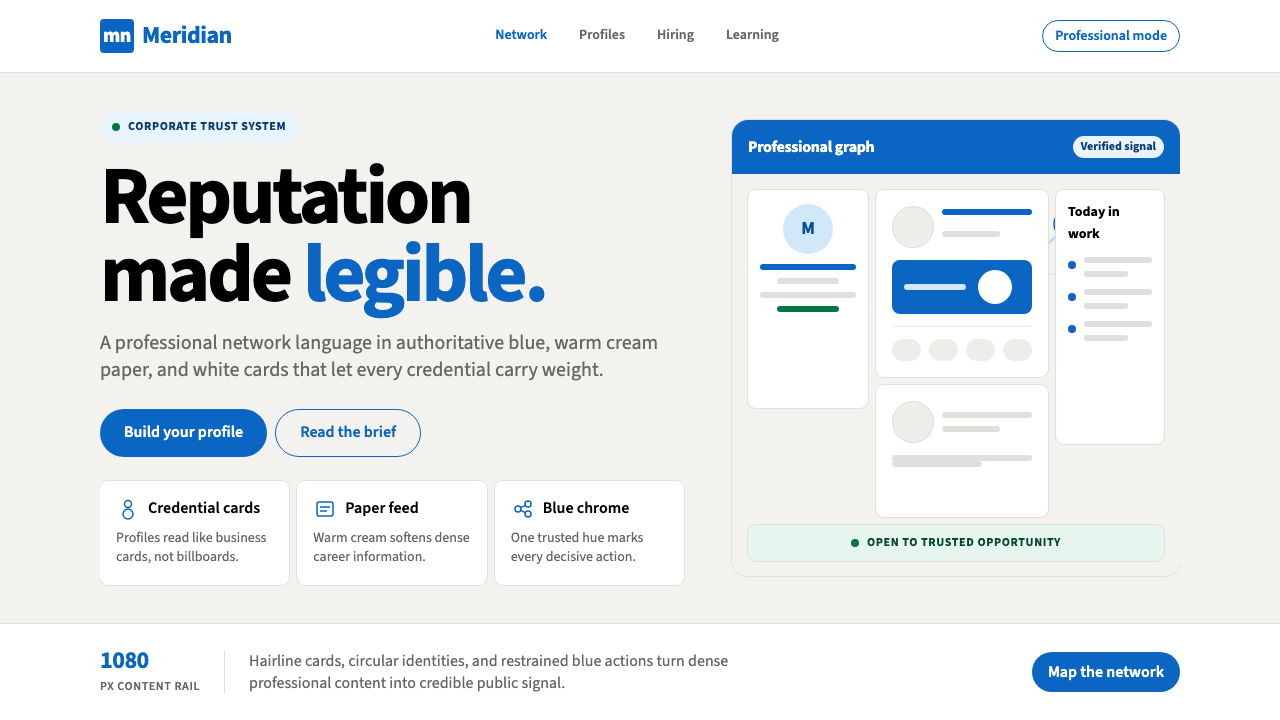 LinkedInCorporate trust, digitized. Authoritative blue frames white cards on warm cre…企业信任数字化:权威蓝框住暖奶油纸面上的白卡。
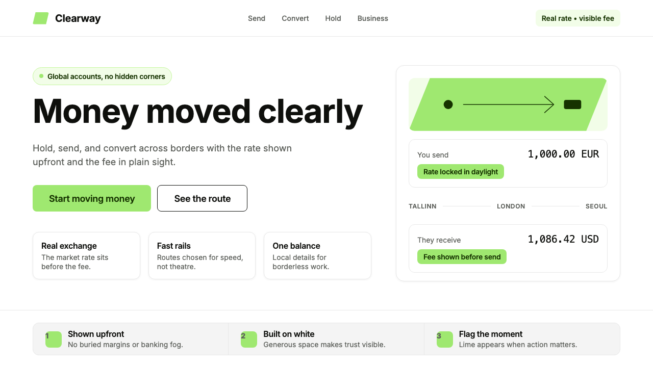 Wise (TransferWise)Clarity feels bankable. Lime flag on white, Inter geometry, quiet fee cards.清晰即可信:白底青柠旗帜、Inter 几何字与细边费用卡。
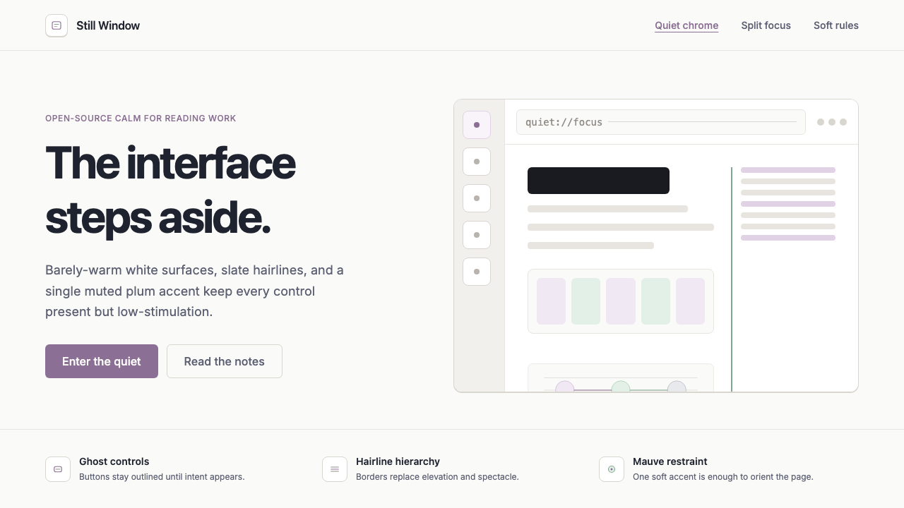 Zen BrowserSoftware steps aside. Warm white, slate hairlines, and muted plum carry the c…软件退到幕后。暖白底、石板灰细线与淡梅紫承载安静。
 Zoom Meeting BlueRemote work's default discipline. One saturated cobalt on pure white, Inter s…远程办公的默认纪律:饱和电子钴蓝压在纯白底上,Inter 无衬线,4px 柔角。
 Android Bugdroid GreenFriendly tech, reduced to geometry. Vivid green pops from Grey 900 and rounde…友好科技化为几何:明绿从 Grey 900 与圆润字形中跃出。
 AsanaCalm productivity breathes. Cream canvas, lavender panels, coral-blue-yellow…安静生产力会呼吸:奶油画布、薰衣草面板与三色圆点。