What is Wise (TransferWise)?什么是 Wise (TransferWise)?
Wise proved that a financial brand can earn trust through pure clarity — a lime flag, white space, and nothing to hide.Wise 证明了金融品牌可以用纯粹的清晰度赢得信任——一面青柠旗帜、充裕的留白,以及无可隐藏的诚意。
Wise (TransferWise) in briefWise (TransferWise) 速览
Wise is a global money transfer and multi-currency banking service whose visual identity — established in its 2021 rebrand from TransferWise — stands as one of the clearest examples of fintech-as-utility design. The system is built around a single, unmistakable lime-green paired with deep navy text on pure white grounds, a palette that communicates confidence and honesty without borrowing the stuffiness of traditional banking or the playful recklessness of early-wave consumer fintech.Wise 是一家全球汇款与多币种银行服务公司,其视觉识别系统——在2021年由 TransferWise 品牌焕新后确立——是金融基础设施设计的最清晰范本之一。整套系统以一种无可认错的青柠绿为核心,搭配深海军蓝文字与纯白底面,这套色彩组合传达出自信与诚信,却不借助传统银行的庄重威严,也没有早期消费金融科技的轻浮感。
Every visual decision in the Wise system serves legibility and trust. Generous white space separates information into digestible units. A single geometric typeface — neutral and highly legible at every size — carries all communication from navigation labels to legal disclosures. Photography depicts real people in real cross-border situations rather than stock-photo abstraction. The overall effect is a brand that feels as straightforward as the promise it makes: the mid-market exchange rate, no hidden fees, no surprises.Wise 视觉系统中的每一个设计决策都服务于可读性与信任感。充裕的留白将信息分解为易于吸收的单元;单一的几何字体——在每种字号下都保持中性且高度易读——承载从导航标签到法律披露的所有文字内容;摄影作品呈现真实的跨境场景中的真实人物,而非泛化的图库图像。最终呈现的品牌,像它承诺的一样直截了当:中间市场汇率、无隐藏费用、没有意外。
What distinguishes Wise from both legacy banks and flashier fintech competitors is its deliberate restraint. Where most financial brands reach for authority through heaviness — dark palettes, serif type, imposing imagery — Wise achieves authority through transparency. The design system behaves like a well-run airport departure board: maximum information, minimum noise, and an implicit assurance that if something were wrong you would already know.将 Wise 与传统银行和更张扬的金融科技竞争对手区分开来的,是它刻意的克制。大多数金融品牌借助厚重感来彰显权威——深色调、衬线字体、压迫性图像——Wise 却通过透明度实现权威。这套设计系统运作起来像一块运转良好的机场航班显示屏:最大化信息量,最小化噪音,以及一种隐含的保证——如果有任何问题,你早就已经知道了。
See the Wise (TransferWise) design system查看 Wise (TransferWise) 完整设计系统
Where does Wise (TransferWise) come from?Wise (TransferWise) 从何而来?
Wise began in 2011 as TransferWise, founded in London by two Estonian friends: Kristo Käärmann and Taavet Hinrikus. Käärmann was working at Deloitte and being paid in pounds while holding a euro-denominated mortgage in Estonia; Hinrikus, Skype's first employee, was earning euros in Estonia while living in London. They solved the problem privately — each topping up the other's local account at the real exchange rate — and realized the mechanism could be formalized into a business. The founding insight was not technological but conceptual: banks were not offering a worse product out of incompetence but out of concealment. The hidden margin buried in the exchange rate was the business model.Wise 于2011年以 TransferWise 之名在伦敦创立,由两位爱沙尼亚朋友克里斯托·科尔曼与塔维特·辛里库斯共同创办。科尔曼当时受雇于德勤,以英镑领薪,却在爱沙尼亚持有一笔以欧元计价的抵押贷款;辛里库斯是 Skype 的第一位员工,在爱沙尼亚以欧元收入,却生活在伦敦。他们以私下的方式解决了这个问题——各自按真实汇率为对方的本地账户充值——随后意识到这套机制可以被正式化为一门生意。创业的核心洞察并非技术性的,而是概念性的:银行提供的不是因无能而糟糕的产品,而是因隐瞒而牟利的产品。藏匿在汇率差价里的隐性利差,才是真正的商业模式。
The early TransferWise brand reflected its startup origins. The visual identity was energetic and deliberately provocateur, most memorably expressed in a 2014 protest in which company employees marched near the Houses of Parliament in their underwear, arguing that banks were taking the clothes off customers' backs. The palette leaned on bright green, but the overall system was informal, irreverent, and positioned squarely against incumbents. This posture served the company during its growth phase — it differentiated TransferWise sharply from anything a traditional bank would produce and gave journalists and regulators a clear story to tell.早期的 TransferWise 品牌忠实反映了其初创气质。视觉识别充满活力且刻意挑衅,最令人难忘的一幕是2014年的一场抗议——公司员工仅穿内衣游行于英国议会附近,以此宣告银行在剥夺消费者的衬衫。色板依赖明亮的绿色,整体系统轻松、不驯,明确将自身定位为现有金融体系的对立面。这种姿态在公司成长阶段大有裨益——它使 TransferWise 与任何传统银行的出品截然不同,并为记者和监管机构提供了一个清晰的故事线。
By 2020, TransferWise had outgrown its antagonist identity. The company had become a significant financial infrastructure provider, not merely a disruptor. It held banking licenses across multiple jurisdictions, offered multi-currency accounts, debit cards, and business banking services. The name TransferWise had also become a constraint — 'Transfer' implied a single use case that no longer described the full product. In 2021, the company rebranded to Wise. The new identity, developed by the in-house Wise Brand team, made a deliberate shift from challenger to institution without sacrificing the clarity and honesty that had distinguished the original brand.到2020年,TransferWise 已经超越了它的对抗者身份。公司已成为一家重要的金融基础设施提供商,而不仅仅是一个颠覆者。它在多个司法管辖区持有银行牌照,提供多币种账户、借记卡和企业银行服务。「TransferWise」这个名字本身也成了一种限制——「Transfer」暗示的单一使用场景已无法描述全部产品。2021年,公司更名为 Wise。新的视觉识别由内部 Wise 品牌团队开发,在不牺牲原有品牌清晰度与诚信气质的前提下,刻意完成了从挑战者到机构的转变。
The centrepiece of the 2021 identity is the flag motif: a lime-green pennant that appears across all brand touchpoints, from app icons to advertising. The flag is simultaneously a navigational symbol — something you plant to mark your position — and a declaration of principle. It visually encodes the company's claim to be a trustworthy landmark in the otherwise murky landscape of international finance. The surrounding system — a refined palette, a disciplined typographic hierarchy, and a photography approach centered on authentic human moments — completed the transition from scrappy fintech to global financial utility. The identity has remained stable through subsequent years, a sign of confidence in the original brief.2021年视觉识别的核心是旗帜图形:一面青柠绿三角旗出现在所有品牌触点,从应用图标到广告投放。这面旗帜同时承载两重含义——既是导航符号(你插旗以标记位置),也是原则宣言。它在视觉上编码了公司的主张:在国际金融这片混浊的地貌中,成为一座值得信赖的地标。周边系统——精炼的色板、严格的字体层级,以及以真实人文时刻为中心的摄影方法——共同完成了从草创金融科技到全球金融基础设施的转型。此后数年,这套视觉识别保持稳定,本身就是对原始设计简报信心的证明。
What defines the Wise (TransferWise) look?Wise (TransferWise) 的视觉特征是什么?
Lime-Green as Signal青柠绿作为信号色
The defining element of the Wise palette is a single, highly saturated lime-green that functions simultaneously as brand identifier, navigational anchor, and trust signal. Its brightness is precisely calibrated: vivid enough to be immediately recognizable in a crowded digital environment, yet not so aggressive that it overwhelms the white space around it. The color does not behave like a typical accent — it carries the full weight of brand recognition. All other palette elements exist to support and contain it.Wise 色板的决定性元素是一种高饱和度的青柠绿,同时承担品牌识别符、导航锚点和信任信号三重功能。它的明度经过精准校准:鲜明到足以在嘈杂的数字环境中被立即辨认,却又不至于强烈到压制周围的留白。这种颜色的行为方式不像普通的强调色——它承载着品牌识别的全部分量。所有其他色板元素的存在,都是为了支撑和容纳它。
Navy and White Foundation海军蓝与白色的基底
Beneath the lime-green, the Wise palette rests on a pairing of deep navy text and pure white backgrounds. Navy carries the weight of financial seriousness without the cold distance of pure black; it suggests authority while remaining approachable. White backgrounds create the breathing room that allows every piece of financial information — exchange rates, fee breakdowns, account balances — to be read without interference. This pairing is the typographic and structural spine of the entire system.在青柠绿之下,Wise 色板以深海军蓝文字与纯白背景的组合作为根基。海军蓝承载金融严肃性的分量,而不带纯黑色的冰冷疏离感;它传递权威,同时保持亲和。白色背景创造了呼吸空间,让每一条金融信息——汇率、费用明细、账户余额——都能在无干扰的情况下被清晰阅读。这一组合是整套系统排版与结构的脊梁。
Geometric Typographic Neutrality几何字体的中性感
Wise uses a single typeface family across all touchpoints, chosen for its geometric construction and exceptional clarity at small sizes. The typeface is deliberately neutral — it has no cultural associations, no historical weight, no stylistic personality that might distract from the information it carries. Its geometric precision communicates rationality and order. Hierarchy is created entirely through scale and weight contrast rather than mixing families or introducing decorative display faces.Wise 在所有品牌触点使用同一字体家族,选择标准是其几何构造方式和在小字号下的卓越清晰度。这款字体刻意保持中性——没有文化联想,没有历史分量,没有可能分散对信息本身注意力的风格个性。其几何精度传达出理性与秩序感。层级完全通过尺度与字重的对比来建立,而不是通过混用字体家族或引入装饰性展示字体。
Functional White Space功能性留白
White space in the Wise system is not aesthetic luxury — it is a transparency mechanism. Financial interfaces are prone to information overload, and the deliberate use of open space around every data element signals that nothing is being hidden between the lines. Fee cards, exchange rate displays, and account summaries are given room to stand alone and be read without confusion. The space itself communicates confidence: a brand with nothing to hide does not need to crowd the page.Wise 系统中的留白不是美学上的奢侈——它是一种透明度机制。金融界面容易陷入信息过载,而在每个数据元素周围刻意使用开放空间,传递出一种信号:行与行之间没有任何隐藏。费用卡片、汇率显示和账户摘要都获得了独立呈现、清晰阅读所需的空间。留白本身传达自信:一个没有任何东西需要隐藏的品牌,不需要将页面填得密不透风。
The Flag Motif旗帜图形
The lime-green flag that anchors the 2021 identity is the system's most distinctive graphic element. It appears in multiple orientations and scales — as an app icon, as a banner in advertising, as a structural device in layouts — but always reads as the same symbol. Its triangular pennant form suggests both movement and permanence: it is planted somewhere, which implies both arrival and commitment. The motif gives the brand a visual shorthand that works entirely without type, a rare achievement for a financial services company.锚定2021年视觉识别的青柠绿旗帜是整套系统中最具辨识度的图形元素。它以多种方向和尺寸出现——作为应用图标、广告中的主视觉、版面中的结构性装置——但始终读作同一个符号。其三角形三角旗的形态同时暗示运动与永恒:它被插在某处,这意味着到达,也意味着承诺。这一图形赋予品牌一种完全不依赖文字就能独立运作的视觉速记——对于金融服务公司而言,这是罕见的成就。
Authentic Documentary Photography真实的纪实摄影
The photography in the Wise system is distinguished by its specificity and warmth. Rather than abstract lifestyle imagery or anonymous stock figures, Wise photography depicts recognizable cross-border situations — a family sending money home, a freelancer receiving a payment from abroad, a small business owner managing multiple currency accounts. The lighting is naturalistic, the expressions are unposed, and the settings are grounded in real geography. This approach makes an implicit argument: the service is used by real people in real situations, not by a demographic construct.Wise 系统中的摄影以其具体性和温度感著称。它没有使用抽象的生活方式图像或匿名图库人物,而是呈现可辨认的跨境场景——向家乡汇款的家庭、收到海外付款的自由职业者、管理多币种账户的小企业主。光线是自然的,表情是非摆拍的,场景扎根于真实的地理背景之中。这种方法隐含着一个论点:这项服务被真实情境中的真实人物使用,而不是被某个人口学构建体使用。
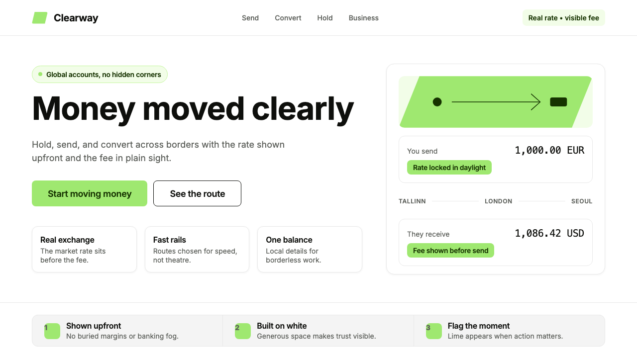
Fee Transparency as Aesthetic Principle费用透明度作为美学原则
One of the most deliberate design decisions in the Wise system is the way fee information is presented: prominently, legibly, and in plain language, rather than relegated to fine print or buried in progressive disclosure. Fee cards and exchange rate displays are treated as primary design elements, not afterthoughts. This is both a product decision and an aesthetic statement: transparency is not merely a value the company espouses but a visual behavior the design system enforces at every touchpoint.Wise 系统中最刻意的设计决策之一,是费用信息的呈现方式:突出、清晰、以平实语言呈现,而不是被推入小号字体或隐藏在逐级展开的内容之中。费用卡片和汇率显示被当作主要设计元素对待,而非事后补充。这既是产品决策,也是美学声明:透明度不仅仅是公司信奉的价值观,更是设计系统在每个触点强制执行的视觉行为。
See the Wise (TransferWise) design system查看 Wise (TransferWise) 完整设计系统
Who shaped Wise (TransferWise)?谁塑造了 Wise (TransferWise)?
Käärmann co-founded TransferWise in 2011 after personally experiencing the hidden costs of cross-border banking. As CEO, he has consistently championed the principle that the design language of the company must reflect its product promise — if the product is about transparency, the brand cannot hide anything either. His commitment to this alignment between product values and visual identity has shaped the company's design culture through the TransferWise era and the 2021 rebrand to Wise.科尔曼在亲身经历跨境银行的隐性成本后,于2011年共同创立了 TransferWise。作为首席执行官,他始终坚持公司的设计语言必须反映其产品承诺——如果产品的核心是透明度,品牌也不能有任何隐藏。他对产品价值观与视觉识别之间一致性的坚守,塑造了公司在 TransferWise 时代及2021年品牌焕新至 Wise 全程的设计文化。
Hinrikus, Skype's first employee and co-founder of TransferWise, brought a product-driven discipline to the early brand. His background in technology — and specifically in software products that had achieved mass adoption by being genuinely better rather than simply marketed harder — influenced the company's foundational belief that design quality and product quality are the same argument. A better product that looks trustworthy will outcompete a worse product that merely looks premium.辛里库斯是 Skype 的第一位员工,也是 TransferWise 的联合创始人,他为早期品牌带来了产品驱动的严谨性。他的技术背景——尤其是在那些通过真正更优秀而非仅靠更大力度营销实现大规模普及的软件产品方面的经验——影响了公司的根本信念:设计质量与产品质量是同一个论点。一个看起来值得信赖的更好产品,将胜过一个仅仅看起来高端的较差产品。
The in-house brand team that led the 2021 rebrand made the consequential decision to build a new identity around institutional confidence rather than challenger energy. They retained the lime-green from the TransferWise era — providing continuity and protecting brand equity built over a decade — while systematizing it within a more disciplined, utility-scaled visual framework. Their work on the flag motif, the typographic hierarchy, and the photography direction established a system that has scaled across product surfaces, marketing, and regulatory communications without losing coherence.主导2021年品牌焕新的内部品牌团队做出了一个关键决定:围绕机构信心而非挑战者活力来构建新的视觉识别。他们保留了 TransferWise 时代的青柠绿——提供视觉延续性,保护十年积累的品牌资产——同时将其纳入一套更为严格、适应基础设施规模的视觉框架之中。他们在旗帜图形、字体层级和摄影方向上的工作,建立了一套能够跨产品界面、营销和监管传播进行规模化延伸而不失连贯性的系统。
The founding story of the company — two Estonians solving their own cross-border banking problem using the real exchange rate — became not just a brand narrative but a design brief. The story mandates honesty as the non-negotiable design value. Every visual decision that followed, from the fee-forward card layouts to the documentary photography, can be traced back to the obligation to look as honest as the product claims to be.公司的创始故事——两位爱沙尼亚人用真实汇率解决自己的跨境银行问题——不仅成为品牌叙事,更成为设计简报。这个故事将诚信确立为不可谈判的设计价值观。此后所有的视觉决策——从费用前置的卡片版面到纪实摄影——都可以追溯到同一个义务:看起来和产品所宣称的一样诚实。
The 2021 rebrand is itself a significant event in fintech design history, representing the moment a digital-native financial challenger chose to communicate maturity and institutional seriousness without abandoning the clarity and directness that had built its reputation. It is a case study in controlled brand evolution: enough change to signal a new chapter, enough continuity to protect a decade of recognition. The decision to center the new identity on a symbolic motif — the flag — rather than purely on typography or color, gave the system a flexibility and emotional register that a purely typographic rebrand would not have achieved.2021年的品牌焕新本身是金融科技设计史上的重要事件,代表着一家数字原生金融挑战者选择传达成熟与机构严肃性、同时不放弃为其建立声誉的清晰感与直接性的历史时刻。这是一个受控品牌演进的案例:变化幅度足以传递新章节的信号,延续程度足以保护十年积累的识别资产。将新视觉识别的核心置于一个象征性图形——旗帜——之上,而非单纯依赖字体或色彩,赋予了这套系统一种纯字体焕新所无法实现的灵活性与情感层次。
How do you use Wise (TransferWise) today?今天怎么用 Wise (TransferWise)?
The Wise visual system is well-suited to any design context where trust, transparency, and clarity are the primary values being communicated. Because the system was designed to handle the full complexity of financial information — exchange rates, fee structures, multi-currency balances, legal disclosures — it performs particularly well in information-dense environments. The core principle is that every design decision should make information easier to find and harder to misunderstand, not merely more visually appealing.Wise 视觉系统适用于任何以信任、透明度和清晰度为首要传达价值观的设计场景。由于这套系统被设计用于处理金融信息的全部复杂性——汇率、费用结构、多币种余额、法律披露——它在信息密集型环境中表现尤为出色。核心原则是:每一个设计决策都应让信息更容易被找到、更难被误解,而不仅仅是让视觉更吸引人。
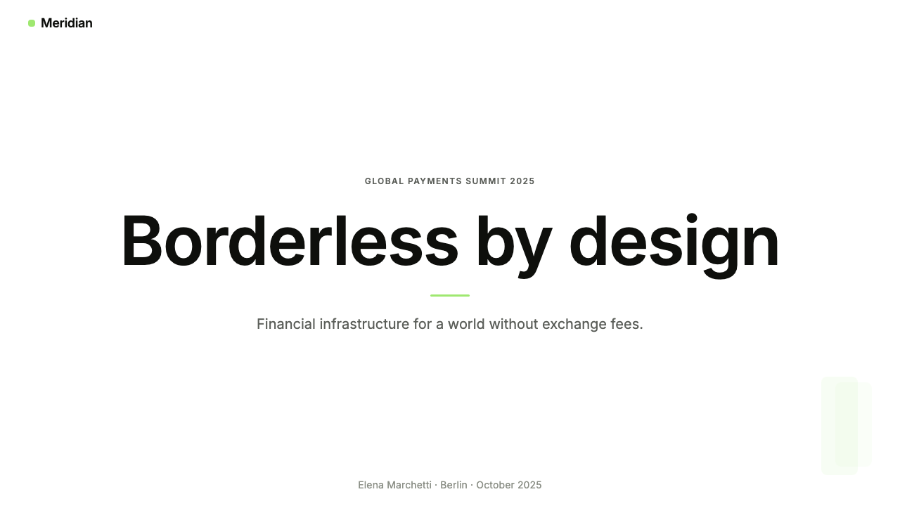
For presentation slides, the Wise approach works on both cover and content pages. A cover page benefits from a bold, asymmetric deployment of the lime-green motif — a flag or flag-derived shape anchoring one corner while the title sits in large, legible type on white. Content pages should use a clear typographic hierarchy: one organizing headline, a clear body level, and supporting data or labels at a smaller size. Data slides particularly benefit from this approach — financial figures, percentage comparisons, and fee breakdowns read with exceptional clarity when given adequate white space and organized within a strict column structure. Avoid decorative chart elements; the data itself, presented in clean type against white, is the visual content.在演示文稿中,Wise 的方法在封面页与内容页上都表现出色。封面页适合大胆、非对称地运用青柠绿图形——一面旗帜或旗帜衍生形状锚定一角,标题以大号、清晰易读的字体置于白色底面上。内容页应使用清晰的字体层级:一个组织性标题、一个清晰的正文层级,以及较小字号的辅助数据或标签。数据幻灯片尤其受益于这种方法——当金融数字、百分比对比和费用明细在充足的留白中呈现、在严格的列结构中组织时,读取效率极高。避免使用装饰性图表元素;数据本身,以简洁字体呈现于白色底面,就是视觉内容。
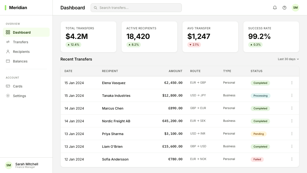
For web interfaces, dashboards, and pricing pages, the Wise system offers a strong model. The approach: work from a white or very light background throughout, use the lime accent exclusively for interactive calls to action and primary navigation highlights, and reserve navy for all substantive text. Card components presenting fee information or account summaries should have clean, visible borders and generous internal padding rather than soft shadows or blurred backgrounds — the goal is that the card looks like something you would hand to a notary, not something you would see in a lifestyle app. Pricing pages in particular benefit from the fee-forward transparency principle: show every number at full size with a clear label, and resist the temptation to defer detail into collapsed sections or tooltips.对于网页界面、仪表板和定价页面,Wise 系统提供了一个有力的参考模型。方法如下:全程使用白色或非常浅的背景,将青柠强调色专门用于交互性行动号召和主要导航高亮,将海军蓝保留用于所有实质性文本。呈现费用信息或账户摘要的卡片组件应具有清晰、可见的边框和充裕的内部填充,而不是柔和阴影或模糊背景——目标是让卡片看起来像你会递给公证人的文件,而不是生活类应用中的界面元素。定价页面尤其受益于费用前置透明度原则:以完整尺寸展示每个数字并配以清晰标签,抵制将细节折叠进收起区域或工具提示的诱惑。
For editorial and marketing work, the Wise style translates well to campaigns where the message is about fairness, access, or financial empowerment. A Wise-influenced marketing layout uses photography centrally, but the photography must be specific and grounded — a recognizable border crossing, a particular currency symbol, a real urban context — not generic aspiration. The lime flag motif can function as a headline-level graphic element in advertising, providing instant brand recognition without requiring the logotype. In editorial contexts, the typographic discipline of the system — one typeface, contrast through scale, ample white space — produces layouts that read as authoritative without being intimidating.对于编辑与营销工作,Wise 风格很好地迁移到以公平、可及性或金融赋权为主题的传播活动中。受 Wise 影响的营销版面将摄影置于核心,但摄影必须具体而落地——一个可辨认的边境口岸、一个特定的货币符号、一个真实的城市背景——而不是泛化的渴望图像。青柠旗帜图形在广告中可以充当标题级图形元素,提供即时品牌识别而无需依赖标准字。在编辑语境中,系统的排版自律——单一字体、通过尺度形成对比、充裕留白——产生的版面读起来权威而不压迫。
A common mistake when applying this system is treating the lime-green as merely a brand color to be applied liberally across backgrounds, buttons, and illustrative elements. The Wise lime functions as a signal, not a surface. When overused as a fill color, it loses its value as a navigational and trust marker and begins to read as aggressive or difficult to read against. The system's power comes from restraint: lime marks the most important action or element on the page, white provides the ground, and navy carries the information. Mixing in additional accent colors, softening borders into shadows, or introducing illustrative elements that compete with photography are the most common ways to dilute the system's effectiveness.应用此系统时最常见的错误,是将青柠绿视为可以自由涂抹于背景、按钮和图示元素的普通品牌色。Wise 的青柠绿功能是信号,而非表面。当它被过度用作填充色时,就会失去作为导航锚点和信任标记的价值,开始显得具有攻击性或在深色背景上难以阅读。这套系统的力量来自克制:青柠绿标记页面上最重要的行动或元素,白色提供底面,海军蓝承载信息。引入额外的强调色、将边框柔化为阴影,或加入与摄影竞争的插图元素,是稀释系统效能的最常见方式。
See the Wise (TransferWise) design system查看 Wise (TransferWise) 完整设计系统
Wise (TransferWise) — FAQWise (TransferWise) · 常见问题
Is the Wise style appropriate for brands outside financial services?Wise 风格适合金融服务以外的品牌使用吗?
Yes, with an important caveat. The Wise visual system encodes a specific set of values — transparency, rational clarity, functional utility — that are not exclusive to financial services. Any product or service where trust is the primary purchase driver, information complexity must be tamed, and honesty is a competitive differentiator can benefit from this approach. Practical candidates include healthcare platforms, legal services, insurance products, tax software, and any B2B tool where professional credibility matters more than emotional resonance. The system struggles in consumer contexts that call for warmth, playfulness, or cultural specificity — luxury goods, children's products, food and beverage brands, or platforms where the experience itself is the product.可以,但有一个重要的前提。Wise 视觉系统所编码的价值观——透明度、理性清晰度、功能性效用——并不是金融服务的专属。任何产品或服务,只要信任是主要的购买驱动力、信息复杂性需要被驯服、诚信是竞争差异化因素,都能从这种方法中受益。合适的候选场景包括医疗健康平台、法律服务、保险产品、税务软件,以及任何专业可信度比情感共鸣更重要的 B2B 工具。在需要温暖感、趣味性或文化特殊性的消费者场景中——奢侈品、儿童产品、食品饮料品牌,或体验本身就是产品的平台——这套系统则力不从心。
How does the Wise design approach differ from generic fintech minimalism?Wise 的设计方法与通用金融科技极简主义有何不同?
Generic fintech minimalism often achieves visual cleanliness through removal — white space, sans-serif type, muted palettes — without that cleanliness encoding any particular values. The result looks modern but says nothing. The Wise system, by contrast, uses its specific design decisions as arguments: the lime-green flag is a claim about trustworthiness; the fee-forward card layout is a claim about transparency; the documentary photography is a claim about real-world relevance. Every element in the system is doing rhetorical work, not just aesthetic work. This is the difference between a system designed to look like a certain kind of company and a system designed to prove it.通用金融科技极简主义通常通过移除来实现视觉整洁——留白、无衬线字体、低饱和色板——但这种整洁并不编码任何特定的价值观。结果看起来现代,却什么也没说。相比之下,Wise 系统将其特定的设计决策用作论点:青柠绿旗帜是对可信度的主张;费用前置的卡片版面是对透明度的主张;纪实摄影是对现实世界关联性的主张。系统中的每个元素都在做修辞工作,而不仅仅是美学工作。这就是一个被设计成看起来像某类公司的系统,与一个被设计用来证明自己就是该类公司的系统之间的区别。
Can the Wise visual system work in dark-mode interfaces?Wise 视觉系统能在深色模式界面中运行吗?
A dark adaptation of the Wise system is technically possible but requires care. The lime-green retains its distinctiveness on dark backgrounds, and navy can be lightened to a pale blue-white for body text. However, the fee-transparency principle — that all financial information should be immediately legible without effort — becomes harder to maintain in a dark environment, where contrast and hierarchy are more difficult to calibrate. The system's photographic approach also loses some of its warmth on dark backgrounds, which tend to shift the reading of images toward drama rather than authenticity. If a dark mode is required, treat it as a secondary surface variant rather than the default, and test every data-display component carefully.Wise 系统的深色适配在技术上是可行的,但需要谨慎处理。青柠绿在深色背景上保持其辨识度,海军蓝可以调浅为淡蓝白色用于正文。然而,费用透明度原则——所有金融信息应无需费力即可立即阅读——在深色环境中更难维持,因为对比度和层级在深色底面上更难校准。这套系统的摄影方法在深色背景上也会失去一部分温度感,深色底面倾向于将图像的阅读感从真实性推向戏剧性。如果需要深色模式,将其视为次要的表面变体而非默认状态,并对每个数据显示组件进行仔细测试。
What is the biggest mistake designers make when borrowing from the Wise aesthetic?设计师在借鉴 Wise 美学时最常犯的错误是什么?
The most common mistake is importing the visual surface — lime-green accents, white backgrounds, geometric type — without importing the underlying discipline of information honesty. The Wise system only works because every visual element is doing a transparent, legible job. Designers who apply the lime color to a product that buries fees, uses dark patterns in its flows, or presents information selectively will find that the visual language creates a credibility gap rather than closing one. The aesthetic signals honesty; if the product does not deliver honesty, the gap between signal and reality becomes more damaging than a more neutral visual approach would have been. Borrow the style only if you are prepared to borrow the standard.最常见的错误是引入了视觉表层——青柠绿强调色、白色背景、几何字体——却没有引入信息诚信这一底层纪律。Wise 系统之所以有效,是因为每一个视觉元素都在做一件透明、清晰的工作。如果设计师将青柠绿应用于一个隐藏费用、在流程中使用暗黑模式,或选择性呈现信息的产品,就会发现这套视觉语言制造了可信度鸿沟,而不是弥合了它。这套美学传达诚信;如果产品不能兑现诚信,信号与现实之间的落差,将比采用更中性的视觉方法更具破坏性。只有在准备好采纳其标准的前提下,才应借鉴这种风格。
How does Wise handle the tension between warmth and professionalism in its design?Wise 如何在设计中处理温度感与专业性之间的张力?
The Wise system resolves this tension primarily through photography rather than color or type. The typographic and structural layers of the system are cool and precise — they provide the professional credibility. The photographic layer introduces human warmth: real faces, real places, real situations involving real money crossing real borders. By separating the warmth-delivery mechanism from the clarity-delivery mechanism, the system can be simultaneously approachable and authoritative without compromising either quality. This is a design lesson that applies broadly: use the most human content format available — photography, in this case — to carry the emotional register, and let the structural elements carry the rational register.Wise 系统主要通过摄影而非色彩或字体来解决这一张力。系统的排版层与结构层是冷静而精确的——它们提供专业可信度。摄影层引入人文温度:真实的面孔、真实的地点、涉及真实金钱跨越真实边界的真实情境。通过将温度传递机制与清晰度传递机制分离,这套系统能够同时保持亲和与权威,而不在任何一个维度上妥协。这是一个具有广泛适用性的设计启示:使用最具人文性的内容形式——在这里是摄影——来承载情感层次,让结构性元素承载理性层次。
Related design styles相关设计风格
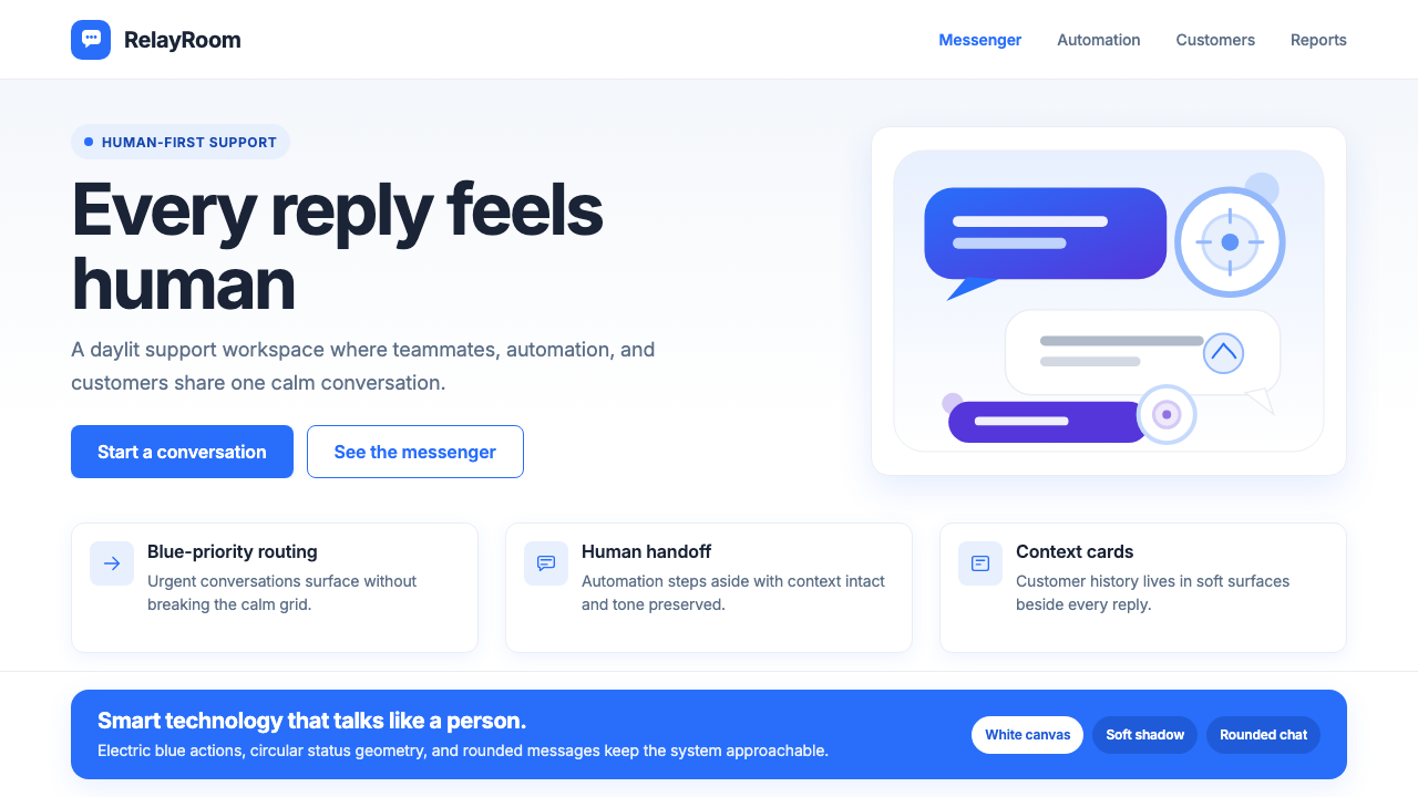 Intercom ModernWarm chat, sharp software. Electric blue bubbles on a daylit white grid.温暖对话,清晰软件。日光白网格托起电光蓝气泡。
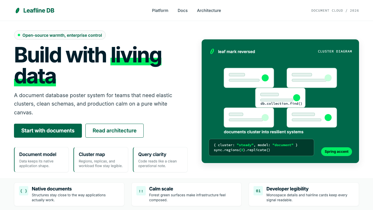 MongoDB Leaf GreenDisciplined green, open warmth. Forest leaf forms and Spring accents breathe…克制的绿有开源温度:森林绿叶形与春绿点缀,留白呼吸。
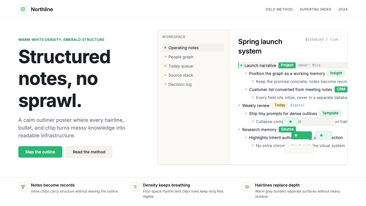 Tana SupertagsCalm density wins. Inter outlines and emerald chips punctuate pure white stru…冷静密度取胜:Inter 大纲与翡翠标签点亮纯白结构。
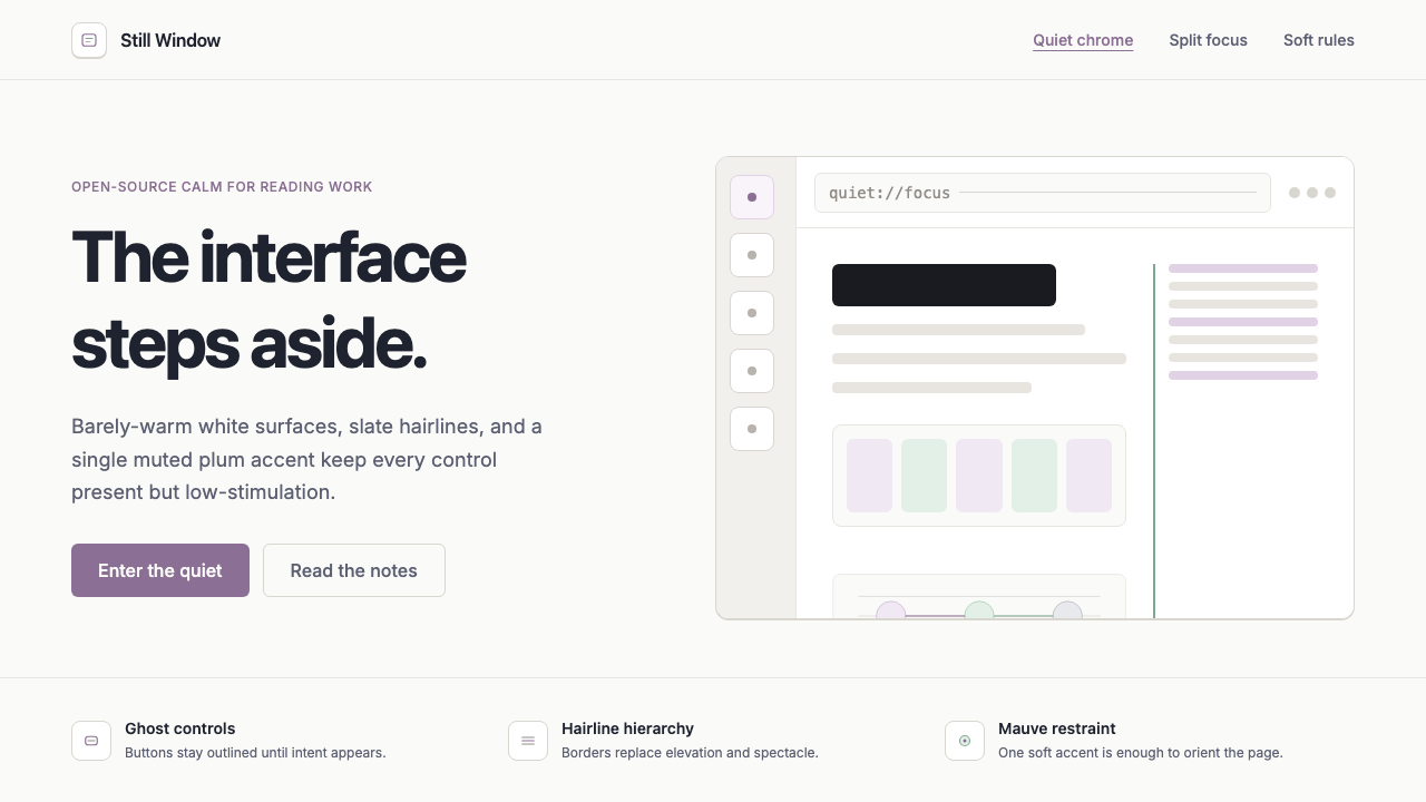 Zen BrowserSoftware steps aside. Warm white, slate hairlines, and muted plum carry the c…软件退到幕后。暖白底、石板灰细线与淡梅紫承载安静。
 Android Bugdroid GreenFriendly tech, reduced to geometry. Vivid green pops from Grey 900 and rounde…友好科技化为几何:明绿从 Grey 900 与圆润字形中跃出。
 AsanaCalm productivity breathes. Cream canvas, lavender panels, coral-blue-yellow…安静生产力会呼吸:奶油画布、薰衣草面板与三色圆点。