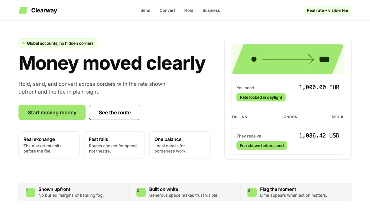
About Wise (TransferWise)
Wise stripped away the startup whimsy of TransferWise and emerged as a financial utility with a flag to plant. The 2021 rebrand centers on a single, unmistakable lime-green paired with deep navy text on white — a palette that communicates trust without the stuffiness of traditional banking.
Every design decision serves clarity: generous whitespace, Inter's neutral geometry, and photography of real people moving real money across real borders. The result is a brand that feels as straightforward as the service it offers.
- Origin
- London, United Kingdom (founded by Estonians)
- Era
- 2011 founded as TransferWise; 2021 rebrand to Wise; current visual ~2022–2024
- Key figures
- Kristo Käärmann · Taavet Hinrikus · Wise Brand team
- Movements
- Cross-border payments · Multi-currency banking · Fintech-as-utility
Wise (TransferWise) design spec
Colors
Typography
The other 11 sections — buttons, cards, spacing, motion, techniques and more — open once you unlock. Download the DESIGN.md or send it to your AI in one click. Unlock once, yours forever.
Sign up nowStyles similar to Wise (TransferWise)
Also inspired by brands & products, with a close feel.
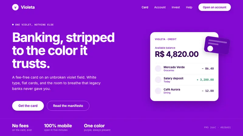 Nubank PurpleBanking stripped to one color. Full-bleed Nupurple ground, white type, generous negative space.
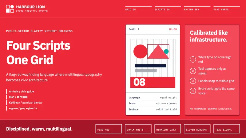 Singapore Merlion BrandPrecision with civic warmth. Flag red and geometric sans lock into a four-script grid.
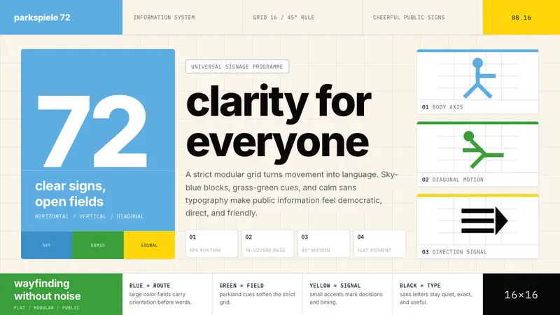 Otl Aicher Munich OlympicsFriendly rigor. Sky-blue grids and straight-line pictograms make public information universal.
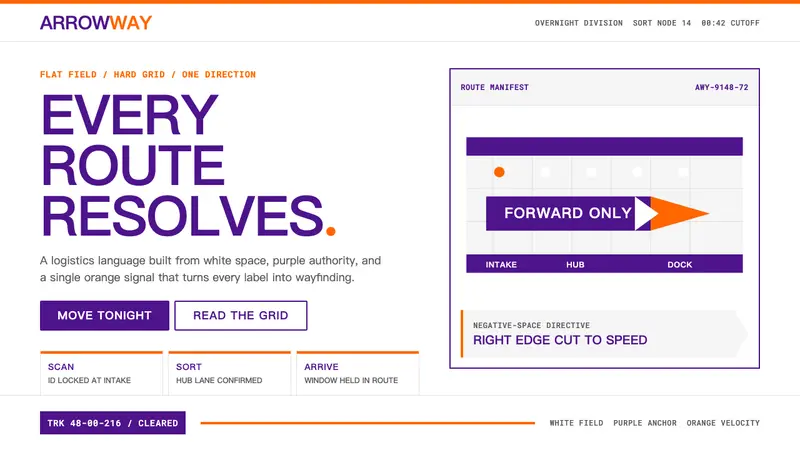 FedExDirections, not decoration. Purple authority and one orange bar organize a flat white grid.