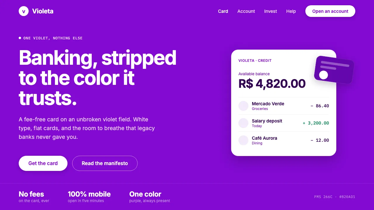
About Nubank Purple
Nubank built one of the most disciplined single-color identities in consumer finance: a full-bleed wash of signature "Nupurple" (#820AD1, PMS 266C) that floods app screens, cards, and marketing. The mandate is literal — purple must always be present.
Minimal white type, flat card mock-ups, and confident negative space sit on an unbroken violet field. This is São Paulo fintech at its most reductive: one violet, white text, no clutter.
- Origin
- Brazil (São Paulo HQ); pan–Latin American expansion
- Era
- 2013 founded; current Nu brand system ~2020–2024
- Key figures
- David Vélez · Cristina Junqueira · Edward Wible
- Movements
- Latin American neobanking · single-color brand systems · mobile-first banking · fee-free credit-card disruption
Nubank Purple design spec
Colors
Background
Surface
Primary
Secondary
Accent
Text
Typography
GellixHeadings
InterBody
IBM Plex MonoMono
Unlock for 1 credit
The other 11 sections — buttons, cards, spacing, motion, techniques and more — open once you unlock. Download the DESIGN.md or send it to your AI in one click. Unlock once, yours forever.
Sign up nowHave an account? Sign in
Styles similar to Nubank Purple
Also inspired by brands & products, with a close feel.
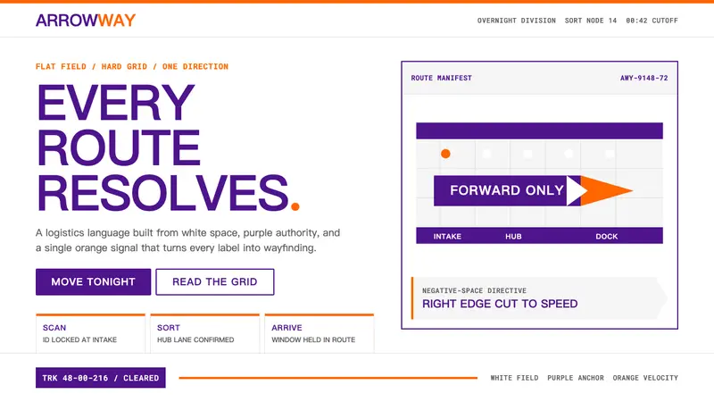 FedExDirections, not decoration. Purple authority and one orange bar organize a flat white grid.
 Strava Orange FitnessData becomes trophy. Inter numerals, gray metric grids, and one orange route line.
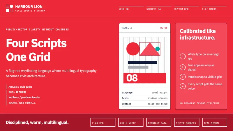 Singapore Merlion BrandPrecision with civic warmth. Flag red and geometric sans lock into a four-script grid.
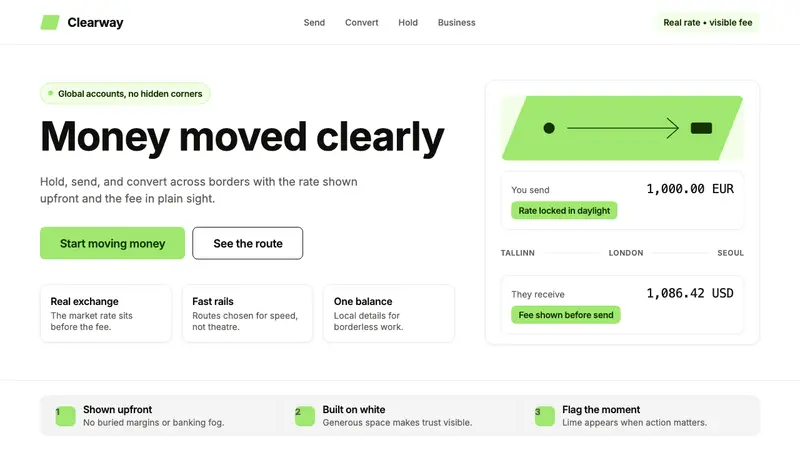 Wise (TransferWise)Clarity feels bankable. Lime flag on white, Inter geometry, quiet fee cards.