What is Nubank Purple?
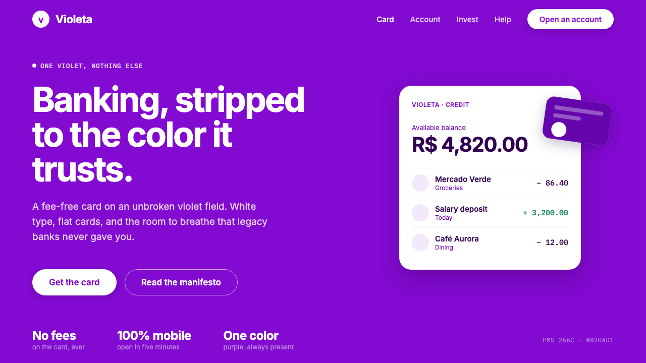
Nubank Purple turns consumer finance into a single confident field: violet everywhere, white type in the open, and nothing competing for attention.
Nubank Purple in brief
Nubank Purple is the visual language associated with Nubank’s consumer-finance identity: a full-bleed signature purple field carrying white typography, white card representations, and unusually generous empty space. The system is intentionally reductive. Purple is not an occasional accent or a campaign flourish; it is the condition that makes the composition recognizably Nubank.
The style makes banking feel direct rather than ceremonious. A large violet surface removes the familiar visual signals of financial institutions—busy information panels, ornamental authority, and a crowded mix of brand colors—and replaces them with a singular atmosphere. White text reads as information placed on a continuous ground, while flat white cards appear as clear objects rather than glossy status symbols.
Its discipline lies in repetition. The same purple presence can hold an app screen, a payment card, or a marketing message without requiring a different visual personality for each context. Negative space is not leftover room. It is an active part of the identity, giving language, product imagery, and calls to action enough separation to feel calm, legible, and deliberate.
Where does Nubank Purple come from?
Nubank was founded in 2013 in São Paulo, Brazil, and belongs to the wave of Latin American neobanking shaped around mobile-first banking and fee-free credit-card disruption. Its identity needed to communicate a break from the visual habits of established finance while remaining simple enough to travel through the compact, repeated interactions of a mobile product.
The named figures connected with this origin are David Vélez, Cristina Junqueira, and Edward Wible. Within the source material, they frame Nubank’s founding context rather than a decorative design mythology. That distinction matters: the Purple system is best understood as a brand decision serving a consumer-finance proposition, not as a historical art movement borrowed for atmosphere.
The current Nu brand system developed across the period from roughly 2020 to 2024, as the company expanded from its São Paulo base across Latin America. In that setting, a single-color system offered coherence across markets and touchpoints. A user could encounter a card, an app surface, or a campaign message and meet the same uninterrupted violet ground.
Nubank Purple therefore sits at the meeting point of mobile-first banking, pan–Latin American expansion, single-color brand systems, and fee-free credit-card disruption. Its visual reduction is strategic: one persistent color creates recognition before a page has to explain itself, while white content can shift in message and function without diluting the overall identity.
What defines the Nubank Purple look?
Persistent Purple
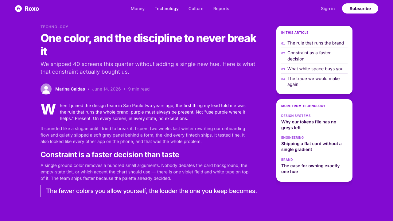
Purple must remain present. It floods the field instead of decorating selected edges, so the background becomes the brand’s most important object. This makes recognition immediate and prevents individual campaigns or interfaces from drifting into unrelated visual moods.
White as Signal
White type and white card forms create the central contrast against violet. White is used as a clear signal for language, product presence, and usable emphasis. The relationship is crisp and flat, with no need for a broad supporting palette to explain hierarchy.
Full-Bleed Field
The violet ground should feel uninterrupted and expansive. Rather than placing purple inside a panel, the composition treats it as the surrounding environment. Content appears within that environment with enough open territory around it to preserve confidence and focus.
Generous Negative Space
Spacing carries much of the style’s restraint. Elements do not need decorative separators when distance can establish their relationship. A message, a card image, and an action can each occupy a distinct quiet zone, making a finance-related screen feel less compressed and more approachable.
Flat Card Presence
Card mock-ups are flat white forms, not metallic trophies or heavily rendered objects. Their simplicity keeps attention on the product while allowing the purple field to remain dominant. The card reads as tangible and useful without interrupting the system’s reductive logic.
Minimal Typography
Typography is spare, white, and allowed to stand alone. The tone comes from direct wording, contrast against the field, and carefully protected space rather than ornamental lettering. Text should feel like a confident voice addressing a person, not a dense institutional document.
Who shaped Nubank Purple?
David Vélez is named in Nubank’s founding context. In an article about Nubank Purple, his importance is tied to the company whose identity turned consumer finance toward a mobile-first, sharply reduced visual presence. The style is not separate from the business context; it gives that context a recognizable public face.
Cristina Junqueira is also named among the figures associated with Nubank’s origin. Her presence locates the identity within the company’s founding story rather than treating purple as an abstract visual trend. Nubank Purple belongs to a specific consumer-finance project and its expansion across Latin America.
Edward Wible completes the group of named figures in the approved founding material. Together, these names anchor the identity in a company established in São Paulo in 2013. The later Nu system carries that origin into a broader regional setting through one visual decision repeated with unusual consistency.
How do you use Nubank Purple today?
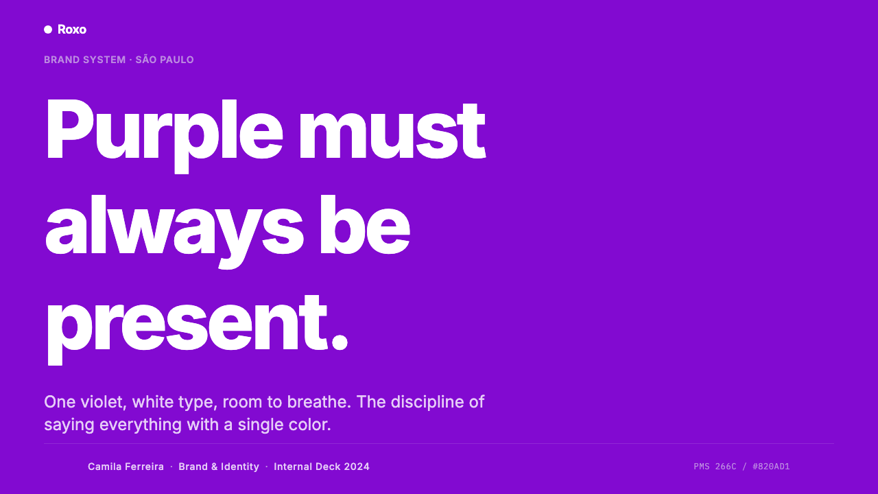
For presentation slides, use the violet field as the unifying stage rather than as a colored header. Cover slides can place a concise white title beside a flat white card form or leave the field nearly empty for a stronger opening. Content slides should separate heading, explanation, and supporting detail through space. Data slides can keep labels white and let the purple ground establish continuity, while white marks and card-like containers clarify the information without turning the slide into a conventional finance dashboard.
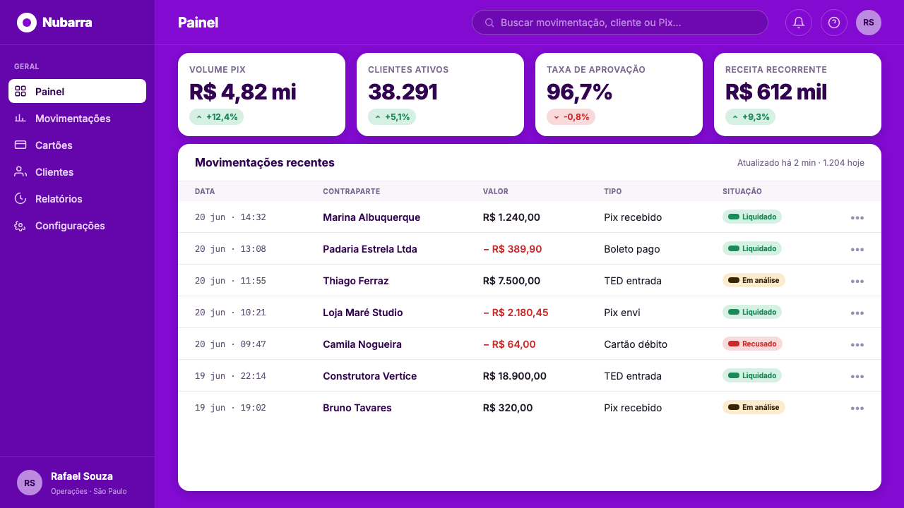
For web interfaces, the system is most convincing when it treats purple as a durable environment across core moments instead of a promotional skin applied to isolated sections. Dashboards can use white surfaces and white type as clear functional signals within that environment. Pricing and product pages can let a white card representation become the focal object, with restrained copy and generously separated actions. The result should feel mobile-first even when viewed on a larger screen: direct, uncluttered, and immediately identifiable.
For editorial and marketing work, Nubank Purple works best when a single message receives real space to land. A campaign can lead with a short white statement on violet, then introduce a flat product image or a white information block only when it has a clear role. Repeated violet fields allow separate pieces to feel like one public voice across markets, while the limited material palette keeps attention on the proposition rather than on decorative production.
A common mistake is to treat the system as merely adding purple to an otherwise generic financial layout. That weakens its central idea. Scattering violet buttons across a pale interface, introducing many competing accents, filling every open area with explanatory graphics, or rendering cards as glossy luxury objects all work against the identity. The stronger application commits to the field, protects white space, and allows white language and flat product forms to do the essential work.
Nubank Purple — FAQ
Is Nubank Purple simply a purple accent palette?
No. Its defining move is not selecting purple for isolated controls or illustrations; it is making signature purple a persistent full-bleed field. White type, white cards, and negative space are organized in response to that field. If purple can disappear without changing the page’s identity, the application has missed the system’s central rule.
Why are white card forms so important?
They create a simple product signal against the violet ground. Because the card form is flat and white, it can be read quickly without competing with the background or requiring elaborate rendering. It makes the banking product present and tangible while preserving the identity’s single-color discipline.
Can the style use other colors?
The approved material defines the system through the mandate that purple is always present, together with white type and white card forms. Additional colors should therefore never displace the violet-and-white relationship or make the page feel multicolored by default. The identity’s clarity comes from reducing competition, not from expanding the palette.
Where does Nubank Purple work especially well?
It is well suited to app surfaces, payment-card communication, product launches, concise marketing pages, presentation covers, and focused dashboard moments. These contexts benefit from immediate recognition and a clear focal message. It is less effective when dense information is allowed to overwhelm the open field, because the system depends on breathing room as much as on color.
Related design styles
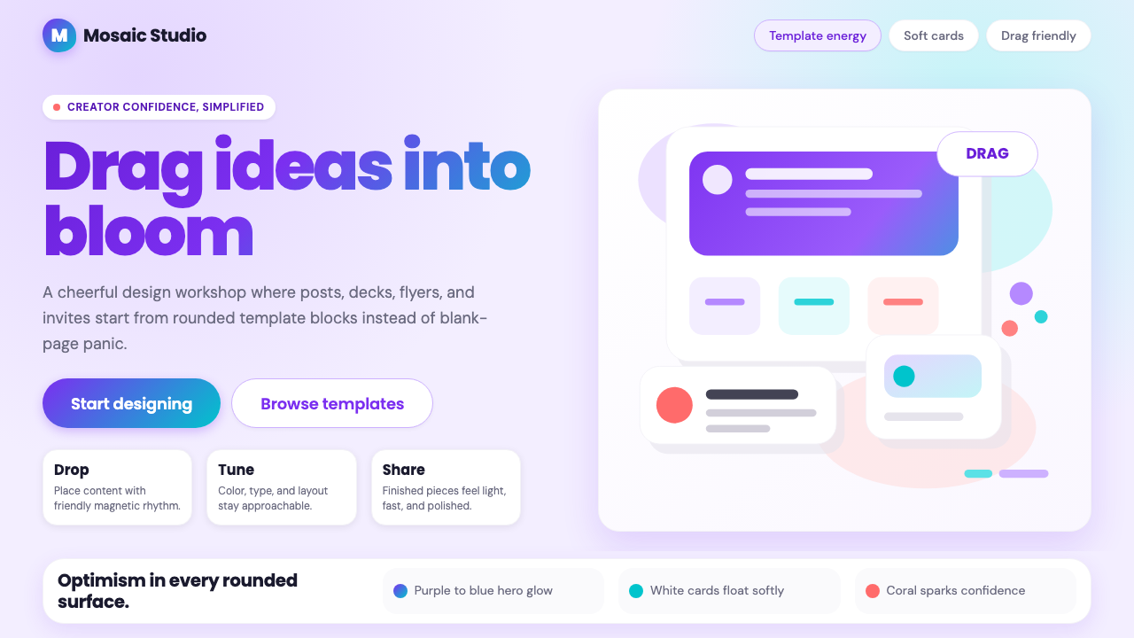 Canva 2024Confidence feels draggable. Purple-blue gradients and floating white template…
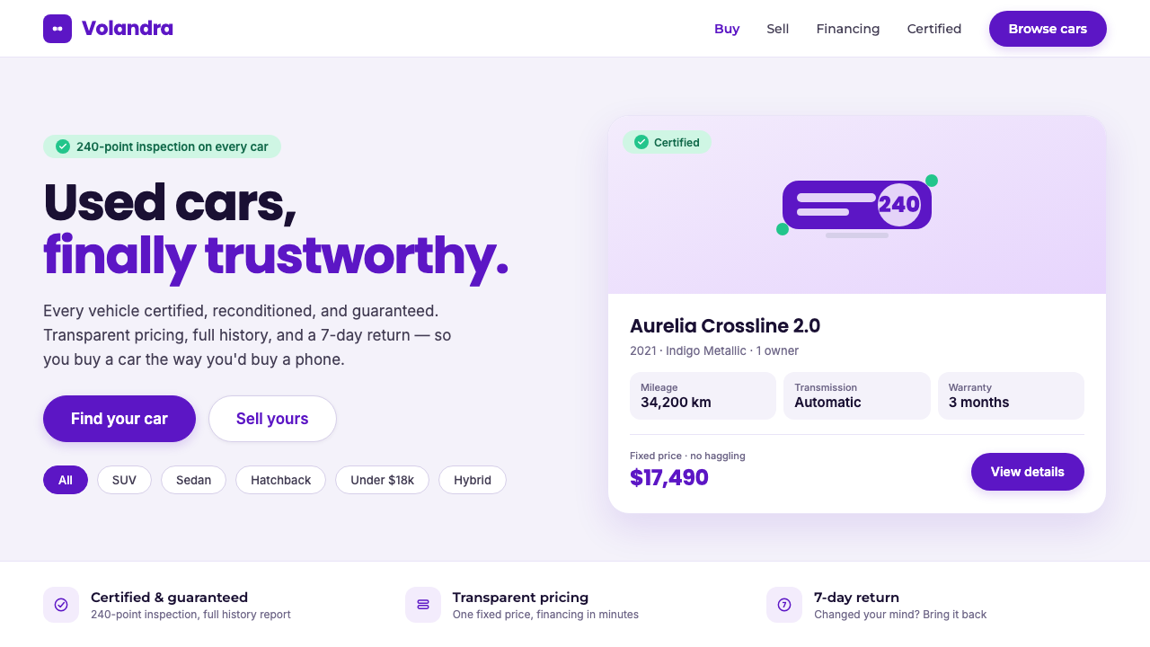 Kavak MarketplaceUsed cars, finally trustworthy. Kavak Purple on violet-tinted white, green ce…
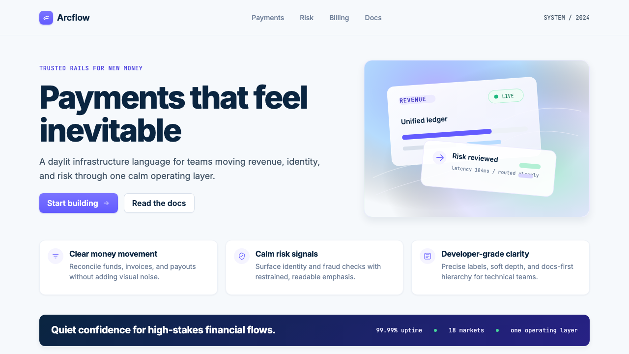 Stripe 2024Trust earns its glow. Indigo mesh, neutral type, and whisper cards float on n…
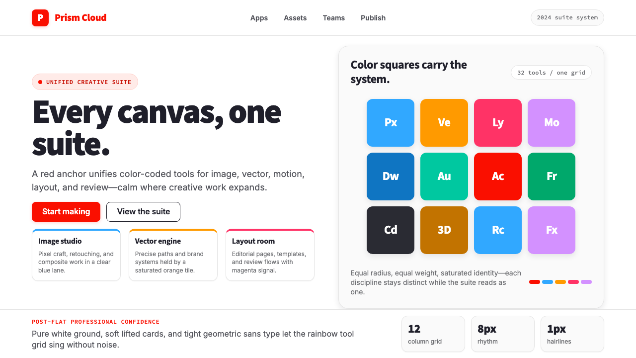 Adobe Creative CloudUnified, not uniform. Red anchor, white space, and saturated app tiles organi…
 Android Bugdroid GreenFriendly tech, reduced to geometry. Vivid green pops from Grey 900 and rounde…
 AsanaCalm productivity breathes. Cream canvas, lavender panels, coral-blue-yellow…