What is Stripe 2024?什么是 Stripe 2024?
Stripe's design language turns the quiet confidence of financial infrastructure into something you can see — a near-white canvas, a deep saturated indigo, and gradient meshes that feel like light refracted through water.Stripe 的设计语言将金融基础设施那种沉静的自信变得可见——近乎纯白的画布、深邃饱和的靛蓝,以及如同光线透过水面折射而成的渐变网格。
Stripe 2024 in briefStripe 2024 速览
Stripe 2024 is the mature visual identity of Stripe, the payments infrastructure company that quietly processes a significant share of the internet's commerce. More than a brand refresh, it is a coherent design system: a near-white foundation, a signature deep indigo-violet, luminous gradient mesh heroes, and a typographic discipline built around neutral-precision letterforms. Together these elements communicate trust, technical competence, and a warmth unusual for enterprise software.Stripe 2024 是支付基础设施公司 Stripe 成熟的视觉标识体系——静悄悄地处理着互联网大量商业交易的那家公司。这不仅仅是一次品牌焕新,而是一套完整的设计系统:近乎纯白的底色、标志性的深靛蓝紫、流光溢彩的渐变网格英雄区,以及以中性精确字形为核心的排印规范。这些元素共同传递出信任感、技术实力,以及企业软件领域罕见的温度。
Where most fintech brands lean on hard blues, rigid grids, and institutional austerity, Stripe's system earns its authority more subtly. The gradient meshes — swirling confluences of indigo, violet, and teal — introduce dimensionality and a sense of organic motion into an otherwise restrained layout. The overall effect is a company that feels engineered without feeling cold, and considered without feeling over-designed.多数金融科技品牌依赖硬朗的蓝色、刚性网格和机构式简朴,Stripe 的系统却以更微妙的方式建立权威感。渐变网格——靛蓝、紫罗兰与青色的漩涡交融——在克制的版面中引入了纵深感和一种有机运动的意象。整体效果是:这家公司感觉像被精密工程构建,却不显冷漠;感觉经过深思熟虑,却不显过度设计。
The system has become a reference point for modern B2B SaaS design, influencing how a generation of startups presents pricing pages, documentation, and product dashboards. Its signature moves — whisper-soft cards floating on near-white, generous breathing room between sections, and color used to guide rather than decorate — have been adapted so widely that the aesthetic now constitutes its own recognizable genre.这套系统已成为现代 B2B SaaS 设计的参考标杆,影响了一代创业公司呈现定价页、文档与产品仪表板的方式。它的标志性手法——浮于近白底面上的轻影卡片、章节间充裕的呼吸空间、用色彩引导而非装饰——被广泛借鉴,以至于这种美学已自成一个可识别的流派。
Where does Stripe 2024 come from?Stripe 2024 从何而来?
Stripe was founded in 2010 by Irish brothers Patrick and John Collison in San Francisco. From its earliest days, the company treated design not as an afterthought but as a competitive advantage — the thesis being that if you could make developer infrastructure as visually compelling as consumer software, you would attract a different kind of customer. The original site was already notable for its directness and typographic care, but it was not yet the recognizable system the industry would later emulate.Stripe 由爱尔兰兄弟 Patrick 和 John Collison 于 2010 年在旧金山创立。从最初起,这家公司便将设计视为竞争优势而非事后补丁——其论点是:如果你能让开发者基础设施在视觉上像消费软件一样令人信服,就会吸引到不同类型的客户。早期网站已因其直接性和排印用心而引人注目,但尚未成为后来业界争相效仿的那套可识别系统。
The visual language that would become Stripe 2024 crystallized gradually between roughly 2017 and 2022, under the influence of Stripe's in-house design leadership — most notably Ludwig van der Pol, who led design efforts across that period. A deep indigo-violet moved to center stage as the brand anchor; whitespace became more deliberate; the gradient mesh emerged as the hero treatment of choice. By 2020 the system was coherent enough that 'Stripe-like' had entered the working vocabulary of product briefs across Silicon Valley — shorthand for premium, considered, and technically credible.最终演变为 Stripe 2024 的视觉语言,在大约 2017 至 2022 年间逐渐成形,深受 Stripe 内部设计领导层影响——尤其是在那段时期主导设计工作的 Ludwig van der Pol。深邃的靛蓝紫色被推至品牌核心;留白变得更加刻意;渐变网格成为英雄区域的首选处理方式。到 2020 年,整套系统已足够连贯,以至于「Stripe 风格」进入了整个硅谷产品简报的工作词汇——成为高端、考究、技术可信的速记。
Two broader cultural movements shaped the style. The first is what might be called the Gradient Mesh Renaissance of the early 2020s: a reaction against the flat-design orthodoxy of the 2013–2018 period, in which designers rediscovered that subtle color gradients could add emotional warmth and dimension without reintroducing the skeuomorphic excess of the early mobile era. Stripe's gradient meshes were among the most studied examples of this approach. The second movement is Modern B2B SaaS Minimalism — the recognition, driven partly by companies like Linear, Vercel, and Stripe itself, that enterprise software did not have to look enterprise.两个更宏观的文化运动塑造了这套风格。第一个可以称为 2020 年代初的渐变网格文艺复兴:对 2013 至 2018 年间扁平化设计正统的一种反拨——设计师们重新发现,微妙的色彩渐变能够在不引回早期移动时代拟物化过度的前提下,增添情感温度与层次感。Stripe 的渐变网格是这一方法中被研究最多的范例之一。第二个运动是现代 B2B SaaS 极简主义——由 Linear、Vercel、Stripe 等公司部分推动的认知:企业软件不必看起来像企业软件。
Stripe Press, the company's publishing imprint launched in 2018, also contributed subtly to the system's character. Its book covers — drawing on the mid-century typographic tradition of publishers like Penguin — featured bold type, limited color, and high-contrast compositions on solid grounds. The imprint signaled that Stripe conceived of itself as a cultural institution as much as a fintech platform. That ambition is legible in the restrained authority of the 2024 design system. The system does not shout; it publishes.Stripe 于 2018 年创立的出版品牌 Stripe Press,也以隐微的方式丰富了这套系统的气质。其书籍封面汲取了企鹅等出版社二十世纪中叶排印传统的营养——大胆字体、有限色彩、实色底面上的高对比度构图。这一品牌传递出一个信号:Stripe 将自己定位为文化机构,而不仅仅是金融科技平台。这种抱负在 2024 年设计系统克制的权威感中清晰可辨。这套系统不喧哗;它出版。
What defines the Stripe 2024 look?Stripe 2024 的视觉特征是什么?
Near-White Foundation近白底色
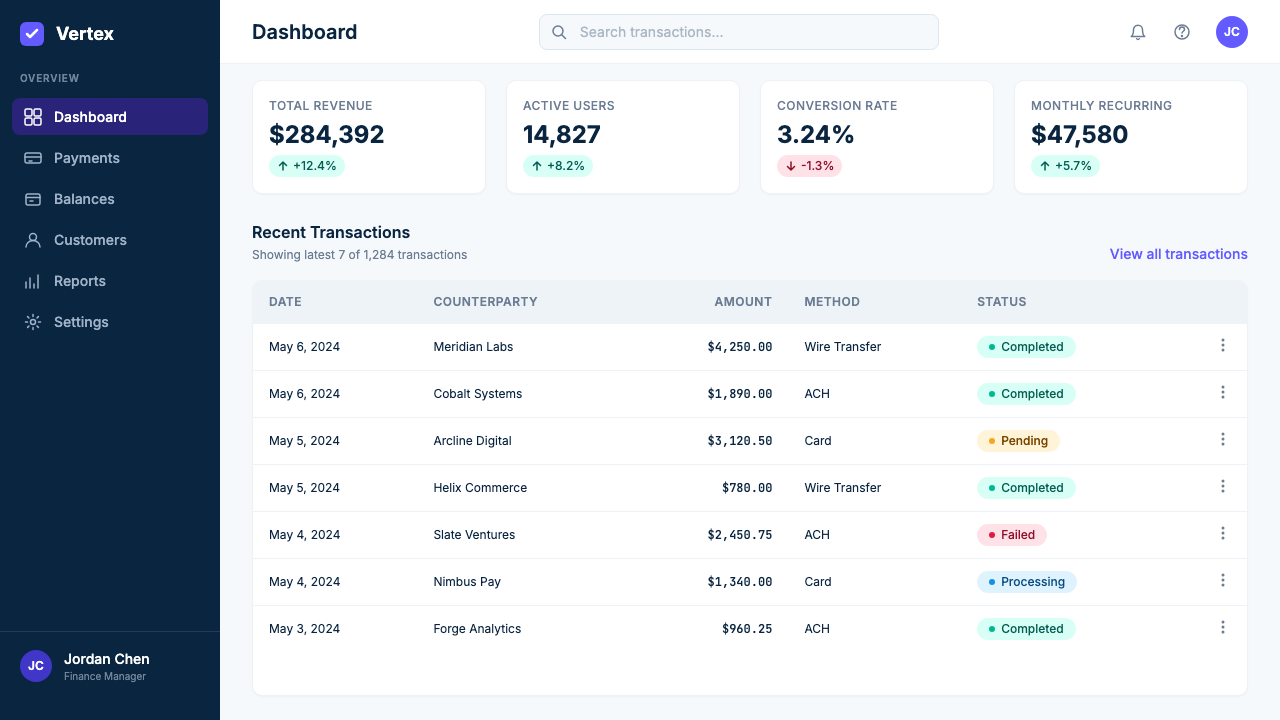
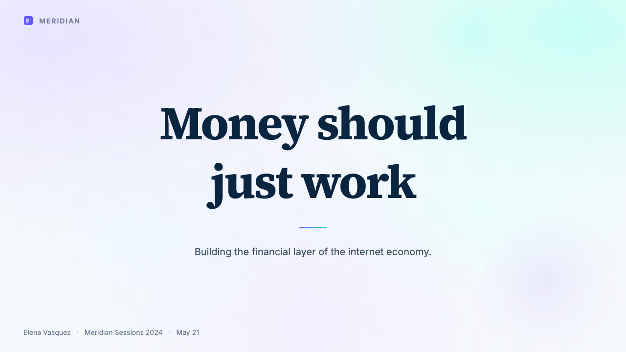
The canvas is not pure white but a subtly warmed near-white, giving the overall page a quality associated with premium print rather than clinical screen. This barely perceptible warmth prevents the starkness of pure white while keeping the layout airy and open. All other tonal decisions — card backgrounds, dividers, hover states — are calibrated as soft variations on this ground. The slightly off-white base is one of the system's quietest and most effective choices.画布并非纯白,而是带有一丝温度的近白,赋予整个页面一种与高档印刷品而非临床屏幕相关联的质感。这几乎察觉不到的温暖避免了纯白的刺眼,同时保持版面轻盈开阔。其他所有色调决策——卡片背景、分割线、悬停状态——都以这个底色的柔和变体为基准。略微偏白的底色是系统最静默也最有效的选择之一。
Indigo-Violet Signature靛蓝紫标志色
The brand's primary accent is a deep, saturated indigo that sits between blue and violet on the spectrum — authoritative enough to anchor a hero section, distinctive enough to be immediately recognizable. It carries associations of depth, technical precision, and a certain gravity without veering into the cold institutional blue common among financial competitors. This color does the heaviest identity work in the system, appearing as the primary interactive color, the call-to-action anchor, and the dominant hue in the gradient mesh.品牌的主要强调色是一种深邃、饱和的靛蓝,在色谱上介于蓝与紫之间——足够权威,能够锚定英雄区;足够独特,能够立刻被辨认。它承载着深度、技术精准与一定分量感的联想,同时不偏向金融竞争者常用的冰冷机构蓝。这种颜色在系统中承担着最重的标识工作,出现在主要交互色、行动号召锚点,以及渐变网格的主导色调中。
Gradient Mesh Hero渐变网格英雄区
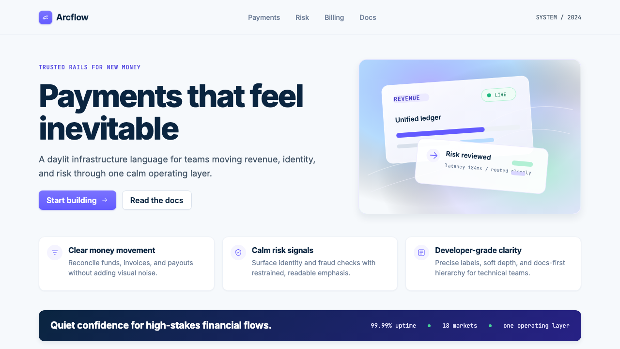
The most visually distinctive element is the gradient mesh: a smooth, swirling blend of indigo, violet, and teal applied to large hero sections and occasionally to feature block backgrounds. Unlike flat gradients, a mesh gradient has no clear directionality — it suggests depth and motion without committing to either. Each gradient layer is applied at low opacity so the effect reads as atmospheric rather than decorative. Placed over the near-white canvas, it reads as light refracted through glass or water, warm and alive in a way that flat color cannot achieve.视觉上最独特的元素是渐变网格:一种平滑漩涡状的靛蓝、紫罗兰与青色混融,施用于大型英雄区域,有时也用于特性模块的背景。与平面渐变不同,网格渐变没有明确的方向性——它暗示深度与运动,却不偏执于任何一者。每一层渐变以低不透明度叠加,使效果呈现为氛围性而非装饰性。置于近白画布之上,它读来如同光线透过玻璃或水面折射,呈现出平面色彩无法达到的温暖与生动。
Whisper-Soft Cards轻影卡片
Cards are a primary compositional unit in the system, and their treatment is deliberately understated. Borders are so faint they function more as shape definition than as visible lines. Shadows are extremely subtle — barely perceptible — lifting each card off the near-white page without creating strong contrast. Rounded corners reinforce the approachable quality. The cards feel like they float rather than sit; they occupy space gently, without demanding attention. This softness is calibrated to contrast with the boldness of the gradient mesh.卡片是系统中最主要的构图单元,其处理方式刻意低调。边框轻淡到几乎透明——与其说是可见的线条,不如说是形状的定义。阴影极为微妙,几乎难以察觉,将每张卡片从近白页面上托起,而不产生强烈对比。圆角进一步强化了亲切感。卡片感觉是悬浮的而非搁置的;它们温柔地占据空间,不强行抓取注意力。这种柔软与渐变网格的大胆形成刻意的对照。
Typographic Precision排印精确感
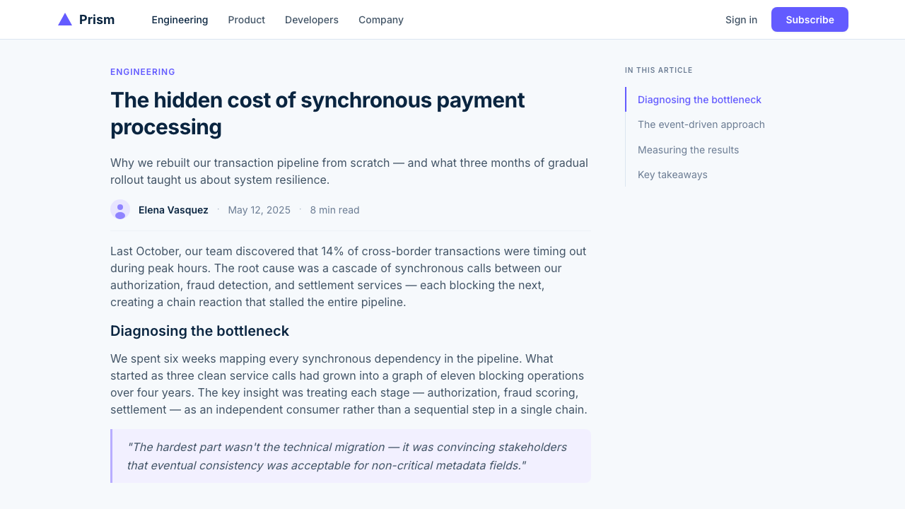
The type system pairs a neutral geometric sans-serif with disciplined scale and spacing. Display headings are large and confidently tracked — letterforms given generous room to breathe at dramatic sizes — creating an airy openness in section titles. Body text is set at a comfortable reading size with adequate line height for technical content. The absence of decorative typefaces is intentional: in a payments context, legibility and neutrality are trust signals. Type does not perform personality; it performs reliability.字体系统将中性的几何无衬线字体与严格的尺度和间距搭配。展示标题尺寸大,字形间距慷慨——在戏剧性的尺寸下给字形以充裕的呼吸空间——在章节标题中营造出通透的开阔感。正文以舒适的阅读字号设置,为技术内容提供充足的行高。刻意回避装饰性字体:在支付语境中,可读性与中立性是信任信号。字体不表演个性——它表演可靠性。
Generous Whitespace慷慨留白
Sections are separated by far more breathing room than typical enterprise software affords. This generosity of space accomplishes several things at once: it prevents cognitive overload, it confers a sense of quality associated with luxury goods or editorial design, and it gives individual elements — particularly feature callouts and pricing cards — room to be considered on their own terms. Whitespace in Stripe's system is not empty; it is structural. The rhythm of space between elements is as carefully considered as the elements themselves.章节之间的间距远大于典型企业软件所给予的。这种慷慨的空间同时实现了多个目标:防止认知过载,赋予一种与奢侈品或编辑设计相关联的质感,并给予个别元素——尤其是特性引用与定价卡片——以被独立审视的空间。Stripe 系统中的留白不是空洞的;它是结构性的。元素间空间的节奏与元素本身一样经过精心考量。
Restrained Color Logic克制的色彩逻辑
Outside the gradient meshes, color is used with deliberate restraint. The deep indigo anchors all interactive elements. Secondary tones — soft teals, muted lavenders — appear as supporting accents in illustrations and icon backgrounds, never competing with the primary indigo for dominance. Functional colors carry semantic meaning: a clear green for success, a clear red for errors, an amber for warnings. The system never feels colorful in the way of a marketing-heavy brand; it feels considered, where every color placement has a reason.在渐变网格之外,色彩被刻意克制地使用。深靛蓝锚定所有交互元素。次级色调——柔和的青色、静谧的薰衣草色——作为插图与图标背景中的辅助强调色出现,从不与主色靛蓝竞争主导权。功能性色彩承载语义意义:清晰的绿色代表成功,清晰的红色代表错误,琥珀色代表警告。这套系统绝不给人以营销型品牌那种色彩丰富的感觉——它给人以深思熟虑的感觉,每一处色彩放置都有其理由。
Who shaped Stripe 2024?谁塑造了 Stripe 2024?
Co-founder and CEO of Stripe, Patrick Collison established design as a first-class concern from the company's earliest days. His conviction that developer infrastructure could be as thoughtfully crafted as consumer software set the cultural conditions that allowed a distinctive visual identity to emerge and be maintained at scale. Stripe's design standards became an industry benchmark in part because its leadership created the organizational conditions for long-horizon design work rather than short-term visual fixes.Stripe 联合创始人兼 CEO Patrick Collison 从公司创立之初便将设计列为头等大事。他坚信开发者基础设施可以像消费软件一样被精心打磨,这种理念设定了文化条件,使独特的视觉标识得以涌现并在规模化中得到维护。Stripe 的设计标准之所以成为行业基准,部分原因在于领导层为长周期设计工作而非短期视觉修补创造了组织条件。
Co-founder and President of Stripe, John Collison shaped the company's developer-first ethos, which permeates the visual identity as much as the product. The decision to treat documentation as a design surface — to make reading technical references a genuinely pleasant experience — flows directly from his priorities. This integration of developer experience and brand experience gives Stripe's design language an unusual coherence across contexts, from a marketing homepage to a deeply nested API reference page.Stripe 联合创始人兼总裁 John Collison 塑造了公司的开发者优先精神,这种精神渗透到视觉标识之中,正如它渗透到产品之中一样。将文档视为设计界面的决策——让阅读技术参考成为真正愉快的体验——直接源于他的优先取向。开发者体验与品牌体验的整合赋予了 Stripe 设计语言在不同语境间罕见的一致性,从营销首页到深层嵌套的 API 参考页皆如此。
Design leader at Stripe through the period when the 2020–2024 visual language crystallized. Van der Pol's leadership shaped the specific character of the indigo palette, the gradient mesh treatment, and the layered card system that made the Stripe look recognizable worldwide. His work demonstrated that a fintech company's marketing site could function as a portfolio of craft in its own right — a standard that propagated throughout the B2B SaaS industry.Stripe 在 2020 至 2024 年视觉语言成形期间的设计领导者。van der Pol 的领导塑造了靛蓝色板、渐变网格处理与分层卡片系统的具体特征,使 Stripe 的视觉风格在全球范围内具有辨识度。他的工作证明,一家金融科技公司的营销网站本身可以作为一件精心制作的作品——这一标准在整个 B2B SaaS 行业广泛传播。
Stripe's publishing imprint, launched in 2018, extended the company's design language into physical books with covers drawing on the mid-century typographic tradition of publishers like Penguin: bold type, limited color, geometric composition on solid-colored grounds. The imprint demonstrated that Stripe's design sensibility was not a marketing veneer but a coherent worldview extending from screen to paper. It introduced a restrained editorial gravity into the broader Stripe visual identity — the feeling that the company designs as a publishing house, not a startup.Stripe 于 2018 年创立的出版品牌,将公司的设计语言延伸至实体书籍,其封面汲取了企鹅等出版社二十世纪中叶排印传统的营养:大胆字体、有限色彩、实色底面上的几何构图。这一品牌证明,Stripe 的设计感知力不是营销的表层涂抹,而是从屏幕延伸至纸张的连贯世界观。它向更广泛的 Stripe 视觉标识引入了一种克制的编辑性庄重感——让人感受到这家公司是以出版社的方式而非初创公司的方式在做设计。
Stripe did not invent B2B SaaS minimalism alone. A cohort of developer-focused companies — including Linear (project management), Vercel (deployment infrastructure), and Resend (email API) — developed parallel visual languages in the same period, all sharing the near-white palette, generous whitespace, neutral sans-serif typography, and soft-shadow cards. Together, they established a new standard for the category and created the context in which 'Stripe-like' became a meaningful shorthand for quality rather than a description of a single company's style.Stripe 并非独自发明了 B2B SaaS 极简主义。同期有一批面向开发者的公司——包括 Linear(项目管理)、Vercel(部署基础设施)与 Resend(邮件 API)——发展出平行的视觉语言,全都共享近白色板、充裕留白、中性无衬线排印与软阴影卡片。它们共同为这一品类确立了新标准,并创造了这样一个语境:「Stripe 风格」成为质量的有意义速记,而非对某家具体公司风格的描述。
How do you use Stripe 2024 today?今天怎么用 Stripe 2024?
Stripe 2024 is among the most transferable contemporary styles for professional work, precisely because its principles are systematic rather than idiosyncratic. Applying it well requires understanding the underlying logic — whitespace as active composition, color as identity anchor, shadow as whisper — rather than copying surface-level visual cues. The gradient mesh is the most tempting element to borrow, but it is also the most easily misapplied.Stripe 2024 是当代最具可移植性的专业设计风格之一,原因恰恰在于其原则是系统性的而非特异性的。良好地应用它,需要理解其底层逻辑——留白作为主动构图、色彩作为身份锚点、阴影作为低语——而非照搬表面视觉线索。渐变网格是最容易被借用的元素,但也是最容易被误用的。
For presentation slides, the style works exceptionally well on cover pages and feature-overview slides. A cover benefits from the gradient mesh treatment: a near-white background with swirling indigo-violet-teal color pooling in one corner or across the upper half, combined with a large neutral sans-serif heading at confident weight and tight spacing. Avoid placing the mesh on every slide — its power comes from being exceptional. Content slides should be treated as card layouts: one concept per card zone, generous margins, type at two or three size steps for hierarchy, and a single indigo accent for calls to action or key data points. Data slides use contained card areas to group charts and supporting labels, keeping the eye within a defined zone.对于演示文稿,这种风格在封面页和功能概览页上表现出色。封面适合使用渐变网格处理:近白背景上,靛蓝-紫罗兰-青色的色彩在某一角落或上半区域漩涡汇聚,配以大号中性无衬线标题,字重有力、间距紧凑。避免在每一张幻灯片上都使用网格——它的力量来自例外性。内容幻灯片应当被视为卡片布局:每个卡片区域一个概念,充裕留白,字体以两到三个尺寸步阶建立层级,单一靛蓝色调作为行动号召或关键数据点的强调。数据幻灯片使用包含的卡片区域将图表与辅助标签分组,将视线保持在定义区域内。
For web UI — dashboards, pricing pages, documentation portals — this is the style's native territory. Dashboards benefit from the card-centric layout: a near-white page background, white surface cards with barely visible borders and whisper-soft shadows, neutral sans-serif type in two weights for metric labels and body, and the deep indigo reserved exclusively for interactive states, focus indicators, and key action buttons. Pricing pages work well with the gradient mesh applied to the recommended plan's column header, drawing the eye without requiring a different background color. Navigation should be typographic and unobtrusive.对于网页界面——仪表板、定价页、文档门户——这是这套风格的原生领地。仪表板受益于以卡片为中心的布局:近白页面背景、带有几乎不可见边框和轻语阴影的白色表面卡片、中性无衬线字体以两种字重用于指标标签和正文,深靛蓝仅保留用于交互状态、焦点指示器与关键操作按钮。定价页对推荐方案的列标题应用渐变网格效果很好,无需更换背景色即可引导视线。导航应当是字体性的且不显眼。
For editorial and marketing content, the style supports strong informational hierarchy and a tone of considered authority. Long-form articles or documentation pages use a comfortable reading measure for body text, generous paragraph spacing, and section breaks marked by subtle horizontal rules rather than decorative dividers. Marketing landing pages work well with alternating content sections using slightly different tonal backgrounds to create visual rhythm without heavy color blocks. Hero sections carry the gradient mesh as the primary visual anchor; all subsequent sections should be clean and unadorned.对于编辑与营销内容,这套风格支持强劲的信息层级与考究权威的基调。长篇文章或文档页面为正文使用舒适的行宽,充裕的段落间距,以及用微妙水平线而非装饰分割线标记的段落分隔。营销落地页受益于交替使用略有不同底色调的内容区,在不诉诸厚重色块的前提下创造视觉节奏。英雄区以渐变网格作为主视觉锚点;其后所有区块应保持干净简洁。
A common mistake when applying this style is treating the gradient mesh as wallpaper rather than as a focal statement. Because it is the most visually memorable element, there is strong temptation to apply it everywhere — which destroys the contrast that makes it effective. The mesh works because it is the exception: deployed only at the top of the page or in key feature headers, it sets emotional tone and then steps back. A second frequent error is using the deep indigo at full saturation for body copy or secondary UI elements, which creates visual fatigue. Reserve full saturation for primary calls to action and the mesh itself; let the surrounding palette remain near-white, neutral, and restful.应用这套风格时最常见的错误是将渐变网格当作壁纸而非焦点陈述。由于它是视觉上最令人印象深刻的元素,将其用在每一个区块的诱惑很强——但这恰恰摧毁了使其有效的对比。网格之所以有效,正因为它是例外:只在页首或关键特性标题处使用,它设定情感基调,然后退出舞台。第二个常见错误是对正文或次要 UI 元素使用完全饱和的深靛蓝,这会造成视觉疲劳。将全饱和度保留给主要行动号召和网格本身;让周围的调色板保持近白、中性而宁静。
Stripe 2024 — FAQStripe 2024 · 常见问题
Can Stripe 2024 work for a non-fintech product?Stripe 2024 风格能用在非金融科技产品上吗?
Yes — and it frequently does. The style has propagated far beyond payments into developer tools, project management software, marketing platforms, and documentation portals. What it communicates is technical credibility, considered restraint, and professional trust — not anything specific to finance. Any product that wants to signal it was built carefully by people who care about quality can adopt the style. It struggles in contexts requiring warmth, sensory richness, or cultural specificity — food, wellness, children's products, entertainment — where the near-white restraint reads as cold or sterile rather than considered.可以——而且很常见。这套风格早已从支付领域扩散到开发者工具、项目管理软件、营销平台与文档门户。它传递的是技术可信度、考究的克制感与专业信任,而非任何金融特定的含义。任何想要传达「由在乎品质的人精心构建」的产品都可以采用这套风格。它在需要温暖感、感官丰富性或文化特殊性的场景中力不从心——食品、健康、儿童产品、娱乐——在这些地方,近白色的克制会被解读为冷漠或过于干净,而非考究。
What makes the Stripe gradient mesh different from a generic gradient?Stripe 的渐变网格与普通渐变有什么不同?
The difference is in layering, opacity, and restraint. A generic gradient typically runs from one color to another in a linear or simple radial pattern at full saturation. The Stripe gradient mesh overlays multiple radial color pools — each at very low opacity — positioned at different focal points so they interact and blend organically rather than producing a clean color transition. The result looks like softly colored light pooling on a surface rather than a filled background. The second key difference is color discipline: constraining the hues to closely related indigo, violet, and teal keeps the mesh harmonious rather than disruptive.差别在于叠加方式、不透明度与克制程度。普通渐变通常是从一种颜色到另一种颜色的线性或简单径向过渡,以满饱和度呈现。Stripe 渐变网格将多个径向色彩池叠加——每层以极低不透明度——定位于不同焦点,使它们有机地交织混合,而非产生整洁的色彩过渡。结果看起来像柔和彩色光线汇聚在一个平面上,而非一个被填充的背景。第二个关键差别在于色彩纪律:将色调限定在相近的靛蓝、紫罗兰与青色之内,使渐变网格保持和谐而非破坏性。
Should I copy Stripe's exact colors or adapt them?我应该直接复制 Stripe 的颜色,还是进行调整?
Adapt them. Stripe's signature deep indigo and near-white are brand identifiers — using them verbatim in a different product will make it look like a Stripe clone rather than a product with its own identity. The transferable principle is the color role: a restrained primary hue with high authority, deployed as the single interactive anchor on a near-white, generous-whitespace canvas with deep neutral body text. Shift the hue to teal, cobalt, warm purple, or forest green and the system remains coherent while acquiring a distinct identity.应该调整。Stripe 标志性的深靛蓝与近白是品牌标识符——原样用于另一款产品会让它看起来像 Stripe 的克隆版,而非拥有自身身份的产品。可移植的原则在于色彩角色:一种具有高权威感的克制主色,作为近白色、充裕留白画布上的唯一交互锚点,配以深中性色正文。将色调转移至青色、钴蓝、暖紫或森林绿——系统仍保持连贯,同时获得独特的身份。
How does Stripe 2024 differ from earlier flat design?Stripe 2024 与早期的扁平化设计有何不同?
Flat design (roughly 2013–2018) rejected depth almost entirely — no shadows, no gradients, hard color fills, a certain visual rigidity. Stripe 2024 works in the same tradition of functional restraint but allows itself three things flat design refused: gradient mesh for atmospheric warmth, subtle diffuse shadows for surface hierarchy, and rounded corners throughout. It is best described as post-flat minimalism — inheriting the clarity and information density of flat design while reintroducing just enough depth cues to create a sense of material quality and approachability.扁平化设计(大约 2013 至 2018 年)几乎彻底拒绝层深——无阴影,无渐变,硬边色块填充,以及某种视觉上的刚硬感。Stripe 2024 遵循同一功能性克制传统,但允许自己做三件扁平化设计拒绝的事:用渐变网格带来氛围温度,用微妙漫射阴影建立表面层级,以及全程使用圆角。它最准确的描述是后扁平化极简主义——继承了扁平化设计的清晰度与信息密度,同时重新引入了恰到好处的层深线索,以创造一种材质质感与亲近感。
Is Stripe 2024 suitable for dark mode?Stripe 2024 适合深色模式吗?
Not natively. Stripe's identity is explicitly daylit — the near-white background and warm palette depend on lightness for their character. A dark inversion is technically possible but requires significant rethinking rather than a simple color flip: the gradient mesh shifts from a warm-light-pooling quality to a neon-glow-on-dark look if applied unchanged; the whisper cards need to become subtly elevated dark surfaces; typography needs to be rebalanced for light-on-dark reading. If your product genuinely needs dark mode, treat it as a separate design problem rather than a color inversion of the light system. The light system should be the primary face of the product.在原生意义上不适合。Stripe 的身份明确是日光感的——近白背景与温润色板的气质依赖于明亮度。深色版本在技术上可行,但需要重新思考而非简单的颜色翻转:渐变网格若不加改动地应用于深色背景,会从「柔和彩光汇聚」的效果变成「深色底霓虹光晕」;轻语卡片需要变成微微高亮的深色表面;排印需要针对深底浅字的阅读重新调整。如果你的产品真的需要深色模式,请将其视为一个独立的设计问题,而非浅色系统的色彩反转。浅色系统应是产品的主视面。
Related design styles相关设计风格
 Android Bugdroid GreenFriendly tech, reduced to geometry. Vivid green pops from Grey 900 and rounde…友好科技化为几何:明绿从 Grey 900 与圆润字形中跃出。
 AsanaCalm productivity breathes. Cream canvas, lavender panels, coral-blue-yellow…安静生产力会呼吸:奶油画布、薰衣草面板与三色圆点。
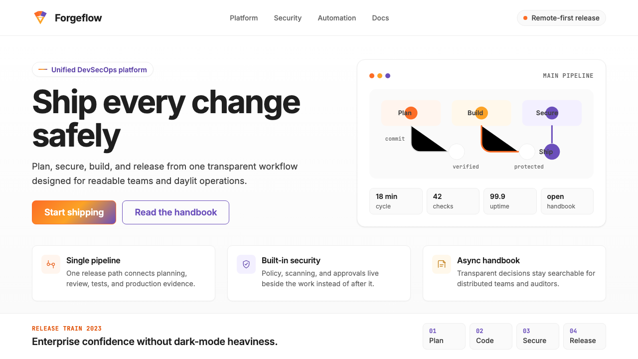 GitLab 2023DevOps in daylight. Tanuki orange-to-purple gradient, Inter, warm enough for…DevOps 走出暗色房间:标志性狸猫橙紫渐变、宽松行高、Inter 字体——…
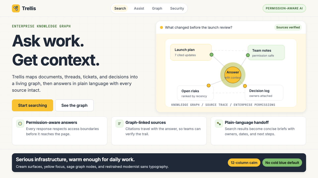 Glean Enterprise-SearchWarm enterprise AI. Cream ground, yellow focus, sage graph nodes, and sans ca…温暖的企业 AI:奶油底、黄焦点、鼠尾草节点与无衬线克制。
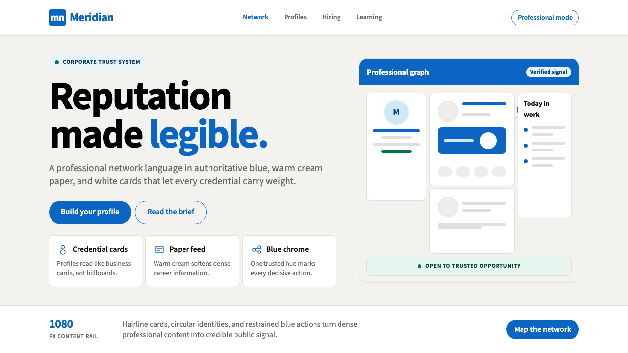 LinkedInCorporate trust, digitized. Authoritative blue frames white cards on warm cre…企业信任数字化:权威蓝框住暖奶油纸面上的白卡。
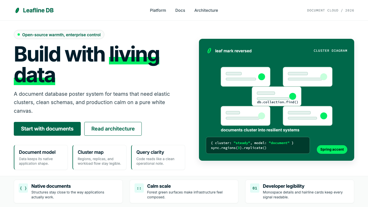 MongoDB Leaf GreenDisciplined green, open warmth. Forest leaf forms and Spring accents breathe…克制的绿有开源温度:森林绿叶形与春绿点缀,留白呼吸。