What is Android Bugdroid Green?
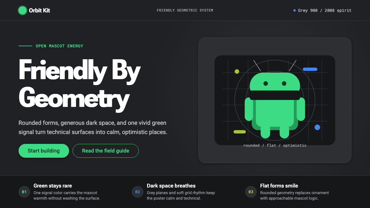
A vivid green robot on a dark grey field turned corporate technology into something a child could recognize and a designer could still respect.
Android Bugdroid Green in brief
Android Bugdroid Green is the visual language built around Android's mascot — a simple, antenna-headed robot assembled from rounded geometric shapes, rendered in an optimistic, saturated green. The current brand system, refreshed in 2019, places that green against a dark charcoal-grey surface rather than a plain white background, establishing dark presentation as the mascot's documented default context rather than a stylistic afterthought.
The system distills Android's broader design philosophy — geometric simplicity, flat color, quiet material depth, generous open space — into a compact token set: a dark charcoal ground, a single vivid green as the primary accent, a cooler blue reserved for secondary actions, and a humanist, rounded sans-serif typeface family carrying all text. Nothing in the system is decorative for its own sake; every shape traces back to the same rounded-geometric vocabulary that built the mascot itself.
The overall impression is friendly without being childish, and technical without being cold. Flat fills replace gradients and gloss; subtle layered elevation replaces heavy drop shadows; open space is treated as a feature rather than empty leftover area. The mascot's approachability and the surrounding system's engineering precision are meant to feel like two expressions of the same underlying idea.

Where does Android Bugdroid Green come from?
The Android robot — nicknamed Bugdroid within Google, though never an official trademark name — was created in 2008 by designer Irina Blok, working within Google's design team as Android prepared for its first public release. The brief was deliberately loose: create a simple robot to represent the operating system. Blok's team explored dozens of directions before converging on a minimal figure built from an oval-domed head, two antenna, a rectangular torso, and simple cylindrical limbs — a form so basic it could be redrawn quickly by anyone, in any medium, without losing recognizability.
That simplicity was strategic rather than accidental. Android launched as an open-source mobile operating system in a market where Apple's iOS represented tightly controlled, single-source branding. Google made the Bugdroid's base design available under a Creative Commons license, explicitly inviting developers, hardware partners, and fans to remix, recolor, and reimagine the mascot. The robot became one of the earliest examples of a major tech brand mascot designed from inception to be openly modifiable rather than jealously guarded — a decision that mirrored Android's own open-source philosophy at the code level.
The green color itself became inseparable from the mascot within the operating system's first years, chosen for its high visibility and its distinctiveness from the blues and greys that dominated competing technology branding at the time. As Android matured from a scrappy open-source alternative into the world's most widely deployed mobile operating system, Google gradually formalized what had originally been a loose, community-remixed identity into a disciplined design system.
The most significant formalization arrived with Google's Material Design language, introduced in 2014 and substantially refreshed in 2019 alongside an updated Android brand identity. That 2019 refresh specifically recontextualized the green mascot against a dark charcoal-grey ground as the brand's primary presentation mode — a deliberate move away from the plain white backgrounds common in earlier marketing, and a signal that Android wanted its identity read as confident and modern rather than merely clean. The mascot survived over a decade of platform redesigns essentially unchanged in silhouette, a rare continuity in an industry where mascots are frequently retired.
What defines the Android Bugdroid Green look?
Dark Charcoal Ground
The documented default surface is a dark, near-black charcoal grey rather than white — the 2019 brand refresh established this explicitly as the mascot's home context. The dark ground makes the vivid green read as luminous and confident rather than merely bright, and it separates the system visually from the sea of plain white technology interfaces.
Vivid Green Accent
A single saturated green functions as the system's identity anchor, used for the mascot itself, primary actions, and key highlights. It is deployed sparingly against the dark ground rather than washed across large fields, which keeps its impact concentrated and prevents the interface from tipping into an overwhelming, all-green look.
Rounded Geometric Form
Every shape in the system — the mascot's dome head, cylindrical limbs, rectangular torso — traces to a small vocabulary of rounded rectangles, circles, and soft-cornered geometric primitives. Interface elements echo this vocabulary: buttons, cards, and icons all favor generous corner rounding over sharp edges.
Secondary Blue
A cooler blue, distinct from the primary green, is reserved specifically for secondary actions and supporting UI states, preventing the single green accent from being overloaded with every possible interactive meaning. This division of labor between two accent colors is a Material Design convention that keeps hierarchy legible.
Flat Fill, No Gloss
Surfaces use solid flat color rather than gradients, gloss, or reflective highlights. This flatness is a deliberate rejection of the skeuomorphic, glossy mobile interfaces common before Android's design language matured, favoring honesty of surface over simulated material shine.
Subtle Material Elevation
Depth is communicated through soft, restrained shadow layering consistent with Material Design's elevation system — surfaces appear to sit at slightly different heights above the dark ground, but the shadows are subtle rather than dramatic, keeping the overall impression flat and calm rather than heavily three-dimensional.
Generous Open Space
Space around elements is treated as an active design feature rather than unused leftover area, giving the rounded shapes and the green accent room to read clearly. Density is deliberately avoided — the system trusts open space to communicate confidence rather than filling every available area with content.

Who shaped Android Bugdroid Green?
Blok designed the original Bugdroid mascot in 2008 while working on Google's design team, converging on a minimal figure built from an oval head, antenna, and simple cylindrical limbs after exploring many directions. Her decision to keep the form radically simple made it possible for the mascot to survive over a decade of redesigns and countless community remixes essentially unchanged in silhouette.
The team behind Material Design, introduced in 2014 and refreshed in 2019, formalized the loose, community-driven Bugdroid identity into a disciplined system of dark-ground presentation, restrained color accents, and consistent elevation rules that could scale across Google's entire product ecosystem.
How do you use Android Bugdroid Green today?
This style works best wherever a product needs to feel technical and modern without becoming cold or corporate — it carries an inherent friendliness that most flat, dark-mode systems lack, largely because of the mascot's underlying influence on the shape language even when the mascot itself is absent from a given screen.
For presentation slides, the dark charcoal ground makes an excellent cover treatment: a single rounded geometric shape in vivid green anchoring one corner, title type set in the humanist rounded sans against the dark field. Content slides should use the green sparingly — as a highlight on one key statistic or call-out per slide rather than a repeated background wash — with blue reserved for secondary information like footnotes or supporting data points.
For web interfaces, this system is a natural fit for developer tools, technical dashboards, and platform or SDK marketing pages that want to feel approachable rather than intimidating — a common challenge for technical products. Buttons and interactive elements should use the green consistently for primary calls to action, blue for secondary or tertiary actions, and the dark ground should remain the default rather than being reserved for an optional 'dark mode' toggle, since dark presentation is this style's canonical context.
For editorial and marketing content, the style suits announcements, product launch pages, and developer-facing communications where a technical product wants to signal openness and community friendliness — echoing Android's own open-source positioning. Large blocks of body text should stay in a light, high-contrast tone against the dark ground, with green reserved exclusively for links, highlights, or a single hero statistic.
A common mistake is treating the green as a background color to wash across large areas, which quickly becomes visually loud and undermines the restraint that makes the accent effective. Another is defaulting to a white background because it feels 'safer' — doing so strips away the specific dark, confident context that distinguishes this system from generic flat design and makes it recognizably Android.

Android Bugdroid Green — FAQ
Is white background ever acceptable in this style?
It appears occasionally in Android's broader marketing but is not the mascot's documented default. The 2019 brand refresh specifically established the dark charcoal ground as the canonical presentation context. Using this style as a design system, the dark ground should be the default, with light backgrounds treated as an occasional secondary variant rather than the primary mode.
Should the mascot's literal robot figure appear in every application of this style?
No. The style is meant to be usable through its underlying shape language, color relationship, and elevation logic even when the literal mascot is absent — a dashboard or pricing page rendered in this style should feel recognizably 'Android' through its rounded geometry and green-on-charcoal palette, not because a robot icon is literally present on the page.
How does this style differ from generic 'dark mode' design?
Generic dark mode is usually just a color inversion applied to an otherwise neutral system. This style is specifically anchored by the mascot's rounded geometric vocabulary and the vivid green accent — the dark ground is one component of a coherent identity, not a standalone theme toggle. Removing the green accent and the rounded shape language would leave a dark interface that no longer reads as this specific style.
Does this style suit a product with no relationship to Android or Google?
Yes — the underlying principles (rounded geometry, restrained flat color, dark confident grounds, generous space) are transferable to any product wanting to feel technical, modern, and approachable at once, particularly developer tools, SDKs, or platforms. It works less well for products that want to signal luxury, tradition, or high-touch human service, where the flat, mascot-adjacent friendliness would feel mismatched.
Related design styles
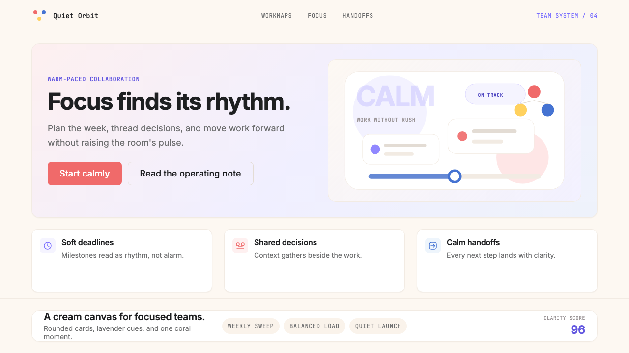 AsanaCalm productivity breathes. Cream canvas, lavender panels, coral-blue-yellow…
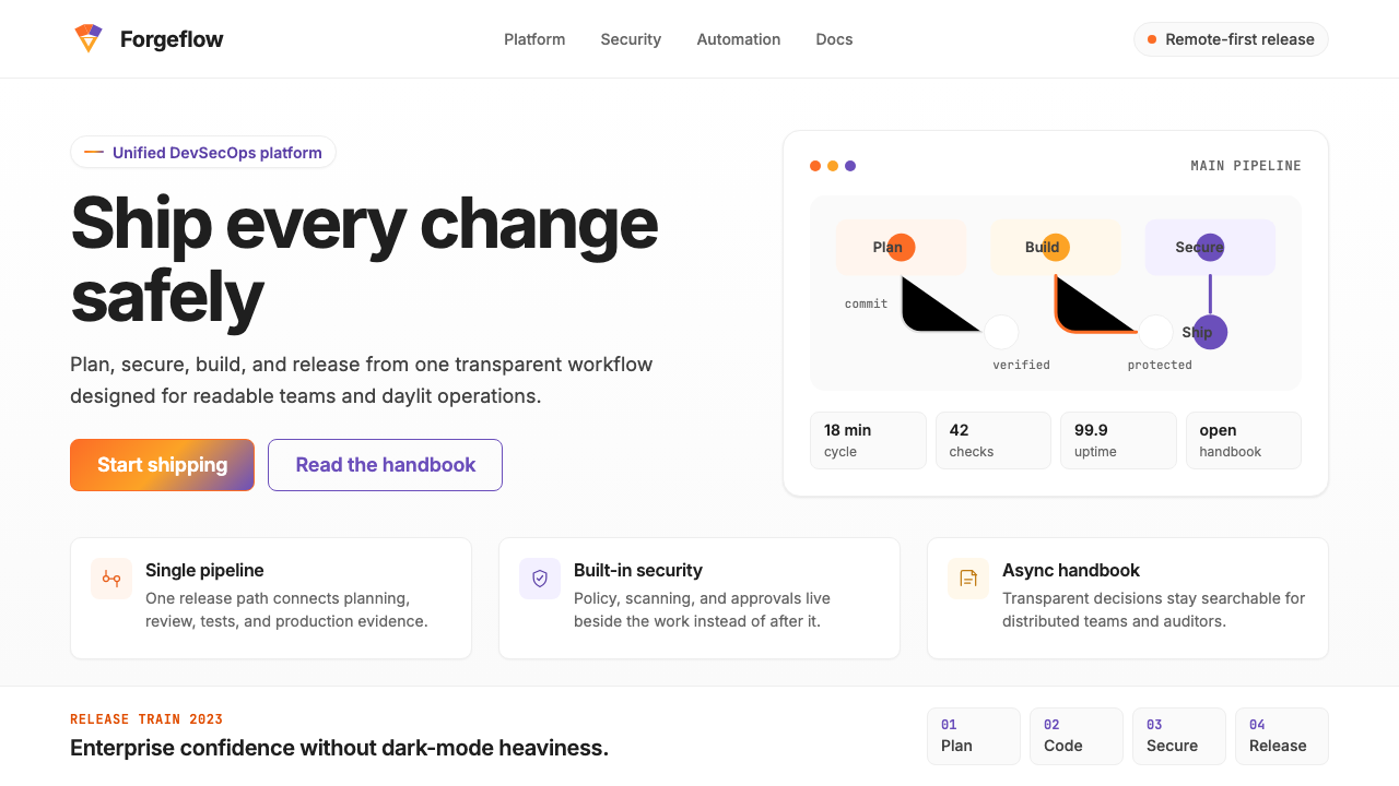 GitLab 2023DevOps in daylight. Tanuki orange-to-purple gradient, Inter, warm enough for…
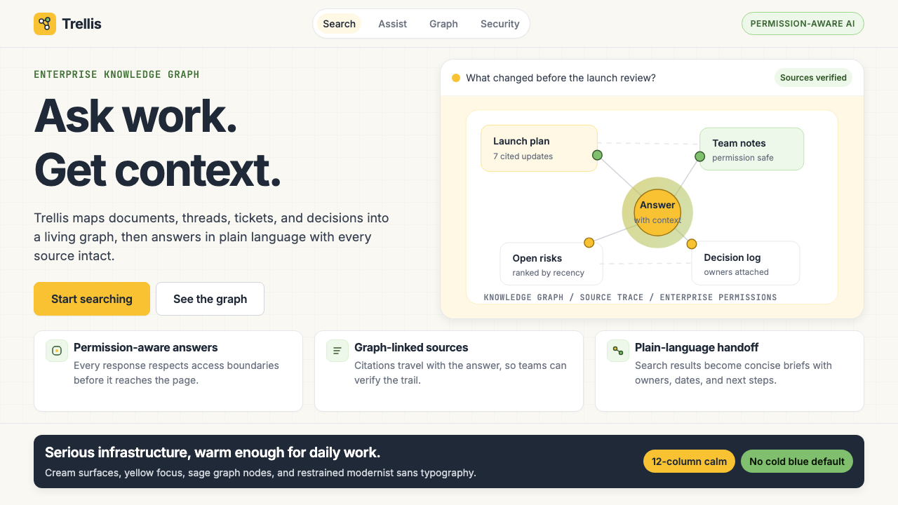 Glean Enterprise-SearchWarm enterprise AI. Cream ground, yellow focus, sage graph nodes, and sans ca…
 LinkedInCorporate trust, digitized. Authoritative blue frames white cards on warm cre…
 MongoDB Leaf GreenDisciplined green, open warmth. Forest leaf forms and Spring accents breathe…
 Stripe 2024Trust earns its glow. Indigo mesh, neutral type, and whisper cards float on n…