What is Glean Enterprise-Search?什么是 Glean Enterprise-Search?
Glean flipped enterprise software's cold blue default to warm cream and sunlit yellow — proving that an AI knowledge assistant could feel approachable without sacrificing authority.Glean 将企业软件惯用的冷蓝底色翻转为温暖的奶油与阳光黄,证明一款 AI 知识助手可以在不失权威感的同时,散发出真实的亲近感。
Glean Enterprise-Search in briefGlean Enterprise-Search 速览
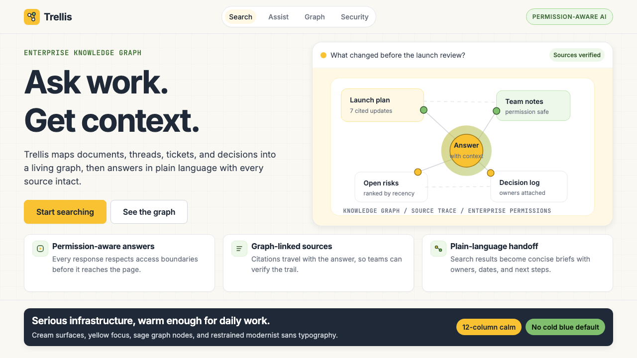
Glean Enterprise-Search is the visual design language developed by Glean — the enterprise-search and AI-knowledge-assistant platform — between 2022 and 2024. It is built around three deliberate color decisions: a warm cream ground that softens the workspace, a saturated but friendly Glean-yellow used as the primary action and focus signal, and a muted sage-green that marks knowledge-graph nodes and secondary structural elements. Together they form a palette that reads as confident and modern without the sterility that dominates legacy enterprise software.Glean 企业搜索视觉语言,是 Glean——企业级搜索与 AI 知识助手平台——在 2022 年至 2024 年间建立的一套品牌设计体系。它的核心建立在三个刻意的色彩决策上:温暖的奶油底色,用于软化工作空间的视觉压力;饱和而友善的 Glean 黄,作为主要操作与焦点信号;以及哑光鼠尾草绿,用于标记知识图谱节点和次要结构元素。三者共同构成一套色板,传递出自信与现代感,却没有主宰传统企业软件的那种冷漠与无生气。
The system pairs this warm palette with a modernist sans-serif typeface whose letterforms are clean and geometrically rational — built for dense information without fatigue. Generous whitespace, subtle rounded corners, and a restrained use of border and shadow give the interface a quality that its designers sometimes describe as a research notebook: orderly, unhurried, and genuinely interested in the reader. Knowledge-graph motifs — node-and-edge diagrams that visualize how documents, people, and topics connect — appear as both functional UI elements and decorative language throughout the brand.这套温暖色板与一款现代主义无衬线字体配对使用——其字形干净、几何上合理,专为高密度信息而设计,久看不易疲劳。充裕的留白、微妙的圆角、以及对边框与投影的克制使用,赋予界面一种设计师有时称之为「研究笔记本」的质感:有序、不急促,且真诚地朝向读者。知识图谱母题——将文档、人员与话题关联可视化的节点-边线图——在整个品牌中既作为功能性 UI 元素出现,也作为装饰性语言贯穿始终。
What distinguishes Glean's visual identity from generic enterprise modernism is its intentionality. Every deviation from the cold-blue convention — the cream instead of gray, the yellow instead of accent-blue, the sage instead of teal — was a considered decision to humanize a product category long associated with friction and opacity. The result is a design system that communicates AI confidence without the clinical distance AI products often project.使 Glean 视觉识别有别于普通企业现代主义的,是其背后的意图性。每一处对冷蓝惯例的偏离——奶油代替灰色、黄色代替强调蓝、鼠尾草代替青色——都是一个经过审慎权衡的决定,旨在为一个长期与摩擦感和不透明性相关联的产品类别注入人情味。最终呈现出的是一套传递 AI 信心的设计系统,同时避免了 AI 产品常见的临床距离感。
See the Glean Enterprise-Search design system查看 Glean Enterprise-Search 完整设计系统
Where does Glean Enterprise-Search come from?Glean Enterprise-Search 从何而来?
Glean was founded in 2019 in Palo Alto, California, by Arvind Jain, Tony Gentilcore, and Piyush Prahladka — three engineers who had previously built search infrastructure at Google. Their premise was specific: the proliferation of SaaS workplace tools through the 2010s had fragmented organizational knowledge across dozens of silos — Slack channels, Google Drive folders, Confluence wikis, Salesforce records — and no existing tool could surface the right information at the right moment. Glean's solution was to build a unified search layer and, later, an AI assistant layer on top of every connected tool, treating a company's collective knowledge as a single addressable graph.Glean 由 Arvind Jain、Tony Gentilcore 和 Piyush Prahladka 于 2019 年在美国加利福尼亚州帕罗奥图创立,三位创始人均曾在 Google 负责搜索基础设施的构建。他们的出发点非常具体:2010 年代 SaaS 工作工具的大规模扩散,将组织知识碎片化地分散在数十个孤岛之中——Slack 频道、Google Drive 文件夹、Confluence 维基、Salesforce 记录——而没有任何现有工具能够在恰当的时刻浮现正确的信息。Glean 的解决方案是在所有连接的工具之上构建统一的搜索层,并随后叠加 AI 助手层,将一家公司的集体知识视为一张可统一寻址的图谱。
The visual identity that emerged between 2022 and 2024 was shaped directly by this product vision. Glean's designers faced a branding challenge common to AI-infrastructure products: how do you make something that is fundamentally a search index and retrieval engine feel genuinely useful and human? The answer they arrived at was to borrow from the warmth register of consumer products — cream grounds, amber-adjacent yellows, organic but precise typography — while retaining the density and precision that enterprise users require. The knowledge-graph visualization, originally a technical diagram for showing how indexed documents relate to one another, became the visual signature of the brand: a motif that communicates intelligence, connectivity, and structure simultaneously.2022 年至 2024 年间逐步成型的视觉识别,直接受到这一产品愿景的塑造。Glean 的设计师面对着 AI 基础设施产品共同的品牌挑战:如何让一个本质上是搜索索引与检索引擎的产品,给人以真实的有用感和人情味?他们得出的答案是:借鉴消费类产品的温暖语域——奶油底色、接近琥珀的黄色、有机而精确的字体——同时保留企业用户所需的信息密度与精准感。知识图谱可视化最初是一种用于展示被索引文档之间关联关系的技术示意图,后来成为品牌的视觉签名:一个同时传递智能、连通性与结构感的母题。
By 2024 Glean had reached a valuation of approximately 2.2 billion US dollars, establishing itself as the category leader in the post-LLM enterprise AI-assistant market. The visual identity scaled with the product: as Glean added AI-generated summaries, people-graph search, and proactive knowledge surfacing, the design system absorbed these features without visual inflation. The palette remained warm and restrained, the graph motifs remained consistent, and the overall tone stayed closer to a well-designed research interface than to the dashboards and alert-heavy UIs associated with legacy enterprise software.到 2024 年,Glean 估值已达约 22 亿美元,确立了其在后大语言模型时代企业 AI 助手赛道的领导地位。视觉识别随产品一同扩展:随着 Glean 陆续加入 AI 生成摘要、人员图谱搜索和主动知识浮现等功能,设计系统吸纳了这些特性而未出现视觉膨胀。色板保持温暖克制,图谱母题保持一致,整体基调始终更接近一个设计精良的研究界面,而非传统企业软件那种仪表板式、警报密布的 UI。
The historical context matters. Glean's design direction emerged at precisely the moment when the enterprise software industry was beginning to question its long-standing visual conventions — the flat blue-and-gray palettes inherited from Windows and corporate intranet aesthetics, the dense information architecture optimized for power users, the implicit message that seriousness and coldness were the same thing. Glean's willingness to introduce warmth and approachability into a serious enterprise context was not merely an aesthetic preference but a strategic positioning argument: if AI at work was going to feel like a capable colleague rather than a database query tool, it needed to look the part.历史背景同样重要。Glean 的设计方向恰好出现在企业软件行业开始质疑其长期视觉惯例的时刻——那些继承自 Windows 和企业内网美学的蓝灰色扁平色板、为高级用户优化的高密度信息架构、以及「严肃等于冷漠」的隐性信息。Glean 愿意在严肃的企业场景中引入温暖感与亲近感,不仅是一种审美偏好,更是一个战略定位论点:如果工作中的 AI 要像一位称职的同事而非一个数据库查询工具,它就需要在外观上与这个角色相符。
What defines the Glean Enterprise-Search look?Glean Enterprise-Search 的视觉特征是什么?
Palette色板
The palette is built around three anchors: a warm cream ground that serves as the universal background, a saturated Glean-yellow used for primary interactive elements and focal highlights, and a muted sage-green that marks graph nodes, secondary badges, and supportive structural elements. Neutral charcoal handles body text and iconography. The overall effect is warm without being playful — a considered departure from the cold blue-and-gray defaults that have dominated enterprise software for decades.色板围绕三个锚点构建:温暖的奶油底色作为统一背景;饱和的 Glean 黄用于主要交互元素与焦点高亮;哑光鼠尾草绿标记图谱节点、次要徽标和辅助结构元素。中性的炭灰色承担正文与图标。整体效果温暖而不活泼——这是对主宰企业软件数十年的冷蓝灰默认值的一次经过深思熟虑的偏离。
Typography字体排印
A single modernist sans-serif typeface carries the entire typographic system, deployed at a limited number of hierarchical weights and sizes rather than across multiple families. Headlines are set at generous scale with comfortable tracking; body text is compact but legible, optimized for reading dense search results and document summaries. The typeface choice signals precision and rationality without coldness — it belongs to the tradition of humanist sans-serifs that carry warmth in their letterform curves even at neutral weights.整个字体排印系统由单一的现代主义无衬线字体承载,通过有限数量的层级字重与尺寸展开,而非跨越多个字体家族。标题字号宽裕、字距从容;正文紧凑而可读,针对高密度搜索结果和文档摘要的阅读场景优化。字体选择传递精准与理性感,同时不失温度——它属于人文主义无衬线传统,即便在中性字重下,字形曲线中也携带着可感知的暖意。
Knowledge-Graph Motif知识图谱母题
Node-and-edge diagrams — visualizations of how documents, people, teams, and topics interconnect across a company's knowledge base — serve double duty as functional UI elements and as decorative brand language. In product contexts, they display actual relationship data. In marketing and editorial contexts, abstracted node clusters appear as background texture or illustrative devices, communicating the core promise of the product — connection and synthesis — through visual form rather than words.节点-边线图——展示文档、人员、团队和话题在企业知识库中相互关联方式的可视化——在功能性 UI 元素与装饰性品牌语言两种身份之间扮演双重角色。在产品语境中,它们呈现真实的关系数据;在营销与编辑语境中,抽象化的节点群落作为背景纹理或插图装置出现,通过视觉形式而非文字,传递产品的核心承诺——连接与综合。
Whitespace and Breathing Room留白与呼吸空间
Generous whitespace is a structural principle throughout the system, not a luxury applied to hero moments. Search result lists, document panels, and navigation elements all maintain a spacing rhythm that prevents the interface from feeling cluttered even when displaying high-density information. This discipline distinguishes Glean's approach from the information-maximalist school of enterprise software and aligns it with the research-tool aesthetic its founders explicitly targeted.充裕的留白是整个系统的结构性原则,而非仅在英雄区域才享有的奢侈处理。搜索结果列表、文档面板和导航元素,都保持一种间距节奏,确保界面即便在呈现高密度信息时也不会显得拥挤。这种自律将 Glean 的方式与企业软件的信息最大化流派区分开来,并使其与创始人明确瞄准的研究工具美学对齐。
Rounded Corners and Surface Softness圆角与表面柔化
Cards, chips, input fields, and modal containers consistently use gentle rounding rather than sharp right angles. The effect is subtle — not the exaggerated softness of consumer social apps, but a measured approachability that reduces the visual tension common in dense enterprise interfaces. Combined with the cream ground and warm palette, this corner language contributes significantly to the overall impression of a product that is both capable and hospitable.卡片、标签、输入框和模态容器一致使用轻柔的圆角,而非锐利的直角。效果是微妙的——不是消费类社交应用那种夸张的软化,而是一种经过克制的亲近感,减轻了高密度企业界面中常见的视觉张力。与奶油底色和温暖色板结合,这种圆角语言对「既称职又好客」这一产品整体印象的形成贡献显著。
Restrained Shadow and Elevation克制的投影与层级感
Shadow is used sparingly and always softly — not as a dramatic depth effect but as a gentle separator between overlapping surfaces. Cards lift slightly from the page with a barely perceptible shadow rather than a bold, illustrative one. This restraint keeps the visual atmosphere clean and ensures that the yellow and sage accents, rather than lighting effects, carry the weight of visual hierarchy. The overall depth system feels measured and calm, consistent with the research-notebook character of the product.投影用量稀少,且始终柔和——不是作为戏剧性的深度效果,而是作为叠加表面之间的温和分隔线。卡片从页面轻微浮起,带有几乎难以察觉的阴影,而非粗重的示意性投影。这种克制保持了视觉氛围的干净,并确保视觉层级的重量由黄色与鼠尾草色强调色承担,而非由光效来主导。整体深度系统感觉有分寸而平静,与产品研究笔记本式的气质保持一致。
Iconography and Illustration图标与插图
Icons are geometric and stroke-based, using a consistent line weight and rounded terminations that echo the overall corner language. They are functional in character — designed to communicate action and category rather than to decorate — and appear in charcoal against the cream ground or reversed against darker surfaces. Illustration, where it appears, leans on the graph-node vocabulary: abstracted networks, connection lines, and document-as-node representations rather than figurative scenes or character-based artwork.图标采用几何形态、线条风格,以一致的线宽和呼应整体圆角语言的圆端收尾。它们在性格上是功能性的——设计用于传达操作与类别,而非装饰——在奶油底色上以炭灰色呈现,或在深色表面上反色呈现。插图(当其出现时)倚赖图谱节点的视觉词汇:抽象化的网络、连接线,以及将文档表达为节点的图示,而非具象场景或人物艺术。
See the Glean Enterprise-Search design system查看 Glean Enterprise-Search 完整设计系统
Who shaped Glean Enterprise-Search?谁塑造了 Glean Enterprise-Search?
Co-founder and CEO of Glean, Jain spent years at Google building distributed search systems before identifying the organizational knowledge-fragmentation problem that Glean addresses. His engineering-first perspective shaped both the product architecture and, indirectly, the visual language: a search product built by search engineers should communicate precision, intelligence, and usefulness — values that are legible in Glean's restrained, information-forward design rather than in decorative visual complexity.Glean 联合创始人兼 CEO。Jain 在 Google 多年构建分布式搜索系统,之后识别出 Glean 所解决的组织知识碎片化问题。他以工程为本的视角塑造了产品架构,并间接影响了视觉语言:一个由搜索工程师构建的搜索产品,应当传递精准、智能与实用性——这些价值观体现在 Glean 克制、以信息为前景的设计中,而非装饰性的视觉复杂度里。
Co-founder and a key technical architect at Glean, Gentilcore's background in large-scale search infrastructure at Google informed the knowledge-graph approach that became both the product's core technical differentiator and its visual signature. The node-and-edge diagrams that appear throughout Glean's brand are not arbitrary decorative choices — they reflect a genuine technical model of how the product understands and navigates enterprise knowledge.Glean 联合创始人及核心技术架构师。Gentilcore 在 Google 大规模搜索基础设施方面的背景,奠定了知识图谱方法的基础——这一方法同时成为产品的核心技术差异点与视觉签名。贯穿 Glean 品牌的节点-边线图并非任意的装饰选择,而是产品理解和导航企业知识方式的一种真实技术模型的具象化。
Co-founder of Glean and another veteran of Google's search engineering teams, Prahladka's involvement in the founding underscores the product's origins in rigorous information-retrieval thinking. The founding team's shared background in precision search — where relevance, ranking, and recall are measurable — contributed to a product philosophy that values clarity of communication, which in turn influenced the design system's preference for legibility and restraint over visual complexity.Glean 联合创始人,同样是 Google 搜索工程团队的资深成员。Prahladka 的参与凸显了产品源自严格信息检索思维的根基。创始团队在精准搜索领域共同的背景——相关性、排名与召回率均可量化——孕育了一种重视清晰传达的产品哲学,进而影响了设计系统对可读性与克制的偏好,而非视觉复杂度。
Inter, the typeface most closely associated with Glean's visual system, was designed by Rasmus Andersson and released in 2016 as an open-source project optimized specifically for screen readability at small sizes. Its humanist geometric structure — clean enough to read at the compressed sizes required for search results and document snippets, warm enough to avoid the sterility of purely geometric sans-serifs — made it the natural typographic choice for an enterprise product attempting to balance precision with approachability. Inter became the de facto standard for numerous high-credibility technology products in the late 2010s and early 2020s, and Glean's adoption of it placed the brand clearly within that modernist-but-warm tradition.Inter 是与 Glean 视觉系统关联最紧密的字体,由 Rasmus Andersson 设计,于 2016 年以开源项目形式发布,专门针对小字号屏幕可读性进行优化。其人文主义几何结构——在搜索结果和文档摘要所需的紧凑字号下清晰可读,同时又足够温暖以避免纯几何无衬线字体的冷漠感——使其成为一款试图平衡精准与亲近感的企业产品的自然字体选择。2010 年代末至 2020 年代初,Inter 成为众多高可信度科技产品的事实标准,Glean 的采用将品牌清晰地置于这一现代主义而温暖的传统之中。
No single individual, Glean's visual identity emerged at a specific inflection point in enterprise software history: the two years following the public release of large language models, when dozens of enterprise AI products were competing to define what AI at work should look and feel like. Most defaulted to gradients, glowing interfaces, and blue-dominated palettes that signaled futurism. Glean's counter-choice — cream, yellow, sage, and restraint — was a collective design decision that distinguished the brand in a crowded field and helped establish a distinct visual language for the category of AI knowledge assistants.没有单一的个人,Glean 的视觉识别出现于企业软件历史上一个特定的拐点时刻:大型语言模型公开发布后的两年,数十款企业 AI 产品正在竞相定义工作中的 AI 应该是何种外观与感受。大多数选择了渐变、发光界面和以蓝色为主的色板,以此传递未来主义感。Glean 的反向选择——奶油、黄色、鼠尾草绿与克制——是一个集体设计决策,使品牌在拥挤的赛场中脱颖而出,并帮助为 AI 知识助手这一产品类别建立了独特的视觉语言。
How do you use Glean Enterprise-Search today?今天怎么用 Glean Enterprise-Search?
Glean Enterprise-Search style is most at home in contexts where the product needs to feel simultaneously intelligent and trustworthy — where users must believe the system knows a great deal and also that it will not overwhelm them. The palette's warmth does the relational work; the typographic precision and whitespace discipline do the competence work. Understanding this dual function is more important than any specific application technique.Glean 企业搜索风格最适合那些产品需要同时显得智能与值得信任的场景——用户必须相信系统知识渊博,同时也相信它不会将他们淹没。色板的温暖感完成关系性工作;字体排印的精准与留白纪律完成能力感工作。理解这一双重功能,比任何具体的应用技巧都更为重要。
For presentation slides, the style scales well from cover to data pages. A cover slide benefits from the large-format presence of the Glean-yellow used as a primary shape or background band, paired with a centered or left-aligned headline in a clean sans-serif at generous scale against cream or white. Content slides should treat the cream ground as a working surface: organize information into card-like blocks separated by whitespace rather than lines, use the sage-green for secondary tags or category indicators, and reserve the yellow strictly for the most important call-out on each page. Data slides — charts, diagrams, metrics — should adopt the graph-node aesthetic where possible: use warm neutral bars for baseline data and yellow or sage highlights for the data point being emphasized. Avoid using all palette colors simultaneously on a single slide; the system reads most coherently when one accent dominates per screen.在演示文稿中,这种风格从封面到数据页都能良好扩展。封面幻灯片适合将 Glean 黄作为主要形状或背景色带,以大版面的方式呈现,配合奶油或白色底面上以干净无衬线体宽松排列的居中或左对齐标题。内容幻灯片应将奶油底色视为工作表面:用留白而非线条将信息组织进卡片式区块,用鼠尾草绿标注次要标签或类别指示,将黄色严格保留给每页上最重要的引用信息。数据幻灯片——图表、示意图、指标——在可能时应采用图谱节点美学:用温暖中性色条呈现基准数据,用黄色或鼠尾草绿高亮强调的数据点。避免在单张幻灯片上同时使用全部色板色彩;每屏只有一种强调色主导时,系统的可读性最为连贯。
For web UI and dashboards, the style is well-suited to information-dense interfaces where hierarchy and quick scanning matter most. Establish a warm cream or very light warm-white background as the canvas; use charcoal for all body text and interface labels; reserve yellow for primary buttons, active states, and focus indicators; use sage for badges, tags, and secondary navigation. Card components should have gently rounded corners and a light, barely-there shadow that lifts them from the background without drama. Navigation bars and sidebars work well in a slightly deeper warm-neutral tone, creating gentle separation from the content canvas without resorting to hard dividing lines. For pricing pages, the yellow accent naturally draws the eye to the recommended tier, while sage can mark included features and neutral charcoal handles standard list items.在网页 UI 和仪表板设计中,这种风格适合层级与快速扫描最为重要的信息密集型界面。以温暖奶油或极浅的暖白色作为画布背景;所有正文与界面标签使用炭灰色;主要按钮、活跃状态和焦点指示器保留黄色;徽标、标签和次级导航使用鼠尾草绿。卡片组件应有轻柔圆角和几乎难以察觉的淡阴影,使其从背景中浮起而不造成戏剧性效果。导航栏和侧边栏在比内容画布略深的暖中性色调下效果良好,形成温和的区隔而无需借助硬分割线。对于定价页面,黄色强调色自然将视线引向推荐套餐,鼠尾草绿可标注已包含的功能,中性炭灰色处理标准列表项。
For editorial and marketing applications — landing pages, keynote backgrounds, content marketing — the knowledge-graph motif is your strongest differentiator from generic enterprise modernism. Use abstracted node-and-edge patterns as background textures for section dividers or hero blocks, at low opacity so they read as texture rather than diagram. Full-width sections should alternate between cream-on-deep-neutral and yellow-on-cream rather than relying on color blocking alone. For long-form editorial content such as research reports or case studies, the style supports a narrow text column with a wide outer margin reserved for call-outs, annotations, or supporting data visualizations — recalling the research-notebook character the product itself aspires to embody.在编辑与营销应用场景——落地页、主题演讲背景、内容营销——知识图谱母题是你区别于通用企业现代主义的最强差异点。将抽象化的节点-边线图案以低不透明度用于区块分割或英雄区块的背景纹理,使其读作质感而非示意图。全宽区块应在奶油底深中性字和黄底奶油字之间交替,而非单纯依靠色块。对于研究报告或案例研究等长篇编辑内容,这种风格支持窄正文列搭配宽边距——宽边距保留用于引用、注释或辅助数据可视化,呼应产品本身所追求的研究笔记本气质。
A common mistake when applying this style is overusing the yellow. Glean-yellow is a focal and interactive color, not a background or brand-wash color; when it covers large surfaces it loses its signaling power and the overall palette tips from warm to loud. A related mistake is treating the sage-green as a general accent interchangeable with the yellow — in the Glean system, sage signals secondary information and relationship context, not primary emphasis. Designs that mix yellow and sage at equal weight produce visual competition rather than hierarchy. A third pitfall is abandoning the cream ground in favor of pure white in an attempt to appear more minimal; pure white against these warm accents produces a clinical tension that undermines the approachability the palette is engineered to deliver. Stay warm, stay restrained, let yellow do one job per view.应用这种风格时最常见的错误是过度使用黄色。Glean 黄是焦点色与交互色,而非背景色或品牌洗刷色;当它覆盖大面积表面时,其信号功能会减弱,整体色板从温暖倾向聒噪。相关的错误是将鼠尾草绿作为可与黄色互换的通用强调色——在 Glean 系统中,鼠尾草绿传递次要信息和关系语境,而非主要强调。以相当比重混用黄色与鼠尾草绿会产生视觉竞争而非层级感。第三个陷阱是放弃奶油底色转而使用纯白色以追求更极简的感觉;纯白与这些暖色调强调色搭配会产生临床感张力,破坏这套色板精心设计出的亲近感。保持温暖,保持克制,每个视图中只让黄色完成一项任务。
See the Glean Enterprise-Search design system查看 Glean Enterprise-Search 完整设计系统
Glean Enterprise-Search — FAQGlean Enterprise-Search · 常见问题
Is Glean Enterprise-Search style appropriate for non-enterprise products?Glean 企业搜索风格适合非企业类产品吗?
It can translate, but with caveats. The warmth of the cream-and-yellow palette and the clarity of the typographic system work well for any product that handles information retrieval, knowledge management, or research — from personal note-taking tools to academic platforms to internal knowledge bases. Where it struggles is in contexts that require strong emotional warmth, sensory richness, or playful energy: food brands, lifestyle products, children's applications. The style sits in a specific register — capable, warm, professional — and drifts outside that register when applied to products with different emotional contracts.可以迁移,但有条件。奶油与黄色组成的温暖色板和清晰的排印系统,适合任何处理信息检索、知识管理或研究场景的产品——从个人笔记工具到学术平台,再到内部知识库。它表现欠佳的场景是那些需要强烈情感温度、感官丰富性或活泼能量的语境:食品品牌、生活方式产品、儿童应用。这种风格处于一个特定的情感区间——称职、温暖、专业——当被应用于持有不同情感契约的产品时,会偏离这一区间。
How does this style differ from Material Design or other enterprise design systems?这种风格与 Material Design 或其他企业设计系统有何不同?
Material Design and most enterprise design systems are palette-agnostic — they define structural rules and component behaviors that teams then populate with their own brand colors. Glean's style is palette-first: the warm cream, the specific Glean-yellow, and the sage-green are not interchangeable; they carry the emotional argument of the brand. Material Design also leans toward blue-family action colors and harder surface delineation. Glean's system softens surfaces, uses warmth as a strategic differentiator, and integrates product-specific motifs — the knowledge graph — that go beyond what a general-purpose design system would specify.Material Design 和大多数企业设计系统是色板无关的——它们定义结构规则和组件行为,由团队用自己的品牌色彩填充。Glean 的风格以色板为先:温暖的奶油色、特定的 Glean 黄和鼠尾草绿不可互换,它们承载着品牌的情感论点。Material Design 也倾向于蓝色系操作色和更硬朗的表面界定。Glean 的系统软化了表面,将温暖感用作战略差异点,并整合了超越通用设计系统所能指定范围的产品特有母题——知识图谱。
Can this style support a dark-mode variant?这种风格能支持深色模式变体吗?
A dark variant is possible but requires more care than most dark-mode implementations. The foundational warmth of the palette — which depends heavily on the cream ground — is partially lost when that ground inverts to a dark neutral. The most successful dark interpretations retain the warmth by shifting to a deep warm charcoal or near-black with a brown undertone rather than a pure cool black. Glean-yellow reads well on dark grounds and can intensify as a focal color. Sage-green should be lightened slightly to maintain legibility. The knowledge-graph motifs, rendered in low-opacity warm lines, can serve as effective background texture in dark contexts without becoming visually heavy.深色变体是可行的,但比大多数深色模式实现需要更多谨慎处理。色板的基础温暖感——高度依赖奶油底色——在底色反转为深中性色时会部分流失。最成功的深色诠释通过将背景转换为带棕色底调的深暖炭灰或近黑色(而非纯冷黑)来保持温度感。Glean 黄在深色底面上效果良好,可作为焦点色加强。鼠尾草绿应略微提亮以保持可读性。以低不透明度暖色线条呈现的知识图谱母题,在深色语境中可作为有效的背景纹理,而不会产生视觉重负。
What makes the knowledge-graph motif work as a design element rather than just a data visualization?是什么使知识图谱母题作为设计元素而非仅仅是数据可视化而发挥作用?
The knowledge-graph motif works decoratively when it is abstracted to the point where individual nodes lose specific identity and the overall pattern reads as texture or network rather than data. The key is density and scale: a cluster of small nodes connected by thin lines at a low opacity creates a sense of interconnectedness without demanding to be read literally. When nodes are too large, too labeled, or too few, the motif tips back into diagram territory and competes with the content it is meant to support. Used at the right scale and opacity — often lighter in marketing contexts than in product UI — it is one of the most distinctive and communicatively precise visual signatures in contemporary enterprise branding.知识图谱母题在被抽象化到单个节点失去具体身份、整体图案读作纹理或网络而非数据的程度时,才能作为装饰性元素有效运作。关键在于密度与尺度:低不透明度下,一组由细线连接的小节点构成的集群,创造出相互关联的感知而无需被字面阅读。当节点过大、标注过多或数量过少时,这一母题就会倒退回示意图领域,并与它本应支持的内容产生竞争。在合适的尺度与不透明度下使用——营销语境中通常比产品 UI 更浅——它是当代企业品牌设计中最具辨识度和传达精准性的视觉签名之一。
Is this style specifically tied to Glean, or can it be used independently?这种风格是专属于 Glean 的,还是可以独立使用?
The visual principles — warm cream ground, warm focal yellow, sage-green secondary, graph-node motifs, modernist sans-serif, generous whitespace — are principles and choices, not trademarks. Any design practitioner can apply this vocabulary to a new project. The style is best understood as representing a particular moment and position in enterprise AI design: warm, knowledge-forward, and deliberately anti-sterile. Used with those values in mind, it can serve any product in the information-management, research, or knowledge-work category. Used as surface decoration without commitment to the underlying values — as a color palette borrowed without the restraint and whitespace discipline — it produces a visual echo of Glean rather than a coherent design system.视觉原则——温暖奶油底、温暖焦点黄、鼠尾草绿次级色、图谱节点母题、现代主义无衬线字体、充裕留白——是原则与选择,而非商标。任何设计从业者都可以将这套视觉词汇应用于新项目。理解这种风格的最佳方式,是将其视为企业 AI 设计中特定时刻与立场的代表:温暖、以知识为前景,以及刻意的反无生气。带着这些价值观来使用它,可以服务于信息管理、研究或知识工作类别的任何产品。将其作为表面装饰使用而不投入背后的价值观——将色板借用过来却缺乏克制与留白纪律——只会产生 Glean 的视觉回声,而非一套连贯的设计系统。
Related design styles相关设计风格
 AsanaCalm productivity breathes. Cream canvas, lavender panels, coral-blue-yellow…安静生产力会呼吸:奶油画布、薰衣草面板与三色圆点。
 Android Bugdroid GreenFriendly tech, reduced to geometry. Vivid green pops from Grey 900 and rounde…友好科技化为几何:明绿从 Grey 900 与圆润字形中跃出。
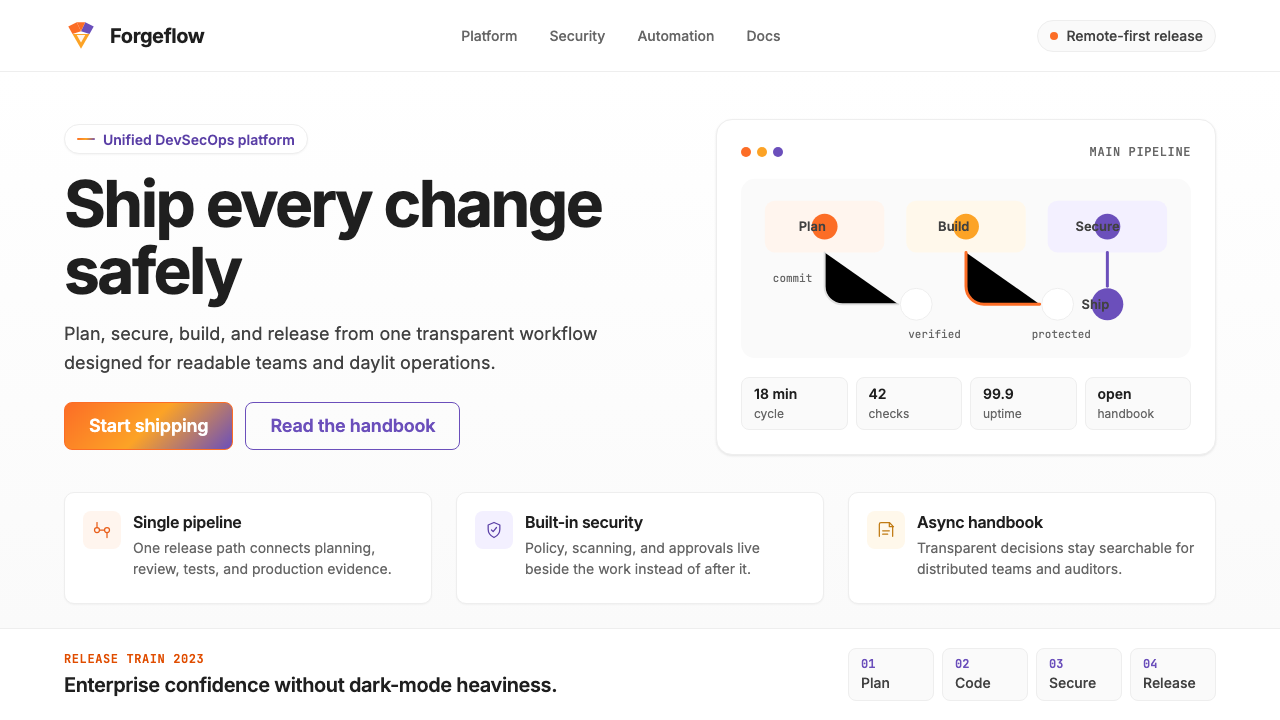 GitLab 2023DevOps in daylight. Tanuki orange-to-purple gradient, Inter, warm enough for…DevOps 走出暗色房间:标志性狸猫橙紫渐变、宽松行高、Inter 字体——…
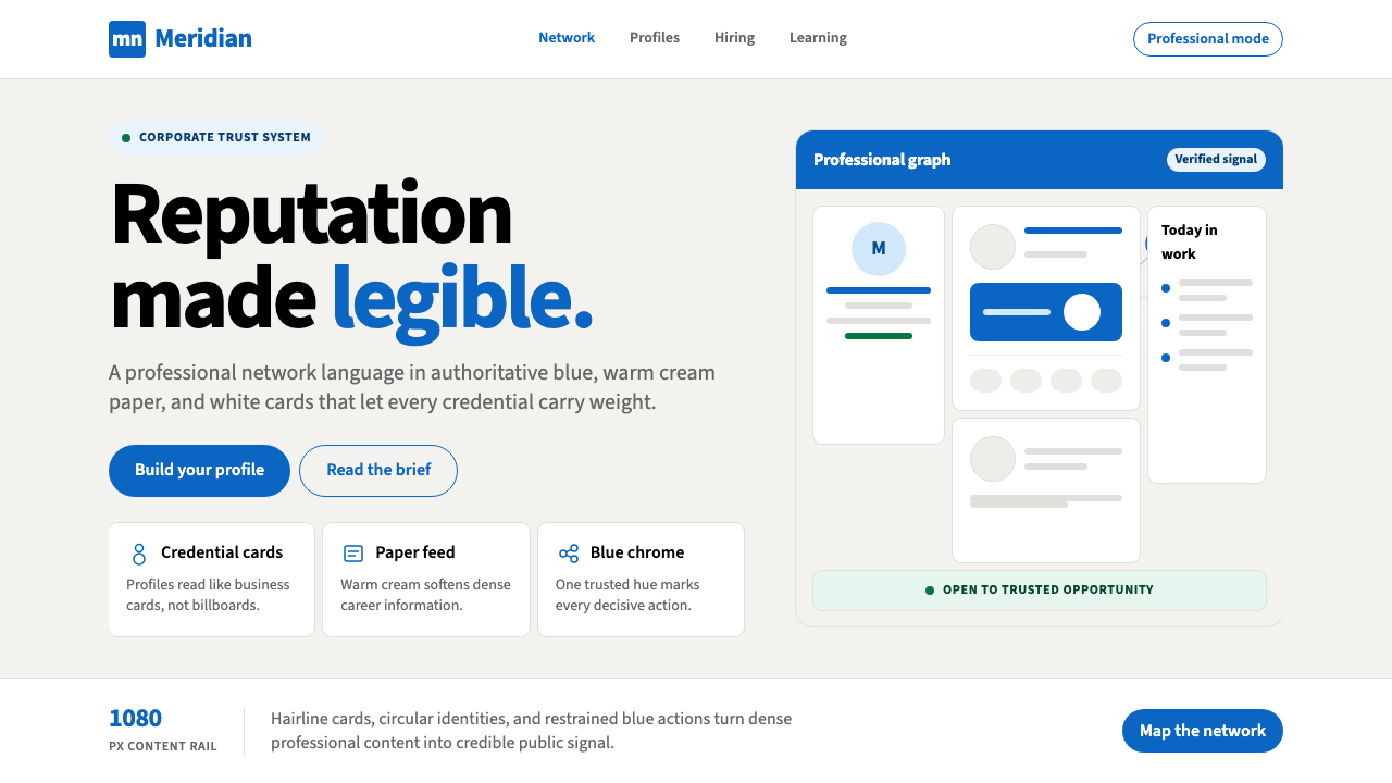 LinkedInCorporate trust, digitized. Authoritative blue frames white cards on warm cre…企业信任数字化:权威蓝框住暖奶油纸面上的白卡。
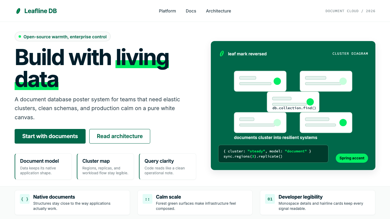 MongoDB Leaf GreenDisciplined green, open warmth. Forest leaf forms and Spring accents breathe…克制的绿有开源温度:森林绿叶形与春绿点缀,留白呼吸。
 Stripe 2024Trust earns its glow. Indigo mesh, neutral type, and whisper cards float on n…信任自带微光:近白底上的靛蓝渐变、中性字体与轻影卡片。