What is Asana?什么是 Asana?

Asana's 2020 rebrand proved that productivity software doesn't have to feel urgent — a lavender-and-cream palette and a three-dot triangle turned a task manager into a calm, unhurried companion.Asana 的 2020 年品牌重塑证明了一件事:生产力软件不必让人感到紧迫——薰衣草与奶油色的组合,加上三点三角标志,让一款任务管理工具变成了从容平静的伙伴。
Asana in briefAsana 速览
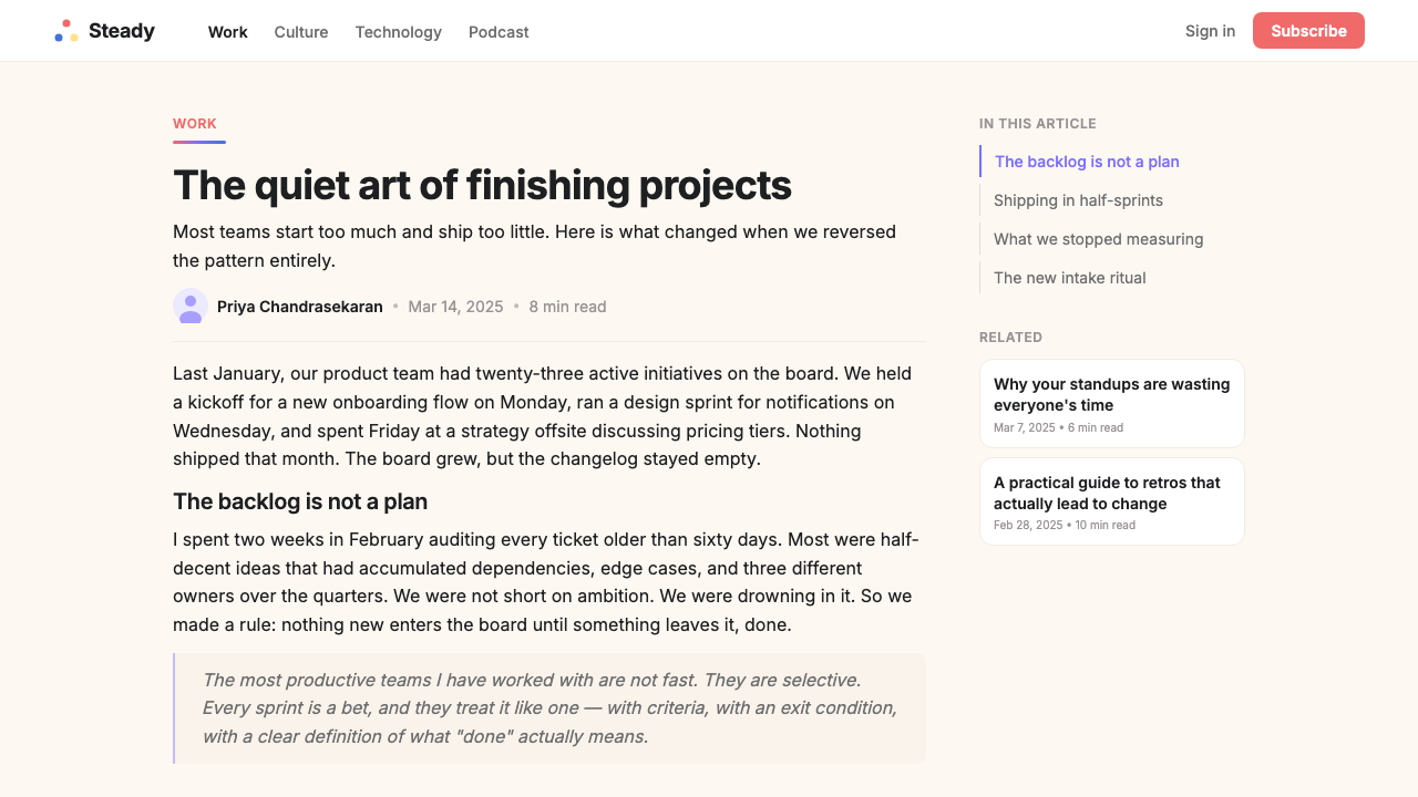
Asana's visual identity is built on a deliberate contradiction: software designed to track deadlines and drive accountability that deliberately refuses to look hurried. The palette centers on a muted, dusty lavender purple — neither the cold violet of enterprise software nor the saturated lilac of consumer social apps, but something in between that reads as both professional and calm. Against this, a warm cream ground replaces the stark white of most productivity tools, softening every surface and inviting the eye to rest rather than scan.Asana 的视觉体系建立在一个刻意为之的矛盾之上:一款追踪截止日期、推动责任落实的软件,却故意拒绝呈现出任何急迫感。色板以一种柔和、沉静的薰衣草紫为核心——既非企业软件惯用的冷调紫罗兰,也非消费类社交应用常见的高饱和淡紫,而是介于两者之间、兼具专业感与平静感的特殊调性。与之相衬的,是一块温暖的奶油色底面,取代了大多数生产力工具惯用的纯白,让每一个界面都更柔和,引导目光驻留而非飞速扫过。
Three accent colors — coral, a clear blue, and a warm yellow — appear together only in the iconic three-dots triangle mark, which has become the brand's most recognizable asset. Outside the mark, these colors operate as individual signals: coral for primary actions and warmth, blue for informational elements, yellow used sparingly as a highlight. The result is a palette that feels curated and intentional rather than varied or energetic.珊瑚色、清透蓝与暖黄三种强调色,只在标志性的三点三角图标中同时出现,那也是品牌最具辨识度的资产。在图标之外,这三种颜色各司其职:珊瑚色用于主要操作与温度感,蓝色用于信息性元素,黄色则极为克制地点缀于高光处。最终呈现出的色板,感觉是经过精心筛选的,而非丰富或充满活力的。
Rounded geometry runs through every element of the system: buttons with generous corner radii, illustrated blobs that replace sharp-edged hero photography, soft gradient washes that tint entire page sections without harsh transitions. The overall effect is what the brand itself calls 'calm productivity' — a visual posture that says work can be organized without being stressful, and that clarity of focus is itself a form of rest.圆润的几何语言贯穿整个系统的每一个元素:拥有充裕圆角半径的按钮、取代硬边英雄图片的插画色块、为整个页面区域涂抹柔和色调却不留生硬过渡的渐变。整体效果正是品牌自己所说的「安静的生产力」——一种视觉姿态,意在传递:工作可以被有序管理而无需充满压力,专注的清晰本身就是一种休憩。
Where does Asana come from?Asana 从何而来?
Asana was founded in 2008 by Dustin Moskovitz, a co-founder of Facebook, and Justin Rosenstein, who had been an engineer at both Google and Facebook. The two left the social network with a specific conviction: that the tools people used to coordinate work were themselves creating more work. Internal task-tracking and communication overhead — the meetings about meetings, the email threads about email threads — had become a larger problem than the underlying tasks. Asana was conceived as a response to this overhead, a platform where work itself was organized transparently so that coordination conversations became unnecessary.Asana 由 Facebook 联合创始人达斯汀·莫斯科维茨(Dustin Moskovitz)与曾任职于谷歌和 Facebook 的工程师贾斯汀·罗森斯坦(Justin Rosenstein)于 2008 年共同创立。两人离开社交网络时怀有一个具体的判断:人们用于协调工作的工具本身正在制造更多工作。内部任务追踪与沟通开销——关于会议的会议、关于邮件的邮件——已经成为比底层任务更大的问题。Asana 正是作为对这种开销的回应而诞生,一个让工作本身透明有序从而使协调对话变得多余的平台。
For its first decade, the company's visual identity was functional but unremarkable — a purple that read as generically 'tech' and a layout language that prioritized density over calm. By the late 2010s, as competitors multiplied and the broader SaaS market had grown visually sophisticated, Asana recognized that its product's philosophy needed to be expressed in its aesthetics. The company had long incorporated mindfulness practices into its work culture — a reflection of Moskovitz's interest in wellbeing — but this dimension was invisible in the interface.在头十年里,公司的视觉形象实用但平淡——一种带有泛化「科技感」的紫色,以及优先考虑密度而非从容感的界面语言。到 2010 年代末,随着竞争者不断涌现、更广泛的 SaaS 市场在视觉上日趋成熟,Asana 意识到产品哲学需要通过美学来表达。公司长期以来将正念实践融入工作文化——这反映了莫斯科维茨对身心健康的关注——但这一维度在界面上完全不可见。
In 2020, Asana engaged the London-based brand consultancy Wolff Olins to lead a comprehensive identity overhaul. Wolff Olins, whose portfolio includes landmark rebrands for companies including Tate, NYC, and GE, brought in typographer and identity designer Sagi Haviv to contribute to the project. The brief was to develop an identity that expressed the idea of 'calm productivity': that being organized should feel like relief, not pressure, and that a well-managed workflow is a form of mental clarity. The three-dot triangle mark — coral, blue, and yellow converging toward a common center — became the keystone of the new system, suggesting collaboration without hierarchy, balance without rigidity.2020 年,Asana 委托伦敦品牌咨询公司 Wolff Olins 主导一次全面的视觉识别改造。Wolff Olins 的履历中包括为泰特美术馆、纽约市以及通用电气等机构进行的标志性品牌重塑;他们邀请字体设计师与视觉识别专家萨吉·哈维夫(Sagi Haviv)参与其中。项目简报的核心是「安静的生产力」这一概念:有条理应该令人感到释然而非承压,管理有序的工作流程本身就是一种心智上的清明。三点三角标志——珊瑚、蓝与黄三色向共同中心汇聚——成为新系统的基石,暗示无层级的协作,传递无僵化的平衡。
The timing of the rebrand had unexpected resonance. Released in early 2020, it arrived just as the global pandemic drove enormous numbers of knowledge workers into remote and distributed work arrangements. Tools for asynchronous coordination, shared task visibility, and structured project management suddenly moved from peripheral to essential. Asana's new visual identity — calm, spacious, and communicating clarity without urgency — turned out to be precisely the visual register that an anxious, newly distributed workforce responded to. The rebrand is now studied as a case of brand positioning and aesthetic decision-making that happened to be ideally suited to the historical moment in which it landed.这次品牌重塑的时机产生了意外的共鸣。发布于 2020 年初,它恰好在全球疫情将大量知识工作者推向远程与分布式工作模式的时刻落地。异步协调工具、共享任务可见性与结构化项目管理,从边缘需求骤然成为核心刚需。Asana 的新视觉形象——从容、宽阔、传递清晰而无急迫感——恰好击中了那个焦虑而突然分散在各地的劳动力群体的心理频率。这次重塑如今被作为品牌定位与美学决策的案例研究,因为它与历史时刻的契合,几乎达到了难以复刻的精准。
What defines the Asana look?Asana 的视觉特征是什么?
Dusty Lavender as Anchor沉静薰衣草作为锚点
The primary brand color is a dusty, muted lavender purple that occupies the middle distance between cool and warm. It is saturated enough to read distinctly against neutral grounds but subdued enough to avoid the assertiveness associated with conventional tech purples. This specific tonal register — not quite corporate, not quite personal — is the identity's most deliberate achievement. It appears in navigation panels, gradient hero sections, and brand materials, always in a way that settles the eye rather than capturing it.主品牌色是一种沉静、克制的薰衣草紫,处于冷暖之间的中间地带。它足够有饱和度,能在中性底面上清晰呈现,但又足够低调,不带传统科技紫通常具备的那种强势感。这个特定的色调区间——既非纯粹企业感,也非纯粹个人感——是这套视觉体系最刻意的成就。它出现在导航面板、渐变英雄区块与品牌物料中,始终以安抚目光而非捕获目光的方式存在。
Cream Ground and Generous Whitespace奶油底面与充裕留白
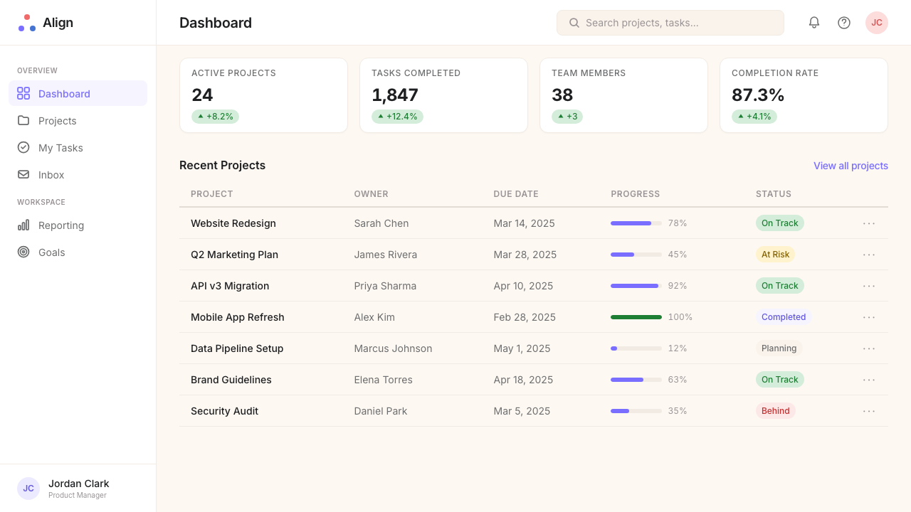
Rather than the clinical white used by most productivity and enterprise software, Asana's layouts rest on a warm cream ground that reduces eye strain over extended sessions and conveys a sense of considered craft. Whitespace is treated as a primary compositional element, not as the absence of content but as a signal of calm and organization. Sections breathe, cards have room around them, and density is consciously avoided even when content volume is high.与大多数生产力和企业软件惯用的临床感纯白不同,Asana 的版面建立在温暖的奶油色底面上,在长时间使用中减轻眼睛疲劳,并传递出经过深思熟虑的质感。留白被视为主要的构图元素,不是内容的缺席,而是从容与有序的信号。各个区域可以呼吸,卡片周围有余地,即使内容量较大时,密集感也被刻意回避。
The Three-Dot Triangle Mark三点三角标志
The three dots — coral, blue, and yellow — arranged in a triangular formation are the system's most iconic element. Each dot is a solid circle of equal size; the three converge toward a shared center without touching, implying balance and mutual orientation. The mark is the only place in the identity where all three accent colors appear simultaneously. Outside the mark, coral, blue, and yellow function as individual semantic signals, never competing as a trio for the eye's attention.三个圆点——珊瑚、蓝与黄——以三角形排列,是整个系统最具标志性的元素。每个圆点是大小相等的实心圆;三者向共同中心汇聚而不相接触,暗示平衡与相互朝向。这个标志是整套视觉体系中三种强调色唯一同时出现的地方。在标志之外,珊瑚、蓝与黄各自作为独立的语义信号运作,从不作为三重奏同时争夺目光。
Soft Gradients as Surface柔和渐变作为界面肌理
Where most design systems of this era avoid gradients in favor of flat color, Asana deliberately embraces them — but in a tightly controlled register. Hero panels and large background sections use gentle tonal sweeps within a single color family, typically moving from the dusty lavender toward cream or from coral toward peach. These gradients are never aggressive or vivid; they function more like a wash of watercolor than a graphic gradient, adding atmospheric depth without introducing the visual tension that high-contrast gradients create.当同时代的大多数设计系统为了平面色彩而回避渐变时,Asana 却刻意拥抱渐变——但控制在极为收敛的区间内。英雄面板与大型背景区块使用单一色系内的柔和色调过渡,通常从沉静薰衣草向奶油色漂移,或从珊瑚色向桃色延伸。这些渐变从不强烈也不鲜艳;它们更像水彩的晕染而非图形化渐变,在不引入高对比渐变所造成的视觉张力的前提下,增添了大气层次感。
Rounded Geometry Throughout贯穿始终的圆润几何
Hard corners are almost entirely absent from the Asana system. Every interactive element — buttons, input fields, cards, chips, tags — carries a rounded corner radius significant enough to read as a considered choice rather than a default. Illustrated elements in marketing materials are organic blobs and swooping curves rather than rectangles and polygons. This consistent commitment to soft geometry sets an emotional register: rounded forms are read cross-culturally as approachable, safe, and non-threatening — visual values that translate directly into the productivity-without-pressure brand promise.硬角在 Asana 系统中几乎完全缺席。每一个交互元素——按钮、输入框、卡片、标签——都带有足够显著的圆角半径,让人感受到这是经过深思熟虑的选择,而非系统默认。营销物料中的插画元素是有机色块与流动曲线,而非矩形与多边形。对圆润几何的一贯坚持设定了情感基调:圆润形态在跨文化语境中都被解读为亲切、安全、不具威胁性——这些视觉价值直接转化为「无压力生产力」的品牌承诺。
Typography Balanced Between Warmth and Precision在温暖与精准之间保持平衡的字体排印
The typefaces in the Asana system are humanist sans-serifs that carry warmth without sacrificing legibility at the small sizes required by dense interface layouts. Headlines are set with restrained weight contrast — large and clear but not aggressive. Body text is set at comfortable measures with generous line spacing, making long-form content in the product feel calm rather than compressed. The typographic system avoids both the cold rationalism of geometric sans-serifs and the quirky personality of display serifs, landing in a register that reads as trustworthy and approachable.Asana 系统中的字体是人文主义无衬线体,在满足密集界面布局所需小尺寸可读性的同时带有温度感。标题以克制的字重对比设定——清晰而大方,却不带攻击性。正文以舒适的行宽与宽松的行距排版,让产品中的长篇内容阅读起来感觉从容而非压缩。这套排版系统回避了几何无衬线体的冷静理性主义,也回避了展示性衬线体的个性张扬,落在一个可信且亲切的区间。
Illustration Over Photography插画优先于摄影
Marketing and onboarding materials rely heavily on custom illustration rather than stock or lifestyle photography. The illustration style uses the brand palette directly — muted lavender, coral, blue, and yellow on cream — with forms that echo the organic geometry of the identity: flowing shapes, stacked or nested blobs, and simplified figurative elements with rounded silhouettes. This approach ensures that every brand touchpoint feels cohesive and controlled, and avoids the tonal inconsistency that photography introduces when brand guidelines need to stretch across many different content contexts.营销与引导材料大量依赖定制插画,而非图库照片或生活方式摄影。插画风格直接使用品牌色板——奶油底上的沉静薰衣草、珊瑚、蓝与黄——以与视觉体系有机几何相呼应的形态呈现:流动色块、叠放或嵌套的有机形,以及带圆润轮廓的简化具象元素。这种方式确保每一个品牌触点都感觉连贯、可控,也避免了当品牌指南需要跨越多种内容语境延伸时摄影所带来的色调不一致问题。
Who shaped Asana?谁塑造了 Asana?
Moskovitz co-founded Facebook before leaving to start Asana with the specific goal of reducing the coordination overhead that enterprise software had normalized. His long-standing interest in mindfulness and organizational wellbeing — he has spoken and written extensively about sustainable work practices — shaped the brand's philosophical commitment to 'calm productivity'. The 2020 rebrand gave visible form to values that had been embedded in the company's culture since founding but had never been expressed in its visual identity.莫斯科维茨在离开 Facebook 联合创立 Asana 之前,曾是 Facebook 的联合创始人,离开的目的正是解决企业软件已然正常化的协调开销问题。他长期对正念与组织健康的关注——他就可持续工作实践发表过大量演讲与文章——塑造了品牌在「安静生产力」上的哲学承诺。2020 年的品牌重塑,为那些自创立之初便嵌入公司文化却从未在视觉身份中得到表达的价值观,赋予了可见的形式。
Rosenstein, who had worked on Google Drive and the Facebook Like button before co-founding Asana, brought a product philosophy centered on reducing friction and invisible overhead in collaborative work. His technical and philosophical contributions to Asana's early architecture — particularly the idea that every task should have exactly one owner and that all relevant information should live in one place — provided the structural rationale that the 2020 visual identity later tried to make visible through clarity, spaciousness, and the absence of visual noise.罗森斯坦在联合创立 Asana 之前,曾参与谷歌云端硬盘与 Facebook 点赞按钮的开发,他带来了以减少协作工作中的摩擦与隐性开销为核心的产品哲学。他对 Asana 早期架构的技术与哲学贡献——尤其是每项任务应有且只有一个负责人、所有相关信息应汇聚于同一处的理念——提供了结构性依据,而 2020 年的视觉识别后来试图通过清晰、宽阔与视觉噪音的缺席,将这种依据变得可见。
The London and New York-based brand consultancy Wolff Olins led the 2020 rebrand that produced the current Asana identity. Founded in 1965, Wolff Olins has a history of high-profile brand systems including the 2012 London Olympics identity and rebrands for Tate, Orange, and GE. For Asana, the firm developed the three-dot triangle mark, the extended palette, and the foundational design principles that position the brand as wellness-adjacent and emotionally calm — a significant departure from the competitive, achievement-oriented visual language common in enterprise productivity software.总部位于伦敦和纽约的品牌咨询公司 Wolff Olins 主导了产生当前 Asana 视觉体系的 2020 年品牌重塑。Wolff Olins 成立于 1965 年,拥有包括 2012 年伦敦奥运会视觉体系及泰特、Orange 与通用电气品牌重塑在内的高知名度项目履历。对于 Asana,该公司开发了三点三角标志、延伸色板与基础设计原则,将品牌定位为贴近健康理念、情感上从容平静——这与企业生产力软件中常见的竞争性、成就导向型视觉语言形成了显著的背离。
Sagi Haviv, a partner at the identity firm Chermayeff and Geismar and Haviv, contributed to the mark development phase of the Asana rebrand. Haviv and his firm are known for logo systems that achieve immediate recognition through radical simplicity — their portfolio includes the US Open tennis logo, the NBC peacock, and brand marks for Harvard University Press and the Library of Congress. His involvement brought a rigorous logo-design philosophy to the three-dot triangle mark, ensuring that the icon would function at the smallest display sizes and in single-color contexts without losing legibility or meaning.萨吉·哈维夫是视觉识别公司 Chermayeff and Geismar and Haviv 的合伙人,参与了 Asana 品牌重塑的标志开发阶段。哈维夫及其公司以通过极端简洁实现即时辨识度的标志系统而知名——其作品集包括美国网球公开赛标志、NBC 孔雀标志,以及哈佛大学出版社与国会图书馆的品牌标志。他的介入为三点三角标志带来了严格的标志设计哲学,确保这个图标在最小的显示尺寸和单色场景下依然不失可读性与意义。
The broader cultural context that made the Asana rebrand legible and persuasive was a movement among knowledge workers and technology companies toward integrating wellbeing and mindfulness into professional life. Companies including Google, Salesforce, and Headspace had normalized meditation rooms, burnout conversations, and wellness benefits by the late 2010s. Asana's identity drew directly on this cultural shift — positioning calm, spaciousness, and the absence of visual stress not as aesthetic choices but as statements of values. The rebrand arrived as a fluent translation of an already-established cultural vocabulary into a software product's visual language.让 Asana 品牌重塑得以清晰传达并具有说服力的更广泛文化语境,是知识工作者与科技公司之间将身心健康与正念融入职业生活的运动。到 2010 年代末,谷歌、Salesforce、Headspace 等公司已将冥想室、职业倦怠对话与健康福利正常化。Asana 的视觉体系直接汲取了这一文化转变——将从容、宽阔与视觉压力的缺席定位为价值观的表达,而非单纯的审美选择。这次品牌重塑,是对一套已然成型的文化词汇向软件产品视觉语言的流畅翻译。
How do you use Asana today?今天怎么用 Asana?
The Asana identity style is one of the most directly transferable contemporary brand aesthetics into presentation and interface design work, because its underlying logic — calm over urgency, spaciousness over density, soft palette over high contrast — is legible and practical rather than art-historical. Applying it well requires internalizing the core tension it manages: the design must feel organized and precise enough to communicate professional capability, while remaining warm and unhurried enough to communicate psychological safety. Achieving that balance is the central design challenge, and every decision should be evaluated against it.Asana 的视觉风格是当代品牌美学中最可直接移植至演示与界面设计的风格之一,因为其底层逻辑——从容优先于急迫、宽阔优先于密集、柔和色板优先于高对比——是清晰可读且切实可行的,而非艺术史意义上的风格引用。正确应用它,需要内化它所管理的核心张力:设计必须足够有条理、足够精准,以传递专业能力;同时必须足够温暖、足够从容,以传递心理安全感。实现这种平衡是核心设计挑战,每一个决策都应针对它进行评估。
For presentation slides, the Asana approach rewards a cover page built around the dusty lavender as a large, breathing field — the title in a humanist sans-serif at generous scale, positioned with asymmetric calm rather than centered symmetry. Coral or blue can anchor a single accent element: an underline, a geometric block, or the three-dot mark itself if the context is brand-referential. Content slides should use the cream ground throughout, with generous margins and minimal content per slide — one idea, one supporting visual, clear typographic hierarchy. Data slides benefit from a restrained approach: a single chart type per slide, bars or segments colored using one accent from the palette, with the cream ground allowing the data shape to read cleanly without visual competition.对于演示文稿,Asana 式方法最适合以沉静薰衣草作为大面积呼吸场域的封面页——标题以人文主义无衬线体大方呈现,以非对称的从容感而非居中对称来定位。珊瑚色或蓝色可以锚定单一强调元素:一条下划线、一个几何色块,或者在品牌相关语境下三点标志本身。内容页应全程使用奶油底面,保持充裕页边距,每张幻灯片内容精简——一个观点、一个支撑视觉、清晰的排版层级。数据页受益于克制的方式:每张幻灯片仅呈现单一图表类型,柱条或扇区从色板中取用一种强调色,奶油底面让数据形态在没有视觉竞争的情况下清晰呈现。
For web interfaces and digital dashboards, the style translates particularly well to tools where users spend extended sessions. The cream background reduces cognitive fatigue compared to pure white; the muted lavender in a sidebar or navigation panel separates function zones without the harsh contrast of dark-mode navigation. Interactive states — hover, focus, active — work well using the coral as the primary action color and the blue as the informational or secondary state. Pricing and feature comparison pages suit this palette because the soft hues allow tier differentiation through tonal variation within the lavender family without reaching for heavy black headers or aggressive color blocking. Rounded card components with minimal border treatment and no drop shadow, or a very soft ambient shadow, maintain the unhurried quality of the system.对于网页界面与数字仪表板,这种风格在用户需要长时间使用的工具中尤为适用。奶油底面与纯白相比能降低认知疲劳;侧边栏或导航面板中的柔和薰衣草在不产生深色导航生硬对比的情况下,实现功能区域的区隔。交互状态——悬停、聚焦、激活——使用珊瑚色作为主要操作色、蓝色作为信息性或次要状态色,效果良好。定价与功能比较页面适合这套色板,因为柔和色调可以在薰衣草色系内通过色调变化实现等级区分,无需借助沉重的黑色标题或强势的色块。带最低限度边框处理、无投影或极轻微环境阴影的圆角卡片组件,能维持系统从容不迫的品质。
For editorial and marketing design, the style functions well in long-form content and campaign work where sustained reading comfort is important. A Asana-inflected editorial layout uses generous line spacing and a comfortable measure for body text, with the cream or near-white ground serving as the continuous thread. Section headers in muted lavender or deep coral provide hierarchy without aggression. Full-width illustrated panels — using the organic blob and rounded-form illustration style with the brand palette — break up text-heavy spreads and maintain visual richness without introducing photographic tonal inconsistency. Campaign materials work particularly well with the three-dot motif used as a compositional device: three circles of varying sizes placed with considered asymmetry can anchor a cover, a social card, or a marketing banner while communicating brand recognition.对于编辑与营销设计,这种风格在持续阅读舒适度重要的长篇内容与活动物料中表现良好。带有 Asana 气质的编辑版面为正文使用宽松的行距与舒适的行宽,以奶油或接近白色的底面作为贯穿始终的线索。柔和薰衣草或深珊瑚色的章节标题提供层级感而不显强硬。全宽插画面板——使用带有机色块和圆润形态的插画风格以及品牌色板——在文字密集的跨页中制造节奏感,维持视觉丰富性而不引入摄影带来的色调不一致问题。活动物料在将三点母题作为构图装置时尤其出色:三个大小各异的圆形以经过考量的非对称方式排布,可以锚定封面、社交卡片或营销横幅,同时传递品牌辨识度。
A common mistake when applying this aesthetic is interpreting 'calm' as permission for low contrast and poor readability. The Asana system achieves calm through palette and spacing, not through reduced contrast between text and ground — body text must still read cleanly, interactive elements must still signal affordance, and hierarchy must still be immediately legible. A second frequent error is overusing the gradient: the soft tonal washes work only in large hero and background contexts where they have room to breathe; applied to smaller elements like buttons, tags, or cards, they undermine the system's quiet authority and make individual components look fussy rather than considered. The three accent colors should also remain disciplined — coral, blue, and yellow together are reserved for the mark only, and deploying all three in the same layout panel creates visual noise that contradicts the brand's central promise.应用这种美学时最常见的错误,是将「从容」理解为低对比度和可读性不足的许可。Asana 系统通过色板和间距实现从容感,而非通过降低文字与底面之间的对比度——正文必须仍然清晰可读,交互元素必须仍然传递可操作性,层级必须仍然即时清晰。第二个常见错误是过度使用渐变:柔和的色调晕染只在大型英雄区块和背景语境中有效,那里有足够的空间供其呼吸;若应用于按钮、标签或卡片等较小元素,则会削弱系统沉静的权威感,让单个组件看起来矫揉造作而非经过深思。三种强调色也应保持克制——珊瑚、蓝与黄同时出现是标志专属,在同一版面区域部署全部三者会制造视觉噪音,与品牌的核心承诺相悖。
Asana — FAQAsana · 常见问题
Is Asana purple a brand-specific color or a general design trend?Asana 的紫色是品牌专属颜色,还是一种普遍设计趋势?
Both. The specific tonal register of Asana's lavender — dusty, muted, warm-leaning — is a deliberate brand choice made by Wolff Olins in 2020. But the broader embrace of soft purple and lavender tones in SaaS and technology branding was also a trend across that period, as companies sought to distinguish themselves from the saturated blue-and-green defaults of earlier enterprise design. Asana's version is notable for how precisely calibrated it is: not quite cool enough to feel remote, not quite warm enough to feel casual, occupying a specific tonal position that has become strongly associated with the brand. If you apply a more generic lavender, the result will feel trend-responsive but not brand-specific.两者都是。Asana 薰衣草紫的特定色调区间——沉静、克制、偏暖——是 Wolff Olins 在 2020 年做出的刻意品牌选择。但 SaaS 与科技品牌对柔和紫调和薰衣草色调的更广泛拥抱,在那个时期也确实是一种趋势,因为企业们希望将自己与早期企业设计的饱和蓝绿默认色区别开来。Asana 的版本之所以值得关注,在于它的精准校准:既不够冷,不至于显得疏远;也不够暖,不至于显得随意,占据着一个已与该品牌强烈关联的特定色调位置。如果你使用更通用的薰衣草色,结果会显得顺应潮流,但不具品牌特异性。
Can this style work for a product that is not a productivity tool?这种风格能用于非生产力类产品吗?
Yes, with some recontextualization. The Asana aesthetic carries an implicit message — organized, professional, psychologically safe — that translates well to any product that benefits from those associations: project management tools, healthcare applications, financial planning platforms, educational products, or any service where trust, clarity, and reduced cognitive load are valued. It is less well-suited to products that need to project energy, excitement, or cultural edge: sports and gaming brands, nightlife and entertainment, fast fashion, or consumer tech products that compete on boldness and novelty. In those contexts, the palette's deliberate calmness will read as a mismatch rather than a differentiator.可以,但需要一定程度的重新语境化。Asana 的美学携带着隐含信息——有条理、专业、心理上安全——这能很好地转化到任何受益于这些联想的产品上:项目管理工具、医疗健康应用、财务规划平台、教育产品,或任何信任感、清晰度与降低认知负荷被重视的服务。它不太适合需要传递能量、兴奋感或文化前卫性的产品:体育与游戏品牌、夜生活与娱乐、快时尚,或以大胆与新颖竞争的消费科技产品。在那些语境中,这套色板刻意的从容感会被解读为风格错配,而非差异化优势。
How do I use the three-dot motif without looking like I am copying Asana?如何使用三点母题而不让人觉得是在抄袭 Asana?
The three-dot triangle is Asana's registered trademark, so direct reproduction of that specific configuration — equal-sized circles in coral, blue, and yellow arranged in a convergent triangle — should be avoided in any professional context. However, the underlying compositional logic of three balanced elements, or circular dots as accent geometry, can be adapted. Change the color assignment to fit your own palette, vary the sizes to create visual weight hierarchy, or shift the arrangement from triangular convergence to linear or scattered distribution. The compositional rhythm of three is a useful tool; the specific mark is protected. Treated as a compositional principle rather than a copied symbol, the approach remains useful.三点三角是 Asana 的注册商标,因此在任何专业语境下,都应避免直接复制这一特定构型——以珊瑚、蓝与黄排列成汇聚三角形的等大圆形。然而,三个平衡元素的底层构图逻辑,或作为强调几何的圆形点,是可以被改编的。将色彩分配改为符合你自己色板的方式,通过大小变化创造视觉重量层级,或将排列方式从三角汇聚变为线性或散点分布。三点的构图节奏是一个有用的工具;具体的标志是受保护的。将其作为构图原则而非照搬符号来对待,这种方式仍然有其价值。
Does this style work well in dark mode?这种风格在深色模式下效果好吗?
The Asana identity was designed as a light-ground system, and a direct dark-mode inversion creates challenges specific to this palette. The dusty lavender that reads as refined and calm on a cream ground tends to look washed out against dark backgrounds; the coral, which functions as a warm accent on light grounds, can become visually dominant to the point of harshness against dark. A considered dark adaptation would not simply invert the palette but would shift to a very deep, near-black version of the lavender as the ground color, use cream or off-white for body text, and reserve the coral and blue for interactive states only. The soft gradient washes that define the light-mode version's atmospheric quality are difficult to translate into dark contexts and may need to be replaced with flat tonal panels.Asana 的视觉体系是为浅色底面系统设计的,直接进行深色模式反转会带来这套色板特有的挑战。在奶油底面上呈现出精致与从容感的沉静薰衣草,在深色背景下往往显得黯淡失色;珊瑚色在浅色底面上作为温暖强调色发挥功能,在深色背景下则可能视觉主导到接近刺眼的程度。经过深思熟虑的深色适配,不会是简单地反转色板,而是将非常深的、接近黑色的薰衣草版本作为底面色,用奶油色或米白色显示正文,仅将珊瑚与蓝色保留给交互状态。定义浅色模式大气质感的柔和渐变晕染在深色语境中难以转化,可能需要以平面色调面板取代。
What distinguishes this style from generic 'soft UI' or pastel design trends?这种风格与泛化的「柔和 UI」或马卡龙设计趋势有何区别?
Soft UI and pastel trends in the early 2020s typically combined multiple pastel hues — often four to seven colors drawn from across the spectrum — with high-saturation glassmorphism effects, blurred backgrounds, and diffuse light simulations. The Asana aesthetic is more restrained: it uses only one dominant hue (the dusty lavender), limits accents to three colors that appear together only in the mark, and avoids glassmorphism entirely in favor of flat or softly-gradated surfaces. The difference is between a palette designed by a specialist brand consultancy with a specific philosophical brief and a general stylistic trend. The Asana system has internal logic and constraints; soft UI trends tend to accumulate effects without a unifying principle. When applying the Asana aesthetic, the discipline of restraint — knowing what not to add — is what separates coherent execution from a generic pastel layout.2020 年代初期的柔和 UI 与马卡龙设计趋势,通常将多种马卡龙色调——往往是从整个色谱中取出四到七种颜色——与高饱和玻璃拟态效果、模糊背景和漫射光模拟结合在一起。Asana 的美学更为克制:它只使用一种主导色调(沉静薰衣草),将强调色限制在仅在标志中同时出现的三种颜色,并完全回避玻璃拟态,转而采用平面或柔和渐变的表面。这是由专业品牌咨询公司基于特定哲学简报设计的色板与一种泛化风格趋势之间的区别。Asana 系统拥有内在逻辑与约束;柔和 UI 趋势倾向于在没有统一原则的情况下堆积效果。在应用 Asana 美学时,克制的自律——知道什么不应该添加——正是连贯执行与泛化马卡龙版面之间的分野所在。
Related design styles相关设计风格
 Glean Enterprise-SearchWarm enterprise AI. Cream ground, yellow focus, sage graph nodes, and sans ca…温暖的企业 AI:奶油底、黄焦点、鼠尾草节点与无衬线克制。
 Android Bugdroid GreenFriendly tech, reduced to geometry. Vivid green pops from Grey 900 and rounde…友好科技化为几何:明绿从 Grey 900 与圆润字形中跃出。
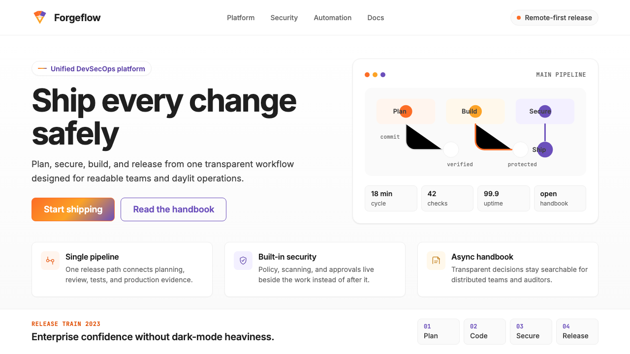 GitLab 2023DevOps in daylight. Tanuki orange-to-purple gradient, Inter, warm enough for…DevOps 走出暗色房间:标志性狸猫橙紫渐变、宽松行高、Inter 字体——…
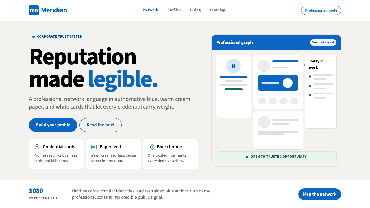 LinkedInCorporate trust, digitized. Authoritative blue frames white cards on warm cre…企业信任数字化:权威蓝框住暖奶油纸面上的白卡。
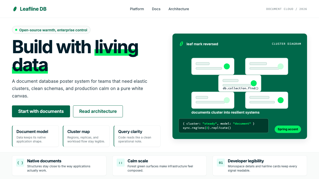 MongoDB Leaf GreenDisciplined green, open warmth. Forest leaf forms and Spring accents breathe…克制的绿有开源温度:森林绿叶形与春绿点缀,留白呼吸。
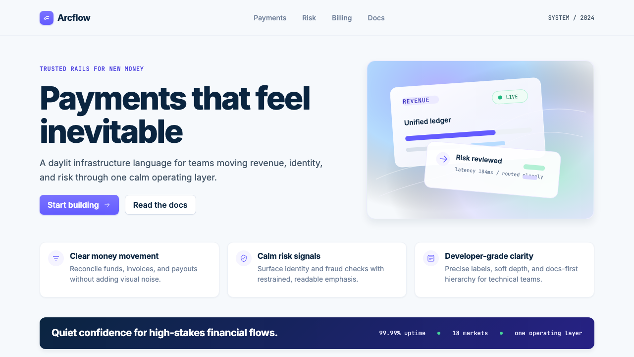 Stripe 2024Trust earns its glow. Indigo mesh, neutral type, and whisper cards float on n…信任自带微光:近白底上的靛蓝渐变、中性字体与轻影卡片。